4,179 search results
(0.06 seconds)
- Sterling Pro by SoftMaker,
$9.99 Sterling Pro is one of the fonts of the SoftMaker font library.
 - Sigmund PRO by Borutta Group,
$39.00 Sigmund PRO is a visual journey around Poland. The main style is inspired by the Polish road signage typeface – designed by Marek Sigmund. With the increase of weight, Sigmund turns into a geometric display – in the spirit of vernacular typography from the signs of Polish streets. Thanks to this span of styles Sigmund will work both in visual identifications and posters. The family consists of 18 varieties and has many alternative characters.
 - Revolancer Pro by Popskraft,
$18.00 The Revolancer Pro font was designed in addition to the unique Revolancer font, so this font looks more familiar. But this is only at first glance. This typeface combines the simplicity of classic grotesque typefaces with the freedom and independence of a Revolancer typeface. This font will give you freedom. The freedom to be unique, not like everyone else. Each character in Revolancer font knows its place, and it is impossible to achieve such a smooth and organic flow of words using a regular font.
 - Pinel Pro by URW Type Foundry,
$39.99 The characteristic ‘French face’ was originally made in 1899 under the supervision of Joseph Pinel. Thus, what was originally French 10 pt. Nº 2, got its present name. The Frenchman Joseph Pinel called himself a "typographical engineer", but was at the time employed as a type draughtsman at the Linotype Works in Altrincham. It appears that this and some other faces that he supervised, were, except for use on the Linotype, also meant for manufacturing matrices for the Dyotype. This composing machine was an invention of Pinel. The Dyotype was a rather complicated machine and consisted, like the Monotype, of two separate contraptions, a keyboard which produced a perforated paper ribbon and a casting machine which produced justified lines of movable type. Unlike the Monotype which has a square matrix carrier, the Dyotype had the matrices on a drum (in fact two drums, hence the name of the machine). A Pinel Diotype company was founded in Paris and a machine was built with the help of the printing press manufacturer Jules Derriey. As is often the case, a lack of sufficient capital prevented the commercializing of this ingenious composing machine. Coen Hofmann digitized the font from a batch of very incomplete, damaged and musty drawings, which he dug up in Altrincham. He redrew all characters, bringing up the hairstrokes somewhat in the process. The result is a roman and italic, while the roman font also includes Small Caps
 - Bello Pro by Underware,
$50.00 Now check this, Underware’s blockbuster type, Bello. Bello Pro is a brush typeface for headline point sizes - it’s big & beautiful. Bello has lots of ligatures and start and ending swashes. They are automatic in Bello Script Pro, which is a cross-platform OpenType font with many OpenType features. Bello has Underware’s world-dominating Latin Plus character set, supporting a total of 219 languages (Latin 1 + 2 and beyond). After a period of hand sketching and lettering, Bello got two main styles: Script and Caps. These two fonts create a strong typographic contrast - while Bello Script Pro is flourished and flowing, Bello Caps Pro provides upright and sturdy capital lettering. As sturdy as brush lettering allows, of course. Careful spacing and kerning ensures* that Bello appears like fluently written handwriting. However, that’s not enough for a hand-lettered feel. Therefore Bello comes with a set of 64 ligatures. Some of them are typographic, some made simply to create a more intimate, natural impression. For the same reasons we have added a few ornaments and a set of snap-on beginning and ending swashes which attach to the lowercase letters of Bello. With Bello Words Pro you can add some two-color words in your text by the pre-designed word logotypes. Trust the brush! *So take care: use ‘metrics’, not ‘optical’ as a spacing setting in layout apps.
 - Yekuana Pro by Neo Type Foundry,
$28.50 Yekuana Pro is a typeface whose design is based primarily on the study of certain geometric ethnic ancestral Venezuelan signs, visually rich and originally used in the enrichment of various utilitarian objects with high symbolic and cultural content. It’s a family that is composed of 330 glyphs y of two weights, including Inline and Outline versions, Stylistic Alternates, Fractions, Ordinals and Ligatures. The combination of their styles through the use of layers by contrasting colors application of allows to obtain new interesting results. Its use is recommended for titles or short phrases and elements of oversized visual communication.
 - Palsam Pro by Abjad,
$110.00 Since the beginning, Palsam was intended to be a super multilingual family, with a real cursive Arabic companion, and a display cut. The typeface was designed to be used for setting text and titles of contemporary Arabic content, specially magazines, and websites. The Arabic and Latin scripts were designed at the same time, to make a true authentic bilingual typeface. Both scripts have affected each other in several ways through the entire design process, which happened within ten years. Palsam has an inviting, approachable, fashionable and humanist look. Thanks to its low contrast, open apertures, detailed calligraphic strokes, and smooth counters, which also make it easy to read at smaller sizes. The main highlight for Palsam was the Cursive companion. For the first time, the calligraphic Ijaza style was used as a model for designing the Arabic cursive. Since the Ijaza is a hyper combination of Naskh and Thuluth, which makes it perfect to be a companion for the upright Naskh. Moreover this script was used in margins, and to highlight specific content inside a paragraph in older manuscripts. With true cursive companions in five weights, and many opentype features, Palsam grants all the tools needed to set complex information and editorial designs applications. More than 1000 characters are included per weight, including small caps, fractions, old style and lining numbers, ligatures, contextual ligatures, and discretionary ligatures. It supports over 40 languages that use the Latin extended, as well as Arabic, Farsi, and Urdu Languages. The latin script was designed in collaboration with the Slovenian type designer Alja Herlah.
 - Borough Pro by The Type Fetish,
$45.00 Inspired by a hand painted sign from Lanesboro, MN. Borough is an OpenType font that contains four variations of every character in its extended character set. Using Contextual Alternatives in OpenType savvy applications will allow the font to rotate through the variations to give a more random look to the text.
 - Curely Pro by Konstantine Studio,
$15.00 Start from the idea of our free font, Curely, which has hit the milestone - a 70K project views on Behance and a thousand times more download (still going). Now we came up with the Pro version of it. More complex, more features, and absolutely more playful. So, please welcome, Curely Pro. A Versatile casual handmade decorative lettering typeface. Still inspired from the girly things and cuteness overload in every letters. Perfectly fit for your cute, sweet, lovely, and casual branding or logo project. Or any design stuff that need a lovely cute touch on it, let the Curely Pro smooch it all the way baby!
 - Economica PRO by Underground,
$29.90 Economica Pro is a font specially developed for printing complex situations. It has been tested successfully in very small sizes without losing legibility. It's ink traps ensure its smooth operation even in low quality papers. Ideal for newspapers.
 - Astaire Pro by Hackberry Font Foundry,
$24.95 This is a deco-style text OpenType Pro font loosely based on Koch's Locarno as seen in KochAltschrift a recent free German tribute to Koch's work. I was familiar with Meek's Letraset presstype version called Locarno, but I never liked the proportions used by either Meeks or Koch. So I radically revised ascender, descender, and x-height to make them more usable and brought the shapes within my sense of design. Mine is probably closer to Meeks than Koch, but hopefully it is a tribute to both. Astaire looks much more modern and it is much more usable. I added oldstyle figures, small cap figures, small caps, several ligatures, and more. There are an italic, bold, and bold italic also in this family
 - Fry Pro by omtype,
$37.00 The typeface Fry was developed in 2008 specially for the Sky-Fish company (fish and seafood dealer). This type is designed for small texts and has a friendly and a fairytale historic flavor. Fry takes the openness and dynamism of humanistic sans serif, the simple and softness of lubok’s letters (primitive style) and the fluidity of shallow marine fry. Despite its funny style, Fry works well even in the 5 point size. In large sizes Fry demonstrates its originality, vivacity and softness, in the small characteristics become less visible, and Fry’s readability becomes more important. This makes the typeface suitable for many tasks of typography. The typeface includes extended set of Latin, Cyrillic and Greek, old style and lining figures, historical alternates and special local features. The combination of lubok’s aesthetics and funny dynamic forms make a nature of Fry. Fry was exhibited on Svjato Cyrillic (Kharkov, Ukraine) festival in 2008. It was awarded for excellence in type and graphic design at Modern Cyrillic 2009 competition. Also it received the second prize in display category at Granshan 2011. Fry was selected among 50 typefaces for the Call for type exhibition in the Gutenberg museum (2013).
 - Miss Mince by Sealoung,
$12.00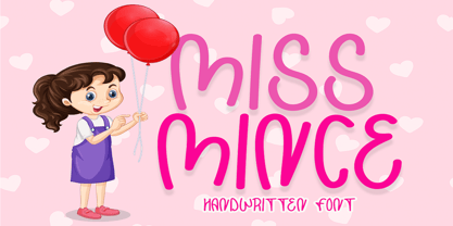 Miss Minceis a flowing handwritten font, described by an elegant touch, perfect for your favorite projects. Fall in love with its incredibly distinct and timeless style and use it to create spectacular designs!
 - Linotype Minos by Linotype,
$29.99Linotype Minos is part of the Take Type Library, chosen from contestants of Linotype’s International Digital Type Design Contests of 1994 and 1997. This fun font was designed by Swiss artist Christian Goetz, who named it after King Minos of Crete of the Bronze Age. Typical of scripts of this time were the ornamental borders around the characters, found on palaces of Knossos, Phaistos and Mallia. These borders surround every character of Linotype Minos, making it exclusively for headlines in larger point sizes. Single characters can also be used as initials mixed with other alphabets, especially with constructed sans serif and modern serif fonts. - Komika Display Tight - Unknown license

- Komika Text Kaps - Unknown license

- Komika Text Kaps - Unknown license

- Komika Text Tight - Unknown license

- Komika Text Kaps - Unknown license

- Komika Text Kaps - Unknown license

- Komika Text Tight - Unknown license

- Micro Manager NF by Nick's Fonts,
$10.00This font features a complete uppercase alphabet, including accented characters, as well as numbers and standard punctation. Lowercase characters are an assortment of useful dings and things. To create very low-load GIFs, compose your type in Photoshop (or equivalent) at 8 point (or multiples thereof), with anti-aliasing turned off. Both versions of the font include 1252 Latin, 1250 CE (with localization for Romanian and Moldovan). - WIP Macho Man by WIP Fonts,
$49.00WIP Macho Man depicts the handwriting of man with a strong need for independence combined with spontaneity and high potential. The (lower case) characters are joined as it is usual in German speaking countries. Originally designed in 1995 the font has been extended by a lot of new characters such as accented characters, punctuation, symbols and currency symbols. - Vinho De Amora by Mans Greback,
$59.00 Vinho De Amora is a truly vintage serif font. Drawn by Mans Greback between 2019 and 2021, this font is created with inspiration from wine cellars, painted typography and genuine quality produce. It has a distinct sharp character, steady legs and a bold and wide appearance. The Vinho De Amora family consists of three styles: Black, White and Stencil; each one geometrically consistent and complimenting, perfect for stacking on top of each other to create more variations. The font is built with advanced OpenType functionality and has a guaranteed top-notch quality. It has extensive lingual support, covering all European Latin-based languages. It contains all characters and symbols you'll ever need, including all punctuation and numbers.
 - Little Micro Sans by Caron twice,
$39.00 It is 1984 and Ridley Scott’s commercial for Apple tells us, “You’ll see why 1984 won’t be like ‘1984’.” The first Mac comes on the market. The Mac interface includes a font for use in small sizes called Chicago. The first version was designed by Susan Kare. The font’s modern grid-like character was also used for the first iPod screens, which is why this font is also associated with music. Today’s font upgrade, Little Micro Sans, is suited for small-point texts, product labels, lists of ingredients, and small captions in books, magazines, websites or applications. For online use, a variable format is particularly handy as it offers all font styles in a single file, has a faster display time and takes up less memory. Little Micro Sans is a revolution for small sizes. Specimen: http://carontwice.com/files/specimen_Little_Micro_Sans.pdf
 - Mingo Gothic SG by Spiece Graphics,
$39.00 This typeface appears to be straight out of a science fiction movie thriller. Mingo is a slightly condensed, somewhat vain gothic with thick vertical strokes proudly tapering downward. Capitals which are normally completely round are now square inside with curving outside corners. Lowercase letters carry the same design traits. And, in the capital A and H, crossbars extend on both sides helping give the face a pronounced retro look. Mingo Gothic is a close cousin to Raleigh Gothic and is an excellent choice for book covers and large display settings. Small caps, fractions, and alternate characters have also been developed for greater layout versatility. Mingo Gothic Bold is now available in the OpenType format. Some new characters have been added to this OpenType version as stylistic alternates, historical forms, small caps, oldstyle figures, ornaments, and f-ligatures. These advanced features work in current versions of Adobe Creative Suite InDesign, Creative Suite Illustrator, and Quark XPress. Check for OpenType advanced feature support in other applications as it gradually becomes available with upgrades.
 - Bessie Mae Moocho NF by Nick's Fonts,
$10.00A thoroughly fun font based on handlettering found on a travel brochure for IMM Steamship Lines, circa 1927, and named after a fictitious girl who likes kissing alot. - Indi Kazka 4F by 4th february,
$25.00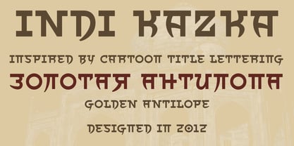
- PTF NORDIC Rnd - Unknown license

- PTF NORDIC Std - Unknown license

- GD-Digit13LED-OTF - Unknown license

- TPF Senseless Strokes - Unknown license

- GD-TiVangerionJA-OTF - Unknown license

- Cleaved TTR BRK - Unknown license

- Visitor TT2 BRK - 100% free

- Visitor TT1 (BRK) - 100% free

- Visitor TT2 (BRK) - 100% free

- Visitor TT1 BRK - 100% free

- Compass TRF Stencil by TipografiaRamis,
$29.00 Compass TRF Stencil is an addition to the Compass TRF family and consists of three styles - Regular, Bold and Alternative. It is recommended for use as a display typeface in large sizes.
 - ATF Headline Gothic by ATF Collection,
$59.00 ATF Headline Gothic cries out to be used in headlines, and that is exactly how it was used after it was first created by American Type Founders in 1936 with newspapers in mind. It would be hard to imagine a better typeface for a shocking, front-page headline in a scene from an old black-and-white movie. With its all-caps character set, and its big, bold, condensed design, ATF Headline Gothic is the epitome of its name. “Extra! Extra!” The style of ATF Headline Gothic recalls the bold, condensed gothic display faces of the 19th century, but with more refinement in its details than many large types of the time (typically wood type). Its most recognizable trait is the restrained, high-waisted M, with short diagonal strokes that end with their point well above the baseline; this avoids the sometimes cramped look of a bold condensed M with a deep “V” in the middle, common in many similar headline faces. The digital ATF Headline Gothic comes in a single weight, all caps, like its predecessor, but offers two styles: one crisply drawn, and a “Round” version with softer corners, to suggest a more “printed” feel, reminiscent of wood type. Of course, in either style it includes a full modern character set, including symbols such as the Euro, Ruble, and Rupee, that didn’t exist in 1936.


