9,063 search results
(0.09 seconds)
- Seibi Minato by Nihon Literal,
$169.00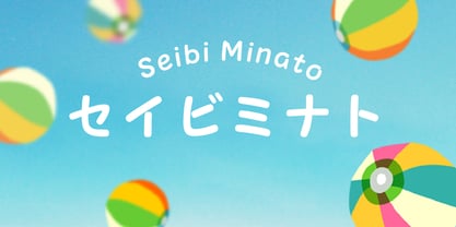 Designed for the covers of children’s literature and picture books, this is a freehand-style, rounded gothic typeface that conveys warmth and softness. It has also been sold as a font for use in game software. 児童書や絵本の表紙向けにデザインされた、あたたかさややわらかさを表現したい場面で使われるフリーハンド(手書き風)書体です。ゲームソフトなどに組み込まれるフォントとしての販売実績もあります。右肩上がりのリズミカルなフリーハンドタッチで、ヨコ組タテ組どちらでも読みやすく組むことができます。
 - Hollywood Deco SG by Spiece Graphics,
$39.00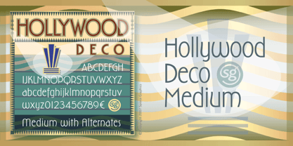 This is yet another Willard T. Sniffin deco-inspired original. Created for the American Type Foundry, Hollywood Deco remains a classic that is still as contemporary today as when it first appeared in 1932. Use this novelty gothic typeface on announcements and stationery. It is also well-suited for many advertising situations where a stylish retro look is desired. A useful set of alternate characters (including the illustrious “Overlapping O's”) is included with this version. Hollywood Deco Medium with Alternates is also available as an OpenType font. This version now contains small caps, lining and oldstyle figures, prebuilt fractions, stylistic alternates, word buttons and a wide assortment of f-ligatures. These advanced features currently work in Adobe Creative Suite InDesign, Creative Suite Illustrator, and Quark XPress 7. Check for OpenType advanced feature support in other applications as it gradually becomes available with upgrades.
 - Arkais by Logitype,
$25.00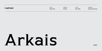 Introducing Arkais, a glyphic serif typeface inspired by the rhythmic construction of Gothic architecture. This unique typeface is characterized by slightly broken shoulder and bowl shapes, offering a fresh and classic feel. With contrasting brackets, consistent barb, and beak shapes, Arkais brings a touch of elegance to any project. Arkais features five weight variants—light, regular, medium, bold, and extra—as well as three width options: condensed, normal, and expanded. Each font family also includes italic styles, providing even greater versatility. Equipped with OpenType features, Arkais offers multiple character alternatives, ligatures, small caps, and more, ensuring a tailored look for your designs. Designed as an alternative to current trends, Arkais is perfect for creating strong headers or captivating display text. The typeface supports over 500 basic Latin glyphs, making it suitable for a wide range of projects.
 - Lupulus by W Type Foundry,
$25.00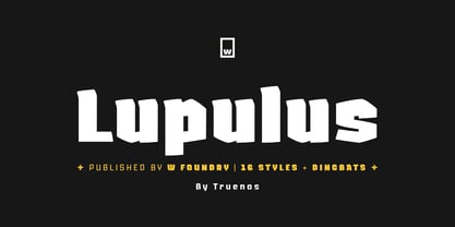 Lupulus is a typeface inspired by the works of german expressionist artist and type designer Rudolf Koch. Drawing inspiration from types such as Neuland and Kabel for some of its features, it possesses a gothic and contemporary essence. Its constant rhythm; strict, solemn, yet boldly exuberant keeps it clean and functional. Its expressiveness allows for a wide range of uses: short texts, headlines, posters and branding, for which it is exceptionally well-suited. Lupulus consists of 17 fonts: 8 weights, 8 italic variables and one free ornamental variable. Featuring alternate characters, it is a comprehensive and versatile set built to suit your design needs. It comes fully equipped with Opentype for any and all technical requirements. Learn about upcoming releases, work in progress and get to know us better! On Instagram W Type Foundry On facebook W Type Foundry wtypefoundry.com
 - Finnegan by Linotype,
$40.99German designer Jürgen Weltin designed Linotype Finnegan, a modern text design with roots in the humanist letterforms of the Renaissance. As the recognizable direction of movement in writing runs from upper left to lower right, Weltin mimicked this in his design: Linotype Finnegan's up and down strokes end in residual serifs. All of the thick strokes have a taper; horizontal strokes and curves are noticeably thinner than the verticals. This dynamic nature lends a combination of individualness and energy, along with a high degree of variety, to Linotype Finnegan. Linotype Finnegan is a wholly new and unique typeface. It distinguishes itself through its extreme legibility, originality, and formal excellence. Linotype Finnegan makes fun to read longer texts non-stop. However, the typeface never distracts the attention from the text's content by forcing itself too much into the foreground. - ITC Lubalin Graph by ITC,
$40.99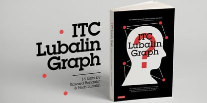 ITC Lubalin Graph® was initially designed by Herb Lubalin and drawn to fit the requirements of typographic reproduction by Tony DiSpigna and Joe Sundwall in 1974. Its underlying forms are those of Lubalin's previously released ITC Avant Garde Gothic, but its shapes were modified to accommodate large slab serifs. Its condensed weights, which include small caps and oldstyle figures, were later additions by Helga Jörgenson and Sigrid Engelmann in 1992. The family, with its generous x-height and overall tight fit has come to represent the typographic style of American graphic design in the 1970s. The typeface is at home when paired with mid-century modern design and spare sanses or more traditional text faces from the period. ITC Lubalin Graph covers four weights in its condensed width from Book to Bold, and five weights in its normal width.
 - Monolisk by Studio Buchanan,
$12.00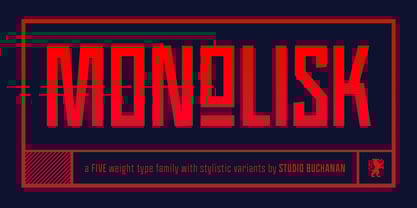 Monolisk is a rigid, gothic typeface that draws on inspiration from Eastmodern and Brutalist architecture. It’s monolithic glyphs, resolute and unapologetic in their construction, create a visually striking design that feels bold and arresting. Monolisk delivers a dominant sense of uniformity, to the point of obstinance, while small facets of it’s make up help to create an undertone of rebellion and dissent, allowing for an element of quirk and personality. Available in 5 weights, each with a corresponding oblique, Monolisk comes equipped with over 700 characters across a variety of languages. A large set of stylistic alternate glyphs give Monolisk further diversity of character all of which retain it’s sturdy and powerful nature. Other open type features include a set of vertically stacked fractions, small caps and ligatures. From sports branding to propaganda posters, Monolisk delivers the impact your designs require.
 - Housewife by Arendxstudio,
$18.00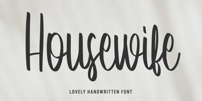 Housewife Font that has a distinctive character that is very thick and elegant to use Housewife is a relaxed and flowing Calligraphy Font. Incredibly versatile, this font fits a wide pool of designs, elevating them to the highest levels. Add this font to your favorite creative ideas and notice how it makes them come alive! Features : • Character Set A-Z • Numerals & Punctuations (OpenType Standard) • Accents (Multilingual characters) • Ligature Multilingual Support : Afrikaans, Albanian, Asu, Basque, Bemba, Bena, Catalan, Chiga, Cornish, Danish, English, Estonian, Faroese, Filipino, Finnish, French, Friulian, Galician, German, Gusii, Icelandic, Indonesian, Irish, Italian, Kabuverdianu, Kalenjin, Kinyarwanda, Low German, Luo, Luxembourgish, Luyia, Machame, Makhuwa-Meetto, Makonde, Malagasy, Malay, Manx, Morisyen, North Ndebele, Norwegian Bokmål, Norwegian Nynorsk, Nyankole, Oromo, Portuguese, Romansh, Rombo, Rundi, Rwa, Samburu, Sango, Sangu, Scottish Gaelic, Sena, Shambala, Shona, Soga, Somali, Spanish, Swahili, Swedish, Swiss German, Taita, Teso, Vunjo, Zulu
 - JMTF Robin by John Moore Type Foundry,
$55.00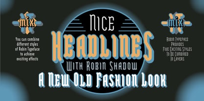 JMTF Robin is a new post-modernist typeface in the spirit of Art & Crafts, born as a concept of a reformulation of a Gothic traditional building structure. Interestingly medieval structural architectural rescue form is for creating a font of traits absolutely contemporary without losing its artisan flavor. JMTF Robin is then a modular typography with very specific characteristics that provides an innovative texts while an appearance of great personality. Early versions of Robin was winners in Letras Latinas 2006. JMTF Robin representing a before and after in terms of contemporary texts composition. JMTF Robin is a typeface family that is presented in a wide variety of forms, from JMTF Robin in condensed forms to other roman proportions like Robin9, ideal for text, also JMTF Robin comes in Shadow and Double Outline. I dedicate this letter to creative genius William Morris father of modernism.
 - Lamaesa by Carlos Maeso González,
$15.90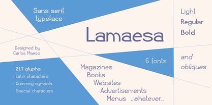 Lamaesa is a versatile and original design sans serif typeface. Designed to be used primarily on medium and large point sizes. Designed so you do not get tired of reading it, but at the same time, so that you notice its particularity. Oriented for use in headlines and continuous text, with a solid appearance, but with a slight aroma of handwriting, which gives it an ambivalent and original character. It is perfect for magazines, company letters, websites, advertisements, restaurant menus, and any support and function where it is essential to attract attention in an elegant and non-abusive way. Basic Latin characters. It consists of 217 glyphs (ISO 8859-15): uppercase, lowercase, numbers, currency symbols, and special characters. It consists of six fonts: light, normal and bold as well as their oblique equivalents. Carlos Maeso González is the designer of the typeface “Lamaesa”.
 - Bright Peony by Nathatype,
$29.00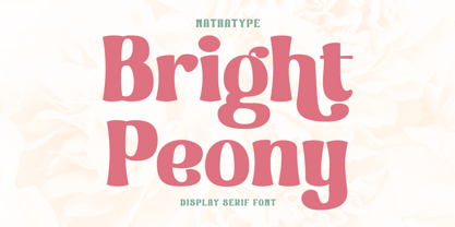 Bright Peony is a lovely display serif font to show friendly, feminim, modern nuances. It is truly legible due to its high contrast and simply noticeable forms. Therefore, you can apply this font for any text sizes and lengths. You may also enjoy various features available in this font. Features: Stylistic Alternates Ligatures Multilingual Supports PUA Encoded Numerals and Punctuations Bright Peony fits best for various design projects, such as posters, banners, logos, magazine covers, quotes, headings, printed products, invitations, name cards, merchandise, social media, etc. Find out more ways to use this font by taking a look at the font preview. Thanks for purchasing our fonts. Hopefully, you have a great time using our font. Feel free to contact us anytime for further information or when you have trouble with the font. Thanks a lot and happy designing.
 - Descent by Graffiti Fonts,
$69.99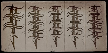 The Descent family is a unique, graffiti style, layered type system consisting of a contextual style & a classic style, each with a base fill version & an outline version. Based on a signature category of wildstyles by Graffiti Fonts® lead designer Raseone, this family was designed to be rotated 90 degrees clockwise so that the text reads in a downward direction. OpenType scripting in the contextual version enables up to 12 unique variants of any word using alternating patterns of interlocking glyphs. The classic version does not include OpenType features but instead has initial glyphs as capitals and medial glyphs in the lowercase positions. The characters in the classic version are similar to the more advanced contextual version but noticeably different & a bit more irregular. Glyphs from both styles can be mixed & used interchangeably & both styles have corresponding outline fonts.
 - Lustra Text by Grype,
$16.00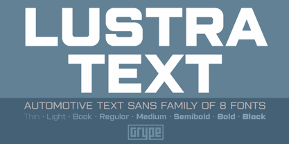 The Lustra Text family is the next evolution of our Lustra Family, which finds its origin of inspiration in the HYUNDAI automotive company logo, and from there expands to an 8 font family of weights. Lustra Text still nods its head to the techno display styling of the inspiration logotype, but evolves its brand inspired origin from a display to a text font family that pulls on modern and historical styles like Eurostyle and Bank Gothic. This text family inherits a sturdy yet approachable geometric style with its uniform stroke forms and curves, and includes a lowercase with a Stylistic Alternate for the lowercase "a", a numerals set, and a comprehensive range of weights. This is a straightforward, powerful, and uncompromising collection of typefaces that lend a solid foundation and a broad range of expression for designers.
 - Gothiks Round Compressed by Blackletra,
$50.00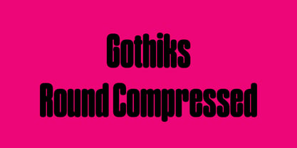 Gothiks Round Compressed is the rounded version of Gothiks Compressed. It is a 6-weight display sans-serif influenced by Texturas. The rhythm and verticality of Texturas can be easily identified on the letters with diagonal strokes like A N M K k V v W w X x Y y Z z: here they are all vertical. This kind of morphology was chosen because it accepts condensation in a very natural way, giving to this sans-serif a very unique personality. It has an extensive character set—with extensive language support—and many OpenType features like fractions, small capitals and different figure sets. Default figures align with lowercase. The typeface’s name refers to the plural of the word Gothic, which in turn can refer to both sans-serifs or Blackletter, depending on geographic location. Use it BIG!
 - Alius by Lucas Tillian,
$18.00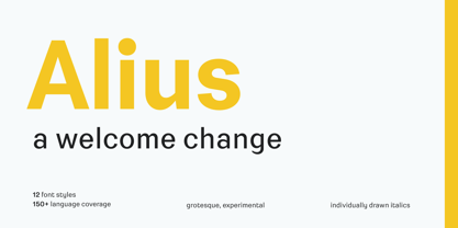 Alius is something else. Experimental shapes combined with traditional ones result in an extremely legible typeface that—because of its economically spaced characters—works extraordinarily well for copy texts as well as big striking headings. Alius has been created with great attention to detail which is particularly noticeable in smaller sizes where proportions and shapes remain intact. The Typeface includes stylistic alternates that provide the designer with endless possibilities for combinations and variations. Alius contains PS-Hinting and is therefore as legible on screen as it is on paper. The typeface comes with powerful OpenType features that will satisfy even the most demanding of designers. With more than 680 Glyphs and a coverage of over 130 languages, Alius is as versatile as it is beautiful. The development of the typeface started in the summer and concluded in the fall of 2021.
 - Gothiks Round Condensed by Blackletra,
$50.00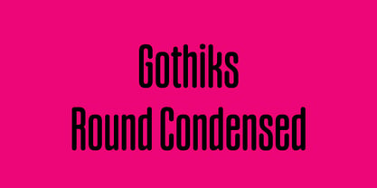 Gothiks Round Condensed is the rounded version of Gothiks Condensed. It is a 6-weight display sanserif influenced by Texturas. The rhythm and verticality of Texturas can be easily identified on the letters with diagonal strokes like A N M K k V v W w X x Y y Z z: here they are all vertical. This kind of morphology was chosen because it accepts condensation in a very natural way, giving to this sans-serif a very unique personality. It has an extensive character set—with extensive language support—and many OpenType features like fractions, small capitals and different figure sets. Default figures align with lowercase. The typeface’s name refers to the plural of the word Gothic, which in turn can refer to both san-serifs or Blackletter, depending on geographic location. Use it BIG!
 - The New Gothic Textura typeface, designed by Elodie Mandray, is a captivating contemporary adaptation of a historic script that pays homage to the intricate and ornamental style of the medieval textu...
- Stylish Classy by Azetype,
$11.00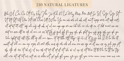 Have you ever used a handwritten font on your design project? Have you ever felt bored or dissatisfied with its glyphs style that looks stiff and doesn't flow even doesn't really characterize the peculiarities of a handwritten font? Or fonts that don't have alternative glyphs so they look monotonous in a word or even sentence. And in the end, it makes your projects so far from your expectations, even your clients. It's so frustrating, isn't it? Just wake up from your dissatisfaction and this is your time to make a good choice for your design project. So, we have a solution to fix it. We introduce 'Stylish Classy' just for you. This is a font that really characterizes from the handwritten style. This font is crafted carefully in every its single scratch, created to look as close to a natural handwritten script so that it can create the perfect combination on each glyph. When we make this font, we really want to create a touch that is so free-flowing that it gives a natural impression on its use later. For example, if you want letter 's' that has a flow sketch with letter 't', you can find it in 'st' ligature glyph. So if you really want a so natural and flowing touch in your project, Stylish Classy Font gives you 210 Natural Ligatures ( combining of two or more letters in a glyph ), Two Alternates, and Slant Version. Stylish Classy is a fashionable handwritten script font and obviously it's so Stylish and Classy :) Stylish Classy Font offers beautiful typographic harmony for your design projects diversity e.g. logos & branding, wedding designs, social media posts, advertisements, product designs, quotes, watermark, photography, poster design, magazine, stationery, or simply as a stylish text overlay to any background image. - Included Languages support: Afrikaans, Albanian, Catalan, Danish, Dutch, English, Estonian, Finnish, German, Icelandic, Indonesian, Italian, Norwegian, Malay, Portuguese, Spanish, Swedish, Zulu. - All Natural Ligatures (210 Glyphs): Bh Cl Cr Cs Ct Cy Hy Jh Ji Kh Kl Lo My Mrs Mr Mt Si Sl Sp Sp St St1 St2 St3 Ul1 Un1 Ut1 Ul Un Ut Wh Yo aa ab ab1 ab2 ak1 all ant app arr art ask ast at at2 at3 at4 att af ah aj ak ak1 al al1 an ap ap ar av bb1 bb cc ch ck co ct dd ever ee1 ee2 ent er1 err ett ee ek el en er es et ff1 ff2 ful ff fi gg1 gh gh2 ght gn1 gf gg gh gi gl gn hh ight ill1 ill2 it's itt1 if1 ill ion ism it1 it2 ith itt ity if ii il it jj1 jj kk ll1 ll2 la lh ll most nt oll on2 on1 op1 ops or1 orr oth ous of oh ok ol om on oo op or ot ow ox oz ph pp pt rk1 rta rk rr rt sl1 sl2 sl3 ss1 ss2 st1 st2 st3 st4 st5 st sh si sl sp ss st the tt1 tt2 th to tt tv ty ull ure ut1 ut2 ut3 us ut ve vs wh wt yl1 yl2 yl3 you yr yr2 yl yn yr mm1 mm2 mm3 mm ms nn1 nn -Swash on pictures are not included
 - "City Burn Night After Night and We Spraypaint the Walls" is not just a font; it's a declaration, an embodiment of the urban spirit captured in digital typography. Imagine walking through the heart o...
- Tomato by Canada Type,
$22.95Tomato is the digitization and quite elaborate expansion of an early 1970s Franklin Photolettering film type called Viola Flare. This typeface is an obvious child of funk, the audio-visual revolution that swept America and put an end to the art nouveau period we now associate with the hippy era. Funk is of course little more than jazz with a chorus and an emphatic beat. Nevertheless, it became the definition of cool in the 1970s, thanks to blaxploitation movies with excellent soundtracks like Shaft and Superfly. Funk began as a commercial audio experience, then later expanded its signature to cover everything, from design to fashion to the later birth of disco, which is really a further simplification of funk. Funk had very strong and unique typographical elements, particularly a kind of titling with an essentially western, wooden core that suddenly changed and flared in unexpected areas until a very individual brand was achieved. Everything that can be tacked on to the alphabet was used towards that individuality. Things like curls, swirls, swashes, ligatures were always plentiful in funk, sometimes giving the titling a specific gender, sometimes bulging, sometimes speeding, sometimes fading in the distance, sometimes doing nothing but crazily aligning with other design elements, but the result was always a fascinating creature that seemed to invariably want to dance and have fun. Tomato was built in exactly that spirit. The original film type certainly had enough swashes and curls to be an unmistakable funk font in itself, but our further expansion of it cements it and makes it the definite font for the genre. With as many as 12 different possibilities for some letters, the designer's choices for a titling set in Tomato are virtually limitless. The Postscript and True Type versions of Tomato come in five fonts, including two fonts for alternates, one font for ligatures, and one font for swashes. These are split into two affordable packages. The entire family package is also available at an even more affordable price, and includes complimentary Cyrillic, Greek, Turkish, and Central European versions of Tomato. A Tomato Pro OpenType version is also available. It is a single font that includes over 650 characters, glued together with extensive programming for convenience of use in OpenType-friendly applications, where you can watch the letters morph and dance as you push the buttons and change the options of your OT palette. Now you know which font will come to mind when someone says the word "funky". - CorpusCare, designed by the prolific Canadian type designer Ray Larabie, stands out as a distinct and innovative font that marries accessibility with aesthetic appeal. Larabie, known for his vast and...
- As of my last update in 2023, "Umbles" does not appear to be a widely recognized or established font within the vast landscapes of typography and design. It's possible that "Umbles" might refer to a ...
- As of my last update in April 2023, there is limited widespread recognition or documentation of a font specifically named "Rogers2". Without direct details or specifications about this font, it's cha...
- Skillwize by Olivetype,
$18.00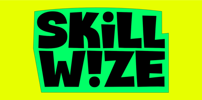 Grow your imagination, this font is for you. Skillwize is a bold and fun typeface. This playful, thick font is perfect for your next design project. It will give you the personality you've been looking for. Skillwize is fresh, creative and has a little bit of everything: it's casual, yet serious; soft yet hard; and made for everyone. Use Skillwize for product packaging, posters, newsletters, invitations, blog posts, headlines - any design where you want to stand out with your creativity. Try it out today! So what’s included : Basic Latin Uppercase and Lowercase Numbers, symbols, and punctuations Multilingual Support. Accented Characters : ÀÁÂÃÄÅÆÇÈÉÊËÌÍÎÏÑÒÓÔÕÖØŒŠÙÚÛÜŸÝŽàáâãäåæçèéêëìíîïñòóôõöøœšùúûüýÿžß PUA Encoded and fully accessible without additional design software Simple Installations, works on PC & Mac Thank You. We hope you enjoy our fonts.
 - Thenie Dawson by Grezline Studio,
$15.00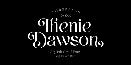 Thenie Dawson is a stylish serif font with classy and timeless charm. This font was designed to enhance the beauty of your projects. Very suitable for headlines, titles, advertising, vintage mood board, branding, logotypes, packaging, editorial design, blog/websites, social media quotes, wedding branding, vintage designs and much more. Add this font to your collection and let its beauty tell your story. Feature : Alternates and Ligatures Multilingual Language Works on PC & Mac Simple installations Accessible in the Adobe Illustrator, Adobe Photoshop, Adobe InDesign, even works on Microsoft Word. We highly recommend using a program that supports OpenType features and Glyphs panels like many of Adobe apps and Corel Draw, so you can see and access all Glyph variations. Thank You! Grezline Studio – Akhmad Reza Fauzi
 - Brown Marlyn by Ergibi Studio,
$20.00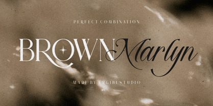 This is the perfect combination of fonts, we are proud to introduce BROWN MARLYN, these fonts are of two types serif and script. Display Serif inspired by famous logo, This typeface has been made carefully to make sure its premium quality and luxury feel. The ligatures on serif makes this typeface unique and stands out rather than the regular serif font, perfectly for headlines, wedding, social media, logos, posters, packaging, T-shirts,coffee shops, restaurants, magazine’s headers, signs or gift/post cards,cafe’s and weddings or any type of advertising purpose. What's Included : Standard glyphs Ligatures International Accent Works on PC & Mac Simple installations If there is a problem, question, or anything about my fonts, don't hesitate to ask! Big Thanks ~ Ergibi Studio
 - Garetra by Letterhend,
$17.00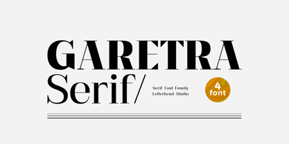 Garetra Serif s a sophisticated serif with many weight you can choose. It has 4 weight styles which you can play around to match your project, whether for a standout headline, or for a tagline, you name it. Perfect to be applied to the other various formal forms such as invitations, labels, logos, magazines, books, greeting / wedding cards, packaging, fashion, make up, stationery, novels, labels or any type of advertising purpose. Features : uppercase & lowercase numbers and punctuation multilingual alternates & ligatures PUA encoded We highly recommend using a program that supports OpenType features and Glyphs panels like many of Adobe apps and Corel Draw, so you can see and access all Glyph variations. How to access opentype feature : letterhend.com/tutorials/using-opentype-feature-in-any-software/
 - Campcraft by Our House Graphics,
$-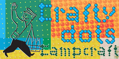 Remember those plastic Popsicle sticks that clicked together and you could make things from them with your sticky little fingers? Things like... camp crafts. Well, no� Of course you don't. You were too young. That�s why there is Campcraft. This is a fun loving dot-matrix font, or it would be a fun loving dot-matrix if the vertical and horizontal grid lines didn't pile up at the intersections. Then again, it wouldn't be any fun if they didn't pile up at the intersections, would it? Strictly a display type... Campcraft is excellent for what the name suggests. I goes well with Christmas sweaters, beaded jackets and purses and that time when we were all happy children with sticky little fingers.
 - The Morshine by Letterhend,
$19.00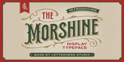 Morshine is a typeface which is inspired by vintage lettering sign and art. While this font has a victorian touch, it still looks bold and solid. Very suitable for for headline, logotype, apparel, invitation, branding, packaging, advertising etc with old school / vintage theme. This typeface looks great combined with decorative ornaments. It comes in uppercase, lowercase, punctuations, symbols & numerals, stylistic set alternate, ligatures, etc also support multilingual and already PUA encoded. Features : uppercase & lowercase numbers and punctuation multilingual alternates and ligatures swashes PUA encoded We highly recommend using a program that supports OpenType features and Glyphs panels like many of Adobe apps and Corel Draw, so you can see and access all Glyph variations. How to access opentype feature : letterhend.com/tutorials/using-opentype-feature-in-any-software/
 - Highshade by Ironbird Creative,
$15.00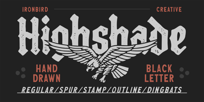 Introducing, HIGHSHADE our stunning and unique Organic Blackletter font, hand-drawn with care and precision to capture the essence of strength and power. Every line and curve has been crafted by hand, giving this font an authentic and organic feel that sets it apart from other Blackletter fonts.Suitable for any graphic designs such as branding materials, t-shirt, print, logo, poster, t-shirt, quotes .etc NOTE : Please Check the Help File first and for all the characters are also available, accessible in the Adobe Illustrator Glyphs Panel, or in Adobe Photoshop Character Open Type Panel. We hope you enjoy the font, please feel free to comment if you have any thoughts or feedback. Thanks for purchasing and have fun! Regards, Ironbird Creative
 - Magnate by Stiggy & Sands,
$29.00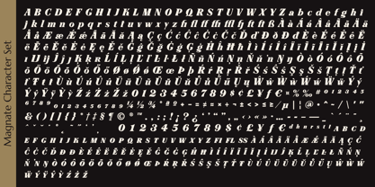 The Magnate Family began as a digitization of a film typeface from LetterGraphics known as "Wilshire". What began as a basic glyphset was fleshed out with a full character set with a smallcaps feature. We also decided to add a slightly more delicate side to Magnate, softening up the sharp flair serifs just a little. See the 5th graphic for a comprehensive character map preview. Opentype features include: - Full set of Inferiors and Superiors for limitless fractions. - SmallCaps feature. - Tabular and Proportional figure sets. - A small collection of Standard Ligatures. - A Stylistic Alternates feature for an alternate lowercase t style. Approx. 687 Character Glyph Set: Each style of Magnate comes with a glyphset that includes standard & punctuation, international language support, and additional features.
 - Breve Title by DSType,
$50.00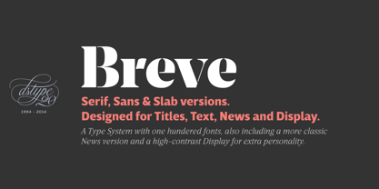 Breve was designed for use in editorial projects. Simple but with enough personality to stand by is own, in a quest for a more forceful and contemporary appearance. All the fonts in Breve superfamily, share the same exact structure, both in terms of anatomy and functionality. The Text versions provide a softer and warm feel to the typographic palette and is intended for use in much longer passages of text, while the Title versions are distinguished by non-descending letterforms, making the titles and headlines much more uniform and interesting. The News version is more classic, with ball terminals and classic proportions, while the Display is, somehow, the set of fonts we had to design: extra-black, ultra-contrasted, proud-display fonts.
 - Deluge by Letterhend,
$19.00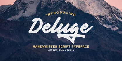 Introducing, Deluge- Handwritten Script Typeface. The natural hand writing feel make this font makes it stands out. This font perfectly made to be applied especially in logo, and the other various formal forms such as invitations, labels, logos, magazines, books, greeting / wedding cards, packaging, fashion, make up, stationery, novels, labels or any type of advertising purpose. Features : uppercase & lowercase numbers and punctuation multilingual ligatures alternates PUA encoded We highly recommend using a program that supports OpenType features and Glyphs panels like many of Adobe apps and Corel Draw, so you can see and access all Glyph variations. How to access opentype feature : letterhend.com/tutorials/using-opentype-feature-in-any-software/ Email us to letterhend@gmail.com if you need something! Happy Designing!
 - Sallenas Grandes by Almeera Studio,
$17.00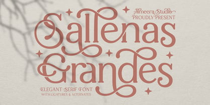 Introducing our newest typeface called Sallenas Grandes - Elegant Serif Font with many Ligatures & Alternates . can make your lettering / logotype become more interesting. The clean and neat of a serif combined with the alternates & ligatures makes this font very attractive. This font perfectly made to be applied especially in logo, and the other various formal forms such as invitations, labels, logos, magazine headers, books, greeting / wedding cards, Clothing Branding, product packaging, fashion, make up, quotes, stationery, novels,cutting, labels and advertising purpose. Features : uppercase & lowercase numbers and punctuation multilingual ligatures stylistic alternates PUA encoded We highly recommend using a program that supports OpenType features and Glyphs panels like many of Adobe apps and Corel Draw, so you can see and access all Glyph variations. Thanks & Happy Designing !
 - Hwaiting Sans by Konstantine Studio,
$20.00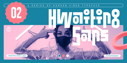 Inspired by the emerging Korean culture that grabbing the worldwide actuation in so many realms of the industry. To bridge the vibes and to make it easier to consume, we found the gap to fill with simple things in life that are useful for it, and yes, it’s a new day it’s a new font. So without any further ado, please welcome Hwaiting Sans. 2/3 series of Korean vibes typefaces. It’s a sans-serif font with bold and strong vibes to catch up with today’s graphic design trends. Crafted with deep research about Korean traditional letters, shaped up with the approach of universal Latin letters. This is the second drop of 3 series from the Hwaiting family. So stay tuned for the upcoming release.
 - George Town by FoxType,
$12.00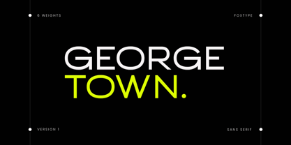 Introducing George Town new generation Typeface with 6 Weights. George Town Typeface created with the vision of to attract the audience to your brand . The finest details of this typeface are methodically and mathematically created. George Town is created with all the tasks of a corporate font and also for the usage in a variety of projects, including branding, logos, titles, headlines, servers, screens, display, digital ads, and everything else. We are putting a lot of effort on this font as a long-term project. The Typeface includes Six Weights. Thin, ExtraLight, Light, Regular, Medium, and SemiBold Features: Numerals, extended punctuation & Basic Symbols(200+ Glyphs). Expert kerning and quality crafting. Uppercase Letters & Lowercase Letters 24x7 Support Thank you for taking the time to look into the font.
 - Melorist by Letterhend,
$19.00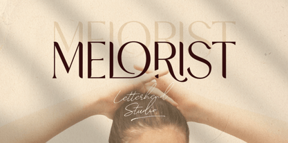 Introducing, Melorist, a Display Ligature Font. This font has neat and sleek letterform, make it looks great to be used for modern and minimalistic design theme. The stylistic alternates and ligatures make this font event more unique and stands from the crowd. This font perfectly made to be applied especially in logo, and the other various formal forms such as invitations, labels, logos, magazines, books, greeting / wedding cards, packaging, fashion, make up, stationery, novels, labels or any type of advertising purpose. Features : uppercase & lowercase numbers and punctuation multilingual alternates & ligatures PUA encoded We highly recommend using a program that supports OpenType features and Glyphs panels like many of Adobe apps and Corel Draw, so you can see and access all Glyph variations.
 - Carlony by Keristyper Studio,
$14.00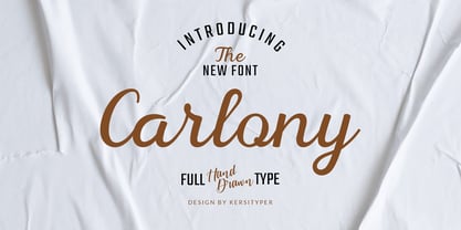 Carlony is a delicate, elegant, and flowing handwritten font. It has beautiful and well-balanced characters and as a result, it matches a wide pool of designs. Fall in love with its incredibly versatile style and use it to create spectacular designs. This font is good for logo design, Social media, Movie Titles, Books Titles, short text even a long text letter, and good for your secondary text font with sans or serif. Featured: Standard Uppercase & Lowercase Numeral & Punctuation Multilingual : ä ö ü Ä Ö Ü ß ¿ ¡ Alternate & Ligature PUA encoded We recommend programs that support the OpenType feature and the Glyphs panel such as Adobe applications or Corel Draw. so you can use all the variations of the glyphs. Hope you enjoy our fonts!
 - Breve News by DSType,
$50.00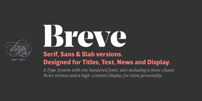 Breve was designed for use in editorial projects. Simple but with enough personality to stand by is own, in a quest for a more forceful and contemporary appearance. All the fonts in Breve superfamily, share the same exact structure, both in terms of anatomy and functionality. The Text versions provide a softer and warm feel to the typographic palette and is intended for use in much longer passages of text, while the Title versions are distinguished by non-descending letterforms, making the titles and headlines much more uniform and interesting. The News version is more classic, with ball terminals and classic proportions, while the Display is, somehow, the set of fonts we had to design: extra-black, ultra-contrasted, proud-display fonts.
 - Romans Story by Letterhend,
$19.00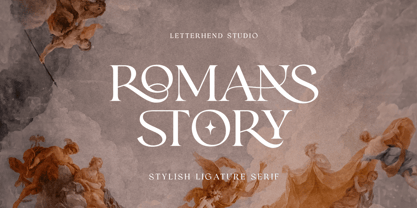 Romans Story is a sophisticated ligature serif from us. This typeface has been made carefully to make sure its premium quality and luxury feel. The ligatures makes this typeface unique and stands out rather than the regular serif font. Very suitable for logo, headline, tittle, and the other various formal forms such as invitations, labels, logos, magazines, books, greeting / wedding cards, packaging, fashion, make up, stationery, novels, labels or any type of advertising purpose. Features : numbers and punctuation multilingual ligatures alternates PUA encoded We highly recommend using a program that supports OpenType features and Glyphs panels like many of Adobe apps and Corel Draw, so you can see and access all Glyph variations. How to access opentype feature : letterhend.com/tutorials/using-opentype-feature-in-any-software/