10,000 search results
(0.042 seconds)
- Sweet Gothic Serif by Sweet,
$39.00Sweet Gothic Serif is a 2009 addition to the Sweet Collection of engraved lettering styles from the 20th Century. It is a serif variant of Sweet Gothic. Sweet Gothic Light (without serifs) is closely based on lettering from an engravers pattern from the early 1900s that was used for tracing letterforms with the engraving machine (pantograph) to make steel engraving plates. The design is related to many similar engravers gothics developed in the early 1900s, but as each engraving house created by hand their own patterns for popular styles of the time, there is variation among the models. Sweet Gothic offers contrast in stroke weight and its unique personality. The bolder weights are new designs, based on the characteristics of the Light. Sweet Gothic Serif has been developed to expand the usefulness of the Sweet Gothics, offering an alternative to Copperplate Gothic. As such, most of the fonts are new designs, yet may seem familiar and ubiquitous given their model. The fonts offer two sizes of figures and monetary symbols: one set is intended for use with upper- and lowercase settings; the second set is the same height as the small caps. - Broadgauge Ornate by FontMesa,
$25.00Broadgauge Ornate originated from MacKellar, Smiths & Jordan in 1869 and was only available as an all caps font with numbers. Today this old beautiful wood type rises again from the archives complete with original numbers and an all new lowercase. An all caps Greek character set has also been added plus accented characters for western, central and Eastern European countries. Included in each font file are two sets of left and right pointing hands located on the Less Than and Greater Than keys and also on the Bracket keys. Because this font works well with a Las Vegas theme I've decided to make the pointing hands gambling related with one set of hands rolling dice and the other holding cards. The condensed versions were created because in today's computer graphics applications people stretch and condense fonts to fit their project but don't notice the change in vertical stroke widths or line thickness. After compressing the letter shapes of each Broadgauge Ornate condensed font the vertical lines were corrected making sure they were the proper width or thickness. The results are balanced condensed versions that weren't simply compressed with out consideration for their appearance. - Organic Pro by Positype,
$29.00 When I released the original Organic in 2009, I was satisfied with it. It was what was possible from me and the technology at the time. The Organic Pro of 2021 takes those original desires of delivering a highly legible and friendly sans serif, and doubles down on those notions, while exploring what further infusing warmth in a highly structured sans serif can really do for a client. Free of distracting and potentially dating visual traits and cues that could be seen as endemic of a specific time period or ‘type trend’, Organic Pro is its own person—take it or leave it. Inviting warmth, assured reliability, and a head nod of confidence is what you walk away with—a stark contrast to the cold, impersonal geometrics and grotesques proliferating the design annuals currently. Releasing this typeface now, completely redrawing the masters, as well as expanding the weight and language options, should be seen as a laid back challenge that we need to do less with type, let it communicate confidently and warmly when it needs to, and stop forcing one-size-fits-all type trends on everyone.
 - Marker Makers by Colllab Studio,
$19.00 "Hi there, thank you for passing by. Colllab Studio is here. We crafted best collection of typefaces in a variety of styles to keep you covered for any project that comes your way! Making your brand visible, interesting and recognizable without having to get in the way of your customer’s experience is hard. It takes a lot of time, money and effort to make a clear brand. And maintaining it through all your customer touchpoints is even harder. Introducing, Marker Makers is a versatile marker font that takes inspiration from the boldness of graffiti and the playfulness of primary colors. It's a joy to use for any design project where you want your audience to pay attention, this is your go-to font and take your next project from good to WOW! Marker Makers comes with more than 400 glyphs, including punctuation, numbers and upper and lower-case letters you’ll have all the tools you need to create invigoratingly unique content. Whether it’s included on posters at trade shows or on the walls of any room in your office, no one will ever think it was boring! A Million Thanks Colllab Studio www.colllabstudio.com
 - News Gothic SB Vietnam by Scangraphic Digital Type Collection,
$26.00 This version of News Gothic contains the Vietnamese character set. Since the release of these fonts most typefaces in the Scangraphic Type Collection appear in two versions. One is designed specifically for headline typesetting (SH: Scangraphic Headline Types) and one specifically for text typesetting (SB Scangraphic Body Types). The most obvious differentiation can be found in the spacing. That of the Body Types is adjusted for readability. That of the Headline Types is decidedly more narrow in order to do justice to the requirements of headline typesetting. The kerning tables, as well, have been individualized for each of these type varieties. In addition to the adjustment of spacing, there are also adjustments in the design. For the Body Types, fine spaces were created which prevented the smear effect on acute angles in small type sizes. For a number of Body Types, hairlines and serifs were thickened or the whole typeface was adjusted to meet the optical requirements for setting type in small sizes. For the German lower-case diacritical marks, all Headline Types complements contain alternative integrated accents which allow the compact setting of lower-case headlines.
 - Futura Paneuropean by Linotype,
$65.00First presented by the Bauer Type Foundry in 1928, Futura is commonly considered the major typeface development to come out of the Constructivist orientation of the Bauhaus movement in Germany. Paul Renner (type designer, painter, author and teacher) sketched the original drawings and based them loosely on the simple forms of circle, triangle and square. The design office at Bauer assisted him in turning these geometric forms into a sturdy, functioning type family, and over time, Renner made changes to make the Futura fonts even more legible. Futura’s long ascenders and descenders benefit from generous line spacing. The range of weights and styles make it a versatile family. Futura is timelessly modern; in 1928 it was striking, tasteful, radical — and today it continues to be a popular typographic choice to express strength, elegance, and conceptual clarity. NEW: the new Futura W1G versions features a Pan-European character set for international communications. The W1G character set supports almost all the popular languages/writing systems in western, eastern, and central Europe based on the Latin alphabet including Vietnamese, and also several based on Cyrillic and Greek alphabets. - Helvetica Hebrew by Linotype,
$65.00Helvetica is one of the most famous and popular typefaces in the world. It lends an air of lucid efficiency to any typographic message with its clean, no-nonsense shapes. The original typeface was called Neue Haas Grotesk, and was designed in 1957 by Max Miedinger for the Haas'sche Schriftgiesserei (Haas Type Foundry) in Switzerland. In 1960 the name was changed to Helvetica (an adaptation of Helvetia", the Latin name for Switzerland). Over the years, the Helvetica family was expanded to include many different weights, but these were not as well coordinated with each other as they might have been. In 1983, D. Stempel AG and Linotype re-designed and digitized Neue Helvetica and updated it into a cohesive font family. At the beginning of the 21st Century, Linotype again released an updated design of Helvetica, the Helvetica World typeface family. This family is much smaller in terms of its number of fonts, but each font makes up for this in terms of language support. Helvetica World supports a number of languages and writing systems from all over the globe. Today, the original Helvetica family consists of 34 different font weights. 20 weights are available in Central European versions, supporting the languages of Central and Eastern Europe. 20 weights are also available in Cyrillic versions, and four are available in Greek versions. Many customers ask us what good non-Latin typefaces can be mixed with Helvetica. Fortunately, Helvetica already has Greek and Cyrillic versions, and Helvetica World includes a specially-designed Hebrew Helvetica in its OpenType character set. Helvetica has also been extende to Georgian and a special "eText" version has been designed with larger xheight and opened counters for the use in small point sizes and on E-reader devices. But Linotype also offers a number of CJK fonts that can be matched with Helvetica. Chinese fonts that pair well with Helvetica: DF Hei (Simplified Chinese) DF Hei (Traditional Chinese) DF Li Hei (Traditional Chinese) DFP Hei (Simplified Chinese) Japanese fonts that pair well with Helvetica: DF Gothic DF Gothic P DFHS Gothic Korean fonts that pair well with Helvetica: DFK Gothic" - Anselm Sans by Storm Type Foundry,
$63.00One of the good practices of today’s type foundries is that they release their type families as systems including both serif and sans serif type. Usually, the sources of inspiration need to be well tried with time and practice, since production of a type family is such a laborious and complex process. From the beginning, it needs to be clear that the result will be suited for universal use. Such systems, complete with the broad, multi-lingual variations permitted by the OpenType format, have become the elementary, default instrument of visual communication. Non-Latin scripts are useful for a wide scope of academic publications, for packaging and corporate systems alike. And what about outdoor advertisement designated for markets in developing countries? Cyrillics and Greek have become an integral part of our OpenType font systems. Maybe you noticed that the sans serif cuts have richer variety of the light – black scale. This is due to the fact that sans serif families tend to be less susceptible to deformities in form, and thus they are able to retain their original character throughout the full range of weights. On the other hand, the nature of serifed, contrasted cuts does not permit such extremes without sacrificing their characteristic features. Both weights were drawn by hand, only the Medium cut has been interpolated. Anselm Ten is a unique family of four cuts, slightly strengthened and adjusted for the setting in sizes around 10 pt and smaller, as its name indicates. The ancestry of Anselm goes back to Jannon, a slightly modified Old Style Roman. I drew Serapion back in 1997, so its spirit is youthful, a bit frisky, and it is charmed by romantic, playful details. Anselm succeeds it after ten years of evolution, it is a sober, reliable laborer, immune to all eccentricities. The most significant difference between Sebastian/Serapion and Anselm is the raised x-height of lowercase, which makes it ideal for applications in extensive texts. Our goal was to create an all-round type family, equally suitable for poetry, magazines, books, posters, and information systems. - Cabo Soft by Design A Lot,
$15.00 Cabo Soft is the 2.0 version of our original Cabo Rounded Typeface, created back in 2015. With this new version, Cabo Soft, we have brought multiple upgrades and updates compared with the original version. Some of those consist in the addition of more glyphs and accents, alternate designs for many of the glyphs (including an alternate for @, #, some of the numbers and more), and most importantly, we have done a slight update in the design of the letters, which we'll give more details in the following paragraphs. The main style and thought behind our Cabo fonts has always been the rounded corners and the soft and welcoming vibe that it gives. It's friendly and familiar, but also modern and slightly elegant, especially the Thin and Light styles. With Cabo Soft we have worked on adding an extra touch to the design of the letters by working on the termination edges of each letter. If Cabo Rounded had an exact round termination for each letter, with Cabo Soft we have developed a unique non-equally rounded shape that is applied to all types of terminations for each letter. This new design approach makes it have a more clean style, a more modern and unique look, but it also gives stylish, exclusivist and elegant vibes, while still being friendly and familiar. Thanks to it's variety in weights and styles, you can use Cabo Soft in almost any design project. It works well with headlines and paragraphs, it's a perfect match for logo design and branding, but can also do wonders in videos, signage and many other elements. The typeface covers most likely the entire Latin Alphabet, it comes with multiple design alternates for many of the letters, glyphs and numbers, with accents applied for all of the available alternates. As a finishing note, with the help of our Cabo Soft typeface you can create an friendly and welcoming designs, as well as stylish, elegant and exclusivist. It has all the necessary glyphs and accents for any Latin Alphabet projects, and you can play around with all of the alternates to create unique designs right from the start.
 - Helvetica Thai by Linotype,
$149.00Helvetica is one of the most famous and popular typefaces in the world. It lends an air of lucid efficiency to any typographic message with its clean, no-nonsense shapes. The original typeface was called Neue Haas Grotesk, and was designed in 1957 by Max Miedinger for the Haas'sche Schriftgiesserei (Haas Type Foundry) in Switzerland. In 1960 the name was changed to Helvetica (an adaptation of Helvetia", the Latin name for Switzerland). Over the years, the Helvetica family was expanded to include many different weights, but these were not as well coordinated with each other as they might have been. In 1983, D. Stempel AG and Linotype re-designed and digitized Neue Helvetica and updated it into a cohesive font family. At the beginning of the 21st Century, Linotype again released an updated design of Helvetica, the Helvetica World typeface family. This family is much smaller in terms of its number of fonts, but each font makes up for this in terms of language support. Helvetica World supports a number of languages and writing systems from all over the globe. Today, the original Helvetica family consists of 34 different font weights. 20 weights are available in Central European versions, supporting the languages of Central and Eastern Europe. 20 weights are also available in Cyrillic versions, and four are available in Greek versions. Many customers ask us what good non-Latin typefaces can be mixed with Helvetica. Fortunately, Helvetica already has Greek and Cyrillic versions, and Helvetica World includes a specially-designed Hebrew Helvetica in its OpenType character set. Helvetica has also been extende to Georgian and a special "eText" version has been designed with larger xheight and opened counters for the use in small point sizes and on E-reader devices. But Linotype also offers a number of CJK fonts that can be matched with Helvetica. Chinese fonts that pair well with Helvetica: DF Hei (Simplified Chinese) DF Hei (Traditional Chinese) DF Li Hei (Traditional Chinese) DFP Hei (Simplified Chinese) Japanese fonts that pair well with Helvetica: DF Gothic DF Gothic P DFHS Gothic Korean fonts that pair well with Helvetica: DFK Gothic" - Anselm Serif by Storm Type Foundry,
$63.00 One of the good practices of today’s type foundries is that they release their type families as systems including both serif and sans serif type. Usually, the sources of inspiration need to be well tried with time and practice, since production of a type family is such a laborious and complex process. From the beginning, it needs to be clear that the result will be suited for universal use. Such systems, complete with the broad, multi-lingual variations permitted by the OpenType format, have become the elementary, default instrument of visual communication. Non-Latin scripts are useful for a wide scope of academic publications, for packaging and corporate systems alike. And what about outdoor advertisement designated for markets in developing countries? Cyrillics and Greek have become an integral part of our OpenType font systems. Maybe you noticed that the sans serif cuts have richer variety of the light – black scale. This is due to the fact that sans serif families tend to be less susceptible to deformities in form, and thus they are able to retain their original character throughout the full range of weights. On the other hand, the nature of serifed, contrasted cuts does not permit such extremes without sacrificing their characteristic features. Both weights were drawn by hand, only the Medium cut has been interpolated. Anselm Ten is a unique family of four cuts, slightly strengthened and adjusted for the setting in sizes around 10 pt and smaller, as its name indicates. The ancestry of Anselm goes back to Jannon , a slightly modified Old Style Roman. I drew Serapion back in 1997, so its spirit is youthful, a bit frisky, and it is charmed by romantic, playful details. Anselm succeeds it after ten years of evolution, it is a sober, reliable laborer, immune to all eccentricities. The most significant difference between Sebastian/Serapion and Anselm is the raised x-height of lowercase, which makes it ideal for applications in extensive texts. Our goal was to create an all-round type family, equally suitable for poetry, magazines, books, posters, and information systems.
 - Helvetica Monospaced Paneuropean by Linotype,
$89.00Helvetica is one of the most famous and popular typefaces in the world. It lends an air of lucid efficiency to any typographic message with its clean, no-nonsense shapes. The original typeface was called Neue Haas Grotesk, and was designed in 1957 by Max Miedinger for the Haas'sche Schriftgiesserei (Haas Type Foundry) in Switzerland. In 1960 the name was changed to Helvetica (an adaptation of Helvetia", the Latin name for Switzerland). Over the years, the Helvetica family was expanded to include many different weights, but these were not as well coordinated with each other as they might have been. In 1983, D. Stempel AG and Linotype re-designed and digitized Neue Helvetica and updated it into a cohesive font family. At the beginning of the 21st Century, Linotype again released an updated design of Helvetica, the Helvetica World typeface family. This family is much smaller in terms of its number of fonts, but each font makes up for this in terms of language support. Helvetica World supports a number of languages and writing systems from all over the globe. Today, the original Helvetica family consists of 34 different font weights. 20 weights are available in Central European versions, supporting the languages of Central and Eastern Europe. 20 weights are also available in Cyrillic versions, and four are available in Greek versions. Many customers ask us what good non-Latin typefaces can be mixed with Helvetica. Fortunately, Helvetica already has Greek and Cyrillic versions, and Helvetica World includes a specially-designed Hebrew Helvetica in its OpenType character set. Helvetica has also been extende to Georgian and a special "eText" version has been designed with larger xheight and opened counters for the use in small point sizes and on E-reader devices. But Linotype also offers a number of CJK fonts that can be matched with Helvetica. Chinese fonts that pair well with Helvetica: DF Hei (Simplified Chinese) DF Hei (Traditional Chinese) DF Li Hei (Traditional Chinese) DFP Hei (Simplified Chinese) Japanese fonts that pair well with Helvetica: DF Gothic DF Gothic P DFHS Gothic Korean fonts that pair well with Helvetica: DFK Gothic" - Alas, my dear inquirer, the font named Conformyst, crafted by the elusive artisans at Clearlight Fonts, remains a figment in the limitless cosmos of typography, as it does not exist (to my current, l...
- Hello Pirates - Personal Use - Personal use only

- Alte DIN 1451 Mittelschrift gepraegt - 100% free

- Sabática - Personal use only

- WildWords Lower by Comicraft,
$49.00 WILD WORDS! WILD WORDS! Buh-Buh-Buh-DUH-DUH! WILD WORDS! Wild Words never lose it! Wild Words never chose this way… Wild Words never close their eyes… Wild Words always sh-- I'm sorry? WILD WORDS is NOT a song by Duran Duran? Really? But I got myself the Simon Le Bon ’80s haircut and my MAD MAX outfit and everything… It’s a font from Comicraft? Now available in lower case? Well that’s good too, right? Comicraft fonts are created BY comic book letterers FOR lettering comic books. Accept no substitutes! See the family related to WildWords Lower: Wild Words
 - Golden Motion by Allouse Studio,
$16.00 Golden Motion a Modern Handwritting Calligaraphy Font that give you ton extras for your need. Beginning Swash Uppercase, Lowercase, Ending Swash Lowercase, Stylistic ampersand and letter t, stylistic set for b, d, f, h, k, l, g, j, y, z. We highly recommend using a program that supports OpenType features and Glyphs panels like many of Adobe apps and Corel Draw, so you can see and access all Glyph variations. Golden Motion is perfect for any tittles, logo, product packaging, branding project, megazine, social media, wedding, or just used to express words above the background. Golden Motion also come with Multi-Lingual Support.
 - FF Basic Gothic by FontFont,
$68.99 German type designers Hannes von Döhren and Livius Dietzel created this sans FontFont in 2010. The family has 16 weights, ranging from Extra Light to Black (including italics) and is ideally suited for advertising and packaging, editorial and publishing, logo, branding and creative industries, small text as well as web and screen design. FF Basic Gothic provides advanced typographical support with features such as ligatures, small capitals, alternate characters, case-sensitive forms, fractions, and super- and subscript characters. It comes with a complete range of figure set options – oldstyle and lining figures, each in tabular and proportional widths.
 - Maat by Wordshape,
$20.00 Maat is a modular geometric stencil display font that includes a number of modular pattern characters, and can be used to create designs that echo early Modernism by merely applying letters, patterns and color. Maat is a loose interpretation of a hand lettered alphabet by the late Dutch designer Jurrian Schrofer called Sans Serious which was included in Wim Crouwel's publication Letters of Maat. It is inflected with a bit of influence from British designer Ken Garland's similar lettering form the cover of his textbook, The Graphics Handbook. Maat derives its name from the title of Couwel's booklet.
 - Gringo Dingbats by Volcano Type,
$19.00Gringo is a type family that contains 27 different varieties. It is divided into three groups: Sans, Slab, and Tuscan = Europe - Texas. Due to its consistant structure, the single groups can be mixed as you wish. Furthermore every variety comes in Light, Medium, and Bold. There are three widths, from Narrow to Wide. Additionally, there is also a Dingbats font. The concept of Gringo is a fusion and a merging of type cultures to cross borders and create something new. Gringo won 3rd place in the "tdc2 2006 award" by the Type Directors Club New York. - Kathak by Ekahermawan,
$14.00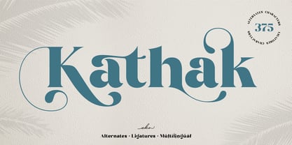 Please welcome Kathak. Kathak is a display serif font. Kathak is specially designed to make your typography design result looks more beautiful with tons of alternates and ligatures characters. Kathak is versatile font for many different projects such as logo, branding, poster, magazines, labels, merchandise, invitation, presentation, advertising, quotes and so much more! FEATURES: OpenType support Playfull to use (with ligatures and alternates options) Multilingual support PUA Encoded If you need support or more information about this item, please kindly contact me : ekahermawanputu@gmail.com Thank you so much.. I really hope you enjoy when using it!
 - Diamonds by HVD Fonts,
$30.00 The Diamonds type family was designed by Hannes von Döhren in 2012. It is an experimental search for geometric new letterforms, which are still easy to read and generate some unexpected attention. Hannes wanted to create a straight and clear typeface but pull away from the path of classic and well learned letter shapes. The Diamonds type family is equipped for complex, professional typography. The OpenType fonts have an extended character set to support Central and Eastern European as well as Western European languages. Each font includes alternate letters, fractions, scientific superior/inferior figures and a set of arrows and geometric forms.
 - Laser Vision by Hanoded,
$15.00 I seem to be in my comic book font fase. It's not that I have tons of comics lying around (I actually have none), but when I was a kid, I used to read them all the time. Laser Eyes is a handmade comic book font. It is a little rounded, a little fat and very useful. You don't really have to put it to work in an actual comic book; it will feel at home just about anywhere. Laser Vision comes with two sets of alternate glyphs that cycle as you type, plus extensive language support, including Cyrillic and Vietnamese.
 - Tabarnak by Canada Type,
$24.95 Tabarnak started out as an assessment and correction of an old concept by George Wilkens. The original idea was for a bold upright alphabet reminiscent of Oz Cooper’s work, but ornamented with some shocard/signage traits. That idea was radically redrawn and reinvented to become a simple 21st century font made to turn heads and induce a friendly rush. Tabarnouche is Tabarnak’s “jittery” incarnation. Just as great for packaging as they are for ads, posters, book and magazine covers, both Tabarnak and Tabarnouche come with about 600 characters, including tons of alternates, and support for the majority of Latin-based languages.
 - Art Maria by Letterara,
$14.00 Art Maria is a playful and strikingly beautiful handwritten font with a bold twist in the style of Modern Calligraphy. Art Maria is fully-featured with tons of alternate characters and OpenType features. It will add a sophisticated charm to any design project! Art Maria handletter is particularly well suited to invitations, branding, editorial design, elegant logos, upscale packaging, wedding stationery, posters, quotes, short text, branding, web, graphic design, and any other projects requiring a handwritten and luxurious touch. The OpenType features can be very easily accessed by using OpenType-savvy programs such as Adobe Illustrator and Adobe InDesign.
 - Shanks Antique 5 AOE Pro by Astigmatic,
$24.95 Shanks Antique 5 Pro is an iconic antique English typestyle rooted in tradition. It is the historical revival and elaboration of the “Antique No. 5” typeface created by Stevens, Shanks & Sons in 1865. What began as a basic character set of Capitals, lowercase, numerals, and a small handful of punctuation characters has been expanded to a full character set including unlimited fractionals, superiors & inferiors, ordinals, tabular & proportional figures, and an expanded language glyph set, all with a smallcaps and Caps to Smallcap set to match. Reviving history looks and feels good. Perfect for wedding invitations, historical ephemera recreations, and classically elegant text settings.
 - Suti by Melvastype,
$29.00 Suti is a non-connected sign painters casual script with upper and lower cases. Suti was originally designed in 2010 but it was completely re-drawn in 2016. Casual lettering is a style sign painters use. Every sign painter has more or less their own style to make these letters. The casual alphabets are painted with speed and they don’t need to line perfectly but letters are still clean and easy to read. Suti has smooth and round forms. Friendly and casual looks. It is suitable for logos, titles, package design or where ever you need a fun and sympathetic display font.
 - Jollin Family by Creativemedialab,
$14.00 Jollin Family is a pretty, attractive and fashionable sans serif, has ton of alternates that you can use to create a simple but pretty letters. Jollin has 8 weights and 3 Widths and also available in Variable version Jollin Family Variable contain three configurable axes: weights, width, and slant, you can adjust the font axis setting to get the desire size. Jollin Perfect for Heading, logo creation, Advertisements, Christmas, Label, business card, branding and more! Get inspired by its fashionable appeal! to access alternate Adobe Photoshop go to Window - glyphs Adobe Illustrator go to Type - glyphs
 - Pseudo-Hellenic by Simeon out West,
$18.00 Pseudo-Hellenic is a font based the Greek typeface of Firmin Didot. The original Greek typeface became standard during the Victorian era and remained popular until the last part of the twentieth century. Pseudo-Hellenic seeks to create an environment reminicent of the many Greek texts and is meant to re-create their ethos while communicating with a non-Greek speaking audience. Pseudo-Hellenic with full punctuation, a character 221 glyph character set that allows the user to type in most Western European Latin alphabet languages. Being a decorative font, it works best at larger point sizes.
 - Seven Seas by Hanoded,
$15.00 Some time ago, my son asked me to name all Seven Seas. I had to think for a bit, because I can think of more than 7 seas (the North Sea, the Caspian Sea, the South China Sea, the Sea Of Okhotsk, etc.), but apparently these are not part of the BIG Seven. It turns out that even oceans count as ‘seas’. Long story short, I created a font, had to think of my son’s question and named the font Seven Seas. Seven Seas is a hand made serif that comes with swashed alternatives for a lot of glyphs.
 - Parametra by URW Type Foundry,
$39.99 This humanistic sans serif distinguishes itself by its Japanese calligraphy influence. Being written with a felt tip rather than with a brush, its Japanese connotation is remote and non-dominant, thus providing excellent readability and a charm of its own. Parametra is a very elegant and modern typeface achieved by the strong form reduction of the individual characters and at the same time harmonizing them by given parameters. It is something of its own, but quite legible and well-suited for small text. Also, Parametra and Bohemian can be mixed perfectly since their proportions and dimensions are the same.
 - Bezar by Mans Greback,
$59.00 Bezar is a wild brush script font drawn and created by Mans Greback in 2020. A handwriting of extreme speed, this typeface will give your graphic project both the action and the character to stand out. Use it for whimsical headlines, a product logotype or anywhere where a bright-spirited, flowing script could lift the layout. Its multiple alternates and ligatures makes for a customizable, non-static typeface. Use [ ] { } _ anywhere in a word to create a swash. Example: Ham}burg The font has extensive lingual support, covering all European Latin scripts. It contains all characters you'll ever need, including all punctuation and numbers.
 - Inquired by Akrtype Studio,
$19.00 Inquired handwritten font is a seductive font that is made with a touch of elegance and feeling to give the best touch. Inquired handwritten font an elegant combination of a script. It is slender, feminine and classy, while still maintaining a friendly feel. Inquired handwritten font is versatile and will work perfectly for fashion, e-commerce brands, trend blogs, wedding boutiques or any business that wants to appear upscale and chic. Inquired handwritten font is perfect for creating original and functional designs. It has extensive language support and tons of ligatures, stylistic sets that add visual interest to every letter.
 - Gringo Slab by Volcano Type,
$29.00Gringo is a type family that contains 27 different varieties. It is divided into three groups: Sans, Slab, and Tuscan = Europe - Texas. Due to its consistant structure, the single groups can be mixed as you wish. Furthermore every variety comes in Light, Medium, and Bold. There are three widths, from Narrow to Wide. Additionally, there is also a Dingbats font. The concept of Gringo is a fusion and a merging of type cultures to cross borders and create something new. Gringo won 3rd place in the "tdc2 2006 award" by the Type Directors Club New York. - Love Potion by HVD Fonts,
$30.00 Hannes von Döhren created Love Potion. Three fonts (Regular/Bold/Ornaments) that include extravagant Ligatures, Swash Letters, Catchwords, Arrows, Borders and other little specials. The hand drawn serif type family is intended to be used in applications like: Food, Clothes, Living, Wedding stationery or basically everywhere where love is in the air… Love Potion is equipped for professional typography. As an exclusively OpenType release, these fonts have an extended character set to support Central and Eastern European as well as Western European languages. In addition to that the fonts contain Standard ligatures, Swash Letters, Catchwords, Arrows, Borders and much more.
 - Mato Sans by Picador,
$29.00 Legible and dynamic shape, tons of OpenType options, different scripts – that’s Mato Sans. Difficult small size, long text in Vietnamese, huge heading in Russian or table full of figures to create? It’s not a problem with this family. There are over 2000 glyphs in every weight with such features: superscript and subscript characters, tabular lining and old style figures, small caps, fractions, arrows or even case sensitive parenthesis. Mato Sans was designed for use in Latin as well as in Cyrillic script. Every font contains an extended set of Cyrillic characters including special, local glyphs for Bulgarian, Macedonian and Serbian.
 - Arinkoln by Letterhend,
$19.00 Arin Koln is a typeface with fun and playful looks. This type of font perfectly made to be applied especially in storybook children or child theme which is need a standout font, and the other various formal forms such as invitations, labels, logos, magazines, books, greeting / wedding cards, packaging, fashion, make up, stationery, novels, labels or any type of advertising purpose. Features : Solid version illustration numbers and punctuation multilingual ligatures PUA encoded We highly recommend using a program that supports OpenType features and Glyphs panels like many of Adobe apps and Corel Draw, so you can see and access all Glyph variations.
 - Gringo Sans by Volcano Type,
$29.00Gringo is a type family that contains 27 different varieties. It is divided into three groups: Sans, Slab, and Tuscan = Europe - Texas. Due to its consistant structure, the single groups can be mixed as you wish. Furthermore every variety comes in Light, Medium, and Bold. There are three widths, from Narrow to Wide. Additionally, there is also a Dingbats font. The concept of Gringo is a fusion and a merging of type cultures to cross borders and create something new. Gringo won 3rd place in the "tdc2 2006 award" by the Type Directors Club New York. - Regional News JNL by Jeff Levine,
$29.00 A roughened and worn version of Daily Tabloid JNL was originally created as a non-exclusive custom font for a client. The design emulates the look of old letterpress wood type and has now been released commercially as Regional News JNL; available in both regular and oblique versions. A special acknowledgement goes to Michael Hagemann of Font Mesa Fonts who partnered with Jeff Levine Fonts for the original project. His creativity and skill resulted in the textured look needed for the typeface. For some beautiful antique typefaces or fine text face collections, please visit Font Mesa Fonts.


