10,000 search results
(0.252 seconds)
- Ice Cream Man by Hanoded,
$10.00 I was listening to an old Van Halen album when I made this font. I named it after one of my favorites: ‘Ice Cream Man’. Ice Cream Man is a happy, sloppy, wobbly kids font. Use it for your book covers, posters and ice cream packaging!
 - Ravenheart by Hanoded,
$15.00 I like Ravens. In fact, I like them so much that I have a tattoo of a Haida raven! Ravenheart was more or less modelled on my Qilin font, but it is completely different. It is scary and inky, but it has a certain flair as well. A bit mystical, a bit evil, but I am sure you’ll find many uses for it. Comes with a fluttering of diacritics.
 - Glowy by Redy Studio,
$17.00 Glowy modern serif font is an exceptional font choice. This font effortlessly blends contemporary aesthetics with a touch of elegance, resulting in a visually captivating and professional typeface. Glowy Modern Serif font unique attribute lies in its luminous and bold quality. The letters seem to emit a soft glow, which sets it apart from traditional serif fonts and adds a modern twist. Glowy modern serif font also includes ligatures and alternate character, it's easy to achieve custom typography for stunning logos, headlines, and quotes. Feel free to give me a message if you have a problem or question. Thank you so much for taking the time to look at one of our products. ~Redy
 - Gibbons Gazette by Comicraft,
$39.00HOLD THE FRONT PAGE! STOP THE PRESSES! We have a new Headline for our Cover Story! DAVE GIBBONS is all over the tabloids, the trades AND the quality papers today. Yes, it's the opening of the WATCHMEN movie, but we have a much BIGGER story; the REAL scoop -- and we're announcing it in 72 point type... yes, there's a new addition to the Dave Gibbons family, and our editorial staff have the baby's name and our paparazzi have the pictures! Dave's new little sprog is called... GAZETTE. Man, that kid is gonna get teased at school, Dave. - WalcomeOne by Ingrimayne Type,
$7.95 WalcomeOne simulates sloppy, messy hand printing. Despite being irregular and childlike, it is quite legible even at small sizes. It comes in four weights, each with an oblique style.
 - Rock Wood by Kprojects,
$15.00 Rock Wood is a fresh version of old western wood type. With its strong and sinuous lines it has a taste of vintage and modern at the same time.
 - OL Egiziano Classic by Dennis Ortiz-Lopez,
$30.00This was my best seller of all time. It should do well at MyFonts.com now that it has a full character set and an Italic style (exclusive to MyFonts.com). - P22 Founders by IHOF,
$24.95 Based on turn-of-the-century advertising type. A condensed, fat-faced display font with a touch of the medieval. The influence of art nouveau is also present in the high-waisted caps and flowing lines, putting the face into the early 20th century.
 - Jackson Park NF by Nick's Fonts,
$10.00Handlettering in an ad from the 1920s for a Chicago engraving company provided the inspiration for this fine, fat, flowing face, full of fun and antique charm. Both versions of this font include the complete Unicode 1252 Latin and Unicode 1250 Central European character sets. - Katfish by ITC,
$29.00Katfish is the work of Michael Gills, a unique and inventive script font. Initial capitals are complemented by a lively lowercase and a number of alternative characters, ligatures and swash elements. Katfish has a fun, irregular style and includes charming cat, fish and dolphin illustrations. - TA Bankslab Art Nouveau by Tural Alisoy,
$40.00 TA Bankslab graphic presentation at Behance The building of the Northern Bank of St. Petersburg's Baku branch was built in 1903-1905. It was the first Art Nouveau-style building in Baku, Azerbaijan. Later the bank was transformed into the Russian-Asian Bank. After the oil boom in Baku in the 19th century, branches of many banks and new banks were opened in the city. The branch of the Northern Bank of St. Petersburg was among the first banks that was opened in Baku. N.Bayev was the architect of the building for the branch of the Northern Bank of St. Petersburg located at Gorchakovskaya 3 in 1903-1905. The building currently houses the Central Branch of the International Bank of Azerbaijan. My purpose in writing this is not to copy and paste the information from Wikipedia. What attracted me to the building was the word "Банкъ" (Bank) written in Cyrillic letters, which was also used in Azerbaijan during the Soviet era. The exact date of the writing is not known. Every time I pass by this building, I always thought of creating a font of this writing someday. I had taken a photo of the building and saved it on my phone. I did a lot of research on the font and asked a lot of people. However, some did not provide information at all and some said they did not have any information. I was interested in the history of this font but I do not know if this font really existed or it was created by the architect out of nowhere. If there was such a history of this font, I wanted to recreate this font and make it available. If not, I had to create it from scratch in the same way, using only existing letters on the building. Finally, I made up my mind and decided to develop the font with all letters I have got. It was difficult to create a font based on the word, Банкъ. Because in the appearance of the letters, the midline of the letters on A, H, K was very distinct, both in the form of inclination and in more precise degrees. The serif part of the letters, the height of the upper and lower sides, differed from each other. I don't know whether it was done this way when the building was constructed or it happened over time. I prepared and kept the initial version of the font. I took a break for a while. I started digging on the story of the font again. Meanwhile, I was researching and got inspired by similar fonts. Unfortunately, my research on the font's history did not yield any results. I decided to continue finishing up the font. After developing the demo, I created the font by keeping certain parts of these differences in the letters. In addition, I had to consider the development of letters in the Cyrillic, as well as the Latin alphabet, over the past period. Thus, I began to look at the appearance of slab-serif or serif fonts of that time. In general, as I gain more experience in developing fonts, I try to focus on the precision of the design for each font. In recent years, I specifically paid attention to this matter. YouTube channel and articles by Alexandra K.'s of ParaType, as well as, information and samples from TypeType and Fontfabric studios on the Cyrillic alphabet were quite useful. I gathered data regarding the Latin alphabet from various credible sources. I do not know if I could accomplish what I aimed at but I know one thing that I could develop the font. Maybe someday I'll have to revise this font. For now, I share it with you. I created the font in 10 styles. 7 weight from Thin to Extra Black, an Outline, Shadow, and Art Nouveau. The Art Nouveau style was inspired by the texture in the background used for the text on the building. The texture I applied to capital letters adds beauty to the font. If you like the font feel free to use it or simply let me know if your current alphabet doesn't support this font.
 - Boldoni by Forte Type,
$4.90 Boldoni is like a caricature: it brings with itself exaggerated elements of the modern typefaces, that has as main names Giambattista Bodoni and François-Ambroise Didot. Boldoni takes to the limit its width and serifs, causing a ultra fat type feeling, and its styles causes a monochromatic effect that remember the colors Black, Gray and White. Boldoni is good for titles, initials, drop caps, lettering, posters and vertical writing.
 - Little King Owl by Letter Art Studio,
$14.00 Little King Owl is a simple and interesting handwritten font. Its friendly feel makes this font incredibly versatile, fitting a wide range of contexts. It looks stunning on thank you cards, quotes, greeting cards, logos, business cards and every other design which needs of a art. Add it to your creative ideas and notice how it makes them stand out!
 - NorB Chalk by NorFonts,
$28.00 NorB Chalk is a handwritten text font with an angled fat chalk style. You can use this font with any word processing program for text and display use, print and web projects, apps and ePub, comic books, graphic identities, branding, editorial, advertising, scrapbooking, cards and invitations and any casual lettering purpose… or even just for fun!
 - Party Doodles Too by Outside the Line,
$19.00 Party Doodles Too is the companion font to the popular font Party Doodles. 29 fun icons including a tray of champagne glasses, appetizers, balloons, pinwheel, stork with a baby, ace of hearts playing card, top hat and tunes, dice, bowling ball and pins, gifts, party umbrellas, cakes, cupcakes, ice cream, lollipop, drinks, corkscrew, noise makers, banners and candy.
 - Journey Unicorn by Allouse Studio,
$16.00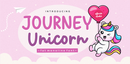 Proudly Present, Journey Unicorn A Fat Monoline Font Journey Unicorn is perfect for any titles, logo, product packaging, branding project, megazine, social media, wedding, or just used to express words above the background. Journey Unicorn also come with Multi-Lingual Support. Enjoy the font, feel free to comment or feedback, send me PM or email. Thank You!
 - Christmas Doodles Too by Outside the Line,
$19.00 Christmas Doodles Too is the follow up font to Christmas Doodles. More Christmas icons including a tree, fun new ornaments, a dove, gifts, pine trees, a church, drinks, sleigh, tree lights, drum, horn, Santa hat, holly, snowflakes, stockings, candy, and mistletoe. This font works well with Holiday Doodles and Holiday Doodles Too which also have Christmas icons in them.
 - Kharon Ultra NF by Nick's Fonts,
$10.00A fine, fat Deco face named Ludlow Stygian provided the basis for this delightful typeface. Although generally formal in character, the font shows a hint of playfulness in the distinctive “humpback” h and n characters. This font contains the complete Latin language character set (Unicode 1252) plus support for Central European (Unicode 1250) languages as well. - Legendum - 100% free

- Rosalline Handwritten by Ditatype,
$29.00 Rossaline Handwritten is a lovely script font of which characteristics are the connections between letters to look like a naturally connected handwriting that leaves the impression of this font being organically, spontaneously written in order to add a firm personal touch. This font has various line thicknesses to show high letter contrasts to strengthen the font’s firm, clear impressions. Besides, the letters’ height variety, meaning that some of the letters are higher than the others, makes Rossaline Handwritten more interesting and dynamic. However, the connected letters can cause difficulty to read in small text sizes, so that you need to be more careful to use this font by adjusting it to your needs. In addition, you may enjoy the available features here as well. Features: Ligatures Multilingual Supports PUA Encoded Numerals and Punctuations Rossaline Handwritten fits best for various design projects, such as brandings, quotes, invitations, name cards, greeting cards, printed products, merchandise, social media, etc. Find out more ways to use this font by taking a look at the font preview. Thanks for purchasing our fonts. Hopefully, you have a great time using our font. Feel free to contact us anytime for further information or when you have trouble with the font. Thanks a lot and happy designing.
 - Mooschak by Maulana Creative,
$14.00 Mooschak is a bouncy fat handwritten display font. With bold contrast stroke and fun character. To give you an extra creative work. Mooschak font support multilingual more than 100+ language. This font is good for logo design, Social media, Movie Titles, Books Titles, a short text even a long text letter and good for your secondary text font with sans or serif. Make a stunning work with Mooschak font. Cheers, Maulana Creative
 - MC Poseface by Maulana Creative,
$13.00 Poseface is an experimental display sans serif fat font. With heavy stroke and fun character. To give you an extra creative work. Poseface font support multilingual more than 100+ language. This font is good for logo design, Social media, Movie Titles, Books Titles, a short text even a long text letter and good for your secondary text font with sans or serif. Make a stunning work with Poseface font. Cheers, Maulana Creative
 - Chalkboy by Typefactory,
$14.00 Chalkboy – Handwritten Chalk Font is a fun and casual display font suited for kids, playground, or school theme. Whether you’re using it for crafting, digital designing, presentations, or greeting card making, it’s perfect!
 - Verdana by Microsoft Corporation,
$49.00The Verdana™ Family of fonts was created specifically to address the challenges of on-screen display. Designed by world renowned type designer Matthew Carter, and hand-hinted by leading hinting expert, Tom Rickner, these sans serif fonts are unique examples of type design for the computer screen. The generous width and spacing of Verdana's characters is key to the legibility of these fonts on the screen. Despite the quality of the Verdana font family at small sizes it is at higher resolutions that the fonts are best appreciated. In the words of Tom Rickner, ‘My hope now is that these faces will be enjoyed beyond just the computer screen. Although the screen size bitmaps were the most crucial in the production of these fonts [their] uses should not be limited to on screen typography. Character Set: Latin-1, WGL Pan-European (Eastern Europe, Cyrillic, Greek and Turkish). - Verdana Ref by Microsoft Corporation,
$29.00The Verdana™ Family of fonts was created specifically to address the challenges of on-screen display. Designed by world renowned type designer Matthew Carter, and hand-hinted by leading hinting expert, Tom Rickner, these sans serif fonts are unique examples of type design for the computer screen. The generous width and spacing of Verdana's characters is key to the legibility of these fonts on the screen. Despite the quality of the Verdana font family at small sizes it is at higher resolutions that the fonts are best appreciated. In the words of Tom Rickner, ‘My hope now is that these faces will be enjoyed beyond just the computer screen. Although the screen size bitmaps were the most crucial in the production of these fonts [their] uses should not be limited to on screen typography. Character Set: Latin-1, WGL Pan-European (Eastern Europe, Cyrillic, Greek and Turkish). - Semilla by Sudtipos,
$79.00 I spend a lot of time following two obsessions: packaging and hand lettering. Alongside a few other minor obsessions, those two have been my major ones for so many years now, I've finally reached the point where I can actually claim them as “obsessions” without getting a dramatic reaction from the little voice in the back of my head. When you spend so much time researching and studying a subject, you become very focused, directionally and objectively. But of course some of the research material you run into turns out to be tangential to whatever your focus happens to be at the time, so you absorb what you can from it, then shelf it — like the celebrity bobblehead that amused you for a while, but is now an almost invisible ornament eating dust and feathers somewhere in your environment. And just like the bobblehead may fall off the shelf one day to remind you of its existence, some of my lettering research material unveiled itself in my head one day for no particular reason. Hand lettering is now mostly perceived as an American art. Someone with my historical knowledge about lettering may be snooty enough to go as far as pointing out the British origins of almost everything American, including lettering — but for the most part, the contemporary perspective associates great lettering with America. The same perspective also associates blackletter, gothics and sans serifs with Germany. So you can imagine my simultaneous surprise and impatience when, in my research for one of my American lettering-based fonts, I ran into a German lettering book from 1953, by an artist called Bentele. It was no use for me because it didn't propel my focus at that particular time, but a few months ago I was marveling at what we take for granted — the sky is blue, blackletter is German, lettering is American — and found myself flipping through the pages of that book again. The lettering in that book is upbeat and casual sign making stuff, but it has a slightly strange and youthful experimentation at its heart. I suppose I find it strange because it deviates a lot from the American stuff I'm used to working with for so long now. To make a long story short, what’s inside that German book served as the semilla, which is Spanish for seed, for the typeface you see all over these pages. With Semilla, my normal routine went out the window. My life for a while was all Bezier all the time. No special analog or digital brushes or pens were used in drawing these forms. They're the product of a true Bezier process, all starting with a point creating a curve to another point, which draws a curve to another point, and so on. It’s a very time-consuming process, but at the end I am satisfied that it can get to pretty much the same results easier and more traditional methods accomplish. And as usual with my fonts, the OpenType is plenty and a lot of fun. Experimenting with substitution and automation is still a great pleasure for me. It is the OpenType that always saves me from the seemingly endless work hours every type designer must inevitably have to face at one point in his career. The artful photos used in this booklet are by French photographer and designer Stéphane Giner. He is very deserving of your patronage, so please keep an eye out for his marvelous work. I hope you like Semilla and enjoy using it. I have a feeling that it marks a transition to a more curious and flexible period in my career, but only time will tell.
 - Mimi MF by Masterfont,
$59.00 Simple yet decorative serif stroked font . Use for titles, signage, captions etc. Highly legible at children books.
 - Bravissima Script by Sudtipos,
$59.00 Bravissima is the dynamic and spirited embodiment of the 1970s, when food was food and the wild brush ruled. It tells you to eat, and to do it right now. Another perfect blend of traditional Koziupa calligraphy and Paul tech, spiced up with OpenType features like the meal of your dreams. A personal favorite for food packaging design, especially hot stuff. Bon appetit.
 - Gilmore Fahrenheit by Red Rooster Collection,
$45.00 Gilmore Fahrenheit is a glyphic, sans serif typeface that was inspired from early designs by the renowned English typographer Eric Gill. It was designed in 1992 by A. Pat Hickson (P&P Hickson) and Steve Jackaman (ITF) exclusively for the Red Rooster Collection. It was designed with true small caps, has an italicized geometric look, and possesses legibility reminiscent of Swiss typefaces.
 - TOILET dsnp - Unknown license

- Arcade King by Ditatype,
$29.00 Arcade King is an exciting display font inspired by classic arcade games. Designed in uppercase, this typeface captures the nostalgic essence of retro gaming with its playful style. With consistent letter proportions and high contrast, this font ensures easy readability while immersing you in a world of gaming fun. The consistent letter proportions of Arcade King create a sense of harmony and balance throughout the font. Each uppercase letter is carefully crafted to maintain visual cohesion, ensuring a smooth and enjoyable reading experience. This design choice guarantees that every character complements the others, resulting in a visually appealing and cohesive typographic composition. The stark difference between thick and thin strokes enhances the visibility of each letter, making them easily distinguishable even at smaller sizes. The high contrast design adds a touch of boldness and excitement to the font, capturing the essence of the arcade gaming experience. Enjoy the available features here. Features: Stylistic Sets Multilingual Supports PUA Encoded Numerals and Punctuations Arcade King fits in headlines, logos, posters, product packaging, branding materials, print media, editorial layouts, website headers, and any projects that aim to evoke a sense of fun and adventure. Find out more ways to use this font by taking a look at the font preview. Thanks for purchasing our fonts. Hopefully, you have a great time using our font. Feel free to contact us anytime for further information or when you have trouble with the font. Thanks a lot and happy designing.
 - Touch Of Nature - Unknown license

- Kaleko 105 Round Remix by Talbot Type,
$19.50 A remixed variation, available in three weights, of the popular Talbot Type geometric sans Kaleko 105 Round . The addition of occasional flourishes at the intersections of strokes, in both upper and lower case, adds character charm, making the font a perfect titling font to accompany Kaleko 105 and/or Kaleko 105 Round , or a display font in its own right. Kaleko 105 Round Remix features a comprehensive glyph set including accented characters for central European languages.
 - Rennie Mackintosh by CRMFontCo,
$35.00The Classic Charles Rennie Mackintosh Font. Created in 1993, the timeless beauty of Charles Rennie Mackintosh’s letterforms is now available at MyFonts for the first time. Often imitated, but never bettered, this font has been used in various projects all over the globe, enjoying the limelight of Hollywood when it was requested for use in Sam Raimi’s second “Spider Man” adventure. A form of this font has subsequently been used for the TV series “An American Horror Story”. - Sandbox by Red Rooster Collection,
$60.00 Sandbox was inspired by designs created by the Robert D. DeLittle Foundry in York, England, sometime after 1888. At the time, the fonts were simply grouped under the title #260 in the DeLittle catalog. This new font family was completely redrawn and engineered by Steve Jackaman, and several additional weights were designed to give the family improved flexibility. Sandbox was given its new name because it showcases a playful and bold feel, and contains many fun alternate characters and ligatures. It excels in display, but can still lend a carefree feel to subhead and text sizes.
 - Stitch Cursive by Okaycat,
$26.50 Stitch Cursive is a cute cursive font, with the added distinction of looking hand sewn! The applications of this full-out cursive font are many. It is designed to be creative & free flowing, but I also wanted it to be at least somewhat proper. The stitch is the central element to this unique design. Use Stitch Cursive any time you want fancy, legible, and luxurious text. Works great for logo design and beautiful for titles. Go ahead and have fun with it. Stitch Cursive is extended, containing the full West European diacritics & a full set of ligatures, making it suitable for multilingual environments & publications.
 - CA Moskow has a plan by Cape Arcona Type Foundry,
$20.00 Inspired by an old Russian book about Moscow’s plan to take over the world, this font was designed to give digital prints the taste of hand lettering. It’s vivid outlines and slight differences in boldness between characters give it an accurate and realistic imperfect letterpress look. It works amazingly well as a text font in small sizes and shows it’s crippled outlines only at larger sizes. »CA Moskow has a plan« has got an extensive character-set including Russian Cyrillic, the Russian Rubel and the Turkish Lira sign. Although it includes kerning, for a full simulation of letterpress print and cold-war feeling we recommend to turn it off.
 - Sequel 100 Wide by OGJ Type Design,
$35.00 Sequel 100 Wide is a static sans-serif or neogrotesque with generous horizontal proportions. A variant of the original Sequel Sans, it considerably expands the stylistic scope of the Sequel superfamily. In addition to its wider letterforms, it has got a larger x-height, slightly shifting the historical flavor from the 1950s to the 1960s. Yet, at its core, it’s as clean and functional as the main font family, with perfectly horizontal stroke endings and vertical terminals. Six weights from 45 (Regular) to 95 (Black), matching italics, and limitless possible interpolations by means of two Variable Fonts offer a rich typographic palette for any situation.
 - Bodoni Unique by Monotype,
$29.99This Bodoni caps only font was an experiment from Dave Farey how tall such a Bodoni could be elongated in its design. It reminds to the look of a fence, but in large sizes it may fit on a narrow window. - Kinghorn 105 by Talbot Type,
$19.50 Kinghorn 105 is an Egyptian style slab-serif. The strokes are all of a roughly equal weight for an even, geometric look. Although original Egyptian slabs date from the early 19th century, the even look gives the font a balanced, contemporary look. It's intended mainly as a display font, but it's even strokes mean it remains legible even at smaller sizes. It's also available with some character variations as Kinghorn 205.


