10,000 search results
(0.132 seconds)
- Along Sans Rounded by Brenners Template,
$19.00 Hi Designers. Everyone will try these soft and sweet typography at least once. All the angles and sharpness are transformed with soft and smooth. Each of these 18 styles has a unique personality and can be combined to showcase the designer's emotion more smoothly. Here is the advantage of being able to stay new without being bored. Of course, it can also be used in typography design for kids. And these soft styles include the following Ligatures. - La, Le, Lo, da, de, do, fi, fl, me, mo, mu, ne, no, nu, ta, te, th, to, tt
 - Taglio by Wilton Foundry,
$29.00 Taglio’s name is derived from intaglio, which means “incised carving” or “an impression from an engraving”. Indeed, Taglio looks like an incised engraving with a contemporary calligraphic interpretation. The down strokes start with a single horizontal line that curves into a dual vertical line and ends with the same single line at the base. The dual elongated strokes create a bold overall impression but is literally twice as sophisticated than if the two lines were solid. That was exactly the goal in creating this font. We managed to create a font that is distinctive, elegant, and crisp that is also intentionally stencilled for more flexibility. For instance, it is ideal for laser cutting signage. One of the unique features in using the capital glyphs is that they stack perfectly without losing legibility, primarily because of the slanted ends of the dual vertical lines - see the example “Miami Fashion Week” display ad. Taglio’s unusual style was carefully crafted to come to life at display sizes. It is therefore ideal for use in branding fashion, restaurants, buildings, packaging, museums, signage, etc. An ideal pairing font is our WERK family which can be seen on some of the display ads below. Taglio has a sparkling and sophisticated personality that will absolutely delight!
 - Lava-Lava - Unknown license

- KS Roam by Kreuk Type Foundry,
$16.00 KS Roam is a handmade display font with fun thick brush impression at a glance. Brush inspired display with strong, catchy & striking form display. KS Roam ideally suited for headline title, logo, branding, posters etc.
 - Speedster by Vozzy,
$10.00 Introducing a vintage label font named Speedster. This strong typeface is perfect for lettering on vintage style posters, t-shirts, greeting cards, logo etc. All available characters and styles you can see at the preview.
 - Foxrights by Maulana Creative,
$15.00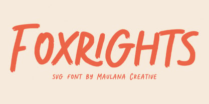 Foxrights is an Handwritten font, with bold stroke, a bit slant and fun character. It has Opentype features ligatures of character, To give you an extra creative work. Foxrights font support multilingual more than 100+ language. This font is good for logo design, Social media, Movie Titles, Books Titles, a short text even a long text letter and good for your secondary text font with sans or serif. Make a stunning work with Foxrights font. Cheers, MaulanaCreative
 - December by OrakArik,
$10.00 December is an easy to use script, suitable for greeting cards, logos, watermarks, and more. It is made with a light and elegant drawing style, as a reminder of a quieter season at the end of the year.
 - Juicebash by Bogstav,
$17.00 It's tall, legible and handmade - and on top of that, charming as heck! Each letter has rounded corners, which leaves a pleasant and smooth look. Juicebash is legible, even at very small sizes and it has multilingual support
 - IM FELL FLOWERS 1 - Unknown license

- MeninBlue - Unknown license

- Covent BT by Bitstream,
$50.99Designed by Jochen Hasinger of Frankfurt, Germany, Covent BT is an unconventional geometric sans serif typeface, featuring rounded terminal ends and a stencil-like break of the contour in some glyphs. At first glance you might think of it as a display typeface, but the generous x-height and openness of the lowercase makes Covent BT very legible at text sizes. Central Europe and Cyrillic is supported in the extended glyph set. Each weight contains 485 glyphs and includes some alternate figures, some upper and lowercase alternates, as well as others, all accessible via OpenType features. Covent BT Symbols is a stylized geometric symbol font, intended to stand alone or used as a companion to the Covent BT typefaces. The array of glyphs covers many of the more popular icons of the day including symbols for web use, numbers, sports, travel and astrology, to name a few, each with its own unique stylized interpretation. - Klint by Linotype,
$40.99 Type designer Hannes von Döhren created Klint. A sans serif typeface with a technical appearance and humanistic streak. The family includes five weights; each weight ships in three widths: condensed, regular, and extended. All of the 15 Klint variants have a companion Italic, rounding out family at 30 fonts. Klint's large x-height makes the design especially legible at small point sizes. In today's day and age, appliance manufacturers and/or companies in the mobile phone, computer hardware and software or Internet sectors are becoming ever more important. Klint fills the rising need for superfamilies with a technical feeling that are also legible in both text and display settings. Through conspicuous letters like R, K, k, or g, as well as the independent nature of its Italic, Klint exudes an ethos that separates it from the competition. Longer text passages in brochures, catalogs, or magazines would be well served by Klint's Light, Regular, and Medium weights. The heavier cuts are optimized for poster settings and headlines."
 - Amarone by Monotype,
$29.99 Amarone is a spiky calligraphic display typeface with some old fashioned flavour. It was designed by Carl Crossgrove, and includes an extensive set of swash caps which allow for extra drama where needed. Crossgrove wrote each of Amarone's letters by hand using pen and rough paper, and has retained some of this visual texture in the final digital design. The typeface works well at small sizes, but when used at larger sizes this texture comes to the fore. Amarone's elegant, formal character can be modified with its swash caps, which allow the typeface to move from prim and ordered to wildly expressive. Amarone lends itself well to packaging, posters and editorial usage – or in any environment where designers need to evoke times gone by. The Amarone font features an extensive character set with support for over 130 languages, and a range of OpenType typographic features including ligatures, initial and terminal forms, figures, fractions and swashes.
 - Tecna by Corradine Fonts,
$24.95 Tecna is a modern sans typeface with straight cuts, rounded angles and curved thinnings at the endings that make the letter shapes fresher. The rounded characters are squarish giving to the layout a very structural appearance. Its wide proportions give big impact to the texts. It has a tall x-height that enhances its legibility in smaller sizes. Its character set has coverage for Western and Central European languages.
 - Fitzronald by Cercurius,
$29.90 Fitzronald is a body text typeface with a strong personality combined with a good legibility in small sizes. It is an excellent book typeface, but it can be used in e.g. advertising and packaging as well. Due to its good legibility at low resolution, it is a superb website and e-book typeface. Fitzronald is based on Ronaldson, an American typeface originally cut by MacKellar, Smiths & Jordan in 1884.
 - Josefov by Ingo,
$28.00 A narrow, modern Slab Serif. JOSEFOV is directly derived from the sans serif text font ”Hedwig“. Therefore, of course, it pairs best with “Hedwig”. The basic thought was to create a font with heavy rounded serifs in the style of ”Clarendon“ but which hardly reminds one of that particular font. The form principle of rounded serifs is applied whenever possible — for example at the points where the individual strokes of the characters join one another. JOSEFOV seems very technical, very constructed (and truly is). In order to soften up the rigid impression, the serifs are applied at some points contrary to the tradition handed down, as with the upper case A C G K M V W and the lower case a b d h i j k l s t. Historically there is no example of the laterally oriented serifs of capital and small s (S) and C G. On the other hand, the double-sided serifs on the stems of b d h k l appear at the beginning of modern times in the very first serif types from five hundred years ago. The double-sided serifs of A M V W were also customary in the first decades of printing. JOSEVOV is particularly suitable for topics such as nature, folklore, culture, music, nutrition.
 - Dan Panosian by Comicraft,
$29.00 It’s true -- having your own font IS The Secret Of Happiness! At times suave and sophisticated, at other times rough and ready for anything, superstar comics artist Dan Panosian has worked on the likes of CAPTAIN AMERICA, SPAWN, THE FLASH,, SPIDER-MAN, X-THE X-MEN and GREEN LANTERN, as well as the movie, HARRY POTTER AND THE SORCERER'S STONE and games like DUKE NUKEM. He hasn't been seen in comics for some time, but he’s back, baby, working on a series of JOHN TIFFANY bandes desinée, and he’s brought his own font with him, courtesy of that awfully nice John JG Roshell at Comicraft. John Tiffany is one of the best bounty hunters in the world and he has no illusions about the world that employs him. Tiffany relies exclusively on four people: the Reverend Lovejoy, who taught him to love his money; Wan Chao, of the geek underworld who serves as an interface with the outside world; Dorothy, his partner, and Magdalena, the ‘call girl in his life.’ But in Mexico, the hunter has become prey, his head has a price. And if his rivals know his location, it means that John Tiffany was betrayed by one of four people he thought he could trust...and now he can rely on only ONE thing, his secret weapon. His FONT. See the families related to Dan Panosian: Urban Barbarian.
 - Nolan by Kastelov,
$55.00 The idea behind Nolan is to create emotional response due to its inviting character and legibility. It is ideal for headlines, presentations, product signage and bespoke logotypes. Due to the structure of the letters, Nolan can also stand its ground in body text, although this is not its primary purpose. Nolan is created slightly wider than what is to be expected from a typical sans font, yet not to the point of being considered a wide typeface. This uniqueness lends the family an air of originality while adhering to already established standards in the creation of contemporary sans typefaces. Nolan has a large x-height, so as to deliver a better punch and be legible at a glance . Its clean and modern lines are reminiscent of architectural aesthetic.
 - Maecenas by Dada Studio,
$29.00 Maecenas is an elegant professional. It stands out from other typefaces due to it’s timeless style and versatility. It will add smartness to all texts, regardless of the user’s expectations. In a quick and flashy way it will make an impression on anyone, who requires from his tool character and reliability. Maecenas won’t be lost in the crowd, and thanks to it neither will you. This font, marked by chivalry, is an AUGUST friend for good and bad. Light and bold weights, due to their strong personality, are perfect for display uses. At the same time, Regulars create a harmonious structure that provides excellent legibility in long texts. Maecenas covers all latin languages and cyrillic. It contains a wide set of numerals, small capitals, fractions, ligatures and other OpenType goodies.
 - Sign Language by Comicraft,
$39.00 Here at Comicraft we have seen the signs on the headline news, we have read the portents of things to come... yes, just as thunder is a sign of storm, just as pumpkins outside Ralph's on November the 1st are sure to be on sale, just as fresh produce becomes rotten, as sure as night turns to day, dark turns to gray, winter turns to spring and milk turns sour if you leave it out on the kitchen table overnight... Yes, here at Comicraft we know there's a signpost up ahead... a sign heading not into the twilight zone, but down a road of hope and hard work, a banner year, a red letter day, we know it's time to knuckle down, soldier on and pull ourselves up by our bootstraps. Well, we should probably pull ourselves up by our bootstraps BEFORE we soldier on, NEVERTHELESS, here it is -- not a soundbite, not an unfulfilled campaign promise -- SignLanguage is a font that makes the impossible possible, a font that cuts the taxes for 95% of American families, a font that closes down Gitmo and brings our troops home from Iraq. Senator Joe "Six Pack" Biden has described SignLanguage as articulate and bright and clean -- and a nice-looking font. In conclusion, Comicraft recommends you elect Sign Language.
 - Maiers Nr 21 Pro by Ingo,
$42.00 A handwritten ”font for technicians“ from ca. 1900. Very geometrical, rigid forms borrowed from the typical characteristics of Jugendstil / Art Nouveau. This script is found in a magazine from the Otto Maier publishing house, Ravensburg, which was issued sometime in the years shortly before WWI. The magazine is entitled ”Schriften-Sammlung für Techniker: Verkleinerte Schriften der wichtigsten Alphabete“ (Collection of scripts for technical specialists: reduced scripts of the most significant alphabets) and published by Karl O. Maier. The original copy, produced by means of a galvanized plate, is just 7 centimeters wide. It served as the model for technical professions in which, at that time, the captions of drawings were still done by hand. The characters have been scanned, digitized and greatly magnified. Special attention was given to ensure the ”uneven“ edges, typical of handwritten script, remained effectively noticeable even in the digitized form. As a result, this ”technical“ font retains a handmade touch. Especially worthy of note are the Jugendstil forms characteristic at the turn of the19th century. In comparison, many alleged ”ultramodern“ font types of today suddenly look quite old-fashioned. Maier’s Nr. 21 Pro is suitable for all European languages. It includes ”Latin Extended-A,“ for Central and Eastern Europe incl. Turkish, and even Cyrillic and Greek, too. The font includes several stylistic alternates as well as a number of ligatures.
 - Beauchef by Latinotype,
$26.00 Beauchef is a sans serif typeface originally created to meet the needs of Centro de Modelamiento Matemático de la Universidad de Chile (University of Chile Center for Mathematical Modeling). Beauchef is a typeface with rough strokes that features subtle optical compensation and does not strictly follow the laws of perception. This typeface might not be too cheerful, but shows a very particular idiosyncrasy of form. Beauchef is as tough as advanced mathematics; however, it is as legible and exact as numbers themselves. This is an avant-garde typeface that resembles the development of mathematics, but at the same time it is as conservative, calm and respectful as clients who require its services. Beauchef is so astonishing as mathematical formulas that mathematicians work with, but at the same time it is as humble as resulting figures.
 - Spaceship Bullet - Personal use only

- Brodia by Rillatype,
$17.00 Introducing, Brodia. Brodia is a modern logo font with different uppercase and lowercase that will make your design futuristic and modern. This font is perfect for your logo, branding, movie poster, or logotype. If you have any question please feel free to reach me at Rillatype@gmail.com Thank You!
 - StarTrack by HandletterYean,
$18.00 Imagine you want an interesting font that fits in many designs yet looks neat and also eye-catching. Don't worry anymore because it is answered. We present you with a special font named StarTrack. StarTrack is a must-have display font that enjoyable, pleasant, and elegant. It looks neat and suitable for your simple or complicated design. This font looks great for packaging, business cards, invitations, posters, labels and all kinds of your designs. Get this font into your collection now. Check out our font collection for more great and artistic fonts. Pick your most favorite font and use it as you like to reach your goals. What's included: 1. StarTrack font file 2. This font completed with: standard glyph, ligatures, punctuation & symbols, underline, and italic font style 3. Works both on Mac & PC 4. Simple installation 5. Accessible in the Adobe Illustrator, Adobe Photoshop, Adobe InDesign, and CorelDraw 6. Support multilingual; ä ö ü Ä Ö Ü ß ¿ ¡ You will love this font!
 - Ice Creamery by FontMesa,
$29.00Ice Creamery is a new variation of our Saloon Girl font family complete with italics and fill fonts which may be used to layer different colors into the open parts of each glyph. We don’t recommend using the fill fonts for Ice Creamery as stand alone solid fonts, Ice Creamery Chocolate was designed as a the stand alone solid font for this font family. Fill fonts go back to the 1850's where they would design matched sets of printing blocks and the layering of colors took place on the printing press, they would print a page in black then on a second printing they would print a solid letter in red or blue over the letters with open spaces to fill them in. Most of the time the second printing didn't line up exactly to the open faced font and it created a misprinted look. With the fill fonts in Ice Creamery and other FontMesa fonts you have the option to perfectly align the fill fonts with the open faced fonts or shift it a little to create a misprinted look which looks pretty cool in some projects such as t-shirt designs. I have some ice cream making history in my family, my Grandfather Fred Hagemann was the manager of the ice cream plant for thirty years at Cock Robin Ice Cream and Burgers in Naperville IL. In the images above I've included an old 1960's photo of the Cock Robin Naperville location, the ice cream plant was behind the restaurant as seen by the chimney stack which was part of the plant. If you were to travel 2000 feet directly behind the Cock Robin sign in the photo, that's where I started the FontMesa type foundry at my home in Naperville. My favorite ice cream flavor was their green pistachio ice cream with black cherries, they called it Spumoni even though it wasn't a true Spumoni recipe. Their butter pecan ice cream was also incredibly good, the pecans were super fresh, their Tin Roof Sundae ice cream was chocolate fudge, caramel and peanuts swirled into vanilla ice cream. One unique thing about Cock Robin and Prince Castle was they used a square ice cream scoop for their sundaes. - Stone Orbit by Olivetype,
$18.00 Introducing Stone Orbit – a very cool font for those looking to make a bold statement. This rough tough brush font is sure to give your project an edge! It's carefree and packed with attitude. Its unique letter forms create an interesting texture that stands out from other fonts, making it ideal for posters and logos. It's versatile enough to fit any style — whether it's grunge, urban, or old school! Stone Orbit font includes : Basic Latin Uppercase and Lowercase Numbers, symbols, and punctuations Multilingual Support. Fully accessible without additional design software Simple Installations works on PC & Mac Thank You and Happy Designing!
 - The Fox Tail by Din Studio,
$22.00 Hi Font Lovers! Let me introduce you to The Fox Tail – Font Duo&Extras The Fox Tail – Font Duo&Extras is a font inspired by the retro style and fox’s tail. It has a unique and attractive design so it is suitable for logos, branding projects, product packaging, quotes, greeting cards and many more. Includes: Features: A Full Set of Lowercase and Uppercase Stylistic Alternates Character Set (A-Z) Numerals and Punctuation (OpenType Standard) Accents (Multilingual Characters) PUA Encoded Make your design look unique with retro vibes. I hope The Fox Tail could fit your project’s standard.
 - Bassanova by Julia Bausenhardt,
$35.00 Bassanova is a dynamic display font inspired by lettering on the "Love in the Afternoon" movie poster by Saul Bass. The font captures the minimalistic, yet very distinct look that is so typical for his designs. Bassanova offers four versions for each letter that change automatically and give the font a handlettered feel. It also contains over 100 discretionary ligatures to add even more dynamic letter combinations to the mix. This cool all-caps typeface fits a wide range of design applications, and it features a full international character set. Please activate Open Type Features to get the most out of this font.
 - Culebra by Mysterylab,
$18.00 Culebra is a neo-traditionalist small-caps font designed in the tradition of high-end metalwork craftspeople and Western & Victorian sign-painting styles. With a bit of a nod to the standard of perennial favorites like Copperplate Gothic font, Culebra brings some eye-catching design touches and a more condensed structure for more economical use of horizontal space. It's a font that is as readable as they come, and would hardly be out of place in any design context, as it truly takes on a complementary vibe to almost any font style you want to pair it with.
 - Koolvexa by Qaratype,
$15.00 Koolvexa is a modern display serif font. This font is perfect for branding, logos, social media, prints, stickers, shirts, svg files and more! Koolvexa is unique as it can be used for a variety of design styles. It fits in wonderfully for free-spirited, boho designs and also for more classy editorial looks! There are a lot of fun stylistic alternates available to use with this font. These letters are embedded into the font file and easily accessible in programs such as photoshop and illustrator. Main Features: Uppercase & Lowercase letters Punctuation and special characters Multilingual support Ligatures & Alternate glyphs
 - SK Fushimi by Shriftovik,
$32.00 SK Fushimi is an accidental experimental font inspired by modern Japanese culture and aesthetics. Its futuristic geometric shapes, on the one hand, follow the spirit of the time of the land of the rising sun, and on the other hand, they make homage to technology. Like Japanese culture, the SK Fushimi font plastic fits perfectly into many areas of graphic design, supporting and complementing any graphic solutions. In addition, this font supports a multilingual set of more than fifty characters, including Cyrillic and Latin alphabets. Unusual in all respects, the font is perfect for the same unusual design or will make it so!
 - Monaz by Craft Supply Co,
$20.00 Introduction to Monaz – Bubble Font Monaz – Bubble Font, a playful and airy display font, is inspired by the lightness and roundness of bubbles and balloons. Perfect for creating eye-catching headings, logos, and children’s books, this font not only grabs attention but also serves as an ideal choice for fun and whimsical projects. Design and Aesthetics In its design, Monaz – Bubble Font features characters that resemble bubbles, with rounded edges and a bouncy feel. Furthermore, the letters mimic the floating appearance of balloons, thus adding a cheerful and lighthearted touch to any design. Additionally, its rounded forms are easy on the eyes, ensuring readability while preserving its playful charm. Versatility and Usage Monaz – Bubble Font boasts high versatility, fitting a variety of design needs effortlessly. Not only does it shine in party invitations and product packaging, but it also excels in promotional materials. Moreover, its effectiveness extends to educational materials for children, making learning engaging with its friendly appearance. As a result, its readability and unique style make it a top choice for designers seeking to add a fun element to their projects. Accessibility and Appeal Designed for a wide audience, Monaz – Bubble Font features a simple and clear style that is easy to read. It appeals to all ages, capturing the whimsy of childhood while still being sophisticated enough for adult projects. In summary, this font brings a unique joy and playfulness to any design, making it a valuable addition to any font collection.
 - Andada - 100% free

- Signika - 100% free

- Best Regardz by Outside the Line,
$19.00 Best Regardz is a casual, quirky handprinted font. A headline font that is kerned to be used at 24 pt or larger. This is the latest font in the Love Letters Series. Others in that series include Dearest John , Yourz Truly and Sincerely Yourz . Best Regardz was in the 2011 Typodarium Page-A-Day Calendar on 10-4-2011.
 - Million Orcids by Four Lines Std,
$15.00 Million Orchids Font: Where Script Meets Blooming Brilliance! Get ready to unleash your creativity and watch your designs blossom with this delightful script font. It's like having a million orchids at your fingertips, adding a touch of elegance and charm to every project. Let your imagination take root and let the million orchids font bring your designs to life!
 - Big Wave by Vozzy,
$10.00 Introducing a vintage look label font named Big Wave. This font have a lot of additional characters and multilingual support (you can see them at the screenshot) and including 7 styles - Regular, Full, Shadow, Texture, Shadow FX, Texture FX and Outline. This font will good viewed on any retro design like poster, t-shirt, label, logo etc.
 - Lazy Dance by PizzaDude.dk,
$17.00 Check out these Lazy Dance moves - fits perfect to any dancefloor! A tall and thin font made with a brush - it has slightly rugged lines, and a kind of jumpy x-line. All in all it is a font that deserves a design with a handmade look. There are 4 different versions of each letter, and thanks to Contextual Alternates, these automatically cycle as you type. Making your text look really authentic and handmade! There is also multilingual support!
 - Corymbus by Nathatype,
$29.00 Unveil the artistry of the written word with Corymbus, a script font that captures the beauty of handwriting. The interplay between thick and thin lines creates a visual feast for the eyes. The whimsical irregularity mirrors the fluidity of natural handwriting. The distinctive hallmark of this font lies in its swinging endings-each letter playfully extends beyond its baseline, creating a sense of rhythm. Corymbus fits in headlines, logos, print media, editorial layouts, and many more.


