10,000 search results
(0.019 seconds)
- Royal Bavarian by Wiescher Design,
$39.50RoyalBavarian was comissioned by King Ludwig the First of Bavaria about 1834. He was probably the greatest king Bavaria ever had, but he fell in disgrace for a short affair with the infamous Lola Montez and subsequently had to resign. He died in 1868, peaceful and happy in Nice on the French Riviera. I happened on an original etching of his type-guidelines for official writers of those days about 20 years ago. I always thought it was a very nice Fraktur (Blackletter), not a sturdy militaristic one as most of them are. Being me, I started with first tests immediately and then just forgot the font on my computer. When I was sorting out old stuff a couple of months ago I happened on the etchings once again and kept on working intermittently on the letters. The Plain cut is pretty much like the king wanted it. The Fancy cut is more to my liking and very decorative. Yours in a royal mood, Gert Wiescher. - KD Bombarda by Kassymkulov Design,
$9.95 - Gambino by Monotype,
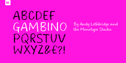
$15.99Childlike, sure; utterly affable, yes, but ultimately actually very cool. Yup, that’s Gambino. This chalky, super textured, semi connected script is a kooky playground pal and a grown-up technically savvy typeface all rolled into one. Upright yet tumbling, these simple, crayon-like letterforms are a delight. - Yang by Wiescher Design,
$39.50 - Miss Rhythm JNL by Jeff Levine,
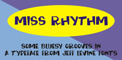
$29.00An early 1960s hand-lettered trade publication ad for an upcoming single 45 rpm release inspired the type design of Miss Rhythm JNL. The nickname of "Miss Rhythm" was given to Ruth Brown because of her popular "jump tunes"; that is rhythm and blues with an uptempo beat. Because the trade ad for her record was the inspiration for the font, it was only fitting to use that nickname as the font's name in honor of her. - Soundstar by PintassilgoPrints,
$29.00 - ITC Kick by ITC,
$29.99ITC Kick is the work of California designer Patty King, a bold and energetic brush script. The marked contrast of stroke weight lends the forms dynamism. ITC Kick is a stylish, graceful calligraphy font which will lend headlines a sense of modernity and sophistication. - Brandon Grotesque Condensed by HVD Fonts,
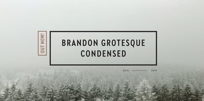
$40.00Eight years after the initial release of Brandon Grotesque , the typeface has grown into a font family of 48 styles, including a version for small sizes and a space saving condensed version. This type family was completely drawn from scratch with the look and feel of the original normal-width version. Today, Brandon supports at least 116 languages, from Latin based languages to Greek and Cyrillic. - Fabrica by Fenotype,
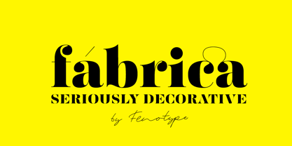
$40.00Fábrica is an exquisite display letter with flair. Its delicate curves have been carefully honed; yet its beauty is seemingly effortless. To add to its appeal, Fábrica is equipped with several handy features such as ligatures (there are plenty of them), old style figures and fractions. Its true crown jewel, however, is the finely tuned hairline accents – no longer will a diacritical mark ruin your heading. Find those under a feature called Thin accents. Use Fábrica to turn your communication into statements of divine elegance. - LDJ Knick Knack by Illustration Ink,
$3.00This fun font will get you singing that old favorite song ... It's fun. - Roman Nouveau JNL by Jeff Levine,
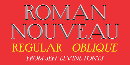
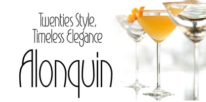
$29.00In the 1904 book “Letters & Lettering” by Frank C. Brown is a page of Roman style upper case letters entitled “Modern American Capitals – after Will Brady”. The slab serif, Art-Nouveau-influenced alphabet inspired a digital version. Roman Nouveau JNL, is available in both regular and oblique versions. - Alonquin by Studio K,
$45.00 - Bun Chalk by Storictype,
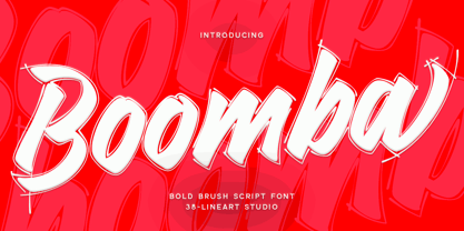
$12.00Introducing BunChalk Typeface Here is new product, It's called Bun Chalk. BunChalk inspired by many lettering on menuboard chalk cafe and bistro, and it's specially designed for the resto who use chalk concept,menuboard Chalk up your brand with our one-of-a-kind chalk concept! Leave your mark and get noticed with custom branded chalk that makes a statement. Whether you're a hip cafe, a stylish boutique, or a savvy startup, our branding chalk is the perfect way to spread the word about your business. Write inspirational quotes, menu specials, sales announcements, or just your logo all over your windows and sidewalks. Made from handmade quality chalk texture that goes on clean and texture typeface, it's ideal for businesses who want to grab attention and stand out from the crowd. Let potential customers know you're there with playful, eye-catching branded chalk that gets your name seen. - Boomba by 38-lineart,
$17.00Boomba is an exciting and dynamic font that embodies the essence of creativity and youthful exuberance. With its unique strokes and electrifying presence, it stands out from the crowd, making it perfect for capturing attention and infusing life into any design. Boomba is a fusion of art and typography, offering an exhilarating journey into the world of expressive fonts. Embrace the energy, unleash your imagination, and let Boomba take you on a thrilling typographic adventure. - Geographica Hand by Three Islands Press,
$39.00Geographica Hand replicates the neat hand-lettering typical of engraved British maps of the 18th century, including the work of cartographers Emanuel Bowen (circa 1694–1767), Geographer to King George II, and Thomas Jefferys (circa 1719–1771) Geographica ro King George III. A kindred font to our Geographica serif family, Geographica Hand exhibits long serifs, irregular edges, and a genuinely hand-made character. Use to simulate historical materials, vintage documents, or other time-worn text. The OpenType release of Geographica Hand comes with true small capitals, contextual and historical ligatures, a series of sketchy map ornaments (e.g., trees, churches, windmills, boats), and full Latin support. - Funboy - Unknown license
- motschcc - Unknown license
- Ghimli Sans by Anonymous Typedesigners,
$40.00Ghimli Sans was created using the ping-pong method, based on the graphic idea of Artem Rulev and the participation of Vladimir Anosov after. Then we sent the font file to each other, adding something of our own and making corrections, and so on many times. Ghimli Sans has already managed to get 2nd place in the Granshan competition in the Cyrillic section. The name was obtained by combining the name of the dwarf Gimli and Studio Ghibli. The font is quite friendly, dense, kind, as if a dwarf is walking around the lawn with a mug of intoxicated ale on a pleasant sunny day. Suitable for short word design, logo creation, menu layout and use in movies about gnomes and anything fantastic. - Merry Old Soul NF by Nick's Fonts,
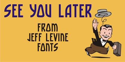
$10.00This jaunty display face was discovered in one of the many books on sign writing produced by Eric Matthews. The work was signed “King Cole", hence the font’s name. This typeface’s large x-height and tight spacing make it highly suitable for attention-grabbing headlines. Both versions of this font include the complete Unicode Latin 1252 and Central European 1250 character sets. - See You Later JNL by Jeff Levine,
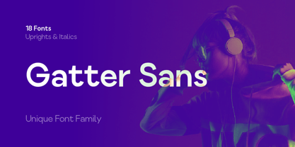
$29.00 - Gatter Sans by Arodora Type,
$35.00 - Hebrew Vilna Std by Samtype,
$59.00 - Hebrew Alter Rebbe of Liadi by Samtype,
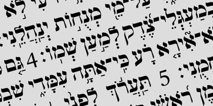
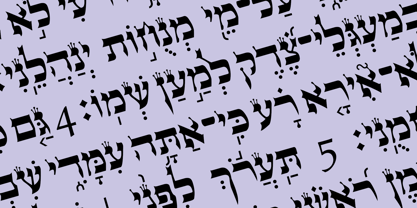
$385.00This is the Alter Rebbe of Liadi Ksav. This is a complete font with all diacritic marks (Nikud and Taamim) and also shevana, kamatz katan, dagesh hazak and holam chaser. There are 2 alternatives kinds of Lamed. The Nikud and the Trop are completily independent of the letters. You can use diferent colors in them. There is no combination of letters except for Alef-Lamed ligature. Two diferents kinds of "He" appears in the Tetragramation. You can make any kind of prayer book with this font. - Rummy Tall by Bunny Dojo,
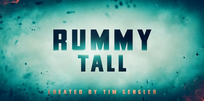
$23.00Rummy, the stout, scrappy font inspired by sports branding and 1940s film, has grown up and is ready to take on new responsibilities. The result: Rummy Tall. Still powerful, precise, and packed with personality, Rummy Tall's added height brings with it even more versatile charm. Track Rummy Tall tightly for a sturdy foundation, or give Rummy Tall some breathing room for an unexpected air of nobility. Reach new heights! - ZITZ - Unknown license
- Deicho by Twinletter,
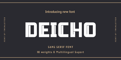
$15.00Do you need a beautiful, one-of-a-kind font for your business, social media, or other purposes? Then this package is ideal for you. Deicho San Serif is a premium font family that comes in 18 different styles. Designed to assist you in creating visually stunning projects of any kind. Its one-of-a-kind shape will make your project stand out to your audience. of course, your various design projects will be perfect and extraordinary if you use this font because this font is equipped with a font family, both for titles and subtitles and sentence text, start using our fonts for your extraordinary projects. - Hanglish by Designsuh,
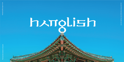
$12.00Hanglish transformed Korean character elements into an English font. Korean characters are the only characters in the world whose creator is known. It was created and announced on October 29, 1446 by King Sejong the Great so that the people could easily write and read the letters. It was created by arranging oriental calligraphic fonts. - Wedding Doodles by Outside the Line,
$19.00A font of 31 wedding icons... bow tie, shoe, bouquet, cakes, invitation, cupcakes, bon bons, wedding dress, tux, ring bearer, flower girl, suitcases, congratulations banner, balloons, garter, gift, cuff links, wedding bands, diamond ring. Use for a wedding shower flyer or make your own gift card. - Sennetarium JNL by Jeff Levine,
$29.00Jeff Levine first designed Sennetarium JNL back in 2004; based on the large drop caps found on intertitle cards from an old Charlie Chaplin film. The font’s name is a nod to Mack Sennett, king of the screwball comedies of the silent film era. - BoldAyres by Wiescher Design,
$39.50 - Bruce - Unknown license
- Lou - Unknown license
- Leira by WildOnes,
$10.00Leira hand drawn typeface is drawn by hand with a thick brush, resulting in really bold characters with some shakiness in line to get that personal touch feel. This typeface will suit for headlines, logo, titles, identities, packaging, posters, cards, quotes, etc. With the uniqueness of the shapes, Leira can definitely attract attention of anyone and be an eye catching font. The bold letters and playfulness of this font makes it stand out from the crowd. - Enterprise by 50Fox,
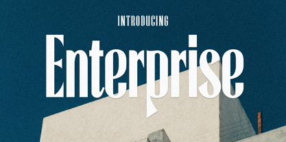
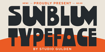
$23.00Say hello to Enterprise Typeface! A strong, tall and handsome display fonts offer a classic, modern look for any project. The tall and slender letterforms are designed to help you stand out from the crowd and create a bold statement. This Enterprise fonts are great for titles, headlines, logos also perfect for websites, magazines, printed materials and branding. This display fonts are easy to read on digital devices, making them a great choice for social media post or web design projects. - SG Sunblum by Studio Gulden,
$20.00Introducing the "SG-SUNBLUM" font, a modern sans-serif typeface that stands out from the crowd with its extraordinary design elements. This font features sleek, elongated lines and bold, asymmetrical letterforms that give it a dynamic and eye-catching appearance. It also includes an extensive range of special characters and multilingual support for added versatility. Whether you're looking for a font for a headline, logo, or any other design project, SG-SUNBLUM is sure to make a bold statement and capture attention. - Wanderer by FontMesa,
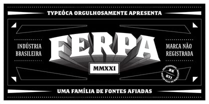
$25.00This font was inspired by the title logo of the TV show The Wild Wild West (season two). The font was named after the train in the TV show. Wanderer is a combination of my Classic Tuscan Rodeo Clown font and a Robust Slab Serif font. Wanderer is available as a stand alone font or with the optional fill fonts. Caution: Use of this font may cause the Wild Wild West theme song to play over and over in your head. Solution: Try temporarily using another FontMesa font such as Rough Riders. - Ferpa by Typeóca,
$30.00Ferpa is Typeóca's Fierciest Font Family. Drawn using only straight lines, Ferpa uses every kink, every kink and every serif as an opportunity for expressivity. From Thin to Black in both Roman and Italic constructions, Ferpa is available as 18 otf static font files, with a character set that goes a little beyond Latin Extended A. - Kingthings Whizzbang - 100% free
- Daliwood NF by Nick's Fonts,
$10.00This quirky charmer is based on a typeface called "Les Catalanes", designed in 1952 by Enric Crous-Vidal for Fonderie Typographique Française. Appropriately, it is named for the king of quirky Cataláns. - Bronzetti by Greater Albion Typefounders,
$10.00A typographic revolution-Bronzetti has been a long term project for Greater Albion Typefounders, aimed at filling a large gap in the range of typefaces available today. The Bronzetti family of 22 text typefaces combines modern requirements for legibility and readability with the charm of traditional Roman faces in the spirit of those carefully constructed by small scale quality foundries such as the Kelmscott and Vale presses. In short, Bronzetti is traditional letterpress meets modern publishing, offering a real opportunity to make your material stand out from today’s ‘run of the mill’ crowd. The range of typefaces on offer includes five widths of type, as well as small capitals and italic forms and regular and bold weights. Try out Bronzetti today, make your work stand out from the crowd and join the revolution!

