9,660 search results
(0.015 seconds)
- Figaro by Monotype,
$29.99Figaro is a very condensed slab serif design of the kind associated with nineteenth century advertising. The Figaro font has considerable weight contrast in the strokes, with a marked weight emphasis on the horizontal elements, including the serifs. Use the Figaro font for display and advertising and for 'Wild West' style posters. - Lullaby by Ania Szerszen,
$20.00 Lullaby is a display font that works great for headlines, posters or logotypes. With its regular rhythm, soft lines, some non-standard ligatures and two versions of each character (caps as alternatives), it gives many possibilities for any kind of typographic artworks. It works best with auto kerning in OpenType savvy applications.
 - Rough Tongue by Comicraft,
$19.00 Here's The Thing -- it can be loosened, twisted, tied, tripped over, wagged, bitten, forked, stuck out or kept in your cheek. You need your tongue to talk, taste, chew, swallow and sing. You can keep a civil tongue in your head or you can give someone the rough side of your tongue...
 - Office Squeeze by Hanoded,
$15.00 Office Squeeze was made with a Japanese brush pen. I kind of like the fact that, despite its roughness, Office Squeeze still maintains a very neat appearance. Office Squeeze can be used for just about anything, but product packaging, logos and posters spring to mind. Comes with a generous square footage of diacritics.
 - Simply Paranoid by Pen Culture,
$15.00 Simply Paranoid is elegant monoline font that comes with various kinds of alternate that will make design very awesome and elegant Feature and what will you get: Uppercase and lowercase Number Punctuation Multilingual support Beautiful alternate Please fell free to contact me on Hipenculture@gmail.com if you have any question Thank you
 - Humion by RagamKata,
$14.00 Humion comes in a modern style featuring Alternates with swash making it easy to adapt to your design. An elegant typeface, Humion is perfect for corporate identities, websites, publications, titles, books, magazines, business cards, logos, product labels, packaging, or any kind of advertising purpose. Thank you, Have a wonderful day, Ragamkata Studio
 - Doowop Initials JNL by Jeff Levine,
$29.00Here's a companion font for the fun and playful typeface Doowop JNL from Jeff Levine. Doowop Initials JNL features an initial over the silhouette of a 1950s-style singing group. For an extra bonus, there's a handful of 50s-style icons on the number keys in both the upper and lower shift positions. - Dark Witches by Rillatype,
$17.00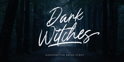 Introducing, Dark Witches a handwritten brush font. dark witches is one kind of a font that is made for you who are looking for a handwritten textured brush font. this font work perfectly for branding, packaging, advertising, headline, logotype, etc. Features : numbers and punctuation multilingual ligatures alternates swash PUA encoded Thank You!
 - NailsNStaples by Ingrimayne Type,
$14.95 In NailsNStaples the letters are made up of nails and staples. (The staples are not the staples one uses to join paper, but the kind one hammers into wood.) It is not often that one needs a typeface made of nails and staples, but if one does, there is a font for that.
 - Izumi Natsuka by Phonnastudio,
$10.00 Izumi Natsuka is a slim typeface with, gorgeous and flowing handwriting in a personalized way, such as branding, greeting, wedding planner, logo, poster, and so on. It can help kind of more your project in the future what you get: - more Stylistic Alternate - more ligatures - Number and Punctuation - Include Multilingual support Latin simple.
 - Circumulus by HakanPolatovic,
$15.00 CIRCUMULUS is a font that designed based on a single circle SOFT AND CURVY Circumulus has soft appearance and curvy lines, which gives it's nice look GEOMETRICALLY RATIONAL Every glyph has a ratio to one another, which makes this font can be used in any kind of rational system like repeating patterns
 - Bodoni Classic Swirls by Wiescher Design,
$39.50 Bodoni Classic Swirls breaks all the rules. The idea of Bodoni typefaces is no embellishments and here I go again and do another decorated set of Bodonis. But I find this is another very nice and useful typeface for all kinds of cards and certificates. Enjoy! Yours, again breaking the rules, Gert Wiescher
 - Carlosea by Portograph Studio,
$20.00 Carlosea is a serif while classic elegance is still maintained. It will boost your design stand out! Carlosea is the perfect typeface for any kind of your project, such as advertisements, branding, graphic design, quotes, wedding design, logo for online or offline business, photography, and others. Make your business more elegant beautiful!
 - Brothers Typeface by Almeera Studio,
$17.00 Introducing the new Brothers Display Typeface!!! is a luxury and glamour display typeface,certainly not the kind of typeface you see everyday and Utterly unique.This font is both modern and nostalgic and works great for logos, magazine, social media,etc. Already matched up and ready to be used together for your next design!
 - Adagio by Monotype,
$15.99 Adagio is a spontaneous, casual kind of font but don’t be fooled into thinking just because it’s all uneven and painted that it’s a pushover. There’s a bold brush pen at the heart of the design as well as a full set of alternate lowercase characters if you’re looking for something extra.
 - Bugbear by Hanoded,
$15.00 A Bugbear is a kind of hobgoblin, comparable to the Bogeyman. No tablets or gizmos were involved in the creation of this font. It was made entirely by hand, using an old-fashioned roller ball pen and a sheet of paper. Use Bugbear for your children’s book covers, party posters and product packaging.
 - Teen - Unknown license

- V-Dub - Unknown license

- Zeroes - Unknown license

- Effloresce - Unknown license

- Unispace - Unknown license

- Tork - Unknown license

- Zrnic - Unknown license

- Hurontario - Unknown license

- Angostura - Unknown license

- Adresack by Scriptorium,
$12.00Adresack is a classic arts and crafts period font. - Tanawonda JNL by Jeff Levine,
$29.00Tanawonda JNL is an Art Deco influenced sanserif face. - Toffee Script by Suomi,
$25.00 Toffee is based on Art Noveau typeface Regina Cursive.
 - Edison by HiH,
$12.00 Edison, is it Victorian or is it Art Nouveau? While this typeface may be found in Petzendorfer’s Treasury of Art Nouveau Alphabets, I believe the decorative spirals are more Victorian than “New Art.” To me, they looked tacked on, rather than organic -- with the industrial mechanics of a coiled spring, rather than the tendrils of a growing plant as the philosophical wellspring. Originally released by ATF in 1894 as Houghton, this typeface was re-released shortly thereafter by Bauer and Berthold in Germany as EDISON. Please do not make the mistake of thinking the font we offer here is no better than freeware fonts in cheap rip-off collections. This font has a set 218 characters and represents many hours manipulating the bezier curves to produce acceptable results. Available freeware fonts are often little more than raw scans with little accuracy of letterform. The muddy line intersections are a dead give-away. Frequently all you get is the alphabet itself. No numbers, no punctuation and don't even think about diacriticals. The font we offer represents a tremendous value. Considering the hours of work involved, I have no business charging so little. I could make better money cooking hamburgers or bagging groceries. But we want very much to encourage you to purchase and enjoy these fascinating historical typefaces and are making it as easy as possible for you to do so. So please encourage us and order Edison today.
 - Engebrechtre Expanded - Unknown license

- Dobi Hand by Tugrul Peker,
$5.00 Dobi Hand is a fat, bold, fun, cartoon like and has variable contrast handmade typeface. Dobi Hand that can be used for graphic design like food packaging, children books, birthday invitations, greeting cards etc. Dobi means in Turkish "fat, fatty" (in street language)
 - Opening Night JNL by Jeff Levine,
$29.00 Add some twinkling lights to a bold Art Deco font such as Art Lesson JNL, and the result is a typeface which truly puts your name (or message) up in lights. Opening Night JNL conjures up images of Broadway plays and Hollywood premiers.
 - Sutton Place JNL by Jeff Levine,
$29.00 Named for a Manhattan neighborhood, Sutton Place JNL is based on a 1930s-era poster advertising training in the “Household Arts” that was produced by the Federal Art Project in Ohio; a segment of the larger Depression Era WPA (Works Progress Administration).
 - Caerphilly by Hanoded,
$15.00 I really like Wales; I like the culture, the people and the language. I also like the Welsh legends, especially the ones about King Arthur and Merlin. I am reading a book about Arthur right now, so when I was working on this font, I wanted to give it a Welsh name. Caerphilly is a town in Southern Wales and is home to an immense 13th century castle (Castell Caerffili). Caerphilly font is based on a 16th century manuscript. I kept the glyphs rough, to give it ‘ye olde’ look. Comes with a hoard of diacritics, a bunch of double letter ligatures and some alternate glyphs as well.
 - Excalibur Sword by Comicraft,
$19.00 The Sword has been Drawn! The Quest for the Holy Grail has begun! When Arthur took the mighty sword of Excalibur from the Lady of the Lake, little did he know of the stories that would be spun, the myths that would be built around him, the Legend of Camelot and the Knights of the Round Table! And The Font. Merlin might have been King Arthur’s sage advisor, a font of wisdom and magicks, but never was Merlin available in postscript, truetype and opentype formats, nor was Lancelot, Arthur’s First Knight suitable for Celtic Display Lettering! See the families related to Excalibur Sword: Excalibur Stone.
 - Zwart by Holland Fonts,
$30.00Originally created with cutting in red litho film, as a headlining typeface for Vinyl music magazine. Its geometric structure was very applicable for early type design experiments on the computer. ...in the early 1980s, he (Max Kisman) became the designer of a small, independent music magazine Vinyl. This Amsterdam-based publication was set up very much as a response to the innovative British magazine, The Face. Responding to Neville Brody's radical designs for that magazine, Kisman began to experiment by creating new headline typefaces for each issue... (Emily King. New Faces: type design in the first decade of device-independent digital typesetting. 1987-1997. - 1790 Royal Printing by GLC,
$38.00 From 1702 to 1811 the French "Royal", then "Imperial", Printers, neglected Garamond and Fournier's designs and used only the font called "Romain du Roy", carved (1693 to 1723) by Philippe Grandjean by order of the king Louis XIV. 1790 Royal Printing was inspired by various variants of Romain du Roy that were in use during this period. Our sources were mainly official and legal documents printed in the late royal period, and in the beginning of the French revolution. There was no bold style. The 1790 Royal Printing Caps fonts contain small caps, plus titling caps for headlines as 1790 Royal Printing capitals are intended to be used preferably for text.
 - Ongunkan Brahmi by Runic World Tamgacı,
$60.00 The Brāhmī alphabet is the ancestor of most of the 40 or so modern Indian alphabets, and of a number of other alphabets, such as Khmer and Tibetan. It is thought to have been modelled on the Aramaic or Phoenician alphabets, and appeared in India sometime before 500 BC. Another theory is that Brāhmī developed from the Indus or Harappa script, which was used in the Indus valley until about 2,000 BC. The earliest known inscriptions in the Brāhmī alphabet are those of King Asoka (c.270-232 BC), third monarch of the Mauryan dynasty. Brāhmī was used to write a variety of languages, including Sanskrit and Prakrit.
 - Linotype Minos by Linotype,
$29.99Linotype Minos is part of the Take Type Library, chosen from contestants of Linotype’s International Digital Type Design Contests of 1994 and 1997. This fun font was designed by Swiss artist Christian Goetz, who named it after King Minos of Crete of the Bronze Age. Typical of scripts of this time were the ornamental borders around the characters, found on palaces of Knossos, Phaistos and Mallia. These borders surround every character of Linotype Minos, making it exclusively for headlines in larger point sizes. Single characters can also be used as initials mixed with other alphabets, especially with constructed sans serif and modern serif fonts. - LT Sweet Nothings - Personal use only


