3,102 search results
(0.02 seconds)
- Bat Liar by Sipanji21,
$16.00 Bat Liar is a spectacular decorative font with a Sharpness style and like a wings of bat for your design look awesome. It will elevate a wide range of design projects to the highest level, be it branding, headings, Movie Tittle, designs, invitations, signatures, logotype, wall art illustration, apparel, labels, and much more!
 - Moonlit Walk JNL by Jeff Levine,
$29.00 Another variant to the ever-popular Art Deco sans lettering with solid centers (no counters) was found in the hand-lettered title on the cover of the 1933 song "There's A Ring around the Moon". This became the basis for the digital typeface Moonlit Walk JNL, available in both regular and oblique versions.
 - Doowop Initials JNL by Jeff Levine,
$29.00Here's a companion font for the fun and playful typeface Doowop JNL from Jeff Levine. Doowop Initials JNL features an initial over the silhouette of a 1950s-style singing group. For an extra bonus, there's a handful of 50s-style icons on the number keys in both the upper and lower shift positions. - Dark Witches by Rillatype,
$17.00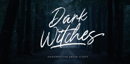 Introducing, Dark Witches a handwritten brush font. dark witches is one kind of a font that is made for you who are looking for a handwritten textured brush font. this font work perfectly for branding, packaging, advertising, headline, logotype, etc. Features : numbers and punctuation multilingual ligatures alternates swash PUA encoded Thank You!
 - NailsNStaples by Ingrimayne Type,
$14.95 In NailsNStaples the letters are made up of nails and staples. (The staples are not the staples one uses to join paper, but the kind one hammers into wood.) It is not often that one needs a typeface made of nails and staples, but if one does, there is a font for that.
 - Izumi Natsuka by Phonnastudio,
$10.00 Izumi Natsuka is a slim typeface with, gorgeous and flowing handwriting in a personalized way, such as branding, greeting, wedding planner, logo, poster, and so on. It can help kind of more your project in the future what you get: - more Stylistic Alternate - more ligatures - Number and Punctuation - Include Multilingual support Latin simple.
 - Circumulus by HakanPolatovic,
$15.00 CIRCUMULUS is a font that designed based on a single circle SOFT AND CURVY Circumulus has soft appearance and curvy lines, which gives it's nice look GEOMETRICALLY RATIONAL Every glyph has a ratio to one another, which makes this font can be used in any kind of rational system like repeating patterns
 - Bodoni Classic Swirls by Wiescher Design,
$39.50 Bodoni Classic Swirls breaks all the rules. The idea of Bodoni typefaces is no embellishments and here I go again and do another decorated set of Bodonis. But I find this is another very nice and useful typeface for all kinds of cards and certificates. Enjoy! Yours, again breaking the rules, Gert Wiescher
 - Carlosea by Portograph Studio,
$20.00 Carlosea is a serif while classic elegance is still maintained. It will boost your design stand out! Carlosea is the perfect typeface for any kind of your project, such as advertisements, branding, graphic design, quotes, wedding design, logo for online or offline business, photography, and others. Make your business more elegant beautiful!
 - Brothers Typeface by Almeera Studio,
$17.00 Introducing the new Brothers Display Typeface!!! is a luxury and glamour display typeface,certainly not the kind of typeface you see everyday and Utterly unique.This font is both modern and nostalgic and works great for logos, magazine, social media,etc. Already matched up and ready to be used together for your next design!
 - Adagio by Monotype,
$15.99 Adagio is a spontaneous, casual kind of font but don’t be fooled into thinking just because it’s all uneven and painted that it’s a pushover. There’s a bold brush pen at the heart of the design as well as a full set of alternate lowercase characters if you’re looking for something extra.
 - Bugbear by Hanoded,
$15.00 A Bugbear is a kind of hobgoblin, comparable to the Bogeyman. No tablets or gizmos were involved in the creation of this font. It was made entirely by hand, using an old-fashioned roller ball pen and a sheet of paper. Use Bugbear for your children’s book covers, party posters and product packaging.
 - Caerphilly by Hanoded,
$15.00 I really like Wales; I like the culture, the people and the language. I also like the Welsh legends, especially the ones about King Arthur and Merlin. I am reading a book about Arthur right now, so when I was working on this font, I wanted to give it a Welsh name. Caerphilly is a town in Southern Wales and is home to an immense 13th century castle (Castell Caerffili). Caerphilly font is based on a 16th century manuscript. I kept the glyphs rough, to give it ‘ye olde’ look. Comes with a hoard of diacritics, a bunch of double letter ligatures and some alternate glyphs as well.
 - Excalibur Sword by Comicraft,
$19.00 The Sword has been Drawn! The Quest for the Holy Grail has begun! When Arthur took the mighty sword of Excalibur from the Lady of the Lake, little did he know of the stories that would be spun, the myths that would be built around him, the Legend of Camelot and the Knights of the Round Table! And The Font. Merlin might have been King Arthur’s sage advisor, a font of wisdom and magicks, but never was Merlin available in postscript, truetype and opentype formats, nor was Lancelot, Arthur’s First Knight suitable for Celtic Display Lettering! See the families related to Excalibur Sword: Excalibur Stone.
 - Zwart by Holland Fonts,
$30.00Originally created with cutting in red litho film, as a headlining typeface for Vinyl music magazine. Its geometric structure was very applicable for early type design experiments on the computer. ...in the early 1980s, he (Max Kisman) became the designer of a small, independent music magazine Vinyl. This Amsterdam-based publication was set up very much as a response to the innovative British magazine, The Face. Responding to Neville Brody's radical designs for that magazine, Kisman began to experiment by creating new headline typefaces for each issue... (Emily King. New Faces: type design in the first decade of device-independent digital typesetting. 1987-1997. - 1790 Royal Printing by GLC,
$38.00 From 1702 to 1811 the French "Royal", then "Imperial", Printers, neglected Garamond and Fournier's designs and used only the font called "Romain du Roy", carved (1693 to 1723) by Philippe Grandjean by order of the king Louis XIV. 1790 Royal Printing was inspired by various variants of Romain du Roy that were in use during this period. Our sources were mainly official and legal documents printed in the late royal period, and in the beginning of the French revolution. There was no bold style. The 1790 Royal Printing Caps fonts contain small caps, plus titling caps for headlines as 1790 Royal Printing capitals are intended to be used preferably for text.
 - Ongunkan Brahmi by Runic World Tamgacı,
$60.00 The Brāhmī alphabet is the ancestor of most of the 40 or so modern Indian alphabets, and of a number of other alphabets, such as Khmer and Tibetan. It is thought to have been modelled on the Aramaic or Phoenician alphabets, and appeared in India sometime before 500 BC. Another theory is that Brāhmī developed from the Indus or Harappa script, which was used in the Indus valley until about 2,000 BC. The earliest known inscriptions in the Brāhmī alphabet are those of King Asoka (c.270-232 BC), third monarch of the Mauryan dynasty. Brāhmī was used to write a variety of languages, including Sanskrit and Prakrit.
 - Linotype Minos by Linotype,
$29.99Linotype Minos is part of the Take Type Library, chosen from contestants of Linotype’s International Digital Type Design Contests of 1994 and 1997. This fun font was designed by Swiss artist Christian Goetz, who named it after King Minos of Crete of the Bronze Age. Typical of scripts of this time were the ornamental borders around the characters, found on palaces of Knossos, Phaistos and Mallia. These borders surround every character of Linotype Minos, making it exclusively for headlines in larger point sizes. Single characters can also be used as initials mixed with other alphabets, especially with constructed sans serif and modern serif fonts. - Peking Duck by Hanoded,
$15.00 I used to be a tour guide and I traveled to China numerous times. Usually, the itinerary mentioned going to a restaurant in Beijing and eating ‘Beijing Roast Duck’ (北京烤鸭), a famous dish that has been prepared since the Imperial era. Typically, the whole duck is sliced at your table. The skin is crisp, glazed and thin and you should eat it with thin pancakes and thinly sliced spring onion. Of course, if I had to guide several ‘China tours’ in a row, I would often eat something else (there is only so much Beijing Duck you can eat). Peking Duck is a nice, handmade, Chinese Ink font. Use it for your restaurant menu, your book covers or your posters, advertising oriental food!
 - Schooner Script by Three Islands Press,
$39.00 I happened to mention to the proprietor of an antique barn near here that I'd be interested in any old typewriters she happened to come across. A conversation ensued, the proprietor withdrew into a back room, and she re-emerged with an old handwritten letter, dated 18 Sept. 1825 and spanning nearly three pages. The letter, penned by Samuel Clarke, a Princeton, Mass., pastor, sought donations for the victims of an accident at sea. I thought his script unique, stylistic, and definitely something worth digitizing, so I bought the old letter and took it home. Had to come up with several uppercase characters to round out the set, but the results seem good and proper. Full release has complete character set.
 - Gernsheim by Brenners Template,
$19.00 Gernsheim is a semi condensed display sans serif font family. This font family has been created for use in headlines and logo display fitted on showcase screen. 9 weights and 18 font styles make up the initial release. To increase the adoption of a wide range of display fonts, the individual glyphs' handle fluctuations were subtly applied. The compromise of disproportion between straight lines and curves improves glyphs autonomy and relieves tension. And by applying rounded corner effects to each style, it presents the reader with softness and comfort. It is designed so that the rebellious disproportion created by heavy styles transition to flat and classy tenderness as the thin style approaches. Try the uniqueness and excitement of individual styles for yourself
 - Atmosfera by Eurotypo,
$28.00 Atmosfera is a classic Didona typeface, recognizable by its extreme vertical tension, great contrast between thin and thick sticks and its straight and fine linear serifs that is angularly related to the staff of the letter, giving them an excellent legibility and a very clear and elegant appearance. In the design of this version, we chose to eliminate some serifs to give it a more avant-garde and modern look while maintaining an elegant style. With its 890 glyphs, it is enriched with a complete set of OpenType Type features: swashes, ligatures, alternates, stylistics sets and small caps, even so in the characters used in Western languages.. Atmosfera is an elegant text typeface that offers a wide range of possibilities.
 - Matahati by Locomotype,
$15.00 Matahati is a script font that is created based on the modern calligraphic style which is reprocessed by combining passion and deep feelings to create beautiful artwork and memorable. Besides bringing charming basic characters, Matahati also offers OpenType features that will facilitate the work of typography and graphic design. It includes Standard Ligatures, Stylistic Alternates, Terminal Swashes, Regular Swashes, Stylistic Set and PUA (Private Use Area) Unicode. This font also presents the beautiful ornaments of Matahati Swash, so it will be easier to mix and match your design. Matahati is suitable for the design of posters, invitations, quotes, headlines etc. Matahati comes in various styles — Regular, Slant, and Swash — each with its own unique personality to suit the style you need for your design.
 - Callimba by Letterena Studios,
$10.00 Are you trying to make an elegant, modern, and stylish statement with your invitations, social media, website, or printed materials? Ready to enchant your audience and enhance your branding? Introducing Callimba - A Serif Font Callimba is a gorgeous serif font that will whisk you away to a place of style! We are hoping that through this elegance and passion edged font, you can maximize your designs, reign in sales or make lasting impressions. The ideal font for social media banners; posts, and ads, printed quotes, t-shirt designs, packaging, or even as a modern text overlay to any background image. Callimba includes Multilingual Options to make your branding globally acceptable. Features: Ligatures Alternates Multilingual Support PUA Encoded Numerals and Punctuation
 - Galea Display by Letra Type,
$50.00 Galea is a slightly condensed serif typeface with long extenders. Its elongated proportions and graceful terminals seek to bring femininity and elegance to any layout. It is a display face that works well at large sizes in editorial contexts as a headline, titling or introduction to a text. Galea was designed by Isabel Urbina Peña while at Cooper Union’s Type@Cooper Extended Program, 2012 and released on May, 2014. Galea obtained an Honorable Mention from the Fine Press Book Association in the Text Family Category, 2013. Also, it is featured in the book "Playing with Type: 50 Experiments" by Lara McCormick, Rockport Press, on Parenthesis Magazine, Autumn 2013 on Behance's Typography Served and will appear on "Typography Magazine", Japan (Nov 2014).
 - Ongunkan Sidetic by Runic World Tamgacı,
$49.99 The Sidetic language is a member of the extinct Anatolian branch of the Indo-European language family known from legends of coins dating to the period of approximately the 5th to 3rd centuries BCE found in Side at the Pamphylian coast, and two Greek–Sidetic bilingual inscriptions from the 3rd and 2nd centuries BCE respectively. The Greek historian Arrian in his Anabasis Alexandri (mid-2nd century CE) mentions the existence of a peculiar indigenous language in the city of Side. Sidetic was probably closely related to Lydian, Carian and Lycian. The Sidetic script is an alphabet of the Anatolian group. It has about 25 letters, only a few of which are clearly derived from Greek. Consensus is growing that the script has essentially been deciphered.
 - Mondo by Untype,
$20.00 Mondo is essentially a contemporary typeface with vintage clothing, the incise terminals and the humanist ductus brings some of the classical dignity of the lettering tradition to an essentially modern typeface. On the middle weights Mondo is a sans with slightly condensed proportions, build with modular regularity and special care for lowing the tension on the curves, which delivers a very even texture and a sense of quietness and balance to long text settings. On the extreme weights the attention is attracted by the accentuated terminals, the vertical rhythm, the ink traps and the details of its overall construction, making Mondo an excellent choice for headlines and display use when a modern and clean but still catchy typeface is needed.
 - Random But Perfect by Aldedesign,
$18.00 Random But Perfect is Nice Bold Script Font - A stylish and quirky new bold script. Random But Perfect font was created to look as close to a readable bold script as possible by including over a lot ligatures, titling, and swash. This font is for those who want to show something strong and modern. You may use this font if you want to attract modern buyers. The font design seems to show that you have a passion in the business and give your love to the products and services you are offered to customers. Because it is an eye-catching bold script font, you can use it for a variety of purposes including design, branding, signature, logo, poster, and many more.
 - Zoxelyna by Meutuwah,
$20.00 Hello Font Lovers... Zoxelyna is another lovely modern signature font, which is combining the style of classic calligraphy with an modern style. combines from copperplate to contemporary typeface with a dancing baseline, modern and elegant touch. Including alternates, and ligatures. Can be used for various purposes such as headings, logos, wedding invitation, t-shirt, letterhead, labels, news, posters, badges etc. To enable the OpenType Stylistic alternates, you need a program that supports OpenType features such as Adobe Illustrator CS/CC, Adobe Indesign CS/CC, Adobe Photoshop CS/CC, CorelDraw X6-X7 & Microsoft Office. Mention, a font having characters move up and down like a dancer. This freestyle has a very unique style of signature and is very suitable for modern design. THANK YOU SO MUCH.
 - Darka by Sudtipos,
$49.00 Darka is a splendid, mysterious dark lady reincarnated in digital vectors as an original blackletter font. Her gothic, medieval, nocturnal attributes take the form of sharp terminals, seductive curves, calligraphic flair and complex character. Darka blends the balance of Textura, the flow of Fraktur and the elegant lowercase-to-uppercase ratio of Bâtarde into a stylish, inventive typeface with a Mexican soul. Starting as a personal, calligraphic hand, Darka slowly evolved into digital type, developing alternate glyphs, flourishes and special signs to preserve its hand-written origins and delicate tension, making it an excellent display typeface and, surprisingly, even a distinctive, crisp font for short texts. Darka received an Award of Excellence at the Type Directors Club of New York annual competition.
 - Alexander Quill by Canada Type,
$24.95 Alexander Quill was originally designed in the early 1980s to be cut in 14 point for casting into foundry type for the setting and printing of limited edition books at Pie Tree Press, Jim Rimmer's private sanctum. This alphabet exhibits traditional calligraphic tension, which helps its simple, somewhat octagonal forms play well together for an easy read. Its setting expresses a dramatic sense of history or fantasy. Alexander Quill was updated and remastered for the latest technologies in 2012. It comes with plenty of built-in alternates, a glyphset of over 410 characters, and supports the majority of Latin-based languges. 20% of this font's revenues will be donated to the GDC Scholarship Fund, supporting higher typography education in Canada.
 - Raxon by Product Type,
$15.00 RAXON is a futuristic mecha typeface. Highly inspired by industrial vibes and future-themed mecha-robots. Font design will make your project more powerful and inspiring. Perfect for headlines, billboards, magazines, websites, titles, posters, branding, thumbnails, creative logos, and many others. We are always passionate about bringing new futuristic typography to market. This time we present a special futuristic font for you. **What’s Included:** - File font - All glyphs Iso Latin 1 - Ligature, Alternate - We highly recommend using a program that supports OpenType features and Glyphs panels like many Adobe apps and Corel Draw, so you can see and access all Glyph variations. - PUA Encoded Characters – Fully accessible without additional design software. - Fonts include Multilingual support Thank you for your purchase!
 - Isla by Sudtipos,
$39.00 Eugene Grasset, the popular 19th-century Swiss graphic designer, dabbled in a multitude of disciplines such as ceramics, furniture, tapestry, jewelry and stamp design. Known mostly for his commercial posters and illustrations, he left a legacy of design that still fascinates scholars and professionals alike. One of the rarely mentioned Grasset treasures is the italic he designed in 1898 for use in two of his posters. Grasset's italic has an irregular quality that makes it seem much older than it is. It can be a very meaningful face in many contexts, such as map-related design or historical publications. Isla was digitized by Alfredo Graziani and completed by Alejandro Paul, maintaining the utmost respect for its historical flavor. The typeface includes a wealth of ligatures and alternates.
 - Bannetters by Ingrimayne Type,
$10.00 Bannetters (Banner Letters) was designed to alternate two letter sets. Both sets are formed on parallelograms, with one set of parallelograms sloped upward to the right and the other sloped downward to the right. When alternated, the result is a zigzaggy line of text. In applications that support the OpenType feature contextual alternatives (calt), the two sets of letters are automatically alternated. The Bannetters family has two styles, one with straight outer edges and the other that rounds these shapes for letters that have curved exteriors. Both styles are largely monospaced and monoline (not to mention weird, strange, and unusual). The tiling pattern of text created by Bannetters makes it attention-grabbing and appropriate for signage, posters, advertising, and other uses where eye-catching text is desired.
 - Sunkist Agness by Alit Design,
$15.00 Introducing Sunkist Agness Typeface The Sunkist Agness inspired by chill and playful street font combined with stencil font style. this font have rough and distorted shape which is become its own characteristic and uniqueness. Designed with 3 characters: Slab Serif, Sans Serif, and Serif, Sunkist Agness font is suitable to be combined into a playful and interesting combinations, not to mention the alternates from each characters that will add more uniqueness to your design! The "Sunkist Agness" are very easy to apply to any design, especially those with an retro and classic, army, playful and retro concept, besides that this font is very easy to use both in design and non-design programs because everything changes and glyphs are supported by Unicode (PUA).
 - Arboria by Type-Ø-Tones,
$60.00 Arboria has been a long-term project. Starting with the commission of a custom ‘architect’ font, this typeface has been changing over the years to its current form, which is its public debut. The source is named after the capital of planet Mongo, a futuristic city with art decó influences in their buildings. Arboria maintains that tension but is influenced by all elements of concern to his author. The result is a hybrid Grotesque with nods to the XXII century. Arboria family consists of six weights and matching italics, aside from many characters (it covers Latin and CE languages), the wide range OpenType features allows Arboria to perform great as a text and as a display typeface. Please check the ‘Read me’ file for more specifications.
 - Bender Script by Dear Alison,
$29.00 Would you hire one of the top hand lettering artists that worked for companies like Max Factor for your designs? Of course you would! Chas Bluemlein passed away many years back, and you couldn't have afforded his services anyway, but his lettering prowess which graced many advertisements, primarily cosmetic ads, has been pulled together from numerous samples to make this font. Bender Script comes with BONUS Swash alternates to mix up the flavor a bit, and exudes passion and confidence! Now you can own not only a piece of his lettering legacy, but you can also put it to work for you! This beauty is a sure fit into any font collection, so what are you waiting for, buy it today!
 - Redzone by VarsityType,
$10.00 “Redzone” is a versatile display family developed as the workhorse typeface for the “Ultimate Football League”, a fictional football league passion project. With a strong focus on the sports branding industry, “Redzone” has a voice that is competitive and sophisticated, its letterforms featuring angled terminals and sharp serifs across 5 weights and widths. Its generous x-height and overall build makes it especially capable for headlines, thought it serves well for shortened body type as well. The “Redzone” name was debuted in October of 2017 as a titlecase font (later refined and renamed “Redzone Classic”), redesigned in November of 2018 with sheared and stenciled styles, and is now presented in the most streamlined version yet with the same charming fearlessness still present. Enjoy!
 - LT Sweet Nothings - Personal use only

- Hagrid by Zetafonts,
$39.00 Crypto-typography - the passion for unknown, weird and unusual character shapes - is a disease commonly affecting type designers. Cosimo Lorenzo Pancini has celebrated it in this typeface family, aptly named Hagrid after the half-blood giant with a passion for cryptozoology described by R. K. Rowling in her Harry Potter books. Extreme optical corrections, calligraphic counter-spaces, inverted contrast, over-the-top overshoots: all the inventions that abound in vernacular and experimental typography have been lovingly collected in this mongrel sans serif family, carefully balancing quirky solutions and solid grotesque design. Hagrid is a typeface designed for editorial & display use, bringing dynamism to the printed and digital page thanks to its extreme contrast and unique details. It has been developed in a range of six display weights ranging from the monolinear and more traditional thin to the expressive heavy weight. For better readability in small sizes and on the web, a companion text family has been developed, with a slightly different selection of weights, wider metrics, and fine adjustments to keep the dynamic expressivity of the design without sacrificing legibility. This is evident in the design of italics: while the display italics sport a cursive feel with calligraphic terminals to lowercase letters, the text design is more restrained, with a more classical geometric grotesque slanted look. Given the crypto-typographer love for foreign specimens of letters, special care has been put into making Hagrid ready for multilingual projects, giving it an extended character sets covering over two hundred languages that use Latin, Cyrillic and Arabic alphabets and adding a selected range of OpenType features to handle alternate forms and stylistic sets.
