10,000 search results
(0.109 seconds)
- Linotype Punkt by Linotype,
$29.99 Linotype Punkt, from US designer Mischa Leiner, is part of the TakeType Library, chosen from the entries of the Linotype-sponsored International Digital Type Design Contest 1999 for inclusion on the TakeType 3 CD. This font, from US designer Mischa Leiner is available in three weights, light, regular and bold. The basic forms are those of a robust sans serif, however the figures are composed of evenly placed dots, hence the name Punkt, the German word for dot. This distinguishing characteristic lets this font look as though it appears on a background of light. One other unique trait of this font is the nature of the three weights. The figures of each weight have exactly the same measurements, the same width, breadth, etc. The only variable measurements are those of the individual dots making up the forms, making the bold weight much darker than the light while retaining the same outer contours. Linotype Punkt should be used in larger point sizes, as when it is too small the dots blur together and rob the font of its 'light'. The font is therefore best for headlines in large and very large point sizes.
 - Hugh Ultra Wide by Fateh.Lab,
$15.00 Hugh is the development of a wide type font, we create a work of art that combines a very strong spirit of wide type, for those of you artistic art lovers, this good news for you, because Hugh has a high artistic soul. This is the start of a happy year for you, get this font right away and develop your wild ideas, Hugh is the answer for you now. Its weight is superior in posters, social media, headlines, titles, large format print - and wherever you want to be noticed
 - Deco Design JNL by Jeff Levine,
$29.00 Hand lettering isn’t a perfect art form, and this is why it often has an appeal over formal typesetting. Individual interpretation can lead to variations in style, character shape and overall design concept. Case in point: The hand-drawn title for the1933 sheet music “Why Can’t This Night Go on Forever” is a simple Art Deco sans, however it mixes character widths and even angles the letter ‘C’ in a nonconventional way. Deco Design JNL is the digital version of this alphabet, which is available in both regular and oblique versions.
 - SHAPIRIT by ME Typography,
$59.00 The Shapirit family belongs to a category of geometric sans sherif fonts, that was created in 1920s. The main feature of this category is geometric architecture of shapes. Shapirit family is perfect for headlines, brief texts used on any screen, print materials as well as logos. The whole family includes 8 fonts from Thin to Black and contains full Hebrew and Latin script. Therefore, Shapirit is an ideal solution for any adaptation into Hebrew or any Latin script language. The word "Shapirt" (in Hebrew שפירית) means dragonfly. The font’s name was inspired by the dragonfly’s slim and elegant body.
 - Bang by ITC,
$29.00Bang was designed by David Sagorski in 1993 as a playful font of spirals. It consists of two capital alphabets which can be combined like the usual capitals and small caps, although both have the same height. They differ from one another only in the decorative forms which adorn them and the highly decorated characters of one set are complemented by the slightly more reserved characters of the second. Serious this font is not, rather, with its circles and spirals, Bang is best in point sizes 12 and larger and is meant for short texts and headlines. - Androgino by Cititype,
$17.00 Androgino is a unique handwritten font with deconstruction concept, where each letters connected to others with different spaces and sizes and sometimes overlaps. This font has an abstract 'dual interpretation'. On the one hand, the unique design of the letters does not have a stylistic tendency. On the other hand, the letters are combined in a unique form when they become sentences. Coupled with several ligatures that add diversity and give a certain surprise and impression when typed. Unique and stand out is the right definition for Androgino. It’s another word of Androgynous, Feminism which is masculine, suitable for all types of branding.
 - Asther by Ivan Rosenberg,
$16.00 Asther is a beautiful and inspiring set of modern typography glyphs based on a minimal and simplistic approach to elegance. The inspiration came from the fashion magazines. Its thick-thin, serif strokes express the modernity of the fashion industry. This typeface includes special uppercase letters and access to your OpenType features, alternate glyphs and more than 60 ligatures. Asther typeface is a serif typeface made mainly for headlines, titles, and other short texts and is well-suited for advertising, vintage mood board, branding, logotypes, packaging, titles, editorial design and modern and vintage design.
 - Orenji by Hanoded,
$15.00 Orenji is the Japanese word for Orange: it is a phonetic translation of the English word. I was actually looking for a certain shade of orange (the color), when I stumbled upon this fun word. I already toyed with the idea of creating a font loosely based on my son Sam's handwriting and I figured Orenji would be a good name for it. Orenji is a fun, cute and extravagant font. It has some uniquely shaped glyphs, comes with a giggle and a hug and more diacritics than you can throw a banana at.
 - XXII Totenkult by Doubletwo Studios,
$21.99 The “XXII Totenkult” is inspired by the classical letterforms of old roman/renaissance typefaces and an ode to the decay. This is an allCapitals-font and the lowercase glyphs contain a variation of the uppercase. With activated “calt”-feature every second lowercase will be replaced by an alternate, this will give the font a more natural look. Detailed information here: XXII Totenkult on Behance.
 - Westside by Linotype,
$29.99 Westside was designed by Adrian Frutiger in 1989 and is a kind of wood type. It is reminiscent of dusty streets, Wild West heroes and swinging saloon doors. The origins of this kind of typeface can be found in the early 19th century. Called Italian or Italienne, these typefaces quickly became very popular. They are distinguished by square serifs whose width is larger than the stroke width of the characters. When the letters are set together, the heavy serifs build dark horizontal bands. Westside is a particularly decorative typeface which will have a marked effect when used expertly. It is perfect for headlines in larger point sizes, which will highlight its special character.
 - Charpentier Sans Pro by Ingo,
$41.00 A humanistic sans serif The first version of this font was created in 1994 within the framework of the bid placed by the city of Graz to become the location for the Winter Olympics in 2006. Appropriately, its original name was ”Olympia.“ The font is intended to embody classic ideals as well as to meet modern demands. The proportions of Charpentier Sans are directly derived from Roman capitals and the humanistic book-face. The contrast between strokes and thin strokes is based on medieval uncial script. And thus, a modern serif sans was created emphasizing thick and thin strokes together. Thanks to its traditional form language, Charpentier Sans is very legible, adapts to various forms of content and expresses a kind of calmness and certainty. Details resulting from writing with the quill guarantee that the font doesn’t appear too rough and unemotional. Even the tiny, pointed mini serifs contribute to the unmistakable appearance of the font. They create an exciting contrast to the soft flowing forms of the letters and are, to a great extent, conducive to the legibility. Consequently Charpentier Sans always appears with an extremely sharp and clear outline. Charpentier Sans Italique has an even more distinct ductus derived from writing. Especially the rounded forms from a, e, f, g and y reflect the handwritten humanistic cursive. Charpentier Sans is comprised of many ligatures, including discretional ones, plus proportional medieval and capital figures for the normal type as well as disproportional tabular figures with a consistent width. Above and beyond the ”normal“ Latin typeface system, small caps are available as an especially elegant form of distinction.
 - Alaskan Malamute by Letterara,
$12.00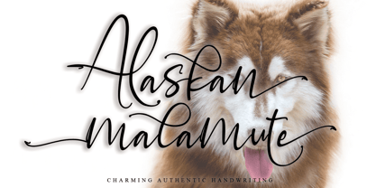 Alaskan Malamute is charming authentic handwriting font. This is a beautiful combination of timeless elegance and authentic calligraphy. Alaskan Malamute is the perfect font for making original and outstanding designs. This font is PUA encoded which means you can access all of the cute glyphs and swashes with ease! It also features a wealth of special features including alternate glyphs and ligatures.
 - Dee Dee by TipografiaRamis,
$39.00 This is a second edition of Deedee type family, originally designed in 2011. Deedee is a geometric sans serif typeface family of ten styles with extended support for most Latin languages plus Cyrillic. Revisions in this edition included minor adjustments to glyph shapes and improved kerning tables. The typeface is ideal for use in display sizes and is quite legible in the text.
 - Librum E by Hackberry Font Foundry,
$24.95 The major focus of my life and ministry at this point is book design. In the brave new world of 21st century self-publishing a new paradigm has arisen: the indie small shop. One of the problems is that all books are published as ebooks, and many books are published only as ebooks. There are two problems with this: character availability and licensing. The licensing problem is solved by including an ebook license with all of the Librum E fonts. The character availability is the core of the design. OpenType features do not work yet with ePUBs [though it is in the spec, if I understand correctly]. Kerning doesn't work, and so on. So these five fonts have only the 256-character [or less] ASCII set. A separate small caps is included. It has lining figures {proportional} and small caps instead of the graphics. The other four fonts have graphics to give bullet choices in lists, oldstyle figures {proportional}, and care given to character shapes so they will work better without kerning. For a great deal, see Librum Book Design Group , for a package containing all fifteen fonts!
 - Art Nouveau 2 BA by Bannigan Artworks,
$19.95This is an original font designed in the Art Nouveau style. - Laricio by Présence Typo,
$36.00Laricio is the italian name of the larch tree. This typeface has naturalist and renaissance connotations. The design of the stems is organic. The general feeling is slightly prickling like the foliage of conifers. In french, the word "fût" qualifies the "stem" (of a letter) and also the "bole" (of a tree). - Brush Type Standard by Brush Art Design Office,
$39.50I created the brush font named "BrushType Standard" in my unique brush style. I made it for ad designers. I believe this is the only one brush font in the world, so using it will enable them to get easily satisfied on their work. Brush handwriting in Japan has a long and proud Tradition and History. I tried to interject this feeling of Tradition into my font designs for you to comprehend its true meaning. I trust I have succeeded to convey my feelings to you. In addition, I can say each letter of the "BrushType Standard" is truly art. I am a pioneer of Brush Art. - Mario by Tipo Pèpel,
$22.00 Once upon a time, Mestre Patau, the «Black» magician, concerned about children´s typefaces historical ugliness, decided to settle the matter and using his vector powers, made letters embellished to be used in that stories so that they were according with the great genius all children have inside. Well done face but happy, goodness is not incompatible with joy. A solid construction, smooth, rounded, vibrant, generous curves and even more generous x-height and general proportions, give to the letter the vitality and freshness needed for use in projects where formality is not a requirement. Naughty but welldone, although not heeding the overshoots or the formal alignments, no symmetry in the horns is, despite this, or because of it, a fresh, cheerful but perfectly legible type. A full menu of freshness in your tales and stories!
 - LHF Birgitta by Letterhead Fonts,
$43.00 This beautiful roman style typeface is inspired from an E.C. Matthews book. Although the book we have is dated 1967, the style appears to have been created in the 1920s or 30s.
 - Noelia Script Pro by Vástago Studio,
$19.00 Noelia Script is a typeface inspired on the work of Doyald Young, Tommy Thompson, Matthew Carter and Giambattista Bodoni. This project is great to use in designs about sports, travel, and city postals, among others. This font has about 360 glyphs with stylistic alternates, old style numbers, serif caps, and a nice touch of classic penmanship. This is the result of a few months of work and that is it! Enjoy it! Thanks for buy it!
 - Fabuleuse Slab by Nuno Dias,
$18.00 Fabuleuse Slab is a one-style font that features a thin, condensed and high cap height and x-height. This gives the font a distinct retro look & bohemian feeling that is great for logos & branding, packaging, titles, magazines, posters, signs, shirts, scrap-booking, … This display font comes in Capital letters as well as Lowercase. It also comes equipped with Ligatures, Numbers, Punctuation Marks, Diacritic Marks and a well stocked supply of special characters.
 - Denedo by Andinistas,
$19.95Just like the M.C. Escher impossible figures and optical illusions, "Denedo" is a font that is impossible to construct in three dimensions because it only exists as a drawing. This font is based on the "0, 1, 2, 3, 4, 5, 6, 7, 8, 9" characters of one of the alphabets published by Nedo Mion Ferrario in the "Letromaquia" exhibition that was shown in Caracas, Venezuela in the 70's. The reason why I chose to restore and complete this font is that unique and exceptional personality that each word acquires when it is written with this alphabet. Denedo is a typographic family in three styles: Denedo 1A, 1B and 1C. When mixing them in big sizes you will emphasize the balance and incongruity of its shapes, providing originality and a unique identity to every word. All of the 3 variations include a complete character set with the lower and upper case letters, numbers, accents, diacritic signs, punctuation and monetary signs. All the fonts included in this family are available in Open Type format and are perfectly compatible with Mac and PC. I want to express my sincere gratitude to all my friends at Typophile who supported and motivated me during the final stages in the development of this font. - Love America by Stefani Letter,
$12.00 Love America! It is an amazing and cute display font. This font will look outstanding in any context, whether it’s being used on busy backgrounds or as a standalone headline! This display font is the perfect choice for making original and outstanding designs. This font is PUA encoded which means you can access all of the cute glyphs with ease! It also features a wealth of including ligatures.
 - Spring Heart by Yoga Letter,
$14.00 This font is called "Spring Heart" which combines spring and a cozy heart. This font is a very beautiful, unique, and very easy to use calligraphy font. The embellishments on the letters are very easy to use, and besides that, there are instructions on how to use them as well. This font is perfect for spring, wedding, mother day, father day, patrick day, easter, earth day, and other projects.
 - Let's Coorgi by Stefani Letter,
$14.00 Let’s Coorgi! It is an amazing and cute display font. This font will look outstanding in any context, whether it’s being used on busy backgrounds or as a standalone headline! This display font is the perfect choice for making original and outstanding designs. This font is PUA encoded which means you can access all of the cute glyphs with ease! It also features a wealth of including ligatures.
 - Bold Garage by Letterhend,
$19.00 Introducing, Bold Garage. Bold Garage is an unusual Bold font that gives you the extraordinary feel. If you want to pick bold and standout font for your design, this is the font that you're looking for! This font is perfect for quotes, branding, packaging, etc. What will you get: Including number and symbol. Support Multi Language This font also support PUA Encoded! So, grab your own. Thank You!
 - Resagnicto - 100% free

- Alta Mesa by FontMesa,
$25.00Alta Mesa is a revival of an old type design from the 1800's that was sold by most of the type foundries in the US and Europe of that time period so it is difficult to know the foundry of origin. New with this version are the fill fonts and plain styles, the fill fonts may be used as stand alone fonts, however the letter spacing is much wider, the plain versions are recommended if you desire a solid black weight. The regular Fill font is in registration with the Regular and Open versions while the Fill L font is in registration with the L and Open L versions. This was a very charming font in its time which was heavily used on old billheads and letterheads. We're pleased to bring this type design, which hasn't been used for over 100 years, into the digital world today. - Mona by WildOnes,
$12.00 Mona hand lettered font is a hand drawn brush font. It has contrasting thin and bold lines. This is a decorative font, so it works best for short descriptions, logos, identities, packaging design. Also looks great on diferent invitations and posters. The typeface has two styles - regular and bouncy. Boucny is ideal for designs where you need just a little bit more playfulness.
 - Ubuvila by Scholtz Fonts,
$19.00African fonts are characterised by design considerations that differ from those of Europe and the Americas. At one extreme we have a relaxed and casual approach to life that values the quality of each moment in life far more than people do in the west. In this approach each element of the font, while being part of a community, nevertheless stands on its own and has its own "character". An African font that characterises this approach is Ubuvila (the word means relaxedness or relaxation in Zulu). There is no strict adherence to a design format in Ubuvila nor are the characters constrained by resting on the same baseline. They wander up and down in the sentence and find a comfortable resting place. - Zulia Pro by Sudtipos,
$59.00 Zulia is located in the west of Venezuela and it is the state in where Joluvian grew up. It is a region of sunshine, high temperatures, oil and cheerful people, although we choose the name to honor his mother who is from there (zuliana) and who is proud of her land and everything that it represents the area. Zulia is also his first typographic project. It is based on two of his favourite calligraphic styles: italic and brush pen. He started with simple and contrasted strokes on paper with brush and marker. After that he developed the full alphabet and its various options for each letter, starting from a set of handmade forms that could be connected in different ways according to the user needs. What motivates him to involve this style was to create a differentiation with his daily work by generating a heavier type, contrasted and low rise. Zulia finally got life of its own with the participation of Alejandro Paul and a feedback of techniques and skills that were generated with the duo work. Zulia is not just a typeface, Zulia is his love of letters.
 - Isfahan by Scriptorium,
$18.00Isfahan is based on the middle-eastern style decorative initials Willy Pogany drew for his edition of The Rubaiyat of Omar Khayaam. This font has both full-size capitals and reduced size small-caps versions of each letter, but although it could be used as a titling font, it is really intended more for decorative character placement. - Iridium by Linotype,
$29.99Iridium™ was designed by Adrian Frutiger in 1972 for Linotype. It is in the modern" style like Bodoni or Didot, in that it has the sparkle created by a high thick/thin contrast and a symmetrical distribution of weight. But the sometimes harsh and rigid texture of the modern style is tempered by Frutiger's graceful interpretation. Iridium itself is a very hard, brittle and strong metal; yet the Latin and Greek roots of the word mean rainbow, or iridescence. And indeed, this font is infused with a more lustrous and complex spirit than the average rather stark modern typeface - note the stems that gently taper from waist to serif, the nicely curved ovals of the round characters, and the slight bracketing of the serifs. Iridium was originally designed for phototypesetting, and Frutiger himself cut the final master photo-mask films by hand. This digital version has all the craftsmanship of that original and includes the roman, a true italic, and the bold weight. Iridium works particularly well for book and magazine text and headlines." - American Wonders by Sarid Ezra,
$17.00 Introducing, American Wonders - Font Duo! American Wonders is a package of two fonts containing signature script and bold serif. This versatile fonts that you can use for any project. This bold serif is strong and powerful while the signature script is soft and authentic hand writing. This font also support language!
 - Quimera by PampaType,
$19.00A happy, and delicate family, available in 5 weights. Being very legible in small sizes, it pays tribute to French designer Roger Excoffon, particularly to his Antique Olive type. Antique Olive combines two features which inspired the design of Quimera: a large x-height with open counters which ensures legibility at tiny body sizes; and letterforms with a horizontal stress which contradicts the logics of calligraphic tradition (thick verticals, thin horizontals). Quimera has a typical sanserif stroke modulation, but letters have a very thin, capricious serif, which helps to keep the texline's continuity. This 'genetic' contradiction is the reason for its name: Khimera, as it would be a 'sanserif avec'! - Aurelux by Andfonts,
$16.00 Just imagine, You are searching for the font that should be modern and elegant at the same time, which is not possible with typical sans or serif fonts. So, Aurelux is what You need. This font in your library can be with you for decades, because it is useful and It's open border to create graphic designs that require "modern but elegant touch". : cafe, bar, theatre, spa, hotels, overall entertainment industry, travel, vintage, retro signs. Font is gender neutral. But, when You see Bold and black styles You understand that this font can be in the design of some industrial companies, factories, construction companies that want to show that they have history and heritage. You can contact me if You need questions: andfontscontact@gmail.com
 - Colorado by Juliasys,
$- Nature is fond of stripes. Animals have them, plants have them and the rainbow has them. Besides being beautiful, stripes in nature have various origins and functions. But only Homo sapiens gave them symbolic meaning. In the American flag, the 13 stripes symbolize the 13 colonies that declared independence from Britain. In the French “Tricolour” flag, they represent Paris and the king of France. And in Russia’s “Georgiyevskaya lenta,” they symbolize the death and resurrection of St. George, the dragon-slayer. The font family COLORADO , named after the beautifully striped Colorado potato beetle, can be used to construct all kinds of symbolic or just beautiful messages. And thankfully, you need no OpenType diploma to do this. To get your texts multi-striped and multicolored, follow this simple procedure: Write the message with one of the COLORADO fonts and apply a color. Then copy and paste in place, and apply a second font and color. Repeat this again if wanted – and the masterpiece is done. COLORADO ’s language support covers about 100 languages. It has a Western European, a Central European and an Extended Cyrillic character set.
 - Merc by Canada Type,
$24.95 Merc is a four-letter word that stops just one y short of Mercy. Merc is also the standard street abbreviation for mercenary, or a soldier for hire. Now that the global security business has become a two hundred billion dollar industry, we thought you would like to have your very own affordable merc. Knew you'd be pleased. Merc is based on an all-cap metal face called Agitator, designed by Wolfgang Eickhoff and published by Typoart in 1960. The rough brush letters look like they were made by someone who is capable of elegance but has no time for it. These are letters that live to catch the eyes and warn them loudly: Doom is here, and if you want it screamed out, this Merc is at your service. This font contains more than 460 glyphs, which means quite a few stylistic alternates and support for the majority of Latin languages.
 - YT Rain Latin by Yangtype,
$9.00The concept of this letter is ‘pleasure’. The shape of the letters with the rain is refreshing. The hardness of the letters, which can tolerate a certain amount of rain, and the intensity of the strong rain create a sense of pleasure. - Kernig Braille by Echopraxium,
$5.00 This font is the younger sister of HexBraille with which it may be combined to create new patterns. This also explains why their introductory text are similar. Introduction The purpose of this monospace font is to display braille in an original and "steganographic" way. The Kernig prefix means "Robust" in German, this is because of the crank shapes . The core of the glyph design is a flat hexagon which can be read as 3 rows of 2 dots (i.e. regular braille glyph grid). Even if within a glyph, braille dots ("square dots" indeed) are placed on the vertices of a flat hexagon, the difference with HexBraille is that edges connecting vertices are not straight lines but "crank shapes" instead. This can be summarized by saying that the whole glyph is a Hexcrank (a flat hexagon where vertice pairs are connected by a crank shape) NB: The initial design is illustrated by glyphs 'ç' (no dot) and 'û' (6 dots) as shown by poster 6. A. "Kernig Lattice" In KernigBraille, glyphs are connected to each other, thus for each Hexcrank glyph there are 6 connections: 2 on left/right and 4 on top/bottom. In the final design some cranks were removed for esthetical reason (i.e. leave empty space for allowing patterns diversity). In summary, a text using this font won't display a honeycomb but a lattice instead. NB: Please notice that in order to obtain the lattice without vertical gaps, you must set the interline to 0. The lattice is made from 3 kind of shapes: a.1. Hexcrank a.2. Square a.3. Irregular cross (mostly unclosed) The design favored squares over crosses. The whole slightly resembling a PCB. B. Text Frames It's possible to frame the text with 4 sets of frame glyphs (as illustrated by poster 2) b.1. Kernig { € ° £ µ § ¥ ~ ¢ } b.2. Rectangular-High { è é ê ï î à â ä } b.3. Rectangular-Low { Â ù Ä Ê Ë Ô õ ö } b.4. Mixed Kernig+High: a mix of Kernig and Rectangular-High frame glyphs When using frame glyphs, it is advised to show Pilcrow (¶) and Non Breaking Space, which are replaced by empty shapes in this font (e.g. in Microsoft Word, use CTRL+8 or use [¶] button in the ribbon).
