10,000 search results
(0.139 seconds)
- As of my last update in early 2023, the font named ILL oCtoBer, created by Kees Gajentaan, embodies an intriguing blend of style, creativity, and distinctive flair that captures the eye and provokes ...
- Hollgates by Mozatype,
$17.00 Proudly present our new font. It is named Hollgates - Elegant Signature Font. Hollgates is script handwritten style with a natural charm. This font which is a modern signature and unique style handmade comes with very beautiful character changes. To keep the maximum real hand-lettered effect, there were created 240 ligatures (you can see them among the presentation pictures). When creating the font, we should take into consideration that each letter should be able to be connected with other letters. For example, the letter "a" should be well connected as well as with "l" and "n" and with any other letters. This limits us: we have to start letter from exact one point and finish at exact second point. So here come ligatures. Hollgates font contains following ligatures: ab ad af ah ai ak al am an ao ap as at az az bh bl bk bt bx br cb cl ch ck cc cr cs ct co cx cz dd db dh dl dk dt dr ds dx dz eb ef eh ek el et ett er em en es ex ez ff fh fl fk fi fo fs ft fr fz fx gg gh gr gb gf gl gk gt go gs gz hf ho hs ht hz ib if ih ik il it itt ii in im ip is ir iz ix jo kl kk kh ko ks kr kt kx kz lo li ls lu lr lx ly lz mm mf mi mh ml mk mo mp ms mt mz mx nb ni nf nh nl nk no ns nr np nt nx nz ob of oh oi oj ok ol om on op os ot ott ou ox oz ph ppl pp ps pt pu pi pr po px pz rs rr st sh sl sk sb si sm sn so sp su sx sy sz oll all ell ill ull th tl tk ti ts tr to tu tx tz ty ub ul uh uk ul ut utt un um up us ux uz vh vl wh wl wo zz ee ll ff oo rr ss tt dd ff It’s the perfect fit for all luxury projects, such as wedding invitation, signatures, luxury logos, printed quotes, grettings cards, social media headers, product packaging and many more! It includes a full set of uppercase and lowercase letters, multilingual symbols, numerals, punctuation and ligatures. It is PUA encoded which means you can access all of the glyphs and swashes with ease! Fall in love with its incredibly versatile style and use it to create spectacular designs! Use this font for any crafting project that requires a personalized look! What’s Included : – Works on PC & Mac – Easy to use ( Installations ) – Easy Convert to webfont – Compabilty Windows, Apple, Linux, Cricut, Silhouette and Other cutting machines Thanks for downloading, and I hope you enjoy it!
 - Tazugane Gothic by Monotype,
$187.99 The Tazugane Gothic typeface family is the first original Japanese typeface created by Monotype. Designed by Akira Kobayashi, Kazuhiro Yamada and Ryota Doi of the Monotype Studio, the Tazugane Gothic typeface offers ten weights and was developed to complement the classic Latin typeface, Neue Frutiger. The design of the Tazugane Gothic typeface balances an original, humanistic style with elements of traditional Japanese handwriting. The two typefaces work together in a natural, seamless and adaptable manner so that Japanese and Latin texts can be used side-by-side for a wide range of applications, including in magazines, books and other print media; on digital devices; in branding and corporate identity systems; and in signage for buildings, highways and mass transit. Tazugane Gothic was updated to support the “Reiwa” new era symbol. Reiwa can be written as two kanji: 令和. This update to Tazugane Gothic includes Reiwa designed as a single ligature and is encoded as U+32FF. The inspiration for the Tazugane Gothic typeface is as elegant as its design. Since antiquity, cranes have been regarded in East Asia as auspicious birds for their noble appearance and elegance in flight. The typeface is named Tazugane Gothic in honor of the longevity of the crane, with the goal that it will be used for many years to come. The combination of the Tazugane Gothic typefaces’ traditional and humanistic elements, along with its intended ability to complement popular Latin typefaces, makes it one of the most uniquely flexible designs for applications where Japanese and Latin texts can be used together. The typeface family was created to have wide appeal, with a pleasing and consistent experience for readers, for use on screen, in print, in signage, packaging and advertising. Tazugane Gothic has 10 weights. The Light, Book, Regular, Medium and Bold weights are considered best for text sizes. The Ultra Light, Thin, Heavy, Black and Extra Black weights are recommended for headline sizes.
 - TT Bricks by TypeType,
$29.00 TT Bricks useful links: Graphic presentation | Customization options Do you love the early Soviet visual culture as much as we do? We’ve tried going back a hundred years and rethinking the constructivist era. We’ve created an extensive font family that consists of the simplest triangle and rectangle forms. TT Bricks font family includes 16 typefaces: Hairline, Thin, Light, Regular, Medium, Bold, ExtraBold, Black and Italics. Regardless of its Soviet past, TT Bricks is a very fresh and visually powerful font family that perfectly fits the contemporary media landscape. TT Bricks is perfect for mobile apps and corporate websites, as well as for printed press layout. Thanks to the exaggeratedly simple forms of all signs, TT Bricks looks great in very small type sizes. FOLLOW US: Instagram | Facebook | Website TT Bricks language support: Acehnese, Afar, Albanian, Alsatian, Aragonese, Arumanian, Asu, Aymara, Banjar, Basque, Belarusian (cyr), Bemba, Bena, Betawi, Bislama, Boholano, Bosnian (cyr), Bosnian (lat), Breton, Bulgarian (cyr), Cebuano, Chamorro, Chiga, Colognian, Cornish, Corsican, Cree, Croatian, Czech, Danish, Embu, English, Erzya, Estonian, Faroese, Fijian, Filipino, Finnish, French, Friulian, Gaelic, Gagauz (lat), Galician, German, Gusii, Haitian Creole, Hawaiian, Hiri Motu, Hungarian, Icelandic, Ilocano, Indonesian, Innu-aimun, Interlingua, Irish, Italian, Javanese, Judaeo-Spanish, Kalenjin, Karachay-Balkar (lat), Karaim (lat), Karakalpak (lat), Kashubian, Khasi, Khvarshi, Kinyarwanda, Kirundi, Kongo, Kumyk, Kurdish (lat), Ladin, Latvian, Laz, Leonese, Lithuanian, Luganda, Luo, Luxembourgish, Luyia, Macedonian, Machame, Makhuwa-Meetto, Makonde, Malay, Manx, Maori, Mauritian Creole, Minangkabau, Moldavian (lat), Montenegrin (lat), Mordvin-moksha, Morisyen, Nahuatl, Nauruan, Ndebele, Nias, Nogai, Norwegian, Nyankole, Occitan, Oromo, Palauan, Polish, Portuguese, Quechua, Rheto-Romance, Rohingya, Romanian, Romansh, Rombo, Rundi, Russian, Rusyn, Rwa, Salar, Samburu, Samoan, Sango, Sangu, Scots, Sena, Serbian (cyr), Serbian (lat), Seychellois Creole, Shambala, Shona, Slovak, Slovenian, Soga, Somali, Sorbian, Sotho, Spanish, Sundanese, Swahili, Swazi, Swedish, Swiss German, Tagalog, Tahitian, Taita, Tatar, Tetum, Tok Pisin, Tongan, Tsonga, Tswana, Turkish, Turkmen (lat), Ukrainian, Uyghur, Vepsian, Volapük, Võro, Vunjo, Xhosa, Zaza, Zulu.
 - Dragonwick is a typeface that seems to whisk you away to an era of fantasy and enchantment. With its distinctive personality, it calls to mind the majestic presence of dragons, embodying an aura of a...
- RNS Baruta Black is part of the RNS Fonts collection, crafted by RNS Foundry, which has been known for offering a diverse array of typeface designs that cater to various aesthetic and functional need...
- Sure, I'd be delighted to paint you a vivid picture of the font named "Felt" crafted by Pat Snyder. Imagine diving into the cozy world of crafting, where textures, warmth, and a touch of homemade cha...
- Sanserifing by Audrius Skersys is a contemporary typeface that embodies simplicity and versatility in design. Created by the Lithuanian designer Audrius Skersys, the Sanserifing font is a dedication ...
- Absolutely, I'd be delighted to share a bit about ChopinScript with you! ChopinScript is a font that dances on the page, much like the compositions of the composer it's named after, Frédéric Chopin...
- Subatomic Tsoonami is not merely a font; it's a vivid journey into the realms of creativity and innovation, embodying a blend of whimsy and sophistication that's rare in the typography world. At firs...
- Nada Fraktur by Johan Elmehag,
$19.00 Nada Fraktur is a modern geometrical blackletter made to serve your hip intentions. Think hip-hop album sleeves, your local t-shirt print shop, and Tumblr-boy action. The goal with this typeface is to blend medieval aesthetic with sharp modern cuts. You could say that the font is sort of monospaced, but it is not. The typeface includes an extended character set to support Central and Eastern European as well as Western European Languages.
 - Sirenia by Floodfonts,
$49.00 Sirenia is designed by nature! A friendly display typeface with organic letterforms and flowing transitions, as if naturally grown. This authentic natural look is ideally suited for lifestyle products, the food & beverage sector and for sustainable design. Sirenia’s 1270 characters contain many decorative letters and swash variations for initial, medial and final letters. This allows the designer to create lively logotypes according to her/his own ideas, matching the respective letter combination.
 - Clunic by Greater Albion Typefounders,
$16.95 Clunic is a Blackletter font in the best traditions of Victorian Gothic revival—that is to say aesthetically marvelous but no historical basis whatsoever. The design combines the perpendicular character of medieval manuscripts with modern legibility and a healthy respect for calligraphic principles. There are alternate large and small forms of some glyphs. Clunic is ideal for use on certificates, themed invitations, posters, headings, initial capitals or sign-writing with an historic theme.
 - Middle Ages by Mans Greback,
$49.00 Middle Ages is a hand-drawn medieval type, designed by Måns Grebäck during 2019. With its blackletter style it works great in many historical context typesettings, as well as for traditional Christmas projects. It has a Gothic style that also works well for rock music genres, or for tattoos and other rough graphics. The font is multilingual and supports all Latin-based European languages, contains numbers and all symbols you'll ever need.
 - Neue Schwabacher by RMU,
$25.00Neue Schwabacher is a revival of a revival. Albert Anklam modified the medieval letter forms of Schwabacher according to the fashion of the fin-de-siècle era, and his font was first released by Genzsch & Heyse in 1876. This most widespread font face of the 19th century was fresh redrawn and made fit for nowadays’ usage. To get access to all ligatures, it is recommended to activate both Standard and Discretionary ligatures. - Fiorentina by Wiescher Design,
$69.50 Fiorentina is a ecstatic, abundant, embellished script in the Renaissance tradition. It could have been made for the Medicis or Sforzas. But I designed it completely new after being inspired by colorful Florentine wrapping papers. I gave it many different swashes and understrokes, alternate upper- and lowercase characters, 659 characters in all! The font has all accents for the European languages, Baltic, Roumanian and Turkish. Yours very versatile designer of beautiful typefaces Gert Wiescher
 - Lombardia Illuminata by Celebrity Fontz,
$24.99Lombardia Illuminata is a collection of Lombardic-style letters surrounded by natural forms of vines, leaves, trellises, scrolls, sun rays, and flowers. This beautifully ornate font includes one set of A-Z ornamental initials conveniently assigned to both the upper and lower case alphabet characters which are perfect for starting off the beginning of paragraphs in artistic publications, storybooks, fairy tales, and texts conveying the feel of medieval manuscripts of the 12th-16th centuries. - Golondrina by LFCF,
$25.00 Golondrina, spanish for swallow, a bird that cannot carry a coconut but migrates form north to south like the angles in this font. Also, like the bird, Golondrina can adaptate to different needs, going from a traditional blackletter with small lowcase characters and ornamental capitals, to a hardcore uppercase and sharp small caps. The right font for designs with a medieval, traditional spirit or a coarse lettering for a Heavy metal band.
 - XAirebesk by Ingrimayne Type,
$14.95 I am not sure exactly how to classify these geometrical ornaments. They resemble the arabesque ornamentation of medieval Islamic art, but also have similarities to Celtic knots and to some Chinese and Korean ornamentation. The bolder of the two only works well at very large point sizes, while the thinner is designed for use at smaller point sizes. There are usually similar ornaments on the same characters of the two, but not always.
 - Keltichi by Dima Pole,
$27.00 Keltichi typeface is based on the Book of Kells, the Irish uncial manuscript, the most beautiful European medieval style of writing. Keltichi contains many Opentype features, which make this font absolutely awesome. It looks great, specially titling uppercase sets, simulating the real Book of Kells scripts. Work on this project lasted 1 year, and now, I believe, Keltichi it is the best font simulating the Book of Kells scripts. Glory, glory to the Celts!
 - Compendium by Sudtipos,
$99.00 Compendium is a sequel to my Burgues font from 2007. Actually it is more like a prequel to Burgues. Before Louis Madarasz awed the American Southeast with his disciplined corners and wild hairlines, Platt Rogers Spencer, up in Ohio, had laid down a style all his own, a style that would eventually become the groundwork for the veering calligraphic method that was later defined and developed by Madarasz. After I wrote the above paragraph, I was so surprised by it, particularly by the first two sentences, that I stopped and had to think about it for a week. Why a sequel/prequel? Am I subconsciously joining the ranks of typeface-as-brand designers? Are the tools I build finally taking control of me? Am I having to resort to “milking it” now? Not exactly. Even though the current trend of extending older popular typefaces can play tricks with a type designer’s mind, and maybe even send him into strange directions of planning, my purpose is not the extension of something popular. My purpose is presenting a more comprehensive picture as I keep coming to terms with my obsession with 19th century American penmanship. Those who already know my work probably have an idea about how obsessive I can be about presenting a complete and detailed image of the past through today’s eyes. So it is not hard to understand my need to expand on the Burgues concept in order to reach a fuller picture of how American calligraphy evolved in the 19th century. Burgues was really all about Madarasz, so much so that it bypasses the genius of those who came before him. Compendium seeks to put Madarasz’s work in a better chronological perspective, to show the rounds that led to the sharps, so to speak. And it is nearly criminal to ignore Spencer’s work, simply because it had a much wider influence on the scope of calligraphy in general. While Madarasz’s work managed to survive only through a handful of his students, Spencer’s work was disseminated throughout America by his children after he died in 1867. The Spencer sons were taught by their father and were great calligraphers themselves. They would pass the elegant Spencerian method on to thousands of American penmen and sign painters. Though Compendium has a naturally more normalized, Spencerian flow, its elegance, expressiveness, movement and precision are no less adventurous than Burgues. Nearing 700 glyphs, its character set contains plenty of variation in each letter, and many ornaments for letter beginnings, endings, and some that can even serve to envelope entire words with swashy calligraphic wonder. Those who love to explore typefaces in detail will be rewarded, thanks to OpenType. I am so in love with the technology now that it’s becoming harder for me to let go of a typeface and call it finished. You probably have noticed by now that my fascination with old calligraphy has not excluded my being influenced by modern design trends. This booklet is an example of this fusion of influences. I am living 150 years after the Spencers, so different contextualization and usage perspectives are inevitable. Here the photography of Gonzalo Aguilar join the digital branchings of Compendium to form visuals that dance and wave like the arms of humanity have been doing since time eternal. I hope you like Compendium and find it useful. I'm all Spencered out for now, but at one point, for history’s sake, I will make this a trilogy. When the hairline-and-swash bug visits me again, you will be the first to know. The PDF specimen was designed with the wonderful photography of Gonzalo Aguilar from Mexico. Please download it here http://new.myfonts.com/artwork?id=47049&subdir=original
 - Semilla by Sudtipos,
$79.00 I spend a lot of time following two obsessions: packaging and hand lettering. Alongside a few other minor obsessions, those two have been my major ones for so many years now, I've finally reached the point where I can actually claim them as “obsessions” without getting a dramatic reaction from the little voice in the back of my head. When you spend so much time researching and studying a subject, you become very focused, directionally and objectively. But of course some of the research material you run into turns out to be tangential to whatever your focus happens to be at the time, so you absorb what you can from it, then shelf it — like the celebrity bobblehead that amused you for a while, but is now an almost invisible ornament eating dust and feathers somewhere in your environment. And just like the bobblehead may fall off the shelf one day to remind you of its existence, some of my lettering research material unveiled itself in my head one day for no particular reason. Hand lettering is now mostly perceived as an American art. Someone with my historical knowledge about lettering may be snooty enough to go as far as pointing out the British origins of almost everything American, including lettering — but for the most part, the contemporary perspective associates great lettering with America. The same perspective also associates blackletter, gothics and sans serifs with Germany. So you can imagine my simultaneous surprise and impatience when, in my research for one of my American lettering-based fonts, I ran into a German lettering book from 1953, by an artist called Bentele. It was no use for me because it didn't propel my focus at that particular time, but a few months ago I was marveling at what we take for granted — the sky is blue, blackletter is German, lettering is American — and found myself flipping through the pages of that book again. The lettering in that book is upbeat and casual sign making stuff, but it has a slightly strange and youthful experimentation at its heart. I suppose I find it strange because it deviates a lot from the American stuff I'm used to working with for so long now. To make a long story short, what’s inside that German book served as the semilla, which is Spanish for seed, for the typeface you see all over these pages. With Semilla, my normal routine went out the window. My life for a while was all Bezier all the time. No special analog or digital brushes or pens were used in drawing these forms. They're the product of a true Bezier process, all starting with a point creating a curve to another point, which draws a curve to another point, and so on. It’s a very time-consuming process, but at the end I am satisfied that it can get to pretty much the same results easier and more traditional methods accomplish. And as usual with my fonts, the OpenType is plenty and a lot of fun. Experimenting with substitution and automation is still a great pleasure for me. It is the OpenType that always saves me from the seemingly endless work hours every type designer must inevitably have to face at one point in his career. The artful photos used in this booklet are by French photographer and designer Stéphane Giner. He is very deserving of your patronage, so please keep an eye out for his marvelous work. I hope you like Semilla and enjoy using it. I have a feeling that it marks a transition to a more curious and flexible period in my career, but only time will tell.
 - Magnirum Serif by Mans Greback,
$79.00 Magnirum Serif is a serif typeface with a medieval flair. Drawing inspiration from historic Roman typography and medieval design, Magnirum Serif is a timeless creation that exudes beauty and elegance. While its serifs and ornaments echo the intricacies of ancient manuscripts, the typeface is designed for modern legibility and regular usage. It combines the best of both worlds, offering a unique blend of historic charm and contemporary readability. Add symbol # after any letter to place a crown on top of it. Example: Cro#wn Magnirum Serif is built with advanced OpenType functionality and has a guaranteed top-notch quality, containing stylistic and contextual alternates, ligatures, and more features; all to give you full control and customizability. It has extensive lingual support, covering all Latin-based languages, and includes all the characters and symbols you'll ever need. Behind this captivating creation is Mans Greback. Renowned for his skill in marrying historical elements with modern utility, Greback has crafted Magnirum Serif to be a versatile yet nostalgic typeface. His portfolio showcases his ability to bring stories and emotions into the realm of type design.
 - ATF Headline Gothic by ATF Collection,
$59.00 ATF Headline Gothic cries out to be used in headlines, and that is exactly how it was used after it was first created by American Type Founders in 1936 with newspapers in mind. It would be hard to imagine a better typeface for a shocking, front-page headline in a scene from an old black-and-white movie. With its all-caps character set, and its big, bold, condensed design, ATF Headline Gothic is the epitome of its name. “Extra! Extra!” The style of ATF Headline Gothic recalls the bold, condensed gothic display faces of the 19th century, but with more refinement in its details than many large types of the time (typically wood type). Its most recognizable trait is the restrained, high-waisted M, with short diagonal strokes that end with their point well above the baseline; this avoids the sometimes cramped look of a bold condensed M with a deep “V” in the middle, common in many similar headline faces. The digital ATF Headline Gothic comes in a single weight, all caps, like its predecessor, but offers two styles: one crisply drawn, and a “Round” version with softer corners, to suggest a more “printed” feel, reminiscent of wood type. Of course, in either style it includes a full modern character set, including symbols such as the Euro, Ruble, and Rupee, that didn’t exist in 1936.
 - Sworded by Fabulous Rice,
$35.00 Sworded is a font family of 8 fonts that was inspired by such diverse things as architecture, tombstones, video games, watching old movies or reading comic books. The art of creating beautiful letters has slowly declined with the rise of the digital age and its solid-colour, 2D fonts. And most of the time, the care given to typography in cultural products just isn't what it used to be anymore. This was the inspiration for Sworded, a family of 4 layerable fonts that can bring a feeling of depth to its letters, and offers endless possible combinations. Sworded Regular is the basic shape of all the characters. Sworded Deep gives an impression of depth to characters or acts on its own as an illusion. Sworded Bright can be used as the bright side of a bevel. Sworded Dark can be used to flesh out the dark side of a bevel. Sworded Shadowed is a contour font with a shadow effect. Sworded Wire is a wire font without depth indication. Sworded Outline is an outline font. Sworded Hatched is a variation of Sworded Shadowed with lines giving a gradient illusion. But of course, any font can be combined with any other font(s) to obtain various results. There are hundreds possible combinations with these eight fonts. Have fun!
 - The WC Wunderbach Bta font, designed by the illustrious WC Fonts, embodies the raw energy and gritty aesthetic reminiscent of urban culture and street art. This distinctive typeface marries the rebel...
- Starlight Sans JL - Unknown license

- Bounties by Balpirick,
$15.00 BOUNTIES is a Fun & Rounded Handbrushed Font. Bounties is a fun, round, hand-brushed, and handwritten font that has an innocent and clean style. It is perfect for product packaging, branding project, magazine, social media, wedding invitations and so much more! BOUNTIES also multilingual support. Enjoy the font, feel free to comment or feedback, send me PM or email.
 - Gelael by Mevstory Studio,
$15.00 Gelael Font, from Muhammad Afif Ersya, is a modern, elegant and creative serif font. It contains uppercase, lowercase, number, punctuation, symbols and some other glyphs. Gelael will look great for; logotypes, business cards, labels, flyers, apparel, stationery, brochures, headlines, invitations, wedding designs, social media posts, advertisements, product packaging, product designs, photography, watermark, special events and more.
 - Kobajeon by Majestype,
$15.00 Kobajeon is a fun handwritten font with a touch of Japanese style. This font is suitable for both display and title. Equipped with 200+ Glyphs that will give the impression of a good handwriting style. It is perfect for product packaging, cartoon, magazine covers, social media, wedding, or just used to express words above the background. Enjoy!
 - History Fabrica by Allouse Studio,
$16.00 Proudly Presenting, History Fabrica A Charming Script Font. History Fabrica is perfect for any titles, logo, product packaging, branding project, megazine, social media, wedding, or just used to express words above the background. History Fabrica also come with Multi-Lingual Support. Enjoy the font, feel free to comment or feedback, send me PM or email. Thank You!
 - Rumini Namamu by Allouse Studio,
$16.00 Proudly Presenting, Rumini Namamu a Handwritten Sans Textured Rumini Namamu is perfect for any titles, logo, product packaging, branding project, megazine, social media, wedding, or just used to express words above the background. Rumini Namamu also come with Multi-Lingual Support. Enjoy the font, feel free to comment or feedback, send me PM or email. Thank You!
 - Black Angel by GlyphStyle,
$18.00 Black Angel is signature text with natural style and flow. Black Angel is perfect for branding projects, logos, wedding designs, social media posts, advertisements, product packaging, product designs, labels, photography, watermarks, invitations, stationery, and any project that requires a sense of handwritten signature. Font features: Uppercase Lowercase Numerals & Punctuation Stylistic alternates Ligatures Swashes Multi-language Support
 - Mallaire by Rochart,
$20.00 Mallaire is a calligraphy font with an exclusive style and a touch of classic, inspired by the handwriting of ancient manuscripts. Carefully designed to work together in harmony that makes it very suitable for wedding media, book covers, greeting cards, logos, branding, business cards and certificates, even for any design work that requires a classic, formal or luxurious.
 - Sophia Marilyn by Timurtype,
$14.00 Introducing by Timur type Proudly Present, Sophia Marilyn Sophia Marilyn A Handwritten Script Font Sophia Marilyn is perfect for product packaging, branding project, megazine, social media, wedding, or just used to express words above the background. This Sophia Marilyn font includes: Sophia Marilyn multilingual support. Embelish your designs with our original fonts.Enjoy the font,Thank you!
 - Misty Black by Balpirick,
$15.00 Proudly Present, Misty Black Font. Misty Black is a Stylish Bold Script Font. Misty Black is perfect for product packaging, branding project, magazine, social media, wedding, or just used to express words above the background. Misty Black also multilingual support. Enjoy the font, feel free to comment or feedback, send me PM or email. Thank you!
 - Black Willow by Krakenbox Studio,
$15.00 Black Willow - is Hand Brush with rough and textured inky. Its has urban, vintage, cool styles and modern look makes it a fantastic choice for fashion, signature, album covers logos, branding, magazines, social media posts, advertisement, and many more. Use this display font to add that special cool touch to any design idea you can think of!
 - Eastern Harrogate by Lemonthe,
$15.00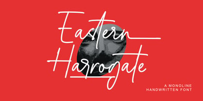 Eastern Harrogate is a beautiful handwritten font, with a monoline style. Is perfect for many different project such as logos & branding, invitation, stationery, wedding designs, social media posts, advertisements, product packaging, product designs, label, photography, watermark, special events or anything.This font is PUA encoded which means you can access all of the glyphs and swashes with ease!
 - Siriella by Nathatype,
$29.00 Siriella is a beautiful handwritten font. It brings an attractive typeface. Made for any professional projects. The font is suitable for any project like logo, t-shirt printing, wedding invitations, and greeting cards to social media quotes, branding, and more! Outstanding in a wide range of contexts. Featured : Standard Ligatures Stylistic Sets Multilingual Support PUA Encoded Numerals and Punctuation
 - Planet Chalky by Allouse Studio,
$16.00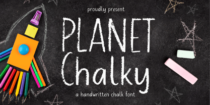 Proudly Presenting, Planet Chalky A Handwritten Chalk Font. Planet Chalky is perfect for any titles, logo, product packaging, branding project, megazine, social media, wedding, or just used to express words above the background. Planet Chalky also come with Multi-Lingual Support. Enjoy the font, feel free to comment or feedback, send me PM or email. Thank You!
