10,000 search results
(0.018 seconds)
- Erbar AT by Linotype,
$29.99 - Caeli AT by Arctype,
$18.99 A typeface that invokes the beauty, strength and liberty of nature. Plant life is honoured with curves flowing from strong stems along with subtle references to Art Nouveau letter-shapes.
 - AT Bubley by Amera Type,
$20.00 Inspired by the archive of music flyers and skateboarding magazine created in the early 90s. Bubbley is made for the purposes of making posters, magazine headers, book titles, flyers and other print media. Bubbley is made for digital needs that are more modern but still have a vintage feel Every line and curve in letterform is made for the needs of the future industry, the latest version in the modern lettering industry. Bubbley is very suitable to be combined with the illustrations that we provide for free, to complete your needs
 - Tarquin AT by Akufadhl,
$15.00 Tarquin is a All-Caps sanserif typeface, inspired by the beautiful hand-painted sign. It has a strong personality, high contrast stem, and widely opened counter to improve the readibility as it designed for display purposes. It's available in 3 different style, REGULAR, STENCIL, and SHADOW designed for display purpose design Crafted beautifully and carefully with hand.
 - AT Glanela by Amera Type,
$15.00 The new fonts from Amera Type are designed in the latest styles and with more inspiration from contemporary typographic art. Glanela was created to complement our visual needs in writing titles, music, fashion and product branding Complete with lowercase and uppercase which have alternate and ligatures to complement every need, support 75+ languages
 - Thai One On by Emboss,
$24.95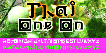
- Ego trip Fat Skew - Unknown license

- 7 days fat rotated - Unknown license

- Big Fat Ugly Cow - Unknown license

- Eat your face now - Unknown license

- Crop©Bats AOE - Unknown license

- Digital dream Fat Skew - Unknown license

- Eat your heart out - Unknown license

- 7 days fat oblique - Unknown license

- Do not eat this - Unknown license

- Digital dream Fat Narrow - Unknown license

- Fat Font Grotesk Streamline by Intellecta Design,
$21.90a stout font with the streamline art deco visual - Too Sweet To Eat by Cuda Wianki,
$20.00 Too Sweet To Eat is a hand-drawn font that has many variations because you can choose from simple outline version, only shadow version, normal version and filling version. If You put one on another then you have a great possibility to apply different colors on different layers! That makes your letters multicolor! Great stuff for decorative writings, posters, informal stationery! SPECIFICATION: alternate characters for all numbers and letters, nearly 400 kerning pairs, multi-language coverage, ornaments.
 - The Lazy Cat Writes by HIRO.std,
$14.00 The Lazy Cat Writes is Handwritten Font This font describes about funny, dynamic, informal, easy going, humanist, easy to use and will bring a good harmony when the letters are connected and paired each other. FEATURES - 3 Alternates Uppercase letters - Numbering and Punctuations - Multilingual Support - Works on PC or Mac - Simple Installation USE The Lazy Cat Writes works great in any poster, book, magazine, typeface, quotes, print, social media posts, e-book, and any projects that need semi casual and informal taste. Enjoy using! Thanks. HIRO.std
 - M Kai 2 HK by Monotype HK,
$523.99 M Kai 2 HK is a handwritten style Traditional Chinese typeface. Handwritten font designs are derived directly from hand-drawn lettering or handwriting using analogue tools. Handwritten style Traditional Chinese fonts can include typefaces that reference or reinterpret traditional calligraphy, using classical exemplars by calligraphic masters.
 - M Kai 2 PRC by Monotype HK,
$523.99 M Kai 2 PRC is a handwritten style Simplified Chinese typeface. Handwritten font designs are derived directly from hand-drawn lettering or handwriting using analogue tools. Handwritten style Simplified Chinese fonts can include typefaces that reference or reinterpret traditional calligraphy, using classical exemplars by calligraphic masters.
 - Cool Cat Jim NF by Nick's Fonts,
$10.00A handlettered headline in the January 1953 issue of Park East magazine by wacko album artist Jim Flora provided the inspiration for this exercise in extreme lettering. Check out the [brackets] and the bullet point... like, endsville, daddy-o. Due to the complexity of this typeface, the font has no math operators. The Postscript and Truetype versions contain a complete Latin language character set (Unicode 1252); in addition, the Opentype version supports Unicode 1250 (Central European) languages as well. - Kate Slab Pro Expanded by Monday Type,
$19.00 Kate Slab Pro Expanded is a sophisticated and robust modern Slab Serif Typeface that works in a variety of design scenarios. It is designed to work in big attention grabbing headlines as well as in smaller text and even body text. The recognition value of Kate Slab Pro Expanded is its biggest asset in world of uniformity. Ranging from “100 Thin” all the way to “900 Black” makes Kate Slab Pro Expanded such an amazing and versatile font family that stands out. Kate Slab Pro Expanded doesn’t only work great in lifestyle and fashion related contexts but will also look amazing for restaurants, coffee shops or and other use cases that ask for character and identity. To fill all the gaps of a designer’s needs, Kate Slab Pro Expanded comes with an italic style with every weight. Those italics are equipped with unique and real italic characters and will make you love it. Being a Slab Serif Kate Slab Pro Expanded manages to remind you of a classic Font Family with a modern and timeless approach that will make you happy for decades. Monday Type can’t wait to see the beautiful designs you are going to create with our Kate Slab Pro Expanded.
 - Funky Fat Jiggly PW by Patty Whack Fonts,
$15.00Funky Fat Jiggly PW is intended and suitable for Display use and Titles. It's not very suitable for long paragraphs of text. This font is meant for fun, fun, fun! It contains the basic characters. Uppercase, lowercase, numerals, and basic punctuation. See the character map for all of the included characters. Funky Fat Jiggly PW is available in OpenType, PostScript and TrueType format. - Eat More Fruit JNL by Jeff Levine,
$29.00 Eat More Fruit JNL is an odd name for a typeface, but then again the lettering style of the font is just as unusual. Named for a 1940s-era poster espousing "Put more pep in your step... eat more fruit", the lettering (although Art Deco in nature) also evokes images of 1960s and 1970s hippie-era concert posters.
 - Wine Vat Stencil JNL by Jeff Levine,
$29.00 An image of a vintage metal stencil for the French wine region Côteaux du Tricastin [now Grignan-Les Adhemar] served as the inspiration for Wine Vat Stencil JNL. This condensed sans serif design is available in both regular and oblique versions.
 - Fat Face No. 20 by Solotype,
$19.95This is almost a necessity if you are doing reproductions of mid-19th century posters and playbills. - Aon Cari Celtic - Unknown license

- Persona Non Grata - Unknown license

- Twelve Ton Sushi - Personal use only

- Twelve Ton Fishstick - Personal use only

- Twelve Ton Goldfish - Unknown license

- KR Firefighter Ron - Unknown license

- SP Don Mills by Remote Inc,
$39.00A font family inspired by the twists and turns of North Americas first planned community. - Hype vol 2 by Positype,
$20.00 Hype lives up to its name. An energetic attempt to blow past previous sans’ descriptive words of massive, large, extensive, super and others. Hype transcends the everyday marketing terms and rests solely atop them all with a jaw-dropping current offering of 432 fonts that spans 18 widths and 12 weights. Insert a long pause and mic drop here, because nothing compares. Hype Volume 2 includes 6 of the 18 subfamilies that comprise the full Hype Collection. Each of these subfamilies represent 1 of the 18 available widths and each width contains 12 weights and matching italics. Volume 2 contains 144 fonts. Families included in Volume 2: Hype 0200, Hype 0500, Hype 0800, Hype 1100, Hype 1400, and Hype 1700. If you would like to complete your collection be sure to view and purchase Hype vol 1 and Hype vol 3. Hype’s bombastic approach meant supplying everything it could within each typeface: including small caps, yes small caps, a full numeral set that includes inferiors and superiors, super- and subscripts, full fraction support, case-sensitive forms, stylistic alternate letterforms, and more while touting a full Western, Central and South Eastern European character support. Embracing a Univers-esque bravado and a willingness to push the envelope, Hype leaves even more room to grow. No corners were cut, no shortcuts taken with a focus on sensible, efficient letter construction and functional reliability that ignores any one classification and instead looks to form an amalgam of classic sans styles influenced by wood type, movie showcards, and urban industrial letterforms.
 - Architype Van Doesburg by The Foundry,
$99.00 Architype Konstrukt is a collection of avant-garde typefaces deriving mainly from the work of artists/designers of the inter-war years, whose ideals have helped to shape the design philosophies of the modernist movement in Europe. Due to their experimental nature character sets may be limited. Architype Van Doesburg derives from the 1919 experimental geometric alphabet by Theo van Doesburg, whose work was heavily influenced by De Stijl theories, specifically rectangularity. The typeface has been constructed on the same 5 x 5 grid, and is limited by his ‘single alphabet’ theory.
 - Hype vol 3 by Positype,
$20.00 Hype lives up to its name. An energetic attempt to blow past previous sans’ descriptive words of massive, large, extensive, super and others. Hype transcends the everyday marketing terms and rests solely atop them all with a jaw-dropping current offering of 432 fonts that spans 18 widths and 12 weights. Insert a long pause and mic drop here, because nothing compares. Hype Volume 3 includes 6 of the 18 subfamilies that comprise the full Hype Collection. Each of these subfamilies represent 1 of the 18 available widths and each width contains 12 weights and matching italics. Volume 3 contains 144 fonts. Families included in Volume 3: Hype 0300, Hype 0600, Hype 0900, Hype 1200, Hype 1500, and Hype 1800. If you would like to complete your collection be sure to view and purchase Hype vol 1 and Hype vol 2. Hype’s bombastic approach meant supplying everything it could within each typeface: including small caps, yes small caps, a full numeral set that includes inferiors and superiors, super- and subscripts, full fraction support, case-sensitive forms, stylistic alternate letterforms, and more while touting a full Western, Central and South Eastern European character support. Embracing a Univers-esque bravado and a willingness to push the envelope, Hype leaves even more room to grow. No corners were cut, no shortcuts taken with a focus on sensible, efficient letter construction and functional reliability that ignores any one classification and instead looks to form an amalgam of classic sans styles influenced by wood type, movie showcards, and urban industrial letterforms.
 - Van Wyck JNL by Jeff Levine,
$29.00Van Wyck JNL was inspired by some old printing found in a catalog. - Kappa Vol. 2 by W Type Foundry,
$25.00 Kappa Vol.2 is the serif version of our popular Kappa. Just as Kappa sans, this font has a slight narrowed structure and a prominent ascender height, therefore this font is suitable for a large range of platforms. Moreover, due to its serif Kappa Vol.2’s level of legibility is more accurate, so when you use it alongside Kappa sans the results will be extremely effective. Designed with powerful OpenType features in mind. Each weight includes alternate characters, ligatures, fractions, special numbers, arrows, extended language support, small caps and many more… Perfectly suited for graphic design and any display / text use. The 36 fonts are part of the larger Kappa super family. Learn about upcoming releases, work in progress and get to know us better! On Instagram W Foundry On facebook W Foundry wtypefoundry.com
 - Bon Mot NF by Nick's Fonts,
$10.00What’s the good word? This elegant, stylish typeface, based on an early twentieth-century Barnhart Brothers & Spindler release, named simply "Engravers Upright Script". Based on French ronde letterforms, this version is bolder—which makes it suitable for text settings, even at smaller sizes—and has more pronounced stroke contrast—which makes it suitable for headlines. Versatile, handsome and charming, this typeface is an invaluable addition to any type repertoire. Both versions of the font contain the complete Unicode 1252 (Latin) and Unicode 1250 (Central European) character sets, with localization for Romanian and Moldovan.


