8,842 search results
(0.014 seconds)
- LTC Ornamental Initials by Lanston Type Co.,
$24.95 Little is known of the origin of these decorative Initial Caps. Series 448 at 24 point were a different design from the 36 point on which this digital version is based. In addition to the basic 26 characters, there is a negative version contained in the lower case position and a fill character (for two color caps) option in the number and punctuation key positions.
 - LTC Circled Caps by Lanston Type Co.,
$24.95 This handy font allows designers of commercial products to add basic circled letters that are uniform in appearance. For example, on music CDs, the Copyright and Publish (AKA Phonogram) symbols often do not match. While most fonts include a circled 'c' for Copyright, they seldom contain a circle 'p' for Publish (note that all P22 fonts include the circle 'p' and 'c'). The circle 'U' and 'K' for Kosher foods are rarely included in fonts and have to be made as needed. This single font contains both a serif and sans serif style caps A-Z as well as figures assigned to regular keys and also mapped to standard Unicode for "Enclosed Alphanumerics".
 - LTC Holly Leaves by Lanston Type Co.,
$24.95 LTC Holly Leaves consists of three ornament fonts. Holly Leaves A is a solid color set of holly leaves borders. LTC Holly Leaves B is the same ornaments but with just the leaves and LTC Holly Leaves C is just the berries. B & C can be overlayed for a two color effect.
 - LTC Fleurons Rogers by Lanston Type Co.,
$24.95 - LTC Goudy Oldstyle by Lanston Type Co.,
$39.95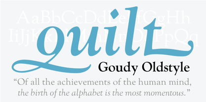
- LTC Goudy Sans by Lanston Type Co.,
$24.95 Goudy Sans Bold was originally designed by Fredric Goudy in 1922 as a less formal "gothic" and finished in 1929. The light was designed in 1930 and the Light Italic in 1931. Alternate letterforms are included in these three Goudy designs which are digitized true to their original design. In 2006, designer Colin Kahn drew "LTC Goudy Sans Regular" which is a medium weight version intended for text purposes. Kahn has also designed an experimental "LTC Goudy Sans Hairline" which has a skeletal almost mono-width stroke and results in a surprisingly elegant display face.
 - LTC Twentieth Century by Lanston Type Co.,
$49.95 Twentieth Century was Lanston Monotypes answer to Futura. In fact Saul Hess's redrawing of Futura is so close that this new digital revival includes alternates of the long lost original letterforms originally designed by Paul Renner for Futura, but were left out of the released version that has become so popular. 20th Century is a modern sans serif with apparent geometry yet still a certain warmth in its design. The OpenType version of LTC Twentieth Century incorporates the alternate Renner glyphs with two sets of alternate lowercase characters. The font also includes oldstyle numerals and a full Western and Central European character set.
 - LTC Forum Title by Lanston Type Co.,
$24.95 Forum Title was originally designed by Frederic Goudy in 1911. It was intended to be the heading font used for a book set in Kennerley. Based on inscriptional Roman stone cut capitals, this face is true to the early Roman forms which did not have a lower case. Forum exemplifies the classic Roman letterform at its finest. If a lower case were desired, Forum Title can be paired with Goudy Oldstyle for a harmonious hybrid font.
 - LTC Swing Bold by Lanston Type Co.,
$24.95
- LTC Record Title by Lanston Type Co.,
$24.95 Record Title was designed by Frederic Goudy in 1927 as a proprietary commission for the Architectural Record magazine. Based on classic Roman letter proportions, Goudy considered this one of his most successful commissions ever. It is an all caps titling face originally digitized by Jim Rimmer for Lanston in 2001. It was remastered in early 2007.
 - LTC Law Italic by Lanston Type Co.,
$24.95 Law Italic was designed as an imitation of a formal style of penmanship used in legal documents. It has a more pronounced angle than standard italics. It is intended to be used by itself but can be combined with other faces to suit a designer's inclination. Historically, this face was once used by Bruce Rogers strictly for headings.
 - LTC Fleurons Granjon by Lanston Type Co.,
$24.95
- LTC Pabst Oldstyle by Lanston Type Co.,
$24.95 Frederic W. Goudy originally designed Pabst in 1902. This lettering was used by the Pabst Brewing Company for their promotional materials. It was later developed into type for ATF. Goudy later licensed Pabst Oldstyle to the Lanston Type Library. Lanston Pabst Oldstyle features several differences from the more familiar ATF version. Some caps are narrower while some lower case characters are wider than the ATF version. The descenders are also shorter in the Lanston version. Logotypes of italic words and, of, and the are included as originally designed as well as ligatures including the unusual tt ligature.
 - LTC Goudy Initials by Lanston Type Co.,
$24.95LTC Goudy Initials has been a best-seller since it was reformatted to font format by P22 in 2005. We decided that while it works very well at medium sizes, when it was used extra large, the outlines were not as true to Frederic Goudy’s 1917 drawings as they could be. We decided to redraw from the ground up—and here we have the NEW LTC Goudy Initials! Meticulously redrawn by Miranda Roth, these ornaments referenced original proofs of large sizes of Cloister Initials. In our quest for artwork for this project, we even arranged a quickly sold out recasting of the 120 point size and have produced a limited edition letterpress print from this casting This new digital version features two additional layers to allow for quick colorizing of the central letter and/or the floriated background. Registered users of the previous version of LTC Goudy Initials may upgrade to the set at a discount. - LTC Remington Typewriter by Lanston Type Co.,
$39.95 Remington Typewriter, whose original designer is unknown, was one of the earliest Lanston Monotype designs. The italic was designed by Frederic Goudy in 1927. His approach was to make an unconventional typewriter form that looked well-spaced even though all letters shared the same width.
 - LTC Fleurons Garamont by Lanston Type Co.,
$24.95
- LTC Holiday Ornaments by Lanston Type Co.,
$24.95 Assembled for those less commercialized holidays, LTC Holiday Ornaments features over 80 printers' ornaments from Lanston Monotype and other historical foundries such as BBS and ATF. Holidays include Easter, Valentine's Day, St. Patrick's Day, April Fool's Day, Thanksgiving and 4th of July. There¹s even a pirate to represent international "Talk Like a Pirate" day. LTC Holiday Ornaments joins the Lanston Collection alongside the popular LTC Halloween and Christmas Ornaments. LTC Holiday Ornaments contains additional Halloween and Christmas ornaments as well.
 - LTC Goudy Thirty by Lanston Type Co.,
$24.95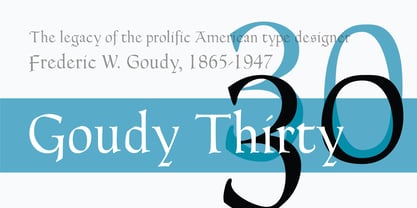
- LTC Ornaments Three by Lanston Type Co.,
$24.95 LTC Ornaments Three combines ornaments previously released as "Printers Vine Leaves C", "Printers Fleurons C" and "Water Garden Ornaments Round" plus additional Lanston ornaments for a total of over 70 printers ornaments for single accentuation or combined for border creation.
 - ITC Franklin Gothic LT by ITC,
$43.99 Franklin Gothic was designed between 1903 and 1912 by Morris Fuller Benton for the American Type Founders Company. The font serves as the American Grotesk prototype. It was named after Benjamin Franklin. Even today, Franklin Gothic remains one of the most widely used sans serif typefaces. The robust character of the font gives text a modern feel. It is widely used in newspapers and advertising and is frequently seen in posters, placards and other material where space is restricted. Featured in: Best Fonts for Tattoos
 - Red Border Labels JNL by Jeff Levine,
$29.00 In the pre-computer, pre self-adhesive label era of office supplies a number of companies (including Dennison, Maco and Denny-Reyburn) manufactured a wide variety of gummed labels for just about any use or purpose. Blank labels, specialty labels and decorative holiday seals were just a part of this line. One popular style was that of labels with parallel thick-and-thin borders of red lines and corners chamfered, rounded or straight cut. Occasionally, one could find similar labels with blue, green or gold borders but red was the mainstay, hence naming this typeface Red Border Labels JNL. Presented in this font is a collection of twenty-six standard and specialty shape label borders on the capital (A-Z keys) and twenty-six solid panel versions on the lower case (a-z) keys which can be used as backfills for the borders or as stand-alone labels.
 - H74 Black Label Whiskey by Hydro74,
$25.00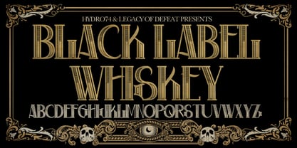
- Ful • Fruitful & Universal Labels by S P I C I O,
$88.88 What is ful? ful is a useful and universal language of symbols for food products. Why use ful? ful is a simple visual system. With ful, you’ll never have to read the entire label to know the basic information. With ful, you have access to the basic information much faster. Answering the questions: • What kind of diet is it? [Diet] • How to store, prepare, and use? [Use] • Can I eat it? [Warnings] Why create ful? • To have the basic information quickly, anywhere in the world. • To create a more homogeneous design. • To solve some of the basic problems with the old designs. • To accelerate the process of consumer choice. • To provide as much information as possible in the least possible space. http://ful.graphics/
 - Kate Slab Pro Ultra Expanded by Monday Type,
$19.00 Kate Slab Pro Ultra Expanded is a sophisticated and robust modern Slab Serif Typeface that works in a variety of design scenarios. It is designed to work in big attention grabbing headlines as well as in smaller text and even body text. The recognition value of Kate Slab Pro Ultra Expanded is its biggest asset in world of uniformity. Ranging from “100 Thin” all the way to “900 Black” makes Kate Slab Pro Ultra Expanded such an amazing and versatile font family that stands out. Kate Slab Pro Ultra Expanded doesn’t only work great in lifestyle and fashion related contexts but will also look amazing for restaurants, coffee shops or and other use cases that ask for character and identity. To fill all the gaps of a designer’s needs, Kate Slab Pro Ultra Expanded comes with an italic style with every weight. Those italics are equipped with unique and real italic characters and will make you love it. Being a Slab Serif Kate Slab Pro Ultra Expanded manages to remind you of a classic Font Family with a modern and timeless approach that will make you happy for decades. Monday Type can’t wait to see the beautiful designs you are going to create with our Kate Slab Pro Ultra Expanded.
 - LTC Village No 2 by Lanston Type Co.,
$39.95
- LTC Fournier Le Jeune by Lanston Type Co.,
$24.95 Based on the all caps decorative face Fournier le Jeune of 1768 by Pierre Simon Fournier for the Peignot Foundry. This version uses more elaborate "Vouge Initials" caps which were offered by ATF in 1920s. Because of the decorative nature of this design, a full character set is not included, but accented characters and basic punctuation are included.
 - LTC Water Garden Ornaments by Lanston Type Co.,
$24.95
- LTC Italian Old Style by Lanston Type Co.,
$39.95LTC Italian Old Style is not to be confused with the English Monotype font also called Italian Old Style, which is an earlier design from 1911 based on William Morris’s Golden Type that is based on Nicholas Jenson’s Roman face. Goudy went back to Jenson’s original Roman and other Renaissance Roman faces for his inspiration and the result is what many consider to be the best Renaissance face adapted for modern use. Bruce Rogers was one of the biggest admirers of Italian Old Style and designed the original specimen book for Italian Old Style in 1924 using his trademark ornament arrangement. These ornaments are now contained in the pro versions of the Roman styles—Regular Pro and Light Pro. With most digitizations of old metal typefaces, one source size is often used as reference (as was Goudy’s method for his own cuttings of his Village foundry types) so that all sizes refer to one set of original artwork. The original hot metal fonts made by Lanston Monotype (from Goudy’s drawings) and other manufacturers used two or three masters for different size ranges to have optimal relative weights—smaller type sizes would need proportionally thicker lines to not appear thin and larger sizes would require thinner lines to not appear to bulky. The variations in size ranges can also be affected by the size of the cutter head in making the master patterns. The light weights of LTC Italian Old Style were digitized from larger display sizes (14, 18, 24, 30, 36 pt) and the regular weights were digitized from smaller composition sizes (8,10,12 pt). The fitting for the regular weights is noticeably looser to allow for better setting at small sizes. Very few font revivals take this approach. Italian Old Style, originally designed by Frederic Goudy in 1924, was digitized by Paul Hunt in 2007. In 2013, it has been updated by James Grieshaber and is now offered as a Pro font. The newly expanded Pro font includes all of the original ligatures, plus small caps and expanded language coverage in all 4 Pro styles. - VTC-SumiSlasherOne - Personal use only

- Vtc-NueTattooScript - Personal use only

- VTC-KomikaHeadLinerChewdUp - Personal use only

- VTC-RoughedUp - Personal use only

- VTC-TribalThreeFree - Personal use only

- VTC Embrace - Unknown license

- VTC ScreamItLoudSliced - Unknown license

- VTC Tribal - 100% free

- VTC NightOfTheDrippyDeadOuttie - Unknown license

- VTC SubwaySlamSC - Unknown license

- VTC-FreehandTattooOne - Personal use only

- VTC CoppaKroma - Unknown license


