9,572 search results
(0.01 seconds)
- Barila by Irina Vascovet,
$16.00
- Urban Pollution by Gassstype,
$23.00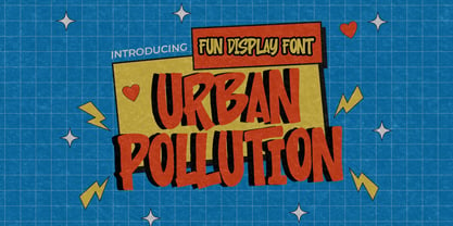
- Heellaaz by Almarkha Type,
$23.00
- The Wildeast by Trustha,
$12.00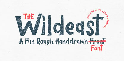
- Whitbury by Rachel White Art,
$16.00
- Herbal Medicine by Wildan Type,
$12.00
- Janda Fabulous by Kimberly Geswein,
$5.00
- LDJ Ho Ho Snow by Illustration Ink,
$3.00 - LD Fundamental by Illustration Ink,
$3.00 - Massi by Komet & Flicker,
$10.00
- Kong Lupasem by Maulana Creative,
$15.00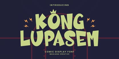
- Corsa Grotesk by Typedepot,
$39.00
- Senkron by Gurup Stüdyo,
$19.00
- Graphit by HVD Fonts,
$40.00
- Rogers2 - Unknown license

- HeavyWood - Unknown license

- Ongunkan Liljegren Runic by Runic World Tamgacı,
$50.00
- Sheet Music JNL by Jeff Levine,
$29.00
- Letterpress Retro JNL by Jeff Levine,
$29.00
- Window Treatment JNL by Jeff Levine,
$29.00
- Final Edition JNL by Jeff Levine,
$29.00
- Cat Paw by Beary,
$14.00
- MTF Jumpin Jack EXT by Miss Tiina Fonts,
$10.00
- Futurino by Larin Type Co,
$10.00
- Gordito by AdultHumanMale,
$10.00
- Sforza by Ampersand Type Foundry,
$65.00
- DB Smartypants by Illustration Ink,
$3.00 - Ka Boink by BA Graphics,
$45.00 - Xantigo by PizzaDude.dk,
$20.00 - Calafragalistic by BA Graphics,
$45.00 - Hatari by BA Graphics,
$45.00 - tobminx - Personal use only

- Adigiana 2 - Unknown license

- Sabandija ffp - Personal use only

- Spork - 100% free

- Walk Da Walk Two - Personal use only

- Hello Pirates - Personal Use - Personal use only

- Toontime - Unknown license

- Killer boots - Unknown license

- Yellow Magician - Unknown license


