9,572 search results
(0.017 seconds)
- Emoticons - Personal use only

- Gimmicky - Unknown license

- F*ck Beans - 100% free

- bubble - Unknown license

- Action Is, Shaded JL - Unknown license

- NoRefunds - Unknown license

- Bionic Comic Italic - Unknown license

- Bunnigrrrls handwriting YOFF - Personal use only

- EvilGenius BB - Personal use only

- Monster boxes - Personal use only

- Deportees - Unknown license

- !the troubles - Unknown license

- Frompac 1889 Arabesque by Intellecta Design,
$29.90 The font here used is the Intellecta's Frompac joined and art worked with the classical arabesques published in the Ludwig Petzendorfer's Schriften-Atlas. Eine Sammlung der wichtigsten Schreib- und Druckschriften aus alter und neuer Zeit nebst Initialen, Monogrammen, Mappen, Landeskarten und heraldischen Motiven f¸r die praktischen Zwecke des Kunstgewerbes, 1889.
 - Hoyts German Cologne by Coffee Bin Fonts,
$20.00This font was inspired by lettering found on old tradecards from the 19th century. - Devin by Linotype,
$29.99Devin is designed mainly for the benefit of the advertising industry, and it surely is a nice typeface for headings, isn't it? And you should see what a nice body type it makes! I had no other typeface in mind when working with it, but I can now find several typefaces it is related to. It reminds of the egyptienne group, but I did't really plan that. The name Devin is taken from my birth region. There is a castle with that name on the northern Adriatic coast (known even from Rilke's Duino elegies - Duino is another name of the same castle). A castle ruin called Devin, too, can be found on a height above the Danube in Slovakia, not far away from its capital Bratislava. Devin was released in 1994. - Juvenis by Storm Type Foundry,
$32.00Designs of characters that are almost forty years old can be already restored like a historical alphabet – by transferring them exactly into the computer with all their details. But, of course, it would not be Josef Tyfa, if he did not redesign the entire alphabet, and to such an extent that all that has remained from the original was practically the name. Tyfa published a sans-serif alphabet under the title Juvenis already in the second half of the past century. The type face had a large x-height of lower-case letters, a rather economizing design and one-sided serifs which were very daring for their time. In 1979 Tyfa returned to the idea of Juvenis, modified the letter “g” into a one-storey form, narrowed the design of the characters even further and added a bold and an inclined variant. This type face also shows the influence of Jaroslav Benda, evident in the open forms of the crotches of the diagonal strokes. Towards the end of 2001 the author presented a pile of tracing paper with dozens of variants of letter forms, but mainly with a new, more contemporary approach: the design is more open, the details softer, the figures and non-alphabetical characters in the entire set are more integral. The original intention to create a type face for printing children’s books thus became even more emphasized. Nevertheless, Juvenis with its new proportions far exceeds its original purpose. In the summer of 2002 we inserted all of this “into the machine” and designed new italics. The final computer form was completed in November 2002. All the twelve designs are divided into six variants of differing boldness with the corresponding italics. The darkness of the individual sizes does not increase linearly, but follows a curve which rises more steeply towards the boldest extreme. The human eye, on the contrary, perceives the darkening as a more fluent process, and the neighbouring designs are better graded. The x-height of lower-case letters is extraordinarily large, so that the printed type face in the size of nine points is perceived rather as “ten points” and at the same time the line spacing is not too dense. A further ingenious optical trick of Josef Tyfa is the figures, which are designed as moderately non-aligning ones. Thus an imaginary third horizontal is created in the proportional scheme of the entire type face family, which supports legibility and suitably supplements the original intention to create a children’s type face with elements of playfulness. The same applies to the overall soft expression of the alphabet. The serifs are varied; their balancing, however, is well-considered: the ascender of the lower-case “d” has no serif and the letter appears poor, while, for example, the letter “y”, or “x”, looks complicated. The only serif to be found in upper-case letters is in “J”, where it is used exclusively for the purpose of balancing the rounded descender. These anomalies, however, fit perfectly into the structure of any smoothly running text and shift Juvenis towards an original, contemporary expression. Tyfa also offers three alternative lower-case letters *. In the case of the letter “g” the designer follows the one-storey form he had contemplated in the eighties, while in “k” he returns to the Benda inspiration and in “u” adds a lower serif as a reminder of the calligraphic principle. It is above all the italics that are faithful to the tradition of handwritten lettering. The fairly complicated “k” is probably the strongest characteristic feature of Juvenis; all the diagonals in “z”, “v”, “w”, “y” are slightly flamboyant, and this also applies to the upper-case letters A, V, W, Y. Juvenis blends excellently with drawn illustrations, for it itself is modelled in a very creative way. Due to its unmistakable optical effect, however, it will find application not only in children’s literature, but also in orientation systems, on posters, in magazines and long short-stories. - MC Aloritsa Meligos by Maulana Creative,
$16.00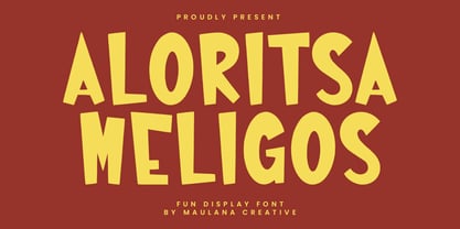 Aloritsa Meligos fun display font. Heavy stroke, fun character with a bit of ligatures. To give you an extra creative work. Aloritsa Meligos fun display font support multilingual more than 100+ language. This font is good for logo design, Social media, Movie Titles, Books Titles, a short text even a long text letter and good for your secondary text font with script or serif. Make a stunning work with Aloritsa Meligos fun display font. Cheers, Maulana Creative
 - Boller by Elemeno,
$10.00Boller is based on handwriting found on the blueprints for the Jayhawk Theater in Kansas. Thomas Williams & Boller Bros. Architects are the only names found on the blueprints. The character set is extremely limited and many of the missing characters are extrapolated from existing letters and symbols. Ideal and distinctive at large sizes. - Gold Standard by FontMesa,
$30.00 Gold Standard got its start from a few letters found on an old Gold Certificate from 1882. From those few letters spelling out the word GOLD, the rest of the alphabet was designed to match. The lowercase design was based on lettering found on an old silver certificate from approximately the same year.
 - Astro Bats by Greater Albion Typefounders,
$5.00 AstroBats is a fun set of ornaments with a 'Retro Sci-Fi' theme. Think of those 1950s Japanese tinplate robots, think ray guns, think spaceships! Have fun!
 - Amio by Eko Bimantara,
$14.00 Amio is fun geometrical connected script font family. Consist of 6 styles from light to extrabold. Perfect for branding and suitable for a variety of fun projects.
 - Bolha by Oporto Design,
$19.90 Bolha is a fun geometrical font which comes in two variants: Filled and Outline. Combine them or use them alone, just remember to have fun with it.
 - Beat Word by D&K Project,
$15.00 Beat Word a very fun font to use, mixed with alternates and ligatures, and will make your work really fun. This font is really the vintage cartoon style you need combine with ligature and alternate feature the way you want, because it is a very powerful font with a fun alternates and ligatures.
 - Elfort by Intellecta Design,
$22.90A lovely script face remastered from found drawings, great for antique, vintage and romantic designs. - Key Largo JNL by Jeff Levine,
$29.00Key Largo JNL is a serif treatment of the lettering found in Gummed Letters JNL. - Letterhead by Coffee Bin Fonts,
$20.00This font family was inspired by lettering found on old letterheads from the 19th century. - Night Train by FontMesa,
$19.95 Night Train is a new font built from the ground up; while Night Train may resemble an old classic wood type there are a few lines that make this font a little more modern setting it apart from other wood type revivals. If you're a railroad enthusiast you're sure to enjoy the steam locomotive graphic located on the less than and greater than keys on all versions of this font, due to the fine detail of this train illustration the best printing results will be at 600dpi or higher on a laser printer. An alternate K and R are within the Night Train fonts, for Win Type1 these alternates are on the left and right bracket keys, for Truetype and OpenType you may access the alternates by using the Character Map in Windows or Adobe Illustrator, for OpenType you may also find them on the stylistic alternates page of the glyph map in Illustrator. There's something new with Night Train that the sign making people will love, for the first time FontMesa is pleased to offer a block shadowed version in four directions. One fill font is all that is needed for all four open faced fonts, you'll need an application that works in layers in order to use the fill font with the open faced fonts, simply place the fill font in its own layer then move it behind one of the open faced fonts of Night Train. The Night Train name has been on my list to use as a font name for a few years, a friend from years ago used to sail his boat in the Mackinac race from Chicago to Mackinac Island, the name of that boat was the Night Train. Watching the 2010 Olympic four man U.S. bobsled team win gold with their sled also called Night Train has inspired me to complete this font.
 - Molly Hugs by Yumna Type,
$15.00 Finding out an attractive font regarding your project design can be such hard work as you take risks of either losing your clients or killing your good reputations once you pick the wrong font. However, Molly Hugs is the right solution for you. It is a rounded display font to add warm, fun character touches on every design. Its shapes and geometry are simple and without too many detailed points for a legibility reason. Additionally, Molly Hugs, completed with a clipart as a bonus, is perfectly applied for big text sizes to be legible and you can make use of some available features here. Features: Multilingual Supports PUA Encoded Numerals and Punctuations Molly Hugs fits best for various design projects, such as brandings, posters, banners, headings, magazine covers, quotes, printed products, merchandise, social media, etc. Find out more ways to use this font by taking a look at the font preview. Thanks for purchasing our fonts. Hopefully, you have a great time using our font. Feel free to contact us anytime for further information or when you have trouble with the font. Thanks a lot and happy designing.
 - Little Pea by Creativemedialab,
$14.00 Little Pea is a cute and fun handwritten font, comes with four family weights: light, regular, medium and bold. the idea in making this font is the wishful thinking of childhood memory, where everything looks so cheerful, colorful and fun. Little Pea font will make your design look modern but still fun. Easy to read and perfect for any design that need a colorful and fun concept like children comic or picture books, greeting cards, toys, posters, song lyrics, website, and much more.
 - SassyFrass ROB by TypeSETit,
$24.95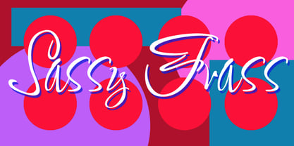 Fun, handlettered script.
 - Naskle by Creativemedialab,
$18.00 Naskle featuring unique shape letters, this fun groovy and retro psychedelic font is ideal for any fun theme design concept, Illustration posters, kids clothing, stickers, title, logo and more
 - The Youth’s Companion by Coffee Bin Fonts,
$20.00This font was inspired by lettering found on an old newsprint periodical from the 19th century. - Menca by Kvant,
$59.00 Menca takes cues from the lettering of engineering, found on road signage and industrial metal plaques.
 - Soap Box by Coffee Bin Fonts,
$20.00This font was inspired by lettering found on an old soap box from the 19th century. - Prospector JNL by Jeff Levine,
$29.00 Prospector JNL is based on a lettering example found in an old Speedball-pen lettering handbook.
 - Poniard by Hackberry Font Foundry,
$24.95 Cutlass was just for fun. Poniard is the working version. Sleek, slender, sharp, to the point! A bit of decorative fun. This is the first font used in teaching Fontographer in my new Practical Font Design Book. I thought I better release it for those who enjoyed the journey. It's just an 8-bit font for fun. Enjoy!
 - Puppies Play by TypeSETit,
$24.95 Puppies Play is a fun, bouncy script with connectors that give a playful flow. Perfect for baby shower invitations, nursery rhymes, and other items that require a fun, children's look.
 - Picaflor Handmade by RodrigoTypo,
$29.00 Picaflor Handmade is a fun handmade version with 8 styles and weights, it contains Light Regular and Bold and its 3D versions plus dingbats, perfect for fun or informal titles!
 - On The Ground by Fascination Workshop,
$10.00 On the Ground is a picture font made from drawings of found objects. These object were found on the ground while walking around different cities in the United States. The font uses varying drawing styles (from detailed to pictographic) but they all have a similar irregularity, unifying the characters. Perfect for animations, signs, greeting cards, posters, etc.
 - Boscho by Flawlessandco,
$9.00 Boscho - Modern Boho Retro Font introducing our new "Boscho" Modern Retro with Fun and Elegant Style is perfect for branding, logos, invitation, master heads, and more. Features : Multilingual Uppercase alphabet A-Z Lowercase alphabet a-z Alternate Character Numbers 0-9 Some punctuation NOTE: For all the characters are also available, accessible in the Adobe Illustrator Glyphs Panel, or in Adobe Photoshop Character Open Type Panel. If you need help, just write me! Thanks so much for checking out my shop ! HOW TO USE FONT : (connected letters, swirls, heart, swashes, diamond) for the first, install font file and open fontbook/character map, find the font and you can copy and paste the heart letters from fontbook/character map to your text. Thanks, Flawless and co.


