10,000 search results
(0.038 seconds)
- Poruka by Tour De Force,
$30.00 Poruka is slanted script typeface with connected letters with gently condensed look. Letters are designed as monoline forms with decent dose of elegancy and stylistic uniformity. Poruka is imagined mainly as typeface for shorter texts or headlines, where text needs to stand out from other elements of content. It can be used successfully both as webfont and on printed materials – all kinds of invitations, labels, packages, posters and editorial use. Poruka comes with two Stylistic Sets – 01 which activates uppercase letters with full font height (from the top of ascender to the bottom of descender) and 02 – which activates handwritten forms on "b", "d", "h" and "l" letters. Also, Poruka is equipped with Swashes and Discretionary Ligatures which doesn't really represent classical pack of expected ligatures, but more as graphical version of a couple of words like "yes", "no", "wait", "ciao" and a few more.
 - Knoedel by PabType,
$12.00 Knoedel is a display typeface with three front-weights: light, regular and bold. Although a conjunction of different styles were a reference during the design process; the art deco style left a more noticeable influence in the final design. Knoedel, also has clear references to geometric and slab serif fonts. The design is intended to be applied on headlines or short text fragments. Knoedel offers full coverage for all languages using Latin alphabet: whole Europe, America, Oceania and on a big number of African and Asian countries. Besides the standard ligatures, Knoedel, additionally, has more than 200 discretionary ligatures and a generous number of borders and ornaments. Knödel (Knoedel) is a traditional dish from Austria and the southeast of Germany; made of dumplings of different ingredients usually boiled in salted water. It is not high-end cuisine but still, it accomplishes its aim of soothing hunger.
 - Steam by Type Forward,
$- Steam combines the spirit of the old-fashioned wood type with modern flavours. Its distinctive reversed high contrast and extremely bold serifs make it impossible to stay unnoticed. It’s a fun and bold unconventional typeface that we’ve designed with great passion and curiosity! The type family consists of 13 weights that are divided into several packs. Each font in the pack can be layered on top of each other to make a funkier look. Steam is multilingual! It speaks more than 130 languages and supports extended Latin, Cyrillic, punctuation, default and small numbers, symbols and signs. It is also familiar with the OpenType features like standard and discretionary ligatures, stylistic sets, localized forms, small numbers and fractions and more. Steam looks best on logos, posters, headlines, and T-shirts and is perfect anytime you need some bold letters with specific flavour and touch. Have fun creating!
 - Drab by Pesotsky Victor,
$12.00 Drab is a neutral grotesque, but with decorative elements. Suitable for texts and titles. When you do not need a strong accidental but a boring set, Drab is also not suitable. Drab supportsBasic Latin, Cyrillic and more than 100 languages all together. The font was designed by Viktor Pesotsky.
 - Skintones by Fikryal,
$22.00 Skintones is a unique handwritten display font that captures beauty and diversity. With its elegant yet playful style, this font is perfect for a variety of projects, including branding, packaging, social media graphics, and more. Skintones features a full set of uppercase letters, as well as numbers, punctuation, and multilingual support for a wide range of languages. Each character is meticulously crafted to evoke the fluidity and natural flow of handwriting while maintaining a clean and polished appearance. What sets Skintones apart is its ability to convey a sense of warmth and humanity that is often missing from more sterile or impersonal fonts. Whether you’re designing a logo or creating a poster, Skintones will help you connect with your audience on a deeper, more professional level. So if you’re looking for a font that celebrates diversity and individuality, look no further than skintones. With its rich, vibrant character and unique style, it’s sure to make a lasting impression on anyone who sees it. Features : Skintones Multilingual Support If you have any questions please don’t hesitate to contact me follow my Instagram: fkryall Thank you
 - Hollyhock by Angie Makes,
$32.00 Meet Hollyhock, a modern and messy calligraphy font with wild, tall letterforms that refuse to be tamed. Inspired by calligraphy the breaks the rules and hollyhocks that grow rebelliously where they please. This font includes two full sets of capital letters… a set that is tall, energetic, and wild as well as a set a bit more tame and subdued. Open type features in this font include contextual alternates, fractions, ordinals, discretionary ligatures, and swashes. Use contextual alternates to add subtle swashes to the beginnings and ends of your letters. Use your open type swashes panel to use the many and various doodles, swirls, and swashes to manually add flare and flavor to your text. Or, install the separate Hollyhock Ornaments font to access the swashes and doodles more easily. Most Diacritics included for various language support. Message me if there’s one you're not sure is included. This font works best in OpenType aware software (ie. Adobe Applications) so that you can take advantage of its many features. Comes as two .otf (OpenType font) files. See this tutorial for more on how to add the various swashes and doodles to this font! http://angiemakes.com/add-swashes-fonts-photoshop/
 - Linotype Typo American by Linotype,
$29.99Mark Stanczyk designed Linotype Typo American in 1999. The font is an excellent revival of American style typewriter type. As most of us can remember from our childhood years, or through old stories and movies, everyone used to type with typewriters before the invention of computers. Unlike computers, most individual typewriters only had one typestyle, or font, to chose from. To make matters worse, the letters in a typewriter font would wear down with use. Over time, text typed out on a typewriter would look more and more corroded, old, and uneven. Stanczyk has captured exactly these features in this “revival” font! Also like most older typewriter styles, Linotype Typo American’s letters are all mono-spaced, i.e., the letter i is the same width as the letter w. Typewriter letters also all tended to be cast in the same size, around 12 points or so. When using typewriter-style fonts, it is best to keep setting your text in similar sizes. (Of course, you can set really large and fun headlines with Linotype Typo American, too; if anything the unevenness of the design will come even more across in these applications.) - Polias by Esintype,
$23.00 Polias is an all-caps uniwidth typeface inspired by an ancient inscription carved on a monoblock stone in hybrid characters — between no-contrast linear sans to low-contrast flared serif. The inspiring inscription is the dedication by Alexander the Great, discovered in the Temple of Athena Polias in the ancient Ionian city of Priene. Stanley Morison mentioned this inscription in one of his lectures: “The distinctive feature of this inscription consists of a consistent thickening towards the ends of perpendiculars and horizontals.” … “We have not the right to say that the serif was invented for Alexander the Great's inscription, only that this is its first datable appearance.” The letter proportions are almost identical to the original, but the stroke features have been reinterpreted and characterized. Serif-like nodes at the end of the strokes are subtle extensions that serve to accentuate rather than break its monoline elegance. With an analogy, they are not flowers, but like blooming buds. Polias is a flared sans typeface which is closer to sans-serif forms on the spectrum between sans and serif. It’s especially light looking by design to convey rather thin and white typographic color of its original monumental look. It comes in eight weights and a variable font, scaled from Thin to Bold. It is multiplexed, so the weights do not affect text lengths. Light weights are closely based on the actual carving of the inscription. Thicker weights can be used on smaller typesettings to compensate for the weight difference of larger letters’ strokes, and to keeping the monoline appearance of the entire text block intact. This method can be used for any purpose, such as setting a hierarchy between the lines or to justify their lengths. Some of the original letterforms have been preserved and stylistic alternatives such as Ionic four-bar Sigma, dotted Theta, palm Y are provided as open type feature. Some of the other ancient forms, such as the three-bar Sigma (S), the pointed U, were also added for both the Greek and Latin scripts. Polias is preferable for big type settings such as logos and headlines as a modern representation of perennial classical forms. Its a fine fit for product branding, movie posters, book covers, packaging materials, and more, which require an epic look to attracting attention with a distinctive elegance. Polias can be considered for distinctiveness wherever Roman Capitals work. As a noun, Polias is one of the epithets of Athena / Minerva, and in this case referring to her role as the protector of the city of Priene. Polias is one of the seven typeface designs in Esintype's ancient scripts of Anatolia project, Tituli Anatolian series.
 - Polias Varia by Esintype,
$140.00 Polias Varia is an all-caps uniwidth variable weight typeface inspired by an ancient inscription carved on a monoblock stone in hybrid characters — between no-contrast linear sans to low-contrast flared serif. The inspiring inscription is the dedication by Alexander the Great, discovered in the Temple of Athena Polias in the ancient Ionian city of Priene. Stanley Morison mentioned this inscription in one of his lectures: “The distinctive feature of this inscription consists of a consistent thickening towards the ends of perpendiculars and horizontals.” … “We have not the right to say that the serif was invented for Alexander the Great’s inscription, only that this is its first datable appearance.” In Polias Varia, the letter proportions are almost identical to the original, but the stroke features have been reinterpreted and characterized. Serif-like nodes at the end of the strokes are subtle extensions that serve to accentuate rather than break its monoline elegance. With an analogy, they are not flowers, but like blooming buds. Polias Varia is a flared sans typeface which is closer to sans-serif forms on the spectrum between sans and serif. It’s especially light looking by design to convey rather thin and white typographic color of its original monumental look. It comes in eight weights and a variable font, scaled from Thin to Bold. It is multiplexed, so the weights do not affect text lengths. Light weights are closely based on the actual carving of the inscription. Thicker weights can be used on smaller typesettings to compensate for the weight difference of larger letters’ strokes, and to keeping the monoline appearance of the entire text block intact. This method can be used for any purpose, such as setting a hierarchy between the lines or to justify their lengths. Some of the original letterforms have been preserved and stylistic alternatives such as Ionic four-bar Sigma, dotted Theta, palm Y are provided as open type feature. Some of the other ancient forms, such as the three-bar Sigma (S), the pointed U, were also added for both the Greek and Latin scripts. Polias Varia is preferable for big type settings such as logos and headlines as a modern representation of perennial classical forms. Its a fine fit for product branding, movie posters, book covers, packaging materials, and more, which require an epic look to attracting attention with a distinctive elegance. Polias Varia can be considered for distinctiveness wherever Roman Capitals work. As a noun, Polias is one of the epithets of Athena / Minerva, and in this case referring to her role as the protector of the city of Priene. Polias (family) is one of the seven typeface designs in Esintype’s ancient scripts of Anatolia project, Tituli Anatolian series.
 - Welcome, typographic enthusiast! Bask in the boldness of Prescript Bold, the font that decided "subtle" was a word best left in the dictionary, untouched. Picture the confident brushstrokes of an elo...
- Bradley by Oddsorts,
$29.00 Oddsorts is delighted to present Bradley Wayside and Bradley Chicopee as its début offerings. Begun in 2000 as a wedding gift for the designer’s wife and used privately for years, they’re finally available to the public. The fonts were inspired by the masterful art nouveau lettering of Will H. Bradley, whose posters for Ault & Wiborg printing inks and Victor Bicycles continue to draw collectors after more than a century. Wayside and Chicopee expand the twenty-odd characters Bradley drew into a comprehensive multiscript system that includes modern Greek and extended Cyrillic alphabets, ordinals, automatic fractions, and ornaments. Bradley Wayside and Chicopee derive much of their charm from an organic mix of shape and spacing intrinsic to hand drawings. Mimicking that spirit in type used to mean painstaking substitution and adjustment of characters. The Bradley fonts make imaginative use of OpenType’s power to achieve the same effect — minus all the work. Wayside and Chicopee contain alternate forms for every letter — up to seven for some characters. Part of what makes these Bradley types delightfully “smart” fonts is that the fonts themselves actually choose the variation best suited to a letter’s place in a word. All you need to do is turn on your software’s “Ligatures” or “Contextual Alternates” option and the Bradleys do the rest. The alternates even work in most word processors. Bradley Wayside and Chicopee are available in “Standard” and “Pro” editions. The Pro editions sport all the bells and whistles, including the alternates. They support over one hundred forty languages and include localized forms especially for setting Bulgarian, Serbian, Polish, Romanian, and Turkish. The Standard editions are geared toward casual use and are ideal for license as webfonts, where streamlined character sets mean faster load times.
 - Treasure House JNL by Jeff Levine,
$29.00 Inspired by the hand lettered title on the cover of a mid-1950s comic book [based on the beloved children’s TV host Captain Kangaroo], Treasure House JNL is a casual, playful serif font available in both regular and oblique versions. From 1955 through 1984, the late Bob Keeshan brought the gentle Captain into the living rooms of eager youngsters who were both taught and entertained each weekday morning.
 - Tough Dude by Celebrity Fontz,
$24.99The Tough Dude font is a confident, devil-may-care, tough-guy font with attitude that screams "I don't need no stinkin' penmanship." It conveys a self-assuredness that does not preoccupy itself with trying to be necessarily legible or easy on the eyes but rather pragmatic, fast-flowing, and interested in scribbling the message out fast and moving on to the next task. We're confident you will enjoy it. - Vintage Varsity by Grant Beaudry,
$17.00 Vintage Varsity was inspired by that classic iron-on letterman jacket your "cool" uncle wore in high school (and lets be real, probably still wears today)... Pair with some fuzzy felt textures and you got yourself a killer duo! Strike the fill, throw a stroke on it, and design a retro-slogan t-shirt. Is this starting to sound like a cheesy infomercial? Good, I'm rolling with it. Have fun!
 - Olymp80 by Konst.ru,
$10.00 Dedicated to the XXII summer Olympic Games. I was inspired by the icons of these games when creating font Olymp80. This is an excerpt from the official report of the Moscow Olympics: "Sports pictographs, as we know, are pictographic drawings symbolising sports. They serve as points of reference and help overcome language barrier. Over the past few years, they have been integrated into the decoration of Olympic cities, and have been depicted in Olympic posters, commemorative medals, postage stamps, tickets, souvenirs, etc. On the OCOG-80’s request, graduates from several art colleges took up the design of the pictographs of the insignia as the theme of their dissertations. With the help of the research institute of industrial aesthetics, the Organising Committee chose the work submitted by Nikolai Belkov, Mukhina Art School graduate from Leningrad. The State Committee for Inventions and Discoveries under the USSR Council of Ministers recognised the new design as a production pattern. Though highly stylised, the new signs are easily comprehensible. They are smoother in outline because they are constructed at an angle of 30-60 (previously the angle was 45-90). Another merit of the new system is that the designs can be adapted for use in four representations: direct (solid, black against a white background), reverse (solid, white against a black background), contour (black contour against a white background), and reverse-contour (white contour against a black background), and permit several colour and shade and size variations." All text and pictures you may see on 1980 Moscow, Volume 2, Part 2, Page 420. Monospaced font for names, logotypes, titles, headers, topics etc. Font includes only uppercase letters with two alternative designs for each letter.
 - Odishi - Unknown license

- Carter Sans by ITC,
$40.99 Carter Sans: a wonderfully accomplished humanist sans serif with a beautiful twist Matthew Carter has been involved in designing typefaces since before many of us were in diapers. With dozens of great typefaces to his name, he has finally put his name to one. His newest typeface, Carter Sans™, brings together those decades of wisdom, experience, and technical expertise. The result is a humanist sans with flared strokes and terminals, a feature that has more in common with the chisel rather than the broad nib pen. Subtle detail, elegant curves, and graceful proportions make for an exceptional and distinctive sans serif typeface, that Carter himself describes as a 'humanist stressed sans.' This imbues the letterforms with a dynamism sometimes lacking in humanist sans serifs. Use it to striking effect in all-caps settings, or for extended texts. Carter Sans was recently used to great effect by Michael Bierut and Joe Marianek of Pentagram, in their work for the Art Directors Club.Carter Sans italics are unfussy, with the only remnants of cursiveness in letters like e and f. It sets beautifully with the roman. Award winning type designer Dan Reynolds (Malabar™ et al.) collaborated with Carter to produce a type that looks just magnificent in print; it would also make a fine choice for that letterpress project! Certainly a welcome addition to anyone's type library.
 - Futura Now Variable by Monotype,
$383.99 For nearly 90 years, Paul Renner’s Futura has been as popular as it is versatile—from children’s books to fashion magazines to the plaque on the Moon. Futura is a typographic icon. Futura Now offers designers a chance to see Futura with fresh eyes. It’s more truly Futura-like than any digital version you’ve ever worked with. “It brings some much-needed humanity back to the world of geometric sans serifs,” says Steve Matteson, Monotype’s Creative Type Director who led the design team. “Despite its reputation as the ultimate modern typeface, Futura Now is surprisingly warm,” he explains. “It’s just as at home set next to a leafy tree as it is next to a stainless-steel table, because it skillfully navigates the border between super-clean geometry and humanist warmth.” Futura Now—the definitive Futura—contains 102 styles, including: new Headline and Text weights; new Script and Display weights and styles; and new decorative variants (outlines, inlines, shadows, and fill). Its contemporary alignment of names and weights makes the family easier to understand and use, and its comfortable Text and judicious Headline subfamilies provide instantly refined spacing. With a large Latin, Greek, and Cyrillic character-set, Futura Now serves a wider international creative community. Futura Now is available both as individual OpenType fonts and as a set of Variable fonts, delivering limitless styles in a tidy digital footprint.
 - Futura Now for Leica by Monotype,
$53.99For nearly 90 years, Paul Renner’s Futura has been as popular as it is versatile—from children’s books to fashion magazines to the plaque on the Moon. Futura is a typographic icon. Futura Now offers designers a chance to see Futura with fresh eyes. It’s more truly Futura-like than any digital version you’ve ever worked with. “It brings some much-needed humanity back to the world of geometric sans serifs,” says Steve Matteson, Monotype’s Creative Type Director who led the design team. “Despite its reputation as the ultimate modern typeface, Futura Now is surprisingly warm,” he explains. “It’s just as at home set next to a leafy tree as it is next to a stainless-steel table, because it skillfully navigates the border between super-clean geometry and humanist warmth.” Futura Now—the definitive Futura—contains 102 styles, including: new Headline and Text weights; new Script and Display weights and styles; and new decorative variants (outlines, inlines, shadows, and fill). Its contemporary alignment of names and weights makes the family easier to understand and use, and its comfortable Text and judicious Headline subfamilies provide instantly refined spacing. With a large Latin, Greek, and Cyrillic character-set, Futura Now serves a wider international creative community. Futura Now is available both as individual OpenType fonts and as a set of Variable fonts, delivering limitless styles in a tidy digital footprint. - Futura Now by Monotype,
$53.99 For nearly 90 years, Paul Renner’s Futura has been as popular as it is versatile—from children’s books to fashion magazines to the plaque on the Moon. Futura is a typographic icon. Futura Now offers designers a chance to see Futura with fresh eyes. It’s more truly Futura-like than any digital version you’ve ever worked with. “It brings some much-needed humanity back to the world of geometric sans serifs,” says Steve Matteson, Monotype’s Creative Type Director who led the design team. “Despite its reputation as the ultimate modern typeface, Futura Now is surprisingly warm,” he explains. “It’s just as at home set next to a leafy tree as it is next to a stainless-steel table, because it skillfully navigates the border between super-clean geometry and humanist warmth.” Futura Now—the definitive Futura—contains 102 styles, including: new Headline and Text weights; new Script and Display weights and styles; and new decorative variants (outlines, inlines, shadows, and fill). Its contemporary alignment of names and weights makes the family easier to understand and use, and its comfortable Text and judicious Headline subfamilies provide instantly refined spacing. With a large Latin, Greek, and Cyrillic character-set, Futura Now serves a wider international creative community. Futura Now is available both as individual OpenType fonts and as a set of Variable fonts, delivering limitless styles in a tidy digital footprint.
 - Centennial Script by Canada Type,
$24.95 Centennial Script was designed and cut by Hermann Ihlenburg in 1876 (the centennial of American independence, hence the typeface's name) for the MacKellar, Smiths & Jordan foundry in Philadelphia. Ihlenburg was then only 33 years old, and these beautiful forms put him on his way to become the most prolific and innovative deco, ornamental and script typeface designer and punch cutter of the nineteenth century. In trying to be a true homage to the history of the new world, Centennial Script transcends its then-contemporary deco fashion to embrace script elements historically similar to lettering found on maps or political documents of the 18th century. Letters like the p and s extend themselves high and mighty to accentuate words and lines of text in a fancy hand-drawn manner. The dots on the i and j are those of a careful scribe who acknowledges the importance of the document being lettered. The lowercase letters connect with two slight angular motions of the hand, also very carefully and elegantly. Even the ligatures and ending swashes Ihlenburg made for this face were reminiscent of a mapmaker's patient hand, though Ihlenburg's elegant touch in them cannot be mistaken. Although Centennial Script was one of the few Ihlenburg faces to make it to film type technology, the transition was neither credited nor faultless. The film type version was a bit sloppy in the way the connectors were made, so the lowercase needed a lot of manual work to typeset properly. To alleviate such waste of time for the user of this digital version, the connectors were redrawn according to the original metal ones made by Ihlenburg himself, and tested thoroughly in print to ensure the quality of the typeface's flowing cursive nature. This wasn't an easy task, and very time-consuming, since the changing angles on both ends of the connection made it impossible to escape from having to build every lowercase letter with both left and right connectors that would fit with the rest of the letters. This is one typeface that couldn't be revived in any other manner than the way it was originally made, regardless of more than 130 years of technological advances since the face was designed. Centennial Script comes in all popular font formats, and supports most Latin-based languages. Also included is an Alts fonts that contains alternates, ligatures, snap-on swash endings, some ornaments, as well as a complete set of the lowercase without left side connectors, for a more natural combination when following a majuscule, or just in case the user finds it fit to set the copy in a non-connecting script instead of the face's original connected flow. Centennial Script Pro, the OpenType version, combines the main font with the Alts font in a feature-packed single font. Use the ligature feature to set wordmarks like Mr, Ms, Mrs, Dr, and &Co, the stylistic alternates feature to replace some letters with their alternative forms, the contextual alternates feature for better uppercase-lowercase sequences, and the titling feature to set your text in a disconnected script. Centennial Script is the only script we currently know of that can be set connected or disconnected simultaneously, either using the titling feature in the OpenType Pro version, or manually in the other formats.
 - Two Turtle Doves - 100% free

- Sabbatical by Fontforecast,
$17.00 Sabbatical is a no nonsense brush font family with lots of character. The family contains 3 hand-lettered fonts, Regular, Bold and Basic. This dry textured script font is inspired by travel journals written by adventurous souls, hence the name. The design is perfect for any type-based creations, quotes, invites, packaging, branding and much more! Sabbatical Basic has his own unique form which complements Sabbatical Regular and Bold. It consists of a fun caps font with an even more playful variation. All Sabbatical fonts have alternate glyphs that can either be accessed by the swashes feature, stylistic sets, or glyphs panel, depending on the application you are using. There are lots of discretionary ligatures that offer more variation. With over 880 glyphs the design options are unlimited.
 - Lyra by Canada Type,
$39.95 Lyra is an Italian Renaissance script that might have developed if metal type had not broken the evolution of broad pen calligraphy. It lies in the area between the humanist bookhand and the chancery cursive, combining the fullness and articulation of the Roman letters with a moderate italic slant and condensation. A steep pen-angle allows use of a broader pen relative to the x-height, giving the letters more contrast with light verticals and heavy curves. Lyra embodies the Renaissance spirit of refining technical advances of the late middle ages with reintroduction of ancient classical principles. Based on the moving penstroke with constantly changing pen-angle, it brings the vitality of handwriting to the ordered legibility of type. Lyra is a formal italic, too slow for copying books. By eliminating the element of speed, digital technology opens up a new level of calligraphy, bringing it into the sphere of typography as would naturally have happened if metalworkers had not controlled the process. If classical Western traditions are respected, digital calligraphy has the potential to recapture the work of the past and restart its stalled evolution. There is of course no substitute for the charm of actual writing, with each letter made for its space; but the tradeoff is for the formal harmony of classical calligraphy as every curve resonates in tune with every other. This three-weight font family marks Philip Bouwsma's much-requested return from a three year hiatus. It also reminds us of his solid vision in regards to how calligraphy, typography and technology can interact to produce digital beauty and vesatility. Each of the three Lyra fonts contains almost three character sets in a single file. Aside from the usual wealth of alternates normally built into Bouwsma's work, Lyra offers two unique features for the user who appreciates the availability of handy solutions to subtle design space issues: At least three (and as many as six) length variations on ascending and descending forms, and 65 snap-on swashes which can be attached to either end of the majuscules or minuscules. The series also offers 24 dividers and ornaments built into each weight, and a stand-alone font containing 90 stars/snowflakes/flowers, symmetric contstructs for building frames or separators, masking, watermarking, or just good old psychedelia.
 - Retrio by Luxfont,
$18.00 Introducing Retrio. Original glyphs with echoed behind. As if the letters were moved, but the kinetic trail remained. Colored, gradient, with transparency or solid - many options in one family for any task and for every taste. The font will emphasize the style of the 20th century in illustration. Discos, electro music, records, nostalgia - these are the associations that this font family evokes, which is very important in design. At the same time, the Retrio font is not outdated, it was created taking into account modern trends in retro themes. A unique family in which there are both color and classic monochrome versions. Great versatility in use is provided by the many fonts in the set. Great for ad designs, posters, headlines and covers. Check the quality before purchasing and try the FREE DEMO version of the font to make sure your software supports color fonts. P.s. Have suggestions for color combinations? Write me an email with the subject "Retrio Color" on: ld.luxfont@gmail.com Features: - Free Demo font to check it works. - Uppercase and lowercase the same size. - With transparency and without. - Mega high-quality gradients in letters. - Kerning. IMPORTANT: - Multicolor version of this font will show up only in apps that are compatible with color fonts, like Adobe Photoshop CC 2017.0.1 and above, Illustrator CC 2018. Learn more about color fonts & their support in third-party apps on www.colorfonts.wtf -Don't worry about what you can't see the preview of the font in the tab "Individual Styles" - all fonts are working and have passed technical inspection, but not displayed, they just because the website MyFonts is not yet able to show a preview of colored fonts. Then if you have software with support colored fonts - you can be sure that after installing fonts into the system you will be able to use them like every other classic font. Question/answer: How to install a font? The procedure for installing the font in the system has not changed. Install the font as you would install the classic fonts. How can I change the font color to my color? · Adobe Illustrator: Convert text to outline and easily change color to your taste as if you were repainting a simple vector shape. · Adobe Photoshop: You can easily repaint text layer with Layer effects and color overlay. ld.luxfont@gmail.com
 - Sticky Rough by Forberas Club,
$16.00 This cute font with thin style. You must have this font for sure. Do your cute moment. :)
 - Apnea by The Type Fetish,
$25.00 Apnea is a layerable type family consisting of fifty weights. It is an all caps font with a few lowercase alternatives (a, e, i, m, n, t, w, and y) thrown in for a more casual feel. The base letterforms are inspired by a painted sign I found in the garage of an old house I moved into years ago. All the hand-drawn elements were done directly in FontLab to keep them loose and playful without getting distorted or grungy. At its core Apnea consists of eight base weights (Base, Drop Shadow, Halftone, Inline Fill, Outline, Outline 3D, Shading and Shadow) that when combined, can make up the rest of the family. Have fun, experiment and play!
 - Yue Han by Phoenix Group,
$13.00 Yue Han is a font created as a form of gratitude for all the feelings and love that has been given, this font symbolizes the willingness to let go of someone we love and move on to a better place.
 - Kobajeon by Majestype,
$15.00 Kobajeon is a fun handwritten font with a touch of Japanese style. This font is suitable for both display and title. Equipped with 200+ Glyphs that will give the impression of a good handwriting style. It is perfect for product packaging, cartoon, magazine covers, social media, wedding, or just used to express words above the background. Enjoy!
 - History Fabrica by Allouse Studio,
$16.00 Proudly Presenting, History Fabrica A Charming Script Font. History Fabrica is perfect for any titles, logo, product packaging, branding project, megazine, social media, wedding, or just used to express words above the background. History Fabrica also come with Multi-Lingual Support. Enjoy the font, feel free to comment or feedback, send me PM or email. Thank You!
 - Rumini Namamu by Allouse Studio,
$16.00 Proudly Presenting, Rumini Namamu a Handwritten Sans Textured Rumini Namamu is perfect for any titles, logo, product packaging, branding project, megazine, social media, wedding, or just used to express words above the background. Rumini Namamu also come with Multi-Lingual Support. Enjoy the font, feel free to comment or feedback, send me PM or email. Thank You!
 - Sophia Marilyn by Timurtype,
$14.00 Introducing by Timur type Proudly Present, Sophia Marilyn Sophia Marilyn A Handwritten Script Font Sophia Marilyn is perfect for product packaging, branding project, megazine, social media, wedding, or just used to express words above the background. This Sophia Marilyn font includes: Sophia Marilyn multilingual support. Embelish your designs with our original fonts.Enjoy the font,Thank you!
 - Misty Black by Balpirick,
$15.00 Proudly Present, Misty Black Font. Misty Black is a Stylish Bold Script Font. Misty Black is perfect for product packaging, branding project, magazine, social media, wedding, or just used to express words above the background. Misty Black also multilingual support. Enjoy the font, feel free to comment or feedback, send me PM or email. Thank you!
 - Planet Chalky by Allouse Studio,
$16.00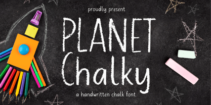 Proudly Presenting, Planet Chalky A Handwritten Chalk Font. Planet Chalky is perfect for any titles, logo, product packaging, branding project, megazine, social media, wedding, or just used to express words above the background. Planet Chalky also come with Multi-Lingual Support. Enjoy the font, feel free to comment or feedback, send me PM or email. Thank You!
 - Nesora GT by Gartype Studio,
$10.00 Lookin for unique logo font? we present to you Nesora, a bold handwritten font that was comes with alternates font and multilingual glyphs to easily use this uniwue logotype font Nesora is very suitable like as logo, tagline, adventure project, posters, book cover & etc.To use alternate this font just change the regular font to alternate font.
 - Deka by Australian Type Foundry,
$35.00 Deka was 10 years in the making. Intended as a clean and straightforward sans serif family, it has just enough personality to stand out. Helvetica this ain't! Deka has 8 weights, language support for all Latin plus cyrillic languages, and loads of Opentype features. It is a versatile workhorse suitable for both text and display usage.
 - Meowtalk by Allouse Studio,
$16.00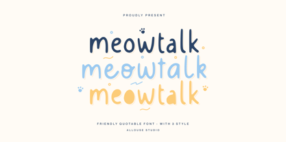 Proudly Presenting, Meowtalk a Friendly Quotable Font with 3 styles. Meowtalk is perfect for any titles, logo, product packaging, branding project, megazine, social media, wedding, or just used to express words above the background. Meowtalk also come with Multi-Lingual Support. Enjoy the font, feel free to comment or feedback, send me PM or email. Thank You!
 - Magnolin Deliciousy by Allouse Studio,
$16.00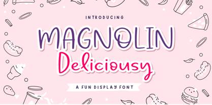 Proudly Presenting, Magnolin Deliciousy A Fun Display Font. Magnolin Deliciousy is perfect for any titles, logo, product packaging, branding project, megazine, social media, wedding, or just used to express words above the background. Magnolin Deliciousy also come with Multi-Lingual Support. Enjoy the font, feel free to comment or feedback, send me PM or email. Thank You!
 - Sidiqie by Chococreator,
$5.00 Sidiqie is a modern sans serif with a monoline and minimalist style. With smooth, neat lines, and with just a hint of contrast, Sidiqie works beautifully for logos, branding, and web titles. See examples for some examples of how you can use them. Includes Sidiqie Light Sidiqie Reguler Sidiqie Bold Sidiqie Black Support for western languages
 - Pathway Artistry by Allouse Studio,
$16.00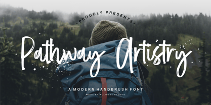 Proudly Present, Pathway Artistry A Modern Handbrush Font Pathway Artistry is perfect for any titles, logo, product packaging, branding project, megazine, social media, wedding, or just used to express words above the background. Pathway Artistry also come with Multi-Lingual Support. Enjoy the font, feel free to comment or feedback, send me PM or email. Thank you!

