1,627 search results
(0.025 seconds)
- Cafe Lounge 19 - Unknown license

- Cafe Lounge 19 - Personal use only

- Summer Sugar by Selvia Design,
$15.00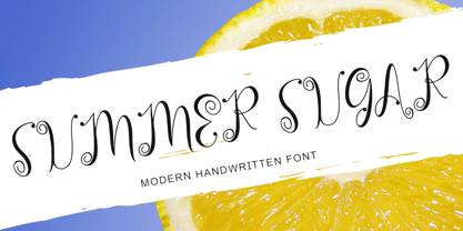
- Summer Landscape by Selvia Design,
$15.00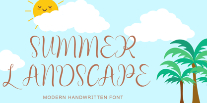
- Military Agent by Yoga Letter,
$17.00
- Dirt2 SoulStalker - Personal use only

- Angelic War - Personal use only

- Elephants in Cherry Trees - Unknown license

- karabinE. - Personal use only

- Movie Star - Unknown license

- Boutique Christmas by Selvia Design,
$14.00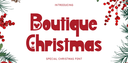
- Father Love by Yoga Letter,
$16.00
- Tropical Beach by Yoga Letter,
$15.00
- LT Cushion Light - 100% free

- Rockner by Linotype,
$29.99 - Ithornët - Personal use only

- Astrab by Yoga Letter,
$18.00
- Kids Brush by Yoga Letter,
$15.00
- DonJulio by Autographis,
$39.50
- Crunchy Taco - Unknown license

- Digifit - Personal use only

- verdy évolution - Personal use only

- Preferred Shares JNL by Jeff Levine,
$29.00
- Christmas Brush by Selvia Design,
$15.00
- Kitchen Doodles by Outside the Line,
$19.00
- MB TyranT - Personal use only

- CaptivSystMRemiX - Unknown license

- Albo by DSType,
$30.00 - Weg by Huerta Tipográfica,
$18.00
- Speedwriter - Personal use only

- Bumpy Road - Unknown license

- Pantra by Nicolas Deslé,
$19.90
- Best Hero by Yoga Letter,
$16.00
- Davis - Unknown license

- Self Promotion JNL by Jeff Levine,
$29.00
- Deco Holiday JNL by Jeff Levine,
$29.00
- Pinstripe Limo - Personal use only

- Geomanticus by 2D Typo,
$28.00
- Maslul MF by Masterfont,
$59.00
- Main Street by FontMesa,
$25.00


