10,000 search results
(0.077 seconds)
- Joe Schmoe by Hanoded,
$15.00 Joe Shmoe is the regular guy, the one who doesn't attract too much attention, but is always there when you need him. So is Joe Shmoe font: it is an easy-going, regular, nothing fancy kinda font and it comes with all the accents!
 - Sloppy Joes by Throndsen,
$10.00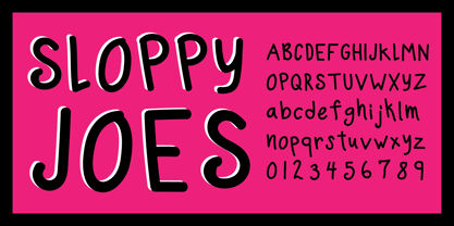
- Mon Voir by Great Lakes Lettering,
$30.00 New to the Great Lakes Lettering library is Mon Voir. Mon Voir is the signature lettering style from Jenna Rainey a talented calligrapher and illustrator and the artist behind Mon Voir studio.
 - Joyful Reason by Sipanji21,
$15.00 Joyful Reason is a delightful and charming Display font that exudes a sense of love and cuteness. With its gentle and playful strokes, this font captures the essence of affection and tenderness. Each letter carries a unique and whimsical touch, resembling handwritten notes filled with love. Joyful Reason is perfect for adding a romantic and joyful touch to various design projects, such as greeting cards, invitations, social media posts, and more. Its lovely and cute characteristics make it an ideal choice for expressing heartfelt emotions in a visually appealing way.
 - Indian Joe by IC Fonts,
$30.00
- Joyful Heart by Azetype,
$12.00 Have you ever used a handwritten font on your design project? Have you ever felt bored or dissatisfied with its glyphs style that looks stiff and doesn't flow even doesn't really characterize the peculiarities of a handwritten font? Or fonts that don't have alternative glyphs so they look monotonous in a word or even sentence. And in the end, it makes your projects so far from your expectations, even your clients. It's so frustrating, isn't it? Just wake up from your dissatisfaction and this is your time to make a good choice for your design project. So, we have a solution to fix it. We introduce 'Joyful Heart' just for you. This is a font that really characterizes from the handwritten style. This font is crafted carefully in every its single scratch, created to look as close to a natural handwritten font so that it can create the perfect combination on each glyph. Happy Creating www.azetypestudios.com
 - Regular Joe by GroupType,
$21.00 Regular Joe was first delivered to the font world by Ron and Joe. Yes, the same Ron and Joe of the ArtParts fame. A few years of being so regular, Regular Joe became, well, just bored. Regular Joe needed company. He wished for a family. After all, most of his font friends had big families. His wishes were granted by FontHaus. So Skinny and Husky were created to be with Regular and all together, they became Family Joe. All is well.
 - Bon Ami by Fontop,
$12.00 Bon Ami is a hand lettered condensed font perfect to add a fun feel and individual look to everything you create including cards & invites, logos, souvenirs, stationary, and so on. It also works perfectly when pairing with other fonts, f.e. with my Paramaribo font (as in the image with the cupcake). The font consists of Latin multilingual support as well as uppercase letters, lowercase letters, numbers and basic punctuations.
 - Browny Joy by Attype Studio,
$16.00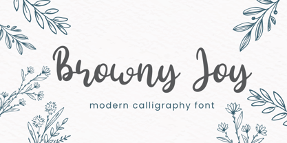 Browny Joy is lovely modern calligraphy font inspired by beauty natural handwriting What's included: - Browny Joy.otf - Multilingual Support --- Hope you enjoy with our font! Attype Studio
 - John Sans by Storm Type Foundry,
$49.00 The idea of a brand-new grotesk is certainly rather foolish – there are already lots of these typefaces in the world and, quite simply, nothing is more beautiful than the original Gill. The sans-serif chapter of typography is now closed by hundreds of technically perfect imitations of Syntax and Frutiger, which are, however, for the most part based on the cool din-aesthetics. The only chance, when looking for inspiration, is to go very far... A grotesk does not afford such a variety as a serif typeface, it is dull and can soon tire the eye. This is why books are not set in sans serif faces. A grotesk is, however, always welcome for expressing different degrees of emphasis, for headings, marginal notes, captions, registers, in short for any service accompaniment of a book, including its titlings. We also often come across a text in which we want to distinguish the individual speaking or writing persons by the use of different typefaces. The condition is that such grotesk should blend in perfectly with the proportions, colour and above all with the expression of the basic, serif typeface. In the area of non-fiction typography, what we appreciate in sans-serif typefaces is that they are clamorous in inscriptions and economic in the setting. John Sans is to be a modest servant and at the same time an original loudspeaker; it wishes to inhabit libraries of educated persons and to shout from billboards. A year ago we completed the transcription of the typefaces of John Baskerville, whose heritage still stands out vividly in our memory. Baskerville cleverly incorporated certain constructional elements in the design of the individual letters of his typeface. These elements include above all the alternation of softand sharp stroke endings. The frequency of these endings in the text and their rhythm produce a balanced impression. The anchoring of the letters on the surface varies and they do not look monotonous when they are read. We attempted to use these tricks also in the creation of a sans-serif typeface. Except that, if we wished to create a genuine “Baroque grotesk”, all the decorativeness of the original would have to be repeated, which would result in a parody. On the contrary, to achieve a mere contrast with the soft Baskerville it is sufficient to choose any other hard grotesk and not to take a great deal of time over designing a new one. Between these two extremes, we chose a path starting with the construction of an almost monolinear skeleton, to which the elements of Baskerville were carefully attached. After many tests of the text, however, some of the flourishes had to be removed again. Anything that is superfluous or ornamental is against the substance of a grotesk typeface. The monolinear character can be impinged upon in those places where any consistency would become a burden. The fine shading and softening is for the benefit of both legibility and aesthetics. The more marked incisions of all crotches are a characteristic feature of this typeface, especially in the bold designs. The colour of the Text, Medium and Bold designs is commensurate with their serif counterparts. The White and X-Black designs already exceed the framework of book graphics and are suitable for use in advertisements and magazines. The original concept of the italics copying faithfully Baskerville’s morphology turned out to be a blind alley. This design would restrict the independent use of the grotesk typeface. We, therefore, began to model the new italics only after the completion of the upright designs. The features which these new italics and Baskerville have in common are the angle of the slope and the softened sloped strokes of the lower case letters. There are also certain reminiscences in the details (K, k). More complicated are the signs & and @, in the case of which regard is paid to distinguishing, in the design, the upright, sloped @ small caps forms. The one-storey lower-case g and the absence of a descender in the lower-case f contributes to the open and simple expression of the design. Also the inclusion of non-aligning figures in the basic designs and of aligning figures in small caps serves the purpose of harmonization of the sans-serif families with the serif families. Non-aligning figures link up better with lower-case letters in the text. If John Sans looks like many other modern typefaces, it is just as well. It certainly is not to the detriment of a Latin typeface as a means of communication, if different typographers in different places of the world arrive in different ways at a similar result.
 - ALT Jun by ALT,
$10.00 Jun Script is a geometric script font.
 - Bon Foyage by Ahmad Jamaludin,
$15.00 Start new year for new font! present to you, Bon Foyage! Bon Foyage is a Vintage modern serif typeface with unique letterforms, beautiful alternative glyphs, and complete multilingual support. Every letter has a subtle uniqueness to it, from the alternate letterforms of "g, j, y", these glyphs are memorable! This font is perfect for editorial projects, logo design, clothing branding, product packaging, magazine headers, or simply as a stylish text overlay to any background image. Features : Unique letterforms Works on PC & Mac Simple Installations Accessible in the Adobe Illustrator, Adobe Photoshop, Adobe InDesign, even work on Microsoft Word. PUA Encoded Characters Fully accessible without additional design software. Follow my shop for upcoming updates including additional glyphs and language support.
 - Joy River by Mightyfire,
$15.00 Introducing Joy River, a delightfully quirky handwritten font that adds a playful and charming touch to your designs. This whimsical typeface captures the essence of spontaneity and creativity, as if each character were penned by an imaginative hand with a penchant for the unconventional. Whether you're designing invitations, greeting cards, or adding a personal flair to your branding, Joy River ensures that your message is delivered with a unique and memorable charm. Its handcrafted feel brings a human touch to digital creations, inviting viewers to engage with the text on a more personal level.
 - Jhon Wave by Maulana Creative,
$15.00 Jhon Wave signature script handmade font. Fun character with a bit of ligatures and alternates. To give you an extra creative work. This font is good for logo design, Social media, Movie Titles, Books Titles, a short text even a long text letter and good for your secondary text font with script or serif. Make a stunning work with Jhon Wave font. Cheers, Maulana Creative
 - ION C by Setup,
$19.95 ION C is a part of the ION superfamily, which consists of 3 families: condensed (ION A), normal (ION B) and wide (ION C), each having a compelling range of 10 weights. Styles Thin to Black have 436 glyphs supporting more than 70 Latin-based languages and the three heaviest weights, named U1, U2 and U3 have 94 basic glyphs. ION glyphs are based on the classic 7-segment display, but for readability and aesthetic reasons, some alphabetic characters don't follow this matrix strictly. In case you like things in order, don't worry, there's a stylistic set that replaces all characters with their strict alternatives. The special characters, such as #, @ or % are composed of special segments, but are designed to fit seamlessly within the whole character set. ION was designed with the needs of contemporary graphic design in mind. There are alternative characters, discretionary ligatures, slashed zero, superior & inferior numbers, fractions, ordinals and three handy stylistic sets. The ten styles of ION C are accompanied with a special 11th style called Cells, allowing you to design a special underlying layer of black or outlined cells. This way you can create various containers and boxes for your text, highlight what's important or go wild and draw a space invader, using the cells as building blocks. Learn more about the OpenType features and Cells at www.urtd.net/ion.
 - Olympus Mons by AvarType,
$28.00 Olympus Mons is a geometric display font, characterized by sharp edges and straight lines, designed to support all European languages. It is intended to be used for headings as well as smaller information, by brands associated by masculinity, power, and ambitious goals.
 - Joyful Chase by Letterhend,
$14.00 Joyful Chase is a display font that effortlessly combines playfulness and classic charm. It comes with extrude style, this option adds depth and dimension to your text, creating a visually striking effect that demands attention.This letterforms bring a sense of fun and excitement to your designs, making it ideal for children's books, cheerful branding, and creative projects that seek to inspire happiness and wonder. Features : Uppercase & lowercase Numbers and punctuation Alternates & Ligatures Multilingual PUA encoded We highly recommend using a program that supports OpenType features and Glyphs panels like many of Adobe apps and Corel Draw, so you can see and access all Glyph variations.
 - Don Sans by SIAS,
$29.90 Don Sans is a sturdy display sans which evokes the invironment of old-day industrialism, steamers, locomotives and other machinery; dusty back-yard workshops and the glamorous air of backstage life. It has been inspired by various letterings crafted by former graphic workmen who would have had an idea of simple letter construction but did not really wanted to bother with detail sophistication. Hence the result is somewhat quaint and imperfect … if that is something you are willing to enjoy. The unique charme of this typeface lies in its lack of perfection. And yet it embodies a peculiar straight-forward strength and sobriety, a visual stubbornness which is certainly not over-used! Utilize Don-Sans for stationary and ads, for crisp title settings and smart identity graphics; for menus and leaflets, business cards, cutting-edge campaign eye-catchers … whatever your imagination makes of it! Don Sans is a multilingual typeface, it supports every Euro-Latin language.
 - Joy Life by Hatftype,
$17.00 Is a font with groovy retro style. With distinctive handwritten characters perfect for branding projects, logos, clothing designs, media posts, advertisements, product packaging, product designs, labels, photography, watermarks, invitations, stationery, and any project who need handwritten dishes. Feature : * Symbol * Number * Punctuation * Multilingual support * Support in Mac and Windows OS * Support in design application (photoshop, illustrator, and more) AA CAPS! I really hope you enjoy it.
 - Dear John by TypeArt Foundry,
$45.00 Typewriter simulation with slight inking imperfections.
 - Bon Apetit by Monotype,
$29.99Food stuff - Back jones by Sipanji21,
$15.00 "Back Jones" is a cute display font characterized by thick and rounded letterforms, making it a great choice for design projects aimed at children, such as children's games, book covers, and any projects related to schools. With its playful and friendly appearance, this font adds a touch of whimsy and charm to your designs, making them more engaging and enjoyable for young audiences. The simplicity and clarity of "Back Jones" make it easy to read and understand, making it an excellent choice for educational materials and other projects aimed at young learners.
 - Eon Age by Monotype,
$29.99 - John Handy by ITC,
$29.99John Handy is the work of British designer Timothy Donaldson and based on his own handwriting. Part of the ongoing trend for casual letterforms in display typography, John Handy is an excellent choice for letters, greeting cards, menus, wherever an elegant yet personal look is desired. - John Doe by Fonthead Design,
$19.00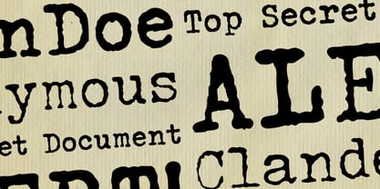
- Joyful Berlin by Arendxstudio,
$13.00 Joyful Berlin - Comic Display Font is a font with distinctive handwritten characters perfect for branding projects, logos, wedding designs, media posts, advertisements, product packaging, product designs, labels, photography, watermarks, invitations, stationery, and any project who need handwritten dishes. Features : • Character Set A-Z • Numerals & Punctuations (OpenType Standard) • Accents (Multilingual characters) • Ligature Multilingual Support : Afrikaans, Albanian, Asu, Basque, Bemba, Bena, Catalan, Chiga, Cornish, Danish, English, Estonian, Faroese, Filipino, Finnish, French, Friulian, Galician, German, Gusii, Icelandic, Indonesian, Irish, Italian, Kabuverdianu, Kalenjin, Kinyarwanda, Low German, Luo, Luxembourgish, Luyia, Machame, Makhuwa-Meetto, Makonde, Malagasy, Malay, Manx, Morisyen, North Ndebele, Norwegian Bokmål, Norwegian Nynorsk, Nyankole, Oromo, Portuguese, Romansh, Rombo, Rundi, Rwa, Samburu, Sango, Sangu, Scottish Gaelic, Sena, Shambala, Shona, Soga, Somali, Spanish, Swahili, Swedish, Swiss German, Taita, Teso, Vunjo, Zulu
 - Bon Apit by Papermode Co,
$16.00 Bon Apit is a monoline script typeface with extra features. Bon Apit comes in a handmade style and can perfectly be used for an elegant addition to any logo, invitation, product packaging, hand-written quote, greetings card, labels, logos, magazines, books, greeting/wedding cards, packaging, fashion, stationery, novels, labels or any type of advertising purpose. Includes multi-lingual support and special ligatures If you do not have programs that support OpenType features like Adobe Illustrator and CorelDraw X Versions, you can access all alternates using Font Book (Mac) or Character Map (Windows). Thank you!
 - ION B by Setup,
$19.95 ION B is a part of the ION superfamily, which consists of 3 families: condensed (ION A), normal (ION B) and wide (ION C), each having a compelling range of 10 weights. Styles Thin to Black have 436 glyphs supporting more than 70 Latin-based languages and the three heaviest weights, named U1, U2 and U3 have 94 basic glyphs. ION glyphs are based on the classic 7-segment display, but for readability and aesthetic reasons, some alphabetic characters don't follow this matrix strictly. In case you like things in order, don't worry, there’s a stylistic set that replaces all characters with their strict alternatives. The special characters, such as #, @ or % are composed of special segments, but are designed to fit seamlessly within the whole character set. ION was designed with the needs of contemporary graphic design in mind. There are alternative characters, discretionary ligatures, slashed zero, superior & inferior numbers, fractions, ordinals and three handy stylistic sets. The ten styles of ION B are accompanied with a special 11th style called Cells, allowing you to design a special underlying layer of black or outlined cells. This way you can create various containers and boxes for your text, highlight what’s important or go wild and draw a space invader, using the cells as building blocks. Learn more about the OpenType features and Cells at www.urtd.net/ion.
 - John Brown by Hanoded,
$15.00 I realized I didn't have that many serif fonts, so I started sketching and came up with John Brown. John Brown is named after the sheriff in the Bob Marley song 'I Shot The Sheriff'. It is an all caps font, but upper and lower case can be freely interchanged for that great 'natural' look.
 - Thai One On by Emboss,
$24.95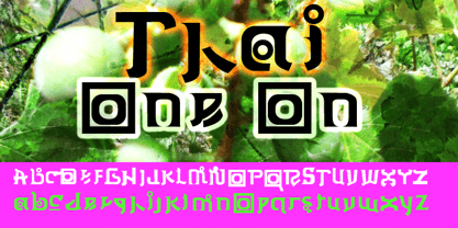
- Kruti Dev 010 - Unknown license

- SCRAP - Unknown license

- ZetueiMincho - Unknown license

- Z_SHINOBI - Unknown license

- D3 Littlebitmapism Katakana - Unknown license

- Quran Standard - Unknown license

- PunjabiAmritsarSSK - Unknown license

- Tanach - Personal use only

- Glagolitsa - Unknown license

- D3 Streetism Katakana - Unknown license


