10,000 search results
(0.039 seconds)
- Jack Stanislav by deFharo,
$22.00 Very condensed typography, thick line and fun look for headlines and advertising where you are looking for saving space and originality at the same time. The upper inclination of the letters, the combination of horizontal with inclined forms, the ascending and descending short, and the lower elongation of some antlers will allow you to print varied styles with a lot of movement according to the context of the design. I started drawing this font with the intention of creating a new decorative typeface Blackletter style but modernizing the strokes, after drawing several letters imitating the ductus of this type of fonts trying to simplify them, emerged all the DNA of the current Jack Stanislav, finally a retro typography without Serif of linear strokes that mimic the angle of a thick pen. Use the following keys to write the bitcoin symbol and the Jack icon: b #, a #
 - Redrains by Sarid Ezra,
$15.00 Introducing, Redrains - An Elegant Serif Font Family with 3 special weight style! Redrains is a classic and modern serif with 3 weight style and a bunch of alternates for each characters and ligatures that will make your presentation or logo even more stunning and stand out! With three style that you can use for several purpose! You can use this font as a complement of your script collections or use this font as a stand alone font for several purposes such as a wedding invitations or even your own brand! This fonts support Multi Language and already PUA Encoded!
 - Collingar by Sarid Ezra,
$15.00 Introducing, Collingar - An Aesthetic Serif Font with italic version! Collingar is a classic and modern serif with a bunch of ligatures that will make your poster, cover or logo even more stunning and stand out! With italic version that you can use as a complimentary! You can use this font as a complement of your script collections or use this font as a stand alone font for several purposes such as a wedding invitations or even your own branding! This fonts support Multi Language and already PUA Encoded! Features : Regular & Italic Version Uppercase & Lowercase Number & Symbol Ligatures Multilingual and PUA Encoded
 - Rockseed by Gassstype,
$25.00 Hello Everyone, introduce our new product Font Rockseed it is Brush Display Typeface .This is a Textured Natural Style and classy style with a clear style and dramatic movement. This font Rockseed is great for your next creative project such as logos, printed quotes, invitations, cards, product packaging, headers, Logotype, Letterhead, Poster, Design this font is great for your creative projects such as watermark on photography, and perfect for logos & branding, invitation,advertisements,product designs, stationery, wedding designs,label ,product packaging, special events or anything that need handwritting taste. You can activate 6 Ligatures and 12 Alternate glyphs OpenType panel.
 - Bloopers by Gassstype,
$23.00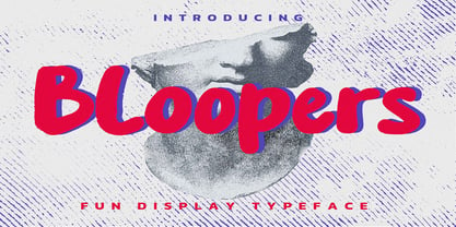 Hello Everyone, introduce our new product Font Bloopers is a Fun Display Typeface .This is a Textured Natural Style and classy style with a clear style and dramatic movement. This font Bloopers is great for your next creative project such as logos, printed quotes, invitations, cards, product packaging, headers, Logotype, Letterhead, Poster, Design this font is great for your creative projects such as watermark on photography, and perfect for logos & branding, invitation,advertisements,product designs, stationery, wedding designs,label ,product packaging, special events or anything that need handwritting taste. You can activate 7 Alternate OpenType panel.
 - Pathway by Gassstype,
$25.00 Hello Everyone, introduce our new product font PATHWAY is a Brush Font.This is a Textured Natural Style and classy style with a clear style and dramatic movement. This font PATHWAY is great for your next creative project such as logos, printed quotes, invitations, cards, product packaging, headers, Logotype, Letterhead, Poster, Design this font is great for your creative projects such as watermark on photography, and perfect for logos & branding, invitation,advertisements,product designs, stationery, wedding designs,label ,product packaging, special events or anything that need handwritting taste. This font is PUA encoded which means you can access all of 11 Ligatures glyphs.
 - Sweet Darkness by Gassstype,
$23.00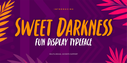 Hello Everyone, introduce our new product Font Sweet Darkness is a Fun Display Typeface .This is a Textured Natural Style and classy style with a clear style and dramatic movement. This font Sweet Darkness is great for your next creative project such as logos, printed quotes, invitations, cards, product packaging, headers, Logotype, Letterhead, Poster, Design this font is great for your creative projects such as watermark on photography, and perfect for logos & branding, invitation,advertisements,product designs, stationery, wedding designs,label ,product packaging, special events or anything that need handwritting taste. You can activate Ligatures glyphs and Alternates glyphs OpenType panel.
 - Coffistylove by Twinletter,
$14.00 Coffistylove is a font designed with amazing details in mind, resulting in a pleasant, elegant, and appealing font. Because it has a wonderful design quality, you can make works that will interest visitors with this font. This typeface has a natural handwritten feel to it, yet it has been developed to create a portion and composition that meets your needs. As a result, this typeface is appropriate for craft, children’s writing, adventure posters, food banner titles, wedding invitations, product packaging logos, quotes, social media page covers, furniture banner headlines, book covers, and a variety of other uses.
 - Nice Postman by Gassstype,
$23.00 Hello Everyone, introduce our new product Font Nice Postman is a Fun Brush Font .This is a Textured Natural Style and classy style with a clear style and dramatic movement. This font Nice Postman is great for your next creative project such as logos, printed quotes, invitations, cards, product packaging, headers, Logotype, Letterhead, Poster, Design this font is great for your creative projects such as watermark on photography, and perfect for logos & branding, invitation,advertisements,product designs, stationery, wedding designs,label ,product packaging, special events or anything that need handwritting taste. You can activate 19 Ligatures glyphs and Alternates glyphs OpenType panel.
 - Tiger Chest by Four Lines Std,
$15.00 Introducing "Tiger Chest" - Unleash Your Creativity with Urban Pop Vibes! With Tiger Chest, your creativity knows no bounds. Break free from the mundane and explore the wild side of design. Whether you're crafting social media graphics, YouTube thumbnails, event posters, or comic book covers, this font will give your projects the urban edge they deserve.
 - ITC Blackadder by ITC,
$29.00ITC Blackadder is the work of British designer Bob Anderton, an eerie transformation of insurrectionist Guy Fawkes' signature after his torture. Anderton based his design on 16th century handwriting, captured the scrolls and curlicues and then added the sinister tremble. This elegant, yet potentially menacing display face is perfect for theatrical or scary" applications." - Ambassador by Juraj Chrastina,
$39.00 Hairline display fonts are elegant and subtle with touch of luxury. They are the Champagne of type. Ambassador represents a classy typeface best suitable for magazines, cosmetics packaging, advertising or any kind of fine and sensitive design. The quality of the display-oriented spacing and kerning of this font is ensured by Igino Marini.
 - Party Trick by PizzaDude.dk,
$15.00 Party Trick is loosely based on the capital letters of a classic typewriter, but I have added a bit sugar and spice to the letters - making them more funky and loose. Another great thing is the contextual alternates, which gives you 6 different versions of each letter - and they automatically changes as you type!
 - P22 Tyndale by IHOF,
$24.95Quill-formed roman/gothic with an olde-worlde flavor. Some background in the designer's own words: "A series of fonts came to mind which would be rooted in the medieval era -for me, a period of intense interest. Prior to Gutenberg's development of commercial printing with type on paper in the mid-1400s, books were still being written out by hand, on vellum. At that time, a Bible cost more than a common workman could hope to earn in his entire lifetime. Men like William Tyndale devoted their energies to translating the Scriptures for the benefit of ordinary people in their own language, and were burned to death at the stake for doing so. Those in authority correctly recognized a terminal threat to the fabric of feudal society, which revolved around the church. "This religious metamorphosis was reflected in letterforms: which, like buildings, reflect the mood of the period in which they take shape. The medieval era produced the Gothic cathedrals; their strong vertical emphasis was expressive of the vertical relationship then existing between man and God. The rich tracery to be seen in the interstices and vaulted ceilings typified the complex social dynamics of feudalism. Parallels could be clearly seen in Gothic type, with its vertical strokes and decorated capitals. Taken as a whole, Gothicism represented a mystical approach to life, filled with symbolism and imagery. To the common man, letters and words were like other sacred icons: too high for his own understanding, but belonging to God, and worthy of respect. "Roman type, soon adopted in preference to Gothic by contemporary printer-publishers (whose primary market was the scholarly class) represented a more democratic, urbane approach to life, where the words were merely the vehicle for the idea, and letters merely a necessary convenience for making words. The common man could read, consider and debate what was printed, without having the least reverence for the image. In fact, the less the medium interfered with the message, the better. The most successful typefaces were like the Roman legions of old; machine-like in their ordered functionality and anonymity. Meanwhile, Gutenberg's Gothic letterform, in which the greatest technological revolution of history had first been clothed, soon became relegated to a Germanic anachronism, limited to a declining sphere of influence. "An interesting Bible in my possession dating from 1610 perfectly illustrates this duality of function and form. The text is set in Gothic black-letter type, while the side-notes appear in Roman. Thus the complex pattern of the text retains the mystical, sacred quality of the hand-scripted manuscript (often rendered in Latin, which a cleric would read aloud to others), while the clear, open side-notes are designed to supplement a personal Bible study. "Tyndale is one of a series of fonts in process which explore the transition between Gothic and Roman forms. The hybrid letters have more of the idiosyncrasies of the pen (and thus, the human hand) about them, rather than the anonymity imbued by the engraving machine. They are an attempt to achieve the mystery and wonder of the Gothic era while retaining the legibility and clarity best revealed in the Roman form. "Reformers such as Tyndale were consumed with a passion to make the gospel available and understood to the masses of pilgrims who, in search of a religious experience, thronged into the soaring, gilded cathedrals. Centuries later, our need for communion with God remains the same, in spite of all our technology and sophistication. How can our finite minds, our human logic, comprehend the transcendent mystery of God's great sacrifice, his love beyond understanding? Tyndale suffered martyrdom that the Bible, through the medium of printing, might be brought to our hands, our hearts and our minds. It is a privilege for me to dedicate my typeface in his memory." - Austin Pen by Three Islands Press,
$29.00 Empresario Stephen F. Austin (1793-1836) is considered by many the “Father of Texas” for leading the first Anglo-American colony into the then-Mexican territory back in the 1820s. A few years later, while on a diplomatic mission to Mexico City, Austin was arrested on suspicion of plotting Texas independence and imprisoned for virtually all of 1834. During this time he kept a secret diary of his thoughts and musings—much of it written in Spanish. Austin Pen is my interpretation of Austin’s scribblings in this miniature prison journal (now in the collection of the wonderful Dolph Briscoe Center for American History, in the Texas city that bears his name). The little leather-bound book is filled with notes in ink and pencil—some of the faded penciled pages traced in ink years later by Austin’s nephew Moses Bryan. A genuine replication of 19th century cursive, Austin Pen has two styles: a fine regular weight, along with a bold style that replicates passages written with an over-inked pen. Each is legible and evocative of commonplace American penmanship of two centuries ago.
 - Garden Hidaleya by Kartiny Type,
$12.00 Garden Hidaleya Script is one of the Elegant script fonts that comes with a very beautiful character change, a kind of classic copper decorative script with a modern touch, designed with high detail to present an elegant style. You will get: Garden Hidaleya Garden Hidaleya Bold Garden Hidaleya Script is interesting because the typeface is pleasing to the eye, clean, feminine, sensual, glamorous, simple and very easy to read, because of the many luxurious letter connections. I also offer a number of decent stylistic alternatives for some of the letters. The classic style is very suitable to be applied in various formal forms such as invitations, labels, restaurant menus, logos, fashion, make up, stationery, novels, magazines, books, greeting / wedding cards, packaging, labels or all kinds of advertising purposes. . . Garden Hidaleya has alternate characters, including multiple language support. With OpenType features with alternative styles and elegant ligatures. The OpenType features don't work automatically, but you can access them manually and for best results your creativity will be required in combining variations of these Glyphs. I highly recommend using a program that supports OpenType features and the Glyphs panel such as Adobe Illustrator, Adobe Photoshop CC, Adobe InDesign, or CorelDraw, so that you can view and access all variations of Glyphs. How to access all alternative characters using Adobe Illustrator: https://www.youtube.com/watch?v=XzwjMkbB-wQ How to access all alternative characters, using the Windows Character Map with Photoshop: https://www.youtube.com/watch?v=Go9vacoYmBw If you need help or have any questions, let me know. I'm happy to help. Thanks & Happy Designing.
 - Juvenis by Storm Type Foundry,
$32.00Designs of characters that are almost forty years old can be already restored like a historical alphabet – by transferring them exactly into the computer with all their details. But, of course, it would not be Josef Tyfa, if he did not redesign the entire alphabet, and to such an extent that all that has remained from the original was practically the name. Tyfa published a sans-serif alphabet under the title Juvenis already in the second half of the past century. The type face had a large x-height of lower-case letters, a rather economizing design and one-sided serifs which were very daring for their time. In 1979 Tyfa returned to the idea of Juvenis, modified the letter “g” into a one-storey form, narrowed the design of the characters even further and added a bold and an inclined variant. This type face also shows the influence of Jaroslav Benda, evident in the open forms of the crotches of the diagonal strokes. Towards the end of 2001 the author presented a pile of tracing paper with dozens of variants of letter forms, but mainly with a new, more contemporary approach: the design is more open, the details softer, the figures and non-alphabetical characters in the entire set are more integral. The original intention to create a type face for printing children’s books thus became even more emphasized. Nevertheless, Juvenis with its new proportions far exceeds its original purpose. In the summer of 2002 we inserted all of this “into the machine” and designed new italics. The final computer form was completed in November 2002. All the twelve designs are divided into six variants of differing boldness with the corresponding italics. The darkness of the individual sizes does not increase linearly, but follows a curve which rises more steeply towards the boldest extreme. The human eye, on the contrary, perceives the darkening as a more fluent process, and the neighbouring designs are better graded. The x-height of lower-case letters is extraordinarily large, so that the printed type face in the size of nine points is perceived rather as “ten points” and at the same time the line spacing is not too dense. A further ingenious optical trick of Josef Tyfa is the figures, which are designed as moderately non-aligning ones. Thus an imaginary third horizontal is created in the proportional scheme of the entire type face family, which supports legibility and suitably supplements the original intention to create a children’s type face with elements of playfulness. The same applies to the overall soft expression of the alphabet. The serifs are varied; their balancing, however, is well-considered: the ascender of the lower-case “d” has no serif and the letter appears poor, while, for example, the letter “y”, or “x”, looks complicated. The only serif to be found in upper-case letters is in “J”, where it is used exclusively for the purpose of balancing the rounded descender. These anomalies, however, fit perfectly into the structure of any smoothly running text and shift Juvenis towards an original, contemporary expression. Tyfa also offers three alternative lower-case letters *. In the case of the letter “g” the designer follows the one-storey form he had contemplated in the eighties, while in “k” he returns to the Benda inspiration and in “u” adds a lower serif as a reminder of the calligraphic principle. It is above all the italics that are faithful to the tradition of handwritten lettering. The fairly complicated “k” is probably the strongest characteristic feature of Juvenis; all the diagonals in “z”, “v”, “w”, “y” are slightly flamboyant, and this also applies to the upper-case letters A, V, W, Y. Juvenis blends excellently with drawn illustrations, for it itself is modelled in a very creative way. Due to its unmistakable optical effect, however, it will find application not only in children’s literature, but also in orientation systems, on posters, in magazines and long short-stories. - FF Info Pict by FontFont,
$62.99 Erik Spiekermann, working in collaboration with Ole Schäfer, originally designed FF Info® Display for use in the context of wayfinding systems. The variants FF Info™ Text and FF Info™ Correspondence were developed later for text setting and office communication. FF Info Display The sober and clear forms of the sans serif FF Info Display have been deliberately molded to make them perfect for use on wayfinding systems. The font by Ole Schäfer and Erik Spiekermann not only takes the problem of lack of space into account - it is some 15% narrower than comparable typefaces - the characters have also been designed to ensure they remain legible even in adverse conditions for reading. As text on signs often contains words with which readers are unfamiliar and which are thus deciphered letter for letter rather than perceived as whole words, it is essential to provide for a clear differentiation between glyphs. Additional serifs on the lowercase "i" and uppercase "I" and a small arch on the terminal of the lowercase "l" ensure that it is possible to readily discriminate between these particularly problematic letters. Moreover, sharp corners on glyphs can also make it difficult to read signs with backlighting or when driving past. The rounded corners of FF Info Display counteract this effect and make sure that the character forms remain well defined.FF Info Display is available in five carefully coordinated weights, from Regular to Bold. In the corresponding italic variants, the letters appear overall more rounded while the lowercase "a" has a closed form and the "f" has a descender. Also included among the glyphs of FF Info Display are several ligatures and arrow symbols. Pictograms with different themes that complement the typeface are also available in four weights. FF Info Text Thanks to his know-how gained through designing other typefaces, Erik Spiekermann became aware that fonts created for use in problematic environments can be used in many different situations. In smaller point sizes, FF Info Display cuts a fine figure when used to set longer texts. So Spiekermann carefully reworked FF Info Display to produce FF Info Text, a font perfected for use in this context. Not only can the characters be more generously proportioned, certain features, such as additional serifs to aid with the differentiation of problematic letters, are also no longer necessary in textual surroundings. The upright styles have a double-story "g" while Spiekermann has added oldstyle figures and small caps. FF Info Correspondence FF Info Correspondence has also been designed for setting block text although it recalls the style of old typewriter characters and is specifically intended for use in office communication. The characters of this third member of the family are thus more formal, without rounded terminals but with rectangular punctuation marks. The narrower letters are provided with large serifs to give them more space although, at the same time, this reduces the differences in terms of letter width among the alphabet. In contrast with its two siblings, FF Info Correspondence has only three weights, each with corresponding italic.The three styles of the FF Info super family cover an extensive range of potential applications. If the different kerning is adjusted manually, the three styles harmonize happily with each other and can be readily used in combination to set, for example, headlines and texts and also creative display options.
 - IM FELL FLOWERS 1 - Unknown license

- Janda Hide And Seek by Kimberly Geswein,
$5.00 This fun, swirly unicase font features two styles- a thicker uppercase and a thin lowercase. Use them separately or mix-and-match for the look you want.
 - Mixiwa Faux by Twinletter,
$15.00 We introduce the Mixiwa typeface, which we created with great attention to give it a dashing and stylish appearance. If you choose this typeface, your entire project will be bombastic, striking, and will always grab your audience’s attention. Your entire project will be excellent if you use this font! Logotypes, food banners, branding, brochure, posters, movie titles, book titles, quotes, and more may all benefit from this font. Of course, using this font in your various design projects will make them excellent and outstanding; many viewers are drawn to the striking and unusual graphic display. Start utilizing this typeface in your projects to make them stand out.
 - Myster by Serebryakov,
$49.00 Myster is a truly random font — each lowercase letter has three alternatives, that interchange in the set. This makes Myster look alive, hand-crafted, painted for a special occasion, rather than a font selected from a regular type case… Of course, the mystical character of the font defines the scope of its usage — film, gaming and publishing industries. However Myster’s field of application goes beyond them. This font is able to create a desired atmosphere in packaging, children books, magazines, as well as in advertising.
 - Chatterbox by Comicraft,
$49.00 Have you seen that new font from Comicraft it's lovely isn't it all soft and spongy it fair warms the cockles of me heart Mrs Robinson at number forty three she has one she got it down at the store on the corner you know the Indian convenience open all night my Albert gets his Heineken down there late of an evening and you know what I saw all manner of strange people down there last week super heroes I think they were Blimey!
 - Troyer AR by ARTypes,
$30.00The Troyer AR ornaments are based on the first series of ornaments designed for American Type Founders by Johannes Troyer (1902-69). They were cast in 36 and 48 point in 1953 by ATF who said that they ‘mark a distinct and refreshing departure from the motif of earlier ornaments, and add a crisp touch to your finer printing’. Kenneth Day, in The Typography of Press Advertisement (1956), found them 'clean-cut and bright and clearly showing their calligraphic origins . . . useful for single decorative touches'. - My Hands by Wiescher Design,
$49.50 The hands in this font are the pointing, counting, threatening, signaling, demonstrating and playing hands I use in my own design projects. I have drawn them all with a felt-tip marker, scanned and digitized for use in a font. This picture font is more user-friendly than having single ps-files. I usually convert the letter to paths once I have decided which one to use, because I might want to fill the lines or background with different colors. Yours very handy, Gert Wiescher.
 - Volta by Linotype,
$29.99Volta is a robust typeface from the 1950s. A revisit to styles that were en vogue at the turn of the century, Bauer type foundry designers Walter Baum and Konrad Bauer designed this type family in1955. The form of Volta's letters are similar to those in New Transitional Serif typefaces, like Cheltenham and Century. Developed after the Didone (i.e., Bodoni) style types, New Transitional Serifs speak more to the zeitgeist of the late 19th Cntury, and were typographic adaptations to it's newer technologies. Already in the period of mass production, typographers and printers at the dawn of the 20th Century had to cope with larger print runs on cheaper materials. The robust letterforms of New Transitional Serifs were designed to compensate for this, but they were also ingenious little inventions in their own right. Form the beginning, the new, peculiar forms of New Transitional Serif letters were adopted for use by advertisers. Their robustness also allowed them to be used in virtually all sizes. Volta was designed especially with advertising display usage in mind. The x-height of Volta's letters is higher than average for serif faces. It is recommended that Volta be used exclusively for shorter tracks of text, above 12 point. Headlines look dashing set in Volta. Four different font styles are available for the Volta typeface: Regular, Medium, Medium Italic, and Bold." - PMN Caecilia eText by Monotype,
$29.99PMN Caecilia™ is the premiere work of the Dutch designer Peter Matthias Noordzij. He made the first sketches for this slab serif design in 1983 during his third year of study in The Hague, and the full font family was released by Linotype in 1990. The PMN prefix represents the designer's initials, and Caecilia is his wife's name. This font has subtle variations of stroke thickness, a tall x-height, open counters, and vivacious true italics. Noordzij combined classical ductus with his own contemporary expression to create a friendly and versatile slab serif family. With numerous weights from light to heavy, and styles including small caps, Old style figures, and Central European characters, PMN Caecilia has all the elements necessary for rich typographic expression. eText fonts - the optimum of on-screen text quality With our new eText fonts that have been optimised for on-screen use, you can ensure that your texts remain readily legible when displayed on smartphones, tablets or e-readers. The poor resolution of many digital display systems represents a major challenge when it comes to presenting text. It is necessary to make considerable compromises, particularly in the case of text in smaller point sizes, in order to adapt characters designed in detail using vector graphics to the relatively crude pixel grid. So-called 'font hinting' can help with this process. This, for example, provides the system with information on which lines are to be displayed in a particular thickness, i.e. using a specific number of pixels. As font hinting is a largely manual and thus very complex technique, many typefaces come with only the most necessary information. What is unimportant for a text printed in high resolution can result in a poor quality image when the same text is displayed on a screen, so that reading it rapidly becomes a demanding activity. Specially optimised eText fonts can help overcome this problem. An extremely refined and elaborate font hinting system makes sure that these fonts are optimally displayed on screens. Monotype has not only adopted font hinting for this purpose but has also thoroughly reworked the fonts to hone them for display in low resolution environments. For example, the open counters present in the letters C, c, e, S, s, g etc. have been slightly expanded so that these retain their character even in small point sizes. Also with a view to enhancing appearance in smaller point sizes, line thickness has been discreetly increased and x-height carefully adjusted. Kerning has also been modified. Don't leave the on-screen appearance of your creations to chance. Play it safe and use eText fonts to achieve perfect results on modern display devices. Many typefaces, including many popular classics, are already available as eText fonts and new ones are continually being published. The eText font you can purchase here are available for use as Desktop Fonts or Web Fonts. Should they be used in Mobile Devices such as smartphones, tablets or eReaders, please contact our OEM specialists at sales-eu@monotype.com. - Munro - Unknown license

- LTC Camelot by Lanston Type Co.,
$24.95 Camelot was the first of over 100 typefaces designed by Frederic Goudy. The upper case characters were drawn in 1896 for the Dickinson Type Foundry. Goudy was so encouraged by his check for $10 (double what he asked for the drawings), that he spent the next 50 years designing type. The lower case was added by the Dickinson foundry. This Lanston digital release includes a Text version based on the smaller point sizes of the metal type and a Display version based on the larger sizes. The two appear different in size but share the exact same line weight when at the same point size.
 - Rugged Rock by Comicraft,
$19.00 Around the rugged rock the ragged rascal ran, Foregoing fancy fonts, the Fontographer fawned and fell! Alliteratively allowing for assonant aspects as well, He spoke of several sentences that some should never spell! This classic title font will deliver tall tales that tell!
 - FS Silas Sans by Fontsmith,
$80.00 The great enigma There are hidden depths to FS Silas Sans. First impressions are of a functional, multi-purpose typeface with a cool, edgy, angular character. Gaze into its eyes a little longer, though, and you'll detect a more nuanced, colourful personality, with full, open, satisfyingly squarish forms balancing the abruptness of the sharply-angled terminals and ascenders. Authoritative, official and stern on the outside; amiable and welcoming on the inside. You’re so Dane The designers, led by Phil Garnham, were trying to capture something straight-talking, authentic, and a little... Scandinavian. ‘We were thinking about some of the characters in Danish dramas that were on in the early stages of the font’s development, like The Killing and The Bridge,’ says Phil. ‘The police officers, that is, not the psychopathic killers. Smart and a bit cool, but with a warm heart.’ For a good Danish name, we settled on Silas. It was that or Hans-Christian. The finer points Silas Sans rewards close inspection. Study, if you will, its amply squarish forms, the roomy ‘o’ and ‘e’, in particular. Observe the angular ascenders and terminals of, for example, the ‘L’, ‘I’, ‘d’ and ‘i’, inferring the movement and lift of a pen. Consider the cuts to the ‘A’ and ‘v’ that create harmony with adjacent letters. And scrutinise the subtle ink traps set within the ‘A’ and ‘Y’ for reproduction at small sizes. A fine subject, we think you’ll agree, and available in a versatile range of weights to make (with FS Silas Slab) a typographic system with a comprehensive hierarchy.
 - Rachela by MrLetters,
$15.00 Introducing:Rachela Lovely Calligraphy! A new and beautiful font, created to meet your needs in creating a beautiful and elegant design, this font is special for you. Rachela Lovely Calligraphy Font is perfect for branding, wedding invitations, magazines, mugs, business cards, quotes, posters, and more you can use on your big project would be very beautiful. This font has been equipped with OpenType features and has many glyphs. By having many of these glyphs will be able to choose the letters according to your liking, lots of variations and options for each letter, so you can customize your design choices and also have other languages supported. This font is perfect for use with programs that support OpenType features like Adobe Photoshop Cs / Adobe Photoshop CC, Adobe Illustrator CS / Adobe Illustrator CC, Adobe Indesign and Corel Draw and many more programs that support OpenType. I've also included a special alternative so you can use any program. This font can be used by everyone! If you have any questions, please feel free to contact me by email at hello.mrletters@gmail.com. Thank you and congratulations designing :-)
 - Burgundy by Sarid Ezra,
$17.00 Introducing, Burgundy - Curly Sans Serif with a bunch of alternates! Burgundy is a sans serif based typeface that have curly and elegant looks with a bunch of alternates that will make your presentation or logo even more stunning and stand out! This font is so fit for wedding invitation or celebrations. Burgundy also support Multi Language and already PUA Encoded! Features Uppercase & Lowercase Number & Symbol Multi language Alternates for each characters PUA Encoded
 - Starlight by Jos Gandos,
$15.00 Starlight is a new modern & fresh calligraphy script with natural style. This font will make your design look elegant, natural and stylish. Starlight is perfect for any awesome projects such as photography, watermark, quote design, social media posts, poster, advertisements, logos, branding, invitation, product designs, label, stationery, wedding designs, product packaging, special events or any project that need handwriting taste or just simply design with stylish text overlay to any background image.
 - Elaine Hanks by Sarid Ezra,
$13.00 Elaine Hanks is a fashionable signature that contain lowercase, uppercase, symbol, and also support multi language. There's a lot ligatures in this font. Elaine Hanks also comes with doodle font that you can use to make a logo for branding, beautiful fashion design, suitable for wedding invitation, or handwritten quote. Also already PUA Encoded. Plus 12 Premade logo for you! Foreign Languages Support: ÀÁÂÃÄÅÇÈÉÊËÌÍÎÏÑÒÓÔÕÖØÙÚÛÜÝßàáâãäåæçèéêëìíîïñòóôõöøùúûüýÿ What Will You Get: 30+ Doodle (Ai) 12 Premade Logo (Ai)
 - Ashley Southine by MJB Letters,
$16.00 Ashley Southine is a handwritten script font that offers an elegant and personal touch to every character. Inspired by handcrafted strokes, this font presents a natural handwritten feel that is both warm and inviting. Each letter showcases uniqueness in every curve and stroke, creating a relaxed yet refined atmosphere. Ideal for design projects seeking a personal touch, such as wedding invitations, greeting cards, brand logos, and other design elements requiring a warm and elegant ambiance.
 - Histeagin by Yahya Type,
$22.00 Histeagin – A New Serif Font with Fancy Curves, More Alternative Character, and Multilingual Support. Histeagin – this style works well for branding projects, logo, wedding designs, social media posts, advertisements, product packaging, product designs, label, photography, watermark, invitation, or whatever project you’re working on. WHAT’S INCLUDED? Uppercase & lowercase letters Numbers, punctuation Ligature & Huge Stylistic alternate Multilingual support. Still got a question? Send me a message and I’ll be happy to answer! qura.yahya@gmail.com
 - Outbreak by Subectype,
$19.00 Outbreak is a bold, handwritten script. It looks original and can be used for all your project needs. Each glyph has its own uniqueness and when meeting with others and will provide dynamic and pleasing proximity. This font is perfect for branding and any awesome projects, such as: logos, invitations, stationery, wedding designs, social media posts, advertisements, product packaging, product designs, labels, photography, watermarks, special events and much more! Thank You, Subectype Studio
 - Hillania Script by Barland Studio,
$9.00 Introduce Hillania Script is modern script font, every single letters have been carefully crafted to make your text looks beautiful. With modern script style this font will perfect for many different project ex: quotes, blog header, poster, wedding, branding, logo, fashion, apparel, letter, invitation, stationery, etc. Feature : - Hillania Script If there is anyone who download and find a problem, do not hesitate to let me know. contact me by email. Thank You
 - Surprise Spring by Putracetol,
$24.00 Introducing a bouncy script font called "Surprise Spring", a bold script with unique element added for each character and alternates. Come with open type feature with a lot of alternates, its help you to make great lettering. Surprise Spring is perfect for is perfect for logotype creation, crafting, quote, lettering compositions, wedding invitations, fashion projects, book design cover, magazines typography, cards, packagings, posters, branding and more. This font is also support multi language.

