10,000 search results
(0.026 seconds)
- Astro Bats by Greater Albion Typefounders,
$5.00 AstroBats is a fun set of ornaments with a 'Retro Sci-Fi' theme. Think of those 1950s Japanese tinplate robots, think ray guns, think spaceships! Have fun!
 - P22 Basala by IHOF,
$24.95 P22 Basala was created using straight horizontal and vertical lines, but with large rounded corners to create an unconventional softness for a bold face. The naming of the font reflects this juxtaposition: Basara= Basala= (in Japanese) free and unrestrained, unconventional.
 - Air Crash by Jehansyah,
$12.00 Air Crush is a modified font of the previous design, I tried to give it a touch of brush, because it will look very strong and bold, and after finishing this boomb the result, looks very energized and very exotic, very suitable for all kinds of designs, titles, books, movies, t-shirts, and much more
 - Jansina by Twinletter,
$15.00 Jansina is a Japanese-style display typeface with a unique shape that is ideal for making your project stand out in Japanese culture. This typeface will make all of your projects consist of a graphic presentation that fits and is precise, but it is not restricted to that. Logotypes, food banners, branding, brochure, posters, movie titles, book titles, quotes, and more may all benefit from this font. Of course, using this font in your various design projects will make them excellent and outstanding; many viewers are drawn to the striking and unusual graphic display. Start utilizing this typeface in your projects to make them stand out.
 - Brushability by My Creative Land,
$29.00The Brushability is a brush-written font family that contains 9 fonts, all united by a brushy look. All fonts compliment each other perfectly and can be used either together or with many other brush-looking fonts on the market. The script contains a lot of alternates, swashes, ligatures, arrows etc. while the Extras font has quite a few design elements with the same brush look - such as arrows, frames and swashes - to add more personality to the design. The 5 sans serif fonts (ranging from Light to Black) also contain alternate glyphs for certain letters - just to make your design process even more fun. All fonts, as usual, are fully unicode mapped so you can use them in any application. Just be aware that if your application doesn’t support OpenType features, you’ll have to choose the glyphs you need manually. - AJSHA by Fontex,
$49.00 AJSHA font, even though being our newest font, is inspired by ancient Japanese and Chinese culture, eastern style of life of about 5000 years before present day, when honor and a good sword were respected. Japanese special sword Katana is known to be handcrafted to be extremely sharp and deadly. Therefore, the shapes of the AJSHA font accompanies the moves of a Katana master when he uses the power of his sword. The font comes in two styles, light and medium. Medium is a bit bolder style while the exact bold or strong version lacks due to the fact that the font's lines needed to be sharp as a swordsman's cuts. We expect this font to be a great asset tool for top-notch designer companies that put quality before everything else.
 - Danu by Phoenix Group,
$12.00 Danu font is a font with a traditional style with a minimalist approach, this font is inspired by Javanese script with curved letters and some dots in it.
 - Contigo by Resistenza,
$39.00 Contigo Is our new brushy script for your summer cards and gifts. This script has a lot of contrast created with a lot of pressure and release of the brush pen. The icon set contains tropical elements like leaves, pink flamingos, pineapple and more.
 - Contigo Vintage by Resistenza,
$29.00 This new brushy script screams Summer! Make any layout look refreshing with Contigo Vintage. Designed with pointed brush and indian ink, this script has a lot of contrast thanks to 'pressure and release' technique. Perfect for food and restauration industry, packaging, illustration, greeting cards...
 - "Japan Deko" is a typeface that embodies a fascinating blend of traditional Japanese aesthetics and the Art Deco movement, which was a dominant style in the 1920s and 1930s, known for its bold geomet...
- Al Crushider by Aluyeah Studio,
$90.00 Crushider Brush, inspired by the feeling when we see your crush, and you will see a lot of butterflies and your heart rate goes up. Crush + hider, mixed feelings that are addictive but you also want to get out of the situation. Very suitable for magazine, headline, website, ads, product package and all type of design project you have. Features: OpenType support Multilingual support (15 languages) PUA Encoded
 - The Rickon - Personal use only

- Painting With Chocolate - 100% free

- Distant Stroke - 100% free

- VTC-SumiSlasherOne - Personal use only

- Savia Filled Shadow - Personal use only

- BrushArt - Unknown license

- Spat Crumb - Unknown license

- Twin Marker - Unknown license

- Bolid - Unknown license

- Udon Soup by Hanoded,
$15.00 Udon Soupis my all time favourite Japanese food! I like it so much that I decided to name a font after it. Udon Soup font is a handmade script font, kind of messy, kind of weird, but very legible and useful. Comes with oodles of diacritics and double letter ligatures.
 - Keitaro by Agny Hasya Studio,
$9.00 Keitaro is a Japanese Font Style Featured with Uppercase and Lowercase, Numerals, Punctuation, and OpenType Features. Perfect for your design projects like logos, branding, advertising, product designs, stationery, magazine designs, book/cover title designs, photography, art quotes, Special events, labels, product packaging, and more.
 - P22 Rakugaki by IHOF,
$24.95 Rakugaki means "scribble" in Japanese. This font expresses casual handwriting with warmth and simplicity. The bold weight of Rakugaki is harmoniously integrated in all three writing systems, Katakana, Hiragana and Latin. The enclosed key charts give instructions for character placement in Katakana and Hiragana.
 - Nipon by URW Type Foundry,
$39.99 Nipon has an affiliation with the Far East. The first character I designed for this alphabet was the capital P. The stepped thin lines are linking to the Japanese characters and the circle shape is a classic Japanese element which means literally: the origin of the Sun, Nippon. So this is where the name comes from, I skipped one P in the name, so my Nipon gets his own identity. Next to this oriental look it also carries a light resemblance with a juwel box. Precious and elegant shapes for the gentle touch in writing.
 - Genki Desu by Hanoded,
$15.00 Genki Desu is one of those Japanese expressions that are used a lot and don’t really mean what you think they mean. You can use it as a greeting: O Genki Desu Ka? (お元気ですか - how are you), or to say you’re feeling fine (元気です - Genki Desu). The word Genki also means ‘energy’ or ‘vigor’. I am not an expert, in fact, there’s so much Japanese I can actually speak (shame on me), but Genki Desu is one of my favourites. Maybe just because it sounds so nice!
 - Omoshiroi by TEKNIKE,
$55.00 Omoshiroi is a display monospace handwriting font. The typeface is a distinct hand drawn font using a marker pen. The Omoshiroi name is derived from the Japanese word omoshiroi (おもしろい) meaning "interesting" or "amusing". Omoshiroi is great for display work, invitations, writing, architecture, posters, labels and headings.
 - HaruNami by PSY/OPS,
$32.00 HaruNami (“spring wave”) fuses Japanese ornamentation with the Roman alphabet. All the motifs in the typeface are based on traditional Japanese wave ornamentation. HaruNami has a unique stylistic system that ranges from Simple to Ornate. The Simple font is a purely functional sanserif that is ready to use as text type. The three other styles, Decorative, Embellished and Ornate, progressively apply the wave ornamentation to the capital letters. HaruNami Complete ships as a unified OpenType font, and as a set of individual fonts. If you're using an application that supports OpenType features, we recommend using the Unified font. The three decorated styles will be accessible as feature sets. Otherwise, you can install the individual fonts and use them in any application. (It is also all right to install the Unified and individual fonts simultaneously.)
 - BDR A3MiK by Typedifferent,
$35.00 The BDR A3MIK is an uppercase alphabet with alternatives including European/Eastern European, Russian Cyrillic, Greek and Japanese Katakana characters. Its strong, constructive, futuristic appearance works perfectly for titling in science fiction related media.
 - Mister Arigato by Colllab Studio,
$19.00 "Hi there, thank you for passing by. Colllab Studio here. We crafted best collection of typefaces in a variety of styles to keep you covered for any project that comes your way! Mister Arigato is a modern, unique calligraphy font inspired by traditional Japanese and Korean brush lettering. It gives you that little extra something you always been looking for. We do more than just type, we help you show how much you care in your most precious brand. This font is a great option for any project that involves sending letters as a decorative piece of artwork (attach it to a mug, or place on a greetings card), or for use for branding purposes(headline, logo, etc.). Though it is not double-width, the letters easily tailor to any word-spacing. A Million Thanks www.colllabstudio.com
 - Jakosta by Twinletter,
$15.00 We introduce Jakosta, a one-of-a-kind Japanese-themed display font. This font was created by paying close attention to each letter shape to make it as natural as possible, similar to a Japanese font, while still prioritizing letterforms that are easy to read and understand by the audience so that all of your projects will become projects that are easy to remember and understand by anyone from anywhere in the world. anywhere Logotypes, food banners, branding, brochure, posters, movie titles, book titles, quotes, and more may all benefit from this font. Of course, using this font in your various design projects will make them excellent and outstanding; many viewers are drawn to the striking and unusual graphic display. Start utilizing this typeface in your projects to make them stand out.
 - Dezaru Faux by Twinletter,
$15.00 DEZARU is a fictitious Japanese display font created by combining Japanese letters with well-known and understood san serif fonts from throughout the world. Imagine all promotional materials can be understood and understood by all audiences in various parts of the world, your message will reach the hearts of the audience, and your brand will be very easy to remember by many people because the display of this font is contemporary and different from the others. Logotypes, food banners, branding, brochure, posters, movie titles, book titles, quotes, and more may all benefit from this font. Of course, using this font in your various design projects will make them excellent and outstanding; many viewers are drawn to the striking and unusual graphic display. Start utilizing this typeface in your projects to make them stand out.
 - Bankai by Allouse Studio,
$16.00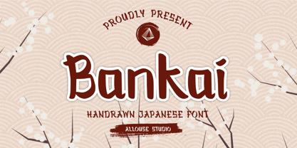 Bankai a Handdrawn Japanese Font. Bankai is perfect for any tittles, logo, product packaging, branding project, megazine, social media, wedding, or just used to express words above the background. Bankai also come with Multi-Lingual Support. Enjoy the font, feel free to comment or feedback, send me PM or email. Thank You!
 - Tiger Rag by ITC,
$29.00Tiger Rag is the work of English calligrapher John Viner, who was inspired by Japanese calligraphy when creating this dramatic, informal typeface. The font is extensive and flexible, with many alternate characters. Tiger Rag is an excellent choice for casual display typography which should produce a fresh, random effect. - Comica by Groen Studio,
$20.00 Comica is a monospaced adaptation of the most well-known but most popular casual font. Designed specifically for programming, which is a typography angle that involves intensive typing that feels more like handwriting than typesetting, this typeface is inspired by the friendly characteristics and character of Japanese characters.
 - Mangkualam by Essentials Studio,
$16.00 Mangkualam Is a Traditional Javanese Style Script Font Mangkualam is perfect for product packaging, branding project, megazine, social media, wedding, or just used to express words above the background.
 - LudwigHohlwein - 100% free

- Kitetsu Faux by Twinletter,
$15.00 Kitetsu is a spoof Japanese typeface that we created especially for those of you who need writing for a Japanese-themed design. Of course, this typeface is also very attractive when used for other graphic display purposes. If you choose this typeface, your project will leave an impression on your audience because of its unique, abstract, and different shape, which will set it apart from the rest. Logotypes, food banners, branding, brochure, posters, movie titles, book titles, quotes, and more may all benefit from this font. Of course, using this font in your various design projects will make them excellent and outstanding; many viewers are drawn to the striking and unusual graphic display. Start utilizing this typeface in your projects to make them stand out.
 - Onigiri by Megami Studios,
$12.50 Cute and adorable, they're...Onigiri! Designed to evoke the cuteness of Japanese mascots with the informality of script, these little riceballs o' text are sure to please! Comes in Latin alphabet, hiragana, katakana and onigiri dingbats!
 - Venture by Linotype,
$29.99Venture Script reflects Hermann Zapf's handwriting. It was originally written with a Japanese feltpen. And like with Zapf's typeface Noris Script he wanted to preserve the rough outline of the handwritten form in the final drawings. - Rice Wine JNL by Jeff Levine,
$29.00 A piece of sheet music from Richard Rodgers and Oscar Hammerstein II's 1958 hit "Flower Drum Song" had the play's name lettered in its iconic Anglo-Japanese style. This became the basis for Rice Wine JNL.


