1,750 search results
(0.026 seconds)
- Gatsby Modern by Nicky Laatz,
$15.00 Gatsby Modern Serif takes its cues from the "Roaring Twenties" , an era when breaking from the norm was the order of the day, when femininity took on a charming 'boyishness', and a time when anyone who’s anyone, needed to be bold and ever so slightly, or even not so slightly, eccentric. Perfect at any size - Gatsby Modern does well from large eye-catching headlines , to large paragraphs of small text. Great for modern branding, posters, logos, social media projects, headers, advertising and so much more. Gatsby Modern is available in two weights, regular and a heavier set bold to suit your project needs.
 - Dueblo by alphabeet.at,
$40.00 Dueblo is a font family in serif, sans serif and semi serif with variability in weight and serifs. It's a classical antiqua with a sans serif basis, a semi serif version, two decor styles for headlines and initials and the italics in sans and in serif. The small caps, alternates as well as other useful optional and contextual open type features are included in the fonts. It has been in development since 2012 and in use for several projects and publications since 2015. It was worked on until 2020, the cyrillic and greek letters were added, and it was built up in a new and modern way. Now it's really ready for building words and paragraphs.
 - Gyst by phospho,
$30.00 Gyst is a neo-humanist sans-serif typeface that artfully blends the principles of Grotesque and Antiqua. With its classic uprights and the serifs in its true italics, Gyst spans the arc from a modern humanistic sans serif to a captivating calligraphic serif. Contrasting strokes and luscious, on the other hand razor-edged terminals reflect a sense of grace, thriving at the intersection of geometric precision and flourishing sophistication. Made for body text as well a s display use. In any situation, you will find the autonomous cursive posture to be a perfect playmate for the upright. Gyst comes in four upright and italic weights, all equipped with a whole lot Alternates and Ligatures.
 - Berling by Linotype,
$29.99The productivity of the Berlingska Stilgjuteriet was made possible by the development of modern typeface art in Sweden in the 1950s. The typeface Berling was designed by Karl-Erik Forsberg for the Berlingska Stilgjuteriet in Lund. It belongs to the modern text typefaces and like most of these markedly shows the influece of the Neorenaissance. Berling Antiqua appeared in 1951 with a matching italic and by 1959, it was expanded to include five weights. Linotype offers Berling in four of them, roman and bold with their respective italics. In 2004 the Swedish publisher Verbum commissioned a complete redesign of Berling for the 21st century. Linotype assisted the designers of this new typeface, which came to be called Berling Nova. - Orbi by ParaType,
$30.00 The Orbi type system is a low contrast antiqua of elegant design with a well developed set of members. It consists of 10 roman and italic faces of different proportions and weights and 3 decorative calligraphic fonts. It also contains 3 additional fonts with various decorated initials. The roman includes small capitals. Thanks to its variety of styles the font is suitable for a wide range of applications - the basic styles are good for books and periodicals; the narrow styles work well in the columns and tables of business papers; the decorative styles are ideal for ceremonial typography where swashes, calligraphy and initials are usual. The fonts were designed by Natalia Vasilyeva. Released by ParaType in 2010.
 - Ferryman by Floodfonts,
$49.00 Ferryman is a Blackletter typeface for the contemporary reader. Unfamiliar Blackletter characters have been replaced with adapted common Latin characters (Antiqua) or with letters from other historical scripts that are more legible to a modern audience. Ferryman is the antidote to the overused geometric and neogrotesk styles. An expressive display typeface with a strong character, it is perfectly suited for counterculture projects and progressive concepts e.g. in visual art, indie music, and alternative lifestyles. With nine weights and corresponding italics Ferryman offers a wide range of creative possibilities. Each style offers 590 glyphs supporting all Western-, Eastern- and Central-European languages and comes with four sets of numbers and various currency symbols.
 - Boardwalk Avenue Rough by Fenotype,
$30.00 Boardwalk Avenue Rough is a textured version of Boardwalk Avenue. It’s a robust type collection of three styles and two weights of each. It’s divided into Boardwalk Pen, Boardwalk Antiqua and Boardwalk Serif. Boardwalk Avenue’s core is a connected mono linear script that works fantastic when paired with either of the impressive serif styles. All the fonts work great on their own but try putting them all together for a complete display font setup for a project. Here’s a short introduction on what’s included: Boardwalk Avenue Rough Pen is a connected Script. It’s great for headlines, quotes or in packaging. It has a casual hand drawn vibe to it but it’s clean and legible. It’s equipped with automatic Contextual Alternates that keep the connections smooth and versatile. For instance when you type double letter another of them will automatically change to add variation. Or if you type “i” for example, as a first letter after space or after capital letter the code will add starting point to the letter to keep the letterforms more balanced. If you need more ambitious letterforms you can try Swash or Titling Alternates -there’s alternates for every standard letter and seek for even more alternates from the glyph palette. Boardwalk Avenue Rough Antiqua is a high contrast serif with strong character. It’s great for glamorous headlines or as a logotype. Boardwalk Avenue Rough Serif is a low contrast serif with bulky character. It’s great for strong and sturdy headlines or as a logotype.
 - P22 Virginian by IHOF,
$24.95 P22 Virginian is an historic script font designed by Ted Staunton for his historic novel centered around a family bible and the handwritten annotation through 7 generations. The Virginian font is strongly influenced by classic “Chancery cursive” script.
 - Opera House by Solotype,
$19.95This is a fake and a fraud and not a bad-looking type. We did this to imitate the look of an old wood poster font, but it is completely new. Don't tell anyone. Please note: no lowercase. - Mother's Hand by Celebrity Fontz,
$19.99A down-to-earth font from the hand of a mother from a time when writing was something still done with accuracy and poise. This font evokes motherly memories that you cannot let die, memories of a woman who didn't have it easy, who never gave up, and who made sacrifices for her children. - Strezed by Gholib Tammami,
$14.00 This font is for anyone who wants to give a touch of pain and horror to their project. This handwritten font is suitable for display use, titles, and some designs with the theme of sadness, fatigue, or anything alike.
 - Behrensmeyer Vigesimals by Dharma Type,
$14.99 This 8-bit pixel font is designed with respect for 80s game designers and the pixel font pioneers in middle 90s. And for the calligrapher H.P. Behrensmeyer & Charles Paxton Zaner. Use at size 20 pixels or multiples of 20 and anti-alias off is recommended. List of our Pixel Font Project. ·Flat10 Antique ·Flat10 Artdeco ·Flat10 Arts&Crafts ·Flat10 fraktur ·Flat10 Holy ·Flat10 Holly ·Flat10 Segments ·Flat10 Stencil ·Flat20 Gothic ·Flat20 Headline ·Flat20 Hippies ·Flat20 Streamer ·Behrensmeyer Vigesimals ·Civilite Vigesimals
 - Santa Claus by Mans Greback,
$59.00 Santa Claus is a traditional Christmas typeface. Being decorative and based on antique, Middle Ages letter forms, it aims to be a traditional type for Holiday contexts. The lettering was drawn by Måns Grebäck and put together into a font during 2019. The font is of high quality, and comes with an additional Christmas symbol typeface. You can also use the numbers to access symbols. Example: Santa6Claus It contains all necessary characters and supports a very wide range of international languages.
 - Rioma by Halbfett,
$30.00 Rioma is a geometric typeface inspired by a legend of type design: Antique Olive. As a font family, Rioma ships in two different formats. Depending on your preference, you can install the typeface as two Variable Fonts or use the family’s 16 static OpenType font files instead. Those weights run from Light to Heavy. While the static-format fonts offer a good intermediary-step selection, users who install the two Variable Fonst have vastly greater control over their text’s stroke width.
 - Stervella by Tatiana Nazarova,
$50.00 Elegant and prickly; smooth and sharp; beautiful, but evil - Stervella - display typeface. Its serifs resemble the twisting branches and thorny thorns of a blackthorn, trying to prick neighboring letters. This font is inspired by the forms of ancient Uncial, combining antique with pointed gothic writing. Изящная и колючая; плавная и острая; красивая, но злая - акцидентная Стервелла. Ее засечки напоминают извилистые ветви и колючие шипы терновника, стремящиеся уколоть соседние буквы. Этот шрифт вдохновлен формами старинного Унциала, совмещая в себе антикву с остроконечным готическим письмом.
 - Civilite Vigesimals by Dharma Type,
$14.99 The Civilite is a historic script in the sixteenth century. This 8-bit pixel font is designed with respect for 80s game designers and the pixel font pioneers in middle 90s. Use at size 20 pixels or multiplies of 20 and anti-alias off is recommended. List of our Pixel Font Project. ·Flat10 Antique ·Flat10 Artdeco ·Flat10 Arts&Crafts ·Flat10 fraktur ·Flat10 Holy ·Flat10 Holly ·Flat10 Segments ·Flat10 Stencil ·Flat20 Gothic ·Flat20 Headline ·Flat20 Hippies ·Flat20 Streamer ·Behrensmeyer Vigesimals ·Civilite Vigesimals
 - Blitz by Wiescher Design,
$20.00 A very glitzy Blitz! I always wanted to design a typeface that was top heavy, but I never knew how not to make it look like Antique Olive, until recently -- I had an idea. My new family is very readable despite it beeing top heavy, thin on the low end and thick on the upper end. The font gets a special shine because of this effect. And it stays readable despite its special design. Your designer of surprising typefaces, Gert Wiescher
 - Saltpetre by Magpie Paper Works,
$32.00 Inspired by late 18th century type specimens, Saltpetre is a grounded yet rustic typeface. His letters have been hand-inked with antique dip pens and playfully spaced for a charming, irregular look. In addition to a set of 26 upper case letters, the font includes a variety of period graphics, interlocking decorative borders, numerals, punctuation, currency figures and multi-lingual support. Saltpetre is extremely versatile and excels at display, as well as specialized uses such as cartography and historical reproduction.
 - Flat10 Stencil by Dharma Type,
$14.99 Stencil pixel font which has rough, tough and masculine impressions. This 8-bit pixel font is designed with respect for 80s game designers and the pixel font pioneers in middle 90s. Use at size 10 pixels or multiples of 10 and anti-alias off is recommended. List of our Pixel Font Project. ·Flat10 Antique ·Flat10 Artdeco ·Flat10 Arts&Crafts ·Flat10 fraktur ·Flat10 Holy ·Flat10 Holly ·Flat10 Segments ·Flat10 Stencil ·Flat20 Gothic ·Flat20 Headline ·Flat20 Hippies ·Flat20 Streamer ·Behrensmeyer Vigesimals ·Civilite Vigesimals
 - Byronic by Alan Meeks,
$30.00 Byronic is soft modern sans-serif but with an antique style lower-case. The rounded end soft look gives Byronic a friendly soft look whilst still retaining a classical typographic appearance. A very clean style and slightly condensed it is excellent for text setting and headline with an unusual loser case that compliments the caps perfectly. Available in a range of 5 weights and 5 italics and a Latin Pro character set of 430 characters including ranging numerals and small caps.
 - Directors Cut Pro by Type Innovations,
$39.00 Directors Cut Pro is a compelling new font series designed by Alex Kaczun. It recently won the second place—a commendation in the Canberra Typeface Competition. This handsome Geometric Antique serif design is based on the early 19-century Moderns and Scotch styles, infused with the warm charm of traditional antique, added for interest. Capturing the best of both ages: it's warm, comforting and persuasive. Directors Cut Pro's graceful aspects naturally invite uses at large sizes, for which we have created a stunning and elegant lighter weight. But, this workhorse typeface series incorporates a solid regular weight, along with its italic—ideal for a multitude of text purposes, at varying point sizes. A robust Bold weight is available for headlines and emphasis. Director Cut Pro comes with proportional as well as tabular lining figures for quickly setting up charts and tables. It also contains an extended character set—including most Central European languages. Alex Kaczun is in the process of expanding this typeface series to include additional weights, styles and proportions. Stay tuned! The large Pro font character set supports most Central European and many Eastern European languages.
 - King Tut by Canada Type,
$24.95 King Tut is a restoration and expansion of the original Egyptian Expanded, a single bold face cut in 1850 by Miller & Richard, the famous Edinburgh founders. This aesthetic, though originally issued to help drive simple print advertising of those days, is perhaps the longest lasting genre of typeface. This aesthetic flourished in the later part of the 19th century, helped by the surge of similar faces from England (such as Figgins' Antique 6 and Expanded Antique), and became the defining index of the old American wild west that continues to this very day. King Tut serves up its impact through a balance between the wide, compact letterforms and elegant curvature that manages to come through even in confined areas. The family's weight variety allows for more options in counterspace use as well as precision in the amount of curve definition and contrast needed by the typographer. The lighter weights completely oppose that 19th century boldness and expose the alphabet's skeleton in a strive for simplicity that fits modern applications. With generous language support to boot, King Tut's diverse offerings make it an essential addition to today's designer repertoire.
 - Anastasia - Unknown license

- Cocaine Nosejob - 100% free

- Dogwood - Unknown license

- Radgrows by Letterhend,
$9.00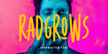 Radgrows is a casual and playful font with ligatures! This font works perfectly for anyone who needs a font for headlines, logotype, apparel, invitations, branding, packaging, advertising, and more. This typeface includes uppercase, lowercase, punctuation, symbols, numerals, ligatures, multi-lingual support.
 - Asterone by Letterhend,
$15.00 Asterone is a modern font family and works perfect for anyone who needs a typeface for headline, logotype, apparel, invitation, branding, packaging, advertising etc. Asterone comes in uppercase, lowercase, punctuation, symbols, numerals, stylistic set alternate, ligatures, etc also support multilingual.
 - P22 Elizabethan by IHOF,
$24.95 Elizabethan is part of the fonts designed by Ted Staunton for his historic novel centered around a family bible and the handwritten annotation through seven generations. The Elizabethan font is based on a style known as “secretary hand” circa 1610.
 - Vadstenakursive by Monotype,
$29.99The Vadstenakursiv font was inspired by letterforms first used in the Vadstena nunnery, Sweden, founded by Birgitta, later canonized Saint Birgitta and buried in Rome 1373. These letterforms were also used in documents for different guilds, and on commercial documents. - Fantique Four by Digital Empires can be described as a font that beautifully merges the charm of antique design elements with a dash of modern flair, making it a unique offering in the landscape of d...
- IngyArrows by Ingrimayne Type,
$10.00 IngyArrows is a set of three fonts with three sets of arrows, with one of them a blend of the other two, where normally there are standard numbers, letters, and punctuation marks. The revision of 2011 added many of the arrows that exist in several places in the unicode codings and that cannot be accessed by normal keystrokes.
 - Semper by Linotype,
$29.99Semper is slightly angular since it is in part based on callygraphic lettering. That is not as evident as in the italic of Jenson Classico. On the contrary, the text looks even and harmonious, which makes the typeface easy to use. The name is Latin meaning always, but you knew that already. Semper was released in 1993. - Breakfast Burrito by Hanoded,
$15.00 Recently I have been watching some re-runs of Dexter. In season 1, Debra has a rough morning and complains she cannot make it through the day without eating a breakfast burrito. The name stuck, a font was born and the result is Breakfast Burrito font. It is a tall, all caps typeface with a little twist.
 - Treifany by Attract Studio,
$18.00 Treifany is an elegant serif font family with an aesthetic style with beautiful ligatures, lots of alternative custom glyphs, and multilingual support. This stylish font family is timeless and cannot be missed in your font collection. Perfect for editorial projects, Logo design, branding, product packaging, magazine headlines or simply as a stylish text overlay onto any background image.
 - Iowan Old Style BT by Bitstream,
$40.99Iowan Old Style was designed for Bitstream in 1990 by noted sign painter John Downer. Iowan Old Style is a hardy contemporary text design modeled after earlier revivals of Jenson and Griffo typefaces but with a larger x-height, tighter letterfit, and reproportioned capitals. Iowan Old Style Titling was designed by John Downer and added to the Iowan Old Style family in 2002. The cap-only character set includes several ornaments and fleurons, broadening the appeal and functionality of the typeface family. Iowan Old Style was originally designed for Bitstream in 1990 by Downer, a noted sign painter. Iowan Old Style is a hardy contemporary text design modeled after earlier revivals of Jenson and Griffo typefaces but with a larger x-height, tighter letterfit, and reproportioned capitals. Expert and old style figure font sets were added in 2000. - 1565 Renaissance by GLC,
$20.00 This set of initial letters was inspired from French renaissance decorated letters. It is a typical pattern, one among dozen quite similar, but this one was in use in Paris, unchanged, for centuries, and was still in use in the beginning of 1900s. This explains the difference between I and J, U and V. These characters were engraved years after the original set. Our font was inspired from a late 1800s publication. It can be used as well with Humane fonts (like our 1543 Humane Janson or 1592 GLC Garamond) as with modern fonts like our 1820 Modern or 1906 French News.
 - As of my last update in April 2023, there isn't a widely recognized or commercially available font specifically known as "Annon." However, the task of imagining or describing a font by this name prov...
- Beetlejuice - Unknown license

- Hands Up by Huy!Fonts,
$15.00 Hands Up is a useful collection of hand designs, with or without shirt. It has from pointing hand to annoying hands or happy hands and some give-the-finger hands. They are drawing in a clear cartoon style, suitable for modern designs.
 - PreCursive by Graffiti Fonts,
$9.99 This set of two fonts is intended for use by kindergarden & 1st grade teachers or anyone else teaching young children how to write. 2 Fonts are included, PreCursive Lined has the upper, lower & dotted mid line & the the Regular has only the letters.


