10,000 search results
(0.024 seconds)
- Tavernaki by Nantia.co,
$12.00 The Tavernaki Handwritten Delicious Font is a 100% handwritten delicious font with which you can achieve a handwritten-type lettering feeling. This typeface is a multilingual lettering font with Greek (of course), Latin characters and diacritics. The style of the font is perfect for your modern graphic design needs. This font has a really nice flow so you use it in a large text if you want to give them a touch of personality. In addition, this typeface can be used on social media content, for branding or packaging.
 - Edellyn Script by Letterhend,
$19.00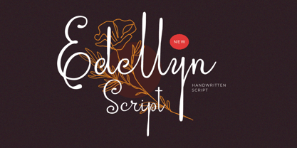 Introducing, Edellyn Script, a modern script typeface. This collection of scripts is perfect for personal branding. As you can see, this typeface has beutiful and modern look which is perfectly made to be applied especially in headline, logotype, apparel, invitation, branding, packaging, wedding card, advertising etc. Features : uppercase & lowercase numbers and punctuation multilingual alternates PUA encoded We highly recommend using a program that supports OpenType features and Glyphs panels like many of Adobe apps and Corel Draw, so you can see and access all Glyph variations. Thank you for purchase this font and Happy Creating !!!
 - Santis by Latinotype,
$45.00 Santis is a multiface type, special for logos, brands, magazines and editorial world. Especially for setting trends in fashion and design. The particularity of this font is that you can easily read it, even when applying swash type letters. It is a Didot based font. Santis versatility can harmoniously display a word or phrase. Santis has 1017 glyphs with alternate characters, numbers and ligatures ornaments specially created for a better design. For best results use with Open Type. Designed by Enrique Hernandez with technical support of Daniel Hernández.
 - Clonoid by Dharma Type,
$19.99 Inspired by and tribute to arcade game logos in 80s and 90s. Clonoid can give futuristic, sci-fi and mechanical impression by its geometric framework but its rounded bowls and semi-rounded edges can make natural and soft impression too. And its orthodox letterform make it possible to use this font for all uses. Clonoid family consists of 12 styles, 6 weights (ExtraLight, Light, Regular, SemiBold, Bold and Black) & italics and it’s available in OpenType format. We released 4 big Sci-Fi families in 2013. Check it out! Clonoid Controller Geom Graphic Space Colony
 - Meliana Script by Arterfak Project,
$13.00 Meliana is a joyful handwriting font, created with a freestyle hand-lettering and a bit bouncy letterform that gives cute and friendly looks. Inspired by children's style and natural handwriting, Meliana Script is suitable for logo, packaging, quote, apparel, cards, invitation, wedding, branding, poster, and more! Meliana is equipped with lots of alternates, there are ligatures, alternates, and stylistic set 01 - 06 that you can mix and match to get more variation of typographic design! You can combine the font with Meliana Extras, containing the swash and doodles.
 - Frank Flowers by Wiescher Design,
$15.00 Frank Flowers are fonts with flowery embellishments. They are useful for all kinds of celebrations, but they also have lots of impact. There are only uppercase letters even on the lowercase keys. Uppercase and lowercase look different, so you can mix them. You can even mix the two sets, it'll look great. I had a lot of fun doing these fonts and I want you to have some fun as well. That's why I sell them very, very cheap, even cheaper if you buy the pair! -Your typedesigner for unusual solutions Gert Wiescher
 - Kuniku by ArimaType,
$18.00 Kuniku is an unconventional sans serif font that sticks to the rules. These can easily fit into a very large set of projects, so add them to your creative ideas and see how they make them stand out. Each character is uniquely crafted and would be amazing to complement any project you're working on. Use it to create beautiful titles, beautiful invitations, stunning logos and more!! Perfect for displays, headers, invitations, save the date, weddings and more! This font is PUA encoded which means you can access all the glyphs and sweeps easily!
 - Straider by Hikhcreative,
$23.00 Specialized for the "speed typeface" and "adrenaline seeker" soul, we got you packed up. A nitro boost for your visual needs. Please welcome, STRAIDER. The racing typeface. Inspired by the mid era of vintage and modern automotive visual branding. We build the bold and strong font with total aim to the speed, cars, vehicles, and automotive vibes. Will be a perfect match for the automotive events, branding, logo, cars and motorcycle posters, advertising, anytime you want some more "speed" in your visual project. FEATURES : Uppercase & Lowercase letters Numbers & Punctuation Ligatures Multilanguage Support Thank you.
 - Minthas Script by Amarlettering,
$15.00 Minthas Script comes with 280+ glyphs. The alternative characters were divided into several Open Type features such as Swash, Stylistic Sets, Stylistic Alternates, Contextual Alternates. The Open Type features can be accessed by using Open Type savvy programs such as Adobe Illustrator, Adobe InDesign, Adobe Photoshop Corel Draw X version, And Microsoft Word. And this Font has given PUA unicode (specially coded fonts) so that all the alternate characters can easily be accessed in full by a craftsman or designer. Note : Tail is available only for lowercase letters. Happy Designing!
 - Sensal by Larin Type Co,
$14.00 Sensal this is a beautiful vintage font in the Art Deco style. elegant and attractive, it will attract attention and create a unique atmosphere. this font is made in two styles - Regular and Outline, this will allow you to combine and make your design more voluminous. Also in this font there are alternates, with their help you can change the dynamics of the font and make it lightweight. Try changing alternatives and you will see how many options you can get. This font is easy to use and has OpenType features.
 - PR Cauldron by PR Fonts,
$9.02 Whether your subject is scary, or just ancient, this font can help get the right feeling across. PR-Cauldron has capitals based on Uncials, and lowercase based on Celtic Minuscule. “Potion” has a rough finish, and “Curse” has the same letters dripping with gore, suitable for Halloween. Letters are size matched in both fonts, so you can put in as much, or as little messiness as you like. Combines well with: PR Bramble Wood 1, PR Bramble Wood 2, PR Hallow Doodles 01, PR Hallow Doodles 02, PR Swirlies 01, PR Swirlies 05
 - Biscuit Juice by PizzaDude.dk,
$20.00 A biscuit and a cup of coffee, a biscuit and a cup of tee ... both are obvious - but what about a biscuit and a glass of juice? I loved that combination as a kid (and I even crumbled the biscuit in the juice...yuck...I wouldn't do that today!!! Anyway, here you have a legible uppercase font with a nice handmade look. I've added 4 different versions of each letter, which makes the font look really nice and slightly jumpy. I even added two nice swashes to the N and K. Enjoy!
 - Aurellio by Pen Culture,
$19.00 Proudly present "Aurellio - Modern Calligraphy Font" A clean and smooth font made by original handwriting. You can apply this font for various needs such as branding, logos, watermarks or signatures. wedding invitations and much more. Aurellio includes fully uppercase and lowercase letters, numbers and punctuation, ligatures and swashes that you can easily access. I really hope you enjoy it – please do let me know what you think, comments & likes are always hugely welcomed and appreciated. More importantly, please don't hesitate to drop me a message if you have any issues or queries. thank you
 - Magdesa by Bosstypestudio,
$14.00 Magdesa is a script type family of four fonts. It is inspired by Elegant Fonts and has a soft and friendly look. Magdesa can be used for branding, packaging and anywhere else you need a script font that is readable and smooth. Magdesa has many ties, strokes and alternate characters that will make your designs unique and beautiful. You can also purchase Magdesa as a Family Font and adjust the weight of Magdesa smoothly between Slant and Bold weights. Note that you need design software that supports Family Fonts.
 - Sathiresa by Zeenesia Studio,
$15.00 Proudly Present Sathiresa Brush Font Sathiresa font with textured characters. Sathiresa is a handbrush font made with natural hand crafted. Sathiresa can be used for a variety of projects such as stationery invitations, social media, logos, weddings, branding, graphic design with added swashes. and can be combined with a variety of serif fonts to enhance the project you want to work on. We hope you enjoy the font, please feel free to comment if you have any thoughts or feedback. Or simply send me a PM or email me at zeenesia@gmail.com.
 - Sinffonia by Corradine Fonts,
$39.95 Sinffonia is a beautiful ornamental font family. Its thin weight and roman style makes very elegant and ideal for any high quality project. The Open Type version, plenty of ligatures, alternative Characters and ornamental characters, is carefully programmed to replace automatically the glyphs accord to the feature and context so you can modify the aspect of the text easily without any incoherence in the design (i.e. overlaps and collisions). Non Open Type users can try the four plain versions of Sinffonia, which includes some of the beautiful ornamental characters of the OT version.
 - Chemistry by MJB Letters,
$15.00 Chemistry is a stylish monoline script with a natural flow and beautiful and elegant characters, you can use this font to design wedding invitations, labels, logos, branding, craft project, quotes, and more. In order to use the beautiful swashes, you need a program that supports OpenType features such as Adobe Illustrator CS, Adobe Photoshop CC, Adobe Indesign, and Corel Draw. but if your software doesn't have Glyphs panel, you can install additional swash font files: if you have questions about the latest fonts, please provide a short message to us Thank You! MJB Letters
 - Griston by Rhd Studio,
$20.00 Introducing the newest product, Griston font, this font is perfect for creating signature logos and watermarks for photography studios or photography logos, best for initial logos or brand signatures. Made with elegant, professional and unique taste, You can try it first by typing what you want below made simple but has a very luxurious feel, this font has a lowercase alternative that is very similar to handwriting using a pen so it is suitable for signatures, logos, watermarks and more. again. can create custom personalized signatures, create custom logos, so this awesome signature is for all. maybe next time I will make an italic or slant version if this font is in great demand and can help with many things you want for signatures, logo branding, or watermarks. If you have any questions about the latest fonts, please send a short message thank you
 - San de More by Kereatype,
$12.00 San de More is a Variable family Serif font. A Hype of summer-themed brings us to express a thirst for creating a product that can help you to choose fonts for your creations. Like as we are on the preview above, how the fonts can "stand" within your design. San de More is created on a 5 weight with italics style. You won’t be worried about which one fits your creative design. Also, You can Mix it up all of it without worrying about design collision. No special software is required to type out the standard characters of the Typeface. To access the Opentype Ligatures and Alternates you will need software that supports Opentype features in fonts. San de More Features: Multilanguage Alternates PUA Encoded Ligatures Very easy to use in any software (Instructions included). If you have any questions, please feel free to get in touch. Thank you
 - Gothiks Round by Blackletra,
$50.00 Gothiks Round is the rounded version of Gothiks. It is a narrow 6-weight display sans-serif influenced by Texturas. The rhythm and verticality of Texturas can be easily identified on the letters with diagonal strokes like A N M K k V v W w X x Y y Z z: here they are all vertical. This kind of morphology was chosen because it accepts condensation in a very natural way, giving to this sans-serif a very unique personality. The intermediate weights can be used for short texts while extreme weights are excellent for big sizes. It has an extensive character set—with extensive language support—and many OpenType features like fractions, small capitals and different figure sets. Default figures align with lowercase. The typeface’s name refers to the plural of the word Gothic, which in turn can refer to both sans-serifs or Blackletter, depending on geographic location.
 - Al Eriega by Aluyeah Studio,
$120.00 Inspired by the many emerging tech startups, we wanted to create a font that can play to give the impression of technology but still fit into various design areas. Eriega gives the impression of modern and technology as a movement for change for the better. Eriega is a modern tech display typeface that unites the enthusiasm and technology. A simple, modern, futuristic font that can be applied to many areas of design. Coming with 90+ stunning and super easy to use alternates and ligatures. Very suitable for apps, magazine, headline, website, ads, product package and all type of design project you have. Features: OpenType support Multilingual support (15 languages) PUA Encoded Super Easy to Use alternates - It's OpenType support but you can easily call alternates character using special combination like A.2 S.2 a.r r.i etc. To get results like the preview just type Er.iega
 - Whisky Trail by Vozzy,
$10.00 Introducing a vintage look label font named "Whisky Trail". All available characters you can see at the screenshot. This font have 7 styles - Regular, Full, Shadow, Light, Shadow FX, Light FX and Print. This font will good viewed on any retro design like poster, t-shirt, label, logo etc. For using effect layer: Type your text in Regular. Copy that and paste at the same position. Change the style to Light FX or Shadow FX. After that you can choose different colors for Regular font and Shadow or Light effects. For the catchwords type the word with space before and after word (for sample ' with ', or ' with2 ' for alternate view of catchword), 'Discretionary Ligatures' on the 'OpenType' tab must be turned on. Or paste it from 'Glyphs' tab in any place on your text. This in Illustrator. In Photoshop 'Discretionary Ligatures' you can find in the menu Type - OpenType. Thank you!
 - Josephani Script by Romie Creative,
$14.00 Josephani Script's newest style with modern types of calligraphy fonts, I hope you are interested in this font, if you want to use it for your work. This font can be used easily and simply because there are many features in it it contains the full set of lowercase and uppercase letters, various kinds of punctuation marks, numbers, and multilingual support. The font also contains several alternatives, ligatures and Stylistic Sets for those of you who have software which can work OpenType (Photoshop / Illustrator / InDesign). Josephani Script is appropriate use for market designs developed at this time. This font has a model trendy, natural and soft, with this font you can use a chance at every moment from one extraordinary way to highlight the celebration from your best party, because this font will be a supporter for the goal such as wedding invitations, parties, graduations, birthdays, meetings, etc.
 - All Is Quiet by Kitchen Table Type Foundry,
$15.00 The year 2022 went and 2023 came. I can honestly say that last year was a horrible year and I am happy it ended a couple of days ago. The first week after New Year’s Eve always fills my head with the U2 song ‘New Year’s Day’ - so I named this font after a line from the lyrics. I also happened to watch a fantastic movie called ‘Im Westen Nights Neues’, directed by Edward Berger, but based on a book by Erich Maria Remarque, which, in English, was published as ‘All Quiet On The Western Front’. So there you have it: naming a font in 2 easy steps! ;-) All Is Quiet is a lovely brush font, which I created using my father in law’s Chinese pencil and ink. I can suggest some uses here, but I am convinced you can come up with that yourself.
 - Algha by Youthlabs,
$17.00 Introducing Algha Beauty Sans Serif Font. Algha inspired from cottagecore which prioritizes beauty and elegance. Algha has an obtuse angle which means that beauty is not confined to the point of view. Algha is suitable for your needs that require beauty. Algha can be worn simply or with ornaments. What's The Feature ? - 3 Stylistic Alternate Set - Stylistic Ligature - Smooth Corner - Multilingual Support - Separate Alternate Files - Opentype Support Need to test words in this font? Just type the box below, and see what it looks like - For more information on accessing alternative flying machines, you can see this link (http://adobe.ly/1m1fn4Y) - If you want to use this font on canva, you can see the tutorial in this link (https://www.youtube.com/watch?v=Rwhf1O3Dv78&ab_channel=tomcunningham) Feel free to message me if you have any question. Thanks, stay safe and healthy, and have a nice day.
 - Magnesit by Rekord,
$22.00 Sporty and brawly, Magnesit creates impact everywhere it lands. Impressive headlines are its specialty, but it feels right at home used in packaging, branding and poster design. With a very tall x-height, wide language support and minimalistic yet playful appearance, it can take on any serious typographic job. Three distinct styles expand the possibilites even further: the straight to the point Regular, the friendly Soft and the determined Hard styles share metrics across related Magnesit Stencil and Magnesit Dark families, so you can mix and match to achieve exactly the effect you need. Magnesit works great with illustrations, the generous shapes can be easily filled with strong imagery to great effect. Based on the best-selling Grim, Magnesit is a vast improvement of the concept with long awaited addition of lowercase, reworked proportions, spacing and kerning, expanded language support and useful icons to satisfy even the most demanding typographers’ needs.
 - Egregio Script by Fontscafe,
$39.00 We at Fontscafe are forever trying to work on conniving up typography that will blend itself into your work space in a manner that will make you wonder how you ever managed without it…and that effort has led us to the birth of yet another all-new font for you! And this one like most of our others has a niche appeal although it is versatile as versatile can be. Now this is a font that can pretty much fit the bill when you want to send out an exclusive appeal but yet not overly formal. It is styled with fonts that cry out ‘eliteness’ and exclusivity, but without the part where it becomes so exclusive and classy that it goes way over people’s heads! The ‘Egregio’ can still connect on a very personal, almost friendly level with your audience while it remains in a class of its very own!
 - Monkton Book Condensed by Club Type,
$36.99 Packing more copy in a narrow space is the main reason for using a condensed type. Characters with a more ovular shape tend to be less wide than their circular counterparts and will allow for more letters per line. In narrow columns for example, this typeface can provide up to 25% more copy than the regular typeface in the same space. Another reason is when a larger type size is called for — used sparingly it is useful for headings or headlines. For emphasis, narrower letters can provide a stark contrast in the flow of reading, creating impact while retaining typographic character. Condensed types can specially useful in tables and charts because typically both use few words in each block. If space now allows, you may think about the luxury of a larger point size. This optimizes space while keeping your typography more easily legible.
 - IM FELL FLOWERS 1 - Unknown license

- Weekend Mood by Colllab Studio,
$9.00 Presenting Weekend Mood! An Aesthetic Font in 2 Versions. This font made with the perfect combination of each character. You can combine to get a unique combination. It looks original and can be used for all your project needs. Each glyph has its own uniqueness and when meeting with others will provide dynamic and pleasing proximity. This font can be used at any time and in any project. You can see in the presentation picture above, Weekend Mood looks unique and playful style on design projects. So, Weekend Mood can't wait to give its touch to all your design projects such as quotes, crafted, kids design, poster design, personal branding, promotional materials, website, logotype, product packaging, etc. WHAT'S INCLUDED? 1. Weekend Mood Regular (Version One) • The first version comes with uppercase, lowercase, numeral, punctuation, symbols, and Standard Latin Multilingual Support (Afrikaans, Albanian, Catalan, Danish, Dutch, English, French, German, Icelandic, Indonesian, Italian, Malay, Norwegian, Portuguese, Spanisch, Swedish, Zulu, and More). 2. Weekend Mood Alt (Version Two) • The second version comes with uppercase, lowercase, numeral, punctuation, symbols, and Standard Latin Multilingual Support (Afrikaans, Albanian, Catalan, Danish, Dutch, English, French, German, Icelandic, Indonesian, Italian, Malay, Norwegian, Portuguese, Spanisch, Swedish, Zulu, and More). A Million Thanks Colllab Studio
 - Magilio by Prioritype,
$19.00 Introducing Magilio - A Chic Serif Fonts Beautiful and soft fonts in a contemporary style that can make your design projects look modern, elegant and luxurious. Made with many alternative characters to make it easier for you to do various design projects and give you fun while typing. You can apply them to designs like social media posts, logos, merchandise, book covers, posters, video content thumbnails, quotes, landing pages, wedding invitations and much more which you can make with this great item for any design :) Features: -Uppercase -Lowercase -Numeral -Punctuation -Multilingual -Opentype Features & PUA Encoded Multilingual contained: Afrikaans, Albanian, Asu, Basque, Bemba, Bena, Breton, Catalan, Chiga, Cornish, Danish, Dutch, English, Estonian, Filipino, Finnish, French, Friulian, Galician, German, Gusii, Indonesian, Irish, Italian, Kabuverdianu, Kalenjin, Kinyarwanda, Luo, Luxembourgish, Luyia, Machame, Makhuwa-Meetto, Makonde, Malagasy, Manx, Morisyen, North Ndebele, Norwegian Bokmål, Norwegian Nynorsk, Nyankole, Oromo, Portuguese, Quechua, Romansh, Rombo, Rundi, Rwa, Samburu, Sango, Sangu, Scottish Gaelic, Sena, Shambala, Shona, Soga, Somali, Spanish, Swahili, Swedish, Swiss German, Taita, Teso, Uzbek (Latin), Volapük, Vunjo, Zulu. Note: Use a program that supports the Opentype features and the glyph panel is available, so you can see the various alternative characters available. Examples of programs such as Adobe Illustrator, Corel Draw or Affinity Designer.
 - Hex Braille by Echopraxium,
$5.62 The purpose of this monospace font is to display braille in an original although rather steganographic way. Its glyphs are built from a flat hexagon which can be read as 3 rows of 2 vertices (i.e. regular braille glyph grid). The initial design is illustrated by glyphs 'ç' (no dot) and 'û' (6 dots) as shown by poster 5. Glyphs are connected to each other, thus 6 connections for each hexagon (2 on left/right and 4 on top/bottom). In the final design many diagonal segments of the hexagon were removed for esthetical reason. Text is displayed not as a honeycomb but as a lattice instead which mixes hexagons, squares and "irregular convex octagons" (mostly unclosed), the design favored squares over octagons. The whole slightly resembling a PCB. Text can be framed with 3 sets of Frame glyphs (as shown in Poster 4): Octagonal: { €, °, £, µ, §, ¥, ~, ¢ } which can be mixed with Rectangular High Rectangular Low: { è, é, ê, ï, î, à, â, ä } Rectangular High: { Â, ù, Ä, Ê, Ë, ô, õ, ë } which can be mixed with Octagonal NB: When using Frame glyphs, it is advised to show Pilcrow (¶) and Non Breaking Space, which are replaced by empty shapes (e.g. in Microsoft Word, use CTRL+8 or use [¶] button in the ribbon).
 - Bullet Numbers by Wiescher Design,
$9.50 This is a must read!!! BulletNumbers come in very handy for all kinds of lists that don't exceed 100 categories. I have long since been using my own BulletNumbers in positive and negative and four styles, serif, sans, engravers and script, a fitting one for every occasion. Now I perfected them for all of you. Here is how to use them: (Important! Set letterspacing to '0', otherwise the two digit numbers will overlap!!!) The numbers 1-0 reside on the standard keys. Two digit numbers 01-99 can be composed out of left and right half circles by using (lowercase) 'abcdefghij' for the first digit (left half circle) and 'lmnopqrstu' for the second digit (right half circle). The critical pairs (all combinations with 1) can be found in various places. Type '!' for 10, '#' for 11, '$' 12, '%' for 13, '&' for 14, '(' for 15, ')' for 16, '*' for 17, '+' for 18, ',' for 19, '-' for 21, '.' for 31, '/' for 41, ':' for 51, ';' for 61, '?' for 81, '_' for 91. The two arrows are on the < and > keys. '100' can be found with shift+option+1. Last but not least, the capital letter bullets A-Z can be found on the shift+letter A-Z. Yours very practical Gert Wiescher
 - Pirouette by Linotype,
$40.99Pirouette is based on a logo that Japanese designer Ryuichi Tateno created for a packaging design project in 1999 (a shampoo container!). Tateno's logo experimented with complex, overlapped swash letterforms. He continued to develop these outside of the initial packaging project, until they took on a life of their own. Eventually, Tateno designed a full typeface out of the logo, Pirouette, which was the first place display face in Linotype's 2003 International Type Design Contest. The Pirouette typeface contains six different fonts. The basic font is Pirouette Regular. This is an engraver's italic lowercase paired with elaborate swash capitals. The swash capitals have two visual elements in their forms: thick strokes and thin strokes. Pirouette Text includes the same lowercase as Pirouette Regular, but the uppercase letters are much shorter and simpler. This "text" font can be used to set longer amounts of copy. Pirouette Alternate contains different lowercase glyphs and additional ligatures, which can be used as substitutes for the lowercase forms in the Pirouette Regular and Pirouette Text fonts. Pirouette Ornaments contains swashes and other knick-knacks that can either be added onto the end of a letter, or used as separate decorative elements or swooshes (accolades) on a page. Pirouette Separate 1 and Pirouette Separate 2 are two fonts that can be layered over top of one another in software applications that support layering (e.g., most Adobe and Macromedia applications, as well as QuarkXPress). Pirouette Separate 1 contains the thick stroke elements from Pirouette Regular's uppercase letters, as well as the same lowercase glyphs that can be found in Pirouette Regular and Pirouette Text. Pirouette Separate 2 contains only the thin stroke elements from Pirouette Regular's uppercase letters. By layering Pirouette Separate 1 and Pirouette Separate 2 over one another, you can give the uppercase letter's thick and thin stroke elements different colors and create unique, more calligraphic designs. The Pirouette family, Tanteno's first commercial typeface, was greatly influenced by the calligraphic and typographic work of the master German designer, Prof. Hermann Zapf, especially his Zapfino typeface. - Bardamu by Groteskly Yours,
$25.00 Bardamu is a variable slab serif font family designed by Eugene Tantsurin and Anna Remm, and released by Groteskly Yours Studio. Bardamu is a type family that is open to interpretation and experimentation, yet this ambiguity does little to hide its inherent friendliness and good vides. Bardamu can easily be used in a variety of projects and feel at home both in graphic design, branding, web design or editorial design. Thanks to its unique letterforms and eye-catching design choices, it can be that final touch that makes your brand pop! One of the standout qualities of Bardamu is its remarkable versatility. Bardamu comes in 25 styles, allowing users to choose a style that best fits their needs. In addition to that, it offers a wide range of styles, from sleek backward-slanted italics at -20° to elegant upright styles, as well as regular 20° italics. For static fonts, there are two extra subfamilies available (10° Half Italic and 10° Half Reverse) that can be used for creating more complex hierarchy in any text. With a total of 25 static fonts and 1 Variable font, Bardamu is the perfect workhorse display slab serif with unlimited typesetting capabilities. Each font in the Bardamu family boasts an extensive 700+ character set, encompassing all major Latin-based languages, punctuation marks, symbols, and even supplementary characters. Bardamu takes flexibility to a whole new level with its incredible OpenType features that further enhance its versatility. With features such as Case-Sensitive Punctuation, Stylistic Alternates, Sub- and Superscript, Tabular Figures, and Localised Forms, you can fine-tune every detail of your design to perfection. Moreover, the multiple stylistic sets available in Bardamu allow you to switch between various versions of the same glyph effortlessly. Bardamu type family includes 25 static styles as well as a variable font. All styles can be purchased separately or as a full family package. Two styles can be downloaded free of charge. If you'd like to explore Bardamu further, we also offer free trials upon request.
 - Bulblamp by Popskraft,
$9.00 Layered font set 3D Bulb lamp Bulblamp is a 12 component font system that can be layered in different ways to create endless classic titling effects used commonly in signage by skilled sign painters and sign makers and any who interested in simple and flexible ways to make graphic design. Examples of how to use this you can see on the images. Moreover, You can start fast in Figma, Illustrator and Photoshop with predefined downloadable package. ! Download free predesigned Figma, Illustrator and Photoshop sets for this fonts here: https://drive.google.com/open?id=17ogdSIjPuLA5-CUaAO1TlqJGbRPWy5iA&authuser=popov_av%40koriphey.ru&usp=drive_fs Each file is named according to its purpose. The number indicates the recommended order of the layers. 1 below, 5 on top. 1 means you should place it first. Of course, you do not have to use all the fonts, and vice versa - you can repeatedly use the same font style with different styles. What is Layered font? In fact, these are common fonts located in a stack strictly one above the other. This allows quickly create unique text effects using ordinary fonts. Where can you use this? These fonts can be used in any program that allows you to stack fonts as objects strictly one above the other, however it is recommended to work in professional programs such as Illustrator, Photoshop, Figma and so on ... How to use this font set quickly? For quick use, I recommend using ready designs for Figma, Photoshop or Illustrator. Download fonts and Install all fonts. Go to the link https://drive.google.com/open?id=17ogdSIjPuLA5-CUaAO1TlqJGbRPWy5iA&authuser=popov_av%40koriphey.ru&usp=drive_fs which has contained pre-made solutions for this font applicable in Figma, Photoshop or Illustrator and download presets. Follow the recommendations on the pages. Basically, you will need to replace the words in the template with your own, then edit colors and transfer the result to your design. In that’s all, it's easy.
 - Shinn Kickers JNL by Jeff Levine,
$29.00 Conrad X. 'Cobb' Shinn (Sept. 4, 1887- Jan. 28, 1951) was a Fillmore, Indiana-born post card illustrator who sold a series of successful novelty postcard lines which included (among others) Charlie Chaplin, automobiles and the Dutch culture in the beginning years of the 20th Century. After serving in World War I, Shinn found the market for novelty postcards dwindling, and he also lent his artistic skills to cartoon features and illustrating many children's books [including his own, under the nickname 'Uncle Cobb'] which taught easy step-by-step drawing methods. Some time in the 1920s, he eventually migrated into the field of supplying electrotypes and stereotypes of 'stock cuts' of photos and line art to the printing trade. In the days of letterpress printing, this was the forerunner of paper clip art and its successor, electronic clip art. Purchasing many of his designs from 'journeyman' artists of the time, the diversity of Cobb Shinn's stock cuts library grew with the passing years, reflecting changing times, styles and topics. Some of the illustrators whose signed works were presented in Shinn's 'CUTalogs' [as he called his stock cuts catalogs] include Mary Clemmitt, Louis H. Hippe, E.C. Klinge, Nelson White, Harvey Fuller, Bess Livings, Lois Head, Harvey Peake and Van Tuyl. Upon his passing in 1951, it's not known how long the Indianapolis-based company existed before finally closing its doors. One of the more popular series of cartoons were the line illustrations of men and women affectionately called 'little big head guys' by many modern fans of these cuts because the heads of the characters were drawn somewhat larger than the rest of their bodies. Shinn Kickers JNL is a collection twenty-six of these illustrations, and just like a kick in the shin (as the pun in the name implies), these charming cartoons get your attention.
 - Sabon Paneuropean by Linotype,
$45.99Jan Tschichold designed Sabon in 1964, and it was produced jointly by three foundries: D. Stempel AG, Linotype and Monotype. This was in response to a request from German master printers to make a font family that was the same design for the three metal type technologies of the time: foundry type for hand composition, linecasting, and single-type machine composition. Tschichold turned to the sixteenth century for inspiration, and the story has a complicated family thread that connects his Sabon design to the Garamond lineage. Jakob Sabon, who the type is named for, was a student of the great French punchcutter Claude Garamond. He completed a set of his teacher's punches after Garamond's death in 1561. Sabon became owner of a German foundry when he married the granddaughter of the Frankfurt printer, Christian Egenolff. Sabon died in 1580, and his widow married Konrad Berner, who took over the foundry. Tschichold loosely based his design on types from the 1592 specimen sheet issued by the Egenolff-Berner foundry: a 14-point roman attributed to Claude Garamond, and an italic attributed to Robert Granjon. Sabon was the typeface name chosen for this twentieth century revival and joint venture in production; this name avoided confusion with other fonts connected with the names of Garamond and Granjon. Classic, elegant, and extremely legible, Sabon is one of the most beautiful Garamond variations. Always a good choice for book typography, the Sabon family is also particularly good for text and headlines in magazines, advertisements, documentation, business reports, corporate design, multimedia, and correspondence. Sabon combines well with: Sans serif fonts such as Frutiger, Syntax. Slab serif fonts such as PMN Caecilia, Clairvaux. Fun fonts such as Grafilone, Animalia, Araby Rafique. See also the new revised version Sabon Next from the Platinum Collection." - Madera Variable by Monotype,
$229.99Malou Verlomme’s Madera is a typeface made strictly for graphic designers, created as an indispensable type toolbox that can meet the needs of both print and digital environments. Verlomme has drawn on his extensive experience creating bespoke type for major brands, and Madera is a “typographic synthesis” of this work. Although designed as a restrained sans serif, the typeface has some punchy personality – with sharpened apexes that inject flavour into the design, particularly in the darker weights and when set at all caps. Madera sits alongside fellow geometric designs such as Proxima Nova, Gotham or Avenir, offering a straight-talking tone of voice but with some extra bite. If you’re a large corporation, with a typeface being used in many different environments you want something that's just the right balance of visibility and legibility to sustain an extensive amount of communication.” “The design is very solid but it doesn’t go out of its way to attract attention,” explains Verlomme. “It still has a fair amount of warmth and personality, in a very understated manner. The Madera typeface family has 32 fonts: Upright, Condensed and Italics. It is available in OpenType CFF and TTF fonts formats. Each typeface contains over 650 glyphs with extensive Western, Central and Eastern European language support. It also supports OpenType typographic features like alternatives, ligatures and fractions. Madera Variables are font files which are featuring two axis and have a preset instance from Hairline to Extra Black. - Quercus 10 by Storm Type Foundry,
$69.00 Quercus is characterised by open, yet a little bit condensed drawing with sufficient spacing so that the neighbouring letters never touch. It has eight interpolated weights with respective italics. Their fine gradation allows to find an exact valeur for any kind of design, especially on the web. Quercus serif styles took inspiration from classicistic typefaces with vertical shadows, ball terminals and thin serifs. The italics have the same width proportion as upright styles. This “modern” attitude is applied to both families and calls for use on the same page, e g in dictionaries and cultural programmes. Serif styles marked by “10” are dedicated to textual point sizes and long reading. The sans-serif principle is rather minimalistic, with subtle shadows and thinned joints between curved shapes and stems. Quercus family comprises of the usual functionality such as Small Caps, Cyrillics, diacritics, ligatures, scientific and aesthetic variants, swashes, and other bells & whistles. It excels in informational and magazine design, corporate identity and branding, but it’s very well suited for book covers, catalogues and posters as well. When choosing a name for this typeface I've been staring out from my studio window, thinking helplessly without any idea in sight. Suddenly I realised that all I can see is a spectacular alley of oaks (Quercus in Latin) surrounding my house. These oaks were planted by the builders of local ponds under the leadership of Jakub Krčín in the fifteenth century.
