10,000 search results
(0.032 seconds)
- Goldsthink by Essentials Studio,
$16.00 Introducing by Essentials Studio Goldsthink Is a Modern Script Font Goldsthink is perfect for product packaging, branding project, megazine, social media, wedding, or just used to express words above the background.
 - Daresiel by Scriptorium,
$18.00Daresiel is an elegant script font based on a sample of Edwardian period hand lettering. It has elaborate curls and embellishments and some other interesting features like the elongated 'f' character. - Thanks Valentine by Sakha Design,
$12.00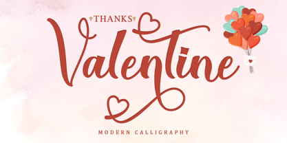 Thanks Valentine is a lovely and delicate script font that exudes elegance and class. This font was particularly crafted for those who need a beautiful and refreshing look to their designs.
 - Brigitta by Autographis,
$39.50 Brigitta is the complementary joining script that can be mixed with Annabella. Also written with a Japanese brush on rough paper, first scanned and then carefully finished by hand on screen.
 - Catalistefa Signature by Letterena Studios,
$9.00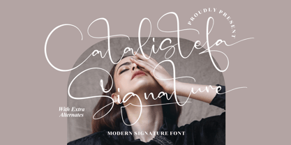 Catalistefa Signature is a lovely and delicate script font that exudes elegance and class. This font was particularly crafted for those who need a beautiful and refreshing look to their designs.
 - Diamond Pride by Illushvara,
$15.00 Diamond Pride is a sweet and beautiful script font. It features an elegant style that makes it perfect for logos, branding, invitations, stationery, wedding designs, social media posts, and much more.
 - Findastone by ahweproject,
$14.00 Findastone is a delicate and fine script font. It can be applied to a variety of design ideas, from invitations, to cards and pretty much anything that requires a lovely touch.
 - Paris Doodles by Outside the Line,
$19.00 Paris Doodles... memories of a feeling, a rainy afternoon, a glass of wine, an outdoor cafe, a metro stop… 28 hand drawn whimsical icons and 2 scripted words. Ooh la la!
 - Pearl River by Epiclinez,
$18.00 Pearl River is a bold and elegant script font. Whether you're designing a logo, or poster or working on crafting projects, Pearl River can take your creativity to a new height.
 - Hadeya by Typefactory,
$14.00 Hadeya is a modern and beautiful script font. It has a elegant style and is perfect for creating quotes, logos, social media post, clothing, poster, id card, card, and many more.
 - Unstream by sizimon,
$18.00 Unstream Script perfect for branding, logotype, website headers, fashion design and any more. It contains a full set of lower & uppercase letters, a large range of punctuation, numerals, and multilingual support.
 - Mount Light by FHFont,
$19.00 Mount Light is script font with authentic calligraphy style, with opentype feature include of the font. Suitable for design, element design, wedding, event, t-shirt, logo, badges, sticker, and awesome work.
 - Arabela by Aqeela Studio,
$15.00 Arabela is a modern and beautiful calligraphy script, ideal for use in elegant designs. This font has a dancing look and adds a lot of femininity to all types of projects.
 - Caustin Bolar by madeDeduk,
$16.00 Really excited to introduce Caustin Bolar is a bold brush script and will be perfect for all your designs project. Uppercase Lowercase Number & Symbol International Glyphs Ligature Hope you enjoy it.
 - P22 Symphony by IHOF,
$24.95 P22 Symphony is a romantic decorative script originally called Zephyr featuring extra flourishes on the capitals. Useful for lines of display in advertising, packaging etc. or for small extracts of poetry.
 - Marlita by Abo Daniel,
$13.00 Marlita is a carefully made script, great for quotes, branding, packaging, wedding card, advertising, and more. It comes with 10 variations of ampersands as well as various titling and ending swashes.
 - Shutten Reason by FHFont,
$16.00 Shutten Reason is font duo handwritten script font and sans with hand-lettering Brush Style. Suitable for design, element design, wedding, event, t-shirt, logo, badges, sticker, and awesome work, etc...
 - Golden Rainbow by Essentials Studio,
$16.00 Golden Rainbow Is a A Fat Handwritten Script Font Golden Rainbow is perfect for product packaging, branding project, magazine, social media, wedding, or just used to express words above the background.
 - Arbor Brush by GroupType,
$29.00 Arbor Brush is a fresh and lively brush script from the FontHaus design studio. The design is organic, strong, painterly, and anything but tentative. Great for advertising, menus, signage, or display.
 - Kallisha by Nirmana Visual,
$17.00 Kallisa is such a artistic font, Script with a touch of hand-written, It's best used for logos, wedding stationery, social media, and quotes. Kallisha features: Multilanguange PUA Encoded Thank you!
 - Smoot by A New Machine,
$10.00 This all new hand drawn font comes as a serif and a script version. Mix and match to bring your designs whimsy and playfulness. Suitable for headlines, posters and call outs.
 - SF Atlantida by Supfonts,
$19.00 Atlantida it is a Calligraphy chick font with exquisite accents. It is perfect for branding, wedding invitations and invitation cards and many more What's inside: Atlantida Script Multilingual support Cricut support
 - Haldane by Greater Albion Typefounders,
$16.50 Haldane is an Art Nouveau 'punctuated' (i.e. not joined) script, ideal for certificates, calligraphic lettering and signage. Stroke width vary from almost hairline to extremely wide. Great fun for every application!
 - Ermin Sweet love by Four Lines Std,
$9.00 Ermin Sweet is a lovely and delicate script font that exudes elegance and class. This font was particularly crafted for those who need a beautiful and refreshing look to their designs.
 - Balneario by Sudtipos,
$39.00 Cities often have their own voice, a voice that can be read... in each location and each business, voice portraying a cultural fabric with an array of manifestations. Balneario Script is a small tribute to a coastal port and tourist city. Through the Sign Painters, in its golden age, a clear, friendly, practical, and functional way of making itself heard evolved. Far from wanting to be perfect, a typeface seeks to be close, warm, and casual. Inspired by the gestures of the brush, Balneario Script reverts to the use of “Casual Letters” so used by Sign Painters. In this adaptation, we sought to adjust its morphology to optimize its performance in small formats and extend the system to include lower case letters as part of the set. The set of fonts has two script weights in addition to an all caps version. The design emphasizes creating a harmonious morphological criterion. Friendly, rhythmic, and with a firm stroke Balneario Script is unique, ideal for headlines and short texts that need to be gestural but simple and highly functional. This typeface was designed to be used in promotional posters or for relaxed and fun Packagings. Balneario Script goes beyond constructive or functional aspects. It seeks to capture the smell of the sea, the warm summer breeze and the nostalgic feeling of a city that from its daily life, knew how to forge a unique personality. This atmosphere allows it to host millions of tourists year after year, and with them reinforce their spirit each summer.
 - Classical Calligraphy by HKL Studio,
$19.00 Classical Calligraphy Script With Ornament Is a calligraphy Vintage script font that comes with beautiful alternate characters. copper plate mix calligraphy with handlettering style. to show its performance. Classical Calligraphy is attractive as a typeface that is smooth, clean, feminine, sensual, glamorous, simple and very easy to read. Classical Calligraphy Script comes with a Clean and Aged version, beautifully binding upper and lower case, binding and loved by many finishes. It has Multilingual support (Western European characters) and works with the following languages: English, Danish, Dutch, Estonian, Finnish, French, German, Hungarian, Icelandic, Norwegian, Polish, Portuguese, Spanish, Swedish. In my example I show how this script can be used. It's perfect for logos, wedding invitations, alcohol labels, romantic cards, and more. Products include: Classical Calligraphy Script, Classical Calligraphy Extras Ornament Alternate Upper & Lower Case Style Binding, as well as a touch of ornament make this font look elegant. Recommended for use in Adobe Illustrator or Photoshop. Special features don't work in Microsoft Word. How to access all alternative characters using Adobe Illustrator: https://www.youtube.com/watch?v=XzwjMkbB-wQ How to use font style set in Microsoft Word 2010 or later version: https://www.youtube.com/watch?v=NVJlZQ3EZU0 There are additional ways to access the alternative/swash, using the Character Map (Windows), Nexus Font (Windows) Font Book (Mac) or a software program such as PopChar (for Windows and Mac). How to access all alternative characters, using Windows Character Map with Photoshop: https://www.youtube.com/watch?v=Go9vacoYmBw If you need any help or suggestions please contact me via email: creativescaleup@gmail.com
 - Etruria by Dima Pole,
$34.00 Font Etruria is based on a real Etruscan inscriptions and realistic accurately simulates the writing of the Etruscans. The idea of the font Etruria is to give an opportunity for anyone to touch the past of mankind! The character of the Etruscan alphabet involves the creation of a font with only uppercase letters. However, I did not limit this font by that. Etruria has not only a lowercase is different from uppercase, but an additional sets of alternative characters. In General, the main characteristic of Etruscan writing is randomness and diversity of characters. Differs from lowercase to uppercase is only the first step on the road to make randomness effect. Next to the aid of the OT features. To recreate the randomness effect, in Etruria there are several OT features (Contextual Alternates, Stylistic Alternates and Stylistic Sets), which built a script to simulate randomness. Additionally, another script creates the effect of random positioning. Together they create incredibly realistic Etruscan inscription. Thus, any of these features can be disabled at will. I also used a small line spacing, because it is characteristic of the Etruscan writing. Actually the Etruscan writings is a mirror of the writings compared with the current European alphabets. I didn't use this feature all the letters, because this would make the font difficult to perceive, but to make the font characteristic of the Etruscan style, Etruria has a few letters in mirror image. However, if for someone it may seem unusual, mirrored letters can be disabled instead of them will appear more familiar to them. Another feature of Etruscan writing is the use instead of a space dotacentered. Font Etruria has this feature, there is a OT feature Stylistic set ss03. Naturally, it also can optionally be disabled. All these features can be used together, separately, or turn it off. The main goal achieved! The text typed in Etruria, creates full impression of these Etruscan inscriptions.
 - Cesium by Hoefler & Co.,
$51.99 An inline adaptation of a distinctive slab serif, Cesium is an unusually responsive display face that maintains its high energy across a range of different moods. The Cesium typeface was designed by Jonathan Hoefler in 2020. An energetic inline adaptation of Hoefler’s broad-shouldered Vitesse Black typeface (2000), Cesium is named for the fifty-fifth member of the periodic table of the elements, a volatile liquid metal that presents as a scintillating quicksilver. From the desk of the designer, Jonathan Hoefler: I always felt that our Vitesse typeface, an unusual species of slab serif, would take well to an inline. Vitesse is based not on the circle or the ellipse, but on a less familiar shape that has no common name, a variation on the ‘stadium’ that has two opposing flat edges, and two gently rounded sides. In place of sharp corners, Vitesse uses a continuously flowing stroke to manage the transition between upright and diagonal lines, most apparent on letters like M and N. A year of making this gesture with my wrist, both when drawing letterforms and miming their intentions during design critiques, left me thinking about a reduced version of the typeface, in which letters would be defined not by inside and outside contours, but by a single, fluid raceway. Like most straightforward ideas, this one proved challenging to execute, but its puzzles were immensely satisfying to solve. Adding an inline to a typeface is the quickest way to reveal its secrets. All the furtive adjustments in weight and size that a type designer makes — relieving congestion by thinning the center arm of a bold E, or lightening the intersecting strokes of a W — are instantly exposed with the addition of a centerline. Adapting an existing alphabet to accommodate this inline called for renovating every single character (down to the capital I, the period, and even the space), in some cases making small adjustments to reallocate weight, at other times redesigning whole parts of the character set. The longer we worked on the typeface, the more we discovered opportunities to turn these constraints into advantages, solving stubbornly complex characters like € and § by redefining how an inline should behave, and using these new patterns to reshape the rest of the alphabet. The New Typeface The outcome is a typeface we’re calling Cesium. It shares many of Vitesse’s qualities, its heartbeat an energetic thrum of motorsports and industry, and it will doubtless be welcome in both hardware stores and Hollywood. But we’ve been surprised by Cesium’s more reflective moods, its ability to be alert and softspoken at the same time. Much in the way that vibrant colors can animate a typeface, we’ve found that Cesium’s sensitivity to spacing most effectively changes its voice. Tighter leading and tracking turns up the heat, heightening Cesium’s sporty, high-tech associations, but with the addition of letterspacing it achieves an almost literary repose. This range of voices recommends Cesium not only to logos, book covers, and title sequences, but to projects that regularly must adjust their volume, such as identities, packaging, and editorial design. Read more about how to use Cesium. About the Name Cesium is a chemical element, one of only five metals that’s liquid at room temperature. Resembling quicksilver, cesium is typically stored in a glass ampule, where the tension between a sturdy outer vessel and its volatile contents is scintillating. The Cesium typeface hopes to capture this quality, its bright and insistent inline restrained by a strong and sinuous container. Cesium is one of only three H&Co typefaces whose name comes from the periodic table, a distinction it shares with Mercury and Tungsten. At a time when I considered a more sci-fi name for the typeface, I learned that these three elements have an unusual connection: they’re used together in the propulsion system of nasa’s Deep Space 1, the first interplanetary spacecraft powered by an ion drive. I found the association compelling, and adopted the name at once, with the hope that designers might employ the typeface in the same spirit of discovery, optimism, and invention. —JH Featured in: Best Fonts for Logos
 - Gator by Canada Type,
$24.95 Cooper Black's second coming to American design in the mid-sixties, after almost four decades of slumber, can arguably be credited with (or, depending on design ideology, blamed for) the domino effect that triggered the whole art nouveau pop poster jam of the 1960s and 1970s. By the early 1970s, though Cooper Black still held its popular status (and, for better or for worse, still does), countless so-called hippie and funk faces were competing for packaging and paper space. The American evolution of the genre would trip deeper into psychedelia, drawing on a rich history of flared, flourished and rounded design until it all dwindled and came to a halt a few years into the 1980s. But the European (particularly German) response to that whole display type trend remained for the most part cool and reserved, drawing more on traditional art nouveau and art deco sources rather than the bottomless jug of new ideas being poured on the other side of the pond. One of the humorous responses to the "hamburgering" of typography was Friedrich Poppl's Poppl Heavy, done in 1972, when Cooper Black was celebrating its 50th anniversary. It is presented here in a fresh digitization under the name Gator (a tongue-in-cheek reference to Ray Kroc, the father of the fast food chain). To borrow the title of a classic rock album, Gator is meaty, beaty, big and bouncy. It is one of the finest examples of how expressively animated a thick brush can be, and one of the better substitutes to the much overused Cooper Black. Gator comes in all popular font formats, and sports an extended character set covering the majority of Latin-based languages. Many alternates and ligatures are included in the font.
 - Lagarto by Sudtipos,
$39.00 Some years ago, a good friend and typophile, Gonzalo García Barcha, approached me with the idea of designing a typeface for his editorial project Blacamán Ediciones. He had just came across an hitherto unknown manuscript by Luis Lagarto, a colonial illuminator and scribe, working in Mexico City and Puebla in the late 1500s. The manuscript calligraphy was incredible and stunningly original. It featured three different hands by the scribe, intermingled in the text: a kind of baroque «Roman» roundhand; a very ornate, lively «Italic»; and some sort of irregular, playful, even funny «small caps». All imbued with an eccentric, convoluted zest and vivacious rhythm. Lagarto is the final result of translating these extraordinary hands into a digital type family. Since the manuscript had no numerals, math signs and many other characters now in use, part of the fun of the job was to infer them from the stylistic peculiarities of Luis Lagarto's calligraphy. Lagarto received an Award of Excellence at the Type Directors Club of New York annual competition.
 - Kiloton - Unknown license

- Skuntch - Unknown license

- Art Greco - Unknown license

- Teenick - Unknown license

- Fatman by AType,
$17.95Fatman is such big thick person. To me it seems to the most interesting font Fatman BL. I name it fatman with the broken leg. The letter A is similar to it. - Borough Hall JNL by Jeff Levine,
$29.00Picture yourself on a New York subway station platform with the location name set into the tiles on the wall. Borough Hall JNL evokes the feeling of urban industrialism at its best. - Daliwood NF by Nick's Fonts,
$10.00This quirky charmer is based on a typeface called "Les Catalanes", designed in 1952 by Enric Crous-Vidal for Fonderie Typographique Française. Appropriately, it is named for the king of quirky Cataláns. - Cut Paper Stencil JNL by Jeff Levine,
$29.00Playing around with a previous design, Jeff Levine came up with Cut Paper Stencil JNL, a typeface with both an Art Deco flair and the look of letters made from cut paper. - Pleasant Evening JNL by Jeff Levine,
$29.00 Pleasant Evening JNL was modeled after an Art Nouveau serif typeface named ‘Racine’ [found in the 1881 Barnhart Bros. & Spindler type specimen book] and is available in both regular and oblique versions.
 - Crispy Magenta by Bogstav,
$17.00 Sweet crispy and crunchy lines, clear and obvious handmade letters! What's not to like?! If you need an organic and dynamic input to your product, Crispy Magenta could be the game changer


