10,000 search results
(0.021 seconds)
- Ratieka by Yukita Creative,
$12.00 Ratieka is a stylish, modern font that is perfect for use in fashion-related design projects. Its elegant letterforms make it ideal for branding and logo design, while its high level of legibility makes it perfect for use in websites, advertising, and other types of communication. Features. Supports all languages in the world (37) Versatile Single Font. One font for all needs. OTF File Ratieka is perfect for modern fashion brands or any projects that require a high-end feel.
 - XXII GoreGrinder by Doubletwo Studios,
$25.99 The face of horror – The GoreGrinder is an extreme logo font designed for extreme music. If you’re in love with deathmetal, grindcore and the horror movie scene, you may find pleasure in using this font. It comes with an upper- and lowercase characterset, numerals, some punctuation and a bunch of drips and stuff used in the genre. Use it in your graphic-editing-application and be creative, play with it and find out what’s possible. Find out more about using it on Behance.net
 - Spiraling Down by Hanoded,
$15.00 I was listening to an Opeth album called Blackwater Park. By the time I had decided that this font needed some swirls, the band was playing a song called The Drapery Falls - which has the word ‘spiraling’ in it (see poster 2) - and the name was born. Spiraling down is a surprisingly elegant font (given its roughness). I probably wouldn’t set a whole text in it, but it will really stand out as a titling font for packaging or book covers.
 - Syntachron by Mofr24,
$11.00 Syntachron is an extraordinary monospaced font that stands out with its futuristic and mecha-inspired design. What sets this font apart is its unique ability to combine simplicity, modernity, and boldness, resulting in a visually captivating typeface. It is the perfect choice for those seeking to create impactful posters, eye-catching marketing materials, captivating logos, attention-grabbing headlines, and engaging book and magazine layouts. One of the distinguishing features of Syntachron is its compatibility with the Cyrillic alphabet, offering versatility and style for a wide range of design projects. Whether you're working on international branding campaigns or multi-language publications, this font seamlessly integrates with the Cyrillic characters, ensuring consistency and cohesiveness across different languages. In terms of typeface pairing, Syntachron harmonizes exceptionally well with related families and typefaces that share its sleek aesthetics and futuristic vibe. It complements and enhances other fonts, enabling designers to create stunning combinations that amplify the impact of their designs. Beyond its striking appearance, Syntachron excels in its functional aspects. The font comes in a variety of styles, allowing for versatility in design choices. Its monospaced nature ensures consistent character widths, making it ideal for code snippets, technical documentation, and typewriter-style layouts. Furthermore, Syntachron offers a comprehensive character set with special features, enabling the seamless creation of diverse and engaging designs. The design concept behind Syntachron was to capture the essence of a futuristic world and merge it with the mechanical elements of mecha-inspired aesthetics. The result is a font that exudes a sense of cutting-edge technology and boldness, empowering designers to create visually striking and impactful designs that captivate their audience. Syntachron was meticulously created to fulfill the need for a font that seamlessly merges modern simplicity with futuristic design elements. Its purpose is to provide designers with a versatile tool that sparks creativity and enables them to craft stunning visual experiences. With its sleek aesthetics, support for the Cyrillic alphabet, and functional aspects, Syntachron is an indispensable asset for any design project seeking to embrace the future.
 - Arapix by Anatoletype,
$69.00 Arapix is a 12 pixel high multilingual Latin-Arabic pixel font with incredible capabilities. The Arapix is an almost traditional Naskh. It is elegant and easy to read even in very small sizes. It includes almost every feature you would expect from a high range Naskh font. Its humanistic look and feel fit perfectly to its Latin counterpart. Arapix was originally designed for a web project that didn't see the light a few years back. It started with the idea of fitting both Latin and Arabic into a 12 pixel vertical grid. The latin glyphs fit properly within the vertical limits, but when it came to the arabic glyphs, it proved to be more challenging. Arabic letters with lower diacritic dots like the (Yeh-fina) or letters with accents above like the (Alef-Hamza-above) need much more space than any Latin letter. Add to this the fact that accents needs to be positioned above and below the glyphs. It is technically impossible to fit a (Yeh-fina-kasratan) or a (Alef-Hamza-above-shadda-damma) into 12 pixels. Initially the accents were dropped and not included in the design. Although it seemed impossible at the start, Sylvain found a solution in the end, including as many contextual alternates and contextual kerning as needed to avoid every collision between letters and diacritics, letters and accents, and diacritics and accents. The contextual kerning was added to achieve an even letter and word spacing in longer text. Arapix is amazingly legible in small size on screen and in print. On the other hand, it also works perfectly as display titling font due to its unique and contemporary pixel approach. It can be used for screens with very low resolution as well as for high resolution screens and prints. The new Arapix comes with various new features and new glyphs including Persian and Urdu letters, stylistic set, old style figures, contextual kerning, contextual alternates and a few icons too. Enjoy the new Arapix and have fun with it.
 - Breaking Bread by Missy Meyer,
$12.00 This font came to be when I was creating a cake topper mockup (see the promo images) and didn't have a thick script font that I liked for it. So I got to work writing out some fun chunky cursive letters that could top a cake! The concept of breaking bread is an old one, often meaning two parties working together. In the Breaking Bread font, I've combined that heavy connecting script with a hand-lettered sans-serif uppercase set. It works in all lowercase, all uppercase, and title case with equal ease! I've also included a number of alternates and ligatures, so you can have a truly hand-written look when double-letter words show up, plus a few extra characters and swashes to add some pizzazz to your work. It's great for crafting a mug or t-shirt, creating a logo, or making product packaging! And all of those alternates are PUA-encoded, so they're easy to access in any character map. Breaking Bread also comes with over 300 extended Latin characters for language support, including but not limited to: Catalan, Czech, Danish, Esperanto, Estonian, Finnish, French, Gaelic, German, Icelandic, Irish, Italian, Latvian, Lithuanian, Norwegian, Polish, Portuguese, Romanian, Serbian (Latin), Slovak, Slovenian, Spanish, Swedish, Turkish, Welsh, and more!
 - Bill Corporate Medium by OGJ Type Design,
$35.00 Bill Corporate is a geometric typeface with generous capitals. A modern classic, based on Max Bill’s lettering work, its straightforward and uncompromising construction can be both edgy and sublime. With minimalist letterforms, pointy apexes instead of flat ones, and archetypal proportions, this font family doesn’t follow any trends but strives to achieve a timeless formal vocabulary. The skeleton of its letters is based heavily on the famous primary shapes of the Bauhaus: square, circle, and triangle. This makes for quite wide uppercase and much narrower lowercase letters. The contrast between uppercase and lowercase benefits inexperienced users, who will be able to get appealing results quickly. At the same time, it’s a powerful tool for seasoned designers, who can employ either case selectively to set the desired typographic course. Bill Corporate Medium’s 16 styles (including a set of eight lighter-than-light fonts from “Two” to “ExtraLight”) are an excellent choice for editorial design, branding, headlines, and even short to mid-length copy in a wide range of applications and industries. The uppercase letters in particular—with their varied widths and lavish dimensions—are suitable for cosmopolitan and stylish logotypes and wordmarks. Whenever a timeless, staid, and classy look is demanded, choose Bill Corporate.
 - FS Koopman Variable by Fontsmith,
$299.99New York to London via Europe The hardworking FS Koopman is a crossbred workhorse which draws inspiration from Swiss and Germanic grotesks, American gothics and early British grotesques, but refuses to fit neatly into any of these categories. Its neither one nor the other, but all of the above. Fontsmith designers Andy Lethbridge and Stuart de Rozario decided to take the characteristics they admired from each category and distill them down into one functional family. Neo meets Neue FS Koopman aims to swim against the tide of Helvetica-ish derivatives by bringing some personality and soul to a genre that all too often ends up feeling bland and sterile. FS Koopman subtly embraces the quirkiness and charm often seen in early twentieth century designs but pairs this with the functionality of later pioneers of the genre. It’s a grotesque isn’t it? The term grotesque surfaced around the early 1800s and refers to the early sans serif designs that many initially believed were strange or ‘grotesque’ due to their lack of elegant serifs. Later variations became known as neo-grotesques and this moniker stuck around even after they gained mass popularity. Some American variants became known as gothics. FS Koopman takes cues from all three categories and blends them into one cohesive design. - DearJoe 6 by JOEBOB graphics,
$29.00 The dearJoe series of fonts had it’s origin somewhere around 1999, the year I created dearJoe 1, which was a first (and half-assed) attempt at converting my own handwriting into a working font. Being able to type in my own handwriting had always been a childhood fantasy, and even though I only partly understood the software, a working font was generated and I decided to put it on the internet for people to use. And that’s what they did: at this moment the dearJoe 1 font has been downloaded millions of times and can be found on just about anything, ranging from Vietnamese riksjas, a Tasmanian gym to a fancy chocolate store on 5th Avenue. The font is not something I am particularly proud of, but it started me of in building what later became the JOEBOB graphics font foundry. Inbetween creating other fonts, the dearJoe series has become a theme I revisit every once in a while, trying to create an update on how my handwriting evolved, along with my abilities in creating fonts that mimic actual handwriting. In the last decade or so I started implementing ligatures and alternate characters, which helped a lot in making something that can almost pass for actual handwriting.
 - Nanami Rounded by Thinkdust,
$10.00 Nanami Rounded is a heavily engineered follow up to the hugely successful Nanami, which debuted at MyFonts #1 Hot New Fonts for over 2 weeks. Nanami Rounded is a carefully engineered take on the original Nanami family. We kept the curve very slight in order to keep the clean corporate balance, and not to go into a style that was too friendly. Nanami Rounded consists of 18 weights ranging from Thin through to Black. It has also extensive support for over 50 languages, and as a font family that works well both in headlines and bodycopy, Nanami Rounded is the perfect choice for a whole variety of creative briefs. The gentler, softer follow-up to the popular Nanami, Nanami Rounded is also motivated by the artistry of Japan. Smoothing the hard lines and definite corners of its predecessor just slightly, Nanami Rounded is still clearly defined and crisp enough to work in whatever context you need. If Nanami is a battle hardened Samurai, Nanami Rounded is the lotus blossom favour handed to him as he leaves his home village to go to war. If Nanami Rounded isn't quite floating your boat why not check out it’s counterparts Nanami and Nanami Handmade.
 - Brightlight by Mercurial,
$10.00 Dazzling Brightlight family typeface is a versatile, modern and classy display serif font with oblique and script also. Gives a wow effect to big titles, headlines. Use it big to enjoy it’s full potential.This font is ideal for design, logo design, blog graphics, stylizing quotes, wedding stationery, art prints, collateral design, packaging, social media, magazine, fashion, creative branding, editorial design and web design. come with elegant style but still has a modern feel, with features an extended latin character set of glyphs by covering various languages in Europe and others, and includes advanced open type features like standard and discretionary ligatures, positional numerals and so on. The Open Type features can be accessed by using Open Type savvy programs such as Adobe Illustrator, Adobe InDesign, Adobe Photoshop Corel Draw X version, And Microsoft Word. And this has given PUA Unicode Font (specially coded fonts). so that all the alternate characters Easily can be accessed in full by a craftsman or designer. Don't forget to check out other cool fonts on our store and wait for new fonts. Follow our shop for upcoming updates including additional glyphs and language support. feel free to send me a message, I would like to update it.
 - Kunhety by Twinletter,
$18.00 Introducing Kunhety, a groovy retro font display perfect for bringing a vintage touch to your designs. This font features bold and quirky letters that will make your projects stand out and evoke a feeling of nostalgia. Whether you’re working on a poster, or an album cover, or want to add some retro vibes to your latest project, Kunhety is the perfect font for you. With a range of alternative characters and multilingual support, this font is versatile and ready to add some groovy flavor to your work. Don’t miss out on the opportunity to elevate your designs with Kunhety. Furthermore, Kunhety is user-friendly and easy to use. Making it compatible with a wide range of software and devices. And with its clear and distinct letterforms, it’s sure to grab the attention of your audience and leave a lasting impression. So, add a touch of retro cool to your next project with Kunhety today! What’s Included : - File font - All glyphs Iso Latin 1 - Alternate, Ligature - Simple installations - We highly recommend using a program that supports OpenType features and Glyphs panels like many Adobe apps and Corel Draw so that you can see and access all Glyph variations. - PUA Encoded Characters – Fully accessible without additional design software. - Fonts include Multilingual support
 - Stars & Love by Roland Hüse Design,
$22.00 Stars & Love is a bold, cursive brush calligraphy font, influenced by retro script style with a friendly rounded look and flourished elegance. It features stylistic alternates, contextual alternates, standard ligatures and terminal forms (beginning and ending characters are a bit different) that ensures multiple options for you to choose from for your design work. This font comes in two instances, a Bottom Heavy and a Regular version. Being friendly yet elegant in its visual presence, Stars & Love is perfect for Love theme designs, premium packaging, stationery design, invitations, posters, logos, custom products and more. The Character set covers most Latin languages. Font Guide PDF Font presentation video For feedback, customisation or extra character request please email me at fonts@rolandhuse.com Font Features: • Latin character set: Uppercase & Lowercase A - Z • Stylistic Alternates (up to 3 Sets) • Contextual Alternates (Initial and Final Forms) • Standard Ligatures • Underline Swashes (Stylistic alternates for underscore) • Numerals & Punctuation • Accented Characters • Symbols (Currencies and basic symbols such as @ # % etc.) Please refer to the Font Guide pdf for more details. To access all features of Stars & Love such as stylistic alternates etc., it's highly recommended to use professional design software such as Adobe Illustrator, Adobe Photoshop, Adobe InDesign or Procreate (via 'add text' feature).
 - DT Paperside by Dragon Tongue Foundry,
$15.00 Paperside: Neither Papyrus nor SSI Countryside. Inspired in some ways by the Papyrus form, but untextured and smoother, with the dimensions and proportions more open, like that of Countryside SSi, with its larger easily readable lowercase body, and more consistent, shorter stems. Paperside has an open scripted feel which is pleasing on the eye and easy to read. Paperside can enhance the first letter of most sentences automatically, and changes other letters to suit their position within words, and the letters they appear beside. Now comes in 5 weights plus italic. For best results, use this ‘smart font’ with Contextual Ligatures turned on. Mulitiple Stylistic Alternatives are included. Inspiration for this font came from two other fonts. Papyrus: was designed by Chris Costello and created in 1982, it is a hand-drawn textured typeface, emulating texts written in biblical times. One of the most used (and misused) fonts of all times. Owned by Letraset, and currently published by the Internation Typeface Corporating (ITC). Countryside SSi: The serif font of an unknown designer, is currently licensed by Southern Software Inc. Feel free to preview some of the Dragon Tongue fonts that are yet to be released, at https://www.dragon-tongue.com/fonts
 - Melinda Script by Gatype,
$12.00 The Melinda is a smooth, elegant and flowing handwritten font. It has a beautifully balanced character, it fits into many designs. Melinda features a varied baseline, smooth lines, gorgeous glyphs, and stunning alternatives. Hand-drawn design elements allow you to create many beautiful typographic designs in an instant like branding, web design and editorial, prints, crafts, quotes, It's great for logotypes, wedding invitations, romantic cards, labels, packaging, spelling of names and others. Add to your most creative ideas and watch how they bring them to life! Melinda includes OpenType stylistic alternates, ligatures and International support for most Western Languages.To enable the OpenType Stylistic alternates, you need a program that supports as Adobe Illustrator CS, Adobe Indesign & CorelDraw X6-X7, Microsoft Word 2010 or later versions. How to access all alternative characters using Adobe Illustrator: https://www.youtube.com/watch?v=XzwjMkbB-wQ Melinda is coded with PUA Unicode, which allows full access to all the extra characters without having special designing software. Mac users can use Font Book , and Windows users can use Character Map to view and copy any of the extra characters to paste into your favorite text editor/app. How to access all alternative characters, using Windows Character Map with Photoshop: https://www.youtube.com/watch?v=Go9vacoYmBw
 - BF Konkret Grotesk Pro by BrassFonts,
$39.99 BF Konkret Grotesk Pro, designed by Guido Schneider, is a contemporary grotesque with a straightforward style – but a very individual touch. Inspired by classic grotesque typefaces, Konkret Grotesk Pro impresses with its unique character and rhythm: It’s elegant and edgy, flexible and forceful. The Pro family supports up to 220 Latin-based languages. Each of the 16 fonts contains more than 1500 glyphs, including small caps, 7 figure sets, fractions, many ligatures, currency symbols, alternates, special characters and other useful symbols. 11 style sets give you the option to individualize and adjust the typeface to the requirement of your design, without changing the general visual feeling. In this way you can also switch the simply slanted styled Italic into a “real Italic”. BF Konkret Grotesk Pro is a typeface family that can adapt to many requirements without losing its character and expression. The range of 8 weights provides all possibilities. Due to the lovingly designed details, Konkret Grotesk Pro works both in small sizes as well as in display applications. Thus, Konkret Grotesk Pro is ideally suited for contemporary and demanding typographic tasks, both in the fields of editorial design, branding, posters and advertising. (The new Pro edition is the extended and optimized version of the previous BF Konkret Grotesk.)
 - Dog Days by Fenotype,
$45.00 Dog Days is an American hand lettering style brush script family. Dog Days is swift, strong and full of bursting energy. Due to its clean features it’s legible even in small sizes. Dog Days is great for any display use -from poster to packaging and logo to t-shirt. Dog Days is also great for lettering works. Dog Days Brush boasts with more than 700 glyphs and plenty of OpenType features: Keep Standard Ligatures on - it adds variety in hand lettering style and keeps the flow steady. If you need more action try turning on Swash, Stylistic or Titling Alternates in any OpenType savvy software. Dog Days Brush is also equipped with Old Style Numerals if you need your numbers to fit more into text. Dog Days Brush uppercase letters are designed to work as initials so if you need to write all caps you might want to use Dog Days Caps or Dog Days Small Caps. Dog Days Caps can also be used as uppercase letters for the script. Dog Days Extras is a set of badges, swashes and swirls designed to play with the font. Dog Days is inspired by a hand lettering sample in a vintage American swimsuit advertisement.
 - Caslon Black by ITC,
$29.99The Englishman William Caslon punchcut many roman, italic, and non-Latin typefaces from 1720 until his death in 1766. At that time most types were being imported to England from Dutch sources, so Caslon was influenced by the characteristics of Dutch types. He did, however, achieve a level of craft that enabled his recognition as the first great English punchcutter. Caslon's roman became so popular that it was known as the script of kings, although on the other side of the political spectrum (and the ocean), the Americans used it for their Declaration of Independence in 1776. The original Caslon specimen sheets and punches have long provided a fertile source for the range of types bearing his name. Identifying characteristics of most Caslons include a cap A with a scooped-out apex; a cap C with two full serifs; and in the italic, a swashed lowercase v and w. Caslon's types have achieved legendary status among printers and typographers, and are considered safe, solid, and dependable. A few of the many interpretations from the early twentieth century were true to the source, as well as strong enough to last into the digital era. Caslon Black was designed by Dave Farey in the ITC library. - Lady Edith by MKGD,
$13.00 Lady Edith harkens back to the days of flappers and cocktail parties. The early part of the twentieth century, when Art Deco was at it’s height and high fashion was all the rage. A time of beauty, class and elegance. A minimalistic font with clean lines and just enough flare to make it unique. The perfect font for any occasion that needs a bit of high end magic. There is no lower case for Lady Edith as it is a decorative font. The Upper case version serves both the upper and lower case keys. Lady Edith has a glyph count of 397 and supports the following languages; Supported Languages: Afrikaans, Albanian, Asu, Basque, Bemba, Bena, Bosnian, Catalan, Chiga, Colognian, Cornish, Croatian, Czech, Danish, Embu, English, Esperanto, Estonian, Faroese, Filipino, Finnish, French, Friulian, Galician, German, Gusii, Hungarian, Icelandic, Indonesian, Irish, Italian, Kabuverdianu, Kalaallisut, Kalenjin, Kamba, Kikuyu, Kinyarwanda, Latvian, Lithuanian, Low German, Lower Sorbian, Luo, Luxembourgish, Luyia, Machame, Makhuwa-Meetto, Makonde, Malagasy, Malay, Maltese, Manx, Meru, Morisyen, North Ndebele, Norwegian Bokmål, Norwegian Nynorsk, Nyankole, Oromo, Polish, Portuguese, Romanian, Romansh, Rombo, Rundi, Rwa, Samburu, Sango, Sangu, Scottish Gaelic, Sena, Shambala, Shona, Slovak, Slovenian, Soga, Somali, Spanish, Swahili, Swedish, Swiss German, Taita, Teso, Turkmen, Upper Sorbian, Vunjo, Walser, Zulu
 - Saturdays Girl - 100% free

- CHEESE - Unknown license

- Lowndes by Greater Albion Typefounders,
$8.50 Lowndes is designed as a Blackletter display face with a spirit of fun rather than historical accuracy, and with an emphasis on legibility and clarity. It's ideal for festive design such as cards, posters etc... Have fun!
 - Wilson wells by Stringlabs Creative Studio,
$25.00 The Wilson Wells is an unique blackletter decorative font. It’s suitable for use in various projects such as gothic lettering, tattoo, headlines, posters, magazines, newspapers, t-shirts, labels, and every other design which needs a striking typeface.
 - Nikki by Galapagos,
$39.00This typeface was named for one of George's daughters, at her request, after she discovered that another of George's designs, ITC Kristen, bore an appellation strikingly similar to that of her sister. And then there was peace... - Breather by Zeenesia Studio,
$17.00 Breather is a bold modern display font with serif style. It's retro, bold, and playful. Perfect if you need a dose of fun in your project. This is a unique display typeface perfect for gorgeous logos & titles.
 - Regal box - Unknown license

- Beta Dance - Unknown license

- Hooper dooper - Unknown license

- Royal box - Unknown license

- MGN Debris by Morgana Studio,
$17.50 This design is characterized by its futuristic and modern aesthetic. The clean lines and minimalist approach create a sleek and sophisticated look, while the unique touches and use of the MGN Debris font give it a bold and edgy vibe. It is a perfect example of how a modern design can also be unique and innovative, with elements that set it apart from traditional designs. This style is perfect for businesses and organizations that want to convey a sense of innovation and cutting-edge technology. The MGN Debris font used in this design adds to its modern and futuristic feel. The font is bold and sharp, with a unique style that makes it stand out. It complements the overall design perfectly and adds to the edgy and unique vibe. This font is perfect for businesses and organizations that want to convey a sense of innovation and forward-thinking, and it pairs well with modern designs. Overall, this design is a great example of how a modern and futuristic style can be unique and captivating, with the use of the MGN Debris font adding an extra element of boldness and edge.
 - Bronkey by Alit Design,
$15.00 BRONKEY Typeface is a sans serif font that has a bold, sporty feel to it. It comes in several styles, including regular, italic, outline, square, and rough, providing a versatile range of options for designers. The font has a high body, making it stand out when used in large sizes, such as for headlines or titles. It contains 700 glyphs, including ligatures and alternates, allowing for greater flexibility and creativity in designing. Additionally, it supports PUA codes and is multilingual, making it accessible to a broad range of users. Overall, BRONKEY Typeface is an excellent choice for those looking for a modern, bold font with a range of styles and features. Its sporty feel and high body make it a great choice for projects related to sports, fitness, or any project that requires a dynamic, attention-grabbing font. Language Support : Latin, Basic, Western European, Central European, South European,Vietnamese. In order to use the beautiful swashes, you need a program that supports OpenType features such as Adobe Illustrator CS, Adobe Photoshop CC, Adobe Indesign and Corel Draw. but if your software doesn't have Glyphs panel, you can install additional swashes font files.
 - Coil by Brownfox,
$44.99 Coil feels comfortable like a well-worn pair of shoes. It could easily pass for an assertive industrial European sans serif of the early 1960s with its slight reverse contrast, monotonous proportions, and squared-off curves, if not for its less predictable side. What appears initially as ellipses upon closer inspection turns out to be irregular shapes, closer to an inverted egg than an oval. The s looks topsy-turvy with its higher curve that is larger than the lower. Some terminal strokes overhang the bowl (as in the a), others open flat (as in the Q, the f, the j, and the t). The resulting effect shakes up this seemingly “retro” face just to make it new. Our midcentury recollections are slightly distorted and reinterpreted by this ironic typeface making it fresh while deceptively cozy and familiar. Coil’s high x-height and even texture make it readable even in small sizes despite its tight apertures. Available in four weights with their italics, with two sets of figures, fractions, and alternates for Extended Latin and Cyrillic scripts. Designed by Vyacheslav Kirilenko and Gayaneh Bagdasaryan, 2020-21.
 - Gutta Percha by HiH,
$8.00 Gutta Percha is a font for golfers. It takers its name from a hard, resilient natural substance that comes from the sap of trees grown in southeast Asia and which was used for the hard core of golf balls well into the twentieth century, when it was gradually replaced with synthetic material. It therefore seemed an appropriate name for a font using the image of a golfer of the 1920s. The letters are from our font Besley Clarendon, reduced to 70%. That means that Gutta Percha set at 40 points will have the same size letters as Besley Clarendon set at 28 points. However, it should be noted that the two fonts have different baselines. If you use them together you will have to manually adjust the vertical alignment. Gutta Percha is obviously a very specialized font, both because of the subject matter and because the uppercase is designed for use as dropped caps. There may not be many uses for it, but when it is right, it will be really right. Whether you are publishing a book about the history of golf or a clubhouse bulletin, Gutta Percha will surely be noticed.
 - Magedov Military by Mans Greback,
$69.00 The Magedov Military font is a strong and robust font that exudes power and authority. It has a sharp, geometric design with bold, hard edges that gives it a strict, army-inspired feel. In a blend of sans and slab serif styles, its unique and versatile look can be utilized for a wide range of projects. This font is perfect for university or college projects, as its straight and clear-cut design gives it an academic, high-school or college feel. It is also ideal for projects that require a strong and tough look, such as law enforcement, university or sports logos. Use the parenthesis symbols ( ) [ ] { } to make decorative elements. Example: United]States The Magedov Military family consists of four high-quality fonts: Regular, Italic, Bold and Bold Italic The font is built with advanced OpenType functionality and has a guaranteed top-notch quality, containing stylistic and contextual alternates, ligatures and more features; all to give you full control and customizability. It has extensive lingual support, covering all Latin-based languages, from Northern Europe to South Africa, from America to South-East Asia. It contains all characters and symbols you'll ever need, including all punctuation and numbers.
 - Eigerdals Slab by insigne,
$30.00 Introducing Eigerdals Slab - the ultimate font for creating a cozy and inviting atmosphere in your designs. This slab-serif font family captures the essence of the mountains of Norway and the streets of Stockholm, making it the perfect choice for design projects that need a touch of Hygge. With its top-heavy characters, Eigerdals Slab has a more approachable and warm feel that sets it apart from other font choices. Plus, its tall x-height, brushed and smooth look makes it both readable and stylish. But that's not all, Eigerdals Slab comes loaded with practical OpenType features like ligatures, unicase alternates, and a set of upright italic swash alternates, that can be fully utilized in software like Quark and Adobe suite. Not only that, it also includes support for a wide range of languages. Eigerdals Slab is an extension of the Eigerdals family, and its distinctive look pairs perfectly with other text faces. Whether you're using it for display work or longer blocks of text, Eigerdals Slab is the perfect font for adding warmth and friendliness to your designs. Don't wait any longer, try Eigerdals Slab today and elevate your work to the next level!
 - Monbloc by Rui Nogueira,
$6.99 Monbloc is a typeface inspired by geometry and lines. It intends to be a practical font wich gives the designer the freedom to incorporate it in his wildest designs.
 - Linotype Freytag by Linotype,
$29.99Linotype Freytag is a condensed display face with simple, geometric shapes. With its highly readable and trendy letterforms, it is perfect for flyers, advertising, packaging, posters and magazine headlines. - Motherblood by Letterafandi Studio,
$10.00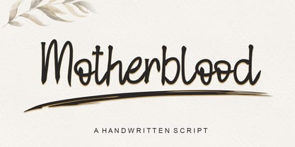 Motherblood is a sweet and friendly handwritten font. Its natural and unique style makes it incredibly fitting to a large pool of designs. The only limit is your imagination!
 - Bobila by Rashatype,
$10.00 Bobila is a cool and casual display font. It will look stunning on any poster flyer or print. Use this font for your designs and explore its endless possibilities.
 - Flintoye by Illushvara,
$10.00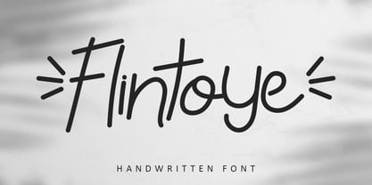 Flintoye is a sweet and friendly handwritten font. Its natural and unique style makes it incredibly fitting to a large pool of designs. The only limit is your imagination!


