10,000 search results (0.105 seconds)
  1. Komika Text - Unknown license
  2. Esquivel Trial - Unknown license
  3. BoinkoMatic - Unknown license
  4. Rickles - Personal use only
  5. cup Font - Unknown license
  6. AndironOutline - Unknown license
  7. WC Wunderbach Bta - Unknown license
  8. Bionic Comic - Personal use only
  9. Jonny Quest Classic - Unknown license
  10. Jumbo Outline - 100% free
  11. Robotaur - Unknown license
  12. Arbuckle - Unknown license
  13. RaveParty Narrow - Unknown license
  14. Crosspatchers delight - Unknown license
  15. Pakenham - Unknown license
  16. Omicron Zeta - Unknown license
  17. PR8 London Ads - Unknown license
  18. Brothers of Metal - Unknown license
  19. RNS BARUTA BLACK - 100% free
  20. Lumio - Unknown license
  21. HIPTRONIC - 100% free
  22. Kovacs - Unknown license
  23. American Dream - Unknown license
  24. Staggering Bob - Unknown license
  25. Prussian Brew - Unknown license
  26. NeverSayDie - Unknown license
  27. Heavy Rotation - Unknown license
  28. Hyggelig by Hanoded, $15.00
    After watching a bunch of Danish series like Dicte, Bron and The Killing, I figured it would be nice to give my newest font a Danish name. It became Hyggelig. Hyggelig, like the Dutch word 'Gezellig', cannot be translated into English, but it means something like 'cosy'. And a 'cosy' font it is. Hyggelig is a very cute, very threedee-ish typeface. It works great in poster ads and as a display font. It comes with upper and lower case letters and a whole bunch of diacritics. Enjoy!
  29. Vanitha by Arterfak Project, $18.00
    Vanitha is a bold script font, inspired by vintage logos and old-school sign painting. This font is made with hand drawings and still pays attention to the calligraphic form so that it looks modern and unique. Vanitha is a display font, which you can use as logos, logotypes, merchandise, sports themes, flags, banners, stickers, labels, posters, and others. This font is also equipped with stylistic alternates to beautify your typographic design. Thank you for your support!
  30. Geodec by Intellecta Design, $12.95
    Geodec is a bold sans serif with classical ornament turning it in a Ornate Initial
  31. Blocky Shape by Cititype, $12.00
    Blocky Shape is a bold script with attractive features. Get inspired by its unique style!
  32. Allstar by Fly Fonts, $15.00
    Allstar is a bold retro font with serious attitude! It works best in display sizes.
  33. Storia Lettering by Gatype, $10.00
    he Storia Lettering Serif style is absolutely perfect for editorial headings. The full font type upright and italic makes it easy for you to use the 2 styles in many projects. This font is complete with symbols and is multilingual. This font style is bold, bold, and sleek, featuring Swash,n Ligature and Stylistic Alt & Stylistic Set features. making it perfect for editorial, web, posters, t-shirts and magazine covers. . etc. Including: Storia Lettering & Italics Uppercase Letters, Numbers, Punctuation & Symbols. Multilingual Support More about this source text Source text is needed to get additional translation information Send feedback Side panel
  34. Century Oldstyle by Bitstream, $29.99
    Century Oldstyle is Linn Boyd Benton’s and Morris Fuller Benton’s renovation of Phemister’s Miller & Richard Old Style for ATF forty-five years later, using the Century name for marketing purposes.
  35. Black Scratch by Blankids, $23.00
    Hello, Are you looking for a strong bold font? Do you want of creating Something that stand out and inspire creativity, imagination, and endless fun? Wait no more, we will give you the best choice. Black Scratch a Strong Bold Font Black Scratch a Strong Bold Font, Inspiring from strong bold typography. This font is perfect for a design that makes it more attractive and playful. made with a very good level of aesthetics making this font suitable for book cover, poster, packging, merchandise, logotype and much more.
  36. Arquitecta Office by Latinotype, $16.00
    We have adapted the version of our Arquitecta font for use in Microsoft Office™. It only has 4 variants: regular, italic, bold and bold italic. Font weights have been named in a way that can be clearly shown up in the font list in Office™ programs for the sake of a good hierarchy (the bold variant is quite bold and does not look the same as the original font). Arquitecta Office update: Improvements of proportions and drawing. The set was extended to the current one of Latinotype.
  37. Costyle by Ergibi Studio, $19.00
    Costyle is a handwritten font. Its unique flow and easy signature style makes it perfect to use for logos, signatures, quotes, badges, labels, packaging design, blog headlines or simply use it in your next design project. multilingual support for the following languages : Cornish, Danish, Dutch, English, Estonian, Faroese, Filipino, Finnish, French, Galician, German, Icelandic, Indonesian, Irish, Italian, Norwegian Bokmål, Norwegian Nynorsk, Portuguese, Spanish, Swahili, Swedish, Swiss German. if you have any Question please Message Me. Big Thanks Ergibi Studio
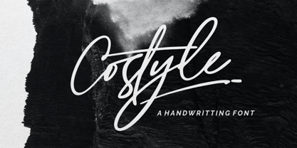
  38. Ambroise Std by Typofonderie, $59.00
    An exquisite Didot font in 18 series Ambroise is a contemporary interpretation of various typefaces belonging to Didot’s late style, conceived circa 1830, including the original forms of g, y, &; and to a lesser extent, k. These unique glyphs are found in Gras Vibert, cut by Michel Vibert. Vibert was the appointed punchcutter of the Didot family during this period. It is the Heavy, whom sources were surest that Jean François Porchez has been used as the basis for the design of the typeface family. In the second half of the 19th century, it was usual to find fat Didots in several widths in the catalogs of French type foundries. These same typefaces continued to be offered until the demise of the big French foundries in the 1960s. Ambroise attempts to reproduce more of what we see printed on paper in the 19th century; a more accurate representation of Didot punches. So, the unbracketed serifs are not truly square straight-line forms but use tiny transitional curves instead. The result on the page appears softer and less straight, particularly in larger sizes. The illustrious Didot family of type founders and printers Every variation of the typeface carries a name in homage to a member of the illustrious Didot family of type founders and printers. The condensed variant is called Ambroise Firmin. The extra-condensed is called Ambroise François. Ambroise Pro brought back to life: fifteen years in the making! Club des directeurs artistiques, 48e palmarès Bukva:raz 2001
  39. Apparel by Latinotype, $35.00
    Inspired by the MacFarland series in the 1912 ATF catalog, Apparel is a typeface that shares similar functional characteristics with Times New Roman and Caslon fonts yet it has its own personality: A great choice for high-impact design. Apparel is a contemporary, classy and fresh serif typeface with a laid-back attitude that best suits your design needs. Its medium-large x-height makes it ideal for headlines and brand identity design. Apparel also includes a version, with a greater contrast between thick and thin strokes, for use in even larger sizes. The font comes with italic styles which can be used individually or in combination with the upright variant. Moderately slanted italics are also available as OpenType Stylistic Alternates. Each font style supports more than 200 Latin-based languages, as you would expect from Latinotype fonts. Apparel also includes a basic Cyrillic set, old style & lining figures, fractions and alternates, among other OpenType features.
  40. Superba Pro by Red Rooster Collection, $60.00
    Superba Pro is a condensed Egyptian font family with short ascenders and descenders. The dots on the lowercase ‘i’ and the German umlaut-vowels are square. Haas Type Foundry created the original Superba in 1928-1930. Steve Jackaman (ITF) designed and produced a digital version of the bold weight in 1992. In 2017, Jackaman completely redrew the bold weight, added an accompanying wide weight, and expanded the glyph set to support Central and Eastern European languages. Like other slab serif faces, Superba excels at display sizes and is comfortable at subhead sizes. ­ It is robust, and has “superb” legibility, allowing it to dominate attention in any project it is utilized in.
Looking for more fonts? Check out our New, Sans, Script, Handwriting fonts or Categories
abstract fontscontact usprivacy policyweb font generator
Processing