10,000 search results
(0.036 seconds)
- Gargoyle SSi - Unknown license

- Bughouse - Unknown license

- Delphi - Unknown license

- LD Cats - Unknown license

- Samovar SSi - Unknown license

- Umber SSi - Unknown license

- InSign by Konst.ru,
$- Geometric font for paradoxical or short texts. Also maybe use for headlines, logos etc.
 - Letter Head by Gleb Guralnyk,
$15.00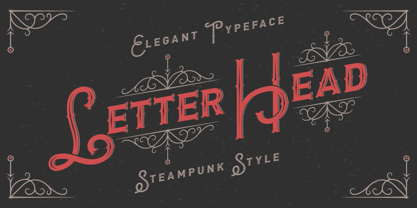 Introducing steampunk classic look typeface "Letter Head". It's a vintage font with decorative elements.
 - Profonts Bureau by profonts,
$41.99 profonts Bureau is a modern, very legible typeface for business correspondence, memos, faxes, etc.
 - LHF Ambrosia by Letterhead Fonts,
$39.00 An old turn-of-the-century style commonly used on billheads, letterheads, certificates, etc.
 - LDJ Elf Note by Illustration Ink,
$3.00This font will have you feeling elfish! It's great for writing your Christmas invitation! - Uzurpator by Artcity,
$6.00 Comic book font dedicated for fantasy characters like dragons, elves, angels, trolls, orks etc.
 - Tel Vardi MF by Masterfont,
$59.00 A super family for all your display needs, packages, signage, billboard, book covers etc.
 - Rusted Brushpen by Gleb Guralnyk,
$13.00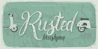 Introducing handcrafted "Rusted brushpen" font. It's a fancy brushpen script with rough grungy effect.
 - Maxim MF by Masterfont,
$59.00 A special high contrast font with unique geometrical shapes for logos, titles, signage etc.
 - FG Jennifer by YOFF,
$13.95FG Jennifer is a neat elderly script style of font. It's neatly held together. - Alt UAV31 by ALT,
$- UAV 31 is a geometric experimental display typeface for use on logos,posters etc.
 - Soap by Typodermic,
$11.95 Hey there! Are you on the hunt for a new typeface that’s cool and laid-back? Well, look no further because Soap is here to sweep you off your feet! This typeface is the epitome of chill, taking the classic Cooper Black and smoothing it out even more. Soap’s unicase letterforms are so soft and inviting, you’ll feel like you’re sinking into a warm bath. And let’s talk about the spacing—it’s so tight you could bounce a quarter off of it. And here’s the best part: Soap is versatile enough to use for both headlines and body copy. That’s right, this typeface can do it all! Plus, with an alternate lowercase-style T available in OpenType adept applications, you’ll have even more creative freedom. But wait, there’s more! Soap comes in not just one, but three unique styles: Clean, Soap Stamp, and Soap Spraypaint. The latter two are perfect for adding a touch of grime and edginess to your designs, with straggly letter variations that prevent any boring repetition. So if you want to add some laid-back coolness to your next project, give Soap a try. It’s the perfect blend of classic and contemporary, and it’s sure to make a splash! Most Latin-based European writing systems are supported, including the following languages. Afaan Oromo, Afar, Afrikaans, Albanian, Alsatian, Aromanian, Aymara, Bashkir (Latin), Basque, Belarusian (Latin), Bemba, Bikol, Bosnian, Breton, Cape Verdean, Creole, Catalan, Cebuano, Chamorro, Chavacano, Chichewa, Crimean Tatar (Latin), Croatian, Czech, Danish, Dawan, Dholuo, Dutch, English, Estonian, Faroese, Fijian, Filipino, Finnish, French, Frisian, Friulian, Gagauz (Latin), Galician, Ganda, Genoese, German, Greenlandic, Guadeloupean Creole, Haitian Creole, Hawaiian, Hiligaynon, Hungarian, Icelandic, Ilocano, Indonesian, Irish, Italian, Jamaican, Kaqchikel, Karakalpak (Latin), Kashubian, Kikongo, Kinyarwanda, Kirundi, Kurdish (Latin), Latvian, Lithuanian, Lombard, Low Saxon, Luxembourgish, Maasai, Makhuwa, Malay, Maltese, Māori, Moldovan, Montenegrin, Ndebele, Neapolitan, Norwegian, Novial, Occitan, Ossetian (Latin), Papiamento, Piedmontese, Polish, Portuguese, Quechua, Rarotongan, Romanian, Romansh, Sami, Sango, Saramaccan, Sardinian, Scottish Gaelic, Serbian (Latin), Shona, Sicilian, Silesian, Slovak, Slovenian, Somali, Sorbian, Sotho, Spanish, Swahili, Swazi, Swedish, Tagalog, Tahitian, Tetum, Tongan, Tshiluba, Tsonga, Tswana, Tumbuka, Turkish, Turkmen (Latin), Tuvaluan, Uzbek (Latin), Venetian, Vepsian, Võro, Walloon, Waray-Waray, Wayuu, Welsh, Wolof, Xhosa, Yapese, Zapotec Zulu and Zuni.
 - Krul by Re-Type,
$99.00 ‘Krul’ is a typographic interpretation of the lettering style created by Dutch letter painter Jan Willem Joseph Visser at the end of the 1940s, which decorated the traditional brown bars of Amsterdam. In the beginning, these letters were strongly associated with the pubs connected to the Amstel brewery, given that Visser was the company’s official painter. As the years passed, the style became increasingly popular, and various business owners in Amsterdam and other Dutch and Belgian cities also commissioned its use. In the 1970s and 1980s, Leo Beukeboom, another talented letter painter, continued and expanded this lettering tradition while employed under the Heineken brand. Much of his work can still be found in the Jordaan and De Pijp neighborhoods in Amsterdam. The Amsterdamse Krulletter, or Amsterdam’s curly letter, is strongly inspired by the calligraphic works of the 17th century Dutch writing masters, of which Jan van den Velde was a central figure. However, distinct characteristics of this style, for example, its unusual and beautiful ‘g’, originate from a model that was published by Johannes Heuvelman in 1659, which J. W. J. Visser referenced. Typographic circles have somehow overlooked the Amsterdamse Krulletter and its heritage. The Dutch calligraphic hands preceded and influenced the formal English penmanship which has inspired numerous typefaces in the Copperplate style. In contrast, the models from van den Velde, Heuvelman, and Jean de la Chambre, among others, are a missing chapter in Dutch typographic history, and had never been turned into typefaces until now. Conscious of the cultural and identity issues that arise in reviving a unique style, and concerned about the speed with which the lettering style was disappearing, Ramiro Espinoza focused the project of designing ‘Krul’ on digitally recreating the calligraphic complexity of these beautiful letters. Created through several years of research, ‘Krul’ is not a direct digitization of the Amsterdamse Krulletter, but instead, an interpretation that incorporates numerous alternative characters absent in the original model, and improves upon details where necessary, resulting in an optimal performance on the printed page. The typeface is presented in Open Type format, with an abundance of intricate ligatures, fleurons, and swashes, which permit the creation of numerous calligraphic effects. The very high contrast and rhythm of the strokes in this typeface make it especially suited for media applications conveying a sense of elegance and sophistication. Designers of feminine magazines, advertisements, and corporate identities within the fragrance and fashion industries will find in this typeface to be an extremely useful and appropriate resource.The great Amsterdamse Krulletter is finally back, and we are proud to make it available to you.
 - Times New Roman PS Cyrillic by Monotype,
$67.99In 1931, The Times of London commissioned a new text type design from Stanley Morison and the Monotype Corporation, after Morison had written an article criticizing The Times for being badly printed and typographically behind the times. The new design was supervised by Stanley Morison and drawn by Victor Lardent, an artist from the advertising department of The Times. Morison used an older typeface, Plantin, as the basis for his design, but made revisions for legibility and economy of space (always important concerns for newspapers). As the old type used by the newspaper had been called Times Old Roman," Morison's revision became "Times New Roman." The Times of London debuted the new typeface in October 1932, and after one year the design was released for commercial sale. The Linotype version, called simply "Times," was optimized for line-casting technology, though the differences in the basic design are subtle. The typeface was very successful for the Times of London, which used a higher grade of newsprint than most newspapers. The better, whiter paper enhanced the new typeface's high degree of contrast and sharp serifs, and created a sparkling, modern look. In 1972, Walter Tracy designed Times Europa for The Times of London. This was a sturdier version, and it was needed to hold up to the newest demands of newspaper printing: faster presses and cheaper paper. In the United States, the Times font family has enjoyed popularity as a magazine and book type since the 1940s. Times continues to be very popular around the world because of its versatility and readability. And because it is a standard font on most computers and digital printers, it has become universally familiar as the office workhorse. Times?, Times? Europa, and Times New Roman? are sure bets for proposals, annual reports, office correspondence, magazines, and newspapers. Linotype offers many versions of this font: Times? is the universal version of Times, used formerly as the matrices for the Linotype hot metal line-casting machines. The basic four weights of roman, italic, bold and bold italic are standard fonts on most printers. There are also small caps, Old style Figures, phonetic characters, and Central European characters. Times? Ten is the version specially designed for smaller text (12 point and below); its characters are wider and the hairlines are a little stronger. Times Ten has many weights for Latin typography, as well as several weights for Central European, Cyrillic, and Greek typesetting. Times? Eighteen is the headline version, ideal for point sizes of 18 and larger. The characters are subtly condensed and the hairlines are finer." - Times New Roman Seven by Monotype,
$67.99In 1931, The Times of London commissioned a new text type design from Stanley Morison and the Monotype Corporation, after Morison had written an article criticizing The Times for being badly printed and typographically behind the times. The new design was supervised by Stanley Morison and drawn by Victor Lardent, an artist from the advertising department of The Times. Morison used an older typeface, Plantin, as the basis for his design, but made revisions for legibility and economy of space (always important concerns for newspapers). As the old type used by the newspaper had been called Times Old Roman," Morison's revision became "Times New Roman." The Times of London debuted the new typeface in October 1932, and after one year the design was released for commercial sale. The Linotype version, called simply "Times," was optimized for line-casting technology, though the differences in the basic design are subtle. The typeface was very successful for the Times of London, which used a higher grade of newsprint than most newspapers. The better, whiter paper enhanced the new typeface's high degree of contrast and sharp serifs, and created a sparkling, modern look. In 1972, Walter Tracy designed Times Europa for The Times of London. This was a sturdier version, and it was needed to hold up to the newest demands of newspaper printing: faster presses and cheaper paper. In the United States, the Times font family has enjoyed popularity as a magazine and book type since the 1940s. Times continues to be very popular around the world because of its versatility and readability. And because it is a standard font on most computers and digital printers, it has become universally familiar as the office workhorse. Times?, Times? Europa, and Times New Roman? are sure bets for proposals, annual reports, office correspondence, magazines, and newspapers. Linotype offers many versions of this font: Times? is the universal version of Times, used formerly as the matrices for the Linotype hot metal line-casting machines. The basic four weights of roman, italic, bold and bold italic are standard fonts on most printers. There are also small caps, Old style Figures, phonetic characters, and Central European characters. Times? Ten is the version specially designed for smaller text (12 point and below); its characters are wider and the hairlines are a little stronger. Times Ten has many weights for Latin typography, as well as several weights for Central European, Cyrillic, and Greek typesetting. Times? Eighteen is the headline version, ideal for point sizes of 18 and larger. The characters are subtly condensed and the hairlines are finer." - Times New Roman WGL by Monotype,
$67.99 In 1931, The Times of London commissioned a new text type design from Stanley Morison and the Monotype Corporation, after Morison had written an article criticizing The Times for being badly printed and typographically behind the times. The new design was supervised by Stanley Morison and drawn by Victor Lardent, an artist from the advertising department of The Times. Morison used an older typeface, Plantin, as the basis for his design, but made revisions for legibility and economy of space (always important concerns for newspapers). As the old type used by the newspaper had been called Times Old Roman," Morison's revision became "Times New Roman." The Times of London debuted the new typeface in October 1932, and after one year the design was released for commercial sale. The Linotype version, called simply "Times," was optimized for line-casting technology, though the differences in the basic design are subtle. The typeface was very successful for the Times of London, which used a higher grade of newsprint than most newspapers. The better, whiter paper enhanced the new typeface's high degree of contrast and sharp serifs, and created a sparkling, modern look. In 1972, Walter Tracy designed Times Europa for The Times of London. This was a sturdier version, and it was needed to hold up to the newest demands of newspaper printing: faster presses and cheaper paper. In the United States, the Times font family has enjoyed popularity as a magazine and book type since the 1940s. Times continues to be very popular around the world because of its versatility and readability. And because it is a standard font on most computers and digital printers, it has become universally familiar as the office workhorse. Times?, Times? Europa, and Times New Roman? are sure bets for proposals, annual reports, office correspondence, magazines, and newspapers. Linotype offers many versions of this font: Times? is the universal version of Times, used formerly as the matrices for the Linotype hot metal line-casting machines. The basic four weights of roman, italic, bold and bold italic are standard fonts on most printers. There are also small caps, Old style Figures, phonetic characters, and Central European characters. Times? Ten is the version specially designed for smaller text (12 point and below); its characters are wider and the hairlines are a little stronger. Times Ten has many weights for Latin typography, as well as several weights for Central European, Cyrillic, and Greek typesetting. Times? Eighteen is the headline version, ideal for point sizes of 18 and larger. The characters are subtly condensed and the hairlines are finer."
 - Times New Roman by Monotype,
$67.99 In 1931, The Times of London commissioned a new text type design from Stanley Morison and the Monotype Corporation, after Morison had written an article criticizing The Times for being badly printed and typographically behind the times. The new design was supervised by Stanley Morison and drawn by Victor Lardent, an artist from the advertising department of The Times. Morison used an older typeface, Plantin, as the basis for his design, but made revisions for legibility and economy of space (always important concerns for newspapers). As the old type used by the newspaper had been called Times Old Roman," Morison's revision became "Times New Roman." The Times of London debuted the new typeface in October 1932, and after one year the design was released for commercial sale. The Linotype version, called simply "Times," was optimized for line-casting technology, though the differences in the basic design are subtle. The typeface was very successful for the Times of London, which used a higher grade of newsprint than most newspapers. The better, whiter paper enhanced the new typeface's high degree of contrast and sharp serifs, and created a sparkling, modern look. In 1972, Walter Tracy designed Times Europa for The Times of London. This was a sturdier version, and it was needed to hold up to the newest demands of newspaper printing: faster presses and cheaper paper. In the United States, the Times font family has enjoyed popularity as a magazine and book type since the 1940s. Times continues to be very popular around the world because of its versatility and readability. And because it is a standard font on most computers and digital printers, it has become universally familiar as the office workhorse. Times?, Times? Europa, and Times New Roman? are sure bets for proposals, annual reports, office correspondence, magazines, and newspapers. Linotype offers many versions of this font: Times? is the universal version of Times, used formerly as the matrices for the Linotype hot metal line-casting machines. The basic four weights of roman, italic, bold and bold italic are standard fonts on most printers. There are also small caps, Old style Figures, phonetic characters, and Central European characters. Times? Ten is the version specially designed for smaller text (12 point and below); its characters are wider and the hairlines are a little stronger. Times Ten has many weights for Latin typography, as well as several weights for Central European, Cyrillic, and Greek typesetting. Times? Eighteen is the headline version, ideal for point sizes of 18 and larger. The characters are subtly condensed and the hairlines are finer."
 - Times New Roman Small Text by Monotype,
$67.99In 1931, The Times of London commissioned a new text type design from Stanley Morison and the Monotype Corporation, after Morison had written an article criticizing The Times for being badly printed and typographically behind the times. The new design was supervised by Stanley Morison and drawn by Victor Lardent, an artist from the advertising department of The Times. Morison used an older typeface, Plantin, as the basis for his design, but made revisions for legibility and economy of space (always important concerns for newspapers). As the old type used by the newspaper had been called Times Old Roman," Morison's revision became "Times New Roman." The Times of London debuted the new typeface in October 1932, and after one year the design was released for commercial sale. The Linotype version, called simply "Times," was optimized for line-casting technology, though the differences in the basic design are subtle. The typeface was very successful for the Times of London, which used a higher grade of newsprint than most newspapers. The better, whiter paper enhanced the new typeface's high degree of contrast and sharp serifs, and created a sparkling, modern look. In 1972, Walter Tracy designed Times Europa for The Times of London. This was a sturdier version, and it was needed to hold up to the newest demands of newspaper printing: faster presses and cheaper paper. In the United States, the Times font family has enjoyed popularity as a magazine and book type since the 1940s. Times continues to be very popular around the world because of its versatility and readability. And because it is a standard font on most computers and digital printers, it has become universally familiar as the office workhorse. Times?, Times? Europa, and Times New Roman? are sure bets for proposals, annual reports, office correspondence, magazines, and newspapers. Linotype offers many versions of this font: Times? is the universal version of Times, used formerly as the matrices for the Linotype hot metal line-casting machines. The basic four weights of roman, italic, bold and bold italic are standard fonts on most printers. There are also small caps, Old style Figures, phonetic characters, and Central European characters. Times? Ten is the version specially designed for smaller text (12 point and below); its characters are wider and the hairlines are a little stronger. Times Ten has many weights for Latin typography, as well as several weights for Central European, Cyrillic, and Greek typesetting. Times? Eighteen is the headline version, ideal for point sizes of 18 and larger. The characters are subtly condensed and the hairlines are finer." - Times New Roman PS Greek by Monotype,
$67.99In 1931, The Times of London commissioned a new text type design from Stanley Morison and the Monotype Corporation, after Morison had written an article criticizing The Times for being badly printed and typographically behind the times. The new design was supervised by Stanley Morison and drawn by Victor Lardent, an artist from the advertising department of The Times. Morison used an older typeface, Plantin, as the basis for his design, but made revisions for legibility and economy of space (always important concerns for newspapers). As the old type used by the newspaper had been called Times Old Roman," Morison's revision became "Times New Roman." The Times of London debuted the new typeface in October 1932, and after one year the design was released for commercial sale. The Linotype version, called simply "Times," was optimized for line-casting technology, though the differences in the basic design are subtle. The typeface was very successful for the Times of London, which used a higher grade of newsprint than most newspapers. The better, whiter paper enhanced the new typeface's high degree of contrast and sharp serifs, and created a sparkling, modern look. In 1972, Walter Tracy designed Times Europa for The Times of London. This was a sturdier version, and it was needed to hold up to the newest demands of newspaper printing: faster presses and cheaper paper. In the United States, the Times font family has enjoyed popularity as a magazine and book type since the 1940s. Times continues to be very popular around the world because of its versatility and readability. And because it is a standard font on most computers and digital printers, it has become universally familiar as the office workhorse. Times?, Times? Europa, and Times New Roman? are sure bets for proposals, annual reports, office correspondence, magazines, and newspapers. Linotype offers many versions of this font: Times? is the universal version of Times, used formerly as the matrices for the Linotype hot metal line-casting machines. The basic four weights of roman, italic, bold and bold italic are standard fonts on most printers. There are also small caps, Old style Figures, phonetic characters, and Central European characters. Times? Ten is the version specially designed for smaller text (12 point and below); its characters are wider and the hairlines are a little stronger. Times Ten has many weights for Latin typography, as well as several weights for Central European, Cyrillic, and Greek typesetting. Times? Eighteen is the headline version, ideal for point sizes of 18 and larger. The characters are subtly condensed and the hairlines are finer." - Times New Roman PS by Monotype,
$67.99In 1931, The Times of London commissioned a new text type design from Stanley Morison and the Monotype Corporation, after Morison had written an article criticizing The Times for being badly printed and typographically behind the times. The new design was supervised by Stanley Morison and drawn by Victor Lardent, an artist from the advertising department of The Times. Morison used an older typeface, Plantin, as the basis for his design, but made revisions for legibility and economy of space (always important concerns for newspapers). As the old type used by the newspaper had been called Times Old Roman," Morison's revision became "Times New Roman." The Times of London debuted the new typeface in October 1932, and after one year the design was released for commercial sale. The Linotype version, called simply "Times," was optimized for line-casting technology, though the differences in the basic design are subtle. The typeface was very successful for the Times of London, which used a higher grade of newsprint than most newspapers. The better, whiter paper enhanced the new typeface's high degree of contrast and sharp serifs, and created a sparkling, modern look. In 1972, Walter Tracy designed Times Europa for The Times of London. This was a sturdier version, and it was needed to hold up to the newest demands of newspaper printing: faster presses and cheaper paper. In the United States, the Times font family has enjoyed popularity as a magazine and book type since the 1940s. Times continues to be very popular around the world because of its versatility and readability. And because it is a standard font on most computers and digital printers, it has become universally familiar as the office workhorse. Times?, Times? Europa, and Times New Roman? are sure bets for proposals, annual reports, office correspondence, magazines, and newspapers. Linotype offers many versions of this font: Times? is the universal version of Times, used formerly as the matrices for the Linotype hot metal line-casting machines. The basic four weights of roman, italic, bold and bold italic are standard fonts on most printers. There are also small caps, Old style Figures, phonetic characters, and Central European characters. Times? Ten is the version specially designed for smaller text (12 point and below); its characters are wider and the hairlines are a little stronger. Times Ten has many weights for Latin typography, as well as several weights for Central European, Cyrillic, and Greek typesetting. Times? Eighteen is the headline version, ideal for point sizes of 18 and larger. The characters are subtly condensed and the hairlines are finer." - Aerle by Hackberry Font Foundry,
$24.95 My first font for 2009 was Aerle. It is a new dark sans serif font in my continuing objective of designing book fonts that I can really use. It made a little ripple in the industry, but more than that I found that I loved it with Aramus and Artimas — my latest book font family with the same proportions. In many ways, Aerle is a very different direction for me built on what I have learned on Aramus and other recent developments in my style. The concept came to me while using Bitstream's Mister Earl on a site online—though there is no direct reference. I wanted a more playful heavy sans with a much smaller x-height than I have been using lately, plus taller ascenders. As I was using Aerle, I constantly needed a light and bold version. The new direction I am taking is a result of a decision that my fonts, though I loved the character shapes, produced an even type color that is too dark or a little dense. Aerle was an attempt to get away from that look even though the letterspacing is quite tight. For Aerle Thin I pushed a little further in that direction and increased the letterspacing. The hand-drawn shapes vary a lot, many pushing the boundaries of the normal character. This gives a little looseness and helps the lightness in feel I am looking for. It will be interesting to see where this all goes. Most new type around the world is far too perfect for my taste. While the shapes are exquisite, the feel is not human but digital mechanical. I find myself wanting to draw fonts that feel human — as if a person crafted them. In most ways this is a normal font for me in that it has caps, lowercase, small caps with the appropriate figures for each case. These small caps were very small (x-height as is proper). So Aerle's small caps are a little oversize because they plugged up too bad at x-height size. The bold is halfway between. These size variations seem important and work well in the text. This font has all the OpenType features in the set for 2009. There are several ligatures for your fun and enjoyment: bb gg sh sp st ch ck ff fi fl ffi ffl ffy fj ft tt ty Wh Th and more. Like all of my fonts, there are: caps, lowercase, & small caps; proportional lining figures, proportional oldstyle figures, & small cap figures; plus numerators, denominators, superiors, inferiors, and a complete set of ordinals 1st through infinity. Enjoy!
 - Straight Ahead by Ronny Studio,
$19.00 Straight Ahead is a dazzling handwritten font. With a modern style, this versatile script font has a wide spectrum of applications such as for branding, logotype, and more. Straight Ahead is PUA coded which means you can access all the glyphs and sweeps easily! It is suitable for branding, Poster Design, Event, logotype, product packaging, decoration, t-shirts, poster labels, etc. 2 Style Font : Regular Italic Straight Ahead Features : Uppercase Lowercase Numbers & Punctuation Ligature Alternative Wash Multilingual Support Simple installation All of features and special characters of this font are included in one file. So it is easy to accessed by using program or software that support the opentype like Adobe Illustrator, Adobe Photosop, and Adobe Indesign). This font also very easy to use because compatible for all software even for non-opentype supported. Please comment us if you have any questions Thank you and have a nice day. thank you
 - Umba Slab by TypeThis!Studio,
$29.00 The best thing about Umba Slab is its surprise! UMBA Slab is a clean but eye-catching typeface designed by Anita Jürgeleit. It adds an amazing touch to your corporate design and titling by developing a more dynamic shape from thin to bold. It’s especially designed for a wide range of variety and to create a highly recognizable branding and titling. Twenty styles from thin to bold and matching italics help you to create design with a strong essence. Separate styles for alternate and small caps will show up in your font menu, making sure that you always stay aware of the wide range of possibilities of your new favourite font. Finally, for all those who love caps, there are extra caps-only fonts added to the collections. Would you like to see more of how UMBA can improve your design? Let’s get in touch! INSTAGRAM @anitajuergeleit +++ FACEBOOK AnitaJuergeleitTypefaces
 - Billion Dollars by HKL Studio,
$15.00 Billion Dollars Signature Font This is a Vintage Handwriting font filled with beautiful characters. Mixed copper plate handwriting in handttering style. to show its performance. Billion Dollars appeals as a smooth, clean, feminine, sensual, glamorous, simple, and easy to read typeface. Billion Dollars Script comes with both Clean and Aged versions, uppercase and lowercase that bind beautifully, bind, and are loved by many finishes. It has Multilingual support (West European characters) and works with the following languages: English, Danish, Dutch, Estonian, Finnish, French, German, Hungarian, Icelandic, Norwegian, Polish, Portuguese, Spanish, Swedish. In my example I show how this script can be used. It's perfect for logos, wedding invitations, alcohol labels, romantic cards and more. Products include: Billion Dollars Swashs Billion Dollars Uppercase & Lowercase Script, as well as a touch of Ligature make this font look elegant. Recommended for use in Adobe Illustrator or Photoshop. Custom features don't work in Microsoft Word.
 - Troubled PB by Pink Broccoli,
$16.00 Loaded with various auto-ligatures (primarily for ALL-CAPS typesettings), Troubled has all of the rebellious custom lettered attitude of a vintage pulp paperback. Troubled PB began as a digitization of a film typeface known as Toronado by LetterGraphics, perfect for typesetting early children books, candy packaging, toy packaging, birthday invitations, or any other playful design need. It's lowercase typesetting is straightforward and casual, with a light animated feel, while the all-caps typesetting goes wild with auto-ligatures galore to create wonderful and interesting interwoven letterform combinations. This typestyle has such an offbeat appeal to it that it just draws your attention. Great for headlines (especially in all caps settings), but also great for small bodies of text in mixed case setting. So whether child-friendly design pursuits, or reminiscing of vintage pulp paperbacks novels, Troubled PB has a little something for everyone.
 - Scandinavian Cyrillic by Ira Dvilyuk,
$17.00 The Scandinavian Cyrillic kids font is stylish and laconic as famous Scandinavian monochrome design. Each letter of the font was carefully cut out of paper with scissors by little childish hands. And now it's turned into a font :) The Scandinavian Cyrillic kids font includes main uppercase, alternative uppercase, and double letters for uppercase and lowercase. It will be perfect for use in all your fun design projects: logos, labels, packaging design, blog headlines. Also, it will look great on mugs, cards, kid's books headlines, or other typographic projects. Multilingual Support for 32 languages: Latin glyphs for Afrikaans, Albanian, Basque, Bosnian, Catalan, Danish, Dutch, English, Estonian, Faroese, Filipino, Finnish, French, Galician, Indonesian, Irish, Italian, Malay, Norwegian Bokmål, Portuguese, Slovenian, Spanish, Swahili, Swedish, Turkish, Welsh, Zulu. And Cyrillic glyphs support for Russian, Belorussian, Bulgarian, Ukrainian and Kazakh languages. Works perfectly on the Canva platform. For Cricut & Silhouette recommended.
 - Riff by estudioCrop,
$24.90Having spent all of my teenage years in the 90s, it's no surprise that this very particular decade resonates so deeply in me. As a graphic designer, I still think the strongest visual languages of the last 50 years or so come from that time. Bold aggressive attitude is what most people remember from those designs. What they seem to forget—or, rather, to have completely ignored—is that some incredibly elegant and subtle styles emerged from those years. It still amazes me how they reflected so well the period in which they were conceived, taking style construction to the next level. Riff is a natural development of some of my thoughts about the 90s. Mixed with a very contemporary feel, it embodies several idiosyncrasies I absorbed over years of exposure to favorite design pieces, fonts, music, films and other cultural products that share the same spirit. - Sunday Artela by Flawlessandco,
$9.00 Introducing "Sunday Artela," a font that effortlessly blends playful script elements with a retro charm, creating a nostalgic yet contemporary feel. This unique typeface doesn't just stop at capturing attention — it transports your designs to a world where every letter tells a story. Sunday Artela doesn't just bring letters to life; it introduces a dynamic trio of styles — regular, solid, and fun — adorned with patterns in fun styles that add an extra layer of delight to your designs. There's some connected letters and some alternates that suitable for any graphic designs such as branding materials, t-shirt, print, business cards, logo, poster, t-shirt, photography, quotes .etc This font support for some multilingual. Also contains uppercase A-Z and lowercase a-z, alternate character, numbers 0-9, and some punctuation. If you need help, just write me! Thanks so much for checking out my shop!
 - Retrim by Yumna Type,
$12.00 Be the center of attention through your sophisticated design with the awesome Retrim. It is a display font that portrays cute looks. While it’s easy to read thanks to all-capped characters, there are also distinctive styles or layers for optical effect. Slay your design with Retrim’s best features so you’ll look your best on what ever your design is, all the time. You also get 15 illustrations as special extra that you can use as you wish. Features: Ligatures Multilingual Supports Uppercase and lowercase PUA Encoded Numerals and Punctuation This font would looks great on your branding, logos, social media quotes, stickers, posters, wall art, merchandise, social media, and many more. Get more inspiration about how to use it by seeing the font preview. Thank you for purchasing our fonts. If you have any further questions, don't hesitate to contact us. Happy Designing.
 - Despeinada by EdyType,
$60.00 Despeinada, which means "uncombed" in Spanish, is a loose script, perfect for when you want to convey informality. It'll look good in a long text, or when a few rough and spontaneous word are needed... Being a packaging designer, my faces are mostly oriented toward that sector, although they won't look in any way out of place in the editorial world or in advertising, for example. This face was generated in the University of Barcelona Master of Typography, in 2010, where I dictated the “Practicum” It's a very versatile design that can be used in small sizes or enlarged as needed. It won't deceive you! I think that this particular face is halfway between Mistral and Zapfino: rough but clean at the same time. None of its glyphs follow any order, nor do their weights... In short, if you start writing with Despeinada you won't want to stop.
 - Frainky by Krafted,
$10.00 Looking for a perfect brush stroke that ties your design together? Introducing Frainky - A Brush Font. Trendy and artsy, Frainky makes your brand memorable. It’s an excellent choice for ads, banners, printed cards, packaging, web pages, apps, and anything else your project needs. Give it a shot and see for yourself! What you’ll get: Multilingual & Ligature Support Full sets of Punctuation and Numerals Compatible with: Adobe Suite Microsoft Office Keynote Pages Software Requirements: The fonts that you’ll receive in the pack are widely supported by most software. In order to get the full functionality of the selection of standard ligatures (custom-created letters) in the script font, any software that can read OpenType fonts will work. We hope you enjoy this font and that it makes your branding sparkle! Feel free to reach out to us if you’d like more information or if you have any concerns.
 - Plessis by Creativetacos,
$9.97 Welcome to our Plesis Brush Display Font! It's a lively, unique handwritten typeface that injects a contemporary and enjoyable twist to your forthcoming assignments. It equips you with everything you require - uppercase, lowercase, numbers, punctuation, and symbols- and even supports multiple languages. Plesis is the typeface for every occasion! Utilize it for presentations, logos, headlines, handwritten styles, posters, branding, uplifting quotes, titles, layout of magazines, web design, adverts, invites, cover artwork, and any other inventive project on your list. What does the Package Contain? - Typeface Weight: Regular The Plesis Typeface is filled with: - Capital Alphabets (Uppercase) - Small Alphabets (Lowercase) - Numerals & Symbols - Multi-language Support Let's take a quick look at the supported characters: - All the alphabets from A-Z (uppercase and lowercase) - All the numerals from 0-9 - All these special characters - !"#$%&'()*+,-./:;?@[]^_`{|}~¥ - And a selection of global characters like ¡¢¤§¨©«®±´¶¸»¿ÀÁÂÃÄÅÇÈÉÊËÌÍÎÏÑÒÓÔÕÖ×ØÙÚÛÜÝÞßàáâãäåçèéêëìíîïñòóôõö÷øùúûüýþÿŁłŠšŸŽžˇ‘’‚‛„†‡…‰€™
 - Yasemin by Bülent Yüksel,
$24.00 My wife name is Yasemin. After building this typeface, I wanted to honor with my wife’s name. I think I fully reflects the character I created in my mind. I created ornaments and connected glyphs. Yasemin is an OpenType font that contains 1045 glyphs. Ligatures, alternates, starting, endings, a wide range of latin languages and a set of ornaments. And words specially designed to use in advertising slogan, stationery for weddings, birthdays, etc. TIPS: Try using Yasemin at a 20º angle so that the slanted strokes, ornament become perfectly vertical. Having the decorative ligatures feature (dlig) activated is a good option to see letters dance. TECHNICAL: It is absolutely recommended to use this font with the standard ligatures feature (liga) activated. It makes letters ligate perfectly and also improves the space between words. UPDATES: - 3 December 2015 Opentype Feature (fractions) update. - 20 March 2019 Opentype Feature (fractions) update. Some bug fixes.
 - Miser by Saint Mislav,
$22.22 Smooth with the roughness and made from scratch, Miser sans serif font family was designed by Mislav Serdarušić and it's name is derived from designers name. Miser typeface blueprints were somewhere in the subconsciousness of the designer but have seen first light of the day in September, 2021. during the Covid pandemic. Inspiration comes from handwritten technical letters of designers parents and graffiti explorations. It comes in 12 styles (6 weights with pairing Italics) with all Latin European language characters which are in daily use(without Greek or Cyrillic). Designed in contemporary appearance with innovations on some letters. Basic ligature set is included. It is suitable for magazines, books and websites, various graphics and paragraphs. Miser has a taste of science, technology, design & architecture, sports and more, yet contemporary boldness but distinctive to regular and oval modern typeface shapes. A must have on your system.


