2,625 search results
(0.016 seconds)
- PiS LIETZ Rathoga by PiS,
$38.00 Welcome to the Jet Age! LIETZ Rathoga jumps right out of the covers of vintage Space-Hero comics and onto your flickering cathode ray tube monitor. Fight the evil Zombies of the Stratosphere with sharp serifs! Race the Rocketmen with narrow stroke widths and fast italics! Loaded with Ligatures for more firepower! Team up with Rathoga's brothers and sisters from the LIETZ font family and you will triumph over the hordes of evil! Power on!
 - Knockdown by Hanoded,
$15.00 Finding my long-lost inkwell was a lucky moment for me and it resulted in a whole bunch of brushy/inky fonts. The latest font to leak out of this well is Knockdown. It is a bold and wild brushface, but very legible. Use if for your posters, book covers and T-shirts! Or, whatever else you like. Comes with a KO of diacritics.
 - Sansumi-ExtraBold - Unknown license

- HT Neon by Dharma Type,
$19.99 HT Neon shines as if to invite us.This rounded and monoline font is very striking. But it is readable because the characters are arranged naturally when they are typed. HT Neon is great to use on your design projects such as Shop Sign,Packaging, Logotype and more.When you type the character “µ”, it becomes a electrical cord! Holiday Type Project offers retro hand drawing scripts. Inspired by retro script on shopfront lettering, wall paint advertisements in Italy around 1950s. Check out the script fonts from Holiday Type!
 - Flagellum Dei by Hanoded,
$20.00 Flagellum Dei is Latin for ‘The Scourge of God’. It is a title given by later generations to Attila the Hun (406-453 C.E.). Flagellum Dei is also a rather scary font, which I made with the use of a stiff brush and some China ink. Of course you could use this quite versatile font to scare the bejesus out of your friends, but I’d much rather see it used on book covers, posters and album artwork. Flagellum Dei comes with a horde of diacritics.
 - Sansumi - Unknown license

- Drip - Unknown license

- Zar2 Casual by SzarDesign,
$19.95 Zar-2 Casual is great for informal fun graphics, pairs well with Zar-2 Script.
 - Zar2 Script by SzarDesign,
$19.95 Zar-2 Script a brush inspired script with flair, designed to work with Zar-2 casual
 - Dulcian by insigne,
$- Inspired by the Appalachian culture of the Southeastern United States, the finely tuned forms of Dulcian strike a clear, empowering chord with your audience. This energetic and fresh sans serif flows fast and smooth with its simple lines and slight hand-written character. All total, there are six weights, with complementary italics and three different widths. Dulcian supports OpenType features and is packaged with unicase alternates, unconnected alternates, ligatures, old-fashioned figures, fractions, titling and small caps. Preview any and all of these features in the interactive PDF manual. The Dulcian family of fonts also includes glyphs for 72 languages, providing you with more than 600 glyphs per font. While designed especially for pull quotes, this display typeface can be used for a variety of applications. Dulcian is an excellent choice for websites as well as flyers and packaging. Other uses include coffee, menus, awards, certificates where a touch of humanity and personalization is needed.
 - Acid - Unknown license

- Elliot_Swonger - Unknown license

- Impressionable JNL by Jeff Levine,
$29.00 Impresssionable JNL is a font created from samples printed from a vintage rubber stamp toy set. This is a limited character design without spacing or kerning in order to preserve the hand-made look of inkpad printing on paper. A few extra punctuation glyphs, a percent sign and Euro were added to the original characters. At smaller sizes (72 point or less), the letters resemble the imprints of the stamps, but at higher sizes, they take on a different look of deconstructed lettering.
 - Hog Bold - HMK - Unknown license

- Blank Manuscript by Aah Yes,
$14.95Blank Manuscript allows you to produce sophisticated musical scoresheets even on basic Word Processors - anything from simple plain staves to complex full-page orchestral scores of your own design, to write in the notation yourself. The basic stuff is really easy and straightforward, but there's some quite advanced things you can do as well. So Copy and Save these Instructions. • The main stuff is simple and tends to follow the initial letter. Treble, Bass and Alto clefs are on upper case T B A (there are more clefs, below). The 5 Lines for the clefs are on L or l. • A small v will give a small vertical line (like a bar line) and a Big U will give a Big Upright - these can start or end a line or piece. • Time Signatures - type the following letters: Think of W for Waltz and it's easy to remember that 3/4 time is on W. Then from that they go up or down together like this: V=2/4 W=3/4 X=4/4 Y=5/4 Z=6/4 Compound Times are on H I J K like this: H=3/8 I=6/8 J=9/8 K=12/8 Common Time and Cut Common symbols can be found on semi-colon and colon respectively (all begin with Co- ). 2/2 3/2 are on lower case a and b, 7/4 and 7/8 are on lower case c and d, 5/8 is on small k (think POL-k-A) • Flat signs are on the numbers. Flat signs on LINES 1 to 5 are on numbers 1 to 5. Flat signs on SPACES 1 to 5 are on numbers 6 to 0 (space 1 being above line 1, space 5 being above the top line of the stave). Sharp signs are on the letters BELOW the long-row numbers. Which is q w e r t for the sharp signs on Lines 1 to 5, and y u i o p for sharp signs on spaces 1 to 5. Doing it this way means it works the same for all clefs, whether Treble, Bass, Alto, Tenor or any other. Sharp and Flat Signs always go in this order, depending on how many sharps or flats your key signature requires: Treble Clef Sharps t i p r u o e Flats 3 9 7 4 2 8 6 Bass Clef Sharps r u o e t i w Flats 2 8 6 3 1 7 = Alto Clef Sharps o e t i w r u Flats 7 4 2 8 6 3 1 • Guitar Chord Boxes are on G and g (G for Guitar) Upper Case G has a thick line across the top Lower case g has an open top, for chords up the fretboard TAB symbols are available: Six-string Tablature is on s & S for Six. Four-string Tablature is on f & F for Four. (Lower case has the "TAB" symbol on it, Upper Case has just the lines to continue.) Five-string tablature, is on lower case "j" (as in BAN-j-O) and of course L or l will continue the 5 lines. •RARE CLEF SIGNS including Tenor Clef, are on various punctuation marks, i.e. dollar, percent, circumflex, ampersand & asterisk, above the numbers 4 to 8. NOTE: The important symbols were kept on the letter and number keys, which are fairly standard all over, but some of the less important symbols are on various punctuation keys, which in different countries are not the same as on my keyboard. If it comes out wrong on your system, all I can say is it's right on the systems we've tried, and they'll be in here somewhere, probably on a different key. CLOSING THE ENDS OF THE LINES and BAR-LINES is done with the 3 varieties of brackets - brackets, brace and parentheses - Left/Right for the Left/Right end of the line. Parentheses L/R () which are above 9, 0 give a clef with a small vertical upright (the same as a bar line). Brace L/R and Brackets L/R (both on the 2 keys to the right of P on my keyboard) will close off a staff line with tall upright bars. Brace gives a double upright - one thick, one thin. Brackets give a single tall upright. A Big Upright is on Big U, (Big U for Big Upright) and a small vertical line is on small v (small v for small vertical). The Big Upright is the maximum height, and the small vertical is exactly the same height as a stave. And there's a tall upright Bar, on Bar (which is to the left of z on my keyboard, with Shift,) which is the same height as the bar on upper case U but twice as broad. • There's a staff intended for writing melodies, which is a little bit higher up than an ordinary treble clef giving a space underneath to put lyrics in - on m and M for Melody line. Lower case has the Treble Clef on, Upper case M has just the higher-up staff lines with no clef. (Use mMMMMMMM etc.) However this clef will be in the wrong place to put in sharp and flat signs, key signatures and so on, so if you use this clef you'll have to write the sharps, flats and key signature yourself. There's also a clef that's smaller (less tall) than the ordinary clef, but with the same horizontal spacing so it will align with other standard-sized clefs - on slash (a plain clef) and backslash (with a Treble Clef). • There are some large brackets for enclosing groups of staves, such as you'd use on large orchestral scores, on Upper Case N O P Q R, which can aid clarity. N and O on the left, Q and R on the right. P is a Perpendicular line to be used on both sides to increase the height of the enclosure, in this way but with the staff lines in between: N Q P P P P P P O R OTHERS —————————————— • Repeat marks are on comma (left) and period/full stop (right). • Hyphen is left as a sort of hyphen - it's a thin line like a single staff line, with the same horizontal spacing as ordinary staff lines - in case you want to draw a line across for a Percussion Instrument, or a Title or Lyric Line. • Space is a Space, but with HALF the width or horizontal spacing as ordinary staff lines, so 2 space symbols will be the same width as a clef symbol or line. • Grave (to the left of 1 on the long row, or hold down Alt and type 0096 then let go) gives a staff line that is one eighth the width of an ordinary staff line. • If you want manuscript in a clef and key which requires a flat or sharp sign in the space underneath the 5 lines, they’re on = equals and + plus . SYMBOLS • Many of these symbols will only be useful if you have worked out in advance which bars will need them, but they are here in case you've done that and wish to include them. • Symbols for p and f (piano and forte) are on 'less than' and 'greater than' < > (above comma and full stop) and m for mezzo is on Question, next to them. They can be combined to make mp, mf, ff, pp, etc. These signs -- and other signs and symbols like Pedal Sign, Coda Sign and so on -- can be found on various punctuation mark keys, including above 1, 2, 3 in the long row, and others around the keyboard. There's a sort of logic to their layout, but in different countries the keys are likely to give different results to what is stated here, so it's probably best to just try the punctuation and see if there's any you might want to use. (But on my keyboard a Coda sign is on circumflex - because of the visual similarity. Pedal sign is on underscore. A "Sign" symbol is on exclamation mark.) They were only included in case you really need them to be printed rather than handwritten. • However, a Copyright symbol is deemed necessary, and also included are a "Registered" symbol and a TradeMark symbol. They are found in the conventional places, and can be accessed by holding down ALT and typing 0169, 0174 or 0153 respectively in the numberpad section and letting go. • Staff lines with arco and pizz. above are on capital C and D respectively ---C for ar-C-o. • An empty circle above a staff line (to indicate sections by writing letters A, B, C or 1,2,3 inside for rehearsal marks) is on n. The actual signs for an A, B, C and D in a circle above the staff line can be produced by holding down ALT and typing 0188, 0189, 0190 and 0191 respectively and letting go. • The word "Page", for indicating page numbers, is on the numbersign key. • The two quotes keys, (quote single and quote double) have symbols representing "Tempo is", and "play as triplets", respectively. • INSTRUMENT NAMES There's a whole lot of Instrument Names built in (over a hundred) which can be printed out above the clef, and you do it like this. Hold down Alt and type in the given number in the numberpad section, then let go. For Piccolo it's 0130, for Flute it's 0131, Cornet is on 0154, Violin is on 0193, and the numbers go up to over 0250, it's a fairly complete set. There's also a blank which is used to align un-named clefs on 0096. Put them at the very beginning of the line for the best results. Here they are: WOODWIND Piccolo 0130 Flute 0131 Oboe 0132 Clarinet 0133 Eng Horn 0134 Bassoon 0135 Soprano Sax 0137 Alto Sax 0138 Tenor Sax 0139 Baritone Sax 0140 Saxophone 0142 Contrabassoon 0145 Recorder 0146 Alto Flute 0147 Bass Flute 0148 Oboe d'Amore 0149 Cor anglais 0152 Pipes 0241 Whistle 0242 BRASS Cornet 0154 Trumpet 0155 Flugelhorn 0156 Trombone 0158 Euphonium 0159 Tuba 0161 French Horn 0162 Horn 0163 Tenor Trombone 0164 Bass Trombone 0165 Alto Trombone 0166 Piccolo Cornet 0167 Piccolo Trumpet 0168 Bass Trumpet 0170 Bass Tuba 0171 Brass 0172 VOICES Vocal 0175 Melody 0176 Solo 0177 Harmony 0178 Soprano 0179 Alto 0180 Tenor 0181 Baritone 0182 Treble 0183 Bass 0197 (see also PLUCKED STRINGS) Descant 0184 Mezzo Soprano 0185 Contralto 0186 Counter Tenor 0187 Lead 0206 BOWED STRINGS Strings 0192 Violin 0193 Viola 0194 Cello 0195 Contrabass 0196 Bass 0197 Double Bass 0198 Violoncello 0199 Violin 1 0200 Violin 2 0201 Fiddle 0252 PLUCKED STRINGS Harp 0202 Guitar 0203 Ac. Gtr 0204 El. Gtr 0205 Lead 0206 Bass 0197 Ac. Bass 0207 El. Bass 0208 Slide Gtr 0209 Mandolin 0210 Banjo 0211 Ukelele 0212 Zither 0213 Sitar 0214 Lute 0215 Pedal Steel 0216 Nylon Gtr. 0238 Koto 0239 Fretless 0244 KEYBOARDS + ORGAN Piano 0217 El. Piano 0218 Organ 0219 El. Organ 0220 Harpsichord 0221 Celesta 0222 Accordion 0223 Clavinet 0224 Harmonium 0225 Synth 0226 Synth Bass 0227 Keyboards 0228 Sampler 0249 PERCUSSION and TUNED PERCUSSION Percussion 0229 Drums 0230 Vibes 0231 Marimba 0232 Glockenspiel 0233 Xylophone 0234 Bass marimba 0235 Tubular Bells 0236 Steel Drums 0237 Kalimba 0240 OTHERS Harmonica 0246 Mouth Organ 0247 FX 0251 Intro 0243 Verse 0245 Refrain 0248 Chorus 0250 un-named 0096 (this is a small spacer stave for aligning clefs without a name) ALSO copyright 0169 registered 0174 TradeMark 0153 Rehearsal marks 0188-0191 (giving A, B, C, D in a circle, an empty circle is on n ) Clef signs for Treble Bass Alto without any staff lines 0253-0255 An Alphabetic List of all signs: a 2/2 time b 3/2 time c 7/4 time d 7/8 time e sharp sign, centre line f Tab sign for 4-string tab g Guitar Chord Box, no nut h half-width stave I sharp sign, third space up j Tab sign for 5-string tab k 5/8 time l Lines - 5 horizontal lines for a stave m Melody Clef - a standard clef but placed higher up, with Treble sign n Stave with an empty circle above o sharp sign, fourth space up p sharp sign, space above stave q sharp sign, bottom line r sharp sign, fourth line up s Tab sign for 6-string tab t sharp sign, top line (fifth line up) u sharp sign, second space up v vertical line (bar-line) w sharp sign, second line up x Fretboard, four strings y sharp sign, first space up z Fretboard, five strings A Alto Clef B Bass Clef C “arco” above stave D “pizz.” above stave E Double Vertical Lines F Four Horizontal lines (for 4-string tab) G Guitar Chord Box with nut H 3/8 time I 6/8 time J 9/8 time K 12/8 time L Lines - 5 horizontal lines for a stave M Melody Clef - a standard clef but placed higher up, plain N Bounding Line for grouping clefs - top left O Bounding Line for grouping clefs - bottom left P Bounding Line for grouping clefs - Perpendicular Q Bounding Line for grouping clefs - top right R Bounding Line for grouping clefs - bottom right S Six Horizontal lines (for 6-string tab) T Treble Clef U tall, thin Upright line V 2/4 time W 3 / 4 time X 4/4 time Y 5/4 time Z 6/4 time 1 flat sign, first line up (the lowest line) 2 flat sign, second line up 3 flat sign, third line up 4 flat sign, fourth line up 5 flat sign, fifth line up (the top line) 6 flat sign, first space up (the lowest space) 7 flat sign, second space up 8 flat sign, third space up 9 flat sign, fourth space up 0 flat sign, space above stave - Agent Red - Unknown license

- Rasstapp 1.0 - Unknown license

- Gloriana - Unknown license

- verdy évolution - Personal use only

- Old Republic - Unknown license

- 1669 Elzevir by GLC,
$42.00 This family was inspired from the set of font faces used in Amsterdam by Daniel Elzevir to print the famous “Tractatus de corde...” the study on earth anatomy by Richard Lower, in 1669. The punch cutter was the famous Dutch Kristoffel Van Dijk. In our two styles (Normal & Italic), font faces, kernings and spaces are scrupulously the same as in the original. This Pro font covers Western, Eastern and Central European languages (including Celtic), Baltic and Turkish, with standard and “long s” ligatures in each of the two styles. The Roman (Normal) style contains a U stylistic alternate, and the Italique style A.
 - Old Republic - Unknown license

- Old Republic - Unknown license

- Old Republic - Unknown license

- Fab Figures by Letterwerk,
$10.00 Fab Figures is a numbers-only font. This high contrast display font family with curly terminals is a great choice for infographics and posters. The entire font family consists of 10 styles: 2 styles for big usage, 2 styles for normal usage, 2 styles for small usage and 3 patterned styles (fitting to the big styles). Character Set: 1 2 3 4 5 6 7 8 9 0 | % # • ~ { $ £ € } . , : ; + - = ÷ / ° * ' ’ (Arrows) (No-Symbol) (Nr-Symbol)
 - Jangly Bounce - Unknown license

- Remarcle - 100% free

- Motoya Aporo by Motoya,
$229.00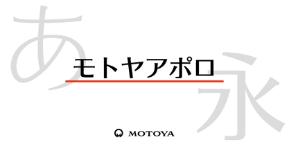 ????????????????????????????????????????????????????????????????????????????????????1969???????????2??????????????????? ????????????????????????????????????????????????????????????????????????????????????????????
 - 1890 Registers Script by GLC,
$38.00 This script font was inspired by the “Ronde” French script. It was in use from 1700s to 1900s (until 1960s in special circumstances) for registers, legal documents and texts, certificates, labels and other documents that must be particularly legible. Today in France, it is still being used for menus, advertising, and labels. The present version is a late 19th Century pattern. This font supports very strong enlargements as well as small sizes. When printed, it remains perfectly legible and elegant from 9/11 pts even if using an ordinary inkjet printer.
 - Al Britania Ligatura by Aluyeah Studio,
$99.00 Britania Ligatura, a Ligature Addict Display Font Coming to you with 170+ stunning alternate and ligature to create a perfectly fashionable, beautiful, fancy, and elegant design. Features: OpenType support Multilingual support (15 languages) PUA Encoded Super Easy to Use alternates - It's OpenType support but you can easily call alternates character using special combination like A.2 B.2 a.2 b.2 etc. so you don't need special software. For special ligature you can use combination like a.n a.m u.b d.h etc To get results like the preview just type B.4r.ita.ni.2a.2 Liga.tur.a Thanks for checking out my font. I really hope you enjoy using it!
 - P22 Music by P22 Type Foundry,
$39.95 P22 Music Pro is a unique font system that allows the user to compose music with text editing and page layout programs capable of OpenType features and contextual substitutions. The OpenType features speed up the composing process by adding chords, contextual accidentals (sharps and flats), contextual key signatures and time signatures. P22 Music Pro covers a wide range of symbols and notation used in traditional western music composition. P22 Music Pro requires an application that uses OpenType features and is capable of contextual substitutions, such as Adobe InDesign or Illustrator. P22 Music is the companion, non-pro font included with P22 Music Pro and also sold separately. P22 Music also contains music symbols and notation and is suited for layout and text edit applications such as Microsoft Word that do not support Pro OpenType features. Unlike the P22 Music Pro font, the music symbols in the non-pro font are not tied to the staff lines, making them more useful for general design purposes. Staff lines are included as a separate character.
 - Institution - Unknown license

- Caristha by Abo Daniel,
$15.00 CARISTHA - the bouncy script - Caristha is great for branding, web design, product tag, wedding card, wedding invitation, logo, quotes, and more it comes in 2 styles of swash. Very easy to access ( You can see on presentation pictures) underscore+underscore+lowercase for titling swash v.1 lowercase+underscore+underscore for ending swash v.1 underscore+underscore+two+lowercase for titling swash v.2 lowercase+underscore+underscore+two for ending swash v.2 Features: Uppercase Lowercase 2 styles of swash (all lowercase) Numeral Multilingual Support Ligatures PUA encoded
 - Al Badlooking Brush by Aluyeah Studio,
$90.00 Badlooking Brush, the ugly duckling modern script font. Coming with 52 alternates, 9 stunning swash and super easy to use alternates. Very suitable for magazine, headline, website, ads, product package and all type of design project you have. Features: OpenType support Multilingual support (15 languages) PUA Encoded Super Easy to Use alternates - It's OpenType support but you can easily call alternates character using special combination like A.2 R.2 a.2 h.2 etc so you don't need a special software. To get results like the preview just type Badloo.2king B.2ru.2sh
 - Gunship - Personal use only

- Commonwealth - Unknown license

- Tele-Marines - Unknown license

- Bloxen by Schaub Design,
$12.00 Hand-hewn along the banks of the mighty River Raisin in Southeast Michigan, this heavy block typeface is the perfect addition to any design project in need of a stout, yet fun typographical treatment. Before this font made its journey into the outside world, it began its life as a 4B pencil sketch on cheap inkjet printer paper, as many of my projects do. This typeface, not unlike me, doesn't waste its time with finesse, or convention, and truly doesn't mind being a little bit on the thick side. There is a time for refinement and propriety, but this ain't it.
 - Module by Sébastien Truchet,
$40.00 Sébastien Truchet designed a modular typographic system during his last year in the School of Fine Arts of Besançon. The system is made of a unique grid and 6 modules which are the components to build several typefaces. The most radical is the "2-2". The last one is the "10-12".This is the "2-3". The goal is to use a grid made of 2 modules in width and three in height. This version is the most pertinent minimalist typeface which keeps plasticity and legibility. There is a character set of capitals tied to the origin of the project
 - Marathon - Unknown license


