10,000 search results
(0.147 seconds)
- Jaquizaca by Lamatas un Slazdi,
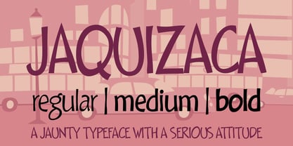
$19.00Jaquizaca is hand drawn type to go well with vector illustrations. Jaquizaca was created in 2001 to make inter-titles for a TV-programme. After twelve years it was revised and updated with ligatures, contextual alternates and other OpenType features. It supports all the European languages using Latin alphabet. - P22 Kane by P22 Type Foundry,
$24.95 - Mafra Display by DSType,
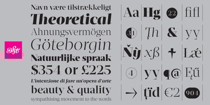
$26.00Mafra, the debut typeface by Pedro Leal, a type family suited both for editorial and corporate design, available in five weights, ranging from Light to Black with matching italics. Mafra is a contemporary typeface with plenty of style, asymmetrical and very dynamic serifs, and pleasent openness and balance. - FF Stargate by FontFont,
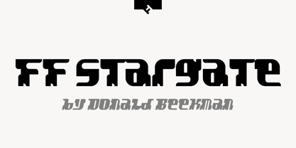
$41.99Dutch type designer Donald Beekman created this display FontFont in 1999. The family contains 2 weights: Regular and Italic and is ideally suited for music and nightlife. FF Stargate provides advanced typographical support with features such as ligatures and case-sensitive forms. It comes with proportional lining figures. - FF Cavolfiore by FontFont,
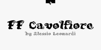
$41.99Italian type designer Alessio Leonardi created this display FontFont in 1994. The font is ideally suited for festive occasions, music and nightlife as well as software and gaming. FF Cavolfiore provides advanced typographical support with features such as ligatures and case-sensitive forms. It comes with proportional lining figures. - Sales Event JNL by Jeff Levine,
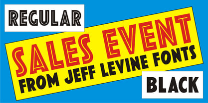
$29.00 - Bradstone-Parker Script by Intellecta Design,
$64.90Iza and Paulo W (Intellecta Design) are proud to announce Bradstone-Parker script Script. A free interpretation of the golden age writing style from American classical penmanship. Inspired in Zaner and his contemporaries Bradstone-Parker has evocative (sometimes exaggerated) ligature forms and voluptuous forms. This enhanced OpenType version is a complete solution for producing documents and artworks with a evocative and voluptuous style of calligraphic script: - many stylistic alternates for each letter (upper- and lowercase), accessed with the glyph palette; - ornaments and tails (“rasgos”) in the typical style from the XIX to the first decades of the XX century writing style, all accessed with the glyph palette using the Ornaments feature; - an extensive set of ligatures (100s of contextual alternates ligatures) providing letterform variations that make your designs really special, resembling real handwriting on the page; - a tour-de-force kerning work: over 4600 kerning paris soft adjusted handly. In non-OpenType-savvy applications it works well as an unusual and beautiful script style font. Because of its high number of alternate letters and combinations (almost 700 glyphs), we suggest the use of the glyph palette to find ideal solutions to specific designs. The sample illustrations will give you an idea of the possibilities. You have full access to this amazing stuff using InDesign, Illustrator, QuarkXpress and similar software. However, we still recommend exploring what this font has to offer using the glyphs palette: principally to get all the power of the Contextual Alternates feature. You can get an idea of the power of this font looking at the “Bradstone-Parker Script Guide”, a pdf brochure in the Gallery section. Take a special look at the Bradstone-Parker Words (ready words). Bradstone-Parker Script has original letters designed by Iza W and overall creative direction plus core programming by Paulo W. - Erotica by Lián Types,
$49.00“A picture is worth a thousand words” and here, that’s more than true. Take a look at Erotica’s Booklet; Erotica’s Poster Design and Erotica’s User’s Guide before reading below. THE STYLES The difference between Pro and Std styles is the quantity of glyphs. Therefore, Pro styles include all the decorative alternates and ligatures while Std styles are a reduced version of Pro ones. Big and Small styles were thought for better printing results. While Big is recommended to be printed in big sizes, Small may be printed in tiny sizes and will still show its hairlines well. INTRODUCTION I have always wondered if the circle could ever be considered as an imperfect shape. Thousands of years have passed and we still consider circles as synonyms of infinite beauty. Some believe that there is something intrinsically “divine” that could be found in them. Sensuality is many times related to perfectly shaped strong curves, exuberant forms and a big contrasts. Erotica is a font created with this in mind. THE PROCESS This story begins one fine day of March in 2012. I was looking for something new. Something which would express the deep love I feel regarding calligraphy in a new way. At that time, I was practicing a lot of roundhand, testing and feeling different kinds of nibs; hearing the sometimes sharp, sometimes soft, sound of them sliding on the paper. This kind of calligraphy has some really strict rules: An even pattern of repetition is required, so you have to be absolutely aware of the pressure of the flexible pen; and of the distance between characters. Also, learning copperplate can be really useful to understand about proportion in letters and how a minimum change of it can drastically affect the look of the word and text. Many times I would forget about type-design and I would let myself go(1): Nothing like making the pen dance when adding some accolades above and below the written word. Once something is mastered, you are able to break some rules. At least, that’s my philosophy. (2) After some research, I found that the world was in need of a really sexy yet formal copperplate. (3) I started Erotica with the idea of taking some rules of this style to the extreme. Some characters were drawn with a pencil first because what I had in mind was impossible to be made with a pen. (4) Finding a graceful way to combine really thick thicks with really thin hairlines with satisfactory results demanded months of tough work: The embryo of Erotica was a lot more bolder than now and had a shorter x-height. Changing proportions of Erotica was crucial for its final look. The taller it became the sexier it looked. Like women again? The result is a font filled with tons of alternates which can make the user think he/she is the actual designer of the word/phrase due to the huge amount of possibilities when choosing glyphs. To make Erotica work well in small sizes too, I designed Erotica Small which can be printed in tiny sizes without any problems. For a more elegant purpose, I designed Erotica Inline, with exactly the same features you can find in the other styles. After finishing these styles, I needed a partner for Erotica. Inspired again in some old calligraphic books I found that Bickham used to accompany his wonderful scripts with some ornated roman caps. Erotica Capitals follows the essentials of those capitals and can be used with or without its alternates to accompany Erotica. In 2013, Erotica received a Certificate of Excellence in Type Design in the 59th TDC Type Directors Club Typeface Design Competition. Meet Erotica, beauty and elegance guaranteed. Notes (1) It is supossed that I'm a typographer rather than a calligrapher, but the truth is that I'm in the middle. Being a graphic designer makes me a little stubborn sometimes. But, I found that the more you don't think of type rules, the more graceful and lively pieces of calligraphy can be done. (2) “Know the forms well before you attempt to make them” used to say E. A. Lupfer, a master of this kind of script a century ago. And I would add “And once you know them, it’s time to fly...” (3) Some script fonts by my compatriots Sabrina Lopez, Ramiro Espinoza and Alejandro Paul deserve a mention here because of their undeniable beauty. The fact that many great copperplate fonts come from Argentina makes me feel really proud. Take a look at: Parfumerie, Medusa, Burgues, Poem and Bellisima. (4) Some calligraphers, graphic and type designer experimented in this field in the mid-to-late 20th century and made a really playful style out of it: Letters show a lot of personality and sometimes they seem drawn rather than written. I want to express my sincere admiration to the fantastic Herb Lubalin, and his friends Tony DiSpigna, Tom Carnase, and of course my fellow countryman Ricardo Rousselot. All of them, amazing. - Aqueo by R9 Type+Design,
$38.00Aqueo™ is a versatile display font family inspired by the cylindrical wireframe of a water glass. The one-sided round corner details added a contemporary feel to this unique typeface. It comes in 6 weights and 12 styles. To ensure the accuracy of the letterforms, we painstakingly drew a master set for each weight. And with over 1,350 glyphs each, Aqueo™ fonts support most Latin-based languages and feature an extensive set of stylistic alternates; The standard uppercase set takes more traditional forms, while the alternate uppercase set sports unorthodox lowercase forms. The standards exude confidence and dependability yet are friendly and approachable, and the alternates elicit more fun, quirky and whimsical. The More Opentype Features, the More Zing for Your Design Projects. Aqueo™ Display Sans Serif comes loaded with Opentype features such as case-sensitive marks, punctuations and mathematic symbols. It also has an extensive set of discretionary ligatures, stylistic alternates, and over 80 essential UX/UI icons, each in three design options. These various Opentype features help improve your user experience, streamline your workflow, and unlock a broader range of typography details you can choose for your design. If you’re looking for a unique contemporary typeface, try Aqueo™ on your packaging design, logo design, infographic, print design, store signages, and UX/UI projects today! To find out more about Aqueo™ Opentype features and type specimens, please visit https://r9typedesign.com/aqueo-font-features-specimen - Workhorse by Borges Lettering,
$35.00Workhorse is a Sign Painter’s Gothic developed by Master Sign Painter Greg Reid. Workhorse captures the true essence of hand lettering. From the tapered waists to the elegant snaps of the brush; these elements present a warmth unseen in today’s mechanically stiff Gothics. Greg Reid and Charles Borges de Oliveira collaborated to bring this truly one of a kind typeface to fruition. With the power of Open type, Workhorse utilizes Contextual Alternates to create random variations of the capitals and lowercase letters. This allows your text to have subtle differences in the letters without losing form which helps to create an honest hand lettered look. This feature can be turned on or off to suit your individual style. You also have the ability to manually choose the glyph variations from the glyph pallet to help you create one of kind designs. Both versions of Workhorse feature complete variations of the capitals and lowercase letters (56 total), Small Caps and six alternates. The Small Caps are not just the capitals scaled down. They have been designed as a unique second set that adjusts the stroke thickness to match the existing letters, creating what we like to refer to as “Real Small Caps”. Workhorse is a timeless classic that can be used from early Americana advertising all the way up to present day modern use. No matter how you use Workhorse it always looks and reads well. - Abesif by Twinletter,
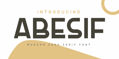
$12.00Introducing Abesif sans serif font. This font is stretched from the normal theme, it is boring, while different, it seems strange. from there we design the appearance of this font that is not normal so that it is not boring and we display it differently but not look strange. so if you use this font it will look different from the others but it doesn't look strange because it has a normal design. so that it creates an impression that is easy for each of your audience to remember when they first see your project. This font is very suitable as text with displays for various kinds of branding, advertisements, posters, banners, packaging, news headlines, magazines, websites, logo design, banners, social media design and of course you can use a lot more. - Matcha by Los Andes,
$59.00We decided to explore the concept of fitness, but from a more natural perspective. With so many people drinking detox drinks and eating raw food, we were inspired to create a font that mixes the ‘strength’ of sports and the organic nature of natural products. The result is ‘Matcha’: a strong and energetic typeface that also flows at the same time. Matcha consists of a stable, very friendly Slab face and a calligraphy Script with a handmade style: spontaneous and fickle with some reverse-contrast alternative characters. Can you guess who is the designer behind each style? The duo contains OpenType features and is perfect for labeling natural products, cookbooks, magazine photography, fashion & beauty magazines covers, health & fitness publications, and more. For both print and digital communication. Matcha: the new black coffee! - As of my last update, there isn't a specific font named "CNN" officially created or endorsed by Ray Larabie that is widely recognized in the type design industry. Ray Larabie is a prolific Canadian t...
- SF Gushing Meadow - Unknown license
- SF Diego Sans - Unknown license
- SF Wonder Comic - Unknown license
- SF Piezolectric Inline - Unknown license
- SF Chaerilidae Outline - Unknown license
- SF RetroSplice Condensed - Unknown license
- SF Arch Rival - Unknown license
- SF RetroSplice Shaded - Unknown license
- SF Comic Script - Unknown license
- SF Piezolectric Condensed - Unknown license
- SF Piezolectric SFX - Unknown license
- SF Intermosaic B - Unknown license
- SF RetroSplice SC - Unknown license
- SF RetroSplice Outline - Unknown license
- SF Proverbial Gothic - Unknown license
- SF Chaerilidae Shaded - Unknown license
- SF Archery Black - Unknown license
- Yafferbuddle by Aah Yes,
$7.00Yafferbuddle comes in the category of 'a funky fun font' with a pleasing rounded shape, but it still has the extensive range of features you'd expect in a modern OpenType font. It's especially useful for posters, headlines and comics. There's 5 weights and a Shadow version in Regular and Italic, making 12 fonts in all. To let you know what's in the font that you might otherwise not suspect . . . With Discretionary Ligatures on, you get special characters if you type Mc St. Rd. Bd. Ave. c/o No. (p) (P) - include the full-stop/period where given. With Stylistic Alternates switched on, you get plenty of extra characters - including a WiFi symbol (type Wifi or WiFi) / bullet numbers instead of ordinary numbers / that different U-dieresis / special characters for c/o No. Mc / an upside down ~ / a huge bullet, and different forms for cent, dollar, percent, per-thousand. As you'd expect, there's all the accented characters for all Western European scripts using Latin letters, and standard ligatures, plus other Open Type features including Class Kerning, Slashed-Zero, Historical Forms, Sub- and Superscript numbers, fractions for halves, thirds and quarters, Ornamental forms giving bullet numbers, etc. There's even some of the more obscure stuff like the main mathematical operators, symbols like card-suits and male/female signs and so on, schwa, U-horn O-horn, and there's more if you can Access All Alternates. Much will depend on what features your software recognises. - Faber Gotic by Ingo,
$21.00A ”modern“ Gothic – designed according to principles of modern form in three variations Faber Gotik is a reminiscence of Gutenberg’s first script from around 1450. The heavily broken forms allow further development in the direction of a modern, strongly geometric and less formal type. It should be possible to push the principle of design so far to the limit that a type is created which, from the very start, extinguishes reminders of a dark past. The characters are composed of squares which are lined up straight or in a more or less slanted manner. The resulting corners similar to serifs were removed so that a sans serif type in the true sense without up and down strokes was created. The principle of ”breaking“ was applied according to the historical model. Even the form of the characters is based on the model from the Middle Ages. Only the characters which cannot be created with the principle described were modeled on today's forms. Faber Gotik includes three variations: - Faber Gotik Text — most similar to the historical model - Faber Gotik Gothic — pushes the applied principle of form the furthest - Faber Gotik Capitals —; a Gothic upper case font, contrary to tradition. 555 years after Gutenberg, interest in black-letter typefaces is nearly extinct. They are especially looked down upon in German-speaking countries because they are still associated with ”Nazi“ scripts. But yet, the very forms of blackletter, Gothic, Schwabacher and especially cursive have enormous potential with regard to the development of new advanced font forms. - ATF Alternate Gothic by ATF Collection,
$59.00ATF Alternate Gothic is a new, significant digital expansion of Morris Fuller Benton’s classic 1903 type design. Originally available in one bold weight, the metal typeface came in three slightly different widths for flexibility in copy-fitting layouts. ATF Alternate Gothic has impact at any size. Its letterforms are instantly familiar: Benton’s original metal type family was used throughout the 20th century in newspapers, magazines, and advertising, providing “strong and effective display” in a compact space. Monotype issued its own metal version for machine typesetting, and Alternate Gothic likely served as inspiration for Linotype’s ubiquitous Trade Gothic® Bold and Bold Condensed. ATF Alternate Gothic expands on the characteristics that perhaps made Trade Gothic so popular, providing a wider range of weights and widths to address the needs of today’s designers and technologies. The space-saving clarity of ATF Alternate Gothic brings readability to the world of advertising typefaces. With its finely graded range of ten weights, with four widths of each weight (40 fonts total), this extensive type family can be used to pack a lot into a narrow space, and the range makes it easy to create variations of an advertisement or announcement for different formats and media. The tall x-height and narrow proportions, combined with a relatively low waist and springy, tension-filled forms, make ATF Alternate Gothic strong and effective in display. All ten weights have been carefully spaced for readability, caps and lowercase work well together, while attention-grabbing all-caps settings are clear and never crowded, no matter how narrow. - Cisalpin by Linotype,
$29.99The ideal typeface for cartography The Swiss designer/typographer Felix Arnold designed Cisalpin during the late 1990s, after he had challenged himself to create a contemporary typeface that could be used for cartographic uses. Arnold came to the subject of cartographic typefaces after analyzing many maps and atlases, and discovering that there was no standard typeface for these types of documents. Like any good cartographic type, Cisalpin is very legible at small sizes. While he was drawing this typeface on his computer, Arnold used a reduction glass to refine his design, making it work in these situations. Cisalpin is a linear sans serif face, with slight resemblance to renaissance serif types. The various weights are all clearly differentiated from one another. And because space is often a premium on maps, Cisalpin runs narrow. Words close in around themselves to help them become more identifiable. The letterforms in Cisalpin are durable, and can maintain their readability when placed over complex backgrounds. They have open interior forms, flattened curves, tall x-heights, and a capital height that almost reaches the tops of the ascenders. Cisalpin also has pronounced Italics, with a very clear angle of inclination. Each letterform in the family has been optimized so that they cannot be easily mistaken for another. This again helps minimize the misunderstandings that often occur because of illegibility. Although Cisalpin was developed for use in cartography, it may be used for countless other purposes; any font that can work well in small sizes on a map could be used almost anywhere else! - Emblema by Corradine Fonts,
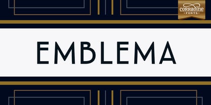
$29.95Emblema is an evocative font that exudes Art Deco style from early decades of the 20th Century. Its geometric shapes give a clean and modern look to any design where it is applied. Emblema was designed in 12 subtly different weights and is ideal for achieving the same weight in a single word when using different point sizes. Open Type users can access an extensive set of alternative and ornamental characters including 3 different size sets of caps, providing the utmost in versatility. - Dom by ParaType,
$30.00Dom was designed by Peter Dombrezian for American Type Founders in 1951–52. It is an informal unjoined script typeface that looks brushwritten. Its letters are almost monotone, freely or casually drawn. Vertical strokes of them have irregular ending at different heights, and oval axis have slightly different slopes. This typeface is to create a friendly, informal look in signs, advertising, and invitations. The Cyrillic version of the Bitstream digital font was developed by Dmitry Kirsanov for ParaType in 2008. - Gullia by Yukita Creative,
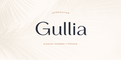
$13.00Gullia is a stylish modern font that's perfect for use in fashion-related design projects. Its elegant thin font makes it ideal for branding and logo design, while low legibility height makes it perfect for use in websites, advertising, and other types of communications. Gullia Modern Font is perfect for adding a touch of luxury and elegance to your designs. This stylish font was created with care to be perfect for use in modern fashion logos, website, and marketing materials. - Abrikos by PizzaDude.dk,
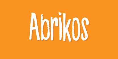
$15.00Abrikos is apricot in danish. A lovely and sweet fruit, often underestimated and not very well known - but if you ask me, it is delicious! The letters were drawn using a small brush, and as you can see, I almost ran out of ink - leaving the letters somewhat rough. I made 4 different versions of each lowercase letter, and these cycle automatically as you type in order to make some randomness. I threw in an extensive set of international characters as well! Enjoy! - FF Super Grotesk by FontFont,
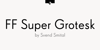
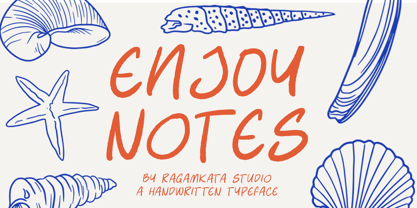
$68.99German type designer Svend Smital created this sans FontFont in 1999. The family has 6 weights, ranging from Regular to Bold in Condensed and Normal and is ideally suited for film and tv and editorial and publishing. FF Super Grotesk provides advanced typographical support with features such as ligatures, alternate characters, case-sensitive forms, fractions, super- and subscript characters, and stylistic alternates. It comes with a complete range of figure set options – oldstyle and lining figures, each in tabular and proportional widths. - Enjoy Notes by RagamKata,
$14.00For those ultra natural-looking handwritten, jotted down notes, say hello to Enjoy Notes! Designed to look casual and carefree, but with business to take care of :) The characters consist of uppercase letters, but they differ in style for the uppercase and lowercase keystrokes, to make the font appear more like natural handwriting. Opentype double-letter ligatures are built in for you too, just turn on your ligatures setting in your design app , to see them appear as you type
