10,000 search results
(0.039 seconds)
- Confetti TP by Tipo Pèpel,
$22.00 The Confetti is a typeface created about 1930 by the defunct José Iranzo foundry in Barcelona, and imitates the forms and gestures of handwriting created with a round nib as “Speedball”Series B. The original typefaces were a pair, called “Escritura Energica ” and “Escritura maravilla”. The typography has a dynamic air, caused partially by irregular alignment of the characters respect to the baseline and aesthetics takes us to the proposed commercial lettering or advertising of years 20-30. Confetti was one of the fonts selected by the website Typographica.org in its prestigious list of “Our Favorite Typefaces” in 2006.
 - Belligoes by Alit Design,
$16.00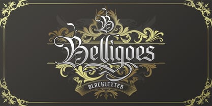 ✒️⬛Belligoes⬛✒️ Font is a font inspired by the Blackletter typeface, made with a modern impression but still looks strong and unique. Supported by alternative options such as swash, ligature and alternative characters, making the Belligoes font very easy to create designs with strong or dark themes. In addition, the Belligoes font is also supported with multilingual characters that can be used in several international languages. The Belligoes font is very suitable for use in making music album cover designs, tattoo logos, wishkey labels, packaging pomades and so on which are made with dark and strong concepts.
 - Brother Tom by Letterara,
$10.00 Brother Tom is a textured brush font. It has a natural handmade look with a less regular baseline. Give your designs an elegant yet completely modern look with Brother Tom. It's a great font font for any branding, posters designs, and for your upcoming winter stuff. Features : - Upper Case & Lowercase - Numerals - Punctuations (OpenType Standard) - Accents (Multilingual characters) - underline in swash - Works on PC & Mac - Simple installations - Accessible in Adobe Illustrator, Adobe Photoshop, Adobe InDesign, even works on Microsoft Word. Don't wait anymore, put it in your shopping basket and follow me, because there will be many promos!
 - Hello Mytoys by Alit Design,
$18.00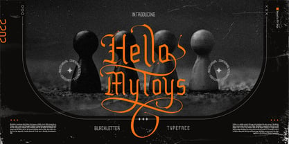 ✒️Hello Mytoys✒️is a font inspired by the Blackletter typeface, made with a modern impression but still looks strong and unique. Supported by alternative options such as swash, ligature and alternative characters, making The Hello Mytoys Blackletter very easy to create designs with strong or dark themes. In addition, The Hello Mytoys Blackletter is also supported with multilingual characters that can be used in several international languages. The Hello Mytoys Blackletter is very suitable for use in making music album cover designs, tattoo logos, wishkey labels, packaging pomades and so on which are made with dark and strong concepts.
 - Ginuk by Twinletter,
$15.00 Take your message to the next level with this Ginuk font. With its versatile style, this font can be used in a variety of ways in your projects so you can demonstrate your ideas in a captivating way. This font is equipped with the Latin ISO standard so you don’t have to worry about the completeness of the character. of course, your various design projects will be perfect and extraordinary if you use this font because this font is equipped with a font family, both for titles and subtitles and sentence text, start using our fonts for your extraordinary projects.
 - Linoblox by Ana's Fonts,
$12.00 Linoblox is a sans and ornaments font family made using hand-carved linoleum, based on my Bloxhall art deco font. This collection has a quirky handmade look, but can also be used in retro and vintage designs, such as collages. The fonts have a realistic ink stamp texture that will look great in logos, notes and quotes, social media posts, and branding and packaging. Linoblox includes: Linoblox font in three variations: regular, jumpy and underlined An ornaments font, with doodles, swashes, smudges and frames (Please note: this is the same set of ornaments as the Notes From Home serif font)
 - Exelancer by Popskraft,
$19.00 We are proud to present the futuristic Excelancer font. This font was inspired by passion for space stories. The uniqueness of this font lies in the rare combination of a wibrant style of decorative capital letters and perfectly balanced lowercase charachters that read well in any massive text. Thus, you get a universal font kit with which all the tasks of futuristic design are solved. However, this font will become a decoration not only for fantastic stories, but also for everything related to technology, development, progress and even sports. In short, this is the pure energy of the future!
 - Lamore by Kaligra.co,
$29.00 The Lamore Collection is a Minimalist Modern Elegant font faired prefect with Signature script font. Full of beautiful ligatures, tons of special alternative glyphs, ornament and multilingual support. It's a very versatile font that works great in large and small sizes. Lamore font is perfect for branding projects, Logo design, Clothing Branding, product packaging, magazine headers, or simply as a stylish text overlay to any background image. HOW TO ACCESS ALTERNATE CHARACTERS Open glyphs panel: In Adobe Photoshop go to Window - glyphs In Adobe Illustrator go to Type - glyphs Get Lamore Script on our website http://kaligra.co/
 - Revolte by Wiescher Design,
$39.50 Whenever I see clippings on TV of demonstrations, protesting against this or that, with people holding up signs, I am surprised about the signs being professionally printed or plotted in Helvetica or Futura condensed. I've even seen signs in Zapfino! That doesn't really cut it, it doesn't look much like a real protest. So I decided to give the protesting world a real good font for the occasion. In German a Revolte is an uprising, I thought that was a good name for the font. Hasta la victoria siempre from your revolutionary type designer Gert Wiescher.
 - Baroque Mortale by Letterhead Studio-YG,
$45.00 Letterhead Studio makes both fonts and design with own fonts. The studio is started in 1998 by Yuri Gordon, Valery Golyzhenkov and Olga Vassilkova. We work in graphic design, branding and type design. Our collection of Cyrillic fonts includes more than 330 faces, generally it is display fonts. Letterhead is one of leading developers of custom-made fonts, lettering and digital calligraphy in Russia. Among clients of studio are magazines like Rolling Stone, Esquire, GQ, Empire, Interni, Harpers Bazaar. Also we develop corporate fonts, more often for banks. Letterhead co-operated with Gazprombank, Rosbank, the Alpha-group, Trust, Menatep, Orgres-Nordea and others.
 - TT Tangerine by Tropical Type,
$29.00 TT Tangerine made in 2017 has been a global hit. It's been used by the biggest performing artist in the world, luxury brands, designer packaging and more. Due to its popularity an italic style was added in Feb 2023. From the designer: I wanted to make a retro font with that 70's good vibes feel but i didn't want to just copy letters from that era. I decided to make new unique letters that had that groovy 70s feel. The bold curves pay homage to the big hair and bell-bottoms of the golden era.
 - Premis by Fenotype,
$20.00 Do you often find yourself looking for a font that is universal and neutral on the one hand, and distinctive and special on the other? Here's one for you. Premis is a fairly broad font family that is suitable for versatile use, but still has plenty of original details, such as straight endings in the letters r, t and f. Equally current and timeless, Premis is available in three different widths. In terms of features, Premis is sensibly designed to meet demanding use, including, for example, capital letters and several different number styles. Make Premis your premise.
 - Xotor by Typogama,
$19.00 Xotor is a double styled typeface family destined for use in titling and headlines. The main style, the Triline weight, is a modular typeface composed of three strokes and is best used in large sizes. For smaller bodies of text, the second Regular style is based on the same letter construction but in a simple, solid stroke. Both weights can either be used individually or combined to add extra effect to any layout. With an extended Latin language support, Xotor covers most Latin based scripts and equally features a range of Opentype features, from ligatures, alternative letters or different styles of numerals.
 - ITC Honda by ITC,
$29.99This simplified blackletter typeface shares some geometric characteristics with a line of typefaces popular that were especially popular in Germany during the 1920s and 30s. Their forms may have originally come about after a desire to mix the classical Fraktur" forms found in typefaces like Linotype Luthersche Fraktur or Fette Fraktur with more modern sans serif typefaces, like Basic Commercial or Futura. ITC Honda's letters are rather narrow and angular. The type can be used for a number of headlines or logo purposes, and is best legible when set large. A similar typeface in our library is Linotype Gotharda." - Bannock Brae Gothic by Red Rooster Collection,
$45.00 Bannock Brae Gothic is a sans serif typeface. It is an original creation of Steve Jackaman (ITF) and was created for the Red Rooster Collection in 1999. The typeface was loosely inspired by a typeface from an old obscure wood type specimen book from the turn of the 20th century. Due to its turn-of-the-century roots, Bannock Brae Gothic has an informal 1920’s art deco look. It finds an ideal home in lighthearted projects concerning crafts, food, festivals, and music, but its alternates still give it the flexibility to showcase a classic and timeless feel in any project.
 - The Quality Brave by Alit Design,
$19.00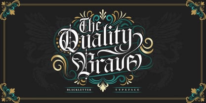 ✒️The Quality Brave✒️is a font inspired by the Blackletter typeface, made with a modern impression but still looks strong and unique. Supported by alternative options such as swash, ligature and alternative characters, making The Quality Brave font very easy to create designs with strong or dark themes. In addition, The Quality Brave font is also supported with multilingual characters that can be used in several international languages. The Quality Brave font is very suitable for use in making music album cover designs, tattoo logos, wishkey labels, packaging pomades and so on which are made with dark and strong concepts.
 - Monotype Bodoni by Monotype,
$40.99 Bodoni expresses the beginning of the Industrial Revolution; its serifs are flat, think and unbracketed, while the stress is always on the mathematically vertical strokes. Bodoni believed in plenty of white space and therefore descenders are long. The M is rather narrow; in the Q the tail at first descends vertically and the R has a curled tail. The italic, like most continental modern faces, has roman serifs. Monotype Bodoni provides a clear-cut effect due to its simplicity. It reproduces well, particularly in sizes over 12pt. This font is slightly darker than Bauer Bodoni. The contrast makes Monotype Bodoni appear more condensed.
 - Ritz Slab Serif JNL by Jeff Levine,
$29.00 Ritz Slab Serif JNL is a bold display face which shares a lot of similar design traits to Stymie and other similar metal type of the 1930s and 1940s, but in actuality was modeled from only four letters. On the sheet music for the 1937 song "Sweet Varsity Sue" [from the 20th Century Fox Film "Life Begins in College"], there is a picture of the Ritz Brothers - a popular comedy team from 1925 through the late 1960s. The hand lettered name "Ritz" became the basis for Ritz Slab Serif JNL, which is available in both regular and oblique versions.
 - Ghosthey by Alit Design,
$14.00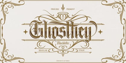 ✒️Ghosthey Typeface✒️is a font inspired by the Blackletter typeface, made with a modern impression but still looks strong and unique. Supported by alternative options such as swash, ligature and alternative characters, making The Ghosthey Typeface Blackletter very easy to create designs with strong or dark themes. In addition, The Ghosthey Typeface Blackletter is also supported with multilingual characters that can be used in several international languages. The Ghosthey Typeface is very suitable for use in making music album cover designs, tattoo logos, wishkey labels, packaging pomades and so on which are made with dark and strong concepts.
 - Umberland Slab by Sharkshock,
$115.00 Umberland Slab is an attractive family available in 3 different weights with italics. There’s a particular emphasis on simple geometric shapes and the way they interact with tall vertical strokes. Smooth curves and sharp angles blend together in a pleasing symmetry. Stroke widths are given variable degrees of contrast but serifs are consistent and heavy handed. Spacing is on the tight side with some lowercase pairs quite snug against each other. Umberland Slab would work well in small blocks of text, corporate logos, menus, or signage. This family is equipped with European accents/diacritics for international support, fractions, alternates, and ligatures.
 - Lupio by Tour De Force,
$25.00 Lupio comes as 102nd family in our catalogue. It is geometric sans serif family with humanistic elements. Lupio family contains variable and classic versions, so you can pick which one suits better for you and your project. Classic version is additionally fine tunned to get overall character look more equalised and uniform. When it comes to distinction – in sea of dozen other sans serif famlies, we made Lupio decently recognizable. You won't mistaken him with others. Lupio is designed as working horse family, to be used in all possible situations – from websites to packages, editorial design and applications.
 - Ds Hand by CozyFonts,
$25.00 Ds Hand Font Family is a handwritten font designed by Tom Nikosey, based on Danielle Nikosey’s printing style. Tom is an American Graphic Designer specializing in Typographic Design and Illustration. Ds Hand is available in Regular & Bold weights CozyFonts Foundry is Tom's intro into the world of font design. Ds Hand Family is a tribute and gift to his daughter. Ds Hand, at first glance, gives a hand drawn aesthetic feel but on closer inspection, when set as text, this font gives off a cool, organized, legibly organic read. Also available in Bold. This is the 5th Hand Drawn Font Family from CozyFonts!
 - ITC Peter's Miro by ITC,
$29.99ITC Peter's Miro is the work of New York designer John Peter. It was inspired by the letters used by Joan Miro in his paintings. No one used letterforms more frequently in his work than Joan Miro," says Peter. For his typeface, however, "considerable liberty has been taken with his [Miro's] original letters and missing characters have been added." The letters are a simple script, irregularly and almost crudely written, but bursting with energy. To give designers free rein with their creativity, Peter designed two complete versions of the alphabet in both upper- and lowercase, Peter's Miro and Peter's Miro Too." - Lloyd Serif by Ivan Kostynyk,
$- Initially, I participated in the contest to design the logo for Bill Lloyd. In the end, the design was rejected, but letters remained. I then decided to continue with the idea and complete the entire typeface. After a couple of months, I realized that the typeface was imperfect, and now that I’m working on an updated Lloyd type, this one is free. The main characteristic of the typeface is its bold and curvy shapes. It is also tall and original in design. It was a great experience because it taught me how failure inspires people to move on, and create something better.
 - Maboth Typeface by Alit Design,
$12.00 ✒️Maboth Typeface✒️is a font inspired by the Blackletter typeface, made with a modern impression but still looks strong and unique. Supported by alternative options such as swash, ligature and alternative characters, making The Maboth Typeface very easy to create designs with strong or dark themes. In addition, The Maboth Typeface font is also supported with multilingual characters that can be used in several international languages. The Maboth Typeface is very suitable for use in making music album cover designs, tattoo logos, wishkey labels, packaging pomades and so on which are made with dark and strong concepts.
 - JWX Memo by Janworx,
$15.00 Memo, designed by Janet Valdez of Janworx, is a digital version of her own personal penmanship, currently displayed in abundance on sticky notes all over her desk and monitor. Although its basis is in actual handwriting, it's perfectly legible, offering a casual alternative typeface for everyday correspondence or simple things, ranging from event flyers to children's birthday party invitations. Memo performs well at regularly used correspondence sizes, but at a larger size can also be manipulated in graphics software for interesting effects. The letters can be moved randomly from the baseline, overlapped, and then contoured with good results for a casual look.
 - Remboland by Alit Design,
$18.00 ✒️Remboland Typeface✒️is a font inspired by the Blackletter typeface, made with a modern impression but still looks strong and unique. Supported by alternative options such as swash, ligature and alternative characters, making The Remboland Typeface Blackletter very easy to create designs with strong or dark themes. In addition, The Remboland Typeface Blackletter is also supported with multilingual characters that can be used in several international languages. The Remboland Typeface is very suitable for use in making music album cover designs, tattoo logos, wishkey labels, packaging pomades and so on which are made with dark and strong concepts.
 - Aladdin by CozyFonts,
$20.00 Aladdin Black is the 3rd member of our Aladdin Bold Font Family. This new style is extra bold and slightly rounded on the outsides of the glyphs. It is fat, fancy, fearless, forward, devilish, heavy, and stylized. Aladdin Bold was my first font introduced in 2012. I've always felt there were possibilities of adding styles to this family and something triggered the decision, so...here it is. I took much time deliberating over many of the finer details in this version of Aladdin and I hope the 'devil is in the details' for whoever decides to try on Aladdin Black.
 - Cotton Club by Vincenzo Crisafulli,
$30.00 Cotton Club remembers the fonts of the thirties of the last century and the Bodoni, but it does not present graces: it is a sans serif. It has 360 glyphs and is composed of two regular and italic styles. Cotton Club is characterized by a high contrast between thick and thin strokes. The emphasized signs give the font an essential, sharp and elegant look. The Italic style of the Cotton Club refers to handwriting and this is noticeable in the ligatures obtained with kerning. The name of the font, “Cotton Club,” refers to the famous Jazz Club in New York, in Harlem, active in the twenties and thirties, during and after Prohibition. At that time the Bodoni, in its many derivations, was widely used not only in lead composition, but also in neon signs, plaques, posters, as well as in many other applications. Redesigning a new font that brings back to those years wants to be, therefore, a tribute and a reinterpretation of the graphics of that period as well as, it is understood, to the glorious Bodoni. Supported Languages Bulgaro, Bosnian, Catalan, Czech, Danish, German, English, Spanish, Estonian, Finnish, French, Irish, Croatian, Hungarian, Icelandic, Italian, Lithuanian, Latvian, Maltese, Dutch, Norwegian, Polish, Portuguese, Romanian, Slovak, Slovenian, Albanian, Serbian, Swedish, Turkish. Vincenzo Crisafulli font designer Vincenzo Crisafulli graduated from the Faculty of Architecture in Palermo and works as a graphic designer. He has been designing fonts since 1996 and has published with T26 (Type-Foundry, digital foundry in Chicago-California USA): Crisafulli, Chocolat, LST, Luminaria, and Stitching; with MyFonts: Rétrospectif, Bella Copy, Jasmin and Noahs Ark.
 - Bourton Text by Kimmy Design,
$25.00 Bourton Text is a modern sans-serif typeface family perfect for both text type settings and display purposes. While it’s not a layering type family like its brother, Bourton, it come packed with features, extras and over 2,000 characters that make it stand on its own. HISTORY Bourton Text is a new take of the Bourton family that was one of the best-selling and favorite fonts of 2016. After countless requests for lowercase alphabet, or suggestions for a font pairing with Bourton, this new text setting family is based on the original shapes of Bourton. DESIGN & CREATION In taking Bourton Base was the starting point as they narrowest width and boldest weight. From there, lowercase shapes were designed that matched the aesthetic and details of the popular capitals. As Bourton was a heavy display font, some small tweaks were done to make it more fitting for smaller text settings, including reducing the letter-spacing and reworking some counters. Some areas needed complete reconstruction, such as the figures. The design of those began anew with a style that worked with the capitals and lowercase but also as a standalone set. Currency shapes were updated to match the numerals. Punctuation was also reimagined to work better in smaller type settings. Diacritics and extended language support was also updated and expanded to include full Latin plus language support for 219 latin based language spoken in 212 countries. Once the basic alphabet for Bourton Text Bold Narrow was formed, the font was expanded in both weight and width. Taking the weight from Bold down to Hairline, it allowed for more range in use. The typeface needed to be expanded in order to reach better as a book weight and width, in addition to a regular width, a wider version was create as well. FEATURES Once the extremes were set in place, small capital forms were designed for text and display purposes. These also allow for nested capital letters, lifted small caps and other display features offered in the typeface. One of the most popular fonts in the Bourton layering font family is Bourton Line. This led to an experimentation with rounded Bourton Text completely and thus a complete set of duplicated characters with rounded terminals. By using the Opentype Panel, a rounded font is a single click away. Every feature has been carefully thought out and updated across the entire font. In total, Bourton boasts over 2,300 glyphs, 42 font files with 3 widths and 7 weights in upright and italic.
 - Pound by Typodermic,
$11.95 Are you ready to elevate your design game with the unique counterless 21st Century Art Deco typeface, Pound? Pound is not your average typeface. Its bold, beefy design is perfect for pounding out meaty phrases with confidence and vigor. With its counterless design, Pound stands out from other typefaces on the market, making it the perfect choice for designers looking to make a bold statement. One of the key features of Pound is its letter pair ligatures, which interlock and break up the monotony of plainly repeating characters. You can turn off your application’s “standard ligatures” function to disable this effect. In addition to its unique design, Pound is also available in a simpler Web style for situations where less detail is required. So what are you waiting for? Take your designs to the next level with Pound, the counterless Art Deco typeface that packs a punch. Get ready to make a statement and stand out from the crowd. Most Latin-based European writing systems are supported, including the following languages. Afaan Oromo, Afar, Afrikaans, Albanian, Alsatian, Aromanian, Aymara, Bashkir (Latin), Basque, Belarusian (Latin), Bemba, Bikol, Bosnian, Breton, Cape Verdean, Creole, Catalan, Cebuano, Chamorro, Chavacano, Chichewa, Crimean Tatar (Latin), Croatian, Czech, Danish, Dawan, Dholuo, Dutch, English, Estonian, Faroese, Fijian, Filipino, Finnish, French, Frisian, Friulian, Gagauz (Latin), Galician, Ganda, Genoese, German, Greenlandic, Guadeloupean Creole, Haitian Creole, Hawaiian, Hiligaynon, Hungarian, Icelandic, Ilocano, Indonesian, Irish, Italian, Jamaican, Kaqchikel, Karakalpak (Latin), Kashubian, Kikongo, Kinyarwanda, Kirundi, Kurdish (Latin), Latvian, Lithuanian, Lombard, Low Saxon, Luxembourgish, Maasai, Makhuwa, Malay, Maltese, Māori, Moldovan, Montenegrin, Ndebele, Neapolitan, Norwegian, Novial, Occitan, Ossetian (Latin), Papiamento, Piedmontese, Polish, Portuguese, Quechua, Rarotongan, Romanian, Romansh, Sami, Sango, Saramaccan, Sardinian, Scottish Gaelic, Serbian (Latin), Shona, Sicilian, Silesian, Slovak, Slovenian, Somali, Sorbian, Sotho, Spanish, Swahili, Swazi, Swedish, Tagalog, Tahitian, Tetum, Tongan, Tshiluba, Tsonga, Tswana, Tumbuka, Turkish, Turkmen (Latin), Tuvaluan, Uzbek (Latin), Venetian, Vepsian, Võro, Walloon, Waray-Waray, Wayuu, Welsh, Wolof, Xhosa, Yapese, Zapotec Zulu and Zuni.
 - Petale by LomoHiber,
$15.00 Petale is my new elegant experimental typeface I'd love to present. At the beginning, I was intended to create a bold wide font, I started sketching options and came out with the letter 'M' design first. I thought it may be interesting and had continued developing the style with letters N, O, etc., spending hours on some letters to match the design and my vision. I liked how it looked (especially digits) and added different weighs. And it came out pretty stylish. You may like it to use in magazine designs, posters, websites, packaging, branding, logo, and so on. Petale can grant your work some graceful modern touch with a brutalist-feminine note. Works well with elegant and strict serif fonts. Also try to experiment with script fonts. I used my Stormy Youth font: https://www.myfonts.com/fonts/lomohiber/stormy-youth and Bodoni 72 Smallcaps If you have some issues or questions, please let me know: lhfonts@gmail.com Hope you'll enjoy using Petale! Language support: Afrikaans, Albanian, Bulgarian, Catalan, Croatian, Czech, Danish, Dutch, English, Estonian, Finnish, French, German, Hungarian, Icelandic, Italian, Latvian, Lithuanian, Maltese, Norwegian, Polish, Portuguese, Romanian, Russian (Русский), Slovak, Slovenian, Spanisch, Swedish, Turkish, Ukrainian (Украинский), Zulu
 - View Slant Black ExtExp - Personal use only

- dearJoe 7 by JOEBOB graphics,
$39.00 The dearJoe series of fonts came to life around the year 1999, when I created dearJoe 1, which was a first (and half-assed) attempt to convert my own handwriting into a working font. Being able to type in my own hand had always been a childhood fantasy, and even though I only partly understood the software, a working font was generated and I decided to put it on the internet for people to use in their own personal projects. Which they did: at this moment the dearJoe 1 font has been downloaded millions of times and can be found on Vietnamese riksjas, Tasmanian gyms and chocolate stores on 5th Avenue for instance. The font is not something I am particularly proud of, but it started me of in building what's now the JOEBOB graphics foundry. Inbetween creating other fonts, the dearJoe series has become a theme I revisit every once in a while, trying to create an update on how my handwriting has evolved, along with my abilities in creating fonts that mimic actual handwriting. In the last decade or so I started implementing ligatures and alternate characters, which helped a lot in coming to a result that can almost pass for actual handwriting. The 2019 dearJoe 7 font is the latest addition to this font family. All characters were scanned from handwritten notes, cherrypicking the characters and letter-combinations I liked best. They were written with a Lamy M66 B pen and only minor adjustments were made to the original scans, leaving most little flaws and rough edges as they were for a convincing ball-point on paper result. The font comes with over 150 ligatures, making sure the font has a variated and credible overall look and feel.
 - Fractus by Eurotypo,
$36.00 The requirements of Middle Ages scribes who copied and produced books in monasteries were fundamentally to preserve space, due to the high cost of the writing surface. During this long period of the development of Gothic forms, many other variations of the style of black letters appear: Textur or “Gothic-antique”, another group called Rotunda preferred by Italian and Spanish scribes. In 1490, the style "Bâtarde" (according to the the French classification) began to be widely used in Germany with more rounded shapes and named Scwabacher (probably derived from the city of Schwabach, but not certified) Fractur is a more condensed and narrower form than Schwabacher. This style is attributed to Johann Neudörfer of Nuremberg, cut in 1513; it was quickly imitated, therefore a few years later became to be a German national identity that extended over the next four centuries. The shape of its characters can be considered as a fusion of Texture and Schwabacher: the lowercase actually has medium strictly vertical and half curved strokes. The first expressions of the baroque influence this writing whose appearance of movement is due to the ornaments applied to the uppercase letters and the ascending and descending features of the lowercase. Despite having spent so many years and being a typeface not suitable for extensive reading texts, the Gothic Fractur has endured over time for possessing a strong and solid characteristic, as well as being closely linked to the spirit of gothic cathedrals of countries in northen Europe. In fact, it is probably that this expressive feature leads them to be chosen in the most varied graphic communication needs, which run from from banks and financial companies, insurers, law offices, publishers, newspapers and TV networks, till alcoholic drinks, funeral tombstones, packaging and even tattoos.
 - Angostura by Typodermic,
$11.95 Introducing Angostura—the sans-serif typeface that’s set to revolutionize your designs! Drawing inspiration from the bold and beautiful American sign lettering of the 40s and 50s, Angostura is a truly unique typeface that’s sure to turn heads. With low crossbars that harken back to the industrial deco signage of yesteryear, and monocular “a” and “g” that pay homage to the mid-century Futura craze, this font is a true original. But that’s not all; Angostura comes in a range of styles, from Ultra-Light to Bold and everything in between, making it a versatile choice for any project. And if you really want to take things to the next level, be sure to check out the spray-paint, wood grain, and stencil variants—these special editions use ligatures to create bespoke letter pairs that add an extra layer of realism and authenticity to your work. So, why choose Angostura? Simple—this typeface is full of character and individuality, allowing you to convey your message in a tone that’s both distinct and memorable. Whether you’re working on a branding project, a website redesign, or a print campaign, Angostura is the typeface that’s sure to take your designs to the next level. So, what are you waiting for? Try it out today and see the difference for yourself! Most Latin-based European, Greek, and some Cyrillic-based writing systems are supported, including the following languages. Afaan Oromo, Afar, Afrikaans, Albanian, Alsatian, Aromanian, Aymara, Bashkir (Latin), Basque, Belarusian (Latin), Bemba, Bikol, Bosnian, Breton, Bulgarian, Cape Verdean, Creole, Catalan, Cebuano, Chamorro, Chavacano, Chichewa, Crimean Tatar (Latin), Croatian, Czech, Danish, Dawan, Dholuo, Dutch, English, Estonian, Faroese, Fijian, Filipino, Finnish, French, Frisian, Friulian, Gagauz (Latin), Galician, Ganda, Genoese, German, Greek, Greenlandic, Guadeloupean Creole, Haitian Creole, Hawaiian, Hiligaynon, Hungarian, Icelandic, Ilocano, Indonesian, Irish, Italian, Jamaican, Kaqchikel, Karakalpak (Latin), Kashubian, Kikongo, Kinyarwanda, Kirundi, Komi-Permyak, Kurdish (Latin), Latvian, Lithuanian, Lombard, Low Saxon, Luxembourgish, Maasai, Macedonian, Makhuwa, Malay, Maltese, Māori, Moldovan, Montenegrin, Ndebele, Neapolitan, Norwegian, Novial, Occitan, Ossetian, Ossetian (Latin), Papiamento, Piedmontese, Polish, Portuguese, Quechua, Rarotongan, Romanian, Romansh, Russian, Sami, Sango, Saramaccan, Sardinian, Scottish Gaelic, Serbian, Serbian (Latin), Shona, Sicilian, Silesian, Slovak, Slovenian, Somali, Sorbian, Sotho, Spanish, Swahili, Swazi, Swedish, Tagalog, Tahitian, Tetum, Tongan, Tshiluba, Tsonga, Tswana, Tumbuka, Turkish, Turkmen (Latin), Tuvaluan, Uzbek (Latin), Ukrainian, Venetian, Vepsian, Võro, Walloon, Waray-Waray, Wayuu, Welsh, Wolof, Xhosa, Yapese, Zapotec Zulu and Zuni.
 - Geometry Script Pro by CheapProFonts,
$10.00 The Geometry Pro family has been designed to be the final word in purely geometric fonts, and this rounded Script sub-family is a nod to the 50s style of connected logomarks. Words set with both the Regular and the Alternate (with its more flourished capitals and alternate stem connections) can be extended by using the underscore character between letters. You can freely mix and match glyphs from both fonts to create a little bit of variety, and finding that perfect combination. For a matching set of capitals (and disconnected lowercase letters): check out the Regular weights of the Geometry Soft Pro family. All the Geometry Pro fonts are strictly geometric (as drawn with a compass and a ruler fixed to 90 and 45 degree angles) but they are not slavishly modular. ALL fonts from CheapProFonts have very extensive language support: They contain some unusual diacritic letters (some of which are contained in the Latin Extended-B Unicode block) supporting: Cornish, Filipino (Tagalog), Guarani, Luxembourgian, Malagasy, Romanian, Ulithian and Welsh. They also contain all glyphs in the Latin Extended-A Unicode block (which among others cover the Central European and Baltic areas) supporting: Afrikaans, Belarusian (Lacinka), Bosnian, Catalan, Chichewa, Croatian, Czech, Dutch, Esperanto, Greenlandic, Hungarian, Kashubian, Kurdish (Kurmanji), Latvian, Lithuanian, Maltese, Maori, Polish, Saami (Inari), Saami (North), Serbian (latin), Slovak(ian), Slovene, Sorbian (Lower), Sorbian (Upper), Turkish and Turkmen. And they of course contain all the usual "western" glyphs supporting: Albanian, Basque, Breton, Chamorro, Danish, Estonian, Faroese, Finnish, French, Frisian, Galican, German, Icelandic, Indonesian, Irish (Gaelic), Italian, Northern Sotho, Norwegian, Occitan, Portuguese, Rhaeto-Romance, Sami (Lule), Sami (South), Scots (Gaelic), Spanish, Swedish, Tswana, Walloon and Yapese.
 - Dederon Sans by Suitcase Type Foundry,
$75.00Dederon Serif has been specifically designed for book setting. Preliminary sketches were drawn in 2004. Its inspiration — particularly its weight and width proportions — can be traced to the Liberta typeface from the TypoArt type foundry in former Eastern Germany. After a careful study of the model, the design of Dederon branched off into its own direction, finding its distinctive voice and becoming a wholly original type family. Dederon Serif kept most of the elements typical for the Old Style Roman lettering, such as the angle of the stress, the medium x-height, and lower contrast. In large sizes, the typical shapes of the letters stand out — the calligraphic feel characteristic for the Czech typefaces by Oldrich Menhart, the unusual serifs hinting at the angle of the pen, the shapes of the stems, or the terminals of dots and ears. Upon finishing the serif version, a sans-serif variant called Dederon Sans was added. The construction principles are also derived from the Old Style Roman model, which lends the lettering its open, humanist feel. Yet the design also conforms to the rules of the modern sans serif. Most characteristics of Dederon Sans match the serif version — the weight of individual cuts, the width proportions, x-height, ascenders' and descenders' length, and the slope of the italics. Each version of Dederon Open Type Std contains the standard Western Latin character set and the Central European characters; a number of basic and accented ligatures, small caps; old style, small caps and caps, table, fraction and superscript numerals; expert glyphs and alternative characters. This brings the total to a comfortable 820 glyphs per weight - PharmaCare - Unknown license

- Lapoya by Cuchi, qué tipo,
$9.95 “LAPOYA” (meaning in english “the coolest”) is a large slab serif typeface family, with a certain Italian inverted contrast touch. Specially designed for advertising big shows and commerces, Lapoya has 36 variables and four axes, including a text and decorative versions, where the drawing and width of its counterforms vary. It also has icons that remember the old aesthetics of wood types from the early 20th century, and more than 400 characters with a multitude of signs and ligatures, that make Lapoya ideal for up to 89 languages. It is clearly inspired by the large wood types designed for posters, advertisements and newspapers. Since they were introduced in the 19th century, slab serifs have become extremely popular. In fact, serifs are often enlarged, not so much to look like beautiful or balanced letters, but to be more graphic and visual powerful than others. Furthermore, in the case of this typeface, this idea has been applied not only to capital letters, but also to the lowercase, numbers and signs of all kinds. “That’s why this typeface is LAPOYA!” Designed by Carlos Campos in 2023. cuchi@cuchiquetipo.com OPENTYPE FONT 426 GLYPHS 388 CHARACTERS 4 AXES 36 INSTANCES 9 LAYOUT FEATURES 89 LANGUAGES

