8,164 search results
(0.012 seconds)
- Fidelity Caps by Jonahfonts,
$19.95
- Sunamy Caps by Intellecta Design,
$20.90 - Snow Cap by Bitstream,
$29.99 - Scrap Caps by Illustration Ink,
$3.00 - Standard Cap by Graffiti Fonts,
$19.99 - Charleston Caps by Type Associates,
$21.95
- Rebimboca Caps by Intellecta Design,
$8.00 - Phi Caps by Cas van de Goor,
$7.00
- Pinkhoff Caps by TypeFaith Fonts,
$10.00
- Neutraliser Caps by HamburgerFonts,
$20.00
- Ricochet Caps by Ben Harman,
$19.00
- Mortised Caps by Intellecta Design,
$19.00
- Doubleline Caps by URW Type Foundry,
$29.00
- Holz Caps by Authentic,
$39.50
- Ichweis Caps by Intellecta Design,
$19.90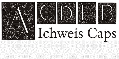
- Alasassy Caps by Leksen Design,
$19.00
- Hilde CAPS by JOEBOB graphics,
$9.00
- Baskerville Caps by Three Islands Press,
$15.00 - Unnamed Caps by Intellecta Design,
$22.90 - Oxona Caps - Personal use only

- Biotrip Caps - Personal use only

- The Smell After Rain by Tlatous Type,
$19.00
- GEOspeed SC - Personal use only

- Skull Capz (BRK) - Unknown license

- Skull Capz BRK - Unknown license

- Vacant Capz BRK - Unknown license

- CA Cape Rock by Cape Arcona Type Foundry,
$39.00
- ImperatorBronzeSmallCaps - Unknown license

- Axial Caps Med - Personal use only

- Octavus Caps Black - Personal use only

- Apothem Caps Med - Personal use only

- Bigplace Caps ExtBd ExtCond - Personal use only

- EG Dragon Caps - 100% free

- Lime Blossom Caps - Unknown license

- Wanted Poster Caps - Unknown license

- Anglo-Saxon Caps - Unknown license

- Kelt Caps Freehand - Personal use only

- Sho-Card-Caps - 100% free

- Art Nouveau Caps - Unknown license

- Outta Control Caps - Unknown license


