10,000 search results
(0.033 seconds)
- The Florest by BlackLotus,
$10.00 The Florest is a display type font inspired by the beauty of nature on florest island, Indonesia. The Florest has a characteristic impression of nature that will beautifully translate into a wide variety of design ideas. Include : The Florest Reguler (with Alternate) The Florest Outline (with Alternate) The Florest Deco (with Alternate) The Florest Deco Outline (with Alternate) The Florest Dingbats Swash
 - Tazugane Gothic by Monotype,
$187.99 The Tazugane Gothic typeface family is the first original Japanese typeface created by Monotype. Designed by Akira Kobayashi, Kazuhiro Yamada and Ryota Doi of the Monotype Studio, the Tazugane Gothic typeface offers ten weights and was developed to complement the classic Latin typeface, Neue Frutiger. The design of the Tazugane Gothic typeface balances an original, humanistic style with elements of traditional Japanese handwriting. The two typefaces work together in a natural, seamless and adaptable manner so that Japanese and Latin texts can be used side-by-side for a wide range of applications, including in magazines, books and other print media; on digital devices; in branding and corporate identity systems; and in signage for buildings, highways and mass transit. Tazugane Gothic was updated to support the “Reiwa” new era symbol. Reiwa can be written as two kanji: 令和. This update to Tazugane Gothic includes Reiwa designed as a single ligature and is encoded as U+32FF. The inspiration for the Tazugane Gothic typeface is as elegant as its design. Since antiquity, cranes have been regarded in East Asia as auspicious birds for their noble appearance and elegance in flight. The typeface is named Tazugane Gothic in honor of the longevity of the crane, with the goal that it will be used for many years to come. The combination of the Tazugane Gothic typefaces’ traditional and humanistic elements, along with its intended ability to complement popular Latin typefaces, makes it one of the most uniquely flexible designs for applications where Japanese and Latin texts can be used together. The typeface family was created to have wide appeal, with a pleasing and consistent experience for readers, for use on screen, in print, in signage, packaging and advertising. Tazugane Gothic has 10 weights. The Light, Book, Regular, Medium and Bold weights are considered best for text sizes. The Ultra Light, Thin, Heavy, Black and Extra Black weights are recommended for headline sizes.
 - Stargit - Unknown license

- Los Lana Niu by Latinotype,
$45.00 Los Lana Niu was designed by Bruno Jara and Luciano Vergara. The typeface is based on Los Lana (2007). Along with the redesign, the font has increased from 1 to 24 different styles. This new version preserves the rustic aesthetics of the original typeface, but it lacks of curves and it visually looks as if it was a nirregular font. Los Lana Niu comes with a wide range of ligatures included in every weight: from Thin to Black. In order to offer a wide array of uses, the typeface has been structured by adding acomplete family of small caps, which makes this font well-suited for headlines, posters, branding and publishing design. Los Lana Niu comprises 3 subfamilies: Los Lana Niu Essential (392 glyphs) – including both regular and alt versions, Los Lana Niu Small Caps (392 glyphs) and Los Lana Niu (820 glyphs), which includes a variety of OpenType features such as stylistic ligatures, contextual alternates and small caps.
 - Neuropolitical by Typodermic,
$11.95 The world of graphic design is a vast and diverse space, with an array of tools, techniques, and resources at the disposal of a designer. However, one crucial aspect of any designer’s arsenal is their choice of typography. The right typeface can elevate a design from mediocre to magnificent, and Neuropolitical is a prime example of just that. Neuropolitical is an ultramodern display typeface that exudes a technical appearance, making it the perfect choice for designs that require an industrial edge. The wide, square curves and sharp ends of the letterforms give your message a voice of efficiency, making it ideal for conveying complex concepts and ideas. Inspired by the iconic 1990s techno typeface, Neuropol, Neuropolitical takes things to the next level. With seven weights and italics, this typeface offers a versatile range of options to fit a multitude of design scenarios. The typeface’s wider design allows for a greater emphasis on the individual characters and the space they occupy, enabling designers to create impactful and memorable designs with ease. But Neuropolitical is not just a tool for the masses, it is a statement of its own. Its wider design embodies the spirit of industrialism and precision, giving designers a new level of control over their designs. The carefully crafted letterforms of Neuropolitical are a testament to the dedication and skill of its designers, resulting in a typeface that is both visually stunning and highly functional. So, whether you’re looking to create a poster, a logo, or a website, Neuropolitical is the typeface for you. It will give your message the power and presence it deserves, leaving a lasting impression on your audience. In a world where first impressions are everything, Neuropolitical is the perfect choice for designers looking to make an impact. Most Latin-based European writing systems are supported, including the following languages. Afaan Oromo, Afar, Afrikaans, Albanian, Alsatian, Aromanian, Aymara, Bashkir (Latin), Basque, Belarusian (Latin), Bemba, Bikol, Bosnian, Breton, Cape Verdean, Creole, Catalan, Cebuano, Chamorro, Chavacano, Chichewa, Crimean Tatar (Latin), Croatian, Czech, Danish, Dawan, Dholuo, Dutch, English, Estonian, Faroese, Fijian, Filipino, Finnish, French, Frisian, Friulian, Gagauz (Latin), Galician, Ganda, Genoese, German, Greenlandic, Guadeloupean Creole, Haitian Creole, Hawaiian, Hiligaynon, Hungarian, Icelandic, Ilocano, Indonesian, Irish, Italian, Jamaican, Kaqchikel, Karakalpak (Latin), Kashubian, Kikongo, Kinyarwanda, Kirundi, Kurdish (Latin), Latvian, Lithuanian, Lombard, Low Saxon, Luxembourgish, Maasai, Makhuwa, Malay, Maltese, Māori, Moldovan, Montenegrin, Ndebele, Neapolitan, Norwegian, Novial, Occitan, Ossetian (Latin), Papiamento, Piedmontese, Polish, Portuguese, Quechua, Rarotongan, Romanian, Romansh, Sami, Sango, Saramaccan, Sardinian, Scottish Gaelic, Serbian (Latin), Shona, Sicilian, Silesian, Slovak, Slovenian, Somali, Sorbian, Sotho, Spanish, Swahili, Swazi, Swedish, Tagalog, Tahitian, Tetum, Tongan, Tshiluba, Tsonga, Tswana, Tumbuka, Turkish, Turkmen (Latin), Tuvaluan, Uzbek (Latin), Venetian, Vepsian, Võro, Walloon, Waray-Waray, Wayuu, Welsh, Wolof, Xhosa, Yapese, Zapotec Zulu and Zuni.
 - CA El Amor by Cape Arcona Type Foundry,
$19.00 This typeface has the most important ingredient of all: love. So it’s not surprising that the font is called El Amor. It is a reversed oblique all-caps headline font that consists of two styles, “Regular” and “Fill”. Feel free to experiment with them, together or alone. Write something with “Regular”, copy paste it to another layer and switch to “Fill”. Give it a little offset if you like or place it straight on top, both works fine. You can also use the “Fill”. style for body text, but do so at your own risk, spacing and kerning is optimized for the use with the “Regular” style, so be generous if the result looks not as even as text-font. Maybe you’ll discover the charm of a more dynamic spacing that fit perfectly with the vivid and crispy outlines. Unlike other display fonts CA El Amor features a huge character set covering most languages that you can write with a Latin alphabet.
 - Blue Goblet Serif by insigne,
$6.99 Blue Goblet is a series of fonts and ornaments by Cory Godbey and Jeremy Dooley. This best selling series has now been extended to include a new member, Blue Goblet Serif. Blue Goblet Serif comes with a variety of weights and also an outline version. Blue Goblet is hand-lettered by the artist, Cory Godbey, and is organic, spontaneous and exuberant. Characters bounce and dance above and below the baseline and x-height, making this a whimsical and fun script. Not only is Blue Goblet Serif a excellent choice, it also is a member of a wide family of different fonts. You can use it side by side with the original Blue Goblet, and there are a wide range of ornaments available, totaling over 350 illustrations! These illustrations include frames, florals and other text ornaments that can be inserted into your text and resized at will. This makes the Blue Goblet series a great pick when you want a type system that works very well together for a very unique and consistent look. The Blue Goblet series continues to grow and be expanded, making it a valuable investment. Blue Goblet Serif also includes auto replacing ligatures that make it appear that the script was drawn by the artists own hand, just for you! Blue Goblet Serif also includes a wide variety of alternates that can be accessed in any OpenType enabled application. Blue Goblet includes over 150 OpenType glyphs, and is loaded with features including an even more unique alternate alphabet. Included are swash alternates, style sets, old style figures and small caps. Please see the informative PDF brochure to see these features in action. OpenType enabled applications such as the Adobe suite or Quark can take full advantage of the automatic replacing ligatures and alternates. This family also includes the glyphs to support a wide range of languages. Blue Goblet Serif is great choice for display and short blocks of display text, children's books, packaging, or other unique applications. Fill in the counter spaces with color for a unique look, or alternate the different weights. Use Blue Goblet whenever you want to inject a sense of fun and whimsy to your designs. Give the Blue Goblet series a try today!
 - Byra by Mariana Sousa,
$28.31 Meet Byra! A new approach to a decorative typeface. This typeface has asymmetrical terminals (round), which means than has serifs, but not in every side of the letterforms. The mix between both classic and modern elements, as terminals and the inverted contrast, gives the typeface a strong personality. Byra contains two weights, regular and bold, it’s a display typeface and great for headlines, branding and editorial proposes
 - Rail Travel JNL by Jeff Levine,
$29.00 Here’s yet another interpretation of the classic “thick and thin” sans serif lettering most popular during the Art Deco era. This particular design comes to you through the courtesy of a hand lettered 1930s travel poster from the Pennsylvania Railroad. Some capitals are much wider than others, while the lower case ‘i’ is somewhat truncated. Rail Travel JNL is available in both regular and oblique versions.
 - Delko by Minor Praxis,
$20.00 Inspired by a scrolling banner led lamp display and monospace fonts like OCR-A/B. A modular typeface that come from an arranged octagonal shape module, with 45 degrees sides slope which can gives it a casual digital-look font. Designed for headlines, posters, and medium size body copy. Delko come with 2 styles, regular and lined. Languages support, ligatures, stylistic alternates, and symbols are available.
 - Gambit Nouveau SG by Spiece Graphics,
$39.00 Sinuous but sturdy; ornate but legible - Gambit Nouveau is modern-day design created in the spirit of Art Nouveau. This delicate and natural typeface features tapered spurs, compact swashes, and spiral curling. You will find it ideally suited for announcements and invitations as well as decorative headlines. And for your convenience, Gambit Nouveau comes equipped with corner and free-standing ornaments plus a wide range of alternate characters. Gambit Nouveau is also available in the OpenType Std format. Some new features including initial forms and old style figures have been added to this OpenType version. Advanced features currently work in Adobe Creative Suite InDesign, Creative Suite Illustrator, and Quark XPress 7. Check for OpenType advanced feature support in other applications as it gradually becomes available with upgrades.
 - Merlo Neue by Typoforge Studio,
$29.00 Merlo Neue is the younger brother of Merlo. New family received refreshed, more square proportions and a new shape of many glyphs. However, what is the most important in new Merlo, is the wide range of instances – nine new weights, from Hairline to super dark Black – which allows to use the family in a complex way, depending on the user’s needs. Italic version has narrower and lighter proportions. Font has a glyph set for latin script and old-style figures. Merlo Neue would be a great choice for display use as well as for the longer texts. Font Merlo Neue is inspired by a “You And Me Monthly” published by National Magazines Publisher RSW "Prasa” from May 1960 till December 1973 in Poland.
 - Narcissus SG by Spiece Graphics,
$39.00 Narcissus Open is a heavy typeface designed by Walter Tiemann in 1921 for the Klingspor Foundry in Germany. It is a shaded wide roman using a very modest amount of white highlighting. Serifs are extremely delicate, almost ornamental. This elegant old typeface gives a feeling of importance and authority and is highly effective when used in large display sizes. Narcissus Solid lacks all highlighting and becomes more useful in smaller sizes. Narcissus Open and Solid are also available in the OpenType Std format. Some new characters have been added to this OpenType version. Advanced features currently work in Adobe Creative Suite InDesign, Creative Suite Illustrator, and Quark XPress 7. Check for OpenType advanced feature support in other applications as it gradually becomes available with upgrades.
 - Seferis by Sudtipos,
$39.00 «Seferis» is an uppercase typeface with a wide repertoire of ligatures, stylistic alternatives, and some swashes. It also has an important language coverage based on Latin. Although the «Seferis» family is mainly influenced by the classical imprint of the incised typefaces, its structure, proportions and aesthetic proposal show modern features, which give it elegance, sophistication, inner strength and an epic character. Designed by Edwin Moreira, with the invaluable support of Ale Paul in the expansion and production of the family. Seferis works perfectly in spaces as diverse as posters, logos, magazine headlines, album and book covers, packaging and many other environments where it can highlight its qualities. Available in 5 weights and a variable file that is included with the full package.
 - Westkreep by Pedro Teixeira,
$25.00 Westkreep is based on wood type with characters extremely wide relative to their height.
 - Fishwrapper by E-phemera,
$25.00 Fishwrapper is a three-member font family (Regular, Bold, and Italic) designed to replicate the look of authentic vintage newspaper typography. The fonts are rough and are meant to be used at newspaper sizes. All three fonts have a complete alternate alphabet built in: using the contextual alternates feature will automatically substitute alternate versions of most glyphs, so that identical characters do not appear side by side, thus helping to create the look of metal type. Fishwrapper Regular has a complete set of small caps built in. Each font features assorted rule lines and other decorative material, many accessible through the discretionary ligature OpenType feature (three em dashes in a row, for example, will become a rule line), as well as fractions and a full international character set. Used in conjunction with some of E-phemera's vintage headline fonts, the Fishwrapper family is intended as a complete vintage newspaper and job-printing type solution.
 - Stomp by Scrowleyfonts,
$15.00 The Stomp Family is a set of three different fonts, Swirl, Flowers and Circles which are designed to be used with Stomp Black to create dual colored type for bright and exciting images. Metrics and Kerning information for the four faces are identical so that they overlay perfectly. Stomp Black is also very usable on its own for bold, high impact type.
 - Kogah by Differentialtype,
$10.00 Kogah is a bold display serif font with a retro feel. Its bold weight and clean lines make it perfect for headlines, logos and other high-impact design elements. Kogah comes with six styles that will add to your options for combining them. Keep in mind that the font is PUA encoded, meaning you can easily access all the fun glyphs and swashes.
 - Countless Lovers by Olivetype,
$18.00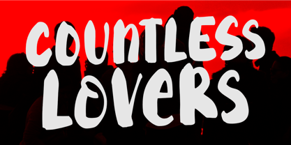 Countless Lovers is a display font that will help your headlines stand out. It's a modern, bold, eye-catching, and easy to read, making your message more impactful. So what’s included : Standard Latin Numbers, symbols, and punctuations Ligatures and Swashes Multilingual Support. Accented Characters : ÀÁÂÃÄÅÆÇÈÉÊËÌÍÎÏÑÒÓÔÕÖØŒŠÙÚÛÜŸÝŽàáâãäåæçèéêëìíîïñòóôõöøœšùúûüýÿžß PUA Encoded and fully accessible without additional design software Simple Installations Works on PC & Mac Thank You!
 - Havoc Rage by Tigade Std,
$40.00 Havoc Rage Font is a dynamic and expressive typeface that captures the raw energy of hand-brushed strokes. With its natural, organic flow, this font exudes a sense of controlled chaos, making it perfect for designs that demand a bold and impactful statement. The brush strokes create an authentic, handmade feel, adding a touch of unruly creativity to your projects.
 - Soylent Blu by Tail Spin Studio,
$20.00 Soylent Blu is an original wedge serif, single font designed by Steve Zafarana. Its high contrast character style and bouncy baseline create a visual impact that makes it a good candidate for Signs, headlines, logos and advertisements. The full lowercase set with balanced white space also functions quite well in text. Soylent Blu, with OpenType features, is clearly an attention-getter!
 - PAG Liberta by Prop-a-ganda,
$19.99Prop-a-ganda offers retro-flavored fonts inspired by lettering on retro propaganda posters, retro advertising posters, retro packages all the world over. This is perfect font for your retrospective project. Very bold stems. Pointed Apexes. Bars and some of the terminals which designed as a ball are very eye-catching. These features make a strong impact with nostalgic feel. - Nouvelle Vague by Anatoletype,
$22.00Nouvelle Vague is a display script typeface of a distinguished look defined by a steady rhythm, only broken by its offbeat, dynamic uppercase initials. It's directly inspired by french advertising scripts from the fifties, particularly by Roger Excoffon's Mistral. In order to accentuate this influences and to reproduce their graphic impact, simply structured connections between letters are preferred over OpenType fanciness. - Hagia Pro by Studio Fat Cat,
$9.00 Hagia Pro's unique sans serif font family is the perfect tool for creators to create impactful things with a different touch. Hagia Pro contains several weights to give the user an interesting experience when using it. This unique sans serif font family is very good for branding, logo projects, headings, advertising, packaging, web design, print goods and other creative projects.
 - Mauline by Yukita Creative,
$14.00 a modern, stylish serif font that offers excellent legibility for a variety of applications. This font is ideal for use in any kind of graphic design or advertising work, from logo designs to web design and print projects. Its easy-to-read character shapes, distinct letterforms, and beautiful typographic details make this typeface perfect for creating impactful and captivating visual designs.
 - Yesterday Night by Mans Greback,
$59.00 Yesterday Night is a lively handwriting font that captures the essence of an active and cute brush style. This handmade calligraphy font is perfect for fashion projects, adding a sense of energy and excitement to your designs. The font family's handbrushed appearance brings an authentic, personal touch to your creative work, making it feel warm and approachable. The Yesterday Night font family includes four engaging styles to suit various design needs: Regular: A balanced and energetic style for everyday use Regular Italic: Adds a playful touch and a sense of movement Bold: Offers a bolder, more assertive presence for impactful designs Bold Italic: Combines the strength of bold with the flair of italic Built with advanced OpenType functionality, Yesterday Night ensures top-notch quality and provides you with full control and customizability. It includes stylistic alternates, ligatures, and other features to make your designs truly unique. The font offers extensive lingual support, covering all Latin-based languages, from Northern Europe to South Africa, from America to South-East Asia. It contains all the characters and symbols you'll ever need, including all punctuation and numbers.
 - Caltic by Ingrimayne Type,
$12.95 Caltic-Holiday, Caltic-Festival, and Caltic-Straight are three eye-catching, very bold typefaces that are suitable for posters and signage. Caltic-Holiday and Caltic-Festival base letter shapes on trapezoids with curved sides but with curves that are reversed going from one to the other. Caltic-Straight has letters based on trapezoids with straight sides. None are suited for text and with their built-in spacing will not work as all upper-case or all lower-case. All three come in two widths, regular and wide, giving the Caltic family six members. Caltic has nothing to do with Celts. The Calt refers to the calt or contextual alternative OpenType feature that makes this typeface work. When the letters on the upper-case keys alternate with the letters on the lower-case keys, they fit snuggly together. As long as the user has a word processor that supports the contextual alternatives feature, there is no need for the user to alternate letters; the calt feature does it automatically. Although the fonts seem similar to hand-drawn lettering that was done on posters and signs during the hippie era of the 1960s and 1970s, I can find nothing quite like them. My inspiration for them is older, in a newspaper from 1932 that led to the typeface family PoultySign. Caltic (and Lentzers) are the result of seeing what else I could do with the inspiration that sprang from that 1932 newspaper.
 - Maribor by Dima Pole,
$30.00 Maribor is a slab serif font with nice shapes, they are both soft and angular. It is perceived calmly and with a twist. Maribor means "Mara`s pinery". The energy of the Universe, reflecting the modification, renewal and change for the better is called Mara; Ancient wise ancestors called it so. Today it is known as the goddess Mara in the Vedic worldview of the Slavic-Aryan peoples. Maribor is a multilingual font, it contains characters for 104 Latin languages and all Slavic, including all capitals for them. There are all major currency signs, including the ruble and the Euro. Many OpenType features allow you to make a variety of compositions; as well as to see the font from the new side thanks to the stylistic sets for the Slavic alphabets.
 - Owned by Typodermic,
$11.95 Owned is a stunning embodiment of the urban aesthetic, with its authentic marker graffiti look and feel. This typeface is a perfect fusion of style and substance, as it captures the essence of streetwise design. Its pragmatic ligatures are not only visually appealing, but also accentuate the natural irregularities of an urgent scrawl. The beauty of Owned lies in its diversity, as it brings together a wide range of stroke weights and angles to create a dynamic and powerful effect. The overall effect is one of urgency, as if the words were scribbled on a wall in a hurry. This typeface commands attention and grabs the viewer’s eye, making it a perfect choice for bold and impactful designs. Owned is an exceptional typeface that is sure to make a statement in any design project. Its unique features and smart design will add an edge and grit to any design, making it a must-have for designers who want to create a bold and unforgettable impact. Whether you’re designing a logo, poster, or website, Owned is the perfect graffiti typeface to add an urban flair to your project. Most Latin-based European writing systems are supported, including the following languages. Afaan Oromo, Afar, Afrikaans, Albanian, Alsatian, Aromanian, Aymara, Bashkir (Latin), Basque, Belarusian (Latin), Bemba, Bikol, Bosnian, Breton, Cape Verdean, Creole, Catalan, Cebuano, Chamorro, Chavacano, Chichewa, Crimean Tatar (Latin), Croatian, Czech, Danish, Dawan, Dholuo, Dutch, English, Estonian, Faroese, Fijian, Filipino, Finnish, French, Frisian, Friulian, Gagauz (Latin), Galician, Ganda, Genoese, German, Greenlandic, Guadeloupean Creole, Haitian Creole, Hawaiian, Hiligaynon, Hungarian, Icelandic, Ilocano, Indonesian, Irish, Italian, Jamaican, Kaqchikel, Karakalpak (Latin), Kashubian, Kikongo, Kinyarwanda, Kirundi, Kurdish (Latin), Latvian, Lithuanian, Lombard, Low Saxon, Luxembourgish, Maasai, Makhuwa, Malay, Maltese, Māori, Moldovan, Montenegrin, Ndebele, Neapolitan, Norwegian, Novial, Occitan, Ossetian (Latin), Papiamento, Piedmontese, Polish, Portuguese, Quechua, Rarotongan, Romanian, Romansh, Sami, Sango, Saramaccan, Sardinian, Scottish Gaelic, Serbian (Latin), Shona, Sicilian, Silesian, Slovak, Slovenian, Somali, Sorbian, Sotho, Spanish, Swahili, Swazi, Swedish, Tagalog, Tahitian, Tetum, Tongan, Tshiluba, Tsonga, Tswana, Tumbuka, Turkish, Turkmen (Latin), Tuvaluan, Uzbek (Latin), Venetian, Vepsian, Võro, Walloon, Waray-Waray, Wayuu, Welsh, Wolof, Xhosa, Yapese, Zapotec Zulu and Zuni.
 - Bandica by IbraCreative,
$17.00 Bandica – A Bold Sans-serif Display Font Bandica is a striking sans-serif display font that boldly commands attention with its modern and assertive aesthetic. Characterized by clean lines and a lack of serifs, this typeface exudes confidence and contemporary style. The bold weight of Bandica amplifies its impact, making it ideal for headlines, banners, and other prominent design elements. The letterforms are meticulously crafted, ensuring a balance between readability and visual flair. With its distinctive personality and strong presence, Bandica stands out as a versatile choice for graphic designers seeking a bold and impactful typographic solution. Bandica is perfect for branding projects, logo, wedding designs, social media posts, advertisements, product packaging, product designs, label, photography, watermark, invitation, stationery, game, fashion and any projects. Fonts include multilingual support for; Afrikaans, Albanian, Czech, Danish, Dutch, English, Estonian, Finnish, French, German, Hungarian, Italian, Latvian, Lithuanian, Norwegian, Polish, Portuguese, Slovak, Slovenian, Spanish, Swedish.
 - Bangkokean by Cadson Demak,
$29.00 This font was originally designed side by side with my first attempt at a semi serif typeface in 1997. The design made it through to full development only a couple years ago when our studio decided to complete the regular weight for a local project here in Bangkok. The face is a traditional serif with narrow stem (somewhat like sans serif) and industrial stroke. A good mix of Bangkok character where you can find Wat (old buddhist temple) next to futuristic high rise. This font was shown in Klingspor-Museum Offenbach, Germany, at a Typographic & Type Design exhibition Schrift in Form 3-26 September 2008.
 - Cooker Cake by Sabrcreative,
$25.00 Elevate your design projects with Cooker Cake, a vibrant and playful sans serif display font. With its charismatic style and versatile nature, this font adds a touch of excitement and creativity to any typography-based endeavor. Whether you're designing logos, posters, headers, or website elements, Cooker Cake will captivate your audience and make your text pop. Cooker Cake features all capital letters, giving your designs a bold and impactful appearance. The font also includes a wide range of numbers and punctuation, ensuring that your compositions are complete and functional. Its multilingual support allows you to incorporate various languages seamlessly, making it ideal for global projects. One of the standout features of Cooker Cake is its PUA (Private Use Area) encoding. This means that you have access to additional special characters, glyphs, and ligatures, expanding your creative possibilities and enabling you to add unique flourishes to your designs. Let your imagination run wild as you explore the various alternates and stylistic options available in this font. With its sans-serif style, Cooker Cake strikes the perfect balance between modern aesthetics and a playful vibe. It works harmoniously in both digital and print formats, making it suitable for a wide range of applications. From branding and packaging to social media graphics and advertising campaigns, this font will bring a sense of joy and energy to your projects. Experience the versatility and captivating charm of Cooker Cake Sans Serif Display Font. Let its playful and dynamic personality infuse your typography with excitement.
 - Mintely by Din Studio,
$29.00 Mintely is a sophisticated and versatile serif font family designed to elevate your typography to new heights of elegance and legibility. With its 6 style variations and 8 weight options, this font offers an extensive array of choices to suit a wide range of design projects. This family combines classic and modern elements, resulting in a timeless design that can adapt to various design contexts. The 6 style variations in this serif provide you with a variety of typographic options, allowing you to experiment with different looks and moods. Whether you need a sleek and minimalistic appearance or a more decorative and ornate style, Mintely has you covered. Additionally, the 8 weight options in Mintely offer a wide range of possibilities in terms of contrast and emphasis. From thin and elegant weights to bold and impactful variations, this font family ensures that you can effortlessly find the perfect weight for your specific design needs. Because of its legibility you can use this font in a variation of text sizes. Enjoy the available features here. Features: Multilingual Supports PUA Encoded Numerals and Punctuations Mintely fits in headlines, logos, posters, flyers, invitations, branding materials, print media, editorial layouts, headers, and any many more. Find out more ways to use this font by taking a look at the font preview. Thanks for purchasing our fonts. Hopefully, you have a great time using our font. Feel free to contact us anytime for further information or when you have trouble with the font. Thanks a lot and happy designing.
 - HU Discopangpang KR by Heummdesign,
$25.00 "Disco Pang Pang" is the Korean name for Tagada rides. It is a characteristic typeface that is good to use when you want to make use of a unique and bouncy feeling. Light and Extrabold are made with the thickness of normal typefaces, but Left and Right have strange shapes with stroke thicknesses that are biased to one side. Its unique shape can make a strong impression on people. This font contains Korean.
 - Square Cat by Lalelum,
$12.99 This is a blocky typeface with thick lines and no serifs. It's a modern design with a hint of vintage lettering with a thicker vertical line on one side of each letter. Most letters are square shaped. The two styles are regualar and hollow, with the hollow style having the thicker areas hollowed out.
 - Gearing by Heyfonts,
$15.00 Gearing is a typeface that is widely associated with the extreme music genre of death metal. It is characterized by its dark and aggressive appearance, evoking a sense of brutality and chaos. The font is typically designed with sharp edges, bold and angular letterforms, and intricate or distorted shapes. The death metal font typically features strong upper and lowercase letter variations, often with sharp, exaggerated serifs or thorn-like spikes. These embellishments contribute to its menacing and threatening aesthetic. The letters may also have broken or damaged elements, giving them a weathered or decayed look. Though death metal fonts come in various styles and variations, they often prioritize legibility and impact over ease of reading. This means that certain parts of the letters may be missing or disconnected, making them appear jagged or incomplete. Ligatures, which are unique letter combinations, are sometimes included in the font to add a sense of continuity or artwork to the overall design. In terms of color, death metal fonts are commonly depicted in monochromatic shades such as black, grey, or dark red to maintain their sinister appearance. The color contrast often enhances the sharpness and intensity of the font, making it more visually striking. Due to its association with the underground music scene, the death metal font has become an essential element in album covers, band logos, posters, and merchandise. It effectively conveys the aggressive and rebellious spirit of the genre, becoming instantly recognizable to fans and enthusiasts.
 - Quick Notation by Alphabet Zoo,
$12.00 Quick Notation is an informal handwriting style suitable for a wide variety of creative applications.
 - Alphon MF by Masterfont,
$59.00 This unique ultra wide font family has its outstanding forms to create a great title.
 - YES! - 100% free

- Soviet - Unknown license


