10,000 search results
(0.037 seconds)
- Vaporuz Strikes by Patria Ari,
$15.00 Vaporuz Strikes is more than just a typeface; it's a dynamic fusion of futuristic cyber technology and the bold, distinctive appeal of stencil design. This remarkable font is your key to crafting impactful headlines of all sizes, as well as making waves in editorial design, branding, packaging, logos, and more.
 - Amsterdam Kindom by Letterara,
$13.00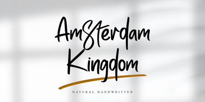 Amsterdam Kingdom is a beautiful original handwritten font with a unique feel and a stunning impact. It will add a unique spark to any design project that you wish to create! This font is PUA encoded which means you can access all of the amazing glyphs and ligatures with ease!
 - Compton by Greater Albion Typefounders,
$10.00 Compton is a clean modern slab serif face that emphasises simplicity of line and legibility. It's offered in three weights: regular, bold and light. Compton brings the spirit of the 60s and 70s to the present day. It is ideal for clear, simple graphic design that makes an immediate impact.
 - Salida by Matteson Typographics,
$19.99 Salida is a reimagining of William Page’s Series 504, a wood type created in 1887. Named for a town in Colorado on the Arkansas River, Salida is a strong and rustic display font reflecting the rugged landscape of the area. Salida is useful for impactful headlines, logos, packaging and signage.
 - Gravelia Helani by TM Type,
$12.00 Gravelia Helani is a beautiful and light handwritten font with a unique feel and a stunning impact. It will add a luxury spark to any design project that you wish to create! This font is PUA encoded which means you can access all of the amazing glyphs and ligatures with ease!
 - Bright Melody by Zeenesia Studio,
$17.00 Bulgaria Script is a beautiful and light handwritten font with a unique feel and a stunning impact. It will add a luxury spark to any design project that you wish to create! This font is PUA encoded which means you can access all of the amazing glyphs and ligatures with ease!
 - BOOM by Albatross,
$19.00 A premium hand-crafted wide display family.
 - Lota Grotesque by Los Andes,
$29.00 Lota Grotesque was designed by Daniel Hernández with the collaboration of Rodrigo Fuenzalida and Latinotype Team in digital editing. The family comes in 7 weights with matching italics and includes alternative versions that provide high versatility and functionality. The whole font family is composed of 4 subfamilies that share exactly the same number of characters and styles but with differences in programming and default characters. Lota Grotesque contains a 760-character set that supports 219 languages and includes alternative characters, discretionary ligatures, small caps, and a variety of figures and fractions—a wide range of typographic tools to meet different design needs.
 - Juno by W Type Foundry,
$20.00 JUNO is a soft & friendly script font for display use. Inspired by latin American vernacular signs, defined by the freshness of the freehand strokes, and mixed with the rigor of typography. Juno is well suited for packaging, headlines, advertising and any handmade feels graphic. Designed with a wide range of options, its variables move between tow poles; regular to black & condensed to expanded, plus true italics. This 40 font family sums up to 5 weight subfamilies: Regular, Semi Condensed, Condensed, Semi Expanded, Expanded. Designed with powerful opentype features, alternate characters and extended language support. We’re proud to introduce: Juno.
 - Mezzotint CF by Connary Fagen,
$25.00 Mezzotint CF is a daring and playful display typeface perfect for logotypes, posters, and editorial use. High-contrast strokes, flared serifs, aqueous connections, and inky terminals give Mezzotint CF its striking and rakish personality. Includes roman and italic sets across a single bold weight, with wide language support, optional ligatures, OpenType alternates, and more. Mezzotint CF pairs well with a contrasting, simple geometric sans-serif like Greycliff CF; for maximum effect, try a large difference in typeface size between the two. All typefaces from Connary Fagen include free updates, including new features, and free technical support.
 - Debira by Nasir Udin,
$25.00 Debira is a contemporary display wedge-serif typeface. Its sharp and longer serif makes Debira a versatile type family that can be used in many different themes of design projects, from classic style to modern. It comes in seven weights from thin to bold with matching italics. Its mixture of weights provide a wide range of styles that will help you find the best vibe for your projects, for headlines or a short paragraph. The set of special ligatures can be perfect mates for your brand. It is well suited for book covers, editorial, branding, advertising and more.
 - Vikive by Eurotypo,
$23.00 Vikive is a family of Sans Serif fonts, better known in its origins as "Gothic" in America or "Grotesque" in Europe. Some authors divide them into three categories: Grotesque, Geometric and Humanistic. Probably, it can be defined that Vikive has some characteristics of the first two: Grotesque and Geometric, high x-height, slight squareness of the curves, wide set, open tail, simple construction. The family concept provides several weights and widths for one face and its matching italics, therefore this family of types is more suitable for text settings, enriched with strong contrast fonts (condensed thin or expanded black) for headlines.
 - Altruiste by ParaType,
$30.00 Altruiste is a decorative slab serif typeface with distinctive sharp features. It was inspired by the idea of duplicating elements, conveying typeface a unique look. It is austere, sophisticated typography marked by light shapes, yet of a strong nature. Altruiste is the perfect choice for a wide range of tasks such as creating logos, signboards, posters, invitation cards and more. The typeface is available in 5 weights, from hairline to regular with italics. Each style contains 600 extended Latin and Cyrillic characters. Altruiste was designed by Alexey Chekulaev in 2021, based on the light styles of the Postulat typeface.
 - Mohr by Latinotype,
$29.00 Mohr is a neutral, versatile and contemporary font based on some characteristics found in geometric sans-serif typefaces. Mohr’s features, together with its design characteristics, make it suitable for a wide range of applications, from display use to small text. The Mohr family comes in three versions: normal, alt and italic, each with 9 font weights, from Thin to Heavy, resulting in a total of 27 fonts. Mohr also includes initial and terminal swashes in most of the uppercase and lowercase characters. This gives the font a unique personality and provides a greater range of uses such as branding and packaging.
 - Sole Serif by CAST,
$45.00 Sole Serif is a newspaper face with features relating to book typography. Inspiration from Francesco Griffo’s romans was adapted to resist the rough usage typical of newspaper printing without any loss of quality. Sole Serif is available in an extensive range of cuts including extra bold and ultra thin. With its big x-height, short ascenders and a roundish and wide italic for text and titles, it has all the attributes of a newspaper face. Nonetheless, details like the inclined axis, calligraphic terminations, Renaissance proportions and a refined but slightly mannered design, all evoke the book rather than the daily paper.
 - Spock by Los Andes,
$19.00 Spock has a neutral and clean structure but as we explore its OpenType features we will begin to discover a rich variety of alternates—even glyphs with pointed ears. All these combined elements provide a wide range of choices to meet different design needs. Each of the 4 sub-families consists of 6 weights and matching italics, making Spock a super family of 48 styles. The Pro family set contains 609 characters and it includes a generous number of alternates. The three other Essential sets are composed of alternative glyphs. Spock is specially suited for advertising as well as editorial and corporate design.
 - Linked Now by Jehoo Creative,
$16.00 Linked Now is so named because this Typeface has Multiple Discreationary Ligatures that unite two different letters to make a striking shape. Is a powerful grotesque typeface designed to be versatile in a wide range of contexts. Having more than 50 stylish Dsicreationary Ligatures on Uppercase letters and unique Alternate on certain letters makes it seem like they have various shapes, so they are great to use as display fonts. To complete it, Linked Now typeface is equipped with 8 weights from Extralight to black and each includes italic. More than 485 glyphs on each and support most European languages .
 - Opinion Pro by Mint Type,
$35.00 Opinion Pro is a geometric grotesque sans-serif typeface with extra-large x-height that comes in 64 styles. It is composed of 4 width variations, each in 8 weights with respective italics. Its rigid curves with pronounced vertical stems makes it useful as both display and paragraph typefaces. Also it works particularly well as a typeface for technical applications such as wayfinding or labeling of any kind. Opinion Pro features a wide range of supported languages, including all Latin-based European languages, main Cyrillic languages, plus Kazakh. The OpenType features include, among others, 4 sets of digits, small-caps, ordinals.
 - Deposit Pro by Mint Type,
$35.00 Deposit Pro is a wide slab-serif family with low x-height. In both headlines and paragraph text it creates a serious yet friendly texture between a typewriter and a contemporary slab-serif, making it particularly suitable for corporate communication design. Deposit Pro consists of 16 styles (8 weights and their corresponding italics) and features broad language support including all European Latin and Cyrillic languages. It also sports plenty of OpenType features including 6 sets of digits, fractions, small caps, ordinals, all-cap punctuation, and contextual forms for ‘f’, eliminating the need for too many ligatures.
 - Blom by The Northern Block,
$29.95 Blom is a humanist sans with subtle squarish character in reverse contrast. The combination of heavy horizontals and modern geometry give the typeface a unique visual aesthetic whilst making small text perfectly readable. Blom bucks the trend of conventional letterforms in favour of a versatile typeface with bags of originality, that is both inventive in style yet completely functional in a wide range of intended uses. Details include 463 characters, six weights with matching italics and five variations of numerals. Opentype features include inferiors, superiors, fractions, slashed zeros, case-sensitive forms, ligatures and language support covering Western, South and Central Europe.
 - Gardenia by W Type Foundry,
$25.00 Gardenia is a grotesk sans-serif. It comes in 9 weights with matching italics. It was designed by Salvador Rodríguez in 2015/2016. It is characterized by legibility in the medium sizes, black and thin weights are great performers in display sizes. Gardenia is well suited for longer texts and headlines. It’s perfect for graphic design, web, print, motion graphics, interaction design etc… Gardenia is equipped with a wide range of opentype features. Learn about upcoming releases, work in progress and get to know us better! On Instagram W Foundry On facebook W Foundry Check out our website!
 - Bionik by Fontador,
$24.99 Bionik is a squarish serif, especially designed for contemporary typography on print and screen. The super ellipse-based forms and high x-height allow large and open letterforms, perfectly adapted to the pixel grid on screen. With light rounded corners Bionik provides a soft and friendly atmosphere. The font contains 6 weights from ExtraLight to ExtraBold plus true italics. 944 glyphs include 218 ligatures, small caps, tabular, old style, fractions …, and a wide range of flexibility for latin language support for every typographical needs. Bionik is a contemporary serif typeface, special for logotypes, brands, magazines and editorial.
 - Librum by Hackberry Font Foundry,
$24.95 This is the serif text family for the book design group of font families which David designed in the process of writing "Practical Font Design With FontLab 5". The letterspacing is set wide for body copy use. The main purpose is readability and reading comfort. There are several whimsical graphics, plenty of OpenType features: oldstyle figures [tabular and not], small cap figures, lining figures [tabular and not], discretionary ligatures, small caps, and so on. The feature set is limited for the italic and bold versions. It produces an exceptional book. See Librum Book Design Group for a package containing all fifteen fonts,
 - Karsten by Nasir Udin,
$25.00 The first development of Karsten typeface was inspired by signs on some old Dutch-buildings in Java. Then in the making, it blends with modern style. It's a synthesis between two cultures, the East & the West. The typeface was named after the Dutch architect who gave major contributions to architecture and town planning in Indonesia, Herman Thomas Karsten. It comes in nine weights from thin to black with matching italics. Its mixture of weights provide a wide range of styles that will help you find the best vibe for your projects, for headlines or a short paragraph. See the full presentation on Behance
 - Krooner by Nois,
$24.00 Krooner is a serif display typeface that seeks sophistication through elegance. With a compressed style and wide circular figures, it stands out as a typeface for short titles, its italic version has a high level of readability for long texts without losing its style in small sizes. The characters are created with a great level of detail that can be appreciated in its greatest splendor in large sizes. It has more than 600 characters and ligatures that together with its rational, humanist and contemporary serif features make it very versatile for a large number of applications.
 - Normative Pro by Green Type,
$37.00 Normative Pro is a sans-serif font family that includes a 12 styles (6 weight and italics), supports Latin, Cyrillic, Greek, Eastern European, Baltic and Turkish scripts. The family uses a large number of useful Open Type features: small caps, contextual alternatives, stylistic alternates, fractions, proportional and tabular figures and more. Normative Pro is a font with a wide sphere of application, legible from very small sizes to very large ones. Can be used both in technical documentation, office work, business communication, as well as in advertising, visual communication, magazines and posters, in branding and packaging.
 - Meguro Sans by GT&CANARY,
$27.00 Meguro Sans has a modern-styled boxy shape that achieves clean, industrial yet friendly style lends itself well to brand building. Its mono-line oriented and very high X-height ensure that it is extremely legible and creates a strong impression. Meguro Sans is Sans serif version of Meguro Serif. The Meguro sans font family is comprised of 10 styles with 5 different weights from light to black, along with matching italics offering possibilities for use in web, print, package and sign design, all with the goal of building an established look for brands in wide range of industries.
 - Cerulea by Cerulean Stimuli,
$36.00 Cerulea is a unicase from the world of the sky. Drawing inspirations from Art Nouveau, Classical Roman, and Uncial styles, Cerulea's wide, spacious bowls, sharp points, and subtle wandering curves evoke airiness, flight, and fantasy. Seven weights, and true italics for each, range from zephyrous to thunderous. Vary the mood every time you choose between the serious capital form of a letter, the more fanciful lowercase form, or another variant in the stylistic sets. The more than 800 glyphs cover pan-European Latin, Greek, Cyrillic, fractions, circled numbers, planet and zodiac symbols, card suits, chess pieces, ornaments, and more.
 - Quador by Fontador,
$24.99 Quador is a squarish serif, especially designed for contemporary typography on print and screen. The superellipse-based forms and high x-height allow large and open letterforms, perfectly adapted to the pixel grid on screen. With rounded serifs Quador provides a soft and friendly atmosphere. The font contains 6 weights from light to ultrabold plus true italics. 1.115 glyphs include 187 ligatures, small caps, tabular, old style, fractions …, and a wide range of flexibility for latin language and cyrillic support for every typographical needs. Quador is a contemporary serif typeface, special for logotypes, brands, magazines and editorial.
 - Contane by Hoftype,
$49.00 Contane is a new font with a classical character. It is high-contrasted and nobel in appearance, but still objective and clean. It is predestined for headlines, editorials and small text applications. All Italic weights also contain Swash Capitals for especially fancy occasions. Contane supports up to 80 languages and it’s OpenType format allows a wide range of typographic applications. 20 styles offer fine graduation of the weights. All weights contain small caps, ligatures, superior characters, proportional lining figures, tabular lining figures, proportional old style figures, lining old style figures, matching currency symbols, fraction- and scientific numerals, matching arrows and alternate characters.
 - FP København Sans by Fontpartners,
$35.00 Copenhagen has been in need of a typeface that unites the city’s many visual expressions. The three designers Morten Rostgaard Olsen, Henrik Birkvig and Ole Søndergaard have designed and developed the typeface FP København. Now available from MyFonts in 44 styles: Serif & sans serif, uprights & italics, small caps, pictos-characters, stencils, sprayed style, OT-features, ligatures, contextual alternates etc. The shapes of the letters are inspired by the city’s culture and the visual environment and design in Denmark in the 20th century. It is relatively low and wide as the city itself and with rounded corners that give it a warm visual mood.
 - Humber by Fettle Foundry,
$10.00 Humber is a rational sans serif typeface designed with a large X-height to provide clarity at both text and display sizes – with subtle features that really shine at larger sizes. Inspired by 20th century typefaces and modern European designs, Humber is suitable for a wide range of projects and audiences looking for a typeface that feels professional – without being overly familiar. Featuring seven weights and matching italics, discretionary ligatures, lining, old-style, and tabular figures, and conditional kerning for accented characters, Humber is truly versatile. With over 738 glyphs, Humber supports over 339 latin-based languages.
 - 28 Days Later - Unknown license

- Etienne by ParaType,
$30.00 Designed for ParaType in 2002 by Tagir Safayev. Inspired by the letterforms of Antique No. 8 typeface and other similar fonts of the 19th century (Latin Antique, Wide Latin, Etienne Condensed, Wide Renaissance). A face of so-called Latin type has stout triangular serifs and rather unusual curls on several letters in the lower case. Nevertheless it is eminently suitable for a wide variety of settings in advertising and display typography.
 - Maiden Orange Pro by Stiggy & Sands,
$29.00 Our Maiden Orange Pro is a light and festive slab serif font inspired by custom hand lettered 1950's advertisements. Clean and legible, while also being offbeat and friendly, this font lends itself to a wide variety of uses. The SmallCaps and extensive figure sets offer a slightly more serious tone as well as a wider range of design use. Opentype features include: - SmallCaps. - Full set of Inferiors and Superiors for limitless fractions. - Tabular, Proportional, and Oldstyle figure sets (along with SmallCaps versions of the figures). - Stylistic Alternates for Caps to SmallCaps conversion.
 - Maiden Orange Inline Pro by Stiggy & Sands,
$29.00 A festive spin off our Maiden Orange Pro typeface, Maiden Orange Inline Pro comes packed with all of the features of the original Maiden Orange Pro typeface, but adds a little more visual flavor with hand drawn inline cuts, leaning even more towards the custom hand lettered 1950’s advertisements that inspired the original. Clean and legible, while also being offbeat and friendly, this font lends itself to a wide variety of uses. The SmallCaps and extensive figure sets offer a slightly more serious tone as well as a wider range of design use.
 - Smoothing by Hanzel Space,
$25.00 Smoothing is a stylish modern calligraphic font in an original handwriting style. It's perfect for branding, wedding invitations and cards, and maybe for red wine labels. Smoothing includes a full set of beautiful upper and lower case letters, numbers, a wide variety of punctuation marks and 46 ligatures. All lowercase letters include initial and final strokes, giving a realistic handwritten style. What did you get, honey? Full Set of standard alphabet and punctuation Extra set of ending swashed lowercase Handwritten ligatures Thanks so much for checking out my shop! Happy creating! Cheers! Hanief - Hanzel Space
 - Briller by Kostic,
$40.00 Briller is a super-wide display sans that covers 6 weights, from delicate Thin on one side to chunky Ultra on the other end. Briller tabular figures (via the OT feature) and most of figure related glyphs (such as monetary symbols) are the same width throughout the weights, leaving fun possibilities in pairing them up in contrast while retaining that sense of tabular order. Briller has a character set to support Western and Central European languages. Each weight includes ligatures, proportional lining and tabular figures, fractions and scientific superior/inferior figures.
 - ITC Founder's Caslon by ITC,
$40.99The Englishman William Caslon punchcut many roman, italic, and non-Latin typefaces from 1720 until his death in 1766. At that time most types were being imported to England from Dutch sources, so Caslon was influenced by the characteristics of Dutch types. He did, however, achieve a level of craft that enabled his recognition as the first great English punchcutter. Caslon's roman became so popular that it was known as the script of kings, although on the other side of the political spectrum (and the ocean), the Americans used it for their Declaration of Independence in 1776. The original Caslon specimen sheets and punches have long provided a fertile source for the range of types bearing his name. Identifying characteristics of most Caslons include a cap A with a scooped-out apex; a cap C with two full serifs; and in the italic, a swashed lowercase v and w. Caslon's types have achieved legendary status among printers and typographers, and are considered safe, solid, and dependable. ITC Founder's Caslon® was created in 1998 by Justin Howes, an English designer who used the resources of the St. Bride Printing Library in London to thoroughly research William Caslon and his types. As was common in the eighteenth century, Caslon had punchcut several different sizes of his types, and each size had a slightly different design. Howes digitized every size of type that Caslon cast, keeping their peculiarities and irregularities and reproducing them as they appeared on the printed page. This family has the 12 point, 30 point, 42 point, and Poster styles, as well as a full set of bona fide ornaments. In keeping with the original Caslon types, none of the sizes have bold weights, the numerals are all old style figures, and a full set of ligatures (some with quaint forms) are included. ITC Founder's Caslon® is a remarkable revival in the true sense of the word, and works beautifully in graphic designs or texts that require an authentic English or historical flavor. - Andes Neue by Latinotype,
$29.00 Unlike its predecessor, Andes Neue contains a larger character set of 759 glyphs which support 219 Latin-based languages from 212 countries. The font comes in 4 variants that provide a wide stylistic range. Andes Neue is the most similar to the original Andes design. The Alt1 character set bears some similarity to the old Andes's (yet cleaner); Alt2 uses the alternates in the font as default glyphs; and Alt3 is a mixture of the other three variants that offers a balanced set of characters. Andes Neue also includes new accents and glyphs for a wider language support, and a set of small caps (in each variant). All of these features give the font a strong personality that helps make text look more appealing. Andes Neue varied weights work well with both short and mid-length text sections, providing a wide range of choices for any design project.
