6,865 search results
(0.364 seconds)
- Space Quest by Lone Army,
$10.00 This font is inspired by aerospace. I use the negative spaces of each font to form planets or rockets. every glyph has its power. can be used as initials or as a word nicely. and also supports multilingual. the space design side is also found in punctuation to! thanks and enjoy the design! cherrs
 - Talesian by Viaction Type.Co,
$15.00 Talesian is in an original handwriting style, and looks very natural and beautiful. It is suitable for boutique brand, photography, magazine, quote, business card, logo, poster and many more. There are two weights: regular and bold, script is equipped with OpenType features such as ligatures and multilingual support. I hope you enjoy and thank you.
 - Brandon Grotesque Office by HVD Fonts,
$40.00 This special Office version of Brandon Grotesque is especially for all Microsoft Office applications (Word, Excel, Powerpoint …). It contains just the 4 basic styles which are stlye-linked and can be easily accessed by the "I" or "B" button in Office. The fonts are manually hinted so their appearance is also optimized for these applications.
 - Radar.one by Srdjan Kuzmanovic,
$50.00I started creating this font at my university while studying graphic design. It's constructed using nails in different sizes and various parts of floppy-disks. It's a highly decorative font and the best way of using it is for posters, flyers and ads. It can also be used for your own website; see example below. - Yogeo by Rochart,
$14.00 Give your designs a classy feel. "Yogeo" is perfectly suited to stationery, logo, typography quotes, magazine or book cover, website header, clothing, branding, packaging design and more. A minimalist serif font containing uppercase and lowercase characters, numerals, a large range of punctuation, international language and ligatures. I hope you make something cool with it!
 - Party Trick by PizzaDude.dk,
$15.00 Party Trick is loosely based on the capital letters of a classic typewriter, but I have added a bit sugar and spice to the letters - making them more funky and loose. Another great thing is the contextual alternates, which gives you 6 different versions of each letter - and they automatically changes as you type!
 - Smooth Fantasy by Din Studio,
$29.00 Smooth Fantasy is designed with a chic and natural handwritten style, and makes for a beautiful typefaces. Smooth Fantasy is best used for logotype, branding, quotes, and more. Features: - Ligatures - PUA Encoded - Multilingual Support - Numerals and Punctuation I hope your project design would be more beautiful with this Smooth Fantasy. Happy Design :) Thank You!
 - Garamono by Khaito Gengo,
$25.00 I have been eager to create a pattern font, and Garamono is a set of patterns which you can simply create by typing an alphabet on keyboard. Garamono consists of 26 unique and original patterns, and 26 elements from traditional to modern. This pattern font is good for using as background, wallpaper, clothing, etc.
 - Better Summer by Din Studio,
$29.00 "Summer is Never Ending :D" Introducing a Better Summer Script. Made from a chic brush, it will make your design more beautiful. Includes: Better Summer (OTF) Features: Character Set A-z Numerals and Punctuation (OpenType Standard) Accents (Multilingual characters) PUA Encoded Beautiful ligatures I hope you can enjoy the font as you enjoy the summer :)
 - Unytour by NicolassFonts,
$25.00 Unytour is a modern sans serif font family of 54 fonts. It includes nine weights with italics from Extra Light to Heavy. Each weight includes alternatives (A,G,I,R,a,l) and OpenType features. Unytour is easy to read and perfect for logotypes, advertising, packaging, book covers and magazines, headings, corporate identities, and more.
 - Nefertiti by JAB,
$12.00As you can see, Nefertiti is a font based on ancient Egyptian hieroglyphs and could be classified as a fun-font. I've always been really interested in Egyptology and a couple of years ago I thought it would be great to be able to write in hieroglyphs. I started to study them but soon realized it would take me a long time to be able to do this. Still, I was determined to find a way around this problem. At some point I came up with the idea of rearranging and reforming the hieroglyphs so as to resemble the English alphabet. During this process I tried as much as possible to preserve their ethos and appearance. However, since they are designed to write in English with, it's obvious that they are not always going to look like the real thing. Despite this, I'm really happy with the final result and I think many Pharaohphiles who just want to have some fun will be also. The only difference in this font between lower and upper case characters, is that the latter are set between two parallel, horizontal lines. These are for use with brackets (motif ends) to form cartouches - elongated ovals for names and/or titles. Try typing the following using the upper case in the sample text box. e.g. (JOHN} The zigzagged vertical lines at each end, separate the motifs from the hieroglyphs. Note the three types of ends/brackets. These lines are also used to separated words from one another and to give a more authentic appearance. So pressing the space bar gives a zigzagged line - not a space. They can also be used at any point within a cartouche to separate first and last names or titles. e.g. ; (JOHN;BROWN} walked straight home after work. Notice the eye glyph (period/full stop) at the end of the sentence. This is the only punctuation mark which can be used within a cartouche, e.g. after Mr. or to add a more Egyptian appearance to a name or title. e.g. (MR>;JOHN;BROWN} Parallel lines dividing hieroglyphical inscriptions and writing into rows or columns are very common. To incorporate these in a body of text, simple use the underline U. e.g. (OSIRUS) and {ISIS} were important gods of the ancient Egyptians. (HORUS) {HATHOR} and [RA],the sun god, were also highly revered deities. The punctuation marks available are shown below. . , " " ' ! ? "where is the king?" The font also includes the numbers 0-9, the following mathematical symbols and the hash sign(Scarab beetle). Once again, I've tried to make them look as Egyptian as possible; whether I've succeeded or not is open to debate. e.g. + - x / = # This font is named after Akhenaten's beautiful wife, Nefertiti, who's image can be seen in the graphic on this page. - Ah, the Amsterdam Graffiti font! Picture this: you're wandering the vibrant streets of Amsterdam, where the scent of fresh stroopwafels fills the air and bicycles whiz past at every turn. Suddenly, y...
- Rabigail by Sensatype Studio,
$15.00 Rabigail is an unique and very elegant font for brand and logo design. Based on our experience as a graphic designer who works for a lot of companies, we often are requested to design a logo in a unique style but with an elegant shape. So, we try to brainstorming and create this font to make the idea is going out. This is perfect for BRANDING and LOGO DESIGN. You will get classy, elegant, and certainly unique logos with this font. To make it look more unique, here we prepared some ligatures: ab ah am an ar ak ap at oo cb ch ck cm cn cr ct eb eh ek em en ep er ub uh uk um un up ur st tb th tk tm tn tp tr tu ty fl fi ff ft oo cra ee ga gi it UPDATE v2 - New Additional Ligatures: ob oh om on op or Wish You enjoy it. :) Rabigail is also included full set of: uppercase and lowercase letters multilingual symbols numerals punctuation Wish you enjoy our font and if you have a question, don't hesitate to drop message & I'm happy to help :)
 - Pantera by Lián Types,
$39.00 ROARRR! THE STYLES -Pantera Pro is the most complete style, and although its default look is mono-rhythmic it gets really playful and crazy like the examples of the posters by just activating the Decorative Ligatures button in the Open-type Panel of Adobe Illustrator. However, I recommend using also the Glyphs Panel because there you'll find much more variants per letter. Pantera Pro is in fact, coded in a way the combination of thicknesses will always look fantastic. -Pantera Black Left, and Pantera Black Right are actually “lite” versions of Pantera Pro: They have very little Open-Type code, so what you see here is what you get. Pantera Black Left has its left strokes thick, while Pantera Black Right has its right strokes thick. -Pantera White is a lovely member in this family that looks lighter and airy, hence its name. With the feature Standard Ligatures activated (liga) the font gets very playful. -Pantera Caps is based on sign painters lettering and since it follows the same pointed brush rules as the other styles, it matches perfectly. -Pantera Claws like its name suggests, is a set of icons that were done by our dear panther. THE STORY It is said that typography can never be as expressive as calligraphy, but sometimes it can get close enough. I tend to think that calligraphic trials, in order to work well as potential fonts, need first to go through very strict filters before going digital: While calligraphy is synonym of freedom (once its rules are mastered), type-design, in the other hand, has its battlefield a little tighter and tougher. When I practice pointed brush lettering, there are so many things happening on the paper. And most of them are delicious. The ones who know my work may see that although many of my fonts are very expressive, my handmade brush trials are much more lively than them. With that in mind, this time I tried to go further and rescue more of those things that are lost in the process of thinking type when first sketches are calligraphic. I wondered if I could create something wild, hence its name Panther, by understanding the randomness that sometimes calligraphy conveys and turning it to something systemic: With Pantera, I created an ordered disorder. Like it happens a lot in many kinds of lettering styles, in order to enrich the written word the scribe mixes the thickness of the strokes and the width of the letters. Like one of my favorite mentors say (1), they make thoughtful gestures Some lively strokes go down with a thick, while some do that with a thin. Some letters are very narrow, meaning some of them will need to be very wide to compensate. Why not?. The calligrapher is always thinking on the following letters, and he/she designs in his head the combination of thicks and thins before he/she executes them. He/she knows the playful rhythm the words will have before writing them. It takes time and skill to master this and achieve graceful results. Going back to the font, in Pantera, this combination of varying thicknesses and widths of letters were Open-Type coded so the user will see satisfactory results by just enabling or disabling some buttons on the glyphs panel. I'm very pleased with the result since it’s not very easy to find fonts which play with the words' rhythm like Pantera does, following of course, a strong calligraphic base. I believe that if you were on the prowl for innovative fonts, this is your chance to go wild and get Pantera! NOTES (1) Phrase by Yves Leterme. In fact, it’s the title of a book by him. EPILOGUE Esta fuente está dedicada a mi panterita
 - Florentine Script II by Monotype,
$29.99Based on script handwriting and engraving used in formal announcements and invitations, the Florentine Script font lends itself to typesetting in which an elegant mood is desired. Florentine Script, Citadel, Flemish Script, and Old Fashion Script have similar lowercase letters but unique flourished capitals. - Sqair by Superfried,
$- Sqair is an experimental display typeface designed by Superfried. It is available in two formats, stencil and solid. The inspiration for this font originates from fond memories of the classic Sinclair Spectrum logo. Consequently Sqair lends itself to any project with a technology related theme.
 - Sandcastle JNL by Jeff Levine,
$29.00 Based on a popular design of the 50s-60s, Sandcastle JNL has the retro-casual charm of many prints ads of that era. It lends itself well to headlines, price tags, announcements, name plates and just about anything that recreates the mid-century panache.
 - Mono Spec by Halbfett,
$30.00 Mono-Spec is a monospaced family of sans-serif type. At least in default settings, all characters across the typeface share a common width. That fixed setting is condensed, and the aesthetic style of Mono-Spec’s letterforms is very industrial. A sister family, called Mono-Spec Stencil, is also available. Its design strays away from the mechanical nature of Mono-Spec, and it channels the spirit of resistance and street culture. Mono-Spec ships in two different formats. Depending on your preference, you can install the typeface as a single Variable Font or use the family’s five static OpenType font files instead. Those weights run from Light through Bold. While the static-format fonts offer a good intermediary-step selection, users who install the Variable Font have vastly greater control over their text’s stroke width. The Mono-Spec Variable Font’s weight axis allows users to differentiate between almost 1,000 possible font weights. That enables you to fine-tune your text’s exact appearance on-screen or in print. Whatever format you choose, the Mono-Spec fonts are equipped with several OpenType features. The most striking of these can be activated via a Stylistic Set. That will replace several letters – like “B”, “E”, “F”, “H”, and “I” with double-width alternates. Those alternates take up as much space as two characters placed next to each other otherwise word. The effect of Mono-Spec’s double-width alternates is striking, and their use strikes a strong chord in any display typography applying them.
 - Grafical by Halbfett,
$30.00 Grafical is a contemporary take on 19th-century sans serifs. In this family, the amount of geometry inherent within the letterforms has been amped up. Many shapes have received further streamlining, too. All the geometric forms you see have been optically corrected, ensuring their delivery of better legibility. Grafical ships in two different formats: depending on your preference, you can install the typeface as two Variable Fonts or use the family’s 16 static OpenType font files instead. The static fonts offer eight weights, running from Extralight through Black. Each weight has an upright and an italic font available. While the static-format fonts offer a good intermediary-step selection, users who install the Variable Fonts have vastly greater control over their text’s stroke width. The Grafical Variable and Grafical Variable Italic font’s weight axes allow users to differentiate between almost 1,000 possible font weights. That enables you to fine-tune your text’s exact appearance on-screen or in print. Grafical is the perfect tool for a range of design uses, including text on the web, text in print, and text in motion graphics. Its fonts are typographic workhorses – not just from their legibility perspective but also because of the amount of OpenType features they include. There are ligatures, for instance, as well as proportional and tabular lining and oldstyle figures, fractions, numbers placed inside circles, and even Roman numerals. Users can also substitute alternate versions of the “a”, “g”, “i”, “j”, “y”, “G”, and “Q” into their work.
 - Kontext H by Elster Fonts,
$20.00 Imagine a font that is easier to read the smaller it is – or the further away the text is. There are already many line screen fonts, I wanted to take it to the extreme and use as few lines as possible, while keeping the grid of the fonts metrics. The result is a typeface that lives up to its name. Each individual line makes no sense on its own; individual letters are only recognisable in the context of all associated lines, individual letters are most likely to be recognised in the context of whole words. Attached to a building wall, text would be readable from a great distance and become increasingly difficult to decipher the closer you get to the building. Placed on the ground or on a large flat roof, text would only be readable from an aeroplane or - depending on the size - in Google Earth. Kontext has old style figures, superscript numerals, case-sensitive questiondown and exclamdown and an alternative ampersand, 390 glyphs at all. Use the same value for font size and line spacing to keep the lines in the grid, or change the line spacing in 10% steps. Change the spacing in 100-unit or 25-percent increments increments to keep the grid. The »H« in the font name stands for horizontal (lines). The numbers in the font name refer to the brightness of the background and letters themselves, with the first number describing the background and the second the letters. Starting with »00« (white) to »200« (dark) See also my Family Kontext Dot
 - Kontext V by Elster Fonts,
$20.00 Imagine a font that is easier to read the smaller it is – or the further away the text is. There are already many line screen fonts, I wanted to take it to the extreme and use as few lines as possible, while keeping the grid of the fonts metrics. The result is a typeface that lives up to its name. Each individual line makes no sense on its own; individual letters are only recognisable in the context of all associated lines, individual letters are most likely to be recognised in the context of whole words. Attached to a building wall, text would be readable from a great distance and become increasingly difficult to decipher the closer you get to the building. Placed on the ground or on a large flat roof, text would only be readable from an aeroplane or - depending on the size - in Google Earth. Kontext has old style figures, superscript numerals, case-sensitive questiondown and exclamdown and an alternative ampersand, 390 glyphs at all. Use the same value for font size and line spacing to keep the lines in the grid, or change the line spacing in 10% steps. Change the spacing in 50-unit or 25-percent increments to keep the grid. The »V« in the font name stands for vertical (lines). The numbers in the font name refer to the brightness of the background and letters themselves, with the first number describing the background and the second the letters. Starting with »00« (white) to »200« (dark) See also my family Kontext Dot
 - Stahlbetontrger - Personal use only

- Dearest Outline - Unknown license

- Dearest Open - Unknown license

- Kelphyn by Creative17studio,
$11.00 Hello, now I tell you. its time for "Kelphyn". Yes you heard right. Kelphyn is a serif font family that allows you to try out new, innovative designs that suit your taste. Created to support all forms of design, art and ideas. especially for modern magazine designs, website layouts and supporting branding layouts. Grab it fast here Free updates
 - Formosa by Hanoded,
$15.00 Formosa is the old, colonial name for Taiwan. Formosa means beautiful in Portuguese and I think this handwritten typeface has a certain beauty itself. It comes in three styles, all of which make extensive use of ligatures, to give the font an authentic, handwritten feel. Like most of my fonts, Formosa comes with Babylonian language support.
 - Davina by Nirmalagraphics,
$14.00 I made Davina for display purposes and it can be used for logos with a vintage style, for flyers, brochures, leaflets and more. If you like a logo with a semi-vintage style, thick, unique and clean, it means you have to buy and use Davina! This font also has Multi-Lingual support and more than 15 Ligatures.
 - La Arista by Kaer,
$19.00 ‘La Arista Del Sol’ it's the mountains climbing route. I've created this font family to transfer adventure and romantic mood. I believe La Arista is very useful in printing and for web. * Regular, italic and pattern styles * Uppercase and lowercase * Numbers * Ligatures * Punctuation * Multilingual support Please feel free to request to add characters you need: kaer.pro@gmail.com
 - Jasson Gillen by Din Studio,
$29.00 Introducing Jasson Gillen Font. Made with naturally handwritten, it will make your design project more beautiful. This font is suitable for any design like branding, quotes, t-shirt printing and etc. Features: Accents (Multilingual characters) Beautiful ligatures Stylistics set PUA encoded Numerals and Punctuations Customer support I hope you enjoy it !!Thanks for visiting and purchasing my font.
 - Schoolyard Blues JNL by Jeff Levine,
$29.00 Schoolyard Blues JNL is based on the hand lettered title found on the sheet music for the 1938 song "I Was Late for School". A condensed sans serif with chamfered corners, it reflects the Art Deco influences of the day in some of the letter forms. This type design is available in both regular and oblique versions.
 - Rozza by Serebryakov,
$49.00 Rozza is a single weight stencil cursive fat face font for extremal display use. Looking at this font the story of beauty and the beast comes to mind. That is how I would describe it. On the one hand prickly and dangerous, and on the other - pulsating beauty and passion. Try to combine Rozza together with Displace — great pair!
 - Taurus Sense by Hatftype,
$17.00 Is a blackletter typeface font that is inspired by gothic and horror style because it's shape is very unique and is perfect for any project that you will use with this theme. Features : Symbol Number Multilingual support Uppercase & Lowercase Support in Mac and Windows OS Support in design application (photoshop, illustrator, and more) I really hope you enjoy it.
 - Fleurons Initials by Wiescher Design,
$39.50Fleurons Initials is a set of elegantly decorated blocked initials, reminiscent of old Jazz and Circus Posters. I have added one set of flat underlays and one of blocked underlays, so you can easily add a little colorful touch here and there. Easy because those underlays have the the same spacing! Have fun. Your elegant designer, Gert Wiescher - Swordtail by Type Innovations,
$39.00 A friend bought me a Chinese calligraphic brush set in a beautifully decorated box. I started to letter the alphabet on parchment, in my own hand, using quick strokes and found the resulting script had an interesting energy to it. After further refinement in my font application software 'Swordtail' was born. A great free-hand script.
 - Eyeballs by Bitstream,
$29.99Eyeballs was designed at Bitstream by designer David Robbins. Its beginnings can be found in Bitstream’s Old Dreadful No. 7, where Mr. Robbins first conceived the capital I. He was later asked by Bitstream to develop the entire character set. The result is a humorous meld of cartoon and typography. A word of caution: Watch how you use it! - Notelia by Gatype,
$14.00 Notelia The elegant font I work with is creative in mood and perfect in shape, inspired by today's beautiful serif look. bold, balanced and varied, born for luxury and beauty. includes uppercase letters, numbers, and a wide variety of punctuation marks. Serif font with a modern style. Made for posters, web design, branding, illustrations, badges and many other works.
 - Tudeprins by Bogstav,
$17.00 Tudeprins is not a really positive word - the font probably did deserve another name, but I was inspired after reading a children's novel, starring a "Tudeprins" The font is dedicated to children's books, adventures, comics or something related to that - but feel free to use "Tudeprins" for anything you like! Comes with multilingual support as well as contextual alternates!
 - Masko by Areatype,
$23.00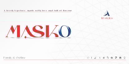 Masko is a very versatile font.perfect for magazine images, to wedding invitations, to branding, poster design, and more. Files included: Masko Family Masko Outline Numerals & Punctuation Stylistic Alternates & Ligatures PUA Encoded Characters Thanks so much for looking, I really hope you enjoy it and please don't hesitate to drop me a message if you have any issues or queries :)
 - Lisa Bella by Wiescher Design,
$39.50 Lisa is an elegant script family in the tradition of early Italian type designers like Bodoni. I added counter strokes and floral embellishments to the font. Lisa comes in three variations: the beautiful Lisa Bella, the flowery Lisa Fiore and the extra swinging Lisa Piu (which means more in Italian). Enjoy! Your elegant script designer Gert Wiescher
 - The City Burn by Alien,
$40.00 The City Burn, formerly called "The city burn night after night and we spray-paint the walls", was especially designed for Mad Skills Mag issue#3 Urban Flavour. It needed to be street, and urban, so I made a stencil font. It’s used by Fox5 tv for the rant TV show, the website infected.com, Fried chillies TV, and others!


