10,000 search results
(0.014 seconds)
- Helena Luis by Romie Creative,
$13.00 Helena Luis is a modern and elegant calligraphic script font that comes with beautiful character changes, a kind of classic decorative copper script with a modern touch, designed with high detail to bring stylish elegance. Helena Luis is smooth, clean, feminine, sensual, glamorous, simple and very easy to read, because there are many fancy and simple letter connections. I also offer several alternative styles suitable for many letters. This font style is perfect for various designs of your work, such as invitations, labels, restaurant menus, logos, fashion, makeup, stationery, novels, magazines, books, greeting / wedding cards, packaging, labels and others. Helena Luis contains 385 characters and alternatives, including various language options. With OpenType features with alternative styles and elegant ties. The OpenType feature does not use manuals, but you can access it manually and for the best results needed for your creativity in this variation of glyphs. The Open Type feature can be accessed using Open Type savvy programs such as Adobe Illustrator, Adobe In Design, Adobe Photoshop Version of Corel Draw X, and Microsoft Word. And this font has provided unicode PUA (special code font). All alternative characters can be easily accessed by craftsmen or designers.
 - Luis Serra by Homelessfonts,
$49.00 Homelessfonts is an initiative by the Arrels foundation to support, raise awareness and bring some dignity to the life of homeless people in Barcelona Spain. Each of the fonts was carefully digitized from the handwriting of different homeless people who agreed to participate in this initiative. Please Note: these fonts include only the latin alphabet; no accented characters, no numbers or punctuation. MyFonts is pleased to donate all revenue from the sales of Homelessfonts to the Arrels foundation in support of their mission to provide the homeless people in Barcelona with a path to independence with accommodations, food, social and health care. Luis Serra was born in Alicante. There he grew up and even started a family His life was there. But at the age of 35 he split up with his wife and decided to go to Barcelona in search of a new life. And it wasn’t easy for him. He had to turn his hand to all kinds of jobs and didn’t manage to find the stability he needed. Luis is a shy, retiring person who takes great pleasure in the little things in life such as walking in the mountains or celebrating the victories of his football team, Barça. After four years living in Barcelona, Luis found himself in a position he’d never imagined. “The street’s much worse now, there’s more trouble, there’s more tension,” says Luís. In the street he had to learn, as he always had, to move fast, to find a place to sleep and something to eat. Luís is one of those people who don’t let circumstances mould him, but adapts to them and always tries to do his best.
 - 1638 Civilite Manual by GLC,
$42.00 This font was inspired by a French solicitor's document dated 1638, written in the special style so named "Civilité". We have worked to transform the almost illegible original form into a contemporary usable typeface, but keeping the time appearance. It contains Western (including Celtic) and Northern European, Icelandic, Baltic, Eastern, Central European and Turkish diacritics. The numerous alternates and ligatures made the font looking like a real various hand.
 - Kuenstler 165 BT by Bitstream,
$29.99 - 1634 René Descartes by GLC,
$38.00 This font was inspired by the well-known philosopher René Descartes' hand writing. In 1634, from Amsterdam, he wrote a famous letter to his friend Mersenne, a great scientist monk, in which he spoke about Gallileus works. The greatest part of our glyphs is based on this document. We have added some letters Descartes himself didn't use, like modern s and j (he used exclusively s long and i instead of j). A lot of ligatures and alternates are enriching the font, giving a better appearance of real handwriting.
 - David Lozano Lucas - 100% free

- Happy-Go-Lucky by Jelloween,
$-The purpose of Happy-Go-Lucky is to bring joy to the world. These cheerful little dingbats will brighten your day right up! - Donna Lucia Cyrillic by Ira Dvilyuk,
$17.00 Charming young Italian lady named Donna Lucia that is my handwritten script font. Donna Lucia is feminine and graceful calligraphic handwritten script font as plus a Symbols font with 52 lovely hand-drawn swashes and illustrations. Donna Lucia script is perfect for branding, logos, wedding stationery, social media, packaging, and other projects that require an elegant touch. Donna Lucia feminine font includes also Cyrillic glyphs. Uppercase lowercase and lowercase with flourishes. Donna Lucia script contains a full set of uppercase letters and 3 full sets of lowercase letters, (standard, alternative, and initial form) and 27 ligatures - which can be used to create a handwritten calligraphy look. Donna Lucia Symbols is a font with over 52 hand-drawn elements, illustrations, and swashes and can help to make your design more original. Combine and merge swashes and illustrations to create your own designs and make borders, frames, dividers, logos, and more (just use A-Z or a-z and 0-9 keys in the included Donna Lucia Symbols font). A different symbol is assigned to each uppercase or lowercase standard character, so you do not need graphics software, just type the letter you need. Multilingual Support for 31 languages: Latin glyphs for Afrikaans, Albanian, Basque, Bosnian, Catalan, Danish, Dutch, English, Estonian, Faroese, Filipino, Finnish, French, Galician, Indonesian, Irish, Italian, Malay, Norwegian Bokmål, Portuguese, Slovenian, Spanish, Swahili, Swedish, Turkish, Welsh, Zulu. And Cyrillic glyphs support for Russian, Belorussian, Bulgarian and Ukrainian languages.
 - The Lucky Hamster by Awan Senja,
$14.00 Introducing our newest funny typeface with cool stylistic alternate , The Lucky Hamster, a funny typeface font. This font perfectly made to be in poster funny, and the other various formal forms such as invitations, labels, logos, magazines, books, packaging, fashion, make up, stationery, novels, labels or any type of advertising purpose.
 - Third Time Lucky by Hanoded,
$15.00 We’re in the process of buying a house. Our first bid was rejected, our second bid as well. Our third (and final) bid was accepted (yay!), so, for us, the old ‘third time lucky’ quote rings true! Third Time Lucky is a set of three distinct handmade fonts, each with its own italic. Use this wonderful set for your books, your packaging or even your ‘house for sale’ signs.
 - FS Lucas Paneureopean by Fontsmith,
$90.00Pure and not-so-simple Maybe it’s the air of purity, openness and transparency that they transmit, but geometric typefaces are more popular than ever among leading brands. Based on near-perfect circles, triangles and squares, geometric letterforms look uncomplicated, even though making them readable is anything but – something the designers of the first wave of geometric fonts discovered nearly a century ago. Many of the world’s most recognisable brands in technology, retail, travel, food, manufacturing and other industries continue to be drawn to the straightforward, honest character that geometric fonts convey. Fontsmith set out in 2015 to develop a typeface in the same tradition, but optimised for the demands of modern brands – online and offline usage, readability and accessibility. And, of course, with the all-important Fontsmith x-factor built in. FS Lucas is the bold and deceptively simple result. Handle with care The letterforms of FS Lucas are round and generous, along the lines of Trajan Column lettering stripped of its serifs. But beware their thorns. Their designer, Stuart de Rozario, who also crafted the award-winning FS Millbank, wanted a contrast between spiky and soft, giving sharp apexes to the more angular letterforms, such as A, M, N, v, w and z. Among his inspirations were the colourful, geometric compositions of Frank Stella, the 1920s art deco poster designs of AM Cassandre, and the triangular cosmic element symbol, which led him to tackle the capital A first, instead of the usual H. The proportions and angles of the triangular form would set the template for many of the other characters. It was this form, and the light-scattering effects of triangular prisms, that lit the path to a name for the typeface: Lucas is derived from lux, the Latin word for light. Recommended reading Early geometric typefaces were accused of putting mathematical integrity before readability. FS Lucas achieves the trick of appearing geometric, while taking the edge off elements that make reading difficult. Perfectly circlular shapes don’t read well. The way around that is to slightly thicken the vertical strokes, and pull out the curves at the corners to compensate; the O and o of FS Lucas are optical illusions. Pointed apexes aren’t as sharp as they look; the flattened tips are an essential design feature. And distinctive details such as the open terminals of the c, e, f, g, j, r and s, and the x-height bar on the i and j, aid legibility, especially on-screen. These and many other features, the product of sketching the letterforms in the first instance by hand rather than mapping them out mechanically by computer, give FS Lucas the built-in humanity and character that make it a better, easier read all-round. Marks of distinction Unlike some of its more buttoned-up geometric bedfellows, FS Lucas can’t contain its natural personality and quirks: the flick of the foot of the l, for example, and the flattish tail on the g and j. The unusual bar on the J improves character recognition, and the G is circular, without a straight stem. There’s a touch of Fontsmith about the t, too, with the curve across the left cross section in the lighter weights, and the ampersand is one of a kind. There’s a lot to like about Lucas. With its 9 weights, perfect proportions and soft but spiky take on the classic geometric font, it’s a typeface that could light up any brand. - Lucky Beauty SS by Sensatype Studio,
$15.00 Lucky Beauty is a Styled Classy Beauty Font pairing between regular and italic style. Crafted specially for Branding needs to make any elements standout and Perfect beauty look. With a simple and classy shape will make your design more classy, elegant, and certainly unique with this font. Lucky Beauty is also included full set of: regular and italic version uppercase and lowercase letters multilingual characters numerals *punctuations Wish you enjoy my font! :)
 - Happy Go Lucky by Gerald Gallo,
$20.00 Happy-Go-Lucky is my interpretation of an antique typeface of the nineteenth century. The font includes upper and lowercase alphabets, numbers, punctuation, accented characters, symbols, and miscellaneous characters.
 - Lucy Said Ok Personal Use - Personal use only

- I hate Comic Sans - Unknown license

- Kremlin Georgian I 3D - Unknown license

- I Want My TTR! - Unknown license

- I Shot The Serif - Unknown license

- Your Complex I BRK - Unknown license

- Do I like Stripes? - Unknown license

- I suck at golf - Unknown license

- Everytime I Miss You - Unknown license

- Polytype Medoc I Frames by Prime Graphics,
$45.00 - Hello I Like You by Cultivated Mind,
$20.00 Hello I Like You was designed by Cindy Kinash. This is a hand-drawn font, light and tall. Hello I Like You is fun, casual and works great for any of your design needs.
 - Polytype Dumas I Frames by Prime Graphics,
$45.00 - Maybe I Was Joking by PizzaDude.dk,
$20.00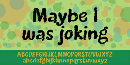
- Polytype Artimus I Frames by Prime Graphics,
$45.00 - I know a ghost by Dismantle Destroy,
$19.00 This font was inspired by music from the band The Devil Wears Prada.
 - KG I Want Crazy by Kimberly Geswein,
$5.00 The handwriting of a teenager- cute, quirky, and fun!
 - Rare Bird Specimen I by Rare Bird Font Foundry,
$100.00 RARE BIRD SPECIMEN I From the the doyenne of modern calligraphy - Maybelle Imasa-Stukuls - we bring you Specimen I, a charming script lettered in Ms. Imasa-Stukuls' signature hand. OBSERVATIONS Specimen I stands on its own. Its subtle nuances make it stand out in a flock of fonts. It is easily recognizable, but it is never one to be too showy. Give it plenty of white space, so every quirk and curve can be noted. DEFINING CHARACTERISTICS Opentype programming, old style numerals, in and out-stroked letter forms at beginning and end of words, six alternate lowercase t cross-strokes, Roman numerals, seamlessly connecting script ligatures, alternate lowercase letters, realistic double-letter ligatures, basic Latin encoding. POTENTIAL SIGHTINGS Book covers, children's literature, broadcast titling, unique product designs, website titles, logo designs, restaurant menus, and gourmet food labels.
 - Polytype Brutus I Frames by Prime Graphics,
$45.00 - Apocalypse 13 by IKIIKOWRK,
$15.00 Proudly Present Apocalypse 13 - Cyberpunk Type, created by ikiiko With its gritty and edgy design, the explosive cyberpunk brush typeface Apocalypse 13 perfectly portrays the feel of a dystopian future. This typeface was created to transport you to the pitch-black, neon-lit streets of a cybernetic metropolis. It is the ideal fusion of technical grit and artistic expression. Each character in Apocalypse 13 is painstakingly created, using jagged edges and strong brushstrokes to evoke a sense of urgency and defiance. The letters suggest a world that is on the verge of anarchy because they look like they were spray painted on a collapsing concrete wall. This typeface is perfect for an movie title, movie poster, game title, game logo, streamer, magazine layout, fashion stuff, quotes, or simply as a stylish text overlay to any background image. What's Included? 2 Weights : Regular & Oblique Uppercase & Lowercase Numbers & Punctuation Multilingual Support Works on PC & Mac
 - Gothic 13 by Linotype,
$29.99Gothic 13 is a bold condensed sans serif typeface. Originally designed in small sizes, Gothic 13 is very similar to Modern Gothic Condensed, which was a turn-of-the-20th-century modernization of a popular nineteenth century style. Until Linotype integrated it into their technology, it did not exist in sizes larger than 24 point. The design used for digitization was the 18-point. Gothic 13 is ideal for display work, especially where space is at a premium. - Lovely Amatis Signature - Personal use only

- You Are Loved - Personal use only

- KR Love Letters - Unknown license

- KR Coffee Love - Unknown license

- KR Neon Love - Unknown license

- VTKS Dear Love - 100% free

- KR Burning Love - Unknown license


