10,000 search results
(0.024 seconds)
- Poniard by Hackberry Font Foundry,
$24.95 Cutlass was just for fun. Poniard is the working version. Sleek, slender, sharp, to the point! A bit of decorative fun. This is the first font used in teaching Fontographer in my new Practical Font Design Book. I thought I better release it for those who enjoyed the journey. It's just an 8-bit font for fun. Enjoy!
 - Peanut Crunch by Hanoded,
$15.00 I really like peanuts! My family and I often eat an Indonesian snack called Rempeyek, which is a deep fried, battered peanut cracker and I was probably craving one when I made this font. Peanut Crunch is a hand painted display font. It comes with some alternates and a bunch of ligatures for you to play around with.
 - Fearsome by Hanoded,
$10.00 I watched the movie Red Dragon a while ago and it inspired me to make this rather spooky font. I was going to call it Dolarhyde (after the antagonist), but settled on the more unsettling Fearsome. Fearsome is a handmade script font with a ‘psychopath’ feel to it. Comes with a gruesome amount of diacritics.
 - Amaze by GRAYlab,
$20.00 AMAZE font is inspired by the maze. Maze always appears as a problem. I feel that in our life, we are facing a lot of problems every day. And for designers, I hope this font can help to solve your design problem. This font is also given an optical illusion. Enjoy and have fun.
 - Conrad by Linotype,
$29.00The award-winning Conrad was created by Japanese type designer Akira Kobayashi. Its design was based on the fifteenth-century type by Conrad Sweynheym and Arnold Pannartz, two German printers active in Rome at that time. They produced a unique, slightly unbalanced yet attractive type. Kobayashi says of his typeface, “I have designed a couple of typefaces inspired from the past, but this time the original print acted merely as a reference. The distinctive lowercase ‘a’ and some other letters were inspired by Sweynheym and Pannartz’s second roman type, but I revived the type in a more informal way. Here I used the historical type as a springboard. The resulting type looks different, taking on a rather temporary and lively look. I assume that the Conrad is the first revival of the Sweynheym and Pannartz type, though it does not closely resemble the original.” Conrad won first prize for the text typeface category in Linotype’s Third International Typeface Design Contest (2000) as well as the Certificate of Excellence in Type Design from the Type Directors Club (2001). - Linear Curve - Unknown license

- TXT Personality by Illustration Ink,
$3.00You'll find this the best font to inspire your creativity. It's simple and clever, with tons of personality. It's a good choice for school newsletters, kids' party invitations, and scrapbook pages emphasizing your children's great accomplishments. - Linotype Rezident by Linotype,
$29.99Flyers, Intros from James Bond films and PlayStation games as well as the typeface Senator from Zuzane Licko inspired the Dutch designer Paul van der Laan to create his font Linotype Rezident. To its design, van der Laan says, I was designing a business card for a friend and I had a certain mood in mind for the typography. I tried to capture this mood in a couple of sketches, drew a few characters directly onscreen and just expanded them into a typeface." And so began Linotype Rezident, with its cool, technical and constructivist appearance which brings to mind computers and virtual reality. And the name? " The name of the font comes from the game Resident Evil. One of the main characters in the game is called Leon and the typeface was initially drawn for a friend of mine called Leon. It also refers to the city of The Hague - where I live and got my education - since it's often called 'de residentie'", where the queen and parliament of The Netherlands are seated." - Lemony Crumpet by Kitchen Table Type Foundry,
$10.00 A crumpet is a small griddle bread, mostly enjoyed in the UK, North America, Australia and New Zealand. I have never had one, but I have heard of them and I like the name - which is probably Welsh in origin. Lemony Crumpet is a whimsical, handmade font. It is tall & thin, shaky and jumpy and I wouldn’t use it as a poster font because of its delicate properties, but it would look fantastic on book covers, product packaging and websites. Comes with extensive language support and a set of alternates for the lower case letters.
 - Letterpress Text by Chris Costello,
$22.75 This font is based on the popular and timeless Caslon design and was carefully digitized from the pages of an early 19th century book. I was excited to see some unique design treatments of characters such as the lower case italic 'p', the question mark, and various swash caps that I had never seen before. During the conversion process, I made sure to preserve the worn look of faded ink on old paper by maintaining a subtle level of decay and opacity with each character. For missing characters not found in the book, I created new characters that were faithful to the style of the rest of the family. Used as a text font, The Letterpress Text Family successfully reproduces the appearance of old letterpress lithography.
 - Machin by Hanoded,
$15.00 Machin is a French word meaning 'thing'. Apparently, it is also a species of macaque from the Philippines, but I named this font after the French word! Machin is based on a really old font I made back in the day. It was called Whynot and (because I didn't know a thing about making fonts at the time) I could not get it to work properly, so it had its 15 minutes of fame before it was pulled off of the internet. Machin was made using the recycled glyphs from Whynot and it does work. It comes with extensive language support (yes, Vietnamese and Sami too), some handy ligatures and a lot of scribbly panache.
 - Tall Skinny Condensed by Outside the Line,
$19.00 This is the tallest, skinniest, most condensed, non serif font I know of. I designed this because I felt a serious need for that one big, thin word to fit in a narrow space. It is great for ‘SALE!’ in a one column ad. Also is a life saver for several long words in a narrow space like Merry Christmas... If you need a full character set take a look at the new Ultra Condensed 3 font family. Ultra Condensed was based on Tall Skinny Condensed with some changes and a full character set. Ultra Condensed Lettered is a hand lettered version and Ultra Condensed Line is a lighter hand drawn version
 - Du by sugargliderz,
$20.00 Du is a self hommage to Uncertain Felttip. Uncertain, made in 2008, is a typeface which reproduced faithfully the style in which I am writing on copy paper, usually using the felt-tip pen. This time, I wrote the new family by the same method but using the tablet PC and the touch pen. Although, as for some characters, Uncertain differs in a form, it is the result of reflecting my hand writing. I wrote all the characters. If it is original, all the characters diverted and composed, for example, characters, such as Aacute and Agrave, are written. Different specification from Uncertain is family composition. Although Uncertain had only 3 weight, 7 weight were designed for Du. This way a user can choose his favorite weight because the variation of weights increased.
 - Exchange Student by Okaycat,
$8.99 I used to be an exchange student in Canada. I noticed my handwriting was quite different from the handwriting of people who are from countries where the roman alphabet is used. So, I thought why not make a font based on my natural handwriting. This font can be used whenever a cute and different style like mine is needed. "Exchange Student" is extended, containing the full West European diacritics & a full set of ligatures, making it suitable for multilingual environments & publications. Enjoy!
 - Ela Demiserif by Wiescher Design,
$39.50Ela Demiserif is the typeface I originally designed for the business of my second wife and mother of my two sons; her name is, of course, Michaela. Ela - the typeface - is suitable for magazines, newspapers, posters, advertiments, books, text, documentation/business reports, business correspondence, multimedia, and corporate design. Because lately this typeface became very popular I decided to extend it to eight weights and I added italic and smallcaps versions to it. So now Ela is a full fledged typeface. - Forgotten Dream by Hanoded,
$15.00 I had a really weird dream the other night, but when I woke up, I had forgotten it. I had the feeling it was about something important, but I cannot, for the life of me, recall what I dreamt about! Forgotten Dream is a horror brush font, which I made with a brushy brush and Chinese ink. It looks like something right out of a nightmare, but you can also use it for something important. Like a ‘keep your distance’ poster, or a sign about the importance of washing ones hands. But then again, if you play in a death metal band, then Forgotten Dream font could be exactly what you need for your album cover!
 - Forgotten Playbill by Lauren Ashpole,
$15.00 Years ago, I came across a vintage playbill and was struck by its lettering. The detailed floral pattern surrounded by thick outlines stayed in my mind even though the play's name and cast have faded. I finally tried to recreate the style from memory and Forgotten Playbill is the result. While all letters are actually capitals, the uppercase rotate slightly counterclockwise and the lowercase slightly clockwise. I suggest alternating between the two to reproduce my mystery inspiration.
 - Squickt by Wiescher Design,
$39.50 Squickt was the first script I designed. The name is an atrocity, I don't remember what was on my mind, when I decided on that name, but after 25 years it is to late to change, so I have to stick with it. I have recently gone over the script and changed a little stroke here, a curve there and I added Small-Caps. The font is very useful for all kinds of signs, that have to look spontaneous. You can even condense or extend it without me going berserk; Squickt is very robust. Your scribe Gert Wiescher
 - Playdates - Personal use only

- Janda Manatee Solid - Personal use only

- Toonish - Personal use only

- SHARKBOY & lavagirl - Personal use only

- American Dream - Unknown license

- Sanseki by Hanoded,
$20.00 The term Sanseki (Japanese for Three [Brush] Traces) is used to describe three famous Heian period calligraphers: Yaseki, Gonseki and Saseki. Not that I would ever dream of comparing my messy brush-work with theirs, but the name stuck and I kind of liked it. I used Chinese ink and a high quality brush (which I got in a sale actually) to create this font. All glyphs were hand painted in one go! Sanseki is a very detailed brush font. Upper and lower case letters mingle and there’s even an alternate for every lower case glyph. Comes with an abundance of diacritics.
 - Sculptura CT by CastleType,
$29.00 A wonderful, very condensed, 3D font. A few years ago, I was commissioned to digitize the letters from this typeface for the words 'LEGENDS OF RODEO' and liked the look of it so much that I went ahead and digitized the rest of the alphabet. This CastleType revival is very clean-cut and contains uppercase, numerals, and punctuation. Sculptura was originally designed by the Swiss designer, Walter J. Diethelm (1913-1986) in 1957.
 - Reaper BT by Bitstream,
$50.99Thomas Oldfield’s typeface, Reaper, is reminiscent of inscribed Greek letterforms but he claims that its origin is much simpler than that. “I recall”, Tom says, “that I just began the design by making the uppercase ‘I’ and continued using it to make up the other characters.” The cap only typeface has alternate cap forms in the lowercase positions, including a vastly scaled downed O and Q that make for some unusual text settings. Contrary to what the name might have you believe, there’s a lot of life in this quirky typeface. - KG Primary Penmanship by Kimberly Geswein,
$5.00 I come from a family of educators- my mom, husband, stepmom, brother-in-law, and sister are all currently teaching and I have taught in the past. This font was created after speaking to several elementary school teachers who were struggling to find just the right font to use on worksheets and projects in their classroom. They liked many features of other fonts, but needed small things altered in order to make a "perfect fit" for their class. Hand-drawn by me, this font hopefully addresses several of those issues. As penmanship styles vary across the globe, I am sure this font will not work in every classroom. But hopefully this style will work for many teachers to give their early readers a highly legible, neat, accurate font. It is best used with kerning turned on to allow for accurate letter spacing.
 - Uncle Edward by Hanoded,
$15.00 First of all, I don’t have an uncle called Edward, nor do I know anyone by that name. When I had finished this font, it had a strong ‘Uncle Edward’ feeling to it, so the name stuck. Uncle Edward is a handmade script font. I used a Japanese brush pen and some rough paper to create that ‘vintage’ look. Use Uncle Edward for your book covers, your invitations or your product packaging. Create labels for your vintage record collection with it, or print a guest list for your Christmas dinner party. Uncle Edward gives you his blessing. Comes with ligatures for double letters and a whole bunch of accents.
 - Tabwa by Scholtz Fonts,
$19.00The design of the Tabwa font was inspired by the font Neuland designed by Rudolf Koch in 1923. Rather than attempting to re-create his font in a digital form as so many others have done, I have tried to capture the "spirit" of his font and merge this with the spirit of Africa. As a result the characters differ markedly from Koch's original styles and have much less of an "Art Deco" look to them. To further modernize the font I have included all the characters missing in Koch's original (a full lower case, as well as all punctuation, diacritics, special characters etc). The result is a thoroughly modern re-interpretation of the original "Neuland". The numbers (0 to 9) bear no relation to Koch's originals but, I believe, are far more in keeping with the alphabetic characters in the font. The triangles that decorate the characters of this African font are typical of the patterns found in the Tabwa culture of central and west Africa (in the Congo region). - P22 Glaser Babyfat by P22 Type Foundry,
$24.95 Milton Glaser on designing Babyfat: “This is the first alphabet I ever designed. For some inexplicable reason I called it Babyfat. Because I’m not a type designer, most of my alphabets are actually novelties or graphic ideas expressed typographically. Here the idea was to take a gothic letter and view it simultaneously from two sides. It started out as a rather esoteric letterform; it ended up being used in supermarkets for ‘Sale’ signs.” This forced perspective 3-D font has appeared on many LP covers and posters from the mid 1960s onward. This revival includes the original lowercase for the first time in digital form. Besides the three original styles (Outline, Shaded, and Black) made for photo typesetting, the new P22 Glaser Babyfat introduces six additional variations to allow the user to easily colorize the type as Glaser envisioned. The Keyline, Fill, Glyph, Left, Right, and Down font styles give the user nearly infinite options to create dynamic chromatic effects. P22 Glaser Babyfat was based on original drawings and phototype proofs from the Milton Glaser Studios archives. Typographic punctuation and sorts were imagined by James Grieshaber to work with Glaser’s design, as well as diacritics to accommodate most European languages. Over the years there have been many typefaces that borrowed heavily from the Glaser designs, but these are the only official fonts approved by Milton Glaser Studio and the Estate of Milton Glaser.
 - Painless Feedback by Bogstav,
$15.00 Here you go...a handmade sans font without much of surprise...actually, this is how I draw letters with my eyes closed...well, almost! I wanted to make a font with letters that were pretty obvious, but had that handmade look that I love so much. The result is this really painless font - it won't hurt or scare anyone, but it could help making your handmade things (such as posters, postcards, flyers, books and alike) come more alive! Anyway, I've added 3 different versions of each lowercase letter...just to add some spice to the painlessness of the font!
 - Hysterian by Gassstype,
$23.00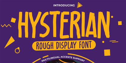 Hello Everyone, introduce our new product Hysterian is a Rough Display Font.This Playful Kids with a natural feel. This handmade font will make your design has a beautiful natural touch for each details. It is perfect for any design project as Invitation,logo, Kids,book cover, craft or any design purposes. This font is PUA encoded which means you can access all of the magical glyphs. That is Hysterian has charming unique,authentic and relaxed characteristic more natural look to your text. It also features a wealth of special features including Alternates glyphs.
 - ITC Handel Gothic by ITC,
$40.99 The Handel Gothic? typeface has been a mainstay of graphic communication for over 40 years - all the while looking as current as tomorrow. Designed by Don Handel in the mid-1960s, and used in the 1973 United Airlines logo developed by Saul Bass, Handel Gothic was an instant success when released to the graphic design community. Its generous lowercase x-height, full-bodied counters and square proportions make the design highly readable at a wide range of sizes. Handel Gothic's slightly idiosyncratic character shapes gave the face a futuristic look 40 years ago that retains its power today. In addition, its Uncial-like lowercase is instantly identifiable - and unique among sans serif typestyles. Award-winning type designer Rod McDonald was attracted to the simple, decisive forms of the original, but he felt the design needed to be refined and updated. ?One of my goals was to bring a modern typographic discipline to what was really an old phototypesetting font.? To achieve his goal, McDonald re-proportioned every character and balanced the delicate relationship between the curves and the straight strokes. He also added a number of alternate characters to extend the range of the design. ?I wanted to give designers a large enough character set so they wouldn't feel constrained in what they could do. I want them to be able to play with the fonts, not just set words.? McDonald enlarged the family from the single-weight original to five weights, each with a full suite of alternate characters.In 2015 Nadine Chahine designed matching arabic weights to this family.
 - Buttered Toast by Hanoded,
$15.00 Buttered Toast is something a lot of people enjoy every day; when I was working on this font I was hoping to create something similar: an uncomplicated font enjoyed by many. The resulting typeface is exactly what is promised on the package: Buttered Toast is unobtrusive, yet quite refined. It may even be taken for granted, but I sure hope it will be used and enjoyed by many. Buttered Toast comes with a generous helping of diacritics.
 - Sukkergris by Bogstav,
$15.00 Need a catchy headline font with a clear handmade and organic look? Look no further, because Sukkergris is here to do the job! Each letter is handmade and manually cleaned up, but keeping the original quirky curves. I have added 6 different versions of each letter, which automatically cycle as you type. I also added a set of small caps, just because I think they look awesome!
 - Organic Tuesday by Bogstav,
$15.00 Sometimes you need things organised in a neat way. Organic Tuesday has that, but also a will to break free at the same time. Years ago I was at a restaurant where the menu was handwritten with a clumsy, but characteristic and charming, monospaced font. I must have focused so much on these letters that I can’t recall what I actually ate. But what I do remember is that it was a Tuesday, and the restaurant was organic!
 - vinceHand II by JOEBOB graphics,
$19.00 This is what my good friend and painter Vincent’s handwriting looks like. I have put in a couple of ligatures and I hope you like it.
 - Monde Libre by Elyas Beria,
$12.00 Monde Libre is a display typeface that exudes optimism, joy, and whimsy. I designed this typeface based on a sign in a clip from some old film footage I saw somewhere. It stayed with me as a typeface that evokes the France of my dreams. Enjoy!
 - Garden Gnome by Hanoded,
$15.00 I am not really fond of Garden Gnomes, but this font is kinda cute and I figured it'd be a nice name. Garden Gnome is a very happy, easy to read Children's Book font. It is bouncy, rounded and comes with all the diacritics you need.
 - Trigomy by Markus Reiter,
$24.90 Trigomy is a proportional pixel font designed on a 5 pixel grid. It is intended for either very small text or as huge display font for posters and the like. To get a crisp look this font should be used at 10 pt or multiples of 10 pt. (A tip for Adobe Creative Suite applications is to change the standard anti-aliasing method from “sharp” to “crisp” and to align the text to whole pixels. Also avoid centered text.) To get started with type design I thought it was best to start with a pixel font because you don't have to focus much on the design itself, but rather have to focus on how kerning and spacing works and the various features you can implement with OpenType. And of course I wanted to have a pixel font that had all that I was missing from other pixel fonts. We were learning trigonometry at the time I started designing Trigomy, and most of the time I misspoke it “trigometry”. So, when I had to come up with a name for my first font I thought: "Why not go with Trigomy?"


