10,000 search results
(0.069 seconds)
- Brittensy by Attract Studio,
$12.00 Introducing the latest styles Brittensy script is a modern calligraphy design, including Regular. This font is enough with a sweep. Can be used for various purposes. such as logos, product packaging, wedding invitations, brand imagery, titles, signs, labels, signatures, book covers, posters, quotes, and more.
 - Mrs Berry by Hipopotam Studio,
$30.00 Mrs Berry is a hand drawn typeface designed for one of our books. You can use it as a regular monochrome typeface or layer different styles to achieve colorful combinations. Mrs Berry has upper and lowercase characters and supports both Latin and Cyrillic scripts.
 - Restauranteur JNL by Jeff Levine,
$29.00 The 1960 revised edition of Sam Welo’s “Studio Handbook – Letter and Design for Artists and Advertisers” showcased a beautiful, semi-condensed Art Deco alphabet called “Modern Gothic”. It has been digitally redrawn and is available as Restauranteur JNL in both regular and oblique versions.
 - Latisha Script by madjack.font,
$17.00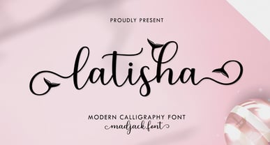 Latisha Script is a modern calligraphy design including Regular. This font is casual and pretty with EXTRAS. Can be used for various purposes. such as logos, product packaging, wedding invitations, branding, headlines, signage, labels, signatures, book covers, posters, quotes, and many more. Thank you, enjoy.
 - FT Moonshine Script by Fenotype,
$19.95 An inky script font written by a madman from the cabin deep in the forest. Moonshine Script has a regular set of uppercase and lowercase script letters but also condensed capital letters that you can access by switching SmallCaps on and writing with CAPS.
 - Simply Conception by Muksal Creatives,
$10.00 Simply Conception is a unique and modern family of serif fonts. Simply Conception has 18 families Regular and italic font, starting from the small thin to the largest black. This typeface is versatile and can be used successfully in magazines, posters, branding, websites, etc.*
 - BudHand - Unknown license

- Porspican Serif - 100% free

- Ant Serif by LNP Fonts,
$9.99 Ant Serif is a font that can be used for advertising, logo creation, webfonts and more. The font comes in two styles, Regular and Italic and has all the characters in the Latin Basic, Additional and Extended scripts. The font's design came from my love of Marvel's Ant-Man and the Wasp logo. The typeface used, which was custom, was of interest for me, so I decided to create it as a font. It's not a perfect font, but I have put work to make sure it looked as decent as possible. Hope you'll enjoy it!
 - Beloved Karins by Say Studio,
$15.00 About The Product Lemonade Fresh font is a Display Serif Typeface with a unique circular shape inspired by the alternate shapes in most serif fonts, but Lemonade Fresh makes it a regular shape, and Lemonade Fresh still has 50+ other alternate that you can combine to get curves and beautiful shapes easily just in seconds. It is a display font with moderate contrast that perfect for branding projects, logo, wedding designs, social media posts, advertisements, product packaging, product designs, label, photography, watermark, invitation, stationery, and any projects, it makes with a high level of legibility. What's Included: - Fresh Lemonade Regular - Fresh Lemonade Italic - Accented Characters (West Europe) - Ligature & Huge Stylistic alternate - Works on PC & Mac - Recommended using Adobe Illustrator or Adobe Photoshop. Wish you enjoy our font and if you have any questions, don't hesitate to drop message & I'm happy to help :) Thanks, Have a wonderful Day, Say Studio
 - MBF Moonlander by Moonbandit,
$15.00 Moonlander, a modern bold and wide sans serif font.This clean and sharp typeface is inspired from the lively urban lifestyle and can be perfect as a headline, title, logo, branding.
 - Nadella by Abbasy Studio,
$15.00 Nadella Script is beauty combinations of script layered and sans font . It has 7 font on script and 1 sans inside. Both combination are perfect for you to make design more detail. You can express the style on script font, you can add line, shadow, extrude, inline_1, inline_2, or inline_3. Changing the color of the other layer as just easy as change standard color of the fonts but it’s make more detail. with 1 more sans font, and some extras. you no longer need to worry about how to make effect and ornament on the text. This font is suitable for young, passionate design, such as logo design, t-shirts, branding, and various other design purposes.
 - MGT Vallery Hills by Magetype,
$15.00 When I was surfing the internet, with rock n 'roll music. I accidentally found a picture of a hotel sign with a very unique style, namely: Mid-century Modern (MCM). It looks very pretty and charming to me. And inspired me to create Font Family. And I am proud to present the Vallery Hills Font Family. This font is in the Retro style of the 50s to 60s. Okay, here are the specifications. 1. Vallery Hills Schrift There is one unique thing about this font. Usually, script fonts with Retro style always have an angled anatomical shape, but I made this font upright. The goal is to make a difference with other script fonts I've seen. By the way, this font comes in two styles, namely: Regular and Bouncy. Why do I make it like that? Because I want to make this font into two different functions, namely: If you want to make it a Display Font, which is usually used for Headings, then use the Bouncy style. And if you want to use it as Bodytext, then use Regular. 2. Vallery Hills Sherift This second font is a font that is very synonymous with the Mid-century Modern (MCM) era. A very distinctive form of the serif font of that era. Similar to the first font, this font also has 2 styles, namely: Regular and Bouncy. You can combine this font with the other two fonts in Vallery Hills. It could be Title, or Bodytext. And you can also combine two styles, namely: Regular and Bouncy. Try! 3. Vallery Hills Suns Sherift This last font is Sans Serif. Also has 2 styles like his two brothers, namely: Regular and Bouncy. The goal is actually the same. I am sure you are cooler to create a design that uses this font family. Well, there is one advantage of this font from its two siblings, which is that it has a feature, namely: SMALLCAPS. Which will be an option when you are bored with the mediocre shape or style of Lowercase. Try combining the Smallcaps with Uppercase or Lowercase. Must be cool! : D Oops, almost forgot. This font consists of several font formats, namely: OTF, TTF, and Webfonts. And of course everything is MULTILANGUAGE. OK, friends. That's all I can describe about the Vallery Hills Family. Hopefully it will please all of you. Cheers!
 - Flying Peace PERSONAL USE - Personal use only

- ITC Honda by ITC,
$29.99This simplified blackletter typeface shares some geometric characteristics with a line of typefaces popular that were especially popular in Germany during the 1920s and 30s. Their forms may have originally come about after a desire to mix the classical Fraktur" forms found in typefaces like Linotype Luthersche Fraktur or Fette Fraktur with more modern sans serif typefaces, like Basic Commercial or Futura. ITC Honda's letters are rather narrow and angular. The type can be used for a number of headlines or logo purposes, and is best legible when set large. A similar typeface in our library is Linotype Gotharda." - Dirty Sundae by Fenotype,
$19.00 Dirty Sundae is a casual hand drawn typeface with interlocking ligatures. Dirty Sundae comes in four styles: Regular and Condensed plus Regular and Bold version of them both. Dirty Sundae suits great into a film title, as a logotype for a cartoon or an animation film or for a new superhero, as well as in a jazz gig poster, magazine, packaging and branding. It can be easily fit into a vintage or modern context as long as it’s on the cheerful side. Dirty Sundae is equipped with 128 interlocking ligatures that you can access by turning on Discretionary Ligatures in any OpenType savvy program or by fetching them manually from the character window.
 - PAG Bankas by Prop-a-ganda,
$19.99Prop-a-ganda offers retro-flavored fonts inspired by lettering on retro propaganda posters, retro advertising posters, retro packages all the world over. This is perfect font for your retrospective project. PAG Bankas is a vintage and old-fashioned that we can find in the posters of old silent film. Bankas’s retro forms lend itself to many design projects from branding to packaging, magazine headlines and so on. - CA El Amor by Cape Arcona Type Foundry,
$19.00 This typeface has the most important ingredient of all: love. So it’s not surprising that the font is called El Amor. It is a reversed oblique all-caps headline font that consists of two styles, “Regular” and “Fill”. Feel free to experiment with them, together or alone. Write something with “Regular”, copy paste it to another layer and switch to “Fill”. Give it a little offset if you like or place it straight on top, both works fine. You can also use the “Fill”. style for body text, but do so at your own risk, spacing and kerning is optimized for the use with the “Regular” style, so be generous if the result looks not as even as text-font. Maybe you’ll discover the charm of a more dynamic spacing that fit perfectly with the vivid and crispy outlines. Unlike other display fonts CA El Amor features a huge character set covering most languages that you can write with a Latin alphabet.
 - Imperfection by LIGHTDESIGNS,
$9.00 IMPERFECTION Is a hand-written san-serif font inspired by human imperfections (mistakes). This is the first font created by LIGHTDESIGNS. It has no consistency in it's design which made the font looks like a lot of mistakes has been made. But this is done with purpose. With these characteristics, the font is given the name "IMPERFECTION', With surprising font and glyph designs, the intent of this font design is to pass a message that says, "SUCCESS IS NOT THE ACHIEVEMENT OF PERFECTION, BUT THE ACCOMMODATION OF IMPERFECTION™ This font design will be a fit in every design project it is utilised like logos, posters, flyers, magazine, card designs e.t.c. This font can be nicely pairs with script fonts & San serif font.
 - Optima Cyrillic by Linotype,
$65.00Many typefaces are distinctive or attractive at the expense of legibility and versatility. Not so the Optima® family. Simultaneously standing out and fitting in, there are few projects or imaging environments outside of its range. Although Optima is almost always grouped with sans serif typefaces, it should be considered a serifless roman. True to its Roman heritage, Optima has wide, full-bodied characters – especially in the capitals. Only the E, F and L deviate with narrow forms. Consistent with other Zapf designs, the cap S in Optima appears slightly top-heavy with a slight tilt to the right. The M is splayed, and the N, like a serif design, has light vertical strokes. The lowercase a and g in Optima are high-legibility two-storied designs. Optima can be set within a wide choice of line spacing values – from very tight to very open. In fact, there are few limits to the amount of white space that can be added between lines of text. Optima also benefits from a wide range of letter spacing capability. It can be set quite tight, or even slightly open – especially the capitals. If there are any guidelines, Optima should be set more open than tight. It’s not that readability is affected that much when Optima is set on the snug side; it’s just that the unhurried elegance and light gray typographic color created by the face are disrupted when letters are set too tight. Optima is also about as gregarious as a typeface can be. It mixes well with virtually any serif design and a surprisingly large number of sans serif faces. The Optima family is available in six weights, from roman to extra black, each with an italic counterpart. In addition, the family is available as a suite of OpenType® Pro fonts, providing for the automatic insertion of small caps, ligatures and alternate characters, in addition to offering an extended character set supporting most Central European and many Eastern European languages. When you’re ready to find its perfect pairing, browse these fantastic matches: Monotype Century Old Style™, Dante®, Frutiger® Serif, Joanna® Nova, Malabar™, and Soho®. - Optima by Linotype,
$45.99 Many typefaces are distinctive or attractive at the expense of legibility and versatility. Not so the Optima® family. Simultaneously standing out and fitting in, there are few projects or imaging environments outside of its range. Although Optima is almost always grouped with sans serif typefaces, it should be considered a serifless roman. True to its Roman heritage, Optima has wide, full-bodied characters – especially in the capitals. Only the E, F and L deviate with narrow forms. Consistent with other Zapf designs, the cap S in Optima appears slightly top-heavy with a slight tilt to the right. The M is splayed, and the N, like a serif design, has light vertical strokes. The lowercase a and g in Optima are high-legibility two-storied designs. Optima can be set within a wide choice of line spacing values – from very tight to very open. In fact, there are few limits to the amount of white space that can be added between lines of text. Optima also benefits from a wide range of letter spacing capability. It can be set quite tight, or even slightly open – especially the capitals. If there are any guidelines, Optima should be set more open than tight. It’s not that readability is affected that much when Optima is set on the snug side; it’s just that the unhurried elegance and light gray typographic color created by the face are disrupted when letters are set too tight. Optima is also about as gregarious as a typeface can be. It mixes well with virtually any serif design and a surprisingly large number of sans serif faces. The Optima family is available in six weights, from roman to extra black, each with an italic counterpart. In addition, the family is available as a suite of OpenType® Pro fonts, providing for the automatic insertion of small caps, ligatures and alternate characters, in addition to offering an extended character set supporting most Central European and many Eastern European languages. When you’re ready to find its perfect pairing, browse these fantastic matches: Monotype Century Old Style™, Dante®, Frutiger® Serif, Joanna® Nova, Malabar™ and Soho®.
 - Komet by Jan Fromm,
$45.00 Komet is a sturdy typeface with a calm and upright feel. Although it derives inspiration from classical English sans-serifs, it’s not too closely related to that model. Komet, instead, feels rather more lively and contemporary. Its compact spacing, low stroke contrast and heavy dots and accents give it an almost monolinear quality. The diagonals are slightly curved and the counters of the round letters such as b, o and q are generously wide. The muted, understated middle weights are built for extended body copy, while Komet’s thin and dark weights look brisk and assertive and make for subtly expressive headlines. Komet is an ideal choice for editorial design, branding and corporate design. The Komet family comes in eight weights with matching italics, from Thin to Black. The glyph set of each font contains around 520 glyphs and provides good everyday support for most Latin-based languages. For a wider range of advanced OpenType features, Komet Pro is also available.
 - Guess by DearType,
$59.00 Guess is a versatile, connecting script, designed to convey elegance and style. It is slender, feminine and friendly, let alone sexy. Guess will work perfectly for fashion, e-commerce brands, trend blogs, or any business that wants to appear classy and chic. The font is ideal for high-end logotypes and magazine headlines, but let’s not forget greeting cards, invitations, posters, ads and the various web usages. When it comes to the glyph set, well, Guess Pro has quite a lot of that (2500+ glyphs) - think multiple languages and tons of swashes and stylistic alternates to unleash your creativity. For all pragmatists out there, there is also a basic version of the font with an extended latin glyph set (no swashes, contextual alternates or stylistic sets). Last, but not least, Guess comes with a neat geometric sans in capital letters, which makes a great addition to the script, and a set of beautiful ornaments and borders that complete the whole look with a bang.
 - Faddy by Ani Dimitrova,
$25.00 Faddy is always fresh, smiling, slightly crazed, sometimes angry, often fuzzy, and can also be very funny. You can write with Faddy in multiple languages. Faddy contains 3 different styles - Regular, Circle & Shaggy. Each style includes more than 500 glyphs, as well as the necessary OpenType features: Superscript, Subscript, Tabular Figures, Arrows, Matching currency symbols, and fractions. Faddy also has a lot of fun stylistic sets, variants of letters that can give him a different mood and look.
 - Regnum by Artisticandunique,
$10.00 Regnum - Sans serif font family - Multilingual - 24 Style Regnum font family has variable font flexibility, and offers better performance. It has a timeless structure where you can create your modern-elegant or classic design alternatives. Regnum a modern variable Sans serif font family. You will be more free and increase your creativity with the variations you can create in your designs. You can enrich your designs with the combination of strong Black style and Thin style. Its dynamic nature is great for book and magazines, editorial, headlines, websites, logos, branding, advertising and more. This font family can meet your needs in all creative projects, modern and classic. With this font you can create your unique designs. If you have a question, please contact me. Have a good time.
 - Brilliant Grunge by Java Pep,
$17.00 Introducing stylish modern sans serif font. The font builds with many stylistic alternates for forming beauty stylish sans. The font is called Brilliant Grunge font, every glyph or letter builds with more than 3 alternates sets for access to the alternate font you must use compatible software like Adobe Illustrator, Adobe Photoshop, Corel, Affinity, Procreate, Inkscape 01. or the newest and etc. If you are not using compatible software you can use and Install character maps software you can see the tutorial https://www.youtube.com/watch?v=KV7n5nxmsLs .
 - Gyroscope by Milan Pleva,
$18.00 Gyroscope is an all caps display font duo consisting of two styles - Serif and Sans Serif. Both of them can also be bought separately. Gyroscope has elegant and well balanced curves of letters perfect for logos, headlines, magazines, or even longer texts. There are selected ligatures you can use for a better look. Features: 2 Styles: Gyroscope Sans & Gyroscope Serif Basic latin alphabet A-Z 43 Ligatures & Alternates 56 Accented characters Numbers, Punctuation, Currency, Symbols, Math symbols & Diacritics Old style figures Case sensitive glyph Enjoy Gyroscope!
 - KG What A Time - Personal use only

- Movement - Personal use only

- Gramers by Dora Typefoundry,
$15.00 Gramers is an elegant and modern minimalist font family, a new roman sans serif font carefully crafted, These font ideas come from various references, from vintage, classic, art deco, to the modern era. Carefully drawn with high contrast between the strokes bold and thin with the aim of making even the simplest sans serif letters look sensual, elegant, and warm. The feeling of versatility and luxury you get in Gramers. As you can see in the display of our creations such as Branding, Header, Logotype, Posters, Magazines, Packaging, Art deco wedding invitations, and others. This shows that Gramers can accommodate various design styles. The flat lines cover five styles (each light, regular, medium, semi thick, Thick), each of which includes nearly 293 glyphs. OpenType features include 103 standard ligatures and a small number of character variants, and multilingual support (including multiple currency symbols). Features: • 5 Font weight • uppercase • Alternative & Ligature Styles • Numbers & Punctuation • Characters with accents • Supports Multiple Languages This type of family has become the work of real love, making it as easy and enjoyable as possible. I really hope you enjoy it! I can't wait to see what you make with Gramers! Feel free to use the #Dora Typefoundry and #Gramersfont tags to show what you've done!
 - Condell Bio Poster by Letritas,
$5.00 Condell Bio Poster is part of the bigger Condell family: a project that involves series of typographies that started to be conceived and developed since 2006. It also includes a bigger legibility version and a sans serif. Condell Bio is very versatile and can be used in the agroindustrial production. Thanks to its strongness and its charm, it can be used in different projects where a short and powerful message is required. For instance in a brand marketing campaign. The Condell project follows in terms of time the design of Comalle (a font also designed by Juan Pablo de Gregorio in 2006), but if we compare them, Condell seems to look for a major range of uses rather than a mere stylistic inspiration. And even if it keeps in its shape some organic forms, Condell seems to be much more similar to a sans serif traditional typography. Condell's fat and soft forms and its nice endings, inspired through spontaneous brush strokes, give it a very peculiar pleasant connotation. Its Italic (10 degrees inclination) have been produced singularly, not automatically calculated by the software. Condell Bio Poster is composed of 2 styles: the regular and the italic. Each one of them have 599 characters and is composed of 206 languages.
 - Kage by Balibilly Design,
$12.00 Welcome to the old version of Kage. "Old does not mean obsolete" In April 2022, we updated whole letterforms. We redrew all glyphs and refined the nodes, corners, rounded shapes, flowing tails, etc. Of course, you can still use the update of an older version of Kage, although we highly recommend you move to the Pro version for the full benefits. Kage Pro has massive development, puts forward experimentation on alternate letters, and applies an oblique style to provide diverse style choices. Come with tons of swirly ligatures and advanced opentype features include case-sensitive forms, small caps, standard and discretionary ligatures, stylistic alternates, ordinals, fractions, numerator, denominator, superscript, subscript, circled number, slashed zero, old-style figure, tabular and lining figure. Learn more about Kage Pro here: Kage Pro 2.0 | Type Specimen About Kage The Inspiration: The radical exploration world of fashion inspires us. It leads our minds to the Neo-classical type style created during the age of enlightenment in the 18th century. It has a reasonably extreme contrast from the previous serif style, making the impression that it is emitted more expensive and classy. Organically, this Neo-Classical typeface is closely related to the fashion world, especially in Europe, and even spread across the globe. Fashion and this typeface reflect each other. After, we boldly observed Japanese fashion designer Rei Kawakubo. Famous for radical & deconstructive fashion, which makes the world of fashion more flexible and dynamic. The Design: As well as the typeface that we made, we started it with a cultural foundation of the Didone typeface. We tried to deconstruct the appearance. The decoration that better reflected the dynamic of fashion implemented in the fashionable alternate and calligraphical stylistic set ended with ball terminals. The versatile impression created is like taking off a scarf on the model's hair during a fashion show. The deconstructive image is combined with a legibility structure like the appearance of the Neo-Classical style. Kage is designed to visualize a costly and exclusive image of a thing, product, world clothing brand, famous fashion magazine, etc. The modern transitions of each letterform are softer, so when repositioning and escalating the size of this font, it will remain beautiful without injuring other elements. So, Kage is a bold choice on headlines and more prominent media with a portion of 50% even more. The Feature: Kage has 11 styles, from thin to black; all family-style consist of one variable font with two axes. The total number of glyphs is 748 in each style. She comes with tons of swirly ligatures and stylistic alternates in Advance OpenType features, including: discretionary ligatures, stylistic alternates, ordinals, fractions. Support multi-language including Western European, Central European, Southeastern European, South American, Oceanian, Vietnamese.
 - Yolk by Monotype,
$31.99 Yolk is an Eggcentric Sans Serif Typeface consisting of nine weights in both roman and italic. Essentially, this is a geometric sans typeface that has been inspired by the shape and proportions of an egg. With its bottom-heavy glyphs, Yolk has an unusual personality – it’s not too awkward to be off-putting, and it’s not too uniform to be associated with the myriad of generic geometric sans fonts that are available. Yolk has a distinctive presence in its upright form, while the italics exude a more flamboyant nature. When combined, your typographic results will be pleasing and perhaps a little quirky too. This 18-font type family achieves a good balance of personality, versatility, and usability. Small Caps are available at the click of a button, then add Stylistic Set 1 to achieve Petite Caps. The petite caps harmonise with the regular lowercase forms, so that you can create unicase-style typography too. All Latin-based languages are covered within the 1000+ glyphs of each Yolk font. Key Features: • 18 font family – 9 weights in Roman and Italic • Small Caps, Petite Caps, with Proportional, Old Style, and Small Cap figures, plus Fractions, Numerators, Denominators, Superiors, and Inferiors • Full European character set (Latin Extended) • 1,000+ glyphs per font.
 - Queenica by Artisticandunique,
$55.00 Queenica - Sans serif font family - Multilingual supports, 12 Style If you're looking for a stylized sans serif font, Queenica might be the font you're looking for with its unique structure. Queenica is a distinctive modern sans serif font. It offers rich solutions to your creative projects with its alternative versions. You can easily use the sans serif font feature in many areas. You can create your text with normal characters and highlight bold characters and titles. This font offers a wide variety of styles to help you discover the best mood for your projects, from body text to large headlines, from classic to modern and bold styles. Well suited for books and magazines, magazine covers, editorials, headlines, websites, logos, invitations, branding, advertising and more. CHARACTER RANGES : Basic Latin, Latin-1 Supplement, Latin Extended-A, Latin Extended-B, General Punctuation, Currency Symbols, CJK Symbols And Punctuation, Private Use Area (plane 0), Alphabetic Presentation Forms -Uppercase typeface -Lowercase typeface -Numbers -Symbols With this font you can create your unique designs. If you have a question, please contact me. Have a good time.
 - Fette Trump-Deutsch - Unknown license

- Petroglifos by John Moore Type Foundry,
$19.00 Petroglifos is a dingbats font as a collection of pre-Hispanic petroglyphs of indigenous ethnic Venezuela, most of them are found in signs carved in stone or painted in caves of the pre-Hispanic period, each icon is an accurate representation of these ancestral signs. Forms are very interesting from a visual, anthropological, historical and semiotic point of view.
 - M+ 1m - Unknown license

- Riley Wow by Etewut,
$36.00 Riley Wow typeface is rounded sans serif. It includes 3 font styles that can be used together to call glowing effect. The typeface supports all European languages based on Latin alphabet.
 - Borka by Wirtu,
$8.00 Borka is sans-serif, clean and simple family that can be used for wide variety of purposes. It is well suited for web text, advertisements, designs, flyers, posters, brochures and more.
 - Threva by GlyphStyle,
$15.00 Threva is a stylish sans serif font with 2 styles, solid and outline. You can combine the two into something creative. The shape is not too stiff, looks modern and elegant


