8,840 search results (0.031 seconds)
  1. Witchcraft - Unknown license
  2. Scrapes - Unknown license
  3. Gargoyles - Unknown license
  4. Faktos-Mirror - Unknown license
  5. Transmaidens - Unknown license
  6. tenuki gothic - Unknown license
  7. King Arthur Special - Unknown license
  8. Dinobots - Unknown license
  9. D_rough - Unknown license
  10. Visionaries - Unknown license
  11. Underwood1913 - Personal use only
  12. Samarkan - Unknown license
  13. EURONEW - Unknown license
  14. Escape Pod - Unknown license
  15. CitonLightDB - Unknown license
  16. ARIA - Unknown license
  17. Shalom - Unknown license
  18. Gardner Sans by Lewis McGuffie Type, $35.00
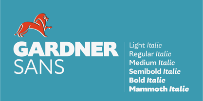
    Gardner Sans is a humanist sans serif with a range of weights, italics, small caps stylistics alternates and a set of decorative ornaments. The light and regular faces work at smaller sizes and the heavier weights are good for display lettering. It is inspired by a few historical sources including Stephenson Blakes' Granby, Gill Sans, as well as some old hand-done lettering for sales tickets. The name (and the basis for the small caps) derives in-particular from the Roy Gardner collection of sales tickets from early 20th century that can be found on spitalfieldslife.com The heavier weights were particularly influenced by a later cut of Gill Sans, Extra Bold 321. The italic is more of a contemporary mix of humanist styles.
  19. REGALIZ - Unknown license
  20. Fabulous 50s - Unknown license
  21. ZARAUTZ - Unknown license
  22. Generation Two - Unknown license
  23. ASTEROID - Unknown license
  24. Choujun - Unknown license
  25. Battle Beasts - Unknown license
  26. NewKids - Unknown license
  27. Laser Rod - Unknown license
  28. Zacken - Unknown license
  29. DE STIJL - Unknown license
  30. plasma poodle - Unknown license
  31. Bayao Hand - Unknown license
  32. Comic Book - Unknown license
  33. TRACK - Unknown license
  34. SinnerMovieCredits - Unknown license
  35. Eiszapfen - Unknown license
  36. Marusya - Unknown license
  37. Leipzig Fraktur - 100% free
  38. Pixel Cyr - Unknown license
  39. Zrnic Cyr - Unknown license
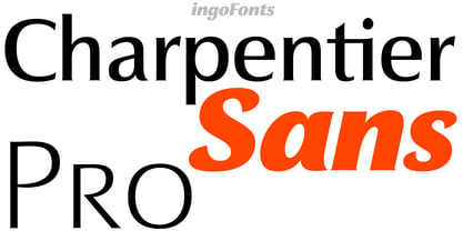
  40. Charpentier Sans Pro by Ingo, $41.00
    A humanistic sans serif The first version of this font was created in 1994 within the framework of the bid placed by the city of Graz to become the location for the Winter Olympics in 2006. Appropriately, its original name was ”Olympia.“ The font is intended to embody classic ideals as well as to meet modern demands. The proportions of Charpentier Sans are directly derived from Roman capitals and the humanistic book-face. The contrast between strokes and thin strokes is based on medieval uncial script. And thus, a modern serif sans was created emphasizing thick and thin strokes together. Thanks to its traditional form language, Charpentier Sans is very legible, adapts to various forms of content and expresses a kind of calmness and certainty. Details resulting from writing with the quill guarantee that the font doesn’t appear too rough and unemotional. Even the tiny, pointed mini serifs contribute to the unmistakable appearance of the font. They create an exciting contrast to the soft flowing forms of the letters and are, to a great extent, conducive to the legibility. Consequently Charpentier Sans always appears with an extremely sharp and clear outline. Charpentier Sans Italique has an even more distinct ductus derived from writing. Especially the rounded forms from a, e, f, g and y reflect the handwritten humanistic cursive. Charpentier Sans is comprised of many ligatures, including discretional ones, plus proportional medieval and capital figures for the normal type as well as disproportional tabular figures with a consistent width. Above and beyond the ”normal“ Latin typeface system, small caps are available as an especially elegant form of distinction.
Looking for more fonts? Check out our New, Sans, Script, Handwriting fonts or Categories
abstract fontscontact usprivacy policyweb font generator
Processing