1,624 search results (0.016 seconds)
  1. Monospace 821 by Bitstream, $29.99
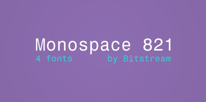
  2. Calligraphic 421 by Bitstream, $29.99
  3. Transitional 521 by Bitstream, $29.99
  4. News 701 by Bitstream, $29.99
  5. Freehand 521 by Bitstream, $29.99
  6. Flareserif 821 by Bitstream, $29.99
  7. Zapf Elliptical 711 by ParaType, $30.00
    The Bitstream version of Melior, a twentieth century modern face commissioned by Stempel and designed by Hermann Zapf in 1952. It is based on Zapf’s thoughts about the squared-off circle known as a super-ellipse. The type was originally intended as a newspaper text face by Linotype. Hermann Zapf’s Melior exhibits a robust character through classic and objective forms. Versatile and extremely legible, it can be used for a variety of texts and point sizes. Cyrillic version was developed by Natalya Vasilyeva and licensed by ParaType in 2002.
  8. Zapf Elliptical 711 by Bitstream, $29.99
  9. Geometric Slabserif 712 by ParaType, $30.00
    The Bitstream version of Monotype Rockwell, 1934. Twentieth-century design influence is revealed in strokes of more even weight than in the original nineteenth-century Egyptians or Slab Serifs. Rockwell is a prime example of this twentieth-century approach. It seems to be a simple Constructivist geometric sans with strong square slab serifs added to. Angular terminals make its sturdy design particular sparkling. It is a strong face for headlines and posters, and is legible in very short text blocks. Cyrillic version was developed at ParaType in 2000 by Isay Slutsker and Manvel Shmavonyan.
  10. Gothic 821 Condensed by Tilde, $39.75
  11. Square Slabserif 711 by Bitstream, $39.00
    A contemporary revival of early 20th century fonts, the Square Slabserif 711™ typeface family from the Bitstream library is perfect for contemporary print and interactive design projects. Its geometric structure of right angles and opposing round corners are ideally suited to current imaging devices. An added benefit is that they also give the design an enduring industrial strength demeanor. Available as three weights with relatively condensed proportions, the Square Slabserif 711 family will surely be a valuable addition to any professional collection of fonts.
  12. Monospace 821 WGL by Bitstream, $49.00
  13. Geometric Slabserif 712 by Bitstream, $29.99
  14. 21 Heads - Unknown license
  15. Triac 71 - Unknown license
  16. 21 Emmerson by Deniart Systems, $20.00
    A bit grungy, a bit stern, 21 Emmerson is a tribute to my birthplace and was designed with punky headline posters in mind. The simple lines of this font are angular and sharp - great for party posters, invitations, labels, etc.
  17. Linea 72 by OLOF Type Foundry, $25.00
    Linea 72 is a typical seventies display typeface that was designed by Roland Hirter back in the phototypesetting days, when typefaces were really drawn by hand. In this static environment each work step took its time. With the decision to digitize this typeface his son Thomas Hirter also chose to develop it further with todays technical possibilities. That’s why the font now includes over 600 glyphs and ten stylistic sets, offering different stylistic alternates of several letters. Linea 72 comes in the two original styles Regular and Kontur.
  18. 21 Cent by Letterhead Studio-YG, $45.00
    21 Cent - not Century or Clarendon. This is an original font family designed from scratch. 21 Cent is named after a magical coin that brings good luck. And well, in honor of the 21st century, of course. 21 cent family is used in the almanac of the State Hermitage Museum, St. Petersburg, Russia. All members of 21 Cent family include the expanded character set of with support of Cyrillics, Central European and Baltic languages.
  19. Lightbox 21 by Protimient, $21.00
    Lightbox 21 is a radical update of my previous version of a geometric sans serif. The design of the original Lightbox was fundamentally based on the idea of incorporating the proportions of the ‘Golden Ratio’ into each letterform; Lightbox 21 greatly improves on this concept by entirely abandoning it. The result is a much more readable, ‘natural’ typeface that retains elements of the original without being bound to it. Overall, Lightbox 21 has been designed to convey that classic feel of a geometric sans that makes the genre so tremendously enduring and versatile, as well as providing an effortless sense of class to whatever they are applied. Primarily intended for editorial work (i.e. short to medium length texts) or display settings, Lightbox 21 has a reasonably extensive character set, including support for Vietnamese, many currency symbols, arrows, and small caps. It also has OpenType support for nut fractions (via a stylistic set) and a barred alternate uppercase i and an alternate curled j.
  20. Triole 21 by KaiserType, $40.00
    "Triole 21" is the name of a gothic script font designed by Bertram Kaiser. The forms of this so called "Rotunda" script are based on the manuscripts of italian calligraphers of the late 14th century. Inspiration for this project also comes from the calligrapher Lisa Beck. The glyphs were first written with a broad-nib and then digitized. The Open-Type font is equiped with multilingual (Latin-based) alternates, ligatures and oldstyle figures for various typographical purposes. It can be used for headlines and also stays legible in smaller textsizes for longer textpassages.
  21. 21 Kilobyte Salute - 100% free
  22. Goonatic 72 Plus by Andrew Fortnum, $9.99
    It is highly recommended to use this font at 72pts or higher. GOONATIC 72 PLUS is intended to be used primarily for headlines. Enjoy!
  23. Monotype Egyptian 72 Extended by Monotype, $29.99
  24. Maiers Nr 21 Pro by Ingo, $42.00
    A handwritten ”font for technicians“ from ca. 1900. Very geometrical, rigid forms borrowed from the typical characteristics of Jugendstil / Art Nouveau. This script is found in a magazine from the Otto Maier publishing house, Ravensburg, which was issued sometime in the years shortly before WWI. The magazine is entitled ”Schriften-Sammlung für Techniker: Verkleinerte Schriften der wichtigsten Alphabete“ (Collection of scripts for technical specialists: reduced scripts of the most significant alphabets) and published by Karl O. Maier. The original copy, produced by means of a galvanized plate, is just 7 centimeters wide. It served as the model for technical professions in which, at that time, the captions of drawings were still done by hand. The characters have been scanned, digitized and greatly magnified. Special attention was given to ensure the ”uneven“ edges, typical of handwritten script, remained effectively noticeable even in the digitized form. As a result, this ”technical“ font retains a handmade touch. Especially worthy of note are the Jugendstil forms characteristic at the turn of the19th century. In comparison, many alleged ”ultramodern“ font types of today suddenly look quite old-fashioned. Maier’s Nr. 21 Pro is suitable for all European languages. It includes ”Latin Extended-A,“ for Central and Eastern Europe incl. Turkish, and even Cyrillic and Greek, too. The font includes several stylistic alternates as well as a number of ligatures.
  25. Andada - 100% free
  26. Ihminen - Unknown license
  27. Averia Serif - 100% free
  28. ImperiumSerif - Unknown license
  29. Senats-Antiqua - 100% free
  30. Vtg Stencil US No 72 by astype, $42.00
    The Vtg Stencil series of fonts from astype are based on real world stencils. All styles offering an extended Latin character set. » pdf specimen «
  31. Philosopher - 100% free
  32. Gill Sonos - Unknown license
  33. Fontin - Unknown license
  34. Droid Sans - 100% free
  35. Lido STF - Personal use only
  36. 1543HumaneJenson - Personal use only
  37. Gentium - 100% free
  38. Casa Sans - 100% free
  39. Bitstream Vera Sans - Unknown license
  40. Garava - 100% free
Looking for more fonts? Check out our New, Sans, Script, Handwriting fonts or Categories
abstract fontscontact usprivacy policyweb font generator
Processing