10,000 search results
(0.035 seconds)
- Destinys by Maulana Creative,
$14.00 Destinys Script and Sans Font Duo is a modern script and display sans font. With regular marker stroke and bold sans stroke, fun character with some of ligatures. To give you an extra creative work. Destinys Script and Sans font support multilingual more than 100+ language. This font is good for logo design, Social media, Movie Titles, Books Titles, a short text even a long text. Make a stunning work with Destinys Script and Sans font. Cheers, MaulanaCreative
 - Machiarge by Dharma Type,
$19.99 Best selling baseball script, Distinctive brush stroke inspired by retro 20th century’s movie.
 - Breezy by Wiescher Design,
$19.00 »Breezy« is a brush script with very expressive strokes and surprising connections. »Breezy« is a great script if you really want to have that crude, rough feeling.
 - Arabetics Aladdin by Arabetics,
$34.00 Arabetics Aladdin is a monoshape font family with a fixed single shape per each Arabic Unicode character. Glyphs are designed to incorporate the traditional Arabetic visual characteristics found in all four varying shapes, isolated, initial, medial, and final, for each letter. The overall design also emphasizes the line-like (khat) horizontal look and feel of the Arabetic scripts without sacrificing legibility. This font family supports all Arabetic scripts covered by Unicode 6.1, and the latest Arabic Supplement and Extended-A Unicode blocks, including support for Quranic texts. It includes two weights: regular and bold, each of which has normal and left-slanted (Italic) versions. The design of this font family follows the Arabetics Mutamathil style design principles utilizing varying x-heights and no glyph substitutions. The Mutamathil type style was introduced by the designer more than 18 years ago. The Arabetics Aladdin font family includes all required Lam-Alif ligatures in addition to all soft vowel diacritics (harakat), which are selectively positioned with most of them appearing on similar high and low levels—top left corner—to clearly distinguish them from the letters. The Tatweel or Kashida lengthening character is a zero-width glyph.
 - Khatt by Arabetics,
$39.00 Khatt tries to mimic the concept behind the meaning of the Arabic word Khatt: a straight horizontal line. The word Khatt is also the word for calligraphy in the Arabic language. Even though Khatt is a cursive style font it offers clearly distinguished and visually unified letter shapes in every position of a word. Khatt supports all Arabetic scripts covered by Unicode 6.1, and the latest Arabic Supplement and Extended-A Unicode blocks, including support for Quranic texts. It comes with five weights, regular, medium, bold, light, and ultra-light. Each weight has normal and left-slanted “italic” styles. The script design of this font family follows the Arabetics Mutamathil Taqlidi style and utilizes varying x-heights. The Mutamathil Taqlidi type style uses one glyph per every basic Arabic Unicode character or letter, as defined by the Unicode Standards, and one additional final form glyph, for each freely-connecting letter in an Arabic text. Khatt includes the required Lam-Alif ligatures in addition to all vowel diacritic ligatures. Katts’s soft-vowel diacritic marks (harakat) are positioned with most of them appearing on similar lower or upper positions to emphasize they are not part of letters.
 - HU Life Style by Heummdesign,
$15.00 English HU Life Style is a headline font designed by using curves and straight lines in harmony. The end of the stroke is designed with a rounded diagonal line, and the horizontal stroke is relatively thin, giving a sense of rhythm. It is a font that is thick and large, so it is a good font to be recognized at a glance. There are 1 weights of HU Basic Round : ExtraBold & Italic Cyrillic HU Life Style - это шрифт заголовка, в котором гармонично сочетаются кривые и прямые линии. Конец мазка представляет собой закругленную диагональную линию, а горизонтальный штрих относительно тонкий, что дает ощущение ритма. Это толстый и большой шрифт, поэтому его легко узнать с первого взгляда. HU Life Style имеет 1 толщины: Экстра жирный и курсив Greek Το HU Life Style είναι μια επικεφαλίδα γραμματοσειρά σχεδιασμένη χρησιμοποιώντας αρμονικές καμπύλες και ευθείες γραμμές. Το τέλος της διαδρομής έχει σχεδιαστεί με στρογγυλεμένη διαγώνια γραμμή και η οριζόντια διαδρομή είναι σχετικά λεπτή, δίνοντας μια αίσθηση ρυθμού. Είναι μια γραμματοσειρά που είναι παχιά και μεγάλη, οπότε είναι μια καλή γραμματοσειρά που αναγνωρίζεται με μια ματιά. Υπάρχουν 1 βάρη του HU Life Style : ExtraBold & πλάγια
 - Hastafi by Mans Greback,
$49.00 Hastafi is a classy serif typeface. It is naturally bold, with contrasting, hairline thin horizontal strokes, and a confident character. Use it for any project that needs that extra bit of elegance and personality, without losing the thoughtfulness and authenticity of a serious serif font. The Hastafi family consists of eight beautiful styles: The Regular, for a medium and normal variety, and the flowing Italic version. It also contains a swash style for decorative additions to the letters, and each of the styles as an emphasized Bold. The font is built with advanced OpenType functionality and has a guaranteed top-notch quality, containing stylistic and contextual alternates, ligatures and more features; all to give you full control and customizability. It has extensive lingual support, covering all Latin-based languages, from North Europe to South Africa, from America to South-East Asia. It contains all characters and symbols you'll ever need, including all punctuation and numbers.
 - Between The Lines BF by Bomparte's Fonts,
$29.00 The famous Catalan architect, Antoni Gaudí, used to say “there are no straight lines or sharp corners in nature…” However, with Between The Lines that’s exactly what you’ll find: straight lines, parallel and perpendicular, all in a glorious display of Art Deco style. Here the verticals and horizontals dominate while the diagonals “sit this one out”. Curvilinear lines also run free here: they serve as refreshing counterpoints to prominent straights. These forms suggest a somewhat expressive script-like characteristic, (especially in lowercase) wherever the font’s many initials, terminals and contextual alternates are employed. Between The Lines offers many options for alternate letterforms (ligatures, stylistic alternates, contextual alternates, etc.). When these OpenType features are used judiciously and selectively, your typography will be greatly heightened. You’ll find BTL right at home in a number of environments: music album covers, snack food packaging, magazine headlines, cosmetics, signage and more. PLEASE NOTE: due to its very tall ascenders, Between The Lines benefits from generous leading (line spacing). Multilingual support included.
 - P22 Counter by IHOF,
$39.95 Canadian designer Patrick Griffin made P22 Counter as an exercise in exploring the limits of counter-space and interchangeability between extremely geometric and standard calligraphic forms. Within a field of solid stems and horizontal strokes, parallel lines and curves play the role of counterparts to define square and round shapes, making what’s revealed just as interesting as what’s withheld. Each of the three basic Counter fonts stakes its own aesthetic territory, from clean basic minimalism, through the nostalgia of exuberantly pixel-based design, and on to calligraphic-cum-typographic, all within clear and precise geometric parameters. Counter Pro comes with that entire range included in a single font, giving its user the ability to move freely in a visual space and counter-space that can be defined by more than 1450 glyphs. While all the fonts come with extended Latin language support, P22 Counter Pro includes all three fonts in one font, many alternates, swashes and ending forms that are not available in the basic fonts.
 - Ponderosa by Adobe,
$29.00Ponderosa font is a joint work of the typeface designers K.B. Chansler, C. Crossgrove and C. Twombly, who also created Rosewood, Zebrawood and Pepperwood together. As the name suggests, it is so-called wood type. The origins of this kind of typeface can be found in the early 19th century. Called Italian or Italienne, these typefaces quickly became very popular. They are distinguished by square serifs whose width is larger than the stroke width of the characters. When the letters are set together, the heavy serifs build dark horizontal bands. The distinguishing characteristic of Ponderosa lies in its extremely fine figures between heavy serifs. The designers approached the boundaries of the impossible with this contrast. The typeface is reminiscent of the Wild West with its shootouts and heroes as well as of the 1970s with their platform shoes and wild hair-dos. When used carefully in headlines, Ponderosa font will surely attract attention. - Jellybrush by Sentinel Type,
$25.00Looking like gifted jelly and falling in between cushions and cat food, this plump and inviting letter mixes simplicity with organic style for a wide range of uses. Jellybrush's compact cursive forms and robust friendliness draw on artbrush scripts, blending brush effects with synthetic forms. A versatile workhorse suitable for: * Dairy & beverage * Sweets & soft drink * Five minute food & sauces * Pet food & accessories * Bathroom & kitchen * Cushions, pillows, rubber & swimming pool, etc. Jellybrush is designed to take squishing and outline treatments and still look good. Squish it down in your application of choice, the letter proportions withstand horizontal compression easily. Jellybrush italic is a subtly-slanted fully cursive variant with the character width, counter size and hanging figures required for good text performance. Designed for supplementary text for packaging and advertising comps and any application requiring readable text matching the main font. The font packages contain two (2) formats of Jellybrush, in OpenType & TrueType flavors. - Core Sans ES by S-Core,
$29.00 The Core Sans ES Family is a rounded version of Core Sans E and a part of the Core Sans Series such as Core Sans N, M, A, G, D. This is a modernized grotesque font family with horizontal terminals, low stroke contrast, enclosed apertures and little line width variation. Its tall x-height makes the text legible and the spaces between individual letter forms are precisely adjusted to create the perfect typesetting. The Core Sans ES Family consists of 9 Weights (Thin, ExtraLight, Light, Regular, Medium, Bold, ExtraBold, Heavy, Black) and Italics for each format. It supports WGL4, which provides a wide range of character sets (CE, Greek, Cyrillic and Eastern European characters). Each font includes support for Superiors and Inferiors, Fractions, Tabular numbers, Arrows, Mathematical operators and Opentype Features such as Proportional Figures, Tabular Figures, Numerators, Denominators, Superscript, Scientific Inferiors, Subscript, Fractions, Case Features and Standard Ligatures. We highly recommend it for use in books, web pages, screen displays, and so on.
 - Serat by Wahyu and Sani Co.,
$24.00 Serat is a medium contrast flared serif with mixed up styles of classic typefaces which is highly influenced by early stages of Latin based hand writing. The lowercase are modernized versions of Carolingian minuscules, vertical stems which touch the baseline have been modified to have horizontal cut for simpler look and keep the calligraphic style for terminals & stroke ends. Then the uppercase are flared serif which were influenced by Roman inscriptional capitals. The font name was taken from the Javanese word "serat" which means writing (noun). It comes with some unique features, such as: - Carolingian style alternate for some letters (a,e,f,g,t), also comes with separated stylistic set for long 's', and long left leg 'x' and alternative ampersand. - Discretionary ligatures for all caps titling. - Standard Ligatures. - Tabular and Proportional for both Lining and Old-style figure. - Fraction with Nominator and Denominator. - Superscript and Subscript for numbers, etc. Serat would be suitable for "classic" themed work; poster, book cover, branding, videography, etc.
 - HS Albadr by Hiba Studio,
$59.00 HS Albadr is an Arabic display typeface. It is useful for book titles and graphic projects where a contemporary, geometrical and streamlined look is desired. The font is based on the simple lines of modern and simplified Kufi calligraphy that support Arabic, Persian and Urdu. It has one weight only which is similar to the bold weight. This typeface is created for being used in technical and engineering companies under strict geometric conditions . The company desires to follow the geometrical shape with uniform and equal dimensions in both vertical and horizontal storks; where some parts of the letters are to be cut at a slanting angle of 45 degree to give the impression of a coherent geometrical nature for this font. The typeface HS Albadr is considered as a chain of geometric fonts series designed for engineering companies. After HS Almohandis and HS Alhandasi were designed we are looking forward to giving some additions to the geometric typefaces field.
 - ITC Abaton by ITC,
$29.00 ITC Abaton, by Argentinian designer Luis Siquot, is an exercise in geometry and simplification. “It is done,” says Siquot, “with few elements, with modules of only straight lines (horizontals, verticals and diagonals of almost 45 degrees). Drawing the I and the O, I got the basic elements, and so started the fight between strict geometry and optical impression, until I obtained the rest of the characters.” The basic rectangular form is characterized by wedge-shaped serifs, almost like caps on the heads and feet of the letters. “Abaton has the 'spirit' of 19th-century faces used on money bills or postage stamps, but the realization is totally different,” Siquot explains. Abaton is a “shaded” typeface of caps and slightly smaller caps, upright and slightly condensed in form. Although the letterforms are legible at small sizes, the shading tends to clog up if it gets too small, so Abaton is happiest as a distinctive display face.
 - Squickt by Wiescher Design,
$39.50 Squickt was the first script I designed. The name is an atrocity, I don't remember what was on my mind, when I decided on that name, but after 25 years it is to late to change, so I have to stick with it. I have recently gone over the script and changed a little stroke here, a curve there and I added Small-Caps. The font is very useful for all kinds of signs, that have to look spontaneous. You can even condense or extend it without me going berserk; Squickt is very robust. Your scribe Gert Wiescher
 - Squaripeg by Andy Peat,
$9.00 About this font family Squaripeg is a funky square typeface with geometric shapes to create impactful headlines and web banners. This typeface was designed so that it takes up less horizontal space but still has a lot of prominence on the page. Some letters have been combined into one unit to save further space. Features 8 weights (from thin to black) Multi language Ligatures To be able to access alternative fonts, make sure the software you use can support opentype features such as Microsoft Word, Paint, Adobe, Corel draw, Cricut and other applications. Designed and published by Andy Peat. Released April 2022
 - Skope by Type-Ø-Tones,
$62.00 Skope is an experiment in horizontal stress and also a recreation of the extreme lettering style of comic masters such as Josep Coll or Manuel Urda from his cartoons in the pages of the classic TBO (Barcelona, Spain, 1917-1998) or our contemporary favorites Francesc Capdevila -Max- and Joost Swarte. The proportions and some of the fundamental features of Skope are drawn from the features of the masthead of the magazine Triunfo (Valencia, Spain, 1946-1982). The inspiration for the numbers comes from a kitchen clock from the 70’s photographed in the distance in a second-hand shop.
 - Missing Stone by Pesic,
$29.00 Missing Stone features grunge rough, lapidary, antique look inspired by letters carved in stone plates. Capital glyphs are, although damaged, satisfactorily legible, whereas instead of lowercase letters, capital glyphs are placed, also featuring nearly abstract, hardly legible look, cross cut with rough horizontal lines and dots. The overall visual experience is rough, reminiscent of erosion of stone and disintegration. Capitals are legible and of small size, whereas the second group can be used only in bigger size, whereby rendering an interesting text texture in the course of alternate use. The font contains all the Latin accented characters used in European languages.
 - Used Servers by AltaTech,
$17.99 Jump back to the future with both faces of the Used Servers family. This blocky titling font comes ready with ligatures and diacritics for all of your English, French, and German retro-future needs. Art Deco density combines with subtly-weighted horizontals for a slight 3D effect. As a retro omni-technical font with roots in OCR and n-segment displays, Used Servers is equally at home as: Titling in an 80s cassette-punk text adventure Environmental advertising in a cyberpunk megalopolis Art Deco filigree worked into a sacred orb Glyphs holding secrets from before time
 - Blom by The Northern Block,
$29.95 Blom is a humanist sans with subtle squarish character in reverse contrast. The combination of heavy horizontals and modern geometry give the typeface a unique visual aesthetic whilst making small text perfectly readable. Blom bucks the trend of conventional letterforms in favour of a versatile typeface with bags of originality, that is both inventive in style yet completely functional in a wide range of intended uses. Details include 463 characters, six weights with matching italics and five variations of numerals. Opentype features include inferiors, superiors, fractions, slashed zeros, case-sensitive forms, ligatures and language support covering Western, South and Central Europe.
 - Ned by Linotype,
$29.99Ned Std. is part of a series of typographic experiments from the young Swiss designer Michael Parson. Using a wide, horizontal hexagonal grid, Parson created the system of letters that make up this font. Text set in Ned Regular takes on a modular, honeycomb-like appearance. For an interesting effect, try overlapping individual letters, or use a few letters together as elements in a logo. A great companion face to Ned Std. is Linotype's Hexatype Bold. Both Ned Std. and Hexatype Bold have been included in the Take Type 5 collection, along with eight further constructions from Parson." - Porchlight by Ana's Fonts,
$15.00 Porchlight is a soft serif font inspired by vintage French typography. It includes three weights: regular, semi bold and bold, with matching italics. It also includes bonus ornaments that complement the font beautifully, for elegant and easy designs. Included in this trendy font family: 6 fonts: regular, semibold and bold, plus italics, with over 300 glyps each, including small caps and lots of ligatures. ornaments font with 52 ornaments (13 different designs, mirrorred horizontally and vertically). borders font, with borders with different thickness. Use Porchlight in print layouts, logotype design, social media posts, branding and packaging.
 - Density by Alandya TypeFoundry,
$15.00 Density Heavy Slab Serif Features a smooth slab serif and a wide surface that makes it especially suitable for horizontal and lengkungan compositions. This is a front view, best used at larger sizes when weight and impact are desired. It's classic with a modern edge and most importantly packed with different styles, and ligatures Density is a heavy slab serif that comes with regular, oblique, outline, outline slanted, rough, rough slanted, extrude and extrude slanted style. this font is perfect for every project. suitable for branding logo, badge design, or apparel design. This font also comes with multilingual support.
 - Culebra by Mysterylab,
$18.00 Culebra is a neo-traditionalist small-caps font designed in the tradition of high-end metalwork craftspeople and Western & Victorian sign-painting styles. With a bit of a nod to the standard of perennial favorites like Copperplate Gothic font, Culebra brings some eye-catching design touches and a more condensed structure for more economical use of horizontal space. It's a font that is as readable as they come, and would hardly be out of place in any design context, as it truly takes on a complementary vibe to almost any font style you want to pair it with.
 - Iwan Zaza Arabic by Zaza type,
$29.00 Iwan Zaza is a high-contrast modern Arabic typeface designed by Ahmed Zaza. The design is inspired by the Kufi calligraphic style and influenced by the Naskh style. Iwan balances classic and contemporary tastes with wide open counters and short ascenders and descenders that minimize the hight. And has a high - contrast between the vertical and the horizontal to line up in harmony with Latin. And openType alternates and ligatures set. This makes it suitable for branding, editorial, packaging and advertising. Iwan features five weights from Light to Black, and supports OpenType features for Arabic, and has a wide glyph set.
 - Montix by Linotype,
$49.00Montix is a narrow, constructed type family that developed by the German designer Diana Fischer in 2003. With five weights (light, light italic, regular, regular italic, and bold), Montix is a particularly effective small family, especially when used for headline or display purposes. Montix's letterforms have relatively long ascenders and descenders, which compared with its horizontally compact body gives it its unique style. Words or lines of text set in Montix would look best when some amount of white space is left around them. Because of this, the faces are well suited for logos and corporate identity uses. - Neue Swift by Linotype,
$50.99 The original Swift (1985) proved its worth in corporate identities, magazines and newspapers and occasionally in books. It is a versatile type and can be used in a wide range of circumstances. It is a striking type, with large serifs, large counters and letters that produce a particularly strong horizontal impression. This means that words and lines in Neue Swift are easily distinguished, even where there are large spaces between words, as can occur in newsprint. Neue Swift's large, robust counters were designed to improve legibility particularly in newspapers. It was designed in the early eighties, when papers were less well printed than they are today, and its special features help it survive on grey, rough paper printed on fast rotary presses. Today it is used more often outside newspapers than in them. Neue Swift (2009) is the newest version of the Swift concept. It has been improved by technical and aesthetic enhancements, and has been expanded into a family of twelve variants. Featured in: Best Fonts for Logos, Best Fonts for Websites, Best Fonts for PowerPoints
 - HS Sondos by Hiba Studio,
$40.00 HS Sondos is an Arabic display typeface designed specifically for titles and graphic projects. Drawing inspiration from Modern Kufi calligraphy, the font features a harmonious fusion of sharp and curved lines, resulting in a visually captivating and innovative take on square shapes and geometric structures. The distinctive sharp endings at the bottom of each character add an extra touch of aesthetic appeal. With three available weights -regular, bold, and black- HS Sondos offers versatility and variety. The black weight introduces a novel concept by maintaining the same horizontal dimensions as the regular weight but expanding the vertical dimensions, creating a uniquely bold appearance. Supporting Arabic, Persian, and English languages, HS Sondos opens up a world of possibilities for designers looking to enhance their Arabic typography. Its visually striking and flexible nature makes it an excellent choice for projects that demand attention and creativity. Overall, HS Sondos stands as a testament to the beauty and adaptability of Arabic typography, empowering designers to bring their visions to life with a captivating and versatile typeface.
 - Mikhael Handwritten by Letterara,
$16.00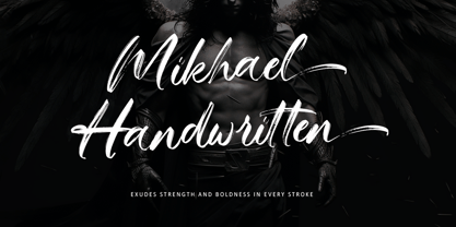 Introducing Mikhael Handwritten, an authentic brush script font that brings a raw and energetic vibe to your designs. With its dynamic strokes and natural brush texture, this font is crafted to make a bold statement in logos, posters, packaging, and various design projects. Its striking appearance and smooth flow make it an ideal choice for conveying a strong and stylish impression. PUA encoding ensures effortless access to all the expressive glyphs. Elevate your projects with Mikhael Handwritten, a font that effortlessly infuses vigor and character into your creative endeavors.
 - Avenir Next Cyrillic by Linotype,
$49.00 The original Avenir typeface was designed by Adrian Frutiger in 1988, after years of having an interest in sans serif typefaces. The word Avenir means “future” in French and hints that the typeface owes some of its interpretation to Futura. But unlike Futura, Avenir is not purely geometric; it has vertical strokes that are thicker than the horizontals, an “o” that is not a perfect circle, and shortened ascenders. These nuances aid in legibility and give Avenir a harmonious and sensible appearance for both texts and headlines. In 2012, Akira Kobayashi worked alongside Avenir’s esteemed creator Adrian Frutiger to bring Avenir Next to life, as a new take on the classic Avenir. The goal of the project was to take a beautifully designed sans and update it so that its technical standards surpass the status quo, leaving us with a truly superior sans family. Since then, Monotype expanded the typeface to accommodate more languages. Akira’s deep familiarity with existing iterations of the Frutiger designs, along with his understanding of the design philosophy of the man himself, made him uniquely suited to lead the creation of different language fonts. Avenir Next World family, the most recent release from Monotype, is an expansive family of fonts that offers support for more than 150 languages and scripts that include Latin, Cyrillic, Greek, Hebrew, Arabic, Georgian, Armenian and Thai. Avenir Next World contains 10 weights, from UltraLight to Heavy. The respective 10 Italic styles do not support Arabic, Georgian and Thai, since Italic styles are unfamiliar in these scripts/languages. Separate Non-Latin products to support just the Arabic, Cyrillic, Georgian, Hebrew and Thai script are also available for those who do not need the full language support.
 - Avenir Next World by Linotype,
$149.00 The original Avenir typeface was designed by Adrian Frutiger in 1988, after years of having an interest in sans serif typefaces. The word Avenir means “future” in French and hints that the typeface owes some of its interpretation to Futura. But unlike Futura, Avenir is not purely geometric; it has vertical strokes that are thicker than the horizontals, an “o” that is not a perfect circle, and shortened ascenders. These nuances aid in legibility and give Avenir a harmonious and sensible appearance for both texts and headlines. In 2012, Akira Kobayashi worked alongside Avenir’s esteemed creator Adrian Frutiger to bring Avenir Next to life, as a new take on the classic Avenir. The goal of the project was to take a beautifully designed sans and update it so that its technical standards surpass the status quo, leaving us with a truly superior sans family. Since then, Monotype expanded the typeface to accommodate more languages. Akira’s deep familiarity with existing iterations of the Frutiger designs, along with his understanding of the design philosophy of the man himself, made him uniquely suited to lead the creation of different language fonts. Avenir Next World family, the most recent release from Monotype, is an expansive family of fonts that offers support for more than 150 languages and scripts that include Latin, Cyrillic, Greek, Hebrew, Arabic, Georgian, Armenian and Thai. Avenir Next World contains 10 weights, from UltraLight to Heavy. The respective 10 Italic styles do not support Arabic, Georgian and Thai, since Italic styles are unfamiliar in these scripts/languages. Separate Non-Latin products to support just the Arabic, Cyrillic, Georgian, Hebrew and Thai script are also available for those who do not need the full language support.
 - Avenir Next Hebrew by Linotype,
$79.00 The original Avenir typeface was designed by Adrian Frutiger in 1988, after years of having an interest in sans serif typefaces. The word Avenir means “future” in French and hints that the typeface owes some of its interpretation to Futura. But unlike Futura, Avenir is not purely geometric; it has vertical strokes that are thicker than the horizontals, an “o” that is not a perfect circle, and shortened ascenders. These nuances aid in legibility and give Avenir a harmonious and sensible appearance for both texts and headlines. In 2012, Akira Kobayashi worked alongside Avenir’s esteemed creator Adrian Frutiger to bring Avenir Next to life, as a new take on the classic Avenir. The goal of the project was to take a beautifully designed sans and update it so that its technical standards surpass the status quo, leaving us with a truly superior sans family. Since then, Monotype expanded the typeface to accommodate more languages. Akira’s deep familiarity with existing iterations of the Frutiger designs, along with his understanding of the design philosophy of the man himself, made him uniquely suited to lead the creation of different language fonts. Avenir Next World family, the most recent release from Monotype, is an expansive family of fonts that offers support for more than 150 languages and scripts that include Latin, Cyrillic, Greek, Hebrew, Arabic, Georgian, Armenian and Thai. Avenir Next World contains 10 weights, from UltraLight to Heavy. The respective 10 Italic styles do not support Arabic, Georgian and Thai, since Italic styles are unfamiliar in these scripts/languages. Separate Non-Latin products to support just the Arabic, Cyrillic, Georgian, Hebrew and Thai script are also available for those who do not need the full language support.
 - Lourdes by insigne,
$24.99 Lourdes is an informal script font drawn with quick, thick brush strokes. The script appears to be quickly dashed down, and the characters were carefully designed to create a subtle rhythm. The strokes are slightly muted to avoid an overly aggressive appearance. Lourdes has a wonderful active tempo that works well for headlines, logotypes and signage.
 - Dog Eared by Andy Babb,
$19.20 Each character of Dog Eared began its life as a half-inch wide strip of paper, folded and Scotch-taped into formation, and then scanned and recreated digitally. Dog Eared is distinguished from other folded paper style typefaces by its robustness and versatility: each numeral and upper- and lowercase letter has a stylistic alternate. Dog Eared Striped is a traditional single color font, while Dog Eared Solid is a chromatic variant that can be used for a two-toned effect. Layer and multiply Dog Eared Striped and Dog Eared Solid together to achieve even more color variety.
 - China - Unknown license

- Familytalk by Ditatype,
$29.00 Familytalk is a script font that exudes confidence and elegance in every character. With its thick and sturdy strokes, this font commands attention. The swinging endings on certain letters provide a delightful sense of rhythm and flow to the text. These unique design elements create a sense of movement within the text, making it visually captivating and engaging. Despite its thick weight, Familytalk maintains excellent legibility. Its ability to strike a balance between boldness and grace makes it a versatile choice for projects that demand a stylish script font. Familytalk fits in headlines, logos, posters, flyers, branding materials, print media, editorial layouts, and many more designs. Find out more ways to use this font by taking a look at the font preview.
 - Madeleine by insigne,
$11.95Madeleine is an open script face with influence from early 50s scripts. The stroke doesn't have much variation, and the characters are wide and flowing. The script also features OpenType end swashes and discretionary ligatures to extend the twirling and fluid nature of the script. This mischievous script is useful for informal invitations, scrap booking or whenever you need a retro look. - Libertinas-co. - Personal use only

- Lovely Amatis Signature - Personal use only


