10,000 search results
(0.054 seconds)
- BILLY ARGEL FONT - Personal use only

- JANDA Love And Rain - Personal use only

- War Letters - Personal use only

- Selfish - 100% free

- Stefan Budde-Siegel - Personal use only

- LYSSA DEMO VERSION - Unknown license

- Moeflon - Unknown license

- Life-Lessons - Personal use only

- Venice Classic - Unknown license

- LostWages - 100% free

- LT Beverage - 100% free

- Megalito Slab ExtCond - Personal use only

- Castor by Albatross,
$20.00 Castor is a woodtype and letterpress hybrid based on grotesque letterforms. It’s a vintage decorative bold distressed display with 3 options for each letter; Uppercase, lowercase, and alternates. Castor comes complete with 4 styles plus catchwords, unique ‘catchword dividers’ (horizontal rules), ornaments, as well as a free set of extras! (grunge, dividers and bullets) The catchwords, ornaments, and dividers are designed to compliment the font family giving it a ton of diversity, and the designer unlimited creative options. Opentype features include alternate letters and numbers, double letter ligatures for realism, subscript numbers,and superscript numbers.
 - Swissra by Abjad,
$35.00 Swissra is an Arabic typeface that was inspired from Swiss graphic design. The motivation behind the typeface was to create a neutral and carefully crafted Arabic font family that can be used on many different applications. Swissra also aspires to tribute the experience of Swiss graphic design and pass it on to the Arabic graphic design scene. Swissra features sharply cut terminals, which are either horizontal or vertical. It also features closed apretures and a high x-height. It comes with eight weights, that range from thin to black.
 - Atrium by Alex Jacque,
$20.00 Atrium, designed by Alex Jacque, is a strong, linear, geometric sans-serif display typeface based off century-old pen art by W.E. Dennis. Atrium's stubbornly geometric letterforms are set off with a few softening flourishes on a few glyphs. It's sharp corners, straight verticals and horizontals make Atrium pack some punch when used in headlines, pull quotes, and logotypes. Atrium was released in 2012 in OpenType format and comes in three different weights: light, regular, and bold, with a regular and oblique version of each for a total of 6 styles in the family.
 - Kondolarge by TypeK,
$39.00 Kondolarge is a slab serif typeface developed from our successful Kondolar in 2011. Based on a simple skeleton, straight sides, gently curved horizontals and sturdy serifs, Kondolarge is a bit more geometric than the prior. It is suitable for both text and display. With a well-built character set including small caps and several numeral styles. The font comes in 9 styles, ranging from a delicate Thin to Black, with matching italics, resulting in a total of 18 weights. Kondolarge contains a set of 800 characters that support over 200 Latin-based languages.
 - VerticalFlipJJ by Ingrimayne Type,
$9.95 Many years ago I created two upside-down typefaces, UpsidedownJJ and UpsidedownTOC. They were based on monospaced or typewriter fonts, and were rotated 180 degrees, which is the same as a vertical flip followed by a horizontal flip. Recently I was reminded that this way of creating an upside-down typeface is not the only way to create an upside-down typeface--a simple vertical flip creates a different one. That is what this typeface is, a simple vertical flip. The original typeface on which this one is based is JetJaneMono.
 - Foundry Flek by The Foundry,
$99.00 Foundry Flek and Foundry Plek are created on the same dot matrix grid system. Each family includes: light, regular, medium and bold weights – with a selection of dot patterns that can extend the grid vertically and horizontally. The underlying matrix common to each weight allows experimentation with overlays, and mixing weights produces varying effects. Foundry Plek used conventionally works well for serious correspondence, with a 'typewriter font' effect. Foundry Flek has an integral dot matrix grid as a background. With these two fonts a whole new graphic language can be explored.
 - Saturknight by Echopraxium,
$13.50 Saturnight Regular is a proportional and kerned typeface. The name is a variation of Saturnight, which is itself the anagram of Unstraight. This is because vertical lines are Unstraight sticks. It's a consequence of the Design rule * Glyphs are built from segments on a triangular tessellation (cf. poster 1) Note 1: Unstraight lines depend from the chosen tesselation orientation (here the tesselation has horizontal lines and thus Unstraight verticals). Note 2: The encoding is Windows Latin 'ANSI', which includes Icelandic characters (as illustrated by poster 3).
 - VerticalFlipTOC by Ingrimayne Type,
$9.95 Many years ago I created two upside-down typefaces, UpsidedownJJ and UpsidedownTOC. They were based on monospaced or typewriter fonts, and were rotated 180 degrees, which is the same as a vertical flip followed by a horizontal flip. Recently I was reminded that this way of creating an upside-down typeface is not the only way to create an upside-down typeface--a simple vertical flip creates a different one. That is what this typeface is, a simple vertical flip. The unflipped typeface from which VerticalFlipTOC is derived is TiredOfCourier.
 - Pork Chop by Font Kitchen,
$9.99 Order a platter of sizzling Pork Chop, a sans serif from Font Kitchen. Rounded squared contours and horizontal terminals give this serif typeface a futuristic feel, while still remaining readable at smaller sizes. 10 weights are available with obliques, weighing in at 20 styles, each fresh cut and farm-raised. This font family is served with sides of expansive ligatures, kerning pairs, stylistic alternates, proportional and tabular figures, and versatile fractions. Pork Chop is a great way to add a calculated, futuristic, yet still approachable feel to your next project.
 - ITC Florinda by ITC,
$29.99 ITC Florinda was designed by Luis Siquot in 1997 and consists exclusively of capital letters. The basic forms were influenced by old favorites like Franklin Gothic, but Siquot ornamented the classic forms with symmetrical knobs which look like pieces of lead left over after pouring the forms. This gives the figures a playful, constructed look. When used in a text, the horizontal lines seem to come together to draw a fine line through the middle of the lines of text, giving it an ornamented character. ITC Florinda should be used exclusively for headlines or display.
 - Foundry Plek by The Foundry,
$99.00 Foundry Plek and Foundry Flek are created on the same dot matrix grid system. Each family includes: light, regular, medium and bold weights – with a selection of dot patterns that can extend the grid vertically and horizontally. The underlying matrix common to each weight allows experimentation with overlays, and mixing weights produces varying effects. Foundry Plek used conventionally works well for serious correspondence, with a 'typewriter font' effect. Foundry Flek has an integral dot matrix grid as a background. With these two fonts a whole new graphic language can be explored.
 - Orto by LetterPalette,
$20.00 Orto is a type family of sans serif fonts in eight weights. It's a humanist typeface with real cursive, containing both Roman and Italic styles. The letters are designed to look good on screen, they have a bit narrower proportions and simple shapes. Their structure is based on flat horizontal and vertical strokes, which are emphasized wherever possible. That’s where the name comes from: Orto is an abbreviation of the word orthogonal. Thanks to its narrow width, the typeface is less space-consuming and adapts well to the screens of smaller devices. It is legible in small sizes, thanks to the larger x-height. The characteristic details, like bent ends of diagonal strokes, stand out when used in larger sizes. Orto can be used equally good in print and its overall neutral look fits different contexts. However, its character is pretty recognizable. Orto contains Latin and Cyrillic script and covers six codepages: Latin 1, Latin 2, Cyrillic, Turkish, Windows Baltic and MacOS Roman. It has basic OpenType features like ligatures, oldstyle numerals, proportional and tabular lining figures, fractions, superiors, etc. Capital German sharp S shows up when the lowercase is typed between two uppercase letters, and the Contextual Alternates feature is turned on. The Stylistic Set 01 changes the shape of the Cyrillic b. The Stylistic Set 02 is a shortcut for using Serban Cyrillic alternatives that differ from Russian in cursive.
 - Text Tile by Tetradtype,
$25.00 TextTile is a system of heavy sans titling faces which can be utilized to carry a repeating chromatic pattern across words and letters. It stands apart from other chromatic faces, where layered effects typically interact only within each letter and do not carry through from one letter to another. The pattern repetition across letters of varying widths is achieved through OpenType substitution, using conditional alternates for each successive letter to allow for a seamless appearance across words, regardless of letter combinations. Though the pattern exists on a strict grid and the letters' widths and spacing must be highly regular in order to preserve the pattern repeat, the letterforms themselves are not rigid; rather, they appear organic, lively. The initial release includes patterns inspired by a classic buffalo plaid, separated into its horizontal and vertical components to maximize the creative possibilities for layering one-, two-, three-, and even four-color plaid patterns. Kits are available to produce the plaid pattern in detail—with overlapping diagonal hatching fully visible—or as a simplified version in which transparency can be used to simulate plaid or to create a checkered or striped effect. The TextTile family of fonts is a flexible canvas for mixing and matching a broad array of patterns to create a unique look. Check back for more pattern releases and take a look at the online specimen to see what is possible with the current offerings. Usage Notes For best results use an OpenType aware program. Enabling Contextual Alternates will ensure pattern alignment. For patterns that are made up of vertical stripes or columns using the Stylistic Alternate/Stylistic Set 1 will shift the columns. Stylistic Set 2 will change 1-0 into blocks of patterns.
 - ChefScript by Andinistas,
$79.95 Chef Script is an experimental font designed by Carlos Fabian Camargo G. Its fantasy design contains 1463 glyphs to compose words, phrases and short messages on small and large sizes. The idea was born in a sketchbook that was perfected again by hand and achieving "non-neutral drawings" on tracing paper. With bezier digitization the empty and full parts of letters appeared with soft and eloquent curves as calligraphic result produces optimal readability. Chef Script combines warmth and good humor running in countless design applications such as labels and base plates, covers, posters, movie titles, seals and any printed design that needs an unusual typographic tool. In that sense, Chef Script is influenced by Speedball lettering manual (1957), Ross F. George. The illustrative nature of "ChefScript-complete" does not look anything like the traditional type design hierarchies. Therefore offers 7 hierarchical resource groups to design comfortable contexts flavored with illustration and typography: • ChefScript-Basic: Letters with horizontal and vertical thrifty proportions mimic an uninterrupted calligraphy brush made with flat tip. Thus its letters have ascenders and descenders strokes perpendicular to its base line and equal to the height of the lowercase. • ChefScript-Swashes: Letters expressive and unique flourishes to design highlighted words or phrases. • ChefScript-Caps: Uppercase with lowercase height give the impression of interrupted uppercase italics writing within what is written with uninterrupted lowercase letters producing strong contrast within a paragraph fragment. • ChefScript-Containers: Container drawings designed to exchange with infinite possibilities each order so that its inferior serve to store information written or drawn. • ChefScript-Dingbats: Pictograms that communicate: kitchen, chef, restaurant, food, etc. • ChefScript-Numbers: Bulky and useful numbers to highlight prices or figures containing points or dollar signs. • Chef Script-Words: Predesigned words with uninterrupted letters diagonally leveled highlighting various thoughts in writing.
 - Synerga Pro by Mint Type,
$- Synerga Pro is a contemporary slab-serif typeface with humanist features. In smaller text sizes it exposes the characteristics of its slab built, but as the size grows, lots of fine features become visible: rounded terminals, dynamic horizontal serifs, non-vertical endings of vertical serifs. Such details make Synerga Pro suitable for setting paragraph texts as well as large captions. Synerga Pro is equipped with many OpenType features including 4 sets of digits, small caps and ordinals. The extensive language coverage includes most of the Latin-based languages, as well as major languages that use Cyrillic script. Also be sure to try Synerga Pro as webfont to appreciate its accurate and rhythmic appearance at virtually any text size! Some of the styles of Synerga Pro can be found in Mint Type Editorial Bundle together with other fonts which make some great pairs. Check it out!
 - Stadia by Device,
$29.00 Stadia is designed around a series of modular units: quartercircles, teardrop shapes, squares, circles and variations thereon. The versatility of these basic shapes is such that a teardrop, for example, can represent a looped bowl, as in the lower part of the a, while also representing a curved arc at the top of the same character. The strict grid is broken for the T and the Y, and the placement of accents. The alternative – basing a T, for example, across three units – though rational, is far less aesthetically pleasing. As always with type design, one has to know when the internal structural rules should be bent for a more beautiful result. The horizontal lines appear to travel through the letters, bursting into stars in the counters of lower-case characters such as the o and p. The outline version is weighted to the same width as the gaps between the units.
 - Grrr by ParaType,
$30.00 Grrr is a headstrong modular display typeface with a large amount of alternative glyphs. It consists of eight weights ranging from Thin to Black. A variable font is also available. The typeface is designed on a modular grid and it proudly ignores the rules of optical compensations: the horizontal and vertical strokes have identical thickness, and round and triangular letters have no overshoots at all! All these peculiarities are making the typeface usable at sizes from 21pt and larger in print and approximately from 24px on non-retina screens. Grrr is especially good at extremely large sizes. The typeface includes three stylistic sets with even more bizarre letterforms. These sets activate a cyclic pseudorandom substitution of letters from a range of alternates — the letterforms keep changing as you type! The typeface was designed by Dmitry Goloub and Alexandra Korolkova and released by Paratype in 2019.
 - Antipod by Octotypo,
$18.00 Antipod is a versatile sans serif family designed with the stroke of the nib in mind. The early sketches were made with a reed pen and then stabilised to keep the specific junctions between verticals and horizontals shapes. The design of the letters constantly balance between curves and inner sharp corners and the contrast of one is cohabiting with the other to give Antipod its specific design. When Antipod is set at small size its specific are almost unnoticeable but the text has a very particular type colour. And this specificity is useful when setting texts for display, to give your design a strong personality. Each weight includes a set of extra glyphs to make your text settings more singular. It also comes with extended language support, tabular figures, fractions and more. It is suited for any work editorial design, signage, corporate as well as onscreen applications.
 - Metalista by Suitcase Type Foundry,
$39.00 The Metalista font was created as a sign of undying admiration for the persistence of heavy metal culture. The angled font of almost fixed width proportions combines capitals with small letters for more variety and better definition of individual letters. Stressing the horizontal strokes subdued the historical Gothic character and emphasized a more modern signature, which is far different from the majority of current attempts at a modern adaptation of Fraktur fonts. We offer Metalista in three styles, or rather widths to be exact: Speed is inspired by the whiplash pace of 70s and 80s speed metal, and can tell and perform a lot even in a very small space; uncompromising Death balances on the fine line between expression and readability; and Metalista Black is the universal go-to, whether as megalomaniacal titles sprawled across the entire LP cover or as tiny texts for glam rock CD booklets.
 - Core Sans E by S-Core,
$29.00 The Core Sans E family is part of the Core Sans series, such as Core Sans N, Core Sans M, Core Sans A, Core Sans G and Core Sans D. This is a modernized, grotesque font family with horizontal terminals, low-stroke contrast, enclosed apertures and little-line-width variation. Its tall x-height makes the text legible; and the spaces between individual letter forms are precisely adjusted to create the perfect typesetting. The Core Sans E family consists of 9 weights, from Thin to Black with italics. It supports WGL4, which provides a wide range of character sets—Greek, Cyrillic, and Central and Eastern European characters. Each font includes support for tabular numbers, arrows, mathematical operators, and OpenType features (such as proportional figures, numerators, denominators, subscript, superscript, scientific inferiors, fractions, case features, and standard ligatures). We highly recommend it for use in books, web pages, screen displays, and so on.
 - Fondue by Latinotype,
$29.00 Fondue: an eclectic-flavoured contemporary typeface. Designed by Jorge Alberto Martínez and Latinotype Team. Fondue is a type family of eclectic shapes, inspired by Art Deco designs, in particular, the lettering used by the Mexican cartoonist Ernesto “El Chango” Cabral on almost the entire publication Revista de Revistas ("Magazine of Magazines"). Far from being a copy, Fondue expects to be an adaptation of the thinking of that time to be used in contemporary context. Fondue has a cursive ductus, wide horizontal proportion and large x-height. Its friendly consistent rhythm makes it ideal for medium-sized text, headlines, branding, and so on. The family comes in 6 weights, from Thin, which reminds of the cartoonist’s loose strokes, to Ultra Bold, the version with powerful and unique voice. Fondue has a set of 496 characters that support 207 different languages.. OpenType features include standard and discretionary ligatures as well as stylistic alternates.
 - ITC Needlescript by ITC,
$29.99It's been said that creativity requires ten parts to perspiration to one part inspiration. But not always. According to its creator, Mira Vucko, ITC Needlescript was designed in one breath." An accomplished lettering artist, Vucko was sketching letters one afternoon. "I was using a calligraphy nib and was drawing the alphabet without much thought," she recalls. "When I allowed the down strokes of a couple of letters to fall below the baseline, I realized that I had created the impression of movement. I kept drawing letters in this fashion and did the same with horizontal lines. I added a firm ending to the descenders. Instead of dots above the 'i' and 'j,' I placed strokes in the opposite direction." In this way, the first characters that were to become ITC Needlescript emerged. The finished design is a lively, distinctive alphabet that produces a striking texture on the page. Letters intertwine and overlap to create a sense of movement and graphic intensity, especially when reversed out of a dark background. Vucko lives, works and was educated in Zagreb, Croatia. She lived in France and Sweden while in her twenties, but then returned to Croatia to work as a graphic designer for the country's largest newspaper. It was here that her passion for type and typography was born. Vucko has since gone on to become one of Croatia's leading graphic designers, and has won many awards for her advertising and packaging design. Vucko recommends that ITC Needlescript be used for "titling, lively but 'thorny' content, and anywhere that a little typographic drama is called for."" - Nomadic by Heyfonts,
$15.00 Nomadic Blackletter font, also known as Gothic or Old English font, is characterized by its bold, ornate and decorative style with thick vertical and thin horizontal strokes. They are highly ornamental and are distinguished by their black, high-contrasting nature. Features of Nomadic Font: Ornate and Decorative: Nomadic fonts are highly ornamental, artistic and decorative, making them ideal for titles, headlines, logos, and other design applications where a touch of sophistication, elegance, and class is required. Strong and Bold: Due to its bold strokes, Nomadic fonts exude strength and power, making them the perfect choice for logos and branding, especially in fields such as music, fashion and sporting industries. High Contrast: Nomadic font creates a high contrast between the thick and thin strokes, creating a unique visual appeal that is not found in other fonts. Gothic Style: Nomadic font originates from the Gothic period where it was commonly used in manuscripts and inscriptions. This style has persisted through the centuries and is still popular today. Use of Capitals: Nomadic fonts make use of stylized capital letters with exaggerated loops and curves, adding to the uniqueness of the font. In summary, They are excellent for logos and headlines, providing a touch of elegance and sophistication. However, their complexity limits their use in large amounts of text.
 - Cyan Sans by Wilton Foundry,
$29.00The design of Cyan was inspired by features found in classic Roman and styles like Trajan and Bodebeck. The characters stay true to the same features as the capitals, resulting in an unusually distinctive style. The Capitals version contains Roman numerals. Cyan's weight is similar to Trajan's but the horizontal strokes are slightly bolder resulting in better legibility for small sizes, especially for lowercase characters. Cyan Sans evolved out of the hugely successful Cyan Serif family. Cyan Sans retains the same geometric Roman proportions with open centers in B,P,R b, d, p . This helps create a thick and thin stroke illusion since the actual strokes don't vary much. There are many subtle details in Cyan Sans that become more interesting in larger sizes. The beauty of Cyan Sans is that it has no features that "jar" the eye. The result is a very pleasing and distinctive sans that scales well. Cyan Sans is a robust font that will exceed expectations in areas never explored before. The name is inspired by the Greek word cyan, meaning "blue". Blue as a primary color that has many hues and uses. Cyan the font, we hope will be seen in a similar light. Obviously Cyan Sans is a perfect companion to the Cyan Serif family. - Flinckstone by Maulana Creative,
$11.00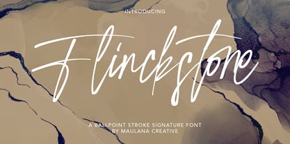 Flinckstone Ballpoint Stroke Signature Font Flinckstone Ballpoint Stroke Signature Font is beautiful script made by love. Flinckstone Script with natural handwriting touch is suitable for you who needs a typeface for Headline, Apparel, Invitation, Branding, Wedding, Logo Design, Lettering, Logotype, Clothing, Poster, Magazine and other design project.
 - PR Sprucewood 01 by PR Fonts,
$5.00 This font is a collection of sketched spruce trees. Some are filled outlines, some are bare trunks and branches, and some are rough squiggles. Each can be used individually to suggest a tree, and the different shapes can be layered in different colors, to suggest texture, or snow cover. There is also a glyph of a mountain range, for a horizon behind your forest.
 - TEMPER Wide by OGJ Type Design,
$35.00 Temper Wide is an extended neogrotesque slab with unbracketed serifs and square dots. Its hard-working letterforms and industrial heritage make for a no-nonsense look, well suited to editorial design and advertising. It provides an energetic backdrop for fashion and accessories, whether on-product, in campaigns, or branding. Horizon’s the limit! This sturdy font family will be by your side. A neutral, unembellished typeface, ready to make an impact.
 - Parteys by Craft Supply Co,
$20.00 Introducing Parteys – Brush Script Dynamic and Captivating: Parteys – Brush Script is a font that exudes dynamism with its varied stroke widths, making it perfect for creating eye-catching displays. Expressive Brush Strokes: This font boasts expressive brush strokes that give your text a lively and energetic appearance, making it ideal for projects that demand a touch of excitement. Versatile Design Possibilities: Parteys – Brush Script offers versatility in design, suitable for a wide range of creative applications, from posters and invitations to branding and social media graphics.


