10,000 search results
(0.036 seconds)
- Monoment - Personal use only

- Kanagif Personal Use - Personal use only

- Argor Got Scaqh - 100% free

- soul handwriting_free-version - Personal use only

- Care Bear Family - Unknown license

- Aspire - Unknown license

- Mutlu - Unknown license

- Fairy Strange - Personal use only

- Hancock - Unknown license

- EcuyerDAX - Unknown license

- Nadejda - Unknown license

- KG Be Still & Know - Personal use only

- HYERBA - Personal use only

- Fangtasia - Personal use only

- Radio 187.5 - Personal use only

- Sleepy Hollow 2.0 - Unknown license

- Caslon Calligraphic Initials - Unknown license

- Donnie - Unknown license

- Little Days - Unknown license

- Chefs Slice Novice - Unknown license

- Esquivel Trial - Unknown license

- Florentine SwashCaps - Unknown license

- Jayne Print YOFF - Personal use only

- My Nerd - Personal use only

- SoulMission - Unknown license

- Rickles - Personal use only

- Jonny Quest Classic - Unknown license

- Safrole - Unknown license

- Edhiron Asdhúriel v. 1.2 - Unknown license

- Addict - Unknown license

- PR8 London Ads - Unknown license

- Florimel™ - Unknown license

- Narony by Alit Design,
$22.00
- Archaz Negras by Mans Greback,
$59.00
- Paella by Wilton Foundry,
$29.00 - Louise Walker by Sarid Ezra,
$15.00
- MC Sero Aromad by Maulana Creative,
$14.00
- Bridgera by Akrtype Studio,
$15.00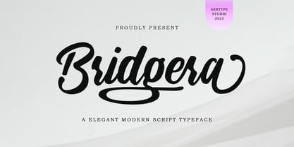
- MC Megie Ceyal by Maulana Creative,
$14.00
- Redoura by Letterhend,
$16.00


