Tank Junior, designed by the talented Levi Halmos, stands as an exceptional font that seamlessly combines the essence of strength with a touch of playful charm. At its core, Tank Junior is distinguis...
Covington SC Shadow is an evocative font that stands out due to its distinct shadow effect, a characteristic that adds depth and dimension to text, making it pop on any backdrop it's placed against. ...

The famous roman type cut in Venice by Nicolas Jenson, and used in 1470 for his printing of the tract, De Evangelica Praeparatione, Eusebius, has usually been declared the seminal and definitive representative of a class of types known as Venetian Old Style. The Jenson type is thought to have been the primary model for types that immediately followed. Subsequent 15th-century Venetian Old Style types, cut by other punchcutters in Venice and elsewhere in Italy, are also worthy of study, but have been largely neglected by 20th-century type designers. There were many versions of Venetian Old Style types produced in the final quarter of the quattrocento. The exact number is unknown, but numerous printed examples survive, though the actual types, matrices, and punches are long gone. All these types are not, however, conspicuously Jensonian in character. Each shows a liberal amount of individuality, inconsistency, and eccentricity. My fascination with these historical types began in the 1970s and eventually led to the production of my first text typeface, Iowan Old Style (Bitstream, 1991). Sometime in the early 1990s, I started doodling letters for another Venetian typeface. The letters were pieced together from sections of circles and squares. The n, a standard lowercase control character in a text typeface, came first. Its most unusual feature was its head serif, a bisected quadrant of a circle. My aim was to see if its sharp beak would work with blunt, rectangular, foot serifs. Next, I wanted to see if I could construct a set of capital letters by following a similar design system. Rectangular serifs, or what we today call "slab serifs," were common in early roman printing types, particularly text types cut in Italy before 1500. Slab serifs are evident on both lowercase and uppercase characters in roman types of the Incunabula period, but they are seen mainly at the feet of the lowercase letters. The head serifs on lowercase letters of early roman types were usually angled. They were not arched, like mine. Oddly, there seems to be no actual historical precedent for my approach. Another characteristic of my arched serif is that the side opposite the arch is flat, not concave. Arched, concave serifs were used extensively in early italic types, a genre which first appeared more than a quarter century after roman types. Their forms followed humanistic cursive writing, common in Italy since before movable type was used there. Initially, italic characters were all lowercase, set with upright capitals (a practice I much admire and would like to see revived). Sloped italic capitals were not introduced until the middle of the sixteenth century, and they have very little to do with the evolution of humanist scripts. In contrast to the cursive writing on which italic types were based, formal book hands used by humanist scholars to transcribe classical texts served as a source of inspiration for the lowercase letters of the first roman types cut in Italy. While book hands were not as informal as cursive scripts, they still had features which could be said to be more calligraphic than geometric in detail. Over time, though, the copied vestiges of calligraphy virtually disappeared from roman fonts, and type became more rational. This profound change in the way type developed was also due in part to popular interest in the classical inscriptions of Roman antiquity. Imperial Roman letters, or majuscules, became models for the capital letters in nearly all early roman printing types. So it was, that the first letters in my typeface arose from pondering how shapes of lowercase letters and capital letters relate to one another in terms of classical ideals and geometric proportions, two pinnacles in a range of artistic notions which emerged during the Italian Renaissance. Indeed, such ideas are interesting to explore, but in the field of type design they often lead to dead ends. It is generally acknowledged, for instance, that pure geometry, as a strict approach to type design, has limitations. No roman alphabet, based solely on the circle and square, has ever been ideal for continuous reading. This much, I knew from the start. In the course of developing my typeface for text, innumerable compromises were made. Even though the finished letterforms retain a measure of geometric structure, they were modified again and again to improve their performance en masse. Each modification caused further deviation from my original scheme, and gave every font a slightly different direction. In the lower case letters especially, I made countless variations, and diverged significantly from my original plan. For example, not all the arcs remained radial, and they were designed to vary from font to font. Such variety added to the individuality of each style. The counters of many letters are described by intersecting arcs or angled facets, and the bowls are not round. In the capitals, angular bracketing was used practically everywhere stems and serifs meet, accentuating the terseness of the characters. As a result of all my tinkering, the entire family took on a kind of rich, familiar, coarseness - akin to roman types of the late 1400s. In his book, Printing Types D. B. Updike wrote: "Almost all Italian roman fonts in the last half of the fifteenth century had an air of "security" and generous ease extremely agreeable to the eye. Indeed, there is nothing better than fine Italian roman type in the whole history of typography." It does seem a shame that only in the 20th century have revivals of these beautiful types found acceptance in the English language. For four centuries (circa 1500 - circa 1900) Venetian Old Style faces were definitely not in favor in any living language. Recently, though, reinterpretations of early Italian printing types have been returning with a vengeance. The name Vendetta, which as an Italian sound I like, struck me as being a word that could be taken to signifiy a comeback of types designed in the Venetian style. In closing, I should add that a large measure of Vendetta's overall character comes from a synthesis of ideas, old and new. Hallmarks of roman type design from the Incunabula period are blended with contemporary concerns for the optimal display of letterforms on computer screens. Vendetta is thus not a historical revival. It is instead an indirect but personal digital homage to the roman types of punchcutters whose work was influenced by the example Jenson set in 1470. John Downer.
Hawkes by Kimmy Design, $15.00 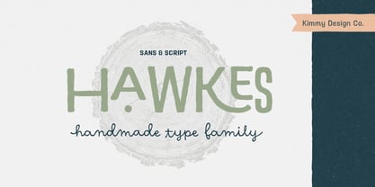
Hawkes is an extensive handmade typeface family that comes with a bundle of weights, widths and styles, all designed to work cohesively. Here is a breakdown of the Hawkes family. Hawkes Sans: The primary subfamily is a sans-serif typeface that includes nine fonts: three weights (light, medium and bold) and three widths (narrow, regular and wide). Within this set are an array of stylistic features; including small capitals, character style alternatives, discretionary ligatures and contextual alternatives. See details below for more information on OpenType Features. Hawkes Variable Width Sans: The secondary subfamily is the same base sans-serif fonts but combined in variating widths. Essentially, it takes all three widths of each weight and randomly mixes them together. This creates a funky and creative alternative to the more traditional sans-serif set. The variations are for the uppercase, lowercase, small capitals, ligatures and numbers. Hawkes Script: The last subfamily is the script typeface. It’s a quirky script with variations of its own, including ligatures, swashes and contextual alternatives (again, see below for further details.) The script font works great as a complimentary style to the sans-serif, or on it’s own. FEATURES Alright, let’s get into all the extra goodies this typeface has to offer. Small Capitals: Small caps are short capital letters designed to blend with lowercase text. These aren’t just capital letters just scaled down but designed to fit with the weight of both the lowercase and capitals. With Hawkes, small caps can either sit on the baseline (in line with the base of the capital and lowercase) or to be lifted to match the height of the capital letters by applying the discretionary ligature setting in the OpenType panel. These small capitals have a dot underlining them that sit along the baseline. The feature offers a unique display affect that is great for logos, titles and other headline needs. Discretionary Ligatures: A discretionary ligature is more decorative and unique combination than a standard ligature and can be applied at the users discretion (as the name indicates.) The specific styling for these ligatures varies for different fonts. With Hawkes, they are used as an all capital styling feature, or to lift the small capitals to align with the height of the capitals. In the former setting, both lowercase and uppercase letters are first changed to all capitals, then a specialized set of letter combinations are transitioned so small characters are positioned within a main capital letter. These combinations only happen with main characters that include an applicable stem, such as C F K L R T Y. Some of these combinations include two or three characters. When Small Caps is turned ‘on’, this feature will lift the small caps to the height of the capital letter. For more information, please check out the user guide! Stylistic Alternatives: Stylistic alternates are a secondary form of a character, often used to enhance the look or style of a font. For Hawkes, these alternatives provide a slightly more handmade feel. A - the capital and small capital A will lose its pointed apex and become rounded. Think of it more as an upside-down U than an up-side-down V ;-) Oo, G, Ss, Cc- these characters’ topmost terminal becomes a loop. The O is applied automatically, the G S and C need to be turn on individually. Titling Alternatives: This feature does sort of the opposite of what it intends. Instead of being used for titling purposes, this feature makes the text look better in paragraph text settings. Kk Rr h n m - curved terminals on the are straightened e - the counter stroke also gets straightened from a more looping motion y - the shape of y is changed from a rounded character to a sharper apex (think more like a ‘v’ than ‘u’) Contextual Alternatives: Contextual alternates are glyphs designed to work within context of other adjacent glyphs. With Hawkes Sans, there are three slightly different variations per character. The feature rotates the application of each variation. This helps with organic authenticity, so if you have two e’s next to each other, they won’t look identical (reflecting the natural variations in handwriting and lettering.) With Hawkes Variable width fonts, I have created a contextual pattern that randomizes the widths of each character. So, when the feature is turned ‘on’ in the OpenType panel, the widths would alternate in a pattern such as: Narrow, Wide, Regular, Narrow, Regular Wide, Narrow, etc. It happens automatically so the user doesn’t have to think or worry about getting a random seed. With Hawkes Script, contextual alternates allow strokes to connect properly from one character to the next while maintaining a believable, natural flow. Connecting strokes are present for two letters next to each other but are replaced by a shorter stroke when located at the end of a word or sentence. Some characters have in-strokes when located at the start of a word. When a character is preceded by a capital letter that doesn’t connect, it too needs an in-stroke or altered spacing. This feature is complicated and messy, but luckily you don’t really have to think about it! I’ve done all the coding so all you have to do is turn ‘on’ the feature in the OpenType panel and you are off to the races! I’m just letting you know what’s happening behind the scenes. Swashes: These are just for Hawkes Script and provide tail swashes to the start and ends of letters. There are three different options. You can pick the basic option by turning ‘on’ the swash feature in the OpenType panel, or you can pick using the Glyph panel. Stylistic Sets: This feature work in new versions of Illustrator CC and InDesign CC. You can pick specific styling sets instead of turning on an entire feature. For example, let’s say you want to have a loopy S, but not a loopy C or O, you can just turn on the S in the Style Set. It also helps create the little drop box that pops up when you hover over a character, showing you the alternates associated with that character. This makes it easy to pick and choose specific styles you want in a word or headline. ---------- And there it is folks! That’s all the basic info on Hawkes, I know it’s been a lot and I appreciate you hanging on. If you are like me and need more of a visual reference to accessing all these goodies, I’ve made a user guide to help navigate Hawkes and everything it has to offer. Altogether this extensive family boasts 14 total fonts in a wide array of styles, weights and widths, making it a great addition to any handmade type collection. Enjoy!
As of my last update in April 2023, there isn't a widely recognized typeface named specifically "Snoopy" in the traditional sense that is acknowledged across major typography communities or databases...
Brushstroke Plain by Altsys Metamorphosis is a captivating font that truly embodies the spirit and essence of artistic spontaneity. This font, with its bold and fluid characteristics, seems to dance ...
As of my last update in April 2023, "GarbageG" does not refer to a widely recognized or standard font within the typographic community or within mainstream font repositories. Nonetheless, the imagina...
Offenbach Chancery is a font that encapsulates the elegance and formality inherent in historical chancery calligraphy, while presenting itself with a modern touch that makes it accessible and usable ...
LiquidCrystal is a distinct and visually engaging font that emulates the appearance of characters displayed on LCD (Liquid Crystal Display) panels. This type of font is characterized by its digital, ...
As of my last update in April 2023, "Special K" by Ficod seems to be a rather unique and intriguing typeface, although it might not be universally recognized or might even be a hypothetical or new en...
The Lovevelyn Two font, crafted by the talented Manuel Lage, stands as a vivid embodiment of creativity and emotion, designed to capture the essence of heartfelt expressions and intimate connections....
Valium is an imaginatively crafted font that exudes an enigmatic yet eminently approachable vibe, reminiscent of the tranquil effects its namesake may suggest. Though not a standard font you'd find i...
The font titled "Chemical Reaction B BRK" created by AEnigma is a distinctive typeface that embodies a unique blend of creativity, precision, and playfulness. Designed to evoke the sense of a chemica...
The font Komika Title, created by Apostrophic Labs, is a distinctive and vibrant typeface that falls within the display category due to its unique characteristics and visual appeal. This font is part...
As of my last update in April 2023, there is no widely recognized typeface known specifically as "Blasphemy" within the graphic design or typography communities. However, I can certainly explore the ...
Barlos-Random, crafted by Manfred Klein, is an intriguing and distinctive typeface that dances on the fine line between the organized structure of traditional typography and the liberated expression ...
Myteri Script, crafted by the renowned font designer Måns Grebäck, stands as an exquisite testament to the beauty and intricate nature of script typefaces. This particular font falls under the catego...
The "Evil Dead" font is a visually striking typeface that seems to crawl out from the darkest corners of horror and fantasy themes, invoking the chilling atmosphere of its namesake - the iconic horro...
Neucha, a font crafted by the talented Jovanny Lemonad, embodies a spirit of casual creativity and uninhibited expression. Designed to capture the essence of handwritten text, Neucha offers a unique ...
As of my last update in April 2023, there's a unique typeface within the realm of digital fonts that stands out for its distinctive character and stylistic flair, known as Staubach. This font is a cr...
The Sabandija ffp font by deFharo is a typographic creature that seems to have scurried out of the imagination of a whimsical artist, finding its way onto the digital canvas. Picture this: if fonts w...
The font "Janda As Long As You Love Me," designed by Kimberly Geswein, is a testament to the versatility and creativity that typographic art can embody. This font is part of Kimberly Geswein's broade...
The Janda Celebration Script is a creation by Kimberly Geswein, a font designer known for her wide range of expressive and character-rich typefaces. This particular font stands out as a celebration o...
As of my last update in 2023, "IDM Minimal" by Emlyn Addison appears to be a niche or possibly a custom font that does not have widespread recognition in mainstream font directories or repositories. ...
As of my last update in April 2023, CounselorScript is not a widely recognized or standard font, and its characteristics might not be universally agreed upon or formally documented. However, let us p...
As of my last update in April 2023, "Squizzlie" isn't a widely recognized or established typeface within mainstream font libraries or among well-known designers. However, envisioning a font with such...
Heidelbe-Normal is a font that brings to mind the charm of the old world, blended seamlessly with the crispness of the modern age. This font appears as if it has captured the essence of history and p...
As of my last update in 2023, no official font directly named "Ren & Stimpy" exists as it would pertain specifically to the iconic American animated television series "The Ren & Stimpy Show" which ai...
"I Hate Comic Sans" by Utopiafonts reflects a unique chapter in the world of typography that is as much about personal expression as it is about the broader discourse surrounding typeface design and ...
Cubicle is an intriguing font style that exudes a blend of modernity and meticulous design, tailored for both digital and print mediums. It plays a pivotal role in delivering messages with a crisp an...
The "You Found Me" font by Kimberly Geswein is truly a charming and whimsical creation that captures the essence of personal touch and creativity. Designed by Kimberly Geswein herself, a designer kno...
The font "Gilgongo Kaps" by Apostrophic Labs is a unique and quirky display typeface that captures the essence of playfulness and innovation. Apostrophic Labs, known for their inventive approach to t...
The "Huggable Hedgehogs Demo" font by Brittney Murphy is a delightful and charming typeface that seems to capture the essence of whimsy and playfulness, much like the endearing qualities of hedgehogs...
The Remachine Script Personal Use font, crafted by the talented Måns Grebäck, is indeed a masterpiece that stands out in the realm of script typefaces. Måns Grebäck is well-known for his ability to c...
Subatomic Tsoonami is not merely a font; it's a vivid journey into the realms of creativity and innovation, embodying a blend of whimsy and sophistication that's rare in the typography world. At firs...
Ye Old Shire is a font that evokes the rustic charm and storied past of medieval England and the broader British Isles, transporting its audience to an era of knights, folklore, and the textual craft...
The unique font "Broken 15" by Misprinted Type, also known as Eduardo Recife, is an evocative and highly characteristic typeface that dives into the artistic realms of the unconventional. Nestled wit...
Picture this: "Teen Spirit" by Steven J. Lundeen is not just a font; it's the embodiment of youth rebellion, a visual shout that echoes through the halls of high school, sticking it to the man with e...
The Penelope font, crafted by Dieter Steffmann, stands as a testament to the unique blend of artistic flourish and classical sensibility. This font is remarkably distinct, primarily due to Steffmann'...

