10,000 search results
(0.166 seconds)
- Rialto Piccolo dF by CAST,
$305.00 Rialto dF is a book face inspired by calligraphic tradition. Named after the famous bridge in Venice, it was conceived as a bridge between calligraphy and typography, roman and italic. It can also be thought of as an imaginary bridge between Italy and Austria, since it is the result of collaboration started in 1995 between the Austrian Lui Karner and Venetian Giovanni de Faccio. The letterforms of Rialto dF were drawn directly in digital format with a starting point deriving from humanistic letterforms memorized in the hearts, minds and the manual ability of its designers… As tradition demands, uppercase, numerals and punctuation are used in combination with italics – the same solution adopted by Francesco Griffo when he cut his first italic for the Virgil, the first of the octavo series printed and published in Venice by Aldus Manutius in 1501. Rialto dF comes in two optical weights: Piccolo, for up to 14 pt, and Grande for 16pt and above. Alternate characters and various dingbats are also provided and these are available through OpenType features developed by type designer and technician Karsten Luecke.
 - Binario by Tarallo Design,
$14.99 Binario is a simple and friendly font with three weights and matching obliques. The geometric and modular characteristics of this typeface subtly reference the Art Deco and early modernist periods. It is an ideal choice for achieving a clean, distinctive, and contemporary aesthetic, making it suitable for branding, posters, and screen-based designs. The light weight of Binario is good for body text. The regular weight exudes confidence, making it suitable for both body and heading text. For impactful headlines, the bold weight is superb. The clear weight distinction of this family make it easy to create organized text. Binario was designed in Siena, Italy taking some inspiration from train stations and shop signage. The name Binario means train platform in Italian. Other aspects that informed the design of this font are modularity and efficiency. The interior rounded forms of the letters (counterforms) are based on shape of the Roman arch. Binario has a sibling, Binario Soft. This version has gently rounded stroke ends, which make a softer impression on the page.
 - Caslon #540 by Linotype,
$29.99The Englishman William Caslon punchcut many roman, italic, and non-Latin typefaces from 1720 until his death in 1766. At that time most types were being imported to England from Dutch sources, so Caslon was influenced by the characteristics of Dutch types. He did, however, achieve a level of craft that enabled his recognition as the first great English punchcutter. The original Caslon specimen sheets and punches have long provided a fertile source for the range of types bearing his name. Identifying characteristics of most Caslons include a cap A with a scooped-out apex; a cap C with two full serifs; and in the italic, a swashed lowercase v and w. A few of the many interpretations from the early twentieth century were true to the source, as well as strong enough to last into the digital era. These include two from the American Type Founders company, Caslon 540 and the slightly heavier Caslon #3. Both fonts are relatively wide, and come complete with small caps, old style figures, and italics. - FS Elliot by Fontsmith,
$80.00 Rooted Rooted in 1960s Brit modernism and infused with a fresh, contemporary spirit, FS Elliot is a future-proof, workhorse sans serif, well-suited to any assignment. Open and harmonious, its clear, fluid shapes lend words a distinctive and optimistic bounce. Britishness FS Elliot came out of a desire to create something squarely in the British modernist tradition, drawing on influences such as Design Research Unit’s portfolio of type for famous British brands and products, and Margaret Calvert and Jock Kinneir’s work on the British road sign system. Nick Job took the openness and simplicity of that style and injected warmth and wide appeal, coming up with a highly practical, multi-purpose family of faces. Enduring appeal “The great thing about having an eye on the future,” says designer Nick Job, “is that most of it is unknown. It’s what encourages us to take risks. And it leaves an uncertainty which, I believe, gives the best work its enduring appeal.” FS Elliot is available in a Pro version with full language support and a full range of Roman, Cyrillic and Greek weights.
 - Relato by Emtype Foundry,
$69.00 Relato has a low contrast and “a muscular” structure that makes it useful for setting longer text. In display sizes it has a variety of details that lends it a unique and personal expression. The formal principle of the serif, the variety of terminal strokes and the combination of curves and semi-straight lines gives the Relato a more “human” flavor. The inspiration for the design comes from different traditional calligraphic styles. The upper case letter, for example, is based on roman capitals from the Rennaissance, whereas the lower case relates to humanist handwriting. Even so, Relato is a decidedly contemporary typeface, proposing individual ideas on the design of type. The italic has a distinct typographic color thanks to the construction principle of broken lines. The bold weights have an increased contrast in the union of the strokes which helps improve legibility in small sizes and reinforce their personality in display sizes. The family consists of a Regular version, Italic, Small caps, Semibold and Bold. For a sans serif version of Relato, please see Relato Sans.
 - Jenalavin by Attype Studio,
$29.00 Jenalavin is a modern serif font with elegant and beautiful touch, with smooth curves and sharp edges. Jenalavin comes with punctuations, numerals and ligatures for a more enjoyable and visually appealing design. If you want to create a luxury design Jenalavin can be an alternative for your choice. Jenalavin is perfect for luxury product, branding, logo, invitation, stationery, product packaging, merchandise, monogram, blog design, game titles, cute style design, Book/Cover Title and more. Features : - Jenalavin Font - Ligatures - Multilingual, US Roman, Latin 1 Support --- This Font Support Language: Afrikaans, Albanian,Asu, Basque, Bemba, Bena, Breton, Catalan, Chiga, Cornish, Danish, Dutch, English, Estonian, Faroese, Filipino, Finnish, French, Friulian, Galician, German, Gusii, Indonesian, Irish, Italian, Kabuverdianu, Kalenjin, Kinyarwanda, Luo, Luxembourgish, Luyia, Machame, Makhuwa-Meetto, Makonde, Malagasy, ManxMorisyen, North Ndebele, Norwegian Bokmål, Norwegian Nynorsk, Nyankole, Oromo, Portuguese, Quechua, Romansh, Rombo, Rundi, Rwa, Samburu, Sango, Sangu, Scottish Gaelic, Sena, Shambala, Shona, Soga, Somali, Spanish, Swahili, Swedish, Swiss German, Taita, Teso, Uzbek (Latin), Volapük, Vunjo, Zulu, If you have any question, don’t hesitate to contact us.
 - TXT101 by 101 Editions,
$19.00 TXT101 is a fresh, friendly typeface for mock text and borders. As a retro-cool digital successor to the pencil marks that were hand-drawn as placeholder text in the analog era, TXT101 includes 52 styles, from Arch to Zigzag, with a couple of loops, several slants, and a swell set of waves. If your final copy is TBD, use TXT101 to mock up roman, bold, italic or light. TXT101 looks GR8 and is EZ to set. BWTM! Corner pieces make TXT101 a complete and charming bordering typeface. All patterns come in four weights, so you can make frames and borders for everything from little labels to big broadsides. Corners (north, south, east, west) are TTLY a snap to select from their own stylistic sets. DIY: MIX & MATCH TO CREATE COOL PATTERNS! Many styles have aligning baselines, so glyphs will connect. Single- and double-line variations abound, and you can combine weights (light, regular, bold, black) as well as styles. BTW, feel free to insert word spaces or leave them out.
 - Posh by Lián Types,
$49.00 I've always been in love with fat didones. That’s the reason of Posh. In search of something unique, I started this family back in 2013 with the aim of creating the fattest yet readable bodonian typeface in the market: It was a challenge, because roman fonts need generous counters (or what some call white spaces) and taking them to the extreme of inexistence attempted against the construction of many glyphs. Ears, dots, terminals and serifs always need some extra space so I had to find the exact point of boldness to make characters which have those attributes work well in the middle of those which haven't. (1) After a while, I felt I was again ‘in my element’: Big contrasted letters, sexy and elegant curves, and that Lubalinesque feeling that characterise my fonts. (2) Words written with Posh are a explosion of elegance and sensuality due to the fact that its didone attributes were exaggerated. Since it’s full of alternate glyphs, one can change and choose them until a nice block of ‘‘black’’ is achieved. (3) To accompany the regular style, I designed Posh Inline, a font with the same quantity of glyphs than the regular one; an all caps style called Posh Capitals, and also a really playful Italic version. I hope you find this one delicious like I do! This font is dedicated to all who understand letters are not just meant to be read, but also to be appreciated in group and individually. Enjoy it. NOTES (1) In example, it can be easy to design a fat letter ‘n’ with almost no counter, but really tough to make a satisfactory letter ‘s’ with serifs to match that ‘n’. (2) Also, it wasn't my first attempt in fat didones. Take a look at my font Reina, made in 2012. (3) Posters above show many words with ball terminals that seem to dance above and below the words in order to fill those “undesired” blank spaces.
 - As of my last update, there isn't a publicly recognized or widely-used font specifically named "GothBallCrap." However, taking a creative leap based on the name and exploring the possibilities it sug...
- Arabetics Harfi by Arabetics,
$59.00 Arabetics Harfi is a Latin Serif typeface with a comprehensive support for the Arabetic scripts, including Quranic texts. Careful spacing and kerning was used to enhance resulting text legibility both scripts. Arabetics Harfi fully supports MS 1252 Western and 1256 Arabic code pages, in addition to all transliteration characters required by the ALA-LC Romanization tables. Users can either select an accented character directly or form it by keying the desired combining diacritic mark following an unaccented character. For Arabic, it fully supports Unicode 6.1, and the latest Arabic Supplement and Extended-A Unicode blocks. The Arabic design of this font family follows the Mutamathil Taqlidi type style with connected glyphs, but it emphasizes a horizontal look and feel rather than verticalone, utilizing slightly varying x-heights. The Mutamathil Taqlidi type style uses one glyph per every basic Arabic Unicode character or letter, as defined by the Unicode Standards, and one additional final form glyph, for each freely-connecting letter of the Arabic cursive text. Arabetics Harfi includes the required Lam-Alif ligatures in addition to all vowel diacritic ligatures. Soft-vowel diacritic marks (harakat) are selectively positioned with most of them appearing on similar high and low levels—top left corner—, to clearly distinguish them from the letters. Tatweel is a zero-width glyph. Arabetics Harfi includes both Arabic and Arabic-Indic numerals, in addition to generous number of punctuation and mathematical symbols. It includes two weights, regular and bold, each of which has normal, right slanted Italic, and left-slanted styles.
 - ARB-187 Moderne Caps AUG-47 by The Fontry,
$25.00 Beginning in January, 1932, Becker, at the request of then-editor E. Thomas Kelly, supplied SIGNS of the Times magazine’s new Art and Design section with an alphabet a month, a project predicted to last only two years. Misjudging the popularity of the “series”, it instead ran for 27 years, ending finally two months before Becker’s death in 1959, for a grand total of 320 alphabets, a nearly perfect, uninterrupted run. In late 1941, almost ten years after the first alphabet was published, 100 of those alphabets were compiled and published in bookform under the title, “100 Alphabets”, by Alf R. Becker. And so, as published in August, 1937, The Fontry presents the truly "modern" version of Becker’s 187th alphabet, Moderne Caps, complete with OpenType features and Central European language support.
 - Partitura1941 by Idoia de Luxan,
$37.50 Tipograf�a caligr�fica inspirada nos t�tulos das canci�ns dun caderno familiar de partituras de 1941. � unha fonte creada da maneira m�is fidel posible a como se debuxar�a cunha pluma estilogr�fica do momento. Axeitada para t�tulos ou letras capitais. Non se recomenda empregar para textos longos, de non ser que se pretenda simular un arquivo antigo dun estilo manuscrito semellante. Tipograf�a caligr�fica inspirada en los t�tulos de las canciones de un cuaderno familiar de partituras de 1941. Es una fuente creada de la manera m�s fiel posible a como se dibujar�a con una pluma estilogr�fica del momento. Adecuada para t�tulos o letras capitales. No se recomienda utilizar pata textos largos, a no ser que se pretenda simular un archivo antiguo de un estilo manuscrito semejante. Calligraphic typography inspired by the titles of the songs of a family notebook of 1941. It is a source created in the most faithful way possible to how it would be drawn with a stylus pen of that moment. Suitable for titles or capital letters. It is not recommended to use for long text, unless you pretend to simulate an old archive with a similar manuscript style.
 - Decora Arabic by Naghi Naghachian,
$65.00 Decora Arabic is a new creation of Naghi Naghashian. Decora Arabic's design fulfills the following needs: A. Explicitly crafted for use in electronic media fulfills the demands of electronic communication. A modern interpretation of Naskh which was invented as calligraphic style by Ebn Moghleh, a Persian savant in ninth century. This script is the most widely used and its popularity has increased through the centuries. Most recently, it has served as a basis for the typefaces that are in use today. B. Suitability for multiple applications. Gives the widest potential acceptability. C. Extreme legibility not only in small sizes, but also when the type is filtered or skewed, e.g., in Photoshop or Illustrator. Decora Arabic's simplified forms may be artificial obliqued in InDesign or Illustrator, without any loss in quality for the effected text. D. An attractive typographic image. Decora Arabic was developed for multiple languages and writing conventions. Decora Arabic supports Arabic, Persian and Urdu. It also includes proportional and tabular numerals for the supported languages. E. The highest degree of calligraphic grace and the clarity of geometric typography. This typeface offers a fine balance between calligraphic tradition and the Roman aesthetic common in Latin typography.
 - Parvin by Naghi Naghachian,
$95.00 Parvin is a new creation of Naghi Naghashian. Parvin design fulfills the following needs: A. Explicitly crafted for use in electronic media fulfills the demands of electronic communication. A modern interpretation of Naskh which was invented as calligraphic style by Ebn Moghleh, a Persian savant in ninth century. This script is the most widely used, and its popularity has increased through the centuries. Most recently, it has served as a basis for the typefaces that are in use today. B. Suitability for multiple applications. Gives the widest potential acceptability. C. Extreme legibility not only in small sizes, but also when the type is filtered or skewed, e.g., in Photoshop or Illustrator. Parvin's simplified forms may be artificial obliqued in InDesign or Illustrator, without any loss in quality for the effected text. D. An attractive typographic image. Parvin was developed for multiple languages and writing conventions. Parvin supports Arabic, Persian and Urdu. It also includes proportional and tabular numerals for the supported languages. E. The highest degree of calligraphic grace and the clarity of geometric typography. This typeface offers a fine balance between calligraphic tradition and the Roman aesthetic common in Latin typography.
 - Sabio by Greater Albion Typefounders,
$11.95 I regard Sabio as an evolutionary face. By this I mean that it merges elements of script and Roman design into one elegant whole. The design was 'evolved' somewhere between these two classic approaches. The resulting family of faces makes an excellent display family, but is also clear and legible at small sizes and can be used as a text face with a distinctive flair. Sabio is a wonderfully flexible face that can sit happily alongside artwork that owes its inspiration to any era from the Art Deco onwards. The regular form is gently and subtly oblique, and the glyphs have a slight hint of swash about them. Alternate and perpendicular forms are also offered. The regular, alternate and perpendicular forms are all in turn offered in regular, and bold weights as well as in a condensed form. All in all Sabio is a humanist face with which almost anything can be done offering flair and elegance for almost any project. Whether it's a distinctive way of setting paragraph text, or poster work that's eye catching yet flowing and clearly legible, Sabio offers the answer.
 - Louise Walker by Sarid Ezra,
$15.00 Introducing, Louise Walker - Font Duo | Organic Serif & Script Louise Walker is perfect combination between serif with script font. Contain two fonts, the organic serif and a free handwritten signature script. This font duo also support multilingual, number and symbol, contextual alternates and many ligatures. Also this fonts already PUA Encoded.
 - MC Sero Aromad by Maulana Creative,
$14.00 Sero Aromad brush script font. This font is good for logo design, Social media, Movie Titles, Books Titles, a short text even a long text letter and good for your secondary text font with signature or script typeface. Make a stunning work with Sero Aromad brush script font. Cheers, Maulana Creative
 - Bridgera by Akrtype Studio,
$15.00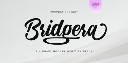 Bridgera script font is a magical script font carefully created with a touch of elegance. This is a beautiful combination of timeless elegance and authentic calligraphy. It features an incredibly classic style, while still keeping a friendly feel. Bridgera script font is the perfect font for making original and outstanding designs.
 - MC Megie Ceyal by Maulana Creative,
$14.00 Megie Ceyal bold script font. This font is good for logo design, Social media, Movie Titles, Books Titles, a short text even a long text letter and good for your secondary text font with signature or script typeface. Make a stunning work with Megie Ceyal bold script font. Cheers, Maulana Creative
 - Redoura by Letterhend,
$16.00 Redoura Font is a script typeface inspired by 70's font style and Script Sports font style which is absolutely awesome for logotype / wordmark, especially for sports theme logos. Redoura Script font includes upper & lowercase characters, punctuation, numerals, and multilingual support. It also has many open type alternates and ligatures.
 - Asterikats by Maulana Creative,
$11.00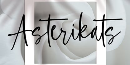 Asterikats Beauty Feminine Script Font is beautiful script made by love. Asterikats Beauty Feminine Script Font with natural handwriting touch is suitable for you who needs a typeface for Headline, Apparel, Invitation, Branding, Wedding, Logo Design, Lettering, Logotype, Clothing, Poster, Magazine and other design project. Thanks for use MaulanaCreative font.
 - HT Maison by Dharma Type,
$19.99 HT Mason is bold and hand painting font. This font is retrospective and decent, but it is also funny and cute. Holiday Type Project offers retro hand drawing scripts. Inspired by retro script on shopfront lettering, wall paint advertisements in Italy around 1950s. Check out the script fonts from Holiday Type!
 - Opkrop by Jipatype,
$25.00 Opkrom is Thai language mean Crispy or Crunchy. With informal sans serif style look like semi handwriting give feel friendly and warm . It support major Latin scripts and Thai scripts. It have stylistic set for Thai script. Opkrop is suited for headline on packaging, print ad and various graphic work.
 - Preta by Lián Types,
$39.00 Preta, portuguese for a very pure kind of black, has its name very related to its concept: I wanted to make the fattest/darkest script ever. People who follow my work may notice its forms are very related to works of my past (1) but this time the challenge was to be very cautious with the white spaces between letters. Not only I followed some rules and ductus of the copperplate style of calligraphy but also I took a lot of inspiration in posters of the early Art Nouveau (specially in Alfred Roller of the Vienna Secession) where letters forms looked like black squares if not looked from a close distance. With Preta, I wanted to achieve that same idea of “darkness” and thanks to the always welcomed question -what if?- the font grew a lot. The result is a very fat font, that looks delicious. Due to possible customer needs, I designed Preta Small, so it can be used in smaller sizes. Preta Ao Sol (which literally means under the sun!) is a style with those lovely tiny details to give the sensation of bright. Preta Ao Sol Solo was made to be used as a layered font with Preta. Finally, Preta Capitals serves as a company for Preta. Hope you enjoy the font as much as I did when designing it: The fact that it’s full of alternates, swashes, ligatures and swirls makes it really pleasurable at the moment of using it. Give it a try and dance with Preta! TIPS For better results, use Preta with the ‘standard ligatures’ feature activated. NOTES (1) Beatle in 2014. Seventies in 2015.
 - Garash by Dharma Type,
$14.99 Very decorative script inspired by old lettering in Eastern Europe. Eye-catching for picture books, toys for children. There is another font which called Garash Script.
 - Rosie by AVP,
$29.00 Rosie is a chunky but elegant pen script with useful OpenType features. In non OpenType-savvy applications it still works beautifully as a fully joined script.
 - NataliScript by ParaType,
$30.00PT Natali Script™ was designed by Natalia Vasilyeva and licensed by ParaType in 2002. An original calligraphic script. For use in advertising and display typography. - Classyloop by Maulana Creative,
$13.00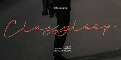 Classyloop Elegant Monoline Script Font Give your designs an authentic handcrafted feel. "Classyloop Elegant Monoline Script Font" is perfectly suited to stationery, logos and much more.
 - YD Winter by Yoon Design,
$400.00YD Winter is a casual script typeface consisting of 3 weights. It supports up to 13 different languages such as English in Latin and other scripts. - Bodoni Classic Free Style by Wiescher Design,
$39.50 Bodoni Classic Free Style is my really fat, high contrast free flowing, liberated designed, script-like non-script extension to my ever expanding Bodoni Classic family.
 - Death Markers by Figuree Studio,
$25.00 Everyone who lives will surely die Death Markers is a natural brush font, inspired by a vintage aesthetic sign painting. Made in combination with hand lettering, it comes with dramatic movement and it’s great for any next creative project that needs a retro vibe and horror touch. It comes with 2 styles: Clean and Drip effect. Ideal for logos, handwritten quotes, product packaging, header, poster, merchandise, social media & greeting cards. With your purchase you get: - All Caps - Numbers and Punctuation Marks - Support for MAC or PC - Simple installation for Adobe Illustrator, Corel Draw, Photoshop, or Procreate (New Updated) - Support Multilanguage I hope you make something cool with it. If you have any questions don't hesitate to ask!
 - Proba Pro by Mint Type,
$- Proba Pro is a geometric sans with lowered x-height, prominent ascenders and descenders and a subtle humanist touch. It comes in 7 weights + matching italics each supporting numerous Latin-based languages as well as major Cyrillic languages. It is packed with OpenType features like ligatures, small caps, 4 sets of digits, 2 stylistic sets, superiors and inferiors, fractions, ordinals, and respective punctuation varieties including all-cap punctuation. There are also language-specific alternates for Romanian Ș/ș, Catalan punt volat, and correct small-cap versions for i/ı in Turk languages. Some of the styles of Proba Pro can be found in Mint Type Editorial Bundle together with other fonts which make some great pairs. Check it out!
 - TG Minagi Sans by Tegami Type,
$30.00TG Minagi Sans is a neo-humanist sans serif that takes inspiration from some calligraphy and blackletter letterforms providing sharp details and a little stiffness in some parts of the typeface. By combining these things with the modern form of the sans serif letter, TG Minagi Sans has a forceful and distinct character. Super terrific when used at massive sizes for display purposes and headlines, but reliable enough for small text sizes. TG Minagi Sans comes with 7 weights, 2 axes & 14 Styles, including a variable font file. Has several OpenType features such as various ligatures, lining figures (proportional, old styles, superior, inferior, denominator, numerator & fraction), stylistic styles 01-04 & covered more than 100 languages Latin based. - The Cats Whiskers by Hanoded,
$15.00 Ok. Another font with cats in it. I asked my son, Sam (age 4), to draw some cats and I have to say: I'm very proud of what he created. The tiger I asked him for became a spinosaurus mom with her baby and I also got some happy hearts thrown in for good measure. The Cat's Whiskers is a very legible hand made font. Nice and loose, not too messy and with just a hint of childishness. Comes with a litter of diacritics. Oh… and a big thank you to Jakob from pizzadude.dk for suggesting I should post more pics of cats on FB - which eventually led to the name of this font.
 - Great Copper by Pixesia Studio,
$19.00 Introducing Great Copper - An Old Handcraft Display Font With a perfect combination of its unique yet classic shapes, Great Copper greatly portrays the familiar feeling that you are looking for. This typeface suits the nostalgic feeling you want to evoke through words. It comes as if Great Copper is written personally as letters to deliver good news. As splendid it curves in delivering the sweet vibe, Great Copper comes also with its firm shape to emphasize how valuable the messages and stories that it brings. Enchanting yet emphatic, Great Copper typeface will be perfect to depict the great story about the past you'd be delighted to tell and share. Hope you Like it. Thanks.
 - Neumatic Compressed by Arkitype,
$12.00 Neumatic compressed has a super compressed character set, increased cap height and tight kerning that combine to give you the ability to create large, beautiful and effective headlines and copy for your artwork. Neumatic Compressed packs punch when it comes to large copy lines and is perfect for posters, display copy, headlines in printed materials like magazines and books . The family comes in 8 weights from extra light to Black so it's versatile. Its extra light weight can give you some great height due to how narrow it is. Play around with the opentype Superscript with an underline or the Opentype stylistic sets which turns the default squared dots on i's, j's and punctuation to round dots.
 - Skaremoosh by Studio 85 Design,
$19.99 Skaremoosh is display typeface that is wild and weird. It plays by its own rules, and so will you when you use this font. Included in Skaremoosh are standard ligatures, currencies, ampersands and footnotes consistent with the design. Skaremoosh is complete with alternates for each letter, and alternate ligatures for variation and stylistic choices. Skaremoosh is well suited for an informal look and feel for apps, games, fashion, posters, menus, graphic novels, and anything eye catching. This font was created after months of working on some very rule driven font projects. The need to just let loose was intoxicating - and the exact opposite of what I was doing. I really hope this font inspires some spirited designs!
 - Face Your Fears II by Hanoded,
$15.00 When I created Face Your Fears some years ago, it was an instant hit. I have seen it on Gangsta Rap albums, metal albums, books and on movie posters. It has been used for T-shirts, websites and, believe it or not, for a beer label as well. I have always toyed with the idea of redoing the original font, as some of the glyphs were a bit off. Face Your Fears II is similar in nature to the original font, but comes with a lot of improvements, has slightly altered glyphs and (probably) better kerning. But maybe, just maybe, it isn't your cup o' tea. In that case, you can always just go for the original!
 - The New Gothic Textura typeface, designed by Elodie Mandray, is a captivating contemporary adaptation of a historic script that pays homage to the intricate and ornamental style of the medieval textu...
- Auchentaller by HiH,
$12.00 Auchentaller was inspired by a travel poster by Josef Maria Auchentaller in 1906. To our knowledge, it was never cast in type. Grado lies on the northern Adriatic, between Venice and Trieste. At one time the port for the important Roman town of Aquileia. With the decline of the Roman Empire, the upper Adriatic region came under the rule of the Visigoths, the Ostrogoths, the Byzantines, the Lombards, the Franks, the Germans, the Venetians and finally, in 1796, the Austrian Hapsburgs. So it remained until the dissolution of the Austro-Hungarian Monarchy in 1919, following World War I, when the seaport of Trieste was awarded to Italy. With Trieste came Montefalcone, Aquileia and Grado. The area was marked by years of political tension between Italy and Yugoslavia, exemplified by the d'Annunzio expedition to capture Fiume (Rijeka) in September, 1919. Some basic discussion of the period from 1919 to 1939 may be found in Seton-Watson’s Eastern Europe Between The Wars (Cambridge 1945) and Rothschild’s East Central Europe Between The Two World Wars (Seattle 1974). In 1965 I was traveling by train from Venice to Vienna. Crossing the Alps, the train stopped for customs inspection at the rural Italian-Austrian border, just above Slovenia. We were warned not to get off the train because there were still shooting skirmishes in the area. Through all this, Grado remained literally an island of tranquility, connected to the mainland by a only causeway and lines on a map. Auchentaller not only painted the beach scene at Grado, he moved there, living out the rest of his life in this comfortable little island town. His travel illustration contains the text from which the design of our font Auchentaller is drawn. The text translates: "Seaside resort : Grado / Austrian coastal land". Please see our gallery images to see a map locating Grado, as well as Auchentaller’s painting of the resort. Auchentaller is a monoline all-cap font, light and open in design , with a lot of typically art nouveau letter forms. Included in our font are a number of ligatures. As is frequently seen in designs by German speakers, the umlaut is embedded in the O & U below the tops of the letters. This approach led to two whimsies: a happy umlauted O and a sad umlauted U. This font has a clean, crisp look that is very appealing and very distinctive. Auchentaller ML represents a major extension of the original release, with the following changes: 1. Added glyphs for the 1250 Central Europe, the 1252 Turkish and the 1257 Baltic Code Pages. Add glyphs to complete standard 1252 Western Europe Code Page. Special glyphs relocated and assigned Unicode codepoints, some in Private Use area. Total of 336 glyphs. 2. Added OpenType GSUB layout features: pnum, liga, salt & ornm. 3. Added 116 kerning pairs. 4. Revised vertical metrics for improved cross-platform line spacing. 5. Revised ‘J’. 6. Minor refinements to various glyph outlines. 7. Inclusion of both tabular & proportional numbers. 8. Inclusion of both standard acute and Polish kreska with choice of alternate accented glyphs for c,n,r,s & z. Please note that some older applications may only be able to access the Western Europe character set (approximately 221 glyphs). The zip package includes two versions of the font at no extra charge. There is an OTF version which is in Open PS (Post Script Type 1) format and a TTF version which is in Open TT (True Type)format. Use whichever works best for your applications.