10,000 search results
(0.032 seconds)
- Gothic Birthday Cake - 100% free

- Source Code Pro - 100% free

- Murder Face by Subversive Type,
$13.00 Inspired by roman typography and extreme metal band logos. This is a vicious looking font that works great in large and small pt. sizes. Ideal for rock bands, alternative literature, films, video games and apparel.
 - Throrian Formal - 100% free

- Throrian Commonface - 100% free

- Juliette Signature by Ferry Ardana Putra,
$10.00 Juliette Signature is natural hand-lettered font manufactured by Bluetype. You will get full set of lowercase and uppercase letters, numerals and punctuation, multilingual symbols, alternate lowercase, and pack of ligatures.This font that is suitable for branding, signature, wedding invitation, promotion, product packaging, and other needs. This font is natural, simple, but still authentic and very stylish. FEATURES Ligatures Uppercase and Lowercase letters Numbering, Symbols, and Punctuations Multilingual Support
 - Kamesky History by Youngtype,
$14.00 Kamesky History is a hand brush font made with brushes and ink. This typeface is ideal for use in thick watercolor designs or in those needing a hand writing touch such as blog titles, posters, comic books, t-shirts, clothing, book covers, business cards, greeting cards, branding, merchandising and more. Kamesky History contains a full set of: Uppercase Lowercase Punctuation numbers multi-lingual support Thank you!
 - Black Monster by Creativework Studio,
$12.00 the Black Monster font—an exquisite typeface renowned for its distinctive style characterized by simplicity, clarity, and informality. This font exudes a natural spontaneity with a beautifully crafted hand that adds a touch of elegance to any design. Its versatile aesthetic makes it an ideal choice for a myriad of applications, ranging from product branding to logos, and from overall brand identity to various promotional activities. **Uppercase
 - Swing Era JNL by Jeff Levine,
$29.00 Hand lettered Art Deco lettering for the title on the cover of the 1930s-era song "And I Still Do" provided the inspiration for Swing Era JNL. A bold, casual and friendly typeface, it features an intersecting inline through some of the characters. One could almost picture the hottest big band of the day promoted on a lobby card with this alphabet, beckoning all to come on in and "cut a rug".
 - mortis - Unknown license

- Times New Roman PS Cyrillic by Monotype,
$67.99In 1931, The Times of London commissioned a new text type design from Stanley Morison and the Monotype Corporation, after Morison had written an article criticizing The Times for being badly printed and typographically behind the times. The new design was supervised by Stanley Morison and drawn by Victor Lardent, an artist from the advertising department of The Times. Morison used an older typeface, Plantin, as the basis for his design, but made revisions for legibility and economy of space (always important concerns for newspapers). As the old type used by the newspaper had been called Times Old Roman," Morison's revision became "Times New Roman." The Times of London debuted the new typeface in October 1932, and after one year the design was released for commercial sale. The Linotype version, called simply "Times," was optimized for line-casting technology, though the differences in the basic design are subtle. The typeface was very successful for the Times of London, which used a higher grade of newsprint than most newspapers. The better, whiter paper enhanced the new typeface's high degree of contrast and sharp serifs, and created a sparkling, modern look. In 1972, Walter Tracy designed Times Europa for The Times of London. This was a sturdier version, and it was needed to hold up to the newest demands of newspaper printing: faster presses and cheaper paper. In the United States, the Times font family has enjoyed popularity as a magazine and book type since the 1940s. Times continues to be very popular around the world because of its versatility and readability. And because it is a standard font on most computers and digital printers, it has become universally familiar as the office workhorse. Times?, Times? Europa, and Times New Roman? are sure bets for proposals, annual reports, office correspondence, magazines, and newspapers. Linotype offers many versions of this font: Times? is the universal version of Times, used formerly as the matrices for the Linotype hot metal line-casting machines. The basic four weights of roman, italic, bold and bold italic are standard fonts on most printers. There are also small caps, Old style Figures, phonetic characters, and Central European characters. Times? Ten is the version specially designed for smaller text (12 point and below); its characters are wider and the hairlines are a little stronger. Times Ten has many weights for Latin typography, as well as several weights for Central European, Cyrillic, and Greek typesetting. Times? Eighteen is the headline version, ideal for point sizes of 18 and larger. The characters are subtly condensed and the hairlines are finer." - Times New Roman Seven by Monotype,
$67.99In 1931, The Times of London commissioned a new text type design from Stanley Morison and the Monotype Corporation, after Morison had written an article criticizing The Times for being badly printed and typographically behind the times. The new design was supervised by Stanley Morison and drawn by Victor Lardent, an artist from the advertising department of The Times. Morison used an older typeface, Plantin, as the basis for his design, but made revisions for legibility and economy of space (always important concerns for newspapers). As the old type used by the newspaper had been called Times Old Roman," Morison's revision became "Times New Roman." The Times of London debuted the new typeface in October 1932, and after one year the design was released for commercial sale. The Linotype version, called simply "Times," was optimized for line-casting technology, though the differences in the basic design are subtle. The typeface was very successful for the Times of London, which used a higher grade of newsprint than most newspapers. The better, whiter paper enhanced the new typeface's high degree of contrast and sharp serifs, and created a sparkling, modern look. In 1972, Walter Tracy designed Times Europa for The Times of London. This was a sturdier version, and it was needed to hold up to the newest demands of newspaper printing: faster presses and cheaper paper. In the United States, the Times font family has enjoyed popularity as a magazine and book type since the 1940s. Times continues to be very popular around the world because of its versatility and readability. And because it is a standard font on most computers and digital printers, it has become universally familiar as the office workhorse. Times?, Times? Europa, and Times New Roman? are sure bets for proposals, annual reports, office correspondence, magazines, and newspapers. Linotype offers many versions of this font: Times? is the universal version of Times, used formerly as the matrices for the Linotype hot metal line-casting machines. The basic four weights of roman, italic, bold and bold italic are standard fonts on most printers. There are also small caps, Old style Figures, phonetic characters, and Central European characters. Times? Ten is the version specially designed for smaller text (12 point and below); its characters are wider and the hairlines are a little stronger. Times Ten has many weights for Latin typography, as well as several weights for Central European, Cyrillic, and Greek typesetting. Times? Eighteen is the headline version, ideal for point sizes of 18 and larger. The characters are subtly condensed and the hairlines are finer." - Times New Roman WGL by Monotype,
$67.99 In 1931, The Times of London commissioned a new text type design from Stanley Morison and the Monotype Corporation, after Morison had written an article criticizing The Times for being badly printed and typographically behind the times. The new design was supervised by Stanley Morison and drawn by Victor Lardent, an artist from the advertising department of The Times. Morison used an older typeface, Plantin, as the basis for his design, but made revisions for legibility and economy of space (always important concerns for newspapers). As the old type used by the newspaper had been called Times Old Roman," Morison's revision became "Times New Roman." The Times of London debuted the new typeface in October 1932, and after one year the design was released for commercial sale. The Linotype version, called simply "Times," was optimized for line-casting technology, though the differences in the basic design are subtle. The typeface was very successful for the Times of London, which used a higher grade of newsprint than most newspapers. The better, whiter paper enhanced the new typeface's high degree of contrast and sharp serifs, and created a sparkling, modern look. In 1972, Walter Tracy designed Times Europa for The Times of London. This was a sturdier version, and it was needed to hold up to the newest demands of newspaper printing: faster presses and cheaper paper. In the United States, the Times font family has enjoyed popularity as a magazine and book type since the 1940s. Times continues to be very popular around the world because of its versatility and readability. And because it is a standard font on most computers and digital printers, it has become universally familiar as the office workhorse. Times?, Times? Europa, and Times New Roman? are sure bets for proposals, annual reports, office correspondence, magazines, and newspapers. Linotype offers many versions of this font: Times? is the universal version of Times, used formerly as the matrices for the Linotype hot metal line-casting machines. The basic four weights of roman, italic, bold and bold italic are standard fonts on most printers. There are also small caps, Old style Figures, phonetic characters, and Central European characters. Times? Ten is the version specially designed for smaller text (12 point and below); its characters are wider and the hairlines are a little stronger. Times Ten has many weights for Latin typography, as well as several weights for Central European, Cyrillic, and Greek typesetting. Times? Eighteen is the headline version, ideal for point sizes of 18 and larger. The characters are subtly condensed and the hairlines are finer."
 - Times New Roman by Monotype,
$67.99 In 1931, The Times of London commissioned a new text type design from Stanley Morison and the Monotype Corporation, after Morison had written an article criticizing The Times for being badly printed and typographically behind the times. The new design was supervised by Stanley Morison and drawn by Victor Lardent, an artist from the advertising department of The Times. Morison used an older typeface, Plantin, as the basis for his design, but made revisions for legibility and economy of space (always important concerns for newspapers). As the old type used by the newspaper had been called Times Old Roman," Morison's revision became "Times New Roman." The Times of London debuted the new typeface in October 1932, and after one year the design was released for commercial sale. The Linotype version, called simply "Times," was optimized for line-casting technology, though the differences in the basic design are subtle. The typeface was very successful for the Times of London, which used a higher grade of newsprint than most newspapers. The better, whiter paper enhanced the new typeface's high degree of contrast and sharp serifs, and created a sparkling, modern look. In 1972, Walter Tracy designed Times Europa for The Times of London. This was a sturdier version, and it was needed to hold up to the newest demands of newspaper printing: faster presses and cheaper paper. In the United States, the Times font family has enjoyed popularity as a magazine and book type since the 1940s. Times continues to be very popular around the world because of its versatility and readability. And because it is a standard font on most computers and digital printers, it has become universally familiar as the office workhorse. Times?, Times? Europa, and Times New Roman? are sure bets for proposals, annual reports, office correspondence, magazines, and newspapers. Linotype offers many versions of this font: Times? is the universal version of Times, used formerly as the matrices for the Linotype hot metal line-casting machines. The basic four weights of roman, italic, bold and bold italic are standard fonts on most printers. There are also small caps, Old style Figures, phonetic characters, and Central European characters. Times? Ten is the version specially designed for smaller text (12 point and below); its characters are wider and the hairlines are a little stronger. Times Ten has many weights for Latin typography, as well as several weights for Central European, Cyrillic, and Greek typesetting. Times? Eighteen is the headline version, ideal for point sizes of 18 and larger. The characters are subtly condensed and the hairlines are finer."
 - Times New Roman Small Text by Monotype,
$67.99In 1931, The Times of London commissioned a new text type design from Stanley Morison and the Monotype Corporation, after Morison had written an article criticizing The Times for being badly printed and typographically behind the times. The new design was supervised by Stanley Morison and drawn by Victor Lardent, an artist from the advertising department of The Times. Morison used an older typeface, Plantin, as the basis for his design, but made revisions for legibility and economy of space (always important concerns for newspapers). As the old type used by the newspaper had been called Times Old Roman," Morison's revision became "Times New Roman." The Times of London debuted the new typeface in October 1932, and after one year the design was released for commercial sale. The Linotype version, called simply "Times," was optimized for line-casting technology, though the differences in the basic design are subtle. The typeface was very successful for the Times of London, which used a higher grade of newsprint than most newspapers. The better, whiter paper enhanced the new typeface's high degree of contrast and sharp serifs, and created a sparkling, modern look. In 1972, Walter Tracy designed Times Europa for The Times of London. This was a sturdier version, and it was needed to hold up to the newest demands of newspaper printing: faster presses and cheaper paper. In the United States, the Times font family has enjoyed popularity as a magazine and book type since the 1940s. Times continues to be very popular around the world because of its versatility and readability. And because it is a standard font on most computers and digital printers, it has become universally familiar as the office workhorse. Times?, Times? Europa, and Times New Roman? are sure bets for proposals, annual reports, office correspondence, magazines, and newspapers. Linotype offers many versions of this font: Times? is the universal version of Times, used formerly as the matrices for the Linotype hot metal line-casting machines. The basic four weights of roman, italic, bold and bold italic are standard fonts on most printers. There are also small caps, Old style Figures, phonetic characters, and Central European characters. Times? Ten is the version specially designed for smaller text (12 point and below); its characters are wider and the hairlines are a little stronger. Times Ten has many weights for Latin typography, as well as several weights for Central European, Cyrillic, and Greek typesetting. Times? Eighteen is the headline version, ideal for point sizes of 18 and larger. The characters are subtly condensed and the hairlines are finer." - Times New Roman PS Greek by Monotype,
$67.99In 1931, The Times of London commissioned a new text type design from Stanley Morison and the Monotype Corporation, after Morison had written an article criticizing The Times for being badly printed and typographically behind the times. The new design was supervised by Stanley Morison and drawn by Victor Lardent, an artist from the advertising department of The Times. Morison used an older typeface, Plantin, as the basis for his design, but made revisions for legibility and economy of space (always important concerns for newspapers). As the old type used by the newspaper had been called Times Old Roman," Morison's revision became "Times New Roman." The Times of London debuted the new typeface in October 1932, and after one year the design was released for commercial sale. The Linotype version, called simply "Times," was optimized for line-casting technology, though the differences in the basic design are subtle. The typeface was very successful for the Times of London, which used a higher grade of newsprint than most newspapers. The better, whiter paper enhanced the new typeface's high degree of contrast and sharp serifs, and created a sparkling, modern look. In 1972, Walter Tracy designed Times Europa for The Times of London. This was a sturdier version, and it was needed to hold up to the newest demands of newspaper printing: faster presses and cheaper paper. In the United States, the Times font family has enjoyed popularity as a magazine and book type since the 1940s. Times continues to be very popular around the world because of its versatility and readability. And because it is a standard font on most computers and digital printers, it has become universally familiar as the office workhorse. Times?, Times? Europa, and Times New Roman? are sure bets for proposals, annual reports, office correspondence, magazines, and newspapers. Linotype offers many versions of this font: Times? is the universal version of Times, used formerly as the matrices for the Linotype hot metal line-casting machines. The basic four weights of roman, italic, bold and bold italic are standard fonts on most printers. There are also small caps, Old style Figures, phonetic characters, and Central European characters. Times? Ten is the version specially designed for smaller text (12 point and below); its characters are wider and the hairlines are a little stronger. Times Ten has many weights for Latin typography, as well as several weights for Central European, Cyrillic, and Greek typesetting. Times? Eighteen is the headline version, ideal for point sizes of 18 and larger. The characters are subtly condensed and the hairlines are finer." - Times New Roman PS by Monotype,
$67.99In 1931, The Times of London commissioned a new text type design from Stanley Morison and the Monotype Corporation, after Morison had written an article criticizing The Times for being badly printed and typographically behind the times. The new design was supervised by Stanley Morison and drawn by Victor Lardent, an artist from the advertising department of The Times. Morison used an older typeface, Plantin, as the basis for his design, but made revisions for legibility and economy of space (always important concerns for newspapers). As the old type used by the newspaper had been called Times Old Roman," Morison's revision became "Times New Roman." The Times of London debuted the new typeface in October 1932, and after one year the design was released for commercial sale. The Linotype version, called simply "Times," was optimized for line-casting technology, though the differences in the basic design are subtle. The typeface was very successful for the Times of London, which used a higher grade of newsprint than most newspapers. The better, whiter paper enhanced the new typeface's high degree of contrast and sharp serifs, and created a sparkling, modern look. In 1972, Walter Tracy designed Times Europa for The Times of London. This was a sturdier version, and it was needed to hold up to the newest demands of newspaper printing: faster presses and cheaper paper. In the United States, the Times font family has enjoyed popularity as a magazine and book type since the 1940s. Times continues to be very popular around the world because of its versatility and readability. And because it is a standard font on most computers and digital printers, it has become universally familiar as the office workhorse. Times?, Times? Europa, and Times New Roman? are sure bets for proposals, annual reports, office correspondence, magazines, and newspapers. Linotype offers many versions of this font: Times? is the universal version of Times, used formerly as the matrices for the Linotype hot metal line-casting machines. The basic four weights of roman, italic, bold and bold italic are standard fonts on most printers. There are also small caps, Old style Figures, phonetic characters, and Central European characters. Times? Ten is the version specially designed for smaller text (12 point and below); its characters are wider and the hairlines are a little stronger. Times Ten has many weights for Latin typography, as well as several weights for Central European, Cyrillic, and Greek typesetting. Times? Eighteen is the headline version, ideal for point sizes of 18 and larger. The characters are subtly condensed and the hairlines are finer." - Kage by Balibilly Design,
$12.00 Welcome to the old version of Kage. "Old does not mean obsolete" In April 2022, we updated whole letterforms. We redrew all glyphs and refined the nodes, corners, rounded shapes, flowing tails, etc. Of course, you can still use the update of an older version of Kage, although we highly recommend you move to the Pro version for the full benefits. Kage Pro has massive development, puts forward experimentation on alternate letters, and applies an oblique style to provide diverse style choices. Come with tons of swirly ligatures and advanced opentype features include case-sensitive forms, small caps, standard and discretionary ligatures, stylistic alternates, ordinals, fractions, numerator, denominator, superscript, subscript, circled number, slashed zero, old-style figure, tabular and lining figure. Learn more about Kage Pro here: Kage Pro 2.0 | Type Specimen About Kage The Inspiration: The radical exploration world of fashion inspires us. It leads our minds to the Neo-classical type style created during the age of enlightenment in the 18th century. It has a reasonably extreme contrast from the previous serif style, making the impression that it is emitted more expensive and classy. Organically, this Neo-Classical typeface is closely related to the fashion world, especially in Europe, and even spread across the globe. Fashion and this typeface reflect each other. After, we boldly observed Japanese fashion designer Rei Kawakubo. Famous for radical & deconstructive fashion, which makes the world of fashion more flexible and dynamic. The Design: As well as the typeface that we made, we started it with a cultural foundation of the Didone typeface. We tried to deconstruct the appearance. The decoration that better reflected the dynamic of fashion implemented in the fashionable alternate and calligraphical stylistic set ended with ball terminals. The versatile impression created is like taking off a scarf on the model's hair during a fashion show. The deconstructive image is combined with a legibility structure like the appearance of the Neo-Classical style. Kage is designed to visualize a costly and exclusive image of a thing, product, world clothing brand, famous fashion magazine, etc. The modern transitions of each letterform are softer, so when repositioning and escalating the size of this font, it will remain beautiful without injuring other elements. So, Kage is a bold choice on headlines and more prominent media with a portion of 50% even more. The Feature: Kage has 11 styles, from thin to black; all family-style consist of one variable font with two axes. The total number of glyphs is 748 in each style. She comes with tons of swirly ligatures and stylistic alternates in Advance OpenType features, including: discretionary ligatures, stylistic alternates, ordinals, fractions. Support multi-language including Western European, Central European, Southeastern European, South American, Oceanian, Vietnamese.
 - Renny Hybrid - 100% free

- Hollow Roachian Futhark - 100% free

- Beiko by Nantia.co,
$12.00 Beiko Uppercase Greek Font is a decorative display font, made from digitized brush hand lettering. Of course, the uppercase font supports a full set of Greek characters and an extended Latin character set with diacritics. Also, this handwritten font is ideal for handcrafted projects. The hand-brushed organic style of Beiko is ideal for logotypes. In fact, this cute typeface can be your next typeface for your graphic design needs. From Instagram quotes to product packaging, merchandise, and branding projects, this font is so fun to use. Also, it can be used on social media content, for branding, poster design, for children projects, and any other kind of product packaging.
 - Seacoast by Fikryal,
$18.00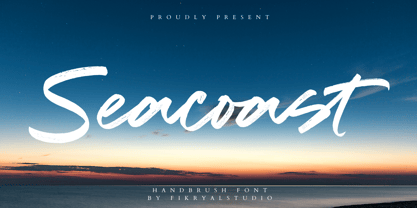 Seacoast is a hand brush font perfect for crafting, branding, invitation, stationery, wedding designs, social media posts, advertisements, product packaging, product designs, label, photography, watermark, special events, or anything. Seacoast comes with a full set of uppercase and lowercase letters, ligatures, multilingual symbols, numerals, and punctuation.
 - Anathema by Bluestype Studio,
$16.00 Anathema is a retro themed script font created using beautiful hand strokes. quickly create awesome designs with this font! Very suitable for branding, quotes, logotype, headline, tittle, and the other various formal forms such as invitations, emblems, logos, magazines, books, packaging, clothing, t-shirt, and labels.
 - Changer by Fikryal,
$18.00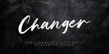 Changer is a hand brush font perfect for crafting, branding, invitation, stationery, wedding designs, social media posts, advertisements, product packaging, product designs, label, photography, watermark, special events, or anything. Changer comes with a full set of uppercase and lowercase letters, ligatures, multilingual symbols, numerals, and punctuation.
 - Historical by Runsell Type,
$9.00 Introducing Historical - Hand Drawn Script Historical consists of clean and textured feature as well as an aesthetic for premium logotypes. The family includes various script styles. Every single letter contains beautiful alternates characters (ss01 - ss10) and features ligatures. Historical can be applied in designs such as logotypes, brand, packaging, branding, quotes, business cards and more custom design. It features uppercase, lowercase, numeral, punctuation & symbol, ligatures, stylistic alternates, multilingual support, PUA encoded (fully accessible without additional design software).
 - Bokar by Pelavin Fonts,
$25.00 I am inspired by imagery that technology has rendered obsolete. I treasure anachronistic packaging and design which has somehow evaded obliteration by focus groups.I especially admire the packaging for A&P coffee brands Eight O'Clock, Red Circle and Bokar whose eccentric yet elegant typography harkens back to an earlier, less complicated era. The font Bokar is my nod of appreciation to those robust and full-bodied blends spared from the bland, tasteless scourge of corporate branding.
 - Allison Dream by Rochart,
$15.00 Hello! We introduce our product called Allison Dream. The Allison Dream font is a modern Hand lettering. We give you a swash to make your design look more awesome. Allison Dream font is great for logotype, Branding Design, Logo Design, Digital Lettering Arts, T-Shirt/Apparel, Poster, Magazine, Signs, Advertising Design, wedding invitation and any hand lettered needs. Allison Dream font Features : Upper and Lowercase Standard Characters, Punctuation, Numerals and Multilingual. PUA Encoded Characters – Fully accessible without additional design software. Ligatures and Stylistic Alternates.
 - Anisha by 38-lineart,
$13.00 “Anisha”. This font is the Great choice for brand identity, branding and just branding ... we have studied various branding of modern products and we found a very interesting style, which is a combination of "calligraphy signature and clean sans". This is like combining two different elements and together in a composition that is very luxurious and elegant. Anisha calligraphy, bold and thin sans, all of which consist of regular and slant versions, so the number of fonts in this package consists of 6 fonts, the more choices the more design combinations you can make. Anisha is a beautiful high fashion font that makes for gorgeous logos, posters, blog posts, social media, and more! I love using them together with layer masks in Photoshop, so it looks like the script is running through the lines of the sans serif. Anisha Script includes 2 alternates for uppercase and 4-5 alternates for lowercase, and additional ligatures to make everything look totally hand-done.
 - Algol by Typodermic,
$11.95 Get ready to be transported back in time with Algol—the low-resolution display typeface that takes inspiration from classic computer pixel fonts. But don’t be fooled, Algol is not just your typical pixel typeface– it adds a touch of elegance to the digital age. By overlapping intersections with rounded corners, Algol creates a softened effect that sets it apart from other pixel fonts. Say goodbye to the sharp, precise pixel junctions and hello to a font that works perfectly for vinyl-cut signage systems and other cases where a more gentle look is desirable. With Algol, you have the choice of three members of the family—Algol Regular, Algol VII, and Algol IX. For a truly dramatic look, layer Algol Regular and Algol VII in inventive color combinations that will leave an impact on anyone who lays their eyes on it. Algol IX, on the other hand, is more relaxed in its spacing, allowing the spectator to look directly through it. But don’t be fooled by its simplicity—hidden alternate letters with closed counters open up a whole universe of design options for you to explore. So what are you waiting for? Let Algol take you on a journey to the past, all while creating stunning designs that are sure to impress. Most Latin-based European, Greek, and some Cyrillic-based writing systems are supported, including the following languages. Afaan Oromo, Afar, Afrikaans, Albanian, Alsatian, Aromanian, Aymara, Bashkir (Latin), Basque, Belarusian (Latin), Bemba, Bikol, Bosnian, Breton, Bulgarian, Cape Verdean, Creole, Catalan, Cebuano, Chamorro, Chavacano, Chichewa, Crimean Tatar (Latin), Croatian, Czech, Danish, Dawan, Dholuo, Dutch, English, Estonian, Faroese, Fijian, Filipino, Finnish, French, Frisian, Friulian, Gagauz (Latin), Galician, Ganda, Genoese, German, Greek, Greenlandic, Guadeloupean Creole, Haitian Creole, Hawaiian, Hiligaynon, Hungarian, Icelandic, Ilocano, Indonesian, Irish, Italian, Jamaican, Kaqchikel, Karakalpak (Latin), Kashubian, Kikongo, Kinyarwanda, Kirundi, Komi-Permyak, Kurdish (Latin), Latvian, Lithuanian, Lombard, Low Saxon, Luxembourgish, Maasai, Macedonian, Makhuwa, Malay, Maltese, Māori, Moldovan, Montenegrin, Ndebele, Neapolitan, Norwegian, Novial, Occitan, Ossetian, Ossetian (Latin), Papiamento, Piedmontese, Polish, Portuguese, Quechua, Rarotongan, Romanian, Romansh, Russian, Sami, Sango, Saramaccan, Sardinian, Scottish Gaelic, Serbian, Serbian (Latin), Shona, Sicilian, Silesian, Slovak, Slovenian, Somali, Sorbian, Sotho, Spanish, Swahili, Swazi, Swedish, Tagalog, Tahitian, Tetum, Tongan, Tshiluba, Tsonga, Tswana, Tumbuka, Turkish, Turkmen (Latin), Tuvaluan, Uzbek (Latin), Ukrainian, Venetian, Vepsian, Võro, Walloon, Waray-Waray, Wayuu, Welsh, Wolof, Xhosa, Yapese, Zapotec Zulu and Zuni.
 - Winterbreak Trio by Ana's Fonts,
$14.00 Winterbreak is a playfont font and doodles set. It includes: 3 variations of the Winterbreak font that can be used together to create interesting hand-lettering compositions 1 set of doodles that complement the handwritten fonts perfectly Use Winterbreak in designs such as postcards and notes, posters, logotypes, social media posts, branding and packaging.
 - Beauty Handwriting by Nirmana Visual,
$22.00 Beauty Handwriting is a Natural handwriting modern calligraphy font. full set of lowercase and uppercase letters, numerals and punctuation, multilingual symbols, lowercase beginning and ending swashes. 80 ligatures giving realistic hand-lettered style. Beauty Handwriting offers beautiful typographic harmony for a diversity of design projects, including logos & branding, social media posts, advertisements & product designs.
 - Hello baby by Letterfreshstudio,
$13.00 Hello baby! A new fresh an modern hand lettered font with decorative characters and a dancing baseline. So beautiful on invitation like handicraft, greeting cards, branding materials, business cards, quotes, posters, and more design concepts. Features : Ligatures Stylistic sets Basic Latin A-Z and a-z Numbers International Symbols included Punctuation Ligature Thank You.
 - Oh Lady Script by Letterfreshstudio,
$12.00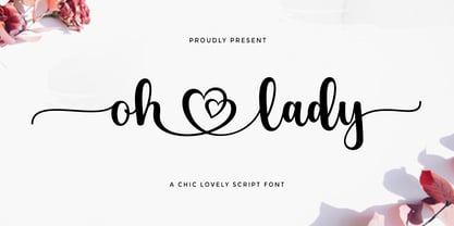 Oh Lady ! A new fresh an modern hand lettered font with decorative characters and a dancing baseline. So beautiful on invitation like handicraft, greeting cards, branding materials, business cards, quotes, posters, and more design concepts. Features : Ligatures Stylistic sets Basic Latin A-Z and a-z Numbers International Symbols included Punctuation Ligature Thank You.
 - Moreganic by Invasi Studio,
$19.00 Inspired by plants and healthy lifestyles. Introducing Moreganic Font, our new and fun font collection. Combining a hand-drawn style with a modern touch. Moreganic comes with Alternates that you can use to give more options to your projects. Moreganic Font is ideal for branding projects or packaging that need an organic and playful feel.
 - Bunken Tech Sans Wide by Buntype,
$49.00 The Bunken Tech Sans superfamily: A reminiscence of constructed fonts of the modern age designed with considerably cleaner forms. •See other members of the Superfamily: Bunken Tech Sans •For further details, view the Specimen PDF. Bunken Tech Sans Wide follows in the best tradition of the straight-lined and somewhat angular structures of its predecessors while offering a much more open and mild design. The shapes of the letters are therefore reduced to the most essential elements: The spurs on a, b, n and other lower case letters occur just as little as decorative or style details, the lightly rounded inside edges are more pleasing to the eye than certain historic role models and make for a harmonic, flowing style. Use In particular Bunken Tech Sans Wide stands out as an easy, distinctive headline font with its straight-lined, technical design. Open counters and large x-height make it equally suited for use in shorter texts. It is also perfectly complemented by Bunken Sans or Bunken Slab in longer texts (available soon). Features Available in 16 styles with widths ranging from Light to Heavy with associated Italics. All of the styles are very extensive: Support for at least 58 languages, Small Capitals, 9 number sets (e.g. Lining, Oldstyle, Tabular and Small Cap Figures), ligatures, alternate characters, numerous Opentype functions, and lots of other small features that make it more pleasant to work with the font on a daily basis as well as fulfilling typographic desires. Each style contains more than 870 characters! Each style is available in a professional (Pro) standard (Std) and Small Caps (SC) edition with a different range of functions. (Language support, OpenType features and number of glyphs). Details can be found on the respective pages. Bunken Tech Sans Wide is part of the Bunken Tech superfamily and is available in Condensed, Normal and Wide. Also of interest: The slab serif variation Bunken Tech Slab Features in Detail: 16 Weights: -Light -Book -Medium -SemiBold -Bold -ExtraBold -UltraBold -Heavy and corresponding Italics 3 Widths: -Condensed -Normal -Wide Alternate Characters: A, E, F, L, S, e, f, t, s, y, etc. Small Capitals 5 Sets of Figures: -Lining Figures -Old Style Figures -Tabfigures -Old Style Tabfigures -Small Cap Figures Automatic Ordinals Automatic Fractions Extended Language Support and more...
 - Western Americana by Celebrity Fontz,
$24.99Western Americana is a unique collection of signatures of 72 famous American frontiersmen, gunslingers, Wild West personalities, outlaws, and Indians in a high-quality font. A must-have for autograph collectors, desktop publishers, lovers of history, or anyone who has ever dreamed of sending a letter, card, or e-mail "signed" as if by one of these famous Western celebrities. This font includes signatures from the following American West personalities: William Frederick Cody ("Buffalo Bill"), George Armstrong Custer, Meriwether Lewis, William Clark, Kit Carson, Joseph Brant, David Crockett, Wyatt Earp, Geronimo, James Bowie, Daniel Boone, Sam Houston, Calamity Jane, Sitting Bull, William H. Bonney ("Billy the Kid"), Cole Younger, Bob Younger, Jim Younger, Pat Floyd Garrett, James Butler "Wild Bill" Hickok, Squire Boone, Samuel Colt, Gordon William Lillie ("Pawnee Bill"), Annie Oakley, William Barret Travis, Allan Pinkerton, Jose de Galvez, George Rogers Clark, George Crook, John Charles Fremont, George Croghan, Simon Kenton, Maj. Frederick Benteen, James Wilkinson, Nelson Appleton Miles, Philip Kearny, Chief G.H.M. Johnson, William George Fargo, William Barclay "Bat" Masterson, King Philip, Frank James, Eleazer Williams, Henry Wells, Junipero Serra, John Sevier, John Ross, Joseph Virgo, Chief Joseph, Red Jacket, Manuel Lisa, Julian Dubuque, John Augustus Sutter, Manuel Lisa, Jesse James, Jesse James alias Thomas Howard, Manasseh Cutler, Robert Newton Ford, Emmett Dalton, Henry McCarty alias Greenville Mellen Dodge, Edward Zane Carroll Judson ("Ned Buntline"), Rain-in-the-Face, James Robertson, Zebulon Pike, Chief Two Guns White Calf, Pierre Chouteau Jr., Frank Butler, Isaac Shelby, Moses Austin, Moses Cleveland, Rufus Putnam, Pierre Chouteau Sr., Father Pierre Jean De Smet, and Auguste Chouteau. This font behaves exactly like any other font. Each signature is mapped to a regular character on your keyboard. Open any Windows application, select the installed font, and type a letter, and the signature will appear at that point on the page. Painstaking craftsmanship and an incredible collection of hard-to-find signatures go into this one-of-a-kind font. Comes with a character map. - Plakato Pro by Underware,
$50.00 Plakato, a stencil love affair Plakato is a family of display fonts, consisting of various eye-catching styles, each of them very bold. Plakato is an identity toolkit, a heavyweight building block in case you need a strong personality, a small stencil font family to cut out your best ideas and grab all the attention. But just as with many other creations, its outcome is as divers as its multiple origins. Plakato comes in 16 eye-catching styles. The default stencil style comes in Regular & Italic. They both have 2 variations: one version, named Plakato Stencil, automatically creates borders around the text, putting any text into a graphic stencil in this way. Another version, the extruded three-dimensional version, guarantees even more attention for your message. Next to this there is also the Inline version, which is an optical play with a lot of lines. Plakato Inline has a supportive background layer, a separate font in case you want to add a background in a different colour. Then there is Plakato Paper, a manually teared version of Plakato offering a more physical look. This small family of eye-catching display fonts also contains a Neon font, an independent design in Plakato style, which can actually be used for making neon signs due to its construction. Plakato Neon comes with its own Dingbat font for that extra flush-flush. Plakato has also been redrawn on a C64, and with all its accompanying limitations been ported back and turned into a font: Plakato Game. Also this font comes with its own Dingbat font, full of emoji’s and icons for oldskool pleasure. Last but not least there is Plakato Build, constructed out of blocks. As if that wasn’t enough, there are various dynamic versions in the Plakato Play package, which offer a whole new range of possibilities for typographic expression, with new animation and interaction opportunities.
 - American Authors by Celebrity Fontz,
$29.99American Authors is a unique collection of signatures of 75 famous American authors, poets, writers, and novelists. A must-have for autograph collectors, desktop publishers, history buffs, fans, or anyone who has ever dreamed of sending a letter, card, or e-mail "signed" as if by one of these famous literary figures. This font includes signatures from the following literary figures: Joel Barlow, Charles Brockden Brown, J. Fenimore Cooper, Stephen Crane, Richard H. Dana Jr., Theodore Dreiser, W.C. Bryan, Timothy Dwight, T.S. Eliot, Ralph Waldo Emerson, William Faulkner, Eugene Field, Philip Freneau, Robert Frost, Hamlin Garland, Alexander Hamilton, Bret Harte, Nathaniel Hawthorne, Lafcadio Hearn, Ernest Hemingway, W.D. Howells, Henry James, John P. Kennedy, Washington Irving, Oliver Wendell Holmes, Julia Ward Howe, Francis Scott Key, Sidney Lanier, James Russell Lowell, Edgar Lee Masters, Cotton Mather, Herman Melville, George John Nathan, Henry W. Longfellow, Edna St. Vincent Millay, Eugene O'Neill, Thomas Paine, Edgar Allan Poe, J.K. Paulding, Sydney Porter (aka O. Henry), Carl Sandburg, Samuel Sewall, John Howard Payne, W.H. Prescott, W. Gilmore Simms, Captain John Smith, Gertrude Stein, Harriet Beecher Stowe, John Trumbull, Daniel Webster, Noah Webster, Samuel L. Clemens (aka Mark Twain), John G. Whittier, Thomas Wolfe, Henry D. Thoreau, Walt Whitman, Emily Dickinson, Jacqueline Susann, Louisa May Alcott, Wystan Hugh Auden, Pearl Buck, Edgar Rice Burroughs, F. Scott Fitzgerald, Erle Stanley Gardner, Horace Greeley, Zane Grey, Sinclair Lewis, Jack London, Norman Mailer, Ogden Nash, Beatrix Potter, Ezra Pound, John Steinbeck, Leon Uris, Thornton Wilder. This font behaves exactly like any other font. Each signature is mapped to a regular character on your keyboard. Open any Windows application, select the installed font, and type a letter, and the signature will appear at that point on the page. Painstaking craftsmanship and an incredible collection of hard-to-find signatures go into this one-of-a-kind font. Comes with a character map. Article abstract: American Authors is a unique collection of signatures of 75 famous American authors, poets, writers, and novelists in a high-quality font. - Organico by Meat Studio,
$17.50 Organico was created as an organic, hand made font. It is designed to be adaptable and useable across a wide range of markets, brands and disciplines. It has upper and lowercase characters with alternatives for all, as well as all the other glyphs you’d expect. It also utilises a number of opentype features, such as standard and discretionary ligatures, contextual alternates and stylistic sets.
 - Bellamy by Calamar,
$12.00 Bellamy is a hand-drawn calligraphic script with dancing baseline and lots of possibilities. This expressive font will look awesome on your cards, wedding invitations, headings, branding materials, quotes, t-shirt and any other amazing projects you are working on. Bellamy includes Upper and Lowercase Basic Characters, Alternates Lowercase Characters, Standard Ligatures, Numbers and Punctuation. Bellamy has multilingual support for the Western and Central European Languages.


