93 search results
(0.005 seconds)
- Gingerbread Hobs by Adita Fonts,
$11.00 Gingerbread Hobs is display font for this festive season! Come with baked cookie detail in letter. Perfect for decorating your project, logo design, shirt design, etc. Easy to use , Cricut Support, Silhoutte Support, and All Program
 - OBO Star by Juri Zaech,
$19.00 OBO Star is a fat, subtly flared display typeface with a not so subtle groove factor. The letters are based on a square and do not have ascenders or descenders. This way the typeface can be used for horizontal and vertical settings, or mixed like crosswords. There are a few exceptions for certain punctuation and special characters that are half the width for better spacing; and the word space’s width can easily be adjusted through OpenType stylistic sets. Talking about spacing, for strictly horizontal typesetting there is the option to turn on kerning for a number of characters to create a more optimal texture across words and phrases. But that’s all just technical talk. The true character of OBO Star is the funky look, amplified by the wide 1x1 format that creates space for unconventional shapes, mostly pronounced in the letters R, K and G.
 - The Rio Lobo - Unknown license

- El Rio Lobo - Unknown license

- RNS Bobo Dylan - 100% free

- Calvin and Hobbes - Unknown license

- MC Robo City by Maulana Creative,
$17.00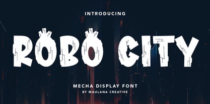 Robo City mecha display font. Heavy stroke, fun character with a bit of ligatures. To give you an extra creative work. Robo City mecha display font support multilingual more than 100+ language. This font is good for logo design, Social media, Movie Titles, Books Titles, a short text even a long text letter and good for your secondary text font with script or serif. Make a stunning work with Robo City mecha display font. Cheers, Maulana Creative
 - Hob Gob NF by Nick's Fonts,
$10.00Although not credited, the inspiration for this typeface, originally called "Dancer", has all the earmarks of the work of legendary lettering artist Alf Becker. Creepy and kooky, mysterious and spooky, but not in the least ooky, this monocase face is just what the doctor ordered; Dr Frankenstein, that is. Both versions of this font include the complete Unicode Latin 1252 and Central European 1250 character sets. - Badge Robo 3d Display Graffiti by Sipanji21,
$15.00 "Badge Robo" is a 3D display graffiti font with very bold and impactful characters. Fonts like this are often used in designs where you want to create a bold, attention-grabbing, and three-dimensional text effect. This style can be seen in various design applications, including street art, posters, or any project where you want your text to stand out prominently. With "Badge Robo," you can create designs that feature powerful and visually striking typography. The bold and 3D nature of this font can make your text appear dynamic and attention-grabbing, helping your design make a strong impact.
 - Pessimistic Lines - Unknown license

- Speed Bowling - Unknown license

- Rail Bum JNL by Jeff Levine,
$29.00 Morris Fuller Benton's Hobo [designed in 1910] is one of a number of fonts which have been so over-used that many designers shy away from it altogether. However, Jeff Levine had often wondered what the design might look like it given a serif treatment. The result is Rail Bum JNL, named for the hobos and transients who hitched along on freight cars to ride the rails across the country during the years when trains were the mainstay of American transportation.
 - Pepino by Robert Petrick,
$19.95 Pepino is loosely based on the classic font Hobo but Pepino is a completely new and original drawing. The font is bold, fun, casual, easy to set and read.
 - Ozone - Unknown license

- Beraka Font - Unknown license

- Ghetto Streetz - 100% free

- Roberta by profonts,
$41.99 Roberta goes back to the old poster fonts of the 1930s. It is an excellent alternative and combination to fonts like Arnold Böcklin or Hobo. Ralph M. Unger redrew and digitized this font in 2003. His work is based on artwork taken from old font catalogs.
 - GetaRobo by The Northern Block,
$12.80 A mechanical typeface influenced by Japanese animation (Anime). Examples Include: Getter Robo and Gatchaman aka (Battle of the Planets).
 - HobbesFriend - Unknown license

- Gesso - Unknown license

- Gliker by Studio Sun,
$8.00 Gliker was designer in the early 2019 and published in June 2020. Gliker is inspired by the characteristics of Hobo Typefaces. All corners of this typeface is founded, giving a more dynamic and vintage feel. Gliker is available in 4 Weights (Regular, Semi Bold, Bold, Black) and 7 Widths (Extra Condensed, Condensed, Semi Condensed, Normal, Semi Expanded, Expanded, Extra Expanded) with a total 28 Styles. Also includes support for 75+ Latin (Extended) Languages.
 - Cachuelin Letter - Personal use only

- Wine Cellar JNL by Jeff Levine,
$29.00 Wine Cellar JNL is a bold, yet casual display face found on some 1930s-era sheet music entitled "Everybody Wants a Key to My Cellar". Since the subject of the song had a number of good times underneath the house, it's a fitting name for the font. The hand lettering for the original song sheet showed strong influence of the 1920s and the Art Nouveau style, and has hints of the popular metal type "Hobo" in its character shapes.
 - Stylin' BRK - Unknown license

- Robeaugo by Stephan Kamperman,
$18.00 Robeaugo is pronounced as “ro-bo-go”. The name is originated out of the 3 words: robo, beau (French) and go. It’s a mix of Art Deco with round shapes and is best used in headings and logos.
 - Celtica - 100% free

- Lyps by hgo,
$15.00 Lyps is a contemporary headline family designed by Heiko Hoos. There are 4 font styles: Lyps Regular, Lyps Small, Lyps Extra Small and Lyps Wide. Each font file has OpenType features for ligatures, caps and some alternative Type variations. The Lyps family is suitable for high impact situations like posters, headlines, titles, magazines, packaging and many others.
 - ST Gaidar by ShimanovTypes,
$9.00 The font "Gaidar" named in the honour of Arkady Gaidar. He was a Soviet writer, whose stories were very popular among Soviet children, and a Red Army commander. He died in combat fighting with German nazis in 1941. Few generations of Soviet kids are raised on his books and a number of films were made based on his stories. This font inspired by posters, movie titles and book covers of this writer. The letterforms are bold and gnarly and comes in 2 styles: uppercase and small caps. It has LATIN and Extended Eastern Europe CYRILLIC letters. "ST-Gaidar" created for titles, poster design, web design, branding and packaging works, illustrations, badges and other typography works. Pls, don't use it for for typing large arrays of text. ST Gaidar supports 15+ languages: Belarusian, Bosnian, Bulgarian, Croatian, Dutch, English, German, Macedonian, Norwegian, Russian, Serbian, Swedish, Spanish, Slovenian, Ukrainian and probably others
 - Bum Steer JNL by Jeff Levine,
$29.00 In older American slang, a "bum steer" is a bad tip, some bad advice or being sent in the wrong direction (to name a few examples). Bum Steer JNL was modeled from some playful hand lettering found on a piece of early 20th Century sheet music entitled "When Uncle Joe Plays a Rag on His Old Banjo". It's very possible that "Hobo" (a popular type design of the time) was a strong influence on the sheet music's style of title lettering. It seems that songwriters in those bygone days were prone to cramming as many words from a line of their song into the title itself. Another such example of a wordy song title which coincidently is in keeping with the theme of a "bum steer" (pun intended) is a novelty number from 1915: "Cows May Come and Cows May Go but the Bull Goes on Forever" (words by Vincent Bryan, music by Harry Von Tilzer). [It's kind of self-descriptive, don't you think?]
 - Futura Maxi by Monotype,
$29.00 First presented by the Bauer Type Foundry in 1928, Futura is commonly considered the major typeface development to come out of the Constructivist orientation of the Bauhaus.movement in Germany. Paul Renner (type designer, painter, author and teacher) sketched the original drawings and based them loosely on the simple forms of circle, triangle and square. The design office at Bauer assisted him in turning these geometric forms into a sturdy, functioning type family, and over time, Renner made changes to make the Futura fonts even more legible. Its long ascenders and descenders benefit from generous line spacing. The range of weights and styles make it a versatile family. Futura is timelessly modern; in 1928 it was striking, tasteful, radical - and today it continues to be a popular typographic choice to express strength, elegance, and conceptual clarity. The PL Futura Maxi font family was created by Victor Caruso in 1960 to add more display weights to Paul Renner's 1927 Futura family. Typefaces in the same style like Futura are: Avenir, Metromedium, Neuzeit Grotesk,
 - The "ROBO" font, designed by George Edward Purdy, is a significant contribution to the typographic world, blending the boundaries between technology and art. At its core, "ROBO" encapsulates the esse...
- Sentinel by Comicraft,
$19.00 Common use(s) of Comicraft's All-new, All-different SENTINEL font include FACTOR-X, X-MAN, GENERATION NEXT and X-CALIBRE. Possible Side Effects: This font should not be used if you are trapped in a world you never made or a world full of people that hate and fear you. Prolonged exposure to this font during an Age of Apocalypse may cause fatigue, muscle soreness, first degree burns and immobility. Contraindications in Homo Superior may manifest as an outbreak of large purple automatons. Interactions: Before using this font in either regular or bold doses, notify your doctor of any recent exposure to mechanoids, synthezoids or paranoid androids. Reprogrammed Sentinel has improved spacing and kerning, Western & Central European accents, alternate lettershapes, and a new Interlocking Mode with over 100 connecting letter combinations!
 - South Wind by Ivan Rosenberg,
$16.00 South Wind Font is a handlettered font with 107 ligatures, lot of alternate characters and multilingual support. Is ideal for blog website, instagram, branding, invitations, business cards, weddings and many more. Ligatures list: ab ae al am an ar as at ax ay bb bl cc ch cl ct dd ee ef el en ep er es et ff ft gh ia ic ie il in it iu kt ll of ok ol om on oo op ot ov rr sh sl sm ss st th ts tt Af Ap As Be Dl Em Es Et Eu Ft If Is It Kt Ml Mr Ms Mt Ph Pl Pt Se Sh Sl St Us outh all alt arr ass can cus ell esl etl ett ill obl old oll oth out sim ted South Wind font also include multilingual support for Western and Central Europe. South Wind Font is a set of 542 glyphs, Upper and Lowercase characters with 107 ligatures, numerals, lot of punctuation glyphs, 3 alternates for each lowercase character and 2 alternates for each uppercase character. For access to Stylistic Alternates is required software with glyphs panel like Photoshop, llustrator, Inkscape etc. No special software is required to use Ligatures.
 - The Lobo Tommy font, created by Iconian Fonts, is an intriguing blend of style and character that sets it apart in the world of typography. Typified by its bold and adventurous spirit, it embodies a ...
- As of my last update in April 2023, Ozone by José Alberto Lobos S. is a font that may not be widely recognized in mainstream font databases or repositories. However, the creation of a font named Ozon...
- The Rio Lobo, a typeface created by Woodcutter Manero, is a vivid reflection of the untamed spirit and robust aesthetics associated with the Wild West. The moment you set your eyes on its characters,...
- Rassum Frassum by Comicraft,
$19.00 In the immortal words of Homer Simpson, "It's easy to complain... and so much FUN, too! Woo-HOO!" Now your characters can grumble, mumble and mutter in barely audible tones as they dredge up some bit of misery from their lives, unleash a rambling river of criticism and complaints about the state of their health, or the government, garbling as much graphic detail as time and your imagination will allow! Or perhaps your creations are issuing drunken slurs as they wake up outside their own fricka-frackin' houses cuddling wheelie bins, covered in glitter, wearing a shiny hat and budgie smugglers over their jeans while holding the reins to a miniature horse. So moan, groan, gossip incoherently or swear under your whiskey-soaked breath like a trooper... courtesy of those Rassum Frassum font lovers at Comicraft. >Hic!
 - Dynamic Duo by Comicraft,
$19.00 Batman & Robin! Thelma & Louise! Butch Cassidy & The Sundance Kid! Hip Flask & Farrell! Frodo & Sam! Sonny & Cher! Calvin & Hobbes! Bert & Ernie! Dynamic Duos exist in all forms of literature & entertainment, and now Comicraft is proud to introduce its latest alliterative offering, DYNAMIC DUO! A buddy movie in font form, Dynamic Duo is a team-up of Solid and Open weights who can’t decide who is the lead and who is the sidekick! In the fine tradition of all two-in-ones and company-wide comic crossovers, first they fight and then they team up — to take your design on the biggest, loudest, most intense adventure of All Time. Dynamic Duo features comic-book style hook caps and alternate uppercase letters which automatically cycle for a more natural, hand-drawn appearance. Solid and Open weights can be layered to create chromatic effects, and matching variable fonts allow near-infinite control of weight and slant. Each weight contains 478 glyphs and supports 220 languages. Comicraft fonts are created BY comic book letterers FOR lettering comic books. Accept no substitutes! Artwork by Axel Medellin from Elephantmen #73
 - Onomatopedia by Comicraft,
$29.00 Fans of Comicraft have made a lot of noise (HELP!) about the availability of ready-to-wear, factory surplus sound effects, not unlike those made available over a decade ago in our extremely popular and raucous ZAP PACK. It may sound impossible (WHA--?!), but Comicraft's Sonic Specialist, John JG Roshell, locked himself away (CLIK) in our top-secret SFX lab forming Onomatopoeia at high speeds (FWOOSH) and extreme temperatures (BBRRR), and sounded out over One Hundred (GASP) of the loudest (BTOOM), most intense (UNNGHH), squawkiest (KRAKK), discordant (SPLANGG), dissonant (SQUTCH) -- as well as dulcet and restrained (THWIPP) -- sound effects ever conceived (WOO HOO!) Helpfully arranged in alphabetical order (YIPPEE!), this Library of Onomatopeia -- the ONOMATOPEDIA, if you will (DING) -- is now available for use by the general public. WARNING: Comicraft Sound Effects may explode on contact with skin (AAAH!); please use protective clothing and eyewear when handling the Onomatopedia.
 - Colorado by Juliasys,
$- Nature is fond of stripes. Animals have them, plants have them and the rainbow has them. Besides being beautiful, stripes in nature have various origins and functions. But only Homo sapiens gave them symbolic meaning. In the American flag, the 13 stripes symbolize the 13 colonies that declared independence from Britain. In the French “Tricolour” flag, they represent Paris and the king of France. And in Russia’s “Georgiyevskaya lenta,” they symbolize the death and resurrection of St. George, the dragon-slayer. The font family COLORADO , named after the beautifully striped Colorado potato beetle, can be used to construct all kinds of symbolic or just beautiful messages. And thankfully, you need no OpenType diploma to do this. To get your texts multi-striped and multicolored, follow this simple procedure: Write the message with one of the COLORADO fonts and apply a color. Then copy and paste in place, and apply a second font and color. Repeat this again if wanted – and the masterpiece is done. COLORADO ’s language support covers about 100 languages. It has a Western European, a Central European and an Extended Cyrillic character set.


