10,000 search results
(0.025 seconds)
- DragonFyre by Scholtz Fonts,
$21.00 Beware: Here be Dragons! It Be Dangeroues to Venture Yonder! This warning, inscribed on a rock at the entrance of a cave in an inaccessible mountain in the far north of Scotland, provided the inspiration for the font DragonFyre. While I have not seen the actual rock myself, I have based the font on an accurate drawing of the original inscription. DragonFyre speaks of lands beyond our ken, of wistful faerie kingdoms, of dark happenings and white magic. Use it at your peril, for its very use will conjure up worlds long forgotten, places of faeries, elves and hobgoblins, of ogres and giants. Those who read texts written in this font may well have their lives strangely changed. I have included a complete character set of 242 characters; upper and lower case; as well as all accented and special characters. All characters have been carefully letterspaced and kerned. For maximum dramatic impact I suggest you use combinations of both upper- and lower-case characters.
 - Martin Luther by Harald Geisler,
$59.00 ❧ Useful links: Luther’s Manuscripts at the UNESCO Memory of the World at Google Arts and Culture Martin Luther font on Kickstarter (with Film about the creation) Each letter of the Martin Luther font is strictly based on original samples found in Martin Luther’s 500 year old handwritten manuscripts. Letters that occur more often for example vowels have two or more different versions stored in the font. (➶ Figure 4) These alternative forms are exchanged automatically by the font as you type, and create a vivid look that comes close to actual handwriting. The font avoids that two identical letters are placed next to each other like, for example the two “o” in the word “look”. ➸ What Historic Sources is the Font based on? Two historic documents were used to base the font on. The notes Luther took before giving his speech in Worms in 1521 and a 6 page letter he wrote immediately after to Emperor Charles V., summarising his speech (➶ Figure 2). Both documents have been added to the UNESCO “Memory of the World” and can be seen at the Google Arts and Culture website. ➸ The Creation of a Handwriting Font The creation of a handwriting font is very different from the creation of a regular font. Harald Geisler has specialised in recreating handwriting in preceding projects with Albert Einstein’s, Sigmund Freud’s and his own handwriting. His experience working with Archives and Museums has gone into this project. First Geisler analyses the movement in the writing to understand how each letter is drawn. This involves partially learning how to write like a person. In this process not the outlines of the sample are reproduced but the original movement path of the handwriting (➶ Figure 3). In a second step width and contrast is added to reproduce Martin Luther’s characteristic impetus and the writing tools used at the time. (Link: Youtube Playlist showcasing the creation of individual letters) How about signs that can’t be found in archives? Some Glyphs can not be found in 500 year old manuscripts, for example the @-sign. Towards the end of the creation one collects a profund amount of details about how a writer moves on paper and addresses certain tasks moving the pen. Keeping this knowledge in mind an improvisation can be based on similar letter forms. For example the @ sign is based on of the movement of a lowercase a and parenthesis. ➸ Features of the Martin Luther font ❶ Extensive Documentation of the creation of the font, including high quality reproduction of the used manuscripts. ❷ Additional texts from Historian Dr. Henning Jürgens and Palaeographer (and Luther handwriting expert) Prof. Ulrich Bubenheimer ❸ Alternating Letters - in handwriting every word looks a bit different. To avoid that two identical letterforms are placed next to each other (for example in the word look) the font actively changes between different versions of letters as you type. ❹ Ligatures - characteristic writing forms when two letters are combined (for example “ct”) (➶ Figure 5) ❺ Terminal Letterforms - renders a special letterform when letter is at the end of a word. (➶ Figure 8) ❻ ‘’’Initial and Medial Letterforms''' - some letterforms are different when placed in the beginning or middle of a word, for example the lowercase s. ❼ Luther Rose - is a seal Luther used to authorise his correspondence. Today it is a widely recognized symbol for Luther. When you enter the numbers of Luthers year of birth and death 14831546 using the Martin Luther PRO font, it will render a stylised version of the Luther Rose. (➶ Figure 7) ❽ Historic letter-forms - letter-forms that are specific to medieval writing around 1500. For example the long-s or h with a loop at the bottom. (➶ Figure 6) ⚑ Multi language support - see the technical information tab for a full list of supported languages. (➶ Figure 11) ➸ The different Styles explained ❋ Martin Luther PRO - this includes all features listed above and is geared towards writing texts that are more readable today. It features alternating letters to create a natural handwriting look as well as two stylistic sets accessible through the OpenType menu. Historic forms are available through the glyph picker. ❋ Martin Luther Historic - this font creates a historically correct reproduction (i.e. with long-s) of Luther’s medieval latin handwriting. It features alternating letters to create a natural handwriting look as well as two stylistic sets accessible through the OpenType menu. ❋ Martin Luther Expert-1 - Dedicated access to the first set of letters only. ❋ Martin Luther Expert-2 - Dedicated access to the second set of letters only. ❈❈❈ Family Pack - recieve all fonts at a discounted price. ❈❈❈ ➸ Kickstarter The creation and development of the Martin Luther font was financed by 500 supporters on ➸Kickstarter.
 - ITC Aram by ITC,
$29.99Jana Nikolic was finishing her degree program at the Faculty of Applied Arts, in Belgrade, with a final project that would combine her two majors: type and book design. Three stories from William Saroyan's My Name Is Aram would provide the text for the book, to be set in a typeface that Nikolic would design. Nikolic knew something special was happening the moment she put pen to paper. The letters just emerged," she recalls. "I started to explore a few new pens and found one I loved. I was able to make its tip bend with pressure." Like the family Saroyan writes about, the design flowing from Nikolic's pen would be simple but a little quirky. "When there were a whole bunch of little black letters around me," continues Nikolic, "I saw that this was going to be a very interesting typeface family." Nikolic drew Latin and Cyrillic letters, lowercase and capital letters, wide letters and narrow letters. She was surprised at how quickly and easily the design came. "There were no badly written letters," she says. "I hardly had to rework them and they fit together remarkably well." ITC Aram's standard character complement consists of one set of lowercase letters and two sets of capitals: one narrow and the other wide. The wide caps can be used with the standard lowercase, or mixed with the narrow caps for a variation on "cap and small cap" copy. The ITC Aram create the opportunity to mix and combine the letters into playful typographic expressions. Words and sentences that twinkle; text that seems light and alive - one runs the risk of creating work that is both delightful and charming when setting copy in ITC Aram." - Lumina by Scholtz Fonts,
$21.00Lumina combines a fluid, informal look with an upright, fairly formal character structure. The font is reminiscent of leaded or stained glass, suggesting a trying to-be-solid outline with flowing inner spaces. Characters are softened by the use of staggered heights and slightly irregular widths, creating the impression of hand-crafted, ink-drawn shapes. Lumina is unusual in that it gives a medieval treatment to a modern character outline. The outline has been given an irregular, slightly hand-crafted look that is at variance with its modern character and hints at both the informality of a grunge font and the carefully hand-drawn quality of medieval illuminated scripts (hence its name). It is one of the few informal, compressed fonts that retains a high degree of legibility. Use it when you want your text to be both relaxed and readable, and yet take up very little space on the page. Lumina Regular is not an outline font in the usual sense, since it contains one or more rounded hollows or lacunae within its outline. Use Lumina for: —Ecclesiastical book headings and illustrations —Church posters —Book covers —Greeting card design —Advertisements —The "fine print" The font contains a full 256 character set (upper and lower case, punctuation, diacritical characters, special symbols and numerals), in which all characters have been fully kerned and letter-spaced. - Gaspa by La Boîte Graphique,
$19.00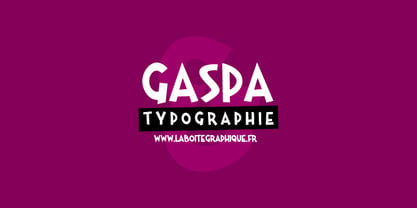 Fanciful, funny, hand-writting, decorative
 - Janda Safe And Sound by Kimberly Geswein,
$5.00 Imperfectly hand-sketched sans serif.
 - Bakersville by TypeFaith Fonts,
$6.00 Bakersville is a package of 2 hand drawn sketch serif fonts by TypeFaith Fonts. The fonts are very useable for food packaging, menu's, etc and gives your product the authentic hand made look.
 - Yoko Smile - Personal use only

- HeummSwifthongcha142 - Unknown license

- Janda Scrapgirl Dots - Personal use only

- A La Nage - Unknown license

- BROKEN GHOST - Unknown license

- Kings of Pacifica - Personal use only

- AHDN - Unknown license

- Ebola - Unknown license

- Tattoo - Unknown license

- Avain - Personal use only

- Wonton - Unknown license

- Magedo by Craft Supply Co,
$20.00 Introducing Magedo Vintage – Fluid Font Looking for a font that’s both fluid and exudes vintage charm? Look no further than Magedo Vintage – Fluid Font. This versatile typeface offers a blend of modern fluidity and classic vintage aesthetics display that will elevate your designs to the next level. Fluid Elegance Magedo Vintage boasts a fluidity that adds a touch of sophistication to your projects. Its smooth curves and flowing lines make it perfect for logos, headings, and invitations, creating a sense of dynamic movement that captures attention. Rustic Hand-Drawn Appeal Embrace the hand-drawn trend with Magedo Vintage. Its rustic, imperfect strokes give your text a unique character and a cozy, artisanal feel. Whether you’re designing a rustic wedding invitation or a quaint cafe menu, this font adds that charming touch. Timeless Stamp Effect Magedo Vintage also offers a stamp-like effect, reminiscent of classic imprints. This effect adds a sense of authenticity and nostalgia to your designs, making it ideal for vintage-themed posters, packaging, and labels.
 - Morphine Jack is a font that isn't just a typography choice; it's an attitude, a character, a whisper from the early 20th century speakeasies, jazz clubs, and the underground writer's circles. Its de...
- Buddy jim - Unknown license

- Dulcian by insigne,
$- Inspired by the Appalachian culture of the Southeastern United States, the finely tuned forms of Dulcian strike a clear, empowering chord with your audience. This energetic and fresh sans serif flows fast and smooth with its simple lines and slight hand-written character. All total, there are six weights, with complementary italics and three different widths. Dulcian supports OpenType features and is packaged with unicase alternates, unconnected alternates, ligatures, old-fashioned figures, fractions, titling and small caps. Preview any and all of these features in the interactive PDF manual. The Dulcian family of fonts also includes glyphs for 72 languages, providing you with more than 600 glyphs per font. While designed especially for pull quotes, this display typeface can be used for a variety of applications. Dulcian is an excellent choice for websites as well as flyers and packaging. Other uses include coffee, menus, awards, certificates where a touch of humanity and personalization is needed.
 - Angola Script by Stripes Studio,
$20.00 Our latest font Angola Script has a kind of modern hand-written feel, I hope you like it. It can easily and simply be used because there are a lot of features in it: Angola Script contains a complete set of lower and uppercase letters, assorted punctuation, numbers, multi-lingual support and also several ligatures and Stylistic Alternates. To enable the OpenType Stylistic alternates, you need a program that supports OpenType features such as Adobe Illustrator CS, Adobe Indesign & CorelDraw X6-X7, Microsoft Word 2010 or later versions. And there are additional ways to access alternates/swashes, using Character Map (Windows), Nexus Font (Windows), Font Book (Mac) or a software program such as PopChar (for Windows and Mac). How to access all alternative characters using Adobe Illustrator: https://www.youtube.com/watch?v=XzwjMkbB-wQ How to access all alternative characters, using Windows Character Map with Photoshop: https://www.youtube.com/watch?v=Go9vacoYmBw This Font has given PUA unicode. Thank you for your purchase!
 - Seol Sans by Monotype,
$187.99 The Seol Sans design offers a fresh palette for designers working with the Korean alphabet, particularly those looking to pair Latin and Korean alphabet (or Hangul) forms without creating typographic friction. The choices for Hangul fonts that work well with humanist Latin typefaces are limited. As Monotype’s first original Korean design, the Seol Sans typeface is a humanist take on the traditional rigid and hard designs of Hangul characters. The Seol Sans design more closely resembles the natural curve of hand-written characters. Seol Sans features Neue Frutiger for its Latin glyphs, and works harmoniously with Neue Frutiger World and Monotype’s CJK typefaces: Tazugane Gothic (Japanese) and M XiangHe Hei (Chinese). Seol Sans is a great choice for global brands using a Sans Serif design looking to maintain their visual identity, and communicate with a consistent tone of voice in the Korean market. Seol Sans has over 18,000 glyphs, and supports the Adobe-Korea1-2 and KS X 1001:2004 character sets.
 - Beethink by Gassstype,
$25.00 Bee Think This is a Rough Brush Typeface that is written casually and quickly. comes in two mode Standart this font are made with brushes on Procreate. Then crafted carefully drawn into vector format. That is why Bee Think has Rough and strong characteristic more natural look to your text with a more modern look to your text. You can activate Ligature OpenType panel to make these two styles. Bee Think is perfect for homeware designs,branding projects, Logo design, Quotes product packaging, especially with horror and scary themes Bee Think a natural Hand Drawn feel. This handmade font will make your design has a beautiful natural touch for each details. It is perfect for any design project as Invitation,logo, book cover, craft or any design purposes,photos, photography overlays, signs, window art, scrapbooking, tags and so much more! That is has charming, authentic and relaxed characteristic more natural look to your text.
 - Lady Slippers by Studioways,
$40.00 This is Lady Slippers, a delicate and beautiful typeface resembling one of Eliza Gwendalyn’s popular modern calligraphic styles! She is the full blown version with many OpenType bells and whistles such as, swashes, ligatures, discretionary ligatures and stylistic alternates. Enabling them makes it possible to create beautiful and seemingly hand-written calligraphy designs. Then there’s Lady Slippers Basic, Lady Slippers Loops, and Lady Slippers Align. These fonts are toned down versions of Lady Slippers. Still beautiful and delicate handwritten script typefaces, they are meant for users who don't require all of OpenType goodies. Each of these fonts support some basic OT features, like fractions, superiors, and ordinals. In an interesting twist, we have redrawn the lowercase in Lady Slippers Align to align on the baseline, giving Lady Slippers a more traditional calligraphic appeal. Finally, Lady Slippers Ornament is offered as a companion for any font in the Lady Slippers family. It contains decorative ornaments, crests and other hand drawn elements, as well as a set of figures, minimal punctuation, and some catchwords useful for invitations and bridal pieces. The package includes a key map so finding the ornaments is made easy. All the glyphs are accessible from any standard keyboard. You can purchase the fonts separately, or one of the discounted bundles we've put together, Lady Slippers 4 Pack (includes Basic, Loops, Align and Ornaments) or the Lady Slippers & Ornaments pack.
 - Bello Pro by Underware,
$50.00 Now check this, Underware’s blockbuster type, Bello. Bello Pro is a brush typeface for headline point sizes - it’s big & beautiful. Bello has lots of ligatures and start and ending swashes. They are automatic in Bello Script Pro, which is a cross-platform OpenType font with many OpenType features. Bello has Underware’s world-dominating Latin Plus character set, supporting a total of 219 languages (Latin 1 + 2 and beyond). After a period of hand sketching and lettering, Bello got two main styles: Script and Caps. These two fonts create a strong typographic contrast - while Bello Script Pro is flourished and flowing, Bello Caps Pro provides upright and sturdy capital lettering. As sturdy as brush lettering allows, of course. Careful spacing and kerning ensures* that Bello appears like fluently written handwriting. However, that’s not enough for a hand-lettered feel. Therefore Bello comes with a set of 64 ligatures. Some of them are typographic, some made simply to create a more intimate, natural impression. For the same reasons we have added a few ornaments and a set of snap-on beginning and ending swashes which attach to the lowercase letters of Bello. With Bello Words Pro you can add some two-color words in your text by the pre-designed word logotypes. Trust the brush! *So take care: use ‘metrics’, not ‘optical’ as a spacing setting in layout apps.
 - Komunikat FA by Fontarte,
$39.00 FA Komunikat is an experimental and geometrical typeface based on simple elements: a circle, it's parts and straight lines. The typeface communicate the spirit of future, dynamism and modernity. FA Komunikat design was based on the sketch of unique lettering from 1932 made by Władysław Strzemiński, Polish vanguard abstract painter, an artist and a typographer. Strzemiński claimed that modern economic letter forms should be standardized and based on lines and arches. He wrote that readability is a matter of habit and after a practice the new letter forms would be very well readable for everyone. In 2004 Artur Frankowski revived original design creating set of characters, widen up with numerals, punctuation marks and diactrics.
 - Clementine Sketch - 100% free

- Lorraine Braille by Echopraxium,
$9.50 This is a decorative and steganographic Braille font based on Lorraine Cross pattern. As the Lorraine cross splits space into six areas, it may be used to represent Braille glyphs. Provided Glyphs * Lowercase letters (a..z): a White cross and Black square dots * Uppercasecase letters (A..Z): a Black cross and White square dots * Special characters (e.g. !#$%*+<>{}()[]...) * Decorative glyphs (provided in black and white as well) Glyph code intervals - Codes 48..57: Bullets (0..9 digits) - Codes 130..150: 'White Stars' - Codes 192..233: 'Black Stars', Black border glyphs and other black patterns. - Codes 214..233: Border/Decorative glyphs (Black) - Codes 235..255: Border/Decorative glyphs (White) - Codes for Cross w/o dots: Black (192), White (235) - Codes for Cross and 6 dots: Black (191), White (234) - Code for 'Half-width space' (166) Posters 1. Logo: illustrates usage of border glyphs 2. Meta: Two big Lorraine Braille glyphs drawn with pattern glyphs 3. Stars: illustrates usage of 'Star' and pattern glyphs 4. Bullets: illustrates usage of bullet glyphs (0..9) 5. Human rights - Article 1 NB: - Encoding is: Windows Latin ("ANSI") - Published in two versions: Commercial and Free for personal use
 - Alvia by Zane Studio,
$12.00 Alvia is a clean, modern script font that is carefully crafted with a touch of elegance. This font can be used to write letters, invitations, food products, headlines and more. It will turn any creative idea into a true work of art!
 - Windha by Febri Creative,
$15.00 Windha is a modern and awesome signature font with extraordinary charm. This will change any design idea to be beautiful and perfect! Can be used as a logo, branding, or just writing. It supports multilingual languages, which you can combine into great designs.
 - Belle Allure by JBFoundry,
$10.00 Belle Allure is a font for schools. It is based on the continuity of movement and simple paths which let a fast and easy cursive writing. It respects the French habits and leans on a wide character set and on the OpenType properties.
 - M Young Hei HK by Monotype HK,
$523.99HK series fonts are in Unicode encoding and consists of BIG 5 character set and HKSCS characters. The character glyphs are based on the regular Traditional Chinese writing form and style. It is generally used in Taiwan ROC, Hong Kong and Macau. - M Kai HK by Monotype HK,
$523.99HK series fonts are in Unicode encoding and consists of BIG 5 character set and HKSCS characters. The character glyphs are based on the regular Traditional Chinese writing form and style. It is generally used in Taiwan ROC, Hong Kong and Macau. - Drogheda by Fontdation,
$20.00 Introducing our latest font release: Drogheda. A reversed-contrast slab serif with a strong but flexible personality. Crafted with high attention to the details, gives you the best designing experience. Suits best for poster designs, headlines, quote writings, etc. THANKS AND ENJOY!
 - M HG Hagoromo T HK by Monotype HK,
$523.99HK series fonts are in Unicode encoding and consists of BIG 5 character set and HKSCS characters. The character glyphs are based on the regular Traditional Chinese writing form and style. It is generally used in Taiwan ROC, Hong Kong and Macau. - The Secret Things by PeachCreme,
$17.00 We're excited to unveil our newest font. Relaxed and unpretentious, "The Secret Things" script gives any design an instant dose of natural flair. 45 ligatures allow you to make writing that seems completely handwritten, not like it was made using a font.
 - M HG Kyokashotai T HK by Monotype HK,
$523.99HK series fonts are in Unicode encoding and consists of BIG 5 character set and HKSCS characters. The character glyphs are based on the regular Traditional Chinese writing form and style. It is generally used in Taiwan ROC, Hong Kong and Macau. - M Hei HK by Monotype HK,
$523.99HK series fonts are in Unicode encoding and consists of BIG 5 character set and HKSCS characters. The character glyphs are based on the regular Traditional Chinese writing form and style. It is generally used in Taiwan ROC, Hong Kong and Macau.


