10,000 search results
(0.02 seconds)
- Grand Central JNL by Jeff Levine,
$29.00Grand Central JNL is named for the most luxurious train depot in the nation—Grand Central Station in New York City. This multi-line Art Deco font is reminiscent of all of the glitz and glamour associated with Manhattan in the 1930s and 1940s. Modeled from Jeff Levine's Parkitecture JNL, its roots go back to the popular typeface best known as Eagle—a lettering design most associated with the NRA posters of the Depression era. - Jadeite by TEKNIKE,
$129.00 Note: This family only contains Capital letters Jadeite is a geometric monospaced display font. The typeface has a distinct style inspired by the Mid-Century Modern era and designed to be easy to read. The Jadeite name comes from a mineral form of jade and also represents a color of green, reminiscent and popular of the 1950’s era. Jadeite is great for display work, quotes, invitations, film credits, fashion, architecture, posters and headings.
 - Calton Hosvesk by UICreative,
$23.00 Introducing our new product the name is Calton Hosvesk Stensil Sans Serif Font Family comes with 9 different weights. Modern Serif font that feels beautiful classy, elegant, and modern. This font is perfectly suited for a wide variety of projects, such as signature, stationery, logo, wedding, typography quotes, magazine or book cover, website header, clothing, branding, packaging design, and more. Also for fashion-related branding or editorial design and displays both masculine and feminine qualities.
 - Rodfat by Rizki Permana,
$15.00 Rodfat is a gorgeous, old-timey display font with a modern feel! Inspired by the industrial revolution, It will bring back the early days of the 20th century. This collection comes in two styles: One and Two. It is possible to be paired perfectly when used together. Perfectly suited for any display use. It could easily work for design product names, posters, signage, packages, logos, labels, and eye-pleasing typographic designs and more.
 - Roots by Vozzy,
$10.00 Stylized as a virus, this hand crafted label typeface is named Roots. This font contains capital and small characters. All capital characters have alternates for ending of words. Roots has two styles: Original and Simple. The simple style looks clean and bold and is a perfect support of your design and combines will with the eccentric Original style. Both styles have numbers, punctuation and multilingual characters. You can see all available characters on the preview.
 - Friedrichsfeld by Otto Maurer,
$17.00 Friedrichsfeld is a small town near there where I live. Friedrichsfeld, Voerde and Wesel was Part of the Preussen Kingdom till 1912. Friedrichsfeld was a Parade ground of the preussen troops and get the name of the King Friedrich II (the old Fritz). Today there is a Preussen Museum near Friedrichsfeld in Wesel. The Font comes in two ground Version, one in the history Letters and old Ligatures and a modern Version.
 - Avoidance Genevra by UICreative,
$23.00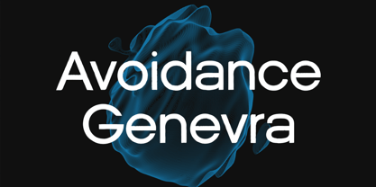 Introducing our new product the name is Avoidance Genevra Sans Serif Font Family comes with 9 different weights. Modern Sans Serif font that feels beautiful classy, elegant, and modern. This font is perfectly suited for a wide variety of projects, such as signature, stationery, logo, wedding, typography quotes, magazine or book cover, website header, clothing, branding, packaging design, and more. Also for fashion-related branding or editorial design and displays both masculine and feminine qualities.
 - La Sonnambula by deFharo,
$18.00 The Sonnambula is a handwritten and expanded font with terminal ornaments, designed to write very elegant titles or calligraphic texts. The name of this typography is dedicated to the opera La Sonnambula by Vincenzo Bellini. - Use the following characters for terminal ornaments: () [] - 380 glyphs. Latin Extended-A • OTF & TTF - OpenType Functions: Discretionary Ligatures, Kerning, All Alternates, Additional languages, Standard Ligatures, Slashed Zero, Capital Spacing, Ornaments, Ordinals, Mathematical Greek, Fractions, Localized Forms. - Bitcoin symbol: b# (ligatures)
 - North End Stencil JNL by Jeff Levine,
$29.00 An image of a vintage British lettering stencil set [probably circa 1960s] spotted in an online auction inspired North End Stencil JNL. The original lettering was a hybrid of both stencil and solid letter forms, but for the digital version all of the characters were given the stencil treatment. North End Stencil JNL is named after a district in London, and the type face is available in both regular and oblique versions.
 - Flagoria Calintha by UICreative,
$23.00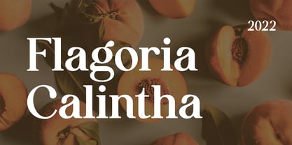 introducing our new product the name is Flagoria Caintha Serif Font Family comes with 9 different weights. Modern Serif font that feels beautiful classy, elegant, and modern. This font is perfectly suited for a wide variety of projects, such as signature, stationery, logo, wedding, typography quotes, magazine or book cover, website header, clothing, branding, packaging design, and more. Also for fashion-related branding or editorial design and displays both masculine and feminine qualities.
 - Diverting by Java Pep,
$17.00 Diverting is an aesthetic signature font that comes with more than 30 ligatures set so it can feel like a handwritten style vibe. For switching on the swash under line, you can write type "underscore (_) + (plus) and number 1 until 6". Diverthing font also have alternate subtitutions for uppercase and some lowercase, this font is perfect for branding, advertising, handwritten quotes, social media post, headlines, subtitle, wedding invitations, greeting cards, signature name, logotype, etc.
 - Forestyland by UICreative,
$23.00 Introducing our new product the name Forestyland Retro Serif Family Font Family comes with 9 different weights. Modern Serif font that is beautiful classy, elegant, and modern. This font is perfectly suited for a wide variety of projects, such as signature, stationery, logo, wedding, typography quotes, magazine or book covers, website headers, clothing, branding, packaging design, and more. Also for fashion-related branding or editorial design and displays both masculine and feminine qualities.
 - Mondapick by UICreative,
$23.00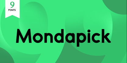 Introducing of our new product the name is Mondapick Sans Serif Font Family comes with 9 different weights. Modern Sans Serif font that feels beautiful classy, elegant, and modern .This font is perfect suited for a wide variety of projects, as to signature, stationery, logo, wedding, typography quotes, magazine or book cover, website header, clothing, branding, packaging design and more. Also for fashion related branding or editorial design and displays both masculine and feminine qualities.
 - Culpepper by Galapagos,
$39.00I've always admired the work of Rudolph Koch. Culpepper is what I think Neuland would have looked like if it had been developed with lowercase, small caps and a range of weights. I started work on this series in the late 80’s and, like so many of my ideas, it was shelved when life drew me in another direction. Culpepper is the name of one of the islands in the Galapagos chain. - Antique Slabserif JNL by Jeff Levine,
$29.00 Antique Slabserif JNL is a reinterpretation of Monotype's Modern Antique 26, released in 1909. The name of the typeface is an oxymoron because Modern conflicts with Antique. Despite many critics of the "mechanical" look of the font's design, it has developed a bit of charm with age and the passing of time. Available in both regular and oblique versions, Antique Slabserif JNL can be used as both a text and headline font.
 - Cartoon Nouveau JNL by Jeff Levine,
$29.00 Most of the lettering on a piece of sheet music for a song from the 1921 George M. Cohan musical comedy entitled “The O’Brien Girl” was hand lettered in a playful, casual Art Nouveau design with rounded ends. The characters on that page took on a look reminiscent of cartoon or comic strip wording, and the result is a digital typeface named Cartoon Nouveau JNL, which is available in both regular and oblique versions.
 - Aerioz by Letrasupply Typefoundry,
$18.00 Aerioz is a monoline all caps font, comes with over 600 characters including 324 alternate letters. Smooth with rounded lines, simple, elegant, and perfect in any layout project such a headline magazines, custom name, neon sign and more typography work. Aerioz is packed with ornaments and OpenType alternates, you can combine the regular font with the ornament to make it more perfect. How to get access alternate glyphs from open type fonts : http://adobe.ly/1m1fn4Y
 - Like A Cat by PizzaDude.dk,
$20.00 As a kid I used to write my favourite football teams name with 3D letters over and over again. I spent hours doing this - often to find out I had the colors wrong, or I had made a spelling error or two - but now, several years after, I have created the "Like a cat" font - so that you can make "handmade" headlines or funny quotes or even your favourite football teams name in a swoosh! If you get the colors wrong, or you make a spelling error, it's fast and easy to correct! :) Like a cat comes with substitution characters for double letters!
 - Marydale by Three Islands Press,
$29.00 While helping produce a trade magazine years ago, I admired the hand-lettering of the art director -- a woman named Marydale -- and suggested she let me model a font after her penmanship. She agreed and drew out the alphabet, and I launched an old copy of Fontographer and (to shorten a long story) ended up developing my very first digital typeface. Which has since, astonishingly, become famous worldwide. So now the real Marydale gets the mixed blessing of seeing her handwriting (and name) plastered all over the planet. Full release has regular, bold, and black weights.
 - Blackhaus by Canada Type,
$25.00Almost a half of a millennium after being mistaken for the original 4th century Gothic alphabet and falsely labeled "barbaric" by the European Renaissance, the blackletter alphabet was still flourishing exclusively in early 20th century Germany, not only as an ode to Gutenberg and the country's rich printing history, but also as a continuous evolution, taking on new shapes and textures influenced by almost every other form of alphabet available. Blackletter would continue to go strong in Germany until just before the second World War, when it died a political death at the height of its hybridization. For almost 50 years after the war, blackletter was very rarely used in a prominent manner, but it continued to be seen sparely in a variety of settings, almost as a subliminal reminder of western civilization's first printed letters; on certificates and official documents of all kinds, religious publications, holiday cards and posters, to name a few. In the early 21st century, blackletter type has been appearing sporadically on visible media, but as of late 2005, it is not known how long the renewed interest will last, or even whether or not it will catch on at all. The last few years before World War II were arguably the most fascinating and creative in modern blackletter design. During those years, and as demonstrated with the grid-based Leather font, the geometric sans serif was influencing the blackletter forms, taking them away from their previous Jugendstil (Art Nouveau) hybridizations. Blackhaus is a digitization and elaborate expansion of a typeface called Kursachsen Auszeichnung, designed in 1937 by Peterpaul Weiss for the Schriftguss foundry in Dresden. This is one of very few designs from that time attempting to infuse more Bauhaus than Jugendstil into the Blackletter forms. This is why we used a concatenation of the words blackletter and Bauhaus to name this face. The result of injecting Bauhaus elements into blackletter turned out to be a typeface that is very legible and usable in modern settings, while at the same time harking back to the historical forms of early printing. The original 1937 design was just one typeface of basic letters and numbers. After digitizing and expanding it, we developed a lighter version, then added a few alternates to both weights. The Rough style came as a mechanically-grunged afterthought, due to current user demand for such treatment. Having the flexibility of 2 weights and many alternates of a blackletter typeface is not a very common find in digital fonts. More specifically, having the flexibility of 2 weights and alternates of a 20th century blackletter typeface is almost unheard of in digital fonts. So the Blackhaus family can be quite useful and versatile in an imaginative designer's hands. - Strikt by NaumType,
$25.00 Strikt is a variable modular font family with 2 axes, build on a 3x3 grid. It was designed by Peter Bushuev and released in August of 2020. It was inspired by the idea of utilizing the variable font technology to make a font with build-in animation potential. Strikt has 2 variable axes: weight and animation. The first one is self-explanatory, but the animation axis is the main feature of the font. It allows you to morph any glyph to a 3x3 dot array and back. In Strikt Plus modification, this array is the same for each letter, which gives the possibility to transform one glyph to the other. Strikt is also a very sturdy and unique display font. In "Plus" modification it gives even more sci-fi and techno vibes. And in light weights, Strikt becomes more architectural and gives the possibility to make unusual ornamental layouts. Get Strikt to jazz up your design! Try variable versions for kinetic typography and motion graphic. Strikt is a bold choice for posters, album covers, experimental identity and packaging, games, and editorial design.
 - Pillar by Loshaj Foundry,
$20.00 The font Pillar is inspired by steel pillars that support buildings and bridges together. In similar fashion, the font is designed to support the content for which it will be used. The font is intended to be used as a header or headline font, but a creative designer will find other uses for it. Most of the characters are based on the same rectangle and therefore contain the same width which displays symmetry. The font contains 242 glyphs which include: uppercase and lowercase letters, numbers, symbols, accented characters, and ligatures.
 - Hello Melky by Good Java Studio,
$20.00 Welcome to: Hello Melky - a Kids Display Font It's smooth, it's funny, it's fun, and it's very nice: it's Hello Melky - a Kids Display Font Mixed fonts with many possible combinations. Everything is made with the same brush, and everything is the same size as Hello Melky, so you can be sure they will work well together! It is suitable for you to use in making t-shirt design, quote, label, packaging, logo type, or long writing. Because we have compiled kerning and matrices that are tailored to your needs.
 - Coffeeshop by Vozzy,
$10.00 Introducing the new 2024 font "Coffee Shop"! This is a strict and at the same time playful serif font. It will look great on any of your designs - T-shirts, posters, promotional materials. Introducing the new font "Coffee Shop"! This is a strict and at the same time playful serif font. It will look great on any of your designs - T-shirts, posters, promotional materials. The font contains many additional characters, there is multilingual support, as well as styles with support for layers - Shadow FX and Scratch Shadow FX.
 - Ongunkan Phoenician by Runic World Tamgacı,
$50.00 Phoenician/Canaanite The Phoenician alphabet developed from the Proto-Canaanite alphabet, during the 15th century BC. Before then the Phoenicians wrote with a cuneiform script. The earliest known inscriptions in the Phoenician alphabet come from Byblos and date back to 1000 BC. The Phoenician alphabet was perhaps the first alphabetic script to be widely-used - the Phoenicians traded around the Mediterraean and beyond, and set up cities and colonies in parts of southern Europe and North Africa - and the origins of most alphabetic writing systems can be traced back to the Phoenician alphabet, including Greek, Etruscan, Latin, Arabic and Hebrew, as well as the scripts of India and East Asia. Notable features Type of writing system: abjad / consonant alphabet with no vowel indication Writing direction: right to left in hortizontal lines. Sometimes boustrophedon. Script family: Proto-Sinaitic, Phoenician Number of letters: 22 - there was considerable variation in their forms in different regions and at different times. The names of the letters are acrophonic, and their names and shapes can be ultimately traced back to Egyptian Hieroglyphs. For example, the name of the first letter, 'aleph, means ox and developed from a picture of an ox's head. Some of the letter names were changed by the Phoenicians, including gimel, which meant camel in Phoenician, but was originally a picture of a throwing stick (giml).
 - Lido STF by Storm Type Foundry,
$39.00Times with a Human Face: In my article of the same name which appeared in the magazine Font, volume 2000 I described the long and trying story of an order for a typeface for the Czech periodical Lidové noviny (People’s Newspaper). My task was to design a modification of the existing Times. The work, however, finally resulted in the complete re-drawing of the typeface. The assignment, which was on the whole wisely formulated, was to design a typeface which would enable “a smooth flow of information in the reader’s eye”, therefore a typeface without any artistic ambitions, from which everything which obstructs legibility would be eliminated. A year later Lidové noviny had a different manager who in the spring of 2001 decided to resume the cooperation. The typeface itself definitely profited from this; I simplified everything which could be simplified, but it still was not “it”, because the other, and obviously more important, requirement of the investor held: “the typeface must look like Times”. And that is why the above-mentioned daily will continue to be printed by a system version of Times, negligently adjusted to local conditions, which is unfortunately a far cry from the original Times New Roman of Stanley Morison. When I was designing Lido, the cooperation with the head of production of Lidové noviny was of great use to me. Many tests were carried out directly on the newspaper rotary press during which numerous weak points of the earliest versions were revealed. The printing tests have proved that the basic design of this typeface is even more legible and economical than that of Times. The final appearance of Lido STF was, however, tuned up without regard to the original assignment – the merrier-looking italics and the more daring modelling of bold lower case letters have been retained. The typeface is suitable for all periodicals wishing to abandon inconspicuously the hideous system typefaces with their even more hideous accents and to change over to the contemporary level of graphic design. It is also most convenient for everyday work in text editors and office applications. It has a fairly large x-height of lower case letters, shortened serifs and simplified endings of rounded strokes. This is typical of the typefaces designed for use in small sizes. Our typeface, however, can sustain enlargement even to the size appropriate for a poster, an information table or a billboard, as it is not trite and at the same time is moderate in expression. Its three supplementary condensed designs correspond to approximately 80% compression and have been, of course, drawn quite separately. The intention to create condensed italics was abandoned; in the case of serif typefaces they always seem to be slightly strained. I named the typeface dutifully "Lido" (after the name of the newspaper) and included it in the retail catalog of my type foundry. In order to prevent being suspected of additionally turning a rejected work into cash, Lido STF in six designs is available free of charge. I should not like it if the issuing of this typeface were understood as an “act out of spite” aimed against the venerable Times. It is rather meant as a reminder that there really are now alternatives to all fonts in all price categories. - Foro Sans by Hoftype,
$49.00 Foro Sans is the matching friend of the popular Foro family (Foro and Foro Rounded). It comes with the same number of styles and the form displays the same characteristic features. Foro Sans consists of 16 styles and is well suited for ambitious typography. It comes in OpenType format with extended language support. All weights contain ligatures, superior characters, proportional lining figures, tabular lining figures, proportional old style figures, lining old style figures, matching currency symbols, fraction- and scientific numerals and matching arrows.
 - Kentya by Twinletter,
$14.00 Introducing our newest Font, Kentya the name This font is made with elegant calligraphy nuances and there are so many kinds you can combine various kinds of font choices to get the beautiful writing you want, this font is also good for writing your name and trademarks and logos and words, sentences that beautiful of course with the right typography harmony. This font also offers the beauty of abstract typography harmony for a wide variety of design projects, including natural handwriting in digital form for designs, quote designs, for social media business designs, advertisements, trademarks, promotional banners, posts, posters, signatures, and all. the design requires handwriting or whatever design you want. This font is equipped with uppercase, lowercase, numbers, punctuation marks, swhases and several variations on each character including multi-language. ================================================== This font is best suited for open type friendly applications. How to get alternative glyphs from open type fonts: http://adobe.ly/1m1fn4Y PUA Character Code - Fully accessible without additional design software. do not hesitate anymore start using this font. and Feel free to send any message you want to convey.
 - Zydeco JNL by Jeff Levine,
$29.00Zydeco JNL gives the 'Latin' style spur serif treatment to Jeff Levine's Halavah Twist JNL, for a new and fun typeface named after the Louisiana French-Creole music popularized by accordion player Clifton Chenier in the 1950s. - Bandidas by Vozzy,
$5.00 Introducing a vintage look label font named "Bandidas".Typeface includes five styles plus aged version, for sample look at 4th preview. This font will good viewed on any retro design like poster, t-shirt, label, logo etc.
 - Boffin by Evolutionfonts,
$- A simple little typeface for all things technical. A faux monospaced, semi-serif with rounded corners that you will never forget. The name comes from a British slang word that means "tech-savy person". Or simply "nerd".
 - Camelopard NF by Nick's Fonts,
$10.00 A wooden face, rather prosaically named Gothic Bold, from Hamilton's 1889 specimen book provided the pattern for this bold and brassy face. Both versions support the Latin 1252, Central European 1250, Turkish 1254 and Baltic 1257 codepages.
 - Nikki by Galapagos,
$39.00This typeface was named for one of George's daughters, at her request, after she discovered that another of George's designs, ITC Kristen, bore an appellation strikingly similar to that of her sister. And then there was peace... - Lawabo by Schriftlabor,
$30.99 The original Lawabo was started many years ago by Rainer Scheichelbauer. Its minimalistic and rounded shapes are reminiscent of bathroom ceramics, hence the name. Schriftlabor designer Miriam Surányi added bold and italic shapes, and produced the family.
 - Eastlake by Solotype,
$19.95Eastlake was a popular furniture style of the period when the MacKellar, Smiths & Jordan foundry brought out this font. As with many types, we find it difficult to see the connection between the name and the face. - Village by Font Bureau,
$40.00 David Berlow undertook the revival of Frederic W. Goudy’s Village family in the early ’90s as the first real step in the successful redesign of Esquire magazine. Goudy originally cut Village No. 2 in 1932 to bring early ideas up to date, adding the italic a year or two later for his own satisfaction. Font Bureau expanded Village, the model for Goudy’s mature style, into a ten-part series designed for Esquire’s use in text and display; FB 1994
 - Grotesco by Latinotype,
$39.00 This South American grotesk font blends the functionality of an American grotesk typeface with that unique Latino rhythm and flair. Sure it can be quite serious, but more importantly, its two alternate sets allow you to bring flavor to your logos, brands and advertising designs. We would like to especially thank Alfonso García for his help with digital editing, the development of a fresh italic version, as well as the addition of Cyrillic and currency symbols.
 - Hello Melodi by IRF Lab Studio,
$10.00 Hi, Introducing the latest styles Hello melodi Script with the kind of modern hand scratches, I hope you are interested in this font, if you want to use for your work this font can be used easily and simply because there are a lot of features in it to contain a complete set of letters lower and uppercase letters, assorted punctuation, numbers, and multilingual support. font also contains several ligatures and alternate style Stylistic. Thank You.
 - Sightseeing Tour JNL by Jeff Levine,
$29.00 Samuel Welo was a sign painter who had published in the 1920s and again in 1960 his “Studio Handbook – Letter and Design for Artists and Advertisers”, prolifically hand lettering all of the type style examples within the pages of the publication. In 1930 Welo also published “Lettering - Practical and Foreign”. From this book comes a thick-and-thin hand lettered Art Deco alphabet – now available digitally as Sightseeing Tour JNL in both regular and oblique versions.
 - Californian FB by Font Bureau,
$40.00 In 1938, Frederic W. Goudy designed California Oldstyle, his most distinguished type, for the University of California Press. In 1958, Lanston Monotype issued it as Californian. Carol Twombly digitized the roman 30 years later for the University of California; David Berlow revised it for Font Bureau with italic and small caps; Jane Patterson designed the bold. In 1999, assisted by Richard Lipton and Jill Pichotta, Berlow designed the black and the text and display series; FB 1994–99