10,000 search results
(0.024 seconds)
- Cita Pro by XdCreative,
$29.00 About Cita Pro Hi there please say hello to "Cita Pro" the latest collection from @faldykudo, Cita Pro is a serif typeface with a taste of old style, its very beautiful with a timeless aesthetic and has a very wide range for various design situations. Cita Pro is perfect for both display and body text because it has a very good readability. Cita Pro has 14 style and 7 weights, - from Thin to Bold and Matching calligraphic italic. Cita Pro also has special alternate characters in complete uppercase from A-Z . it is to give a different look for your display design. thanks, hope you would like and accept "Cita Pro" as part of your family. thank you in advance
 - Pivnaya-Arabic by Roman Type,
$35.00 An Arabic font designed by a German living in Berlin’s Neukölln district, between Karl-Marx-Strasse and Sonnenallee. This is the Latin+Arabic version of poster/display font Pivnaya designed and published by Roman Type. Designer Roman Wilhelm finds himself constantly surrounded by Arabic type and hand-lettering in his neighborhood. With this font, he is trying to answer to all these linguistic, type-related, and cultural inspirations. It works for Afrikaans, all languages of the Arab World, Albanian, Catalan, Croatian, Czech, Danish, Dutch, English, Estonian, Farsi, Finnish, French, German, Hungarian, Icelandic, Italian, Latvian, Lithuanian, Maltese, Norwegian, Polish, Portugese, Romanian, Slovak, Slovenian, Spanisch, Swedish, Turkish, Urdu, Vietnamese, Zulu. Equipped with a wide coverage of the International Phonetic Alphabet (IPA), the font is equipped for multi-purpose usage.
 - Garmalad by Si47ash Fonts,
$18.00 A distorted and fun Persian Arabic font which brings a lot of diverse emotions! Garmalad font is playing with standard and traditional way of Right to Left Arabic script. Based on Naskh, letters are designed in a deformed and disintegrated way to make it a typographic artistic typeface at the end. This font is a great choice for all graphic designers, typographers and visual artists. Shahab Siavash, the designer has done more than 30 fonts and got featured on Behance, Microsoft, McGill University research website, Hackernoon, Fontself, FontsInUse,... Astaneh text and headline font which is one of his latest designs, already got professional typographers, lay-out and book designers' attention as well as some of the most recognizable publications in Arabic/Persian communities.
 - Beebzz by Popskraft,
$19.00 Everybody loves black colour, strict stylish and elegant shapes. We strive to be perfect. Right? But... Do not you think that we have lost something? Maybe child's spontaneity? The Beebzz font brings you back to those perfect times, when there was no need to be serious, when the whole world was not so serious. Beebzz is an original font family designed for headlines, titles and subtitles. It has his own unique style in expressive, perfectly condensed forms, inspired by freehand child calligraphy and strong geometric typefaces. Beebzz is a font family that is ideal for display, text, print, branding, signage, and also for user interfaces, mobile devices, especially web design creation, with a set of optimal characters for your design in any layout.
 - Bodebeck by Linotype,
$29.99 The Swedish designer/typographer Anders Bodebeck designed the Bodebeck type family in 2002. The family, which includes five different styles, is primarily intended for use as a titling, or display face, and belongs to the neo-transitional style of typefaces. Transitional style type first appeared in England during the late 1750s, when John Baskerville released his first sets of type. Bodeck bears similarities to another, later transitional style typeface as well - Eric Gill's Perpetua (originally released by the British Monotype Corporation in 1928). Like these two previous English stonecutters turned masters of typography, Anders Bodebeck has given us a modern re-interpretation of classic letterforms. Bodebeck, which is fitted with old style figures, is available in the following styles: Regular, Italic, Bold, Bold Italic, and Extra Bold."
 - Heller Sans JNL by Jeff Levine,
$29.00 Heller Sans JNL is based on the main letterforms of an experimental alphabet designed by Steven Heller; noted author of over 170 books on design and visual culture. Some modifications were made in turning his design into a digital font. In his own words, here is the background to this typeface: “I recently recovered this from the junk heap. It is a yellowing photostat of my first and only typeface design (1969-70). Total folly! At the time I was smitten by Art Moderne lettering. I called it “Klaus Boobala Bold” because I liked the K and B. I’ve lost the letters S through Z, which were made. The letters were drawn with compass, Techno pen (that frequently clogged). as well as a triangle and T-square. The inline and outline made no real logical sense. I based the design, in part, on Kabel, Avant Garde and it was a product of whatever I could accomplish with those tools. The caps-only alphabet was photographed and produced as a film negative that was cut in foot-long strips and spliced to fit on a Typositor reel. Sadly, the negatives made for the font were too brittle and the splice snapped apart in the Typositor. I worked on it for well over a month and used the face only once. I realized with this attempt, like so many other times I attempted different challenges, that type design — indeed mechanical drawing — was not my strong suit.” Heller Sans JNL is available in both regular and oblique versions.
 - Tulipán Broken Caps Pro by Estudio Calderon,
$40.00 Tulipán Broken Caps Pro is new variable/complement of Tulipán Broken Caps, it includes 200 interesting ligatures, specially designed for games, apps, books, logos and packaging. Its bold structure is perfect to give great effects.
 - Penny Pincher by Great Lakes Lettering,
$12.00 Penny Pincher is here to deliver a great fun and fancy at a super value. Penny Pincher is perfect for childrens books, cereal boxes and board games. Makes you wish you were a kid again.
 - Kidwriting Pro by Corradine Fonts,
$20.00 Kidwriting is a hand-drawn font, originally released in 2007. Now, we are proud to present a totally redrawn and improved font: Kidwriting Pro, which include not just a softer appearance but also an extended set of characters and new typographic features that makes it a professional tool. The childlike appearance of Kidwriting Pro allows to apply it to any child related project like teaching material or games. It effectively recreate the charming and somehow bumbling qualities of a child’s handwriting, but is balanced enough for comfortable reading. Kidwriting Pro has many Open Type features such as Old Style figures, discretionary ligatures, ordinals and fractions. Composed of more than 500 glyphs, Kidwriting Pro supports Western European, Central/Eastern European, Baltic, Turkish and Romanian Languages. Kidwriting Pro is complemented with a set of 62 selected dingbats which evoque the children world. And the best: it comes also in the same five weights to match completely with each one of the fonts.
 - Bookish by Hackberry Font Foundry,
$24.95 This all started with a love for Jenson. I know there're hundreds of variations on that theme. But, that is where I began, several years ago. How far it came, as usual as I wandered through the vagaries of font design, is not unusual. If you've read any of my font design books, you know my design processes are quite loose and spontaneous. I wanted the general feel of a favorite old font, but softer, easier, and more comfortable. I built these on the same vertical metrics as my Librum Publishing Group. However, this family is not part of that group. I used the metrics because that shows my current taste in fonts. This family does work with the Librum group—but to be honest, I haven't experimented enough to come up with a good companion. I suspect I'll need to make another companion family. I may need make a non-modulated bold version also. But, that remains to be seen. I'm pleased with this.
 - Fall Fashion JNL by Jeff Levine,
$29.00 Stencil-like lettering appearing on a 1930s WPA (Works Progress Administration) poster for the Pennsylvania Game Commission saying “Protect Our Birds” is the basis for Fall Fashion JNL.
 - Sentzoff Coupon JNL by Jeff Levine,
$29.00The perfect font for coupon clippers has arrived with Sentzoff Coupon JNL by Jeff Levine. The dashed lines form letters in the same way a coupon is bordered. - Nd Harquied by Notdef Type,
$25.00 What about some spooky type? Nd Harquied is great for Halloween, Comics, Monsters, or maybe something that you came up with melting cheese! How creative can you be?
 - Sticky Beat by Bogstav,
$15.00 Yes, it's handmade - and yes, it's super funky! Sticky Beat is quite useful for everything that needs a quirky approach, and at the same time not overdoing It.
 - Diamante Robusto by César Modesto,
$- Diamante Robusto Font is my new font, where all the letters came out of this strange shape created without intention of being the inspiration for this new font.
 - Crowden by Aftertime Studio,
$17.00 Crowden is a cool, bold and futuristic display font. It works great on games, science projects, sporting events or pretty much anything that requires a high-tech vibe.
 - ITC Stepp by ITC,
$29.99When Hal Taylor saw the 1930 logo for the Stetson Shoe Company of Weymouth, Massachusetts, he didn't run out and buy a pair of loafers. Instead, he seized on this striking example of an Art Deco logotype as the basis for a new typeface design. “I was impressed with the delicate and sophisticated letter forms,” Taylor recalls, “particularly the enlarged cap S -- in any other case it would have seemed unbalanced, but in the context of this logo, it worked perfectly.” All the letters in the original all-caps Stetson Shoe logo were rendered with condensed proportions except the O, which was a perfect circle. While the prominent O added visual interest to the logo, Taylor knew that such a character would limit his typeface to display applications. For versatility's sake, he drew his O for ITC Stepp with the same proportions as the rest of the alphabet. Taylor also gave the logotype's inverted S a more traditional design, but kept the original as an alternate character in the OpenType font. Taylor's toughest challenge during the design process was creating a lowercase. “A good type design tells you what it wants to be,” he says, “and after a little while the Stepp caps began to tell me what the lowercase should look like.” Taylor's lowercase is slightly more conventional than the caps. The jaunty g" and almost upside-down "s" add subtle charm, while the capital letters provide the broader gestures of Stepp's personality. Together, they create a versatile and distinctive typeface design. One of Hal Taylor's first jobs was as a photo-lettering typographer in Philadelphia, setting headlines and creating custom lettering. This was followed by a stint doing finished lettering for John Langdon, whose ambigrams appear in Dan Brown's best-selling novel, Angels & Demons. Today, Taylor works as a graphic designer in the publishing industry, but he still finds time to create an occasional hand-lettered book jacket, and draw handsome typeface designs. ITC Stepp is available in four weights, ranging from Light to Ultra Bold. All four weights have companion italics, and the lightest three weights also offer a suite of small caps." - ITC Tactile by ITC,
$29.99ITC Tactile is a puzzle of subtle typographic contradictions. Capitals have traditional epigraphic proportions, but the lowercase has a uniform optical width. Light weights are stately and elegant, but bold designs are almost jolly. This paradoxical alphabet even combines two distinctively different serif designs. Designer Joe Stitzlein says, “I wanted to create a modern and dynamic serif face that draws its forms from antiquity. I also wanted to have as much fun as possible with the drawing and architecture of each letter. Hopefully I've created a very legible typeface that grabs the reader's eye in a nice, 'tactile' way.” The apparent inconsistencies of the design are the result of careful consideration. Of the seemingly odd serif design, Stitzlein explains, “The transitional serif is an entry point for the eye into the letterform, and the long slab is an exit, leading to the next letter.” The result is a typeface that's easy to read at text sizes but offers surprising details when enlarged to display sizes, setting ITC Tactile apart from more traditional designs. While this is his first commercial typeface design, Stitzlein has ample experience creating custom typefaces for corporate branding, including companies such as Silicon Graphics and Sempra Energy. His graphic design business has served a wide range of clients, including Apple Computer and the 2002 Salt Lake City Olympics. The ITC Tactile family is available in three weights, with complementary italic designs and a suite of small caps for each of the roman designs. Stitzlein drew the small caps to match the height of the lowercase x-height, which enables “bi-form” or “unicase” setting in display copy. - Diane Script by GroupType,
$27.00 In 1995, FontHaus came upon a rare opportunity to create a revival of Aries, a little known and previously unavailable typeface by the legendary Eric Gill. Discovering a lost typeface by one of the major designers of the 20th Century, was the discovery of a buried treasure, and being the first type company to release it was an honor. Thirteen years later, FontHaus came across another little known typeface treasure: Diane. Designed by the legendary French designer Roger Excoffon in 1956, this remarkable script has never been faithfully recreated until now. In close collaboration with Mark Simonson, FontHaus and Mr. Simonson painstakingly researched rare type books, publications, European metal type services, and period showings from the United States, England, Germany and from the University of Groningen in the Netherlands. Finding full specimens of the font turned out to be quite a challenge. In most cases, only the caps and lowercase were shown. Furthermore, the more we researched Diane, many curious facts came to light. The caps in earlier specimens of Diane are completely different from specimens published later, suggesting that the face was redesigned at some point, perhaps in the mid-1960s. So we are left with two different sets of caps. The original had very elaborate, swirly strokes, very characteristic of Excoffon¹s gestural designs for posters and logos. Later on, these appear to have been replaced by a set of simpler, more traditional script caps. The original caps are criticized in one source Mark found (Practical Handbook on Display Typefaces, 1959) as being "exquisite" but "not highly legible". Perhaps this is what led to the simpler caps being introduced. Nevertheless, FontHaus's release includes not only both sets of caps, but a range of alternates and a number of new characters not originally available such as the Euro, and a magnificent alternate Ampersand to name a few.
 - Hexenhammer by Hanoded,
$15.00 The ‘Hammer of Witches’, ‘Malleus Maleficarum’ or ‘Hexenhammer’ in German is the best know and most important treatise on witchcraft. It was composed by Heinrich Kramer in 1487. I thought it was a rather apt name for my latest fairytale font! Hexenhammer is a rough, handwritten typeface with an attitude. It can be used for book covers, posters and even spells. Comes with a bunch of end ligatures and a pandemonium of diacritics.
 - Nicolas Cochin by Linotype,
$40.99Georges Peignot designed the font Nicolas Cochin based on copper engravings of the 18th century and Charles Malin cut the typeface in 1912 for the Paris foundry Deberny & Peignot. The font is named after the French engraver Charles Nicolas Cochin (1715-1790) although its style had little to do with that of the copper artist. Nicholas Cochin is a freer variation of another Peignot font, Cochin, a bit more balanced and elegant. - Copal by Adobe,
$29.00Inspired by the carvings on meso-American monuments, David Lemon of Adobe's type staff created Copal. It is named after a resin that was burned as incense by ancient cultures and which is used today as a binding agent in printer inks and varnishes. The fonts in Copal can be used individually or combined to achieve chromatic effects. Try the decorated letters in headlines when you are in need of a burst of primitive energy. - The Beautyline by Putracetol,
$14.00 The Beautyline is a modern monoline typeface. Like the font name, this font is made of beautiful lines with additional lines in some characters which makes this font more beautiful. It’s perfect for branding, logos, wedding designs, social media posts, advertisements, invitations, stationery and any projects. The Beautyline comes with uppercase, lowercase, numerals, punctuation and many variations on each character, including OpenType alternates and common ligatures to let you customize your designs.
 - XXII HandTypeWriter by Doubletwo Studios,
$9.99 If you liked the XXII Marker you may like this small family too. The HandTypeWriter is, like the name might suggest, a playful handwritten typewriter font. And as already known from XXII Marker is this cool letter-replacing “Contextual Alternates” feature replacing every second glyph by an alternate character. This gives the HandTypeWriter a more natural and handwritten look. Just check it out. XXII HandTypeWriter – Your digital ink. For more detailed info: Behance.net
 - Rimogles by UICreative,
$23.00 Introducing our new product the name is Rimogles Modern Serif Font Family comes with 9 different weights. Modern Serif font that feels beautiful classy, elegant, and modern. This font is perfectly suited for a wide variety of projects, such as signature, stationery, logo, wedding, typography quotes, magazine or book covers, website headers, clothing, branding, packaging design, and more. Also for fashion-related branding or editorial design and displays both masculine and feminine qualities.
 - Bitumen by Hanoded,
$12.00 Bitumen is a sticky, black, and highly viscous liquid form of petroleum. When I created this font, it reminded me a bit of asphalt, hence the name. Bitumen is a handmade font based on Schmallfette Grotesk by Walter Haettenschweiler and Haettenschweiler font. The font was made with a Japanese brush pen, hence the bold lines. Bitumen comes in two styles: the regular, fat display font and a lighter version - both with italics.
 - MPI Tuscan Extra Condensed by mpressInteractive,
$5.00 Tuscan X Condensed (whose actual name is Gothic Concave Tuscan Extra Condensed) was first produced in wood type by William H. Page & Company around 1872. The design is derived from a Gothic Condensed typeface, but with vertical stokes bowing inwards at the center. We modified the weight of the uppercase characters (since the original wood type has a lowercase much thinner than the caps) to harmonize with the lowercase when used digitally.
 - Gigantic by Eclectotype,
$40.00 Gigantic, as the name suggests, should be set large. The type is spaced "tight-not-touching" so you really don't want to go under 72 points. The font is intended to be used to create an impact - a chunk of text will have a graphic aesthetic while maintaining legibility. Because it's so bold, it's a great face to use with images showing through. Ideal for magazine headlines and posters, not so ideal for setting novels.
 - Gymphow by UICreative,
$23.00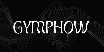 Introducing our new product the name is Gymphow Modern Serif Font Family comes with 9 different weights. Modern Sans Serif font that feels beautiful classy, elegant, and modern. This font is perfectly suited for a wide variety of projects, such as signature, stationery, logo, wedding, typography quotes, magazine or book covers, website headers, clothing, branding, packaging design, and more. Also for fashion-related branding or editorial design and displays both masculine and feminine qualities.
 - Susan by ParaType,
$30.00 An original text and display type family was designed for ParaType in 2007 by Manvel Shmavonyan. The face was named after the designer’s wife. This is an open sans serif font with soft letterforms distinguished by rounded details resembling rudimentary serifs. The family contains true italics developed like in humanist sans serif fonts. Susan is well suited for short and middle range text composing as well as for use in advertising and display typography.
 - Chicago Darling Serif by Gatype,
$14.00 Chicago Darling is a modern and classy minimalist design typography that features more alternative characters and lots of ties. Lifestyle friendly fonts with on-trend designs. The Chicago Darling is designed to be versatile, to match all your designs. This alternative makes the Chicago Darling very versatile. You can design beautiful, elegant and diverse typographic elements with it. It's perfect for logos, lettering artwork, t-shirt designs, editorial illustrations to name a few.
 - Roundy by Linotype,
$29.99Roundy was designed by F.K. Sallwey and appeared with Linotype in 1993. This calligraphy font is true to its name with its soft, round characters. The regular strokes give text an easy, relaxed feel. For variation and emphasis, Sallwey included swash capitals in this font. As initials, the swash characters add zest to texts and can be combined with other alphabets. The calligraphic elegance of Roundy is a perfect contrast to constructivist typefaces. - Vogue Sans by Fenotype,
$20.00 Vogue Sans is a luxurious high contrast sans serif well suited for fashion and haute couture design or glamorous headlines. Try typing any word or name with Vogue Sans and it'll look great. Vogue Sans is equipped with several interlocking ligatures - CC, CO, LA, LC, LL, LE, OO & TT. Vogue Sans also has Swash & Titling Alternates for letters A K L T X Q R and Stylistic Alternates for letters K and R. Go chic!
 - Ragniart by UICreative,
$23.00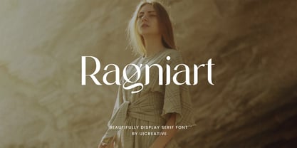 Introducing our new product the name is Ragniart Display Serif Font Family comes with 9 different weights. Modern Serif font that feels beautiful classy, elegant, and modern. This font is perfectly suited for a wide variety of projects, such as signature, stationery, logo, wedding, typography quotes, magazine or book covers, website headers, clothing, branding, packaging design, and more. Also for fashion-related branding or editorial design and displays both masculine and feminine qualities.
 - Walbert by FadeLine Studio,
$12.00 Walbert is a bold and bold new display font. This blocky font creates a brave and strong style. It is suitable to meet your various design needs that are currently trending. With a style like this, this font will be suitable in use for comic, logo's, branding projects, homeware designs, product packaging, mugs, quotes, posters, shopping bags, logo's, t-shirts, book covers, name card, invitation cards, greeting cards, and all your other lovely projects.
 - Primate by John Moore Type Foundry,
$20.00 Primate is a typeface family that works both as a display font for reading, casual and informal as it approaches the forms of nature, hence the name Primate. Primate's family comes in a full range of weights, from the thin Ultra Light to Heavy Black, all weights are also presented in italics and all have ornaments. Primate is a natural and fun to compose texts, giving the design work of a contemporary look.
 - Yellow Balloon by Hanoded,
$15.00 Yellow Balloon is a typeface named after my two year old son's favorite book: The Yellow Balloon by Dutch author/illustrator Charlotte Dematons. Every night before he goes to sleep, he wants to read the book and manages to find the yellow balloon on every page. Yellow Balloon is a cartoonesque font with an uneven baseline. It would look great on book covers or posters. Yellow Balloon comes with extensive language support.
 - Beauty Shine by Java Pep,
$17.00 Introducing a pretty script font that comes with two styles regular and italic, As the name Beauty & Shine is a pretty calligraphy font that has a lot of alternate characters to switch it for more stunning and outstanding looks. Beauty & Shine aslo can switching into italic style based on you need or mix and match with regular style . This font is perfect for quotes, logo, branding, invitations, apparel, prints, wall decor, cricut projects, and etc.
 - Mustachio by UICreative,
$23.00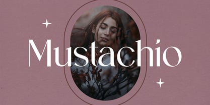 Introducing our new product the name is Mustachio Elegant Serif Font Family comes with 9 different weights. Modern Sans Serif font that feels beautiful classy, elegant, and modern. This font is perfectly suited for a wide variety of projects, such as signature, stationery, logo, wedding, typography quotes, magazine or book covers, website headers, clothing, branding, packaging design, and more. Also for fashion-related branding or editorial design and displays both masculine and feminine qualities.
 - Decutto by Michael Rafailyk,
$15.00 Decutto is a neo-grotesque that packs the Marionette formula and some blackletter ideas into a low-contrast sans serif design. Its name plays on the phrases “off cut” and “cut to” which express the key feature – the contemporary legible letter shape is decorated with cut carved edges and counters, giving the typeface crisp and simplistic look, like that of an old minted coin. Scripts: Latin, Greek, Cyrillic, Hebrew. Hinting: Manual PostScript.