10,000 search results
(0.051 seconds)
- Hello Alexandria by DLetters Studio,
$32.00 Hello Alexandria is a modern handwritten font, the name of this font taken from a city in Egypt (Alexandria). USE Hello Alexandria works great in branding, logos, Quotes, headlines, high fashion, Landing Page and Magazine. FEATURES Ligatures, Stylistic Alternates, Numbers & Punctuation / Extensive Language Support Thanks for checking out Hello Alexandria. I really hope you enjoy using it!
 - Keynote Speaker NF by Nick's Fonts,
$10.00This curious little gem is patterned after a typeface named "Bloomsbury", released by P. M. Shanks & Sons, Ltd. of London in the 1920s. Its gentle curves and somewhat quirky construction combine to create a warm and friendly, if slightly offbeat, antique charm. Both versions of the font include 1252 Latin, 1250 CE (with localization for Romanian and Moldovan). - Jimi by Canada Type,
$24.95Jimi is a tribute to classic rock posters of the sixties and seventies. It was inspired by and modeled after a 1969 sheet of dry transfer letters. Named after the famous American rock and blues guitarist Jimi Hendrix. Ideal for any design that intends to invoke or parody the era of classic rock, free love and mysticism. - Argentina NF by Nick's Fonts,
$10.00This elegant titling face is based on an American Type Founders release from the 1920s named Sterling. Hairline serifs and graceful curves give this typeface a certain grace and charm that will brighten up any project. All versions of this font include the Unicode 1250 Central European character set in addition to the standard Unicode 1252 Latin set. - Sails Next by East end,
$16.30 This font was created from scratch in a simple, strong, and unique style. No other fonts were used as references. Its name was inspired by the shape of the first letter, A, that flashed into being. Sails next is perfect as a display font for posters, flyers, and magazine headings. The font family consists of the regular font only.
 - Runaround Kid by Hanoded,
$15.00 I was listening to some old Smashing Pumpkins albums when I created this font. The name comes from a song called *** You (An Ode To No One). Runaround Kid is a hand painted typeface. I used Chinese ink and a cheap Chinese brush to create the inky look. Comes with double-letter ligatures and a whole bunch of diacritics.
 - Keepon Truckin NF by Nick's Fonts,
$10.00Baby Fat, designed by Milton Glaser in 1964, saw a lot of action during the psychedelic poster phase. This little dumpling is based on that workhorse, and takes its name from a phrase that also got around a lot in the 60s. Both versions of the font include 1252 Latin, 1250 CE (with localization for Romanian and Moldovan). - Huruvida by Cercurius,
$19.95 A decorative font with descending tails on the capital letters. The design is based on a popular typeface from the 1880s, mainly used for personal names on title-pages, advertisements and stationery. Today, you can use it e.g. on book and album covers, invitation cards, restaurant menus and concert programs to give a fin-de-siècle impression.
 - Babyshine by Letterena Studios,
$9.00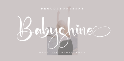 Babyshine is a beautiful script font suitable for any projects such as logos, branding projects, homeware designs, product packaging, mugs, quotes, posters, shopping bags, t-shirts, book covers, name cards, invitation cards, and greeting cards. It’s also a perfect fit for labels, photography, watermark, special events, and all your other lovely projects that need a beautiful script taste.
 - Zokak Arabic by FarahatDesign,
$39.00 Zokak is a first-of-its-kind ultra condensed Arabic typeface designed for display uses. The name means an alley in Arabic which comes from its very narrow letters, which makes it perfect in small spaces. Zokak has two main styles, the default style and the tall one to give more diversity and to be suitable for more uses.
 - Betta Peach by Letterena Studios,
$9.00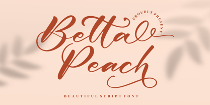 Betta Peach is a beautiful script font suitable for any projects such as logos, branding projects, homeware designs, product packaging, mugs, quotes, posters, shopping bags, t-shirts, book covers, name cards, invitation cards, and greeting cards. It’s also a perfect fit for labels, photography, watermark, special events, and all your other lovely projects that need a beautiful script taste.
 - Waiting For My Girl by Hanoded,
$15.00 Waiting For My Girl comes from a System of a Down song (Hypnotize). I was listening to it when I created this font and I liked the name! Waiting For My Girl is a script font - it’s quite loose and uneven, just like proper hand writing. It comes with double letter ligatures and a lot of character!
 - Formetic by Bülent Yüksel,
$19.00 The Formetic family can be used for logos, advertising slogans, posters and banners,etc. Designed for use in many different kinds of materials. The design is Sans-serif, modern, geometric and I created digital fonts when designing this first for numbers and players names for a football team. Formetic comes in 6 styles, 3 weighted with corresponding Oblique versions.
 - Khinta by FadeLine Studio,
$10.00 Khinta comes in a bold and clean style, this font is firm, luxurious and simple. With a style like this, this font will be very suitable to use for logo's, branding projects, homeware designs, product packaging, mugs, quotes, posters, shopping bags, logo's, t-shirts, book covers, name cards, invitation cards, greeting cards, and all your other lovely projects.
 - Hagelia Patricia by Letterena Studios,
$9.00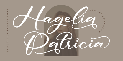 Hagelia Patricia is a beautiful script font suitable for any projects such as logos, branding projects, homeware designs, product packaging, mugs, quotes, posters, shopping bags, t-shirts, book covers, name cards, invitation cards, and greeting cards. It’s also a perfect fit for labels, photography, watermark, special events, and all your other lovely projects that need a beautiful script taste.
 - Sunshine Gabriela by Letterena Studios,
$9.00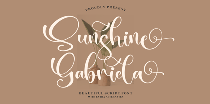 Sunshine Gabriela is a beautiful script font, suitable for any projects such as logos, branding projects, homeware designs, product packaging, mugs, quotes, posters, shopping bags, t-shirts, book covers, name cards, invitation cards, or greeting cards. You can also use it for labels, photography, watermark, special events, and all your other lovely projects that need a beautiful script taste.
 - Nanki Poo NF by Nick's Fonts,
$10.00This little gem is based on a typeface discovered in a Boston Type Foundry catalog from the late 1800s, originally called "Mikado". This font gets its name from one of the more memorable characters in Gilbert and Sullivan’s operetta. Both versions of this font include the complete Unicode Latin 1252 and Central European 1250 character sets. - Rosetica by FadeLine Studio,
$18.00 Introducing Rosetica, a smooth, soft script font in handwriting style which gives the characters of this font a very simple, natural and sweet touch. Rosetica is perfect for logo's, branding projects, homeware designs, product packaging, mugs, quotes, posters, shopping bags, logo's, t-shirts, book covers, name card, invitation cards, greeting cards, and all your other lovely projects.
 - Meatball by Parkinson,
$25.00 Meatball is a fat and happy display font based on some lettering on a mid-20th century poster for the movie Bringing Up Baby. The lettering for the names of the stars, AudryHepburn, Cary Grant and Charles Ruggles, was the basis for Meatball. The sample was all caps and as it evolved, a lower case started to appear, etc.
 - Laguna Madre NF by Nick's Fonts,
$10.00Another addition to the Whiz-Bang Wood Type series is this ultra-condensed font, well suited for very large headlines. Named for the body of water which separates Padre Island from the mainland of Texas. Both versions of this font contain the Unicode 1252 (Latin) and Unicode 1250 (Central European) character sets, with localization for Romanian and Moldovan. - Stamper RS by Ingrimayne Type,
$5.00 In StamperRS all the letters are on little stamps. The upper-case letters are have black letters on white stamps and the lower-case letters have white letters on black stamps. The character set is limited. The letters are from the typeface Myhota, also by Ingrimayne Type. StamperRS was first released in 1995 with the name Stamper.
 - Monthly Issue JNL by Jeff Levine,
$29.00 An Art Nouveau, hand lettering on a Good Housekeeping magazine cover from the 1920s inspired Monthly Issue JNL, which is available in both regular and oblique versions. Prior to the 1940s, it was not unusual to find the covers of many popular magazines hand lettered with either their names and/or content information; often in different type styles.
 - Vida Bandida by Vozzy,
$20.00 Introducing vintage label font named Vida Bandida. It is based on my other font, Black Widow. All available characters you can see at the screenshots. This font has six styles: Regular, Full, Shadow, Shadow FX, Texture and Texture FX. This font will look good on any vintsge styled designs like a poster, T-shirt, label, logo, etc.
 - Kunstgewerbe NF by Nick's Fonts,
$10.00J. M. Bergling called the inspiration for this typeface “modern”—at least, it passed for modern in 1914. Its bold, sinuous forms and unusual decorative treatment suggest stained glass of a certain era, and so its name is German for “Arts and Crafts”. Both versions of the font include 1252 Latin, 1250 CE (with localization for Romanian and Moldovan). - Dahlia Regictik by Letterena Studios,
$10.00 Dahlia Regictik – Luxury Serif Font, from Letterena, is a Luxury serif font, suitable for any projects such as: logos, branding projects, homeware designs, product packaging, mugs, quotes, posters, shopping bags, t-shirts, book covers, name card, invitation cards, greeting cards, label, photography, watermark, special events, and all your other luxury and beautiful projects that need a Luxury serif taste.
 - PF Fuel Pro by Parachute,
$79.00 This typeface was inspired by the rough surroundings of a modern city and reflects the contradicting nature of an emerging global youth culture. Ever since its first release—back in late 1999— it is constantly on our ‘most wanted’ list and has been part of numerous product campaigns. Music, mobile telephony, food and beverages, politics, you name it. Coca-Cola used it, José Cuervo used it for about 3 years. The new ‘Pro’ version goes one step ahead. You may now capture the essence of the younger generation in every major European language. PF Fuel has been extended with the full array of Cyrillic characters as well as matching frames for this extra stamped look. Furthermore there more alternate characters than ever. Create a custom look, when same characters sit close, or one next to the other. You may find these useful—alternate characters either in the lowercase positions, or access them through the ‘stylistic alternates’ OpenType Pro feature. If you need some extra fuel, this is where to get it!
 - Gutenberg A by Alter Littera,
$- This is a free abridged edition of the full-featured Gutenberg B and Gutenberg C fonts. Although (as the name suggests) it was originally conceived as the first release in the B42-type series, it actually represents the colophon to this series. In addition to having a narrower scope, the font differs from its full-featured predecesors in both letter and word spacing, as well as in glyph design, using exclusively straight lines for every glyph and providing a significantly rough appearance at medium to large point sizes. The font includes the usual standard characters for typesetting modern texts, as well as a few special characters, alternates and ligatures that can be used for typesetting nearly as in Johann Gutenberg’s 42-line Bible and later incunabula. Please note that the use of this free font is subject to the same terms and conditions as those for Alter Littera’s pay fonts. Specimen, detailed character map, OpenType features, and font samples available at Alter Littera’s The Oldtype “Gutenberg A” Font Page.
 - Polydot by Christoph Reichelt,
$16.00 Polydot is an experimental Font, built following its own rules. It has interesting letter shapes, making it a perfect choice for creative packaging and magazine design. At the same time it makes a beautiful, neat but vivid text pattern when used in smaller sizes: Use it for children’s books, food and beverage, cosmetics or health topics. Each Glyph is based on at least one dot on the body line, and has up to two more on the lower case level and the ascender level. Since they have the same size and are on the same height on all letters, no matter what weight and shape, these dots give a strong structure to the typeface, allowing for dynamic and easy letter shapes, inspired by brush strokes. It’s not a hand font but it has the dynamics of one. It has no serifs but provides the structure and readability of a roman type. It has an extensive choice of weights, but it’s characteristic dots have the same size and it has the same tracking through all weights. Try it, it’s special.
 - Yuk Ngexi by Product Type,
$17.00 Meet the Yuk Ngexi Font: Strong, Bold, and Fun in Gaming Style. Who says design has to be boring? With the Yuk Ngexi Font, you can bring a touch of power, thickness, and gaming style fun to your every project. The Yuk Ngexi font is the perfect solution for various projects that require a unique theme. Whether it's for movies, games, or streaming game events, this font provides unmatched appeal. This font is designed with a strong gaming touch, giving each character a bold and striking feel. The Yuk Ngexi font comes in four different style variants: Regular, Blury, Outline, and Shadow. This gives you the flexibility to bring in a variety of nuances in your designs. Yuk Ngexi also supports multiple languages, allowing you to connect with a global audience easily. With Yuk Ngexi Font, you don't just get a font, you get the key to bringing creativity, power, and fun to each of your designs. Download the Yuk Ngexi Font now and watch how your design turns into something extraordinary!
 - Sweet Treats by Jeff Levine,
$29.00 A piece of British sheet music for “You’re Sweeter than I Thought You Were” [from the 1935 film “Jack of All Trades” starring Jack Hulbert] provided inspiration for a digital typeface based on the credits for Hulbert and the film that rather than the song’s title. What’s interesting is the lettering style was influenced by Art Nouveau at a time when Art Deco was gaining in popularity. The result is Sweet Treats JNL, which is available in both regular and oblique versions. (According to Wikipedia, John Norman ‘Jack’ Hulbert (April 24, 1892 – March 25, 1978) was a British actor, director, screenwriter and singer, specializing primarily in comedy productions, and often working alongside his wife Cicely Courtneidge.)
 - Guillaume by George Tulloch,
$21.00 Guillaume is a small family of text fonts with its roots in the French sixteenth century. The roman is based on the types of Guillaume Le Bé (c.1525–1598), and the italic on those of Claude Garamont (Garamond) (d. 1561). Garamont’s romans have inspired countless modern interpretations, but his italics, despite their merit, have attracted much less attention. Guillaume offers extensive support for European languages, and is best suited for use in applications that support OpenType. Among its OpenType features are ligatures, small caps, several sets of numerals, contextual alternates, intelligent implementation of long ‘s’ and other period features, and fractions. For more detail, please see the pdf available in the Gallery.
 - Ford's Folly by Ascender,
$50.99Ford's Folly is a lively yet sophisticated handwriting font designed by Ascender's Jim Ford. It captures the look and spirit of the designer's handwriting using a using a Sharpie™ Extra Fine felt pen. This casual script font evokes an energetic feeling, and has very legible letterforms without quirky distractions. Jim Ford took his hand global by creating a massive multilingual character set. The font features the WGL Pan-European character set (Eastern Europe, Cyrillic, Greek and Turkish) and advanced typographic features for use with OpenType-savvy applications. The font is a fun and attractive handwriting font that is great for greeting cards, menus, advertisements, scrapbooking and many other projects that can benefit a personal appearance. - Aeronic by Hanoded,
$15.00 Aeronic is a work of love. I stumbled upon a fantastic Japanese poster for Nikke Coat by Gihachiro Okuyama (1907 - 1981). Gihachiro Okuyama (also: Okayama) was a very prolific Japanese print artist who started his career making woodblock prints, but later moved on to posters and advertisements. I tried to recreate the hand lettering in the original 1937 Nikke Coat poster, but since I had to work with a few glyphs only, I designed the remaining ones myself. The outline of Aeronic is rather thin, with thicker bits in some glyphs. It is quite rough in places, but it all adds to its unique look. Aeronic comes with a bonanza of diacritics.
 - Miedinger by Canada Type,
$24.95 Helvetica’s 50-year anniversary celebrations in 2007 were overwhelming and contagious. We saw the movie. Twice. We bought the shirts and the buttons. We dug out the homage books and re-read the hate articles. We mourned the fading non-color of an old black shirt proudly exclaiming that “HELVETICA IS NOT AN ADOBE FONT”. We took part in long conversations discussing the merits of the Swiss classic, that most sacred of typographic dreamboats, outlasting its builder and tenants to go on alone and saturate the world with the fundamental truth of its perfect logarithm. We swooned again over its subtleties (“Ah, that mermaid of an R!”). We rehashed decades-old debates about “Hakzidenz,” “improvement in mind” and “less is more.” We dutifully cursed every single one of Helvetica’s knockoffs. We breathed deeply and closed our eyes on perfect Shakti Gawain-style visualizations of David Carson hack'n'slashing Arial — using a Swiss Army knife, no less — with all the infernal post-brutality of his creative disturbance and disturbed creativity. We then sailed without hesitation into the absurdities of analyzing Helvetica’s role in globalization and upcoming world blandness (China beware! Helvetica will invade you as silently and transparently as a sheet of rice paper!). And at the end of a perfect celebratory day, we positively affirmed à la Shakti, and solemnly whispered the energy of our affirmation unto the universal mind: “We appreciate Helvetica for getting us this far. We are now ready for release and await the arrival of the next head snatcher.” The great hype of Swisspalooza '07 prompted a look at Max Miedinger, the designer of Neue Haas Grotesk (later renamed to Helvetica). Surprisingly, what little biographical information available about Miedinger indicates that he was a typography consultant and type sales rep for the Haas foundry until 1956, after which time he was a freelance graphic designer — rather than the full-time type designer most Helvetica enthusiasts presume him to have been. It was under that freelance capacity that he was commissioned to design the regular and bold weights of Neue Haas Grotesk typeface. His role in designing Helvetica was never really trumpeted until long after the typeface attained global popularity. And, again surprisingly, Miedinger designed two more typefaces that seem to have been lost to the dust of film type history. One is called Pro Arte (1954), a very condensed Playbill-like slab serif that is similar to many of its genre. The other, made in 1964, is much more interesting. Its original name was Horizontal. Here it is, lest it becomes a Haas-been, presented to you in digital form by Canada Type under the name of its original designer, Miedinger, the Helvetica King. The original film face was a simple set of bold, panoramically wide caps and figures that give off a first impression of being an ultra wide Gothic incarnation of Microgramma. Upon a second look, they are clearly more than that. This face is a quirky, very non-Akzidental take on the vernacular, mostly an exercise in geometric modularity, but also includes some unconventional solutions to typical problems (like thinning the midline strokes across the board to minimize clogging in three-storey forms). This digital version introduces four new weights, ranging from Thin to Medium, alongside the bold original. The Miedinger package comes in all popular font formats, and supports Western, Central and Eastern European languages, as well as Esperanto, Maltese, Turkish and Celtic/Welsh. A few counter-less alternates are included in the fonts.
 - FS Aldrin by Fontsmith,
$80.00 Elegant and round Having harboured a desire for a rounded font within the Fontsmith library for some time, Phil Garnham recognised that FS Emeric offered the perfect skeleton around which to design it. Most new rounded fonts rely on scripts or other in-app automation to form their characters. For all their warmth and approachability, they too often conjure images of jelly sweets and sausages. Not so FS Aldrin, where every curve and transition has been crafted by hand, giving a distinctive look and elegant feel. Design highlights FS Aldrin enjoys wide-open ‘lunar’ counters and soft, tube-like terminals. These improve legibility, especially on backlit signage and screens. The open proportions and circular strokes are juxtaposed against a more serious technical aspect that exists within each counter shape. The lighter weights feel precise and efficient, perfect for notes on blueprints or technical drawings. The heavy weights are equally crafted but more playful by their rotund nature, and are perfect for strong headlines or packaging projects. UI icons A suite of 268 icons complement the typeface beautifully and extend the design language in all directions. They cover a range of commonly used applications and themes ranging from ecommerce to weather, and also serve as a solid starting point for a bespoke brand icon set or UI. In addition, born of FS Aldrin’s astronomical theme and playful nature is a special collection of space-themed icons, including rockets, shuttles and lunar modules (hint: if you type the word BUZZ with ligatures enabled, an astronaut appears). Earth to Buzz Buzz Aldrin was the pilot of Apollo 11’s lunar module, the one that put man on The Moon for the very first time. Early on in the project’s life, FS Aldrin emerged as the ideal hook on which to hang the font’s space helmet (hardly surprising given Phil’s fascination with space travel and astronomy). An approach was made to Buzz’s management to see if he would sanction the association. Not only was the great man himself happy to see his name on a typeface, he also asked to use it in his upcoming keynote talks, book launches and online projects.
 - Vinneta by Dima Pole,
$27.00 Vinneta is a direct italic font. Its contours and graceful, and precise. Vinneta has a huge number of alternative variations of the glyphs, 20 stylistic sets, it allows you to create a variety of compositions. In addition Vinneta has 17 OpenType features, including oldstyle numbers, swashes, contextual alternates, historical forms, standard ligatures, discretionary and contextual ligatures, localized forms, stylistic alternates, and more others. For convenience here are two faces, one with stylized capitals (they are different from swashes), in another - classic capitals. Vinneta has characters of all European and Slavic languages. "Vinneta" it is an ancient city of the Venedi (Wends), the legendary highly developed Slavic-Aryan people that lent its name to Venice city, lake Bodensee in southern Germany, the land of Wendland in Lower Saxony; and besides, Lithuanians and Estonians even today, this name referred to the Slavs (Veneja and Vene).
 - Seashore Pro by Sudtipos,
$59.00 A feminine, graceful script whose thicker horizontals create a wave-like rhythm — hence the name. Seashore is loosely based on an "eccentric" (left-leaning) penmanship style of the late 19th century. Used mainly by professional "engrossers" in certificates and tributes, or by society ladies in their stationery and invitations, it sent a message of true refinement, as the style would have been only been mastered after the more common business, Spencerian, and standard ornamental styles. In fact, unusual script styles were in such demand that type foundries of the era exploded with metal-type knockoffs of increasing fanciness. Seashore includes a wide variety of swash capitals, alternate endings, and contextual ligatures, over 900 glyphs in all. Seashore is best used in short display settings — in names and addresses on formal invitations, in menus and food packaging, or fashion and beauty contexts.
 - Ghimli by Anonymous Typedesigners,
$40.00 Ghimli Antique was created using the ping-pong method, based on the graphic idea of Artem Rulev and the participation of Vladimir Anosov in the future. Then we sent the font file to each other, adding something of our own and making corrections, and so on many times. Ghimli Antique has already managed to get 2nd place in the Granshan competition in the Cyrillic section. The name was obtained by combining the name of the dwarf Gimli and Studio Ghibli. The font is quite evil, incredibly dense, bold. It looks like when the dwarves closed ranks and go to defend their lands from the invasion of the orcs. Suitable for short word design, logo creation, menu layout and use in movies about gnomes and anything fantastic.
 - Rabbits by Piñata,
$9.00 Rabbits is a super emotional hand-written font family that unites 10 different fonts. We’ve united these fonts with one common theme - childhood. Use these fonts to create any products for kids — children’s books layouts, mobile applications for children, as well as nursery interior design. We’ve given each rabbit a unique name. The names are arranged as the first 10 letters of the Latin alphabet: A — April, B — Bro, C — Chili, D — Dummy, E — Elf, F — Fatso, G— Goody, H — Hyper, I — Idol, J — Junior. Each rabbit has its own character, and you’ll definitely like Rabbits because of that. We’ve used an individual writing tool for every font. All the fonts were created on paper first and then digitized. Now, what’s your favorite rabbit?
 - SomaSkript by ArtyType,
$29.00 SomaSkript is a natural extension to the basic Somatype font design, adding more variety to the family, all of which have similar features. Basically, by widening the uprights and maintaining the thin cross-bars it takes on more of a script-like quality, hence the name. Slanting the letters reinforces the script illusion and consequently brings a broader application to the font’s original format. When designing the Somatype alphabet originally, I always envisaged maximizing on its potential by creating an incised version. This variation not only emphasizes the implied script qualities within the name but brings out the softer, feminine side of the typeface. This evolutionary process creates a different looking font altogether and in turn the slanted version emphasizes the elegant quality even more so.