10,000 search results
(0.022 seconds)
- Shine Pro by Thinkdust,
$10.00 Shine Pro is the quintessential sans serif gentleman you’ve been looking for all your life. It doesn’t confuse, confound, or complicate - it politely offers up what it has as though your fontal satisfaction is the most important thing in the world; and to Shine Pro, it is. The Regular weight is subtle, gentle - his softer side; while the Bold weight has impact and creates an imposing, important air.. In order to please everyone, Shine Pro has an impressive 10,000 kerning pairs and extensive language support, including cyrillic. Designed with traditional influences but with a contemporary coup-de-grace, the clean, smartly turned out, and oh-so-reliable Shine Pro is ready to become your new go-to font for all matters.
 - Flaminia by Andinistas,
$39.95 Flaminia is a typeface family of 4 members designed by Carlos Fabián Camargo G. The central idea started as Dingbats and titles labeled with fine-tipped brushes and flat tip for graphic design related restaurant menus, instructions, packaging, food containers and labels. Thus began the process of drawings and letters integrated by shapes and counterblocks that seem inaccurate yet but at the same time clean and attractive. For this reason each variable suggests fresh brushstrokes that combine ideas from Roman and italic calligraphy. Flaminia members work separately or together by solving needs in different scenarios. This will enhance its properties in order to control and diagram titles, subtitles and short paragraphs with an effusive and manuscript character. Flaminia is useful for generating a flavor of "hand lettered by skilled artists lettering." In conclusion, Flaminia Regular and Italic are used to write short paragraphs. His ascending and downs are lower that the X height. Its width is imperceptibly condensed to save horizontal space. Its smooth lines and finishes simulating a crescent moon have been made with fine-tipped brush. The contrast between thick and thin has medium intensity. Its complement is an ideal italic to emphasize words and phrases. Its conceptual characteristics are similar with foundation's handwriting, except for his companion who takes ideas from the ornamental italic calligraphy. Flaminia Black is compact and ideal for ranking information such as words and titles. Its personality is based on ornamental penmanship italics mixed with humanistic ideas outlined with contrast-type, flat-tipped brush thickness. Its overall width is slightly condensed, rising and falling are short compared to an exaggerated X height. Its smooth lines and terminations as in a crescent moon simulate the path of a broad brush. Its amount of contrast between strokes have average intensity. In brief, push to the limit parameters such as the type and amount of contrast, size, backward, forward, overall width, etc. And finally, Flaminia Dingbats offers three sets of different illustrations, a total of almost 90 drawings useful in communications related to: Food, Clothes and Sketchy. Each carefully wrought through research, testing, analytical design, visual strategy and high-definition of Bezier paths, optimizing time and work to their users. And in conclusion, I have plans to continue expanding the family with more complete versions in the future.
 - Roller Poster by HiH,
$12.00 Roller Poster is named after Alfred Roller. In 1902, Roller created a poster to advertise the 16th exhibit of Austrian Artists and Sculptures Association, representing the Vienna Secession movement. The exhibit was to take place in Vienna during January & February 1903. The location is not mentioned because everyone in Vienna knew it would be held at the exhibit hall in the Secession Building at Friedrichstraþe 12, a few blocks south of the Opernring, near the Naschmarkt. Designed by Joseph Maria Olbrich in 1897, the buiilding has been restored and stands today as one finest of the many fine examples of Art Nouveau architecture in Vienna (see vienna_secession_bldg.jpg). Because of its dome, it is called “the golden cabbage.” The poster itself is unique. The word “secession” is in one type style and takes up two-thirds of the elongated poster. At the bottom of the poster are the details in a different lettering style. It is this second style at the bottom that is the basis for the font Roller Poster. In keeping with our regular naming conventions, we were going to call it Roller Gezeichnete (hand-drawn), but the wonderful play on both words and the shape of the three S’s in secession was too compelling. In November 1965 there was an exhibit of Jugendstil and Expressionist art at the University of California. Alfred Roller’s Secession Poster was part of that exhibit. Wes Wilson was designing promotional material at Contact Printing in San Francisco. Among their clients was a rock promoter named Bill Graham, staging dance-concerts at Fillmore Auditorium. Wilson saw the catalog from the UC exhibit and Roller’s lettering. Wilson adapted Roller’s letter forms to his own fluid style. The result was the poster for the August 12-13, 1966 Jefferson Airplane/Grateful Dead concert at Fillmore put on by Graham (BG23-1). Wilson continued to use Roller’s letter forms on most of the posters he did for Graham through May 1967, when he stopped working for Graham. The posters were extremely successful and the lettering style along with Roller’s letter forms were picked up by other artists, including Bonnie MacLean, Clifford Charles Seeley, James Gardner, and others. The Secession poster and the Fillmore posters have inspired a number of fonts in addition to ours. Among them are JONAH BLACK (& WHITE) by Rececca Alaccari, LOVE SOLID by Leslie Carbarga and MOJO by Jim Parkinson. Each is different and yet each clearly shows its bloodlines. Our font differs in two ways: 1) the general differences in the interpretation of the letter forms and 2) the modification of the basic letter form to incorporate the diacriticals within the implied frame of the letter, after the manner of the original design by Roller. We borrowed Carbarga’s solution to the slashed O and used it, in a modified form, for other characters as well to accomplish the same purpose. We recommend that you buy ours and at least one of the other three. According to Alaccari, a version called URBAN was released by Franklin Lettering in the 70’s (and is shown on page 51 of The Solotype Catalog). For comparison of our font to original design, see image files roller_poster_2s.jpg of original poster and roller_poster_2sx.jpg showing reconstruction using our font for the lower portion (recontructed area indicated by blue bar). Please note the consistency of character width. In the lower case, 23 of the basic 26 letters are 1/2 EM Square wide. The ‘i’ is an eighth narrower, while the ‘m’& ‘w’ are one quarter wider. All the Upper Case letters are 1/8 EM wider than the lower case. This is to make it easier to fill a geometrical shape like a rectangle, allowing you to capture a little of the flavor of Wes Wilson’s Fillmore West poster using only a word processor. We have also included a number of shapes for use as spacers and endcaps. If you have a drawing program that allows you to edit an ‘envelope’ around the letters to distort their shape, you can really get creative. I used Corel Draw for the gallary images, but there are other programs that can accomplish the same thing. The image file “roller_poster_keys.jpg” shows the complete character set with the keystrokes required for each character (see “HiH_Font_readme.txt” for instruction on inserting the non-keyboard characters). The file “roller_poster_widths.jpg” shows the exact width of each character in EM units (based on 1000 units per EM square). You will notice that the font is set wide for readability. However, most programs will allow you to tighten up on the character spacing after the manner of Roller & Wilson. In MS Word, for example, go to the FORMAT menu > FONT > CHARACTER SPACING. Go to the second Drop-Down Menu, labeled ‘Spacing’ and select "condensed' and then set the amount that you want to condense ‘by’ (key on the little arrows); two points (2.0) is a godd place to start. Let your motto be EXPLORE & EXPERIMENT. Art Nouveau has always been one of my favorite movements in art -- I grew up in a home with a couple of Mucha prints hanging on the living room wall. Perhaps because of that and because I lived through the sixties, I have enjoyed researching and designing this font more than any other I have worked on. Let’s face it (pardon the pun), Roller Poster is a FUN font. You owe it to yourself to have fun using it.
 - Bangkok Restless by Roland Hüse Design,
$25.00 I have been walking around the streets of Bangkok with my good old film camera taking photos the way like back in the day. I think there is something magical and authentic in it. Guess what, the first day I went out with that camera I stumbled upon a place is called Fotoclub BKK they develop film rolls how cool is that! I shoot all the 36 photos at the Silom area, taking random photos most came out off centred subject, wrong settings, blurry just like the way I wanted! Soon after I was working on a handwritten script that is a perfect match to the overall topic of my stay in Bangkok so I named it after this exceptional adventure I have had here. The font contains all European diacritics and special characters, some double letter ligatures and stylistic alternates for better flow and more organic and natural look. I hope you guys like it and it will add some spiciness to your next creative project! Any feedback or questions, character request please don't hesitate to contact me either in email or on social.
 - Lipa Agate by TypeTogether,
$49.00 Lipa is the name of the Slovenian national tree 'Linden'. The typeface Lipa Agate by Croatian designer Ermin Međedović, is part of a bigger type collection, comprising various type groups into one coherent system which Ermin developed over the past 10 years. Lipa Agate is the first to be released; a sans serif designed and engineered to be used in the smallest text sizes, best under 10pt, and in very bad printing conditions. It is perfect for phone books, classified ads, directories or any other job requiring economy without jeopardising legibility. To achieve this, Lipa Agate employs a range of tools, such as deep ink-traps, narrow proportions and a tall x-height. Contemporary editorial design requires a high amount of flexibility to respond to various design situations in a consistent fashion. Lipa Agate — with its 3 levels of condensation, 4 weights and 2 sets of different x-heights, 'High' and 'Low', which share the same width — fulfils these requirements wonderfully. That's a total of 24 fonts! To make this clean and honest workhorse face complete, its large character set also includes small caps, arrows, info-numerals and much more.
 - Mr Foodie by Hipopotam Studio,
$30.00 Mr Foodie is a set of 825 icons divided into 7 groups – 109 fruit icons, 157 kitchen icons, 120 animal products icons, 100 veggie icons, 107 desserts icons, 127 beverages icons, and 105 other food related icons. You can find a full, multi-color list of every icon with its name and corresponding character on a dedicated website or in a pdf manual. It’s a multilayer font so every group consists of 4 fonts – Regular, Back, Front, and 3rd Color. The Regular style is for single color use only and the Back, Front, and 3rd Color styles are necessary if you want to achieve a multicolor effect. Position three identical text boxes exactly on top of each other, apply layer font styles, and choose whatever colors you like. You’ll quickly discover that some icons don’t have 3rd Color style. This is not a mistake – a lot of things look good with just two colors. Use it to make logos, illustrations, games, app icons, t-shirts, mugs, cooking books, restaurant menus, interior decorations, invitations, balloons, and any other project where fine crafted food drawing is needed.
 - Blanchard by Canada Type,
$39.95 Blanchard is a revival and elaborate extension of Muriel, a 1950 metal face made by Joan Trochut-Blanchard for the Fonderie Typographique Française, that was published simultaneously by the Spanish Gans foundry under the name Juventud. Blanchard is a script that embodies the post-war narrow decorative aesthetic that would become the instantly recognizable feature of that era’s design. Its high ascenders corners make it the tuxedo of fonts, with slight and casual angles gradually revealing a trustworthy confidante, and sharp corners signaling a most expressive ally. Font. James Font. This digital version updates the original metal shapes to work within today’s design tools and designer needs. Some of the questionable metal shapes were optimized, plenty of alternates were added, and as many as five ending forms were built for most lowercase letters. Overall, this is one of the most useful packages for book cover, magazine and packaging design. Blanchard is available in all popular formats. Blanchard Pro combines all five fonts into a single one that makes use of OpenType’s cross-platform compatibility and programs that support OT’s fine typography features, like recent versions of Adobe InDesign and QuarkXpress.
 - Fierro by Los Andes,
$16.00 Fierro is a heavy-geometric-retrofuturistic typographic construction that, without any curve, still retains good legibility. These shapes are based on great bended metal pieces, which represent its name, meaning "hardware store". It has been designed to be used in large sizes and for designs with character that look to create a strong visual block. Designed by Jko Contreras.
 - Silver Crown by Linecreative,
$16.00 Silver Crown is an Ultra Condensend display font with minimalist characters. It's perfect for logos, name cards, magazine layouts, headers, or even large scale artwork. Silver Crown, a clean sans serif, offers you: 1. Upper and Lowercase characters (All Caps) 2. Ligatures (121 characters) and Stylistic alternates (9 Characters) 3. Multilingual Support (Latin Western Europe), Numbers and Punctuation
 - Khayla Almira by Studio Hello Good,
$12.00 Khayla Almira is a clean and elegant sans serif font, this font also provides ligature and alternate letters, this font itself has 6 families, namely regular, line, bold, regular italic, line italic and bold italic. for use as logos, display designs, and also for other purposes, make sure you have this font collection on your device.
 - Fernburner NF by Nick's Fonts,
$10.00This stunning display face is based on Hans Bohn’s 1929 opus for Gebr. Klingspor, originally named Orplid. One of the treasures discovered in the legendary green vinyl binder that launched Nick’s love of type, it’s a real crowd pleaser. Both versions of this font include the complete Latin 1252, Central European 1250 and Turkish 1254 character sets. - Formosa by Hanoded,
$15.00 Formosa is the old, colonial name for Taiwan. Formosa means beautiful in Portuguese and I think this handwritten typeface has a certain beauty itself. It comes in three styles, all of which make extensive use of ligatures, to give the font an authentic, handwritten feel. Like most of my fonts, Formosa comes with Babylonian language support.
 - Manito LP by LetterPerfect,
$39.00 Manito was designed by Garrett Boge in 1989. He employed a wide pen and angular, sturdy forms to simulate rough-hewn woodcut letters. The font, consisting of both capitals and small caps, provides an ideal graphic complement to collateral of a natural or environmental character. It is named after a native American word for 'Great Spirit'.
 - Falfurrias NF by Nick's Fonts,
$10.00Another in the Whiz-Bang Woodtype series, based on authentic xylographic designs from the late nineteenth century. Named after (surprise!) a small town in Texas. The net effect is a typeface which can add style and warmth to any project. Both versions of this font include the complete Unicode 1252 Latin and Unicode 1250 Central European character sets. - Dime Museum by Solotype,
$19.95This idea of "wrong way weights" was originally called French Clarendon by the Americans, Italienne by the French, and American by the Italians. Sounds like nobody wanted to own up to it. When it was revived by ATF in 1933, it was given the name P. T. Barnum. Many variations have appeared. Dime Museum is an old wood type. - Serid by Samuel Vicente Types,
$22.00 SERID is a display font condensed and regular designed for editorial applications. Inverted contrast, features a serif hybrid that gives a decorative character and personality to the font. Being a display type, intended for use in titles or in small blocks of text, from 24pt. The name SERID comes from the combination of words “SERif” and “hybrID”, resulting SERID.
 - Neon by Superfried,
$32.50 Neon is an experimental, retro display typeface designed by Superfried. Neon features two styles which can be toggled via shift. As the name suggests styling for the typeface started with classic neon signage, but quickly took a new direction of its own leading to a very distinct and versatile display face. Neon has been featured in Computer Arts magazine.
 - Esperanto by Linotype,
$29.99Franko Luin, Esperanto's designer, on this typeface: Esperanto has a lot in common with classic typefaces, and newer interpretations of the classics. The italic reminds of the lettering idea of the Renaissance and their manuscripts. This typeface's name refers to the international language Esperanto, of course. The font is not compatible with the character set of the Esperanto language - Allerton by Jeff Levine,
$29.00 Presenting a condensed Art Deco sans serif font with rounded corners and squared inner lines, based on the hand lettered title on the cover of the sheet music for 1944’s “Just A Little Fond Affection”. Allerton JNL is available in both regular and oblique versions, and was named after a neighborhood in the Bronx, New York.
 - Delysha by Letterena Studios,
$9.00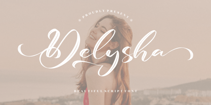 Delysha is a beautiful script font suitable for any projects such as logos, branding projects, homeware designs, product packaging, mugs, quotes, posters, shopping bags, t-shirts, book covers, name cards, invitation cards, and greeting cards. It’s also a perfect fit for labels, photography, watermark, special events, and all your other lovely projects that need a beautiful script taste.
 - Bully Pulpit Plain NF by Nick's Fonts,
$10.00 This engaging headline face is based on a rather pudgy typeface named “Bullion Shadow”, which was originally released somewhere on the cusp between the hippie and disco eras, and was equally at home in both. Now available in shaded and plain. Both versions of this font support the Latin 1252, Central European 1250, Turkish 1254 and Baltic 1257 codepages.
 - Rolington by Letterena Studios,
$9.00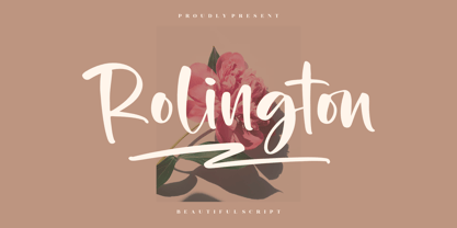 Rolington is a beautiful script font suitable for any projects such as logos, branding projects, homeware designs, product packaging, mugs, quotes, posters, shopping bags, t-shirts, book covers, name cards, invitation cards, and greeting cards. It’s also a perfect fit for labels, photography, watermark, special events, and all your other lovely projects that need a beautiful script taste.
 - Douceur by Hanoded,
$15.00 Douceur (pleasantness in French) is an all caps, serif typeface with a flourish. It was created by hand in one go: no sketches, no try-outs. The font comes in two styles: regular (outlined) and black. Due to style naming issues, the black version will show up as a different font. Douceur comes with all diacritics.
 - Columnist JNL by Jeff Levine,
$29.00 “News Gothic” has been a reliable workhorse of a font since it was created by Morris Fuller Benton and first offered for sale in 1908 by American Type Founders. A clean, legible design used for text copy, it can also double as a light headline face. This reinterpretation (named Columnist JNL) is available in both regular and oblique versions.
 - Albion's Marker No.1 by Greater Albion Typefounders,
$16.50 Albion’s Marker No.1, as the name suggests is the first in a series of ‘Marker Pen’ typefaces- merging good type design practice with deliberately casual and hand-drawn letter forms. Inspired by the great classic typefaces such as Bembo and Caslon, the design of Marker No.1 offers a unique blend of legibility and relaxed randomness.
 - Gullywasher NF by Nick's Fonts,
$10.00One in the series of fonts called Whiz-Bang Wood Type, intended to be set large and tight. Gullywasher is distinguished by its unusual letterforms and “pineapple” serifs. The font takes its name from a Texas term for a heavy rain. Both versions of this font include the complete Unicode Latin 1252 and Central European 1250 character sets. - Hofstad by Hanoded,
$15.00 Hofstad is a font which was modeled on a poster designed by Dutch graphic artist Jan Lavies (1902 - 2005). Lavies became famous for the posters he designed for the Holland America Line of cruise ships. Hofstad font was named after the theatre group "Vereenigd Rotterdamsch - Hofstad Tooneel" for which Jan Lavies designed a poster. Hofstad comes with all diacritics.
 - Koning Display by LucasFonts,
$49.00 Koning transports high-contrast sans serifs into the present. Koning is the Dutch for king. Given the design’s elegance, this name should come as no surprise. It has been recognized with numerous awards: TDC Certificate of Typographic Excellence and Award of Excellence from Communication Arts both in 2018, and Gold from German Design Awards in 2020.
 - Scientesia by sizimon,
$16.00 Scientesia is hand brushed typeface. Very cool for name tags, handwritten quotes, product packaging, merchandising, social media & greeting cards. And very easy to make design magazine headlines and other products. Time saving in making the design of a product. Scientesia contains a full set of lower & uppercase letters, a large range of punctuation, numerals, and multilingual support.
 - Coverack by Scriptorium,
$18.00Coverack was inspired by some hand lettering spotted by Dave Nalle on a pub menu blackboard during a recent trip to England. It's in the tradition of Celtic uncial lettering, but is extra bold and has some fantastical embellishments. The name comes from a lovely little town on the Cornish coast where the designer stayed during the trip. - Roundlane by Zealab Fonts Division,
$10.00 Roundlane is a font inspired by retro badges antique labels, and includes all-caps, multilingual support, alternates signs, numbers & punctuation. It works well for album covers, video tittles, stickers, clothing brand names, t-shirt designs, badges designs, banner, flyer and more. I can’t wait to see what you guys will come up with with using this font!
 - Roney JNL by Jeff Levine,
$29.00If it's at all possible to "Deco-ize" an Art Deco font even more, it's been done with Roney JNL. Named for one of the classic hotels built during the heyday of Miami Beach, this font is a stylized version of Jeff Levine's Metalet Modern; a design derived from an actual 1940s home movie titling set. - Vow Neue by Thinkdust,
$10.00 As glamorous as its name would suggest, Vow Neue is the new fashion model on the typeface scene. Vow Neue loves excess without losing style, containing itself in strict forms that belie a boundless desire. Sharp edges lead into enticing curves in all the right places, making this a font that draws the eye and keeps up interest.
 - Monday Honey by Letterena Studios,
$9.00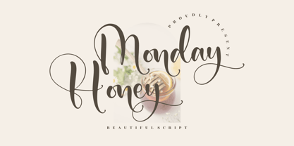 Monday Honey is a beautiful script font suitable for any projects such as logos, branding projects, homeware designs, product packaging, mugs, quotes, posters, shopping bags, t-shirts, book covers, name cards, invitation cards, and greeting cards. It’s also a perfect fit for labels, photography, watermark, special events, and all your other lovely projects that need a beautiful script taste.
 - Art Magazine JNL by Jeff Levine,
$29.00 A 1920 art magazine from Great Britain entitled “Pan” had its three letter name hand lettered on the cover in a style that had elements of Art Nouveau, Art Deco and what would eventually be called Techno in the 1980s. This inspired the typeface Art Magazine JNL, which is available in both regular and oblique versions.
 - Morning Miow by Arttype7,
$6.00 We want to introduce the newest product from us. which we named "Morning Meow." Morning Meow comes with 2 weights. Regular Morning Meow and Morning Meow Outline. and accompanied by ligatures that will bring your design to life. This Morning Meow is perfect for craft designs, birthday greeting cards, t-shirts, movie titles, quotes, logos. and Silhouette crafts.
 - Darling Carlina by Letterena Studios,
$9.00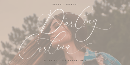 Darling Carlina is a beautiful calligraphy font suitable for any projects such as logos, branding projects, homeware designs, product packaging, mugs, quotes, posters, shopping bags, t-shirts, book covers, name cards, invitation cards, and greeting cards. It’s also a perfect fit for labels, photography, watermark, special events, and all your other lovely projects that need a beautiful script taste.
 - Golden Years JNL by Jeff Levine,
$29.00 The cover of the sheet music for the 1910 song “We’ve kept the Golden Rule” features a hand lettered and slightly spurred Art Nouveau type style. As an older couple was pictured below the song’s title, this inspired the name Golden Years JNL for the digital font, which is available in both regular and oblique version.
 - Ambigue by Linotype,
$29.99The original name for Ambigue was “Confidence”. This font family received the first prize at the German Kurt Christians-Foerderpreis in 1997/98. Its interpolated weights offer a subtle differentiation in the grey levels. A special “Small” weight is available that offers better readability in very small sizes. The work was supported by Professor Jovica Veljovic. - Birch Beer JNL by Jeff Levine,
$29.00Birch Beer JNL comes from lettering spotted on a European business sign found in some stock footage that was used for an old black and white film about World War II. The name is derived from a popular root beer-like soda sold by the Royal Castle Restaurants that were popular in Florida from the 1930s through the 1970s.