4,403 search results
(0.018 seconds)
- Bunny Hop by Larin Type Co,
$10.00 Bunny Hop - funny playful bold typeface. Will not leave you indifferent, thanks to its brave forms. It is great for creating your project, it can be used to create beautiful inscriptions on t-shirts, children's books, branding, book covers, stationery, marketing, color, toy branding, a blog, magazines and much more.
 - Chips Snack by Omotu,
$16.00 Chips Snack! A hand-written font with 2 styles, regular (brush texture) and solid. Chips Snack is perfect for short typography, logotype, apparel, T-shirt, Hoodie, product packaging, quotes, flyer, poster. Whats Include? 1. Uppercase and lowercase characters 2. Supports international languages 3. Numerals, punctuations 4. Accessible in the Adobe Illustrator Glyphs panel, or under Stylistic Alternates in the Adobe Photoshop OpenType menu, Adobe InDesign, Corel Draw, even work on Microsoft Word 5. Multilingual support Please message me if you're unsure of any language support. Thanks for looking, and I hope you enjoy it! Please don't hesitate to drop me a message if you have any issues or queries.
 - LT Sip - 100% free

- Aviano Copper Variable by insigne,
$199.99 The retro-inspired design of Aviano Copper Variable echos the bold style of America’s Gilded Age. Inspired by the copper-inscribed intaglio printing designs of the early 20th century, the powerful, wide character shape of this font walks softly across your page while carrying a big stick. To create the right balance, small wedge serifs were added onto Aviano Sans, giving you a sophisticated style that looks and acts like it belongs nowhere short of Boardwalk. Developed to a new level of excellence, this design offers a wide range of weights from thin to black. There's full multilingual support of all Latin-based languages and five stylistic sets, swash designs, and 1000 glyphs per weight, including some unique ligatures. Number options include old style figures, tabular figures, and superscripts. Unique median spur alternates, swashes, and ligatures will help you customize every single design. The feel of last century’s personal and business correspondence is waiting for you in this member of the Aviano family. While ideal for headings, displays, logos, and short texts, Aviano Copper’s use for everything from letterhead to wine labels may just give you the monopoly you’re looking for.
 - MGT American Copper by Magetype,
$29.00 American Copper Family is a vintage font inspired by an old American motorcycle logo. The logo looks very manly and strong, just like the motorbike. American Copper Script is the dominant one that turns the logo into a font. Whereas the Sans and Block family is a complement to the Script. But all three are a very good unit to be juxtaposed together. American Copper is a font made for you (designers) who love automotives: old cars and motorbikes. Anything related to automotive. Besides these two objects, this font is also very cool for music-themed design needs; rock n roll, metal, rockabilly, and others. Oh yes, Custom Culture is another very interesting thing to be depicted with this font. Workshop logo for example. It will look very unique with Interlock on American Copper Script. Pair it with American Copper Block. And, BOOM! The logo will look very manly. If you are curious, you can download the American Copper Script Demo version to try. Happy Designing. Cheers
 - coffee talk - Unknown license

- PB Roman Uncial Vc by Paweł Burgiel,
$32.00 PB Roman Uncial Vc is a font face designed for imitate Roman uncial writing style found in manuscripts from 4th to 5th century. All characters are handwritten by use ink and reed pen (calamus), scanned, digitized and optimized for best quality without lost its handwritten visual appearance. Character set support codepages: 1250 Central (Eastern) European, 1252 Western (ANSI), 1254 Turkish, 1257 Baltic. Include also additional characters for Cornish, Danish, Dutch and Welsh language, spaces (M/1, M/2, M/3, M/4, M/6, thin, hair, zero width space etc.), historical characters (overlined Roman numerals, abbreviations, I-longa, historical ligatures for "nomina sacra" and "notae communes") and wide range of ancient punctuation. OpenType TrueType TTF (.ttf) font file include installed OpenType features: Access All Alternates, Localized Forms, Fractions, Alternative Fractions, Ordinals, Superscript, Tabular Figures, Proportional Figures, Stylistic Alternates, Stylistic Set 1, Historical Forms, Historical Ligatures. Include also kerning as single 'kern' table for maximum possible backwards compatibility with older software. Historical ligatures for "nomina sacra" and "notae communes" are mapped to Private Use Area codepoints.
 - PB Roman Uncial IIc by Paweł Burgiel,
$32.00 PB Roman Uncial IIc is a font face designed for imitate Roman uncial writing style found in manuscripts from 1st to 2nd century. All characters are handwritten by use ink and reed pen (calamus), scanned, digitized and optimized for best quality without lost its handwritten visual appearance. Character set support codepages: 1250 Central (Eastern) European, 1252 Western (ANSI), 1254 Turkish, 1257 Baltic. Include also additional characters for Cornish, Danish, Dutch and Welsh language, spaces (M/1, M/2, M/3, M/4, M/6, thin, hair, zero width space etc.), historical characters (overlined Roman numerals, I-longa, historical ligatures for "nomina sacra" and "notae communes") and wide range of ancient punctuation. OpenType TrueType TTF (.ttf) font file include installed OpenType features: Access All Alternates, Localized Forms, Fractions, Alternative Fractions, Ordinals, Superscript, Tabular Figures, Proportional Figures, Stylistic Alternates, Stylistic Set 1, Historical Forms, Historical Ligatures. Include also kerning as single 'kern' table for maximum possible backwards compatibility with older software. Historical ligatures for "nomina sacra" and "notae communes" are mapped to Private Use Area codepoints.
 - PB Capitalis Rustica IVc by Paweł Burgiel,
$32.00 PB Capitalis Rustica IVc is a font face designed for imitate latin writing style found in manuscripts from 1st to 9th century. All characters are handwritten by use ink and reed pen (calamus), scanned, digitized and optimized for best quality without lost its handwritten visual appearance. Character set support codepages: 1250 Central (Eastern) European, 1252 Western (ANSI), 1254 Turkish, 1257 Baltic. Include also additional characters for Cornish, Danish, Dutch and Welsh language, spaces (M/1, M/2, M/3, M/4, M/6, thin, hair, zero width space etc.) and historical characters (overlined Roman numerals, I-longa, historical ligatures for "nomina sacra" and "notae communes"). OpenType TrueType TTF (.ttf) font file include installed OpenType features: Access All Alternates, Localized Forms, Fractions, Ordinals, Superscript, Tabular Figures, Proportional Figures, Stylistic Alternates, Stylistic Set 1, Historical Forms, Historical Ligatures. Include also kerning as single 'kern' table for maximum possible backwards compatibility with older software. Historical ligatures for "nomina sacra" and "notae communes" are mapped to Private Use Area codepoints. Use of OpenType features to get historical characters: ïTo get "I-longa" use Stylistic Alternates for: "I"(U+0049), "i"(U+0069), "dotless i"(U+0131). ïTo get "nomina sacra" use Historical Ligatures and write uppercase letters: DS for: "Deus", DMS or DNS for: "Dominus" EPS for: "Episcopus", IHS for: "Iesus", PBR for: "Presbiter", SCS for: "Sanctus", SPS for: "Spiritus", XPS for: "Christus". ïTo get "notae communes" use Historical Ligatures and write: B(U+0042) + "middle dot"(U+00B7) for: "-BUS", Q(U+0051) + "middle dot"(U+00B7) for: "-QUE". ïTo get "scriptio continua" (writing without words separation) use Historical Forms (regular spaces are replaced by zero width spaces between words). ïTo get "middle dot" for separate words use Stylistic Set 1 (regular spaces are replaced by middle dot between words).
 - Shit Happens - Personal use only

- Parry Hotter - Unknown license

- Battered Cooper - Personal use only

- Houters-Normal - Unknown license

- Dimestore Hooker - Unknown license

- Monogram Holder by Edignwn Type,
$19.00 The font is called "Monogram Holder", it is a slab serif display with monogram themes. The font comes with 450+ combined of two letters, you just type uppercase letters with lowercase letters. For example you type "M" combined with "h" then it will become a ligature monogram of "M" and "h". This font includes different widths of alternate glyphs. The Monogram Holder matches apply in some designs such as the logotype, poster, label, badge, packaging, branding, and more custom design. Monogram Holder includes : 450+ ligature monograms All-caps, numeral, symbol and punctuation Alternates Multilingual PUA Encoded Thank you for your support and choosing us.
 - Cooper Goodtime by Breauhare,
$35.00 Cooper Goodtime is a font based on the lettering used on the CBS-TV variety series The Glen Campbell Goodtime Hour (1969-1972). The name pays tribute to its two origins, the other being Cooper Black. It was never an actual complete font set on the TV show, only a limited number of handmade letters, all upper case. It has lain dormant since the show went off the air in 1972. With this incarnation, a set of lower case letters has been created to complement the upper case letters. These lower case letters never existed before now. Cooper Goodtime is a funky, nostalgic, cool way to create a display, and it works surprisingly well in text sizes, too.
 - Cooper Screamers by Wordshape,
$- In 1925, at the request of Barnhart Brothers & Spindler, the foundry he worked for, Oswald Bruce Cooper designed a wide selection of "screamers", oversized exclamation points used to grab attention in display advertising. The foundry rushed the screamers into production, much to Cooper's dismay. Cooper was disappointed with the final form of the screamers– they were designed in assorted weights to match the assorted Cooper series of typefaces, as well as in a variety of other formal solutions- squaredoff, incised, wavy, Tuscan, and rounded. Cooper's working design methodology was to re-draw his projects a number of times in order to refine the formal results. However the screamer project was hastily cut by the head of BB&S's matrix engraving room in fourteen sizes from the initial sketches, causing Cooper to fire off a fiery missive stating, "Everything I draw is bum the first half-dozen times I draw it; the trouble with these is that I drew them only once!" This typeface is the result of researching Cooper's original drawings and series of engraved proofs for the screamers, as well as the original Screamer type specimen. Cooper Screamers have never been available before in digital format.
 - Chilli Peppers by Letterara,
$12.00 Chilli Peppers is a stylish, quirky, and incredibly distinct script font. Its stand-out feel makes this font incredibly versatile, fitting a wide range of contexts. Whether you’re using it for crafting, digital designing, presentations, poster, logos, events, or greeting card making, it’s perfect! This font is PUA encoded which means you can access all of the awesome glyphs with ease! It also features a wealth of special features including ligatures.
 - Cooper BT by Bitstream,
$34.99 Cooper Black, commissioned by Barnhart Brothers & Spindler, is the best known of Oswald Cooper’s typefaces. Bitstream has expanded the 1921 original into a complete series of round-edged text faces.
 - Cooper Antique by URW Type Foundry,
$35.00
- BF Souper by BrassFonts,
$30.00 - Golden Pepper by Letterhend,
$16.00 Golden Pepper is a vintage display typeface with the touch of nostalgic feel. The bold looks make this font standout to be used as a title or a logo. This font perfectly made to be applied especially in logo, and the other various formal forms such as invitations, labels, magazines, books, greeting / wedding cards, packaging, fashion, make up, stationery, novels, labels or any type of advertising purpose. Features : Numbers and punctuation Stylistic alternates multilingual PUA encoded We highly recommend using a program that supports OpenType features and Glyphs panels like many of Adobe apps and Corel Draw, so you can see and access all Glyph variations. Email us to letterhend@gmail.com if you need something! Happy Designing!
 - Sgt Peppers by K-Type,
$20.00 SGT PEPPERS LONELY HEARTS CLUB is a typeface inspired by the capital letters on the bass drum in the Beatles' Sgt Pepper album cover. The original lettering was hand painted by fairground artist Joe Ephgrave during March 1967 in an art deco style he called 'futuristic'. The font completes the uppercase, adds a lowercase, and includes a full complement of over 400 characters. SGT PEPPERS OUTLINE and SGT PEPPERS OUTLINE FILL are two fonts with matching spacing and kerning that can be overlapped for creating bicolor/multicolor effects and faux drums. The Outline and Outline Fill fonts do not contain lowercase characters, instead they comprise two weights of outline capitals as painted on the Sgt Pepper drum. The uppercase letters are in the wider style from around the outer edge of the drum, and the lowercase keys deliver the more condensed 'Lonely Hearts' inline style from the middle of the drum. The uppercase Y has been flipped to produce a more conventionally acceptable character with the thicker diagonal arm on the left. However, Joe Ephgrave's reverse Y (with inline) is included in the Outline fonts at the Section keystroke § (Alt-0167 on Windows). A simplified vector image (mono) of the bass drum without lettering is also included within the Outline fonts at the PlusMinus keystroke ± (Alt-0177 on Windows).
 - ITC Zipper by ITC,
$40.99Zipper is a striking font designed in 1970 by Phillip Kelly for the Letraset dry transfer sheets and it shows itself as a true child of the 1970s. The most distinguishing characteristic is the markedly robust horizontal stroke, heavier by far than the verticals. In a line of text, the figures present a close, stripe-like line, strongly dominated by the horizontal. Zipper is meant exclusively as a headline font and should be used in larger point sizes to highlight its unique, eye-catching characteristics. - Cooper Black by URW Type Foundry,
$89.99Cooper Black The Cooper Black font should be used in display sizes only. Cooper Blacks serifs are rounded and the counters are small. Cooper Black was designed by Oswald B. Cooper for Barnhart Brothers & Spindler in 1921 for advertising and posters. The capital O and Q of the Cooper Black font are tilted back; in the lowercase, the dot on the I and j become elliptical. The extra bold Cooper Black font has a remarkable personality and reproduces well in sizes over 18 point in titles, subheadings and generally short sentences. - The Holler by Javatypestd,
$10.00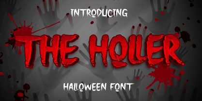 Introducing The Holler Font with a scary Halloween theme. Masterfully designed to become a true favorite, this font has the potential to bring each of your creative ideas to the highest level To access the alternate glyphs, you need a program that supports OpenType features such as Adobe Illustrator CS, Adobe Photoshop CC, Adobe Indesign, and Corel Draw. What’s Included : - Web Font - Standard glyphs - Ligature and Alternate - Works on PC & Mac - Simple installations - Accessible in Adobe Illustrator, Adobe Photoshop, Adobe InDesign, even work on Microsoft Word. - PUA Encoded Characters – Fully accessible without additional design software. - Fonts include multilingual support Thank you for your purchase! Hope you enjoy our font!
 - Cooper Black by Mecanorma Collection,
$45.00 - Gopher Mono by Adam Ladd,
$25.00 Gopher Mono is a reverse contrast, monospace sans serif typeface ranging in weight from thin to black with italics. The design provides a unique look to the monospaced genre by using a contrast where the vertical strokes are a little thinner with horizontal strokes thicker. While monospaced fonts are typically used for smaller body text, the slightly unusual quirks of a reverse contrast design make it interesting enough to also use for display treatments so style and function are blended.
 - Cooper Black by Linotype,
$40.99 Oswald Bruce Cooper designed Cooper Black, an extra bold roman face, based on the forms of his earlier typeface Cooper Old Style, which appeared with Barnhart Brothers & Spindler Type Founders in Chicago. Copper Black was produced by Barnhart in 1922 and acquired in 1924 by the Schriftguß AG in Dresden, where it was later completed with a matching italic. Although Cooper Black appeared in the first third of the 20th century, it still looks contemporary and it can be found on storefronts in almost any city scene. The flowing outer contours create forms that are both strong and soft, making Cooper Black an extremely flexible font.
 - Cooper Poster by GroupType,
$15.00 Cooper Poster was inspired by showcard lettering samples featured in the book, Commercial Art Of Show Card Lettering, published in 1945. Although named ""Western"", the design was modeled after Ozwald Cooper's 1921 original Cooper Black.
 - Horier Time by Letterhend,
$17.00 Unveil the depths of terror and embrace the macabre with our latest font creation,Horier Time - – a bloody mesmerizing horror display font. Prepare to embark on a spine-tingling journey into the darkest realms of design, where fear and fascination intertwine. Features : Uppercase & lowercase Numbers and punctuation Alternates/Ligatures Multilingual PUA encoded
 - Amelia Harper by Letterhend,
$14.00 Amelia Harper , a new font duo where the elegance of a serif font intertwines flawlessly with the beauty of a handwritten script. This font duo is carefully crafted to bring together the classic charm of serifs with the contemporary edge of modern scripts. Features : Uppercase & lowercase Numbers and punctuation Alternates & Ligatures Multilingual PUA encoded
 - Cooper Nouveau by House Industries,
$33.00 Few fonts reach cult status. Despite its ubiquity—and perhaps because of its lack of subtlety—for a hundred years Cooper continues to draw the faithful. It’s even come to define an entire typographic genre and recently starred in its own documentary. Cooper Nouveau is Dave West’s imaginative contribution to the Cooper oeuvre. Drawn in 1966, Nouveau refreshes Oswald Cooper’s original italic with an energetic pitch, simplified contours, and a plump friendly figure. Uniform strokes and generous curves push the font’s playful personality and springy silhouette even further. A selection of swashed characters and ligatures offers options for lively logos and strong captions. While Cooper Nouveau looks laid-back and easy-going, it’s more than capable of pulling it’s own typographic weight. Put it to work where relaxed needs to project confident. Set Nouveau large for eye-magnet posters, packaging, and advertisements. Maximize its youthful energy for kids’ themes, craft action, and apparel bounce. Or set it alongside a master like Benguiat Buffalo or Chalet to show how Cooper Nouveau can communicate on paper and screens with an inherent ability to speak the language of style in many tongues. But like any cult icon: beware! Cooper has a way of setting the needle, and Nouveau just may become your go-to design fix. FEATURES ALTERNATES: Cooper Nouveau contains several alternate characters, which add flair to your designs and can help solve spacing issues LIGATURES: Many letter combinations in Cooper Nouveau form a ligature to solve spacing issues and produce more pleasing designs. COOPER NOUVEAU CREDITS Typeface Design: Dave West Digitization: Dave Foster Typeface Direction: Ben Kiel, with Ken Barber Like all good subversives, House Industries hides in plain sight while amplifying the look, feel and style of the world’s most interesting brands, products and people. Based in Delaware, visually influencing the world.
 - Cooper BT by ParaType,
$30.00Bitstream Cooper was designed at Bitstream in 1986 by means of adding light, medium, and bold styles, with the corresponding italics, to the existing black ones. Based on Cooper Black, 1919, by Oswald Bruce Cooper, which was firstly released as a hand composition font in 1922 by Barnhart Brothers & Spindler of Chicago and later spread by ATF. Cooper Black is an extra bold face based on Cooper Old Style. Bitstream Cooper is an old style face with rounded serifs and tilted back ovals. For use both in text (normal weights) and in advertising and display typography (heavy weights). Cyrillic version was developed for ParaType in 2000 by Manvel Shmavonyan and based on TM Oswald face of TypeMarket, 1996, by Victoria Grigorenko. - Pepper Sans by VIDI Visual Design Studio,
$17.99 The core design of Pepper family, designed by VIDI Visual Design Studio, is the fingertip handwriting style inspired by children’s writings on windows. This distinctive low-contrast typeface combines characteristics from neo-grotesque and organic models. Warmer than most Helvetica inspired typefaces, Pepper has organic shapes, playful strokes, rounded endings, and a generous x-height which makes Pepper easy to read. This family could be used well for food packagings, content aimed for children, book covers, branding, high-impact titles and small body texts, advertising, editorial design and more. What makes Pepper Sans Vol.1 competent and more spicy then some other fonts is that it contains a set of more than 900 characters for each of 5 weights that support many Latin-based languages, Greek and Cyrillic. As the weight decreases, the typeface gains impact with becoming elegant, giving titles in (Hair, Thin or Light) a breath of fresh air. We derived a typeface family consisting of Hair, Thin, Light, Regular, Semi Bold in this Vol.1 edition. Typeface features: • 5 weights: Hair, Thin, Light, Regular, Semi Bold • Latin, Greek & Cyrillic multilingual support • More than 900 characters for each of 5 weights Font Specs: • Created: August 2020 • Files type: .ttf
 - Harpers Grotesque by Cloud9 Type Dept,
$45.00 Harpers Grotesque is a classic multiusable grotesk font with a modern twist. Harper Grotesque has an extended character set to support Central and Eastern European as well as Western European languages plus OpenType features, fractions and alternates.
 - BD Supper by Typedifferent,
$45.00 "BD Supper" is a friendly and humorous geometric-organic sans serif typeface great for use on food packaging and in gastronomy-related topics. It features a wide selection of alternate characters to choose from. Use them as you like. With two weights regular and bold, «BD Supper» fits the needs to structure a body text with a headline and to create logotypes.
 - Salt & Pepper by Almarkha Type,
$29.00 Salt & Pepper is cute handwritten, but also Crafty. This versatile script font has a wide range of applications ranging from greeting cards to kids’ crafts, and is guaranteed to add a sweet touch to your next design.
 - IP - Unknown license

- hyper 2000 - Unknown license


